Magazine Style Model


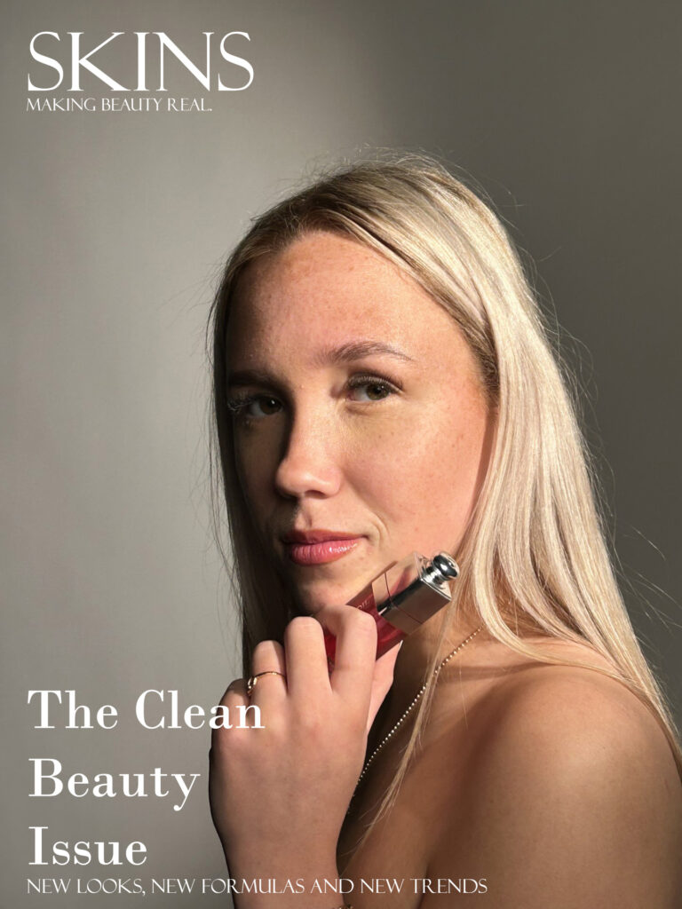
I am designing and promoting a magazine cover about makeup and beauty. This magazine promotes natural makeup and natural beauty to make people feel more confident in their skin, one of the reasons it’s called ‘SKINS.’ My inspiration for this was the magazine ‘Cosmetics.’ My model is a fictional model ‘Evie Walker.’ In this front cover i am promoting a new product of lip oil.
Walker is purposely wearing little to no makeup in this picture to try and change societies view of women. To make people love themselves and stop society believing they need makeup to be pretty. This also makes the lip oil get more attention as the readers aren’t distracted by anything else. By her holding the lip oil it also makes people intrigued and get drawn to the packaging and aesthetics of the product. The model is also representing herself as an advocate for this idea and she supports it.
My target audience for this is predominantly women of 16-30. The reason it is targeted at these younger ages is because people who are influencers on social media can change girls’ views on beauty as they are all over social media. The model Evie Walker also reposted this on all her social media platforms promoting the new lip oil, increasing readers and buyers.
In my magazine cover you can see it says ‘clean beauty issue’ this demonstrates a no makeup; makeup look which is a lot more realistic and achievable for young women and girls. The background is also a beige colour promoting the minimalistic idea, along with subtle white writing on one side. By having the product in the photo just underneath her lips promotes the product and intrigues people to buy it to test it out. I took the picture horizontally and left space on the left side to write information and market the magazine, so it is clearly seen and easy to read. It is a close and intimate photo with a direct address. This entices the viewers and links nicely with the theme of the magazine and the clean look to it.
Magazine front cover

I chose to create a hair front cover for my magazine ‘roots’, in this front cover I used my fictional celebrity ‘Evie Walker’. I want my front cover to focus on helping the audience to make their hair healthy and thick by inspiring them with someone who has shiny clean hair. To also promote a strong independent woman that my audience look up to.
In my front cover photo, I used a low camera angle to showcase my protagonist to be of high status, the woman in the photo is also making direct eye contact with the camera to assert dominance and to break that fourth wall making whoever’s reading the magazine feel as if it is personalized for them. The clothing worn by my model seems to be modest and appropriate, the reasoning of this is to attract the correct audience of women therefore making my model look so she is not being objectified. The use of the mid–motion image is to draw the audience’s attention to the magazine’s purpose rather than what the model is wearing. The pink/red shade of my model’s lips showcase the power of women rather than dragging the male gaze theory into my magazine.
The target audience of my magazine is an age range of 16–35-year-old women. The reason for this is due to the fictional idol used on the cover as that is her age range of fans. The fact that my model is on the younger side also attracts the younger half of that audience. The use of the pink and purple purposely stereotypically attracts a female audience.
The repetitive use of the word ‘you’ enhances the idea of making the magazine feel personalized and therefore will have the reader questioning is this for them? This is exactly what I want my front cover to do which will attract more readers for the questioning. To keep my audience engaged I used a lot of statements rather than questions as if I’m telling the audience they need this therefore drawing in a larger audience.
