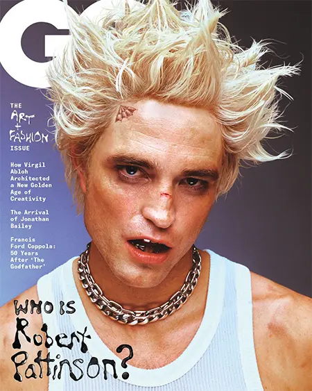
Read below a reading of GQ cover and inner pages that employs semiotics, genre theory and structuralism.
Exercise: Highlight the key terms used and summarize the main points made in the text below.
source [https://media-studies.com/gq-magazine/]
‘Semiotic Analysis of GQ Magazine cover’
The conventions of magazine covers are immediately apparent on this issue of GQ. First, the dominant signifier is a celebrity who has the star power to attract the interest of the audience intrigued by his glamorous lifestyle. The actor is known for his smouldering good looks, charm, and his high-profile roles in popular films, such as Edward Cullen in the Twilight franchise and the eponymous hero in The Batman.
Pattinson demands our attention with his direct address. Interestingly, the actor subverts his mysterious and intense allure by choosing a more aggressive version of masculinity. A thuggish quality is encoded in his bruised eyes, broken nose, metal-capped teeth, and thick chains around his neck. The carefully spiked hair completes the punk look. That white (Burberry) tank top is certainly not glamorous, but the actor remains incredibly charismatic in this photo shoot.
Anchored by the headline “who is Robert Pattinson”, the audience are being positioned to re-evaluate their understanding of the actor. This marketing ploy was particularly important because Pattinson wanted to shake off his boyish persona for his role as the enigmatic Batman. Perhaps the blue gradient background also encodes this sense of transformation.

Notice how the masthead appears behind the actor and the headline is in front of his body. This is another convention of magazine covers. By layering the elements in this way, the designers are trying to imitate a three-dimensional space and ensure the magazine pops out on the shelves.
Commissioned by the publishers in 2000 and developed by Tobias Frere-Jones, the “geometric” design and bold lettering of the title reinforce the brand’s confidence and modern style.
Coverlines reassure the reader the magazine is worth purchasing by highlighting the main features, articles, interviews, and exclusive content. The three coverlines on this issue draw attention to an iconic fashion designer, an upcoming English actor, and one of the most famous directors in Hollywood cinema.
It is worth noting the reference to the Jonathan Bailey interview is on the British edition of the magazine – the coverline for the American audience is “The 50 Holy Grails of Modern Menswear”. The publishers simply adapted the content to appeal to the different markets.
Finally, the layout is easy to navigate with a clear hierarchy of information. There is no doubt the designers have communicated the magazine’s brand and content effectively to its target audience.
Genre
In his analysis of popular cinema, Steve Neale defined genre as the “specific variations of the interplay of codes”. This definition also works very well for magazines. For instance, the front covers usually repeat the pattern of presentational devices outlined in the previous section.
Inside, readers will expect the fashion magazine to have content devoted to different types of clothing and accessories. Alongside the interview with Jonathan Bailey, the actor poses in some stylish and expensive outfits. If you wanted to recreate the following look, the Louis Vuitton jacket and trousers cost over £3,000. The Hermès belt was available for £850.

The story is written from the perspective of the interviewer, Douglas Greenwood, who arranged his conversation with the actor in Hyde Park into a coherent narrative. We learn some details about Bailey’s personal life and his acting career – his thoughts on his “avoidant and toxic” protagonist in Bridgerton are useful if you are analysing the representation of masculinity. In terms of genre, this narrative style is typical of longer form magazine interviews. Have a look at our analysis of The Gentlewoman because the Isabella Tree article is another example of this format.
The interplay between the arrangement of text into columns and the high-quality photography is another a key feature of the format.
A Structuralist Approach
Rather than simply being determined by the intentions of individual creators, structuralists argue media messages are part of a larger system of social relationships and cultural values. If we analyse the codes and conventions of magazines, we should be able to develop our understanding of these deeper influences behind the text.
For example, fashion magazines always promote the latest trends in the fashion industry, providing narratives which can influence the clothes we buy in the shops. Jonathan Bailey is wearing his expensive outfits in carefully staged settings, encoding a powerful sense of fantasy and aspiration that will appeal to readers with plenty of money in their designer wallets. However, GQ is dependent on the luxury fashion houses for their support and financial sustainability, so they might prioritise certain designers over others to maintain positive relationships with their advertisers.
You also need to consider how Bailey provides his depth and personality to the designer clothes in exchange for publicity for his own work, especially the second season of Bridgerton. The producers obviously believe readers are more likely to connect with the opinion leader compared to an unknown model because we are already familiar with his rakish identity in the television series. This is another reason why structuralists believe we cannot fully appreciate the meaning of media text until we locate the product in its wider context.
Of course, Bailey’s poses are effortlessly cool which also reinforces the traditional ideal of beauty.
The Gentle Woman
Analysis of the Front Cover
The dominant signifier is a close up of the cover star, Scarlett Johansson. Her face fills the frame and her eyes, half-open and dreamy, gaze back at the viewer with a soft confidence.
Portrait photography is meant to reveal the essence of the subject, but there is a hyperreal quality to Johansson’s makeup with the use of thick eyeshadow, full lipstick, and the dark colour and shape of her eyebrows. This stylised representation alludes to her role as Black Widow, the high-kicking superhero from the Marvel cinematic universe. Perhaps the fashion photographers, Inez and Vinoodh, also wanted the pop art colours to emphasise a tension between the actor’s private life and her public identity.
The cover story includes a quotation from Noah Baumbach who directed Johansson in the film Marriage Story: “Her face says everything. It’s that thing when the internal becomes external. And a closeup can be the greatest shot imaginable”. This candid closeup on the cover of The Gentlewoman is a great photograph and will certainly grab the attention of the target audience.

Although the main image is a little more experimental than most of the magazine’s covers, the rest of the page follows The Gentlewoman’s house style with the masthead positioned at the top and the cover star’s name at the bottom. The message is clear – Johansson is “the gentlewoman” and this is her story.

The title uses a variation of the Futura typeface. The geometric letters and the distinctive “l” and “h” shapes create a feeling of modernity and progress. This ideology of function over form is appropriate for an independent magazine which aims to represent “real women” and “the way women actually look, think and dress”.
The Gentlewoman does not rely on impulse buyers, so there is no need for coverlines to compete for the reader’s attention at the newsstand. See our analysis of GQ magazine or Men’s Health for comparison. The minimalist approach keeps our focus on Scarlet Johansson’s narrative and celebrates her individuality.

