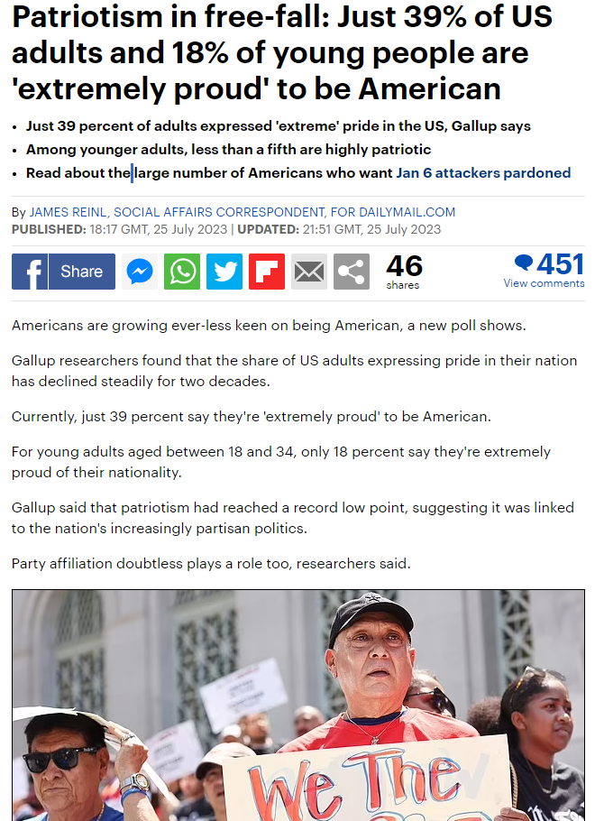

The Daily Mail’s headline is more dramatic and straight to the point to create a feeling of worry and fear in whoever is reading- as a way to make them more invested. It makes them wish to find out the answer to the dramatic point they have expressed (in this case, the decreasing amount of patriotism in America). Guardian’s headline in comparison is more laid back and less aggressive, choosing to simply explain the theme of patriotism rather than make the reader more afraid. Another point is that both articles are presented quite differently, as the writing of the Daily Mail is very limited, more so keeping to a summarised explanation as a lot of people who would have saw the article would just be scrolling online and would not be as invested in a longer article (due to our small attention spans). That is why it is more straight to the point with only short sentences with no real paragraphs. It also features a lot of simple, to the point images along with it. Guardian, on the other hand, is much more detailed with its presentation, a lot more words and paragraphs rather than relying on the summary of the point being expressed and simple images. When the article does use images, its more so just to enhance the details of the written sections, rather than explaining the point further. For example, the Guardian article uses a picture of an American flag being waved- this picture doesn’t provide any extra information. It is just there to enhance the words, as it is kind of unrelated (it still links to patriotism but it isn’t necessarily linked to the writing).
