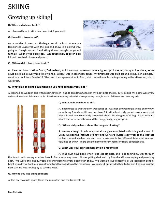
evaluation of summer task

In my summer task, my main aim was to inform and persuade the reader to maintain a healthy lifestyle and improve their fitness. I did this through a conversation with Lucy Kerr (a personal trainer) where she exposes her top tips and tricks and how she became a personal trainer. She describes what interests her in the fitness industry and why having a healthy lifestyle is important.

I created my magazine page with bright colours and a picture of Lucy so that it was catchy to the eye. The background of the article is a textured picture of Lucy lifting a weight, I did this to draw in the intention of the reader whilst still leaving it looking tidy and organised.

with my article, I tried to create a radical image of a personal trainer as she is now 46 years old, is still training clients and is in great health. She exceeds the standards of personal trainers being young and in their twenties, I wanted to show that no matter what you can reach your goal, and she has shown this through her business.

Evaluation of Summer Task

Statement of intent:

For my summer task my intention was to give an insight on the life of an aspiring nurse. I got in contact with one of the nurses from the General Hospital; over the phone I gave Crystal questions varying from ‘Where did she study’, to ‘What she finds difficult about working in her environment’.

Media Language:

For my summer task I wanted its presentation to be simple and noticeable; I made the headline a text size of 42, and the colour theme I focused on was mainly red. I also made the text justified, and highlighted dialogue to make it stand out to a reader.

Representation/content:

I wanted to represent a nurse almost as a soldier; risking their lives for the betterment of others, “because it’s their line of duty”. It’s common that nurses are seen as just assistants to patients and doctors, but I wanted to challenge the typical stereotype of nurses being soft and caring, so I radicalized that common view point by comparing them to soldiers; who are known for giving their own lives for the betterment of their country and their people; which is picture that isn’t commonly associated with nurses.

What kind of company would make your product? What kind of audience would consume it?

I see the ‘Nursing times’ as being one of the best fits for my article. The ‘Nurses times’ is accessible to all, and is commonly viewed by nurses in the UK. Alternatively there are various nursing blogs that publish articles and news for nurses.

What would you do differently? What did you do well?

In terms of my graphic design; I would change the colour scheme to light blue, and blue; since the colour blue is associated with nurses attire. I would also add more graphics, such as background images, and a more modern article style. I aimed my article to be more fitted for newspapers, but after looking through more nurse blogs I noticed that the majority of articles were in a more modern format style. I’d say that I manged to succeed in representing a nurse in a new form.

evaluation of summer task

statement of intention for my article was: My intent for my summer task was to highlight the beauty of this island that we live in so I took a picture of St Brelade’s beach and spoke about how beautiful it was but highlighted all the rubbish that littered the beautiful beach. As I was down at Brelade’s beach I interviewed some of the by standers that were around to see what they thought of the beach. the main issue was the litter that scattered the beach. these people were local and tourists a like some said that they were disappointed with the state of the beach.

Media Language:

in my summer task I wanted my article to be eye catching by using a photo of the beach with the headline: Plastic Beach in bold writing in order to catch the attention of the reader. I used a grey back lining to high light the text in the paragraph.

Media Representation:

In my Summer task homework i wanted to represent jersey as a beautiful place with locals and tourists that care for this island and to show that they are against plastic pollution. instead of being by standers and becoming a participant in this global phenomenon so I emphasised the title as Plastic Beach to highlight the state of the beach and what the condition is like and to gather a group of people who wish to change the beach from a plastic beach to a beautiful beach.

what company would make your product?

the company that would make my product would be Jersey Evening Post because the product is related to the island itself and has relevance to people who live in st Brelade.

what went well, what would you change?

if I was to change my article I might of changed the subject that I wrote about. what I think went well was how I tried to draw readers in with a flashy title that makes you wonder what it is. I think my lay out was good I could of changed the font size I used. I Think I could of interviewed some of the staff that worked in some the restaurants.

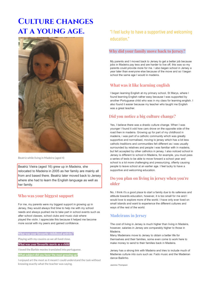
evaluATION of summer task

In my summer task, my main intent was to highlight the culture change from moving from Madeira to Jersey. I chose this topic because it is a common occurrence in jersey and felt it could benefit those who have been through similar changes, I also believed it could be interesting for those who may not be able to relate because people from jersey and madeira are a big community.

I used the colours of the Madeiran flag on my text, I also included a picture of Beatriz to relate to the age she was speaking about in the article. I also made the heading and subheading bigger than the rest of the text to emphasis where everything is.

In my article, I was trying to challenge the stereotype that younger children aren’t mentally developed enough to easily adapt to a new environment and seamlessly live their life the same as anyone else in jersey, whether this is through learning English, adapting to different environments and making new friends.

My article would probably be in a niche travel magazine or a niche jersey based magazine as it highlights travel and culture. it would be aimed at people who are moving from one country or someone being introduced to a new culture. it was also be helpful for someone who is currently learning English as it could inspire them to keep trying.

In my post I would make it more aesthetically pleasing and more interesting to look at, I would also include some more interesting facts for the reader.

Evaluation Of Summer Task

For my Summer Task, my intentions were to communicate how interesting one of my grandmother’s hobbies is (beekeeping) and offer insight into what goes into it. One of my further potential goals was to make people even consider taking up beekeeping for themselves! I wanted the article to read well, be easy to consume and present an out of the box subject in an understandable way.

My summer task followed my style model in various ways, such as using similar headlines, subtitles and font layout (columns). Additionally, I used shapes, pictures and an in-line quote and laid them out in a way similar to that of the style model I attempted to follow. I also paid close attention to font style, size and position, changed various colours and used a drop cap to show exactly where the article started.

In my opinion, my article was reactionary as it went along with what most would consider normal, stereotypical beekeeping processes. It added insight into these, leading to a more involved understanding of what would occur if you were a beekeeper yourself, and it in my opinion presents a positive viewpoint on beekeeping.

I think that my article would be created by a local company and that it would be shown in local newspapers, or perhaps a few magazines. I think that the audience would be relatively broad, however it would probably be focused on an older demographic. It’d be consumed by everyday people looking for an interesting topic to casually read about.

I think that I did well regarding the layout and readability of my article, with a good focus on how to present the elements of my article as well as information clearly. However, I should have asked permission to include a picture of the person I was interviewing, and perhaps implemented a more interesting background rather than the plain white to make it more interesting to look at and make it more eye catching.

INDUCTION TASK EVALUATION

  1. Within my induction task my main aim was to inform an audience about my brothers views on how education works at Oxford university and his opinions on the university as a whole. I used a magazine called Beyond Education as a template to write this interview, this helped me to understand the kind of style to write in.
  2. The kind of media language I used within my interview were drop caps, coloured font and a small picture, the reason I used these were to create elements of a real print product. I used a small picture because my interview is based on education, which is thought of as a more serious and studious topic to talk about. My use of graphical features such as drop caps are a way to grab the readers attention because they can be useful for adding personality and visual strength to my page.
  3. My interview on my brother is intended to represent the countertype that youth do not particularly enjoy education, I have done this by showing my brothers interest and passion for his subjects within Oxford. This therefore means that my interview suggests a reactionary view, as the stereotype is being opposed.
  4. The kind of company of magazines that would publish my article would be an education or school-based company, this is because my article is based around the life at Oxford university and the opinions of an insider.
  5. In my article I think I did the presentation well because I feel that it does look like a magazine article. I also think I chose an interesting topic to write about. The things I would improve about my interview would probably be to write in more detail to give the audience a clearer understanding and I think I should have included more graphical features to encourage the audience to read it and have more of an interest.

Evaluation of summer task

Statement of Intent:

For my summer task, an article addressing the life of Jayden Bourne. I interviewed Jayden about what he had done in the past, what he’s doing presently and what he plans to do in future.

Media Language

I used red text for Jayden’s name to make it stand out to the eye and draw the viewers attention to his name, which was located right beneath the design with his picture in, which would then direct the viewers eye above to look a his picture, Even the other way around it would’ve worked because that how I want the viewer to view the article. I positioned the main design at the top middle because not only was I going off a style model, but again I wanted them to know who the article was about and know his name face etc

Representation:

Obviously the stereotype of a teenager is there sulky, moody, grumpy and monotone. But my article attempts to challenge the reactionary stereotypes with a radical individual which countertypes the stereotypical traits that most of society would assume he would have, so once an audience consumes my article it may challenge their reactionary and stereotypical view.

What kind of company would make your product:

I think that my media product would be produced by a magazine, possibly a business magazine or a casual magazine, I only think business magazine because the style model which I used looked very professional and may of been from a professional magazine. And a say more of a casual magazine because of the article content and what I chose to write about.

Evaluation:

I think I could’ve asked more questions in the interview I held and fully determine the content I wanted for the article before the interview. I could’ve also used more designs. I could’ve wrote more too. But ultimately I think I should’ve used the inverted pyramid writing style way more to structure the article and help me with the questions I should’ve asked.

induction task evaluation

In my summer task, my main aim was to display Charlie Dicker’s passion for performing arts while also displaying a colourful, action packed article. My page was busy to also symbolize Charlie’s chaotic rehearsal timetable. To get inspiration for my article I searched up online magazines and took a couple of ideas from them like the sectioning off of the paragraphs with lines, the the picture along with their captions and the larger title.

I made the lines green and the questions pink to add more colour to the article while keeping it organised. I added two pictures: one of Charlie while on stage performing in ‘Oliver!’ as it was the biggest part he has had in a show before and the audience could see evidence. The other picture of him is when he won ‘ young musician of the year award’ again to prove that he has achieved these. I also put the main two quotes in bold to outline their significance in the article.

Charlie is a stereotypical drama and smart student achieving 9 GCSE’s at grades B-A*. He is also stereotypical as he has been involved in many different drama groups and different types of shows. However he can be seen as a countertype as he focus’ mainly on singing as it is what he enjoys the most and not acting.

I think that this would be seen on a university/drama school website explaining Charlie’s background for the public to see. This may even be in a magazine based on performing arts or maybe for talented people. Technically this would be mainstream and broad as anyone can access it but it is narrow in the sense that there is a target audience of people who either visit the website or read the magazine. So the narrow audience are people who are involved in performing arts.

I would have added more colour, wrote less text and made the title and pictures bigger. This would make it more aesthetically pleasing and eye-catching for the audience. It will also encourage them to read it all (if there wasn’t as much writing in particular). I could have also changed the background colour or changed it to a picture to make it more eye-catching and less amateur.

Evaluation Of Summer Task

In my summer task, my main aim was to tell a story of my dad, and how his workplace experience is. The significance it shows is how it is unenjoyable for him after working for his own business for so many years. The contents of the text includes how many apprentices he trains up, hoping the will stay to work for him, and what happens after.

I used a bold title and organised columns of smaller text to portray my article as a genuine piece of media. The larger and smaller images are places around the text rather than over or under as I find the text unreadable. The drop cap used for the first letter of the text helps the first word make more of an impact.

My dad is a mechanic, he’s always home late and he can’t do cooking or other stereotypical ‘mum’ things at home because of how overloaded with work he is all the time. This is what people would expect from a dad, making my article reactionary.

My product would be suitable for people who want to learn how they can relate to others. By showing how someone has to live, this may allow other people to see how they are similar to each other and are able to make comparisons.

There was no empty space as almost all of it was taken up with text. This makes the whole document look quite bland as there is just lines and lines of text.