INDUCTION TASK EVALUTATION

Statement of intent-

In my summer task I wanted to focus on females in hospitality and their experiences. I did this by asking a colleague at work who had 3 years experience, knew that she would be willing to share her experiences, and would make an interesting interview. I asked her 3 questions that resulted in long informative answers, all including topics such as dealing with angry customers, sexual harassment and the positives.

Media language_

The media language used in my language was based in a question and answer format, I used a main image of her in her work uniform as I thought it would set the scene of her on a shift. I added a title and a by-line. To improve next time I will add collems and more colour to make my interview more interesting and include more media language.

Representation-

My product challenges the stereotype of teenagers, a general idea of teenagers in modern society is rebellious and troublesome, but here Tilly is a hardworking teen who balances friendships and school with working, and highlights that teenagers aren’t the problem as it provides us with story’s of adults acting inappropriately and what adults themselves would call improper. It also directly provokes the subject of how without young, enthusiastic staff, who contribute new, fresh ideas, the hospitality world wouldn’t thrive.

Audience-

The audience I am focusing on is teenagers, who work in hospitality, or customers who are restaurant or café users. I want the audience to use the article as a way to step into hospitality workers shoes, and re-think their manor towards staff, and to re-assure other teenage waitresses or waiters that they are not alone in their treatment by customers.

Evaluation-

Next time to improve, I will add columns to my article to create a more magazine/ newspaper aesthetic. Also I also include more topics within my topic of hospitality to cover a bigger scale article.

summer project

For my interview layout for my summer project didn’t go as I intended. I believe I could of improve it by having a better layout. My problem was that the person I interviewed, which was my brother, didn’t want his photo on the interview so I added two photos from his holiday which he talked about and he didn’t have any interesting stories. By improving my summer project I could of used columns instead of boxes and adding headlines and more interview questions making it more interesting. Now that I have seen most peoples summer project I understand what I was missing in my interview as it does not look like a typical magazine interview. I used my brother to show that he’s not an annoying stereotypical sibling and that he’s interested in sports and what he’s

photoshop banner

Ok to get you started on some practical work, I will introduce you to Adobe Photoshop. First of all open up photoshop (short cut on your start menu) and register with your school email.

You will be able to use Photoshop outside of school! Yay! Try it and let me know if you are encountering problems.

To get you going please produce a banner / blog header. You will need to produce a document that is 1260 px / 240 px, 150 dpi, transparent background. Save this file as a PSD in your home folder / Media A level folder.

PLEASE NOTE THAT YOU WILL NEED TO SAVE YOUR FINISHED WORK AS A (COPY) JPEG.

Upload your finished JPEG to a new post on your blog – categorise it as production & induction – you will get a mark for this.

If you are a whizz at Photoshop then off you go, otherwise I help everybody to:

  • add text
  • edit text
  • add shapes and colours
  • add images
  • adjust image size
  • erasing with magic wand tool
  • blending options & opacity
  • layer styles

Extension:

If you have finished your banner (and saved it as a JPEG on your blog) then produce a MASTHEAD as an extension activity. A masthead is the title of of newspaper or magazine. They are unique in design and generally communicate the theme and style of the publication.

You will need to measure some real products and produce a photoshop documents that is the actual size (in centimetres). As this would be a real print product make sure you resolution is 300 dpi.

Extension Extension!

Ok you must be a super Adobe Photoshop whizz if you are here!! If so, you task now is to produce the front page of your newspaper / magazine – the (made-up product) that you just created the masthead for (so you would import your masthead as a separate image / layer) and that you wrote your article for.

Make sure the front cover makes a link to your article (summer task).

As ever, post up as a JPEG on to your blog.

Enjoy this process – theory next!!

Summer task

Summer evaluation

Statement of Intent

This summer task interview was intended to inform and educated people what it’s like to grow up in Switzerland and to learn how to ski. It shows people how much different it is than growing up in jersey or the UK, and gives you a insight into what it like to live there. The audience it targets are people that are interested.

Media language

 I would add more colour and something that grabs the reader’s attention to make it less dull. I could’ve also spoke in a more enthusiastic and exaggerated way to more fit the magazine style. I could also have made my whole page more colourful and brighter.

Representation

I could have used more content about the subject such as skiing and talked more about it and what it is. I would say that this task is more radical as it shows the background of where she grew up and how she learnt to ski, and less reactionary as it doesn’t stereotype the working mum.

Audience

The audience that these targets are for people who are interested and willing to learn more and read about different lifestyles and places around the world. It would most likely be posted up in the JEP newspaper so the information can be spread around jersey.

Evaluation

For the summer task I would have changed how the whole page looked and made it much more desirable and colourful to better grab the reader’s attention and make it more presentable. I could have also made the writing more exaggerated and interesting .

Summer task evaluation

My intent in making this interview was to produce a minimalistic interview on one of my friends’ interests and share it with others. I also intended on seeing his view of film as it is a common interest that many share and has many critical opinions that spark conversation.

My interview had few media elements due to the minimalistic design, but the information (I believe) is structured well into 2 columns and a quote, giving a backstory to Kai, what he is doing now, and his future. I also included a caption relevant to the interview telling readers what the interview will centre around. However, I feel that I could have added much more and the image I included could also have been bigger and centred more instead of joining it into a column. 

The minimalist design of my interview is a countertype to a typical magazine interview, the interview would have a very niche audience as it is a local story about someone in Jersey. I believe it would be published in a local newspaper or magazine (either local to Jersey or to the Parish) and the audience that would read this would be local to the area it is published in.

To make my task better, I would include much more of the media content that I have learned since making the interview to make it more eye catching and interesting to read, I think I have conveyed the information well but the design is uninteresting and too empty.

Summer task evaluation

Statement of Intent

In my summer task, I interviewed my sister on her love for movies. The style of the article was meant for an online magazine article, as it featured a picture (go the person being interviewed), text (formatted in the style of an online article), and it was a 5-10 minute read. The article is intended to give an insight into the thought process of a movie critic, whilst also giving appealing takes on some of the interviewee’s favourite and least favourite movies.

Media Language

I did not strictly follow a style model. However, I did draw inspiration from a few different magazines. For instance, the font I used, Cormorant Garamond, is the font used by popular online magazine, The Cut. Also, the format I used is similar to one used in another online article which I studied.

Representation

The article I have written is fairly reactionary because it focuses on movies, which are liked by almost all people. However, you could also argue that the article is radical because the audience it is targeting is quite specific. Most people aren’t aware of who ‘Wes Anderson’ is and almost everyone won’t be familiar with the site mentioned, Letterboxd. Therefore some sections of the interview appeal to the small number of people who are interested in those subjects.

Audience / Platform

The article would be best published in an online magazine because it follows the traditional format of one. The audience targeted in the article is fairly niche. Yes, an article about movies could interest a wide range of audiences, however as I touched on earlier, the subjects looked at in the article may appeal to a slightly more select audience, who are into slighter nerdier film topics.

What kind of company would make your product? What kind of audience would consume it?

An online magazine would be the type of company making my product. The audience most likely to consume it would be movie lovers, who love to study and analyse film techniques as well as write reviews.

Evaluation

Overall, I am pleased with my summer task. I think the interview that I gave my sister was engaging and well-written, and I am also pleased with the picture used of her because I utilised Photoshop to edit a bag of popcorn into her hands. However, after viewing the work of other students in my class, there are a few things that I wish I’d done differently. Firstly, I think the layout is fairly formulaic, and in future, I’d like to get more inventive with it. Also, I think I’d try to include more interesting media techniques, such as composition, editing style, structure, sound design and more. Unfortunately, at the time when I wrote my article, I had little to no knowledge of how to successfully implement these techniques in an aesthetically pleasing manner, and so the end result of the article isn’t quite up to the standard that I hope to achieve in future projects.

summer task evaluation

 With my summer task I intended to get the point across of how terrible the Government of Jersey is and what a horrible job they are doing at running the island. I intended to show Kelsie Chapmans perspective of what the government do wrong in the act of attempting to help the island. I put in some of my own thoughts and opinions on the matter to show a deeper in-depth evaluation on what the Government do which brings jersey down. I intended to get Jersey Citizens to rethink who they elect to be in the government as teenagers aren’t benefitting from anything their government are doing at the moment. 

I used a newspaper interview as my style model for this project. I used colour to highlight key points within my project and show the importance of what the Government do wrong within helping the community. I positioned my interview link a usual newspaper one to create the affect that this interview went into a newspaper. I used a readable font and so it becomes understandable for the reader and to spread a clear message. 

Kelsie’s thoughts and opinions on the government are reactionary as the government has let a lot of people down and broken a lot of promises to people. It is very stereotypical for people to hate the government. Whether it’s because of lack if jobs within the island or tax’s increasing. The members of the government pay themselves more than others who wo0rk more and so it does create upset and anger towards them which is why Kelsie’s thoughts are considered to be Stereotypical as she’s not the only one on the island who thinks like this. There are thousands who think like this. 

The audience that would consume this product would be from the ages 15 above due to the fact that this article is written about teenagers and so teenagers can explore what a teenage representative has said on behalf of them to adults and members of the government.  Adults would consume this to create an understanding as to why teenagers act like they do and what movement to make to help teenagers out to get the government to show more attention to teenagers than to tiny things like increasing their own pay check. Out of all newspaper companies the Jersey Evening Post would be the best to post this article on as this newspaper company is spread to all of Jersey and placed in shops 

If I were to-do this project again, I would change my layout and chose a subject to question about which is more relatable to all citizens on the island of Jersey. I would change my layout more to create a better newspaper article affect and make it look more appealing to readers to make them want to read on. I would also choose a more intriguing headline to entice a better audience to read my article. I think some aspects I did well in my article was showing Kelsie’s true thoughts and feelings on the matter and creating a sense of urgency for change, as the teenagers of Jersey are disappointed with the government and what they believe might be right for the teenagers in fact isn’t right at all. 

Evaluation of summer task

Statement of Intent

For my media summer work, I planned to design my work in the style of a modernised newspaper. The colour grey represents a modern style, but the font is in the style of an article. I feel that the font size could have been smaller, and the style could have been changed to something in the present day. Some of the photographs should have had a small caption underneath to explain to the reader what the pictures are.

I hoped to achieve an interview on my mum’s career in the police due to the amount of success she accomplished during her 20 years and continuing. I also decided to do my mum because she has qualifications that barley anyone has in England and in the Channel Islands.

The companies that I think would produce my product would be business that are involved with currency and fraud, along with any police branch to show off the sort of qualifications you can gain. I feel that the audience aimed at my article would be adults ages 20 and over, as younger pupils wouldn’t understand the strong language used.

I could have improved my summer task by making a drop cap to express the style that I was copying. As well as using a different app/document to have more options of effects and presentation. Furthermore, if I did the task again, I would make it into a stronger style of a newspaper.

INDUCTION TASK EVALUATION

Statement of intent – I found the news article I wanted to re-create. I took a photo of it on my phone. I want to add my own twist to it, I replaced the people and questions of the interview with a friend of mine and a celebrity, henry cavil. The article is local and the celebrity and friend is also local so it made a great match.

Media language – I started off by re-creating the page size dimensions. I then used the guide tool in photoshop and combined it with maths to get the exact same measurements as the article so I could do a perfect match. I liked the simplicity of the article and how easy it was to read for the consumer which resulted in me re-creating it. I used very similar font and text size to maintain a sense of consistency which ties in with the minimalism of the article. I had an image with 2 of my subjects in black and white to match the font, I also had a headline and textboxes.

Representation – The article I re-created was reactionary and countertype because it shows how celebrities and normal people can be the same. It could be countertype because some people may not expect a celebrity to like similar things compared to a typical person. But it is also reactionary because people can understand how they don’t like similar things and interests.

Audience – The type of people who would consume my product would be people who like news articles and locals who wants to know what’s happening in Jersey. Both genders will consume the product and mostly older people will consume it more than younger people.

Evaluation – Something I learned is that I should use Illustrator and InDesign next time if I were to do this again, I should also pick a real person, as finding questions for my project was very hard and time consuming.

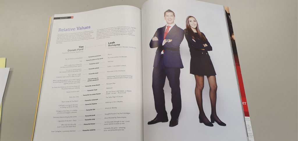
I based my Summer Project off this

Evaluation of summer task

I created my media interview with the intent of showing how not all teenage girls are interested in smoking and getting drunk.  Also, to share Carolina’s (my friend) weird but fascinating love for pigeons which are usually viewed as feral birds that no one really cares about. She wanted to make more people aware of how nice these pigeons can be and why they should legalise them as pet due to the many benefits.

I followed the style model which was a magazine interview on the internet. By using red coloured writing for the title to make it stand out and put the opening line in bold to grab the reader’s attention as to what the article is about very similar to the style model to make the audience feel curious. The features I included which show it is a magazine are the hardlines, captions, three column layout and a picture. I structurally made my article using the inverted pyramid meaning that my first few paragraphs contained the most important and exciting details and then the tail of the article is just little bits of extra information that could have been cut off if it was too long.

My friend’s perspective on pigeons is quite radical and she is presented in this article as a countertype because a typical teenager is portrayed as trying to fit in and be cool whereas she doesn’t care how people view her and just wants to be happy and unique. The advantages of the product being radical is that it will draw more attention and people will be more likely to read it. Additionally, it is great evidence to remove the barriers of stereotyping all teenagers in the same way because we are all different and has a positive outlook.

I think the type of company that would make my product is somewhere like a British local kind of magazine as Carolina isn’t a celebrity so wouldn’t fit into a magazine for famous people, however her story is quite interesting so could maybe be shared with the rest of the UK or places where there are judgements about teen but also the view on pigeons. It would be aimed mainly at the older generation to give a radical response to the youths of today.

 To improve my product, I could have made the picture more inclusive of the article and use more media language like shapes and boxes to make it more interesting. Furthermore, I believe my print work would have been more appealing if I used bold Caps and italics with more freedom on how the words ar portrayed like wrapping the text around an image, so it flows better.