Advert statement of intent

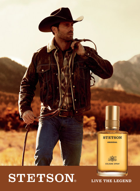
Stetson Cologne - CVS Pharmacy

For my AD I want it to be similar to other cologne ads that are seen in the media, like the AD above. However whilst I want it to be similar to this AD shown, I do not want to copy the style completely and would like to go for something more modern instead – that would be seen today. I still want to have a dominant signifier of a well-dressed man taking up most of the ad, with the product, its name and a slogan at the bottom. The model will be well dressed as to symbolise wealth, with a gold waistcoat and sunglasses.

As I want my ad to be more modern I feel like a minimalistic approach would be more appropriate, with no background in the AD – this will help keep focus on my product -instead of distracting the audience with background elements – and still keep the AD looking how I want.

My AD is targeted towards predominantly richer men shown in the gold waistcoat and gold box on the bottom of the AD – an iconic signifier of wealth and luxury. I want my AD to have a connotation of dominantly wealth and luxury, and link the cologne to being wealthy as to make it fancy and to show that the product is prestigious.

My AD will come out as quite reactionary and stereotypical, possibly helping promote the ideology of the patriarchy and men being powerful as my male model will appear powerful due to the symbolism of wealth.

As mentioned earlier, I have positioned my audience to be predominantly richer men, those who can afford luxury items, which fits into Young & Rubicam’s audience model

Icon(ic) – Index(ical) – SymbolConnotationDominant SignifierIdeology – Reactionary – Signifier

David Gauntlett – Constructed Identity – Collective Identity

Audience Positioning – Positive/Negative stereotypes – Selective representation – Patriarchy

Young & Rubicam (The Aspirer and/or succeeder) And Opinion Leaders

ADVERTISING NEA : Statement of intent

AFTERSHAVE AD

For my advert, I would like to show the result of what the product would look like on someone. This product will ideally be only for men, and shows a reactionary view. It will have a reactionary view in the sense that the dominant signifier will be males that look smart, formal and smug, to create the desire for the product so that the buyer could look the same way to make the target audience buy it.

I will place the product along side the dominant signifier to show what its going to look like when bought. Its going to be highlighted in a outer glow to emphasize the product and how glorious it is. The model presented in the advert would have a index to the aftershave product and the product is a symbol to the model. The whole advert is a icon as it represents the whole product in one.

The name of the product will named in the language French to make it sound posher and further demonstrate how fancy it is.

In order to do this, I will be the model and dress up with formal clothes and shades to create a desire for the product.

Iconic, dominant signifier, reactionary, index, symbol, connotation, signified, ideology

David gauntlet – Constructed identity, collective identity

Constructed reality, Male gaze, positive and negative stereotypes, Audience positioning

The aspirer, The reformer.

CSP 3: Score

Media language Analysis

Semiotic Analysis:

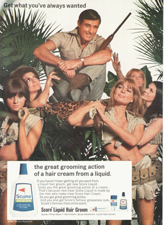
  • The Dominant signifier is the male who has been placed above all the women. He is surrounded by a paradigm of women who clearly are holding the man in a higher status, they are beneath him both literally and metaphorically. There is a code where the man is holding a weapon and seems to be in a dangerous jungle like area, this holds meaning to the fact that the man is strong and supposed to be shown as attractive to women, saying if you use their product it will make you manly and irresistible to women. This is a reactionary view of the time as during the era of this advert it was normal for women to be discriminated and seen to be beneath men, hence the use of women holding the man above them. The anchorage of the phrase “Get what you’ve always wanted” followed by the image of the man being held above the women all under the theoretical spell of his masculine appeal.

Textual Analysis:

  • They’re in a jungle type setting, which allows the females in the ad to wear their supposedly safari clothing, which is just clearly a over sexualised type outfit, to clearly be attractive to the presumed straight male that the ad is targeted at.
  • A main male character, with a well cut clean shave, (to promote the product of course).
  • The main heading “Get what you’ve always wanted” – Text that attracts the customers and the target market.
  • 5 Female characters being used as a marketing strategy to appeal to the target market.

Representational Analysis:

  • This ad is a clear representation of the Patriarchy, the women are clearly being used in this constructive reality where they are here only to serve to men, the ad is trying to create a collective identity that if men use their product they will “Get what they’ve always wanted”. Based on contextual ideas, this is all a tool used to generate more sales and produce more loyal costumers, which of course, is a main purpose of an advert.
  • The text clearly follows some voyeuristic ideas, as well as the use of the male gaze, to once again, like mentioned before, appeal to the target market of the presumed straight male.
  • This ad is an bold representation of body positivity values and the fair and equal representation of women during the time period. From my own knowledge, during this era women were discriminated against and were not treated anywhere near as equal to men. Men were considered protectors of women and that women were to do as they were told by their husbands. As men went out for work and earned the majority, if not all of the money for the family, the wife would stay home and take care of the kids and the home. I believe that therefore, the use of the women in this advert, represents this old ideology and tradition.

The narrative:

The narrative of this advert is that if the man in the advert was not using the score hair grooming product, he would not be worshiped and wouldn’t be attractive to women, that he would not be as manly. The main title and strap line of “Get what you’ve always wanted” directly points out to the audience of the advert and uses a subtle manipulation of the reader, that in fact YOU do want what is being shown in the ad, that YOU want Score grooming product. It implies that that all men want it, this is a toxic masculine idea which clearly creates some issues but yet, it’s what “you’ve always wanted”. It also follows ideas that men want to be better than everyone and want to be attractive to women, but it can only happen, the thing that they’ve “always wanted”, if they buy their product and shave using their grooming products.

statement of intent

For this advertisement, I intend to present a perfume as admirable through clever persuasion, through media. Written in a golden font the phrase ‘Be desirable, wear Gucci” suggesting a reactionary approach. This is due to the idea of perfume adverts usually inflicting the idea that wearing perfume will mean you are admired and wanted all of a sudden. I have used a women’s magazine as a prop, identifying the audience positioning of the perfume to be those who choose to wear a female scent. I envision the magazine to be casually positioned, with the perfume standing upon it. The magazine features a model on the front due to her article being published in the magazine. With my product being next to it, the elegance of a model wearing it could possibly be inferred.

The colour of my product, red, is sharp and mysterious. This adds a sense of richness, possibly identifying the target audience as aspirers and those willing to spend more on perfume, additionally. I want my advert to have a golden toned background reflecting against the gold font on the product. The metaphor of royalty is almost suggested through this, demonstrating my product as expensive. I also do not wish to feature additional pictures or text as I am taking a simple approach to the advert, portraying the minimalism of the scent and the perfume itself.

The text ‘Wear Gucci, be desired’ signifies the message that perfume adverts try to influence over consumers ‘ wearing the product will increase attractiveness’. I have chosen a gold coloured font to match with the gold font already present on the original Gucci product, making it more realistic.

I did not use any sexualising marketing techniques with intention. However, the magazine of which is seen to be present in the advert reads sexual language. This language relates to connotations of femininity so links with my ‘female targeted’ product. The patriarchy and drive for male gaze is not something that I believe is pronounced through this and is a misrepresentation of what I target to promote.

STATEMENT OF INTENT (NEA)

Statement of intent – My intention is to create an advertisement by using a shampoo bottle which I brought in. Then to take a photo of it, import it into photoshop and add effects to it. For my theme I am going to try and match the colour of the product. The product will be directed at any gender and ages from 20 – 60. The advertisement will be related to the environment and being eco-friendly. I am going to create two print products which will be the size of A4. I am going follow my style model. I am going to make sure the picture is of a high quality and that it looks like an actual advertisement.

Media Language – The dominant signifier of the advertisement will be my product. The code of the product will be nature and naturalness. And I will try to create a signification with this. The symbols will be in the background of my product. I am going to add text to my product along with nature. My product will give a reactionary reaction as the product is accepted by many. There is Katz, Gurevitch & Haas theory by giving the consumers their social needs and giving the consumer self-confidence, stability and self-esteem.

Representation  – The assets of my product will provide connotation to nature and being eco-friendly, such as leaves and grass. The signified meaning in my product will that it will be used to clean your hair in the shower and once used you will throw it away in the bin from Ferdinand de Saussure. So the advertisement could be seen as a myth as you’re not really helping the environment by throwing away plastic. With David Gauntlets theory there is going to be collective identity in my advert in the sense that we care about our planet and want it to be healthier which my advert relates back to that. There is also going to be a constructed identity in the sense that it creates a false reality that you are helping the planet and being eco-friendly by using this product when in fact the product is polluting the planet with its chemicals inside of it.

Audience – The audience of my product would be people who are earning any income are in their 20’s to 60’s and are any gender. The audience positioning would also be people who want to help and save the environment as well as having natural and healthy hair creating a positive stereotype.

Institution – The kind of company who would make my product would be shampoo manufactures who are looking to make money. They people are either looking to capitalize or promote friendliness to the environment and help it.

Tomb raider semiotics

In this essay I will be applying a semiotic analysis to both the Tomb Raider cover and the Metroid cover and how they both present females in two different ways. I will be arguing about the sexualisation of Lara Croft and how this links in to the Male Gaze and then the radical representation of females on the front cover of Metroid.

I believe the front cover of Tomb Raider takes advantage of Lara’s clothes and sexualises her in a way to get straight males to buy the game and focus more on her body than the actual plot of there game; the outfit she is wearing isn’t something that an explorer exploring ancient ruins and doing acrobatics would wear, and since games with female leads often sexualise them we could say this is a reactionary representation of females in video games and contributes to Laura Mulvey’s theory of the Male Gaze. However, I can also argue it is a radical view of women as Lara’s character isn’t something anyone would usually do- fighting off monsters, exploring ancient tombs; but i do believe this is undermined by her sexualisation, as the clothes she is wearing do not add any development of depth to her character and instead shows her as some ‘sassy’ ‘bad’ female lead instead of a courageous explorer. Overall I think the sexualisation leads to a negative stereotype which pejoratively affects the gaming community, more likely to see her as an object and ignore her character development.

On the other hand the front cover of Metroid completely covers the main leads body showing no representation of gender at all, hiding her identity and linking into character development instead. The costume she is wearing shows stealth, power and strength all at once hiding any connotations to gender identity, therefore no link to gender off of first glance can be made and instead wants to dig deeper into the character itself instead of the shallow view of sexualisation. I asked three people if they thought the person in the suit was a female or male to which all of them assumed it was a male character; this furthermore reinforces the reactionary view of women in video games how they’re not often promoted as strong, and therefore shows the cover as a radical representation and a counter stereotype towards women in video games. As much as a positive thing this representation is, it really highlights the idea that the gaming industry prays on sex-appeal instead of deepening female characters storyline. As Helen Brown said in the industry “It’s woven into the very tapestry of how the business works” relating to sexualisation and the male gaze.

advertising: nea

This is an NEA (non examined assessment) task otherwise known as coursework. In other words, it is a good way to understand an area of Media Studies (in this case Advertising) and to prepare you for your A level coursework, which we will do in later in this A level course.

Things to bear in mind:

  1. You have 2 weeks to produce some advertising coursework / NEA
  2. You need to submit a statement of intent (it is worth 10 marks) guidance below
  3. You need to PRINT OUT YOUR WORK – if not you will not get any marks. This is print work and the expectation for your real coursework is to print your work out. So let’s set that expectation now!
  4. You will need to produce 2 x Portrait A4 magazine adverts
  5. Your adverts will follow professional conventions and look realistic and convincing.
  6. Try to create a new product (ie change or hide the label?) but if not don’t worry too much.
  7. You need to produce a contemporary and a historical print advert.
  8. You need to produce a radical and a reactionary advert.
  9. Make sure your adverts are produced at a high resolution 300 dpi so that the final quality is a professional standard.
  10. We are also going to try and produce a short video advert.

Task 1: statement of intent

Upload a statement of intent to your blog. It is worth 10 marks. It needs to be 500 words. So perhaps write about: what your intentions are (100 words), focusing in particular on: Media Language (codes, conventions, signs, elements of real print product). Put another way: how did if follow your style model? (100 words). Representation / content (use key language) (100 words). Audience, ie what kind of audience would consume it? (Again, 100 words). Institution: What kind of company would make your product? 100 words.

This will be assessed with the products and will allow you to explain the ways in which you will apply knowledge and understanding of media language and media representation to your products, how your products will target the intended audience, reflect the industry context they are created for This is a compulsory element of the non-exam assessment and you must complete the Statement of Intent using a maximum of 500 words.

Task 2: Produce your adverts

  1. Open up Photoshop – make sure it is a blank A4 PORTRAIT document (this should be 300dpi – THIS IS IMPORTANT AS OTHERWISE YOUR WORK WILL BE PIXELATED)
  2. Develop your use of the camera. Make sure you are able to change the settings on your camera (specifically FOCUS & LIGHT) to be able to take a good PRODUCT SHOT.
  3. make sure you are able to use the flash lighting set-up (YOU NEED THE TRIGGER FOR THE FLASH LIGHTS)
  4. Create an appropriate (AND ORIGINAL) logo and title for your product. Think about Font, colour, size etc etc
  5. Record and Produce all of your assets – product shot, model shot, text, copy, background images or textures, any other symbolic / creative features

Task 3: Edit,Publish and Print your products

  1. Edit all of your assets. Think about size, positioning and placement. Edit all of your assets appropriately into an A4 portrait document (I suggest you use Photoshop at 300 dpi)
  2. Post-produce your assets – so adjust as appropriate eg colour correction, size, scale and positioning
  3. Make sure that you save your PSD as a JPEG and upload to the blog
  4. Make sure you print out your finished products and pin up to the blue display board in our classroom.