Category Archives: Uncategorized

Filters

Author:
Category:

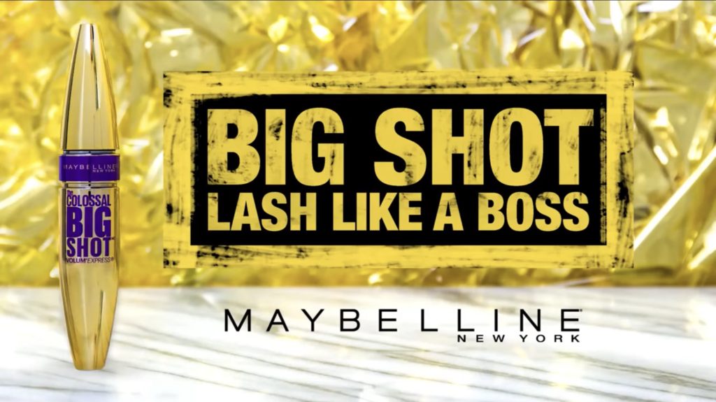
maybelline

dominant signifiers-shayla and MannyThe use of well known influencers gains more publicity for the product and therefore more sales. Their heavy influence will convince others that they also need this product.
anchorage-‘ that boss life’ in the first shot of the adThe strap line not only tells us what the product is, but it also signifies the effect this product will have on a consumer – they will become more confident.
code- gold sparkles special effects and glistening sound effects
have connotations to magic and portray the mascara tube as a magic wand. This creates the idea that by using this product you will magically become more beautiful and more confident. 

symbolic sign, paradigm- the colour goldGold packaging, gold suitcase, gold outfits, gold lighting has connotations of wealth and luxury

This Maybelline advert promotes it being okay for men to wear makeup and this advertisement for Maybelline was the first of many of a gay man selling the product. Promoting their product with the first gay male is widely making their advertisement more known and potentially promoting the product to reach more people.

Having more diversity with the promotion of the product is much better for creating a positive side to the brand and not labelling who and who cannot wear makeup, having a women of colour also being in the advert promoting the product is also a positive act as that is also not very commonly seen nowadays.

Having well known people in an advert is a very good way of selling the product as other competitors normally find it harder to compete.

The advert does have some cringey parts but that is a good way of it getting stuck in your head so you end up being the product out of spite. The colours that are also used in the ad are gold, this represents wealth, satisfaction, pleasure and happiness symbolising how the buyers may feel after using the product.

Statement Of Intent

For my print advert I plan to use a can of Lynx. I will use a black can for the modern ad and a white can for the old ad, by doing this I’m attempting to demonstrate the progression of racism since the 60’s. In other words, I plan to do one ad representing a modern outlook and the other being an ad with more outdated values. I intend to make both look professional by using style models for similar products that were/are used in the time which both ads are set. The ads will be aimed at a younger male audience, being between ages 12-25.

Focusing more on the semiotic aspect of it, I can use my style model (Calvin Klein DEFY) to distinguish the signs and conventions which are used in professional print products to therefore improve my product by making it look more professional. By attempting to look at the print as a potential consumer I can immediately spot a paradigm of blue/denim imagery which emphasises the colour of the aftershave

patriarchy, dominant ideology, hegemony, audience positioning, P+N stereotypes.

David Gauntlett: Fluidity of identity constructed identity.

statement of intent

for my advertisement page i will be using aftershave as my product that i will be using for my ad i will be my own model in a suit jacket as well as a white buttoned shirt i am gaining my own ideas from the Hugo boss advert where it has Ryan Reynolds as man of the year i want to mimic some of the quality’s of the ad where i want to say something similar to the ad im getting my ideas from where the poster says “confidence makes the man of the year” i want to make something similar towards it i am wanting to wear a buttoned shirt with a blazer or something similar my audience is for the “elite” those who buy expensive things like fast cars and the so my age range is those who are 25 and upwards. this advertisement will be my modern day poster where my other poster will be a funk pop 90s poster with a wig and bright vibrant colours where my strap line will be “peace and love within a bottle”

focusing more on my modern poster i have used the hypodermic model within my strap line talking about how charisma and confidence makes the man of the year making my audience believe that if they have those quality’s they will become the man of the year…

within my poster i have an indexical sign where my model is wearing a suit representing wealth and money within my work as well as an iconic sign of wealth an maturity as a sign. The word man suggest he is powerful and mature and wealthy this could also be classed as a symbolic sign

in my poster my strapline has anchorage within it the words confidence and charisma have word connotations that link to something more than just adjectives it provokes the thought of quality’s that women want within a man

the dominant signifier within my work would be the word man suggesting that hes the definition of the word man as well as all the myths and stereotypes that follow the word man

the signified concept behind my poster is to sell a product that is aimed at those who are elite

my product refers to the male gaze where it shows of the male status as well as the components of what a man is this also reinforces the patriarchy within modern day times it also creates the stereotype that all men will rule the world by the strapline when it says charisma and confidence make the man of the year signifying that those quality’s are those who are the best. This also positions the audience to believe that this product will imbue these quality’s through the product that they are seeing and buying.

the poster uses all three identity’s that David Gauntlet came up with. such as the fluidity of identity like the construction of showing of masculinity through the use of words

, counter types , positive and negative stereotypes , dominant ideology ,

david gauntlet – constructed identity , collective identity

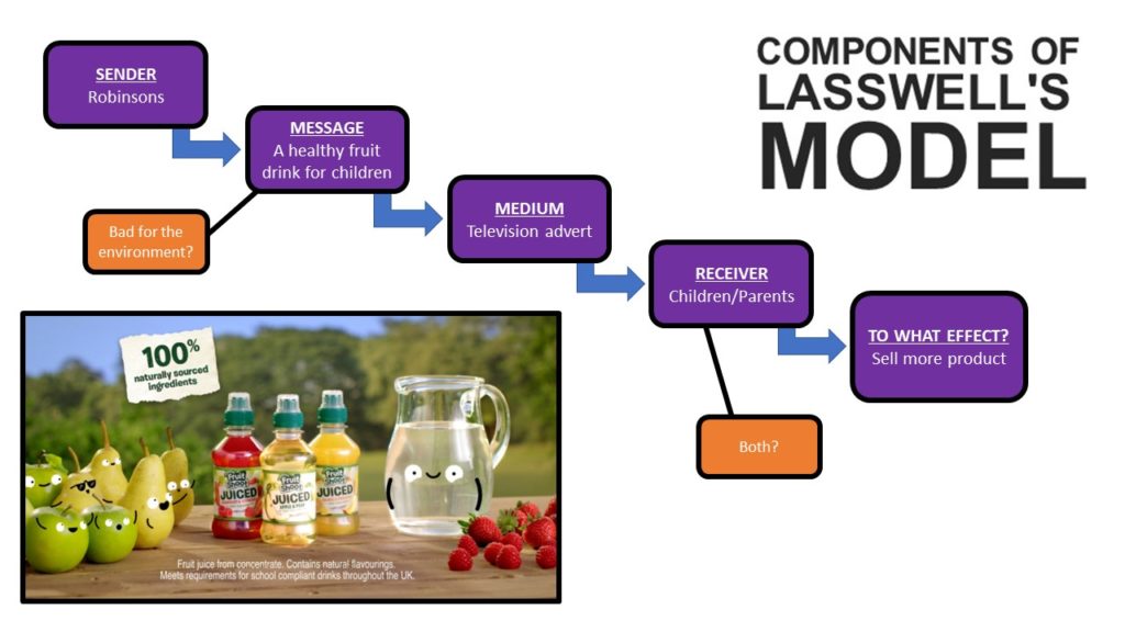
hypodermic model – lasswell

noise , error , feedback

two step flow

uses and gratifications

katz,….,…..

statement of intent- nea

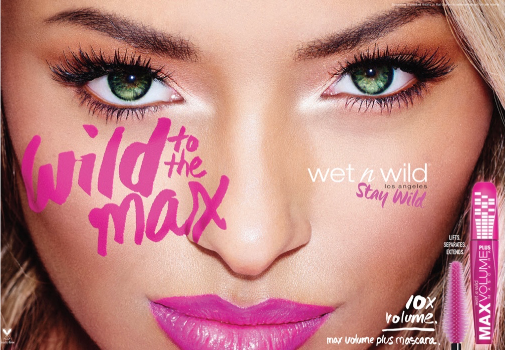
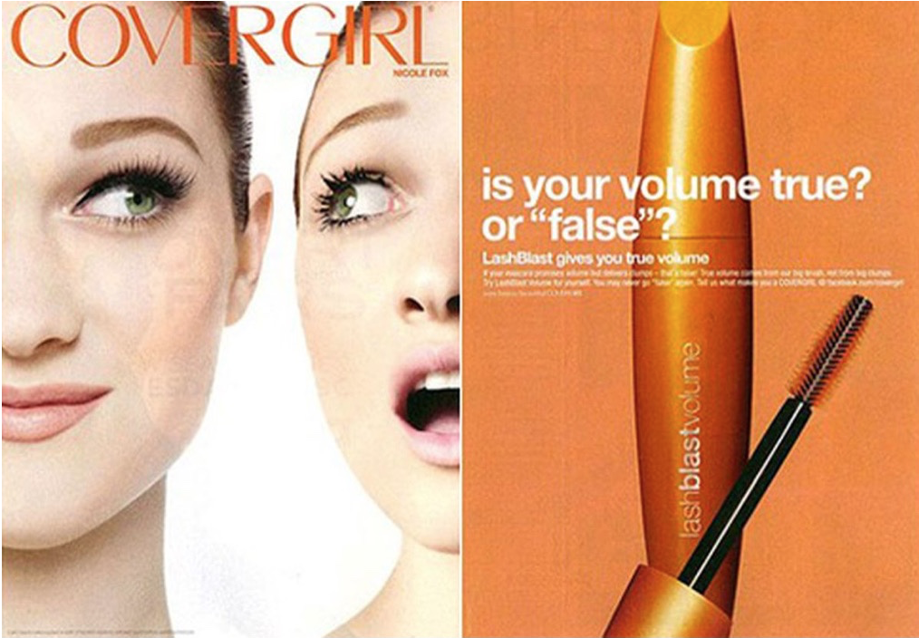
I intend to make two product adverts, one that is historical and one is contemporary, for the mascara made by Maybelline called Falsies Lash Lift. I aim for my historical product advert to resemble that of an old 1960s advert, which will be targeted at women of the age 12+, whereas I intend for my contemporary product to be targeted more towards the male gender as well as the female gender. This is to imply the difference between discrimination of genders from 1960’s compared to now male gender. In the past it was not seen as acceptable for men to wear makeup as it was believed that the purpose of makeup was solely for women, however now in the more modern times discrimination against the genders have decreased and it is more acceptable for makeup to also be targeted at men. Therefore, for my modern, which can be described as radical, advert I am going to use Liv as a model to represent a member of the male gender and then for my historical advert, which can be described as reactionary. I am going to use Liv as a model to represent the female gender, this is to emphasise the difference in how times have changed between the roles of genders.

In both of my adverts, I am going to have Liv applying mascara, however, for the first advert she is going to represent the female gender giving the suggestion that she loves herself by making sure that she looks confident and bold. In order to do this, I will have the dominant signifier (Liv) wearing a bright red wig to represent the bold colours of the 1960’s. The adverts colour palette will mostly consist of red/ gold/ nude shades because these colours are usually associated with the 1960’s. The strap line will be ‘a dramatic mascara for dramatic lashes’, this will create anchorage for potential buyers as it insinuates to the audience that if they buy the mascara they can feel as if they are someone they’re not or feel more confident within themselves.

Whereas, in my second advert, I am going to have Liv as my model to represent the male gender, in which she is going to have a moustache and wig on. She is going to give the impression to the audience that the male character is in awe with the look the mascara has given him.  The adverts colour palette will mostly consist of pink / nude shades because these colours are usually associated with femininity, even though I am representing a male in this advert I would like femininity to also be represented, in order to emphasise that in our modern times people can be who they want to be and wear what they want to wear no matter their gender.

Advert statement of intent

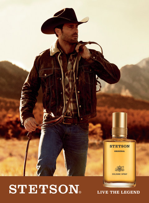
Stetson Cologne - CVS Pharmacy

For my AD I want it to be similar to other cologne ads that are seen in the media, like the AD above. However whilst I want it to be similar to this AD shown, I do not want to copy the style completely and would like to go for something more modern instead – that would be seen today. I still want to have a dominant signifier of a well-dressed man taking up most of the ad, with the product, its name and a slogan at the bottom. The model will be well dressed as to symbolise wealth, with a gold waistcoat and sunglasses.

As I want my ad to be more modern I feel like a minimalistic approach would be more appropriate, with no background in the AD – this will help keep focus on my product -instead of distracting the audience with background elements – and still keep the AD looking how I want.

My AD is targeted towards predominantly richer men shown in the gold waistcoat and gold box on the bottom of the AD – an iconic signifier of wealth and luxury. I want my AD to have a connotation of dominantly wealth and luxury, and link the cologne to being wealthy as to make it fancy and to show that the product is prestigious.

My AD will come out as quite reactionary and stereotypical, possibly helping promote the ideology of the patriarchy and men being powerful as my male model will appear powerful due to the symbolism of wealth.

As mentioned earlier, I have positioned my audience to be predominantly richer men, those who can afford luxury items, which fits into Young & Rubicam’s audience model

Icon(ic) – Index(ical) – SymbolConnotationDominant SignifierIdeology – Reactionary – Signifier

David Gauntlett – Constructed Identity – Collective Identity

Audience Positioning – Positive/Negative stereotypes – Selective representation – Patriarchy

Young & Rubicam (The Aspirer and/or succeeder) And Opinion Leaders

ADVERTISING NEA : Statement of intent

AFTERSHAVE AD

For my advert, I would like to show the result of what the product would look like on someone. This product will ideally be only for men, and shows a reactionary view. It will have a reactionary view in the sense that the dominant signifier will be males that look smart, formal and smug, to create the desire for the product so that the buyer could look the same way to make the target audience buy it.

I will place the product along side the dominant signifier to show what its going to look like when bought. Its going to be highlighted in a outer glow to emphasize the product and how glorious it is. The model presented in the advert would have a index to the aftershave product and the product is a symbol to the model. The whole advert is a icon as it represents the whole product in one.

The name of the product will named in the language French to make it sound posher and further demonstrate how fancy it is.

In order to do this, I will be the model and dress up with formal clothes and shades to create a desire for the product.

Iconic, dominant signifier, reactionary, index, symbol, connotation, signified, ideology

David gauntlet – Constructed identity, collective identity

Constructed reality, Male gaze, positive and negative stereotypes, Audience positioning

The aspirer, The reformer.

Tomb raider semiotics

In this essay I will be applying a semiotic analysis to both the Tomb Raider cover and the Metroid cover and how they both present females in two different ways. I will be arguing about the sexualisation of Lara Croft and how this links in to the Male Gaze and then the radical representation of females on the front cover of Metroid.

I believe the front cover of Tomb Raider takes advantage of Lara’s clothes and sexualises her in a way to get straight males to buy the game and focus more on her body than the actual plot of there game; the outfit she is wearing isn’t something that an explorer exploring ancient ruins and doing acrobatics would wear, and since games with female leads often sexualise them we could say this is a reactionary representation of females in video games and contributes to Laura Mulvey’s theory of the Male Gaze. However, I can also argue it is a radical view of women as Lara’s character isn’t something anyone would usually do- fighting off monsters, exploring ancient tombs; but i do believe this is undermined by her sexualisation, as the clothes she is wearing do not add any development of depth to her character and instead shows her as some ‘sassy’ ‘bad’ female lead instead of a courageous explorer. Overall I think the sexualisation leads to a negative stereotype which pejoratively affects the gaming community, more likely to see her as an object and ignore her character development.

On the other hand the front cover of Metroid completely covers the main leads body showing no representation of gender at all, hiding her identity and linking into character development instead. The costume she is wearing shows stealth, power and strength all at once hiding any connotations to gender identity, therefore no link to gender off of first glance can be made and instead wants to dig deeper into the character itself instead of the shallow view of sexualisation. I asked three people if they thought the person in the suit was a female or male to which all of them assumed it was a male character; this furthermore reinforces the reactionary view of women in video games how they’re not often promoted as strong, and therefore shows the cover as a radical representation and a counter stereotype towards women in video games. As much as a positive thing this representation is, it really highlights the idea that the gaming industry prays on sex-appeal instead of deepening female characters storyline. As Helen Brown said in the industry “It’s woven into the very tapestry of how the business works” relating to sexualisation and the male gaze.