Category Archives: Uncategorized

Filters

Author:
Category:

Representation key terms

Male Gaze The perspective of typically heterosexual men as intended for media


Voyeurism gaining sexual pleasure through watching others who are naked or engaged in sexual activity


Patriarchy A male dominated society


Positive and Negative Stereotypes Good or bad oversimplifications of a person or thing


Counter-Types A view opposite to what would be expected


Misrepresentation Showing things in the wrong (or just a bad) way


Selective Representation Only showing specific things, not everything


Dominant Ideology The view most shown in society
Constructed Reality


Hegemony Leadership or dominance over others

Audience Positioning the relationship between the audience and a piece of media

ESSAY

In this essay I am going to apply a semiotic analysis to both the Tomb Raider and Metroid video games covers. I will argue that both Tomb raider and Metroid represent women in two different ways and will be arguing about the sexualisation to Lara croft and link this back to Laura Mulvey and the ‘Male Gaze’ and then the radical representation to Metroid and the main character Samus Aran.

I think Tomb raider takes advantage of the main character Lara Croft as she is dressed in revealing and clothes which is used to sexualise her and attract the straight male to buy their game. This is degrading to women as it sexualises her and draws attention away from the actual point of the game. Lara Croft is also positioned in a way to show her body as she is positioned to show her female attributes, for example her butt and breasts. They have also given her a very unrealistic body by enlarging her breasts while giving her a very petite torso. This then contributes to unrealistic beauty standards where many women and men believe that this is what women should look like. On the other hand, I can also argue there is a radical view as Lara doesn’t rely on any Male help during her quest. This then influences the gaming community to change their mind about women being the ‘damsel in distress’ and that only male characters should be the ones fighting.

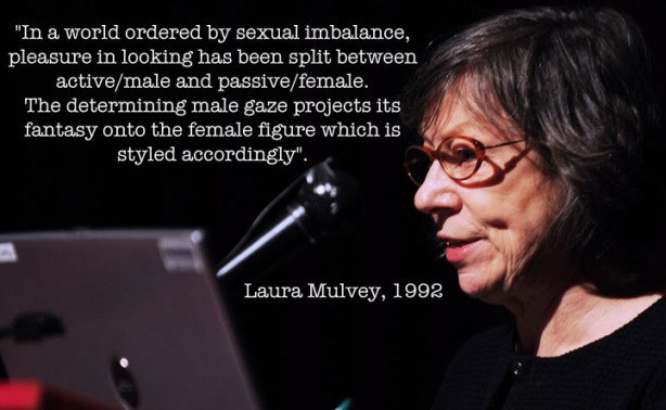
This links back to Laura Mulvey and the Male Gaze in that the dominant signifier is designed in a way that she is sexualised. Laura Mulvey said “she is a character who’s appearance is coded for a strong visual and erotic impact”. Laura also states that women are presented as sexual objects to satisfy the heterosexual male.

The Metroid game cover completely covers the main characters body and hides her gender and identity by doing this. This then focuses the gamers on the actual game rather than the body and features of the character. The armour she is wearing shows a powerful and strong character. Most people believed the main character was a male, this links back to the reactionary view of women as women are believed to be the ‘damsel in distress’ whereas male characters are the heroes. Metroid counteracts the stereo type and shows a radical representation.

Male gaze / laura mulvey

Male Gaze:

In feminist theory, the male gaze is the act of depicting women and the world, in the visual arts and in literature, from a masculine, heterosexual perspective that presents and represents women as sexual objects for the pleasure of the heterosexual male viewer. 

The Male Gaze describes the practice in which where media is filtered through the lens of heterosexual men. In other words, the viewpoints of the heterosexual men is accepted as the norm, whereas the perspectives of all others are largely ignored.

Some examples of the male gaze in media include: Extraneous nudity by female characters. Slow camera pans of women’s bodies. Women wearing tight or occasion-inappropriate clothing when male characters are appropriately dressed.

Laura Mulvey:

Laura Mulvey is a British feminist film theorist. She was educated at St Hilda’s College, Oxford. She is currently professor of film and media studies at Birkbeck, University of London.

Laura Mulvey is a feminist film theorist from Britain, best known for her essay on Visual Pleasure and Narrative Cinema. Her theories are influenced by the likes of Sigmund Freud and Jacques Lacan whilst also including psychoanalysis and feminism in her works.

Laura Mulvey in Conversation with Reclaim The Frame - Film Birmingham

physcographic profiles

Quantitative:

My product is for ages 12+ and for a person who has an average income that they can afford to spend £60 on a pair of sunglasses. The main target consumer for my product is a middle aged person (male or female) who are in the need of a good pair of sunglasses.

Qualitative:

My product can be linked to The Explorer. This is because the person who buys a pair of the sunglasses could wear them whilst exploring, discovering new things, setting new challenges and when adventuring outdoors.

Essay

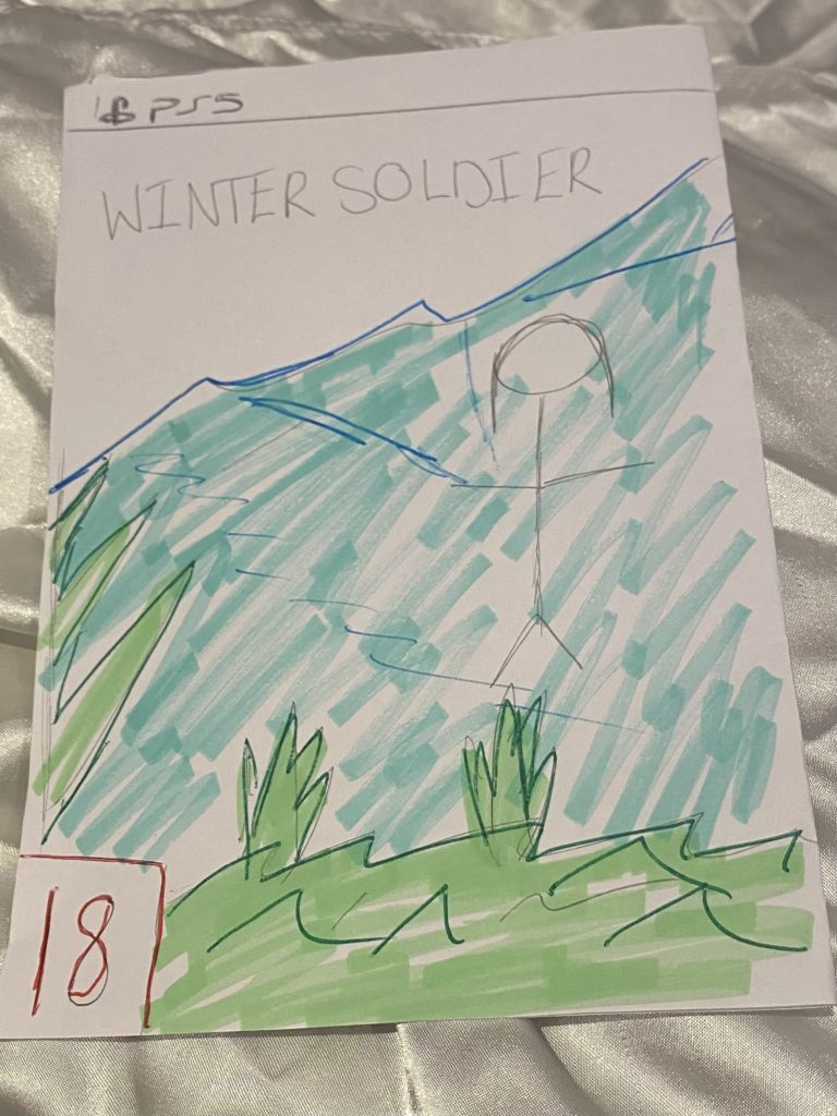
In this essay I am going to compare the two CSP front covers of Metroid and Tomb Raider using semiotic analysis. I am arguing that both games present their main character to be objectified due to them being female, however both games explore this in many different ways. Tomb Raider displays their female main character to be oversexualised with poses and body parts. Metroid displayed their character as a masculine strong character which implies that females are less superior than males.

The front cover of tomb raider presents a dominant signifier of a female character it is clear that Lara is a woman from the cover you frist see Lara’s gun which may seem radical and different from what people are used to however it is quickly seen that this cover is the same as many others For example the position that Lara is in manages to show off both her breasts and her behind in addition to this her clothes don’t help either Lara is shown to be wearing a tight shirt and tight shorts Both of these examples set an unrealistic example for women, that they should sexualize themselves to be seen as sexual objects This matches with the male gaze and Laura Mulvey’s views “woman displayed as a sexual-object is the erotic spectacle” Overall, whilst Lara’s guns show that she can be tough and fend for herself which is contrasting typical views of women in video games where they are normally “the damsel in distress” the front cover of the game also feeds into the stereotype of sexualizing women in games. The quote “For every forward step however, there is often a reminder of how far is left to travel” from the article “diversity matters” perfectly describes how this front cover portrays Lara Croft. 

 Furthermore I believe that the representation of women and the ‘Male Gaze’ are shown in an overall more positive way in the Metroid cover image than the Lara Croft Tomb Raider cover image This is because there is some evidence of an effort to cover up the once again over-exaggerated body of the character The armour she wears also creates a reactionary response within the audience as they are led to believe that Metroid is a male character from what is displayed in the iconic sign Neither of these CSPs support the ‘damsel in distress’ theory that I mentioned previously This theory is described as how the female character in numerous storylines is more often than not the one who needs rescuing or saving from a typical antagonist by the male hero These images and game contents are trying to point people in the direction of knowing that women are very able to defend themselves against themselves and others This may not always be the case however Once again the excessive sexualisation and violent nature of these video games may not have a positive impact on the audience outside the target

In conclusion I believe that neither CSPs present women in a good way This is because of how their bodies are used as pleasure for the targeted audience more so with the Lara Croft example The Metroid cover does make some effort to cover up Samus’ body with the classic Metroid armour as well as to cover up some of the contents of the game itself Both games covers prove Laura Mulvey’s theory of the Male Gaze true The use of these images can also bee seen as disempowerment This can easily be improved by games cover designers creating countertypes of the covers This would flip the negative effect they give on its head making it positive People in the further audience may then be more inclined to buy the products increasing sales and revenue Some other developers might take the same idea on board and follow along

the currently ‘over-the-top’ sexual exaggeration and representation of women overall may be improved over time

Advertising: NEA statement of intent

I would like to advertise my product on focusing on the product itself and also involving images of hair so that it could be an example and a demonstration of what will be shown on the advert. I would like my image of the product to be very clear and readable as I would like to see the product itself. I would also like if I could have a model as it would indicate what the product is used for.

For my advert I would like to create it with my own imagination and try to experiment with all sorts of techniques. I would like to make it vivid but not with extreme colours. There will be 3 different images of my style model who will have different poses to demonstrate how my product makes them feel. I don’t want to add a lot of information as the audience prefer more visionary pictures rather than wordy images. I am still not very confident with the final colours that I will be using, however I think I will just experiment with all the colours that go well with he image. The aim I have with my image is to attract the audience to look at my style model because then the audience will gain the impression that they will look like them. Therefore, my first advert will be something to experiment with and make the audience believe that the product could change their lives.

For my second advert I would like to follow the example of some other adverts, but adding my own ideas instead. I think I will have my style model being the main image with the product at the bottom of the corner or at the side. There will be a heading and a slogan on the image as the product will stay on their mind. I would like this image to be very creative and radical. This is because then the icon of the image will look realistic. Ferdinand de Saussure helps us realise that the signified will stand out and it will imply to the audience what I am trying to attract.

My product will be the dominant signifier as it will be the main image of the front cover of the article. Additionally, my product will also be anchorage as my product is shampoo and will need context in whom it is aimed for. For my product their will be an index symbol as their will be a model that will relate to the product. Therefore, my product will be reactionary and less of radical. Roland Barthes gives us the knowledge to create the advert we want to make to look in a certain way. However, I would like to add more radical ideas.

This product will be targeting women as varies of women struggle with hair products and I will like to portrait how my product is better and it will give a boost of confidence towards them. This is also known as the aspirer as women will feel motivated by esteem and status needs. This could also explain how giving the positive and negative stereotypes to give the impression of how they feel towards the product. I would also like to add the mainstreamer to motivate the audience that it is something they need that should belong to them. The reason for giving both adverts the sense of fluidity identity is because I would like to give the ability for the audience to see how they could change themselves. Overall, I would like my audience not to feel lied to and believe what they see and what it does.

Statement Of Intent – Advert

My aim is going to be to create two contrasting (one reactionary, one radical) advertisements to promote a Molton Brown body wash product. The two styles of advertisements will portray varying representations. I am going to try and replicate something that would be shown in a print magazine. The style model I am going to attempt to recreate is a Revlon Research Flex Formula advertisement for a hair product that was shown during the 80s. To do this, there will be a few things that must be included in my advertisements.

The main component of my advert will be a dominant signifier including the hands of my model and the product being spilt over them. I am aiming to have no harsh joints/lines between the images that I will insert during post-production to have a softer looking advertisement in general. For the reactionary advert, these images will be kept in colour with slight editing to the colour tints and textures. This will be done using Adobe Lightroom software accessible via the school computers. This will help match the Head and Shoulders style model as closely as possible. I am going to use a female model as this will create a reactionary response from the audience. This advert will be directed towards the Aspirer and Mainstreamer audience groups, with the target age group ranging from 10 and up. Either gender would be able to purchase and use the product, I just preferred to use a female model as one is used in my style model. The strapline will be: “The only wash you will ever need”, as it is similar to the original. This will present the idea that the model feels good about the way they smell and how their skin looks and feels.

For my radical advert, I am going to use both a male model and a female model. It will target the male audience only. I will do this by getting my models to pose in a position where the female is clinging to the male that men find attractive, accompanied with a strapline stating: “Drench your skin in the smell of health”, with accompanying text underneath explaining the benefits of using a Molton Brown product. Other features will include a small Molton Brown logo in either of the bottom corners and an image showing the products themselves.

Male Gaze, Dominant ideology, Audience Positioning, Counter-types, Patriarchy.

David Gauntlett – Collective. and constructed identity.