Category Archives: Semiotics

Filters

Author:
Category:

Film poster analysis

Five Feet Apart': Here's A New Trailer & Poster

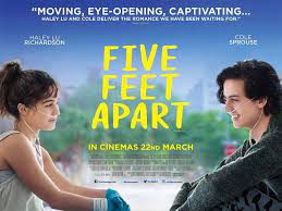
The signifier is the city behind then which can be used as an indexical sign to suggest that there is life beyond their illness in the distance. It is a radical representation of teenagers. There is a denotation of medical equipment eg. the breathing tubes which has connotations of illness and possibly death.

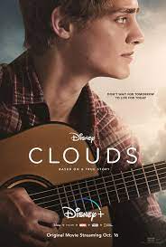
There is a syntagm which includes the dark sky, the sun, the guitar and the image of the guy to form meaning of what his future could look like. There is a symbolic sign between the light from the sun and hopefulness.

There are 2 dominant signifiers in this poster however the female is emphasised more due to the positioning and angle of her which is a media code to allow people to identify quickly with the main character.

Iconic sign of a ship front. People looking down from above is could be a symbolic sign of people dying as though they are looking down on the accident from heaven. There is anchorage of the word titanic to tell us what the tragedy is about.

The word family is a signifier of the representation in the image above. There is an icon sign of a happy family but there are connotations that they may have to reach out or overcome something in order to get to this position as they are placed higher up.

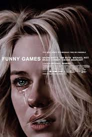
The tears are a signifier of the sadness that the girl is experiencing. Supports the dominant ideology that only women cry however in her eyes it looks like she is ready to seek revenge and is strong which creates a paradigm.

Film Poster Analyse

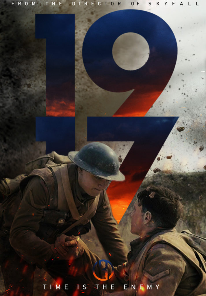
1917 – In the poster, the dominant signifier is the words ‘1917’ which can relate to either true events or even the year in which the movie is set in. I also think the movie poster agrees with reactionary ideas towards world war 1.

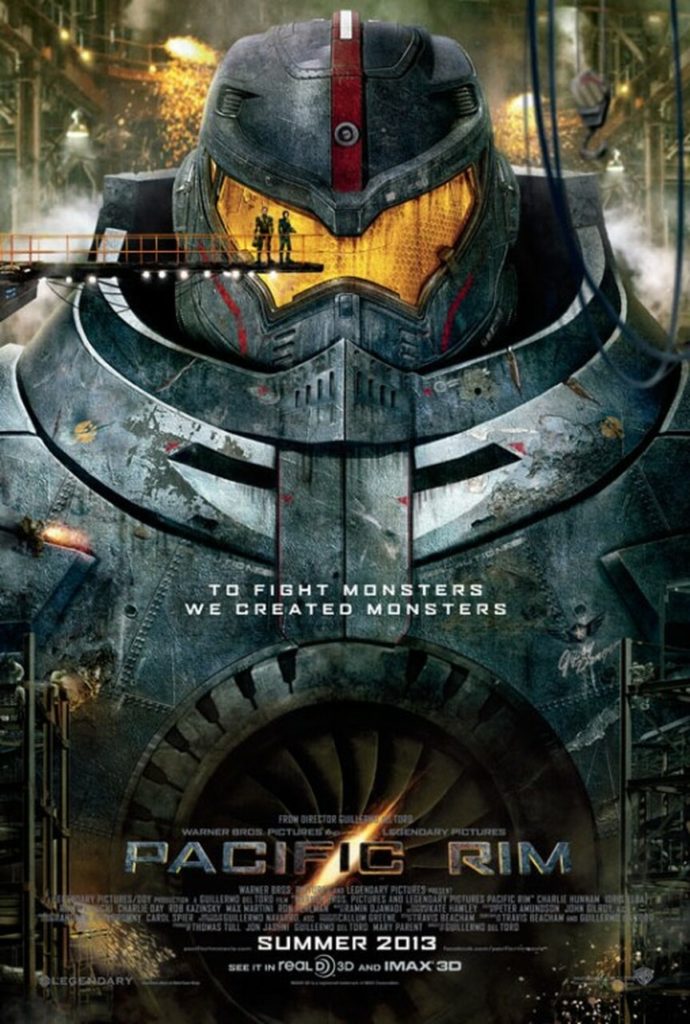
Pacific Rim – Within this poster, Gypsy Danger (the mech) is the dominant signifier due to being the largest object on the screen and to reel the audience in. The quote ‘To fight monsters we created monsters’ is a connotation to the mech, meaning the mech was created to fight ‘monsters’.

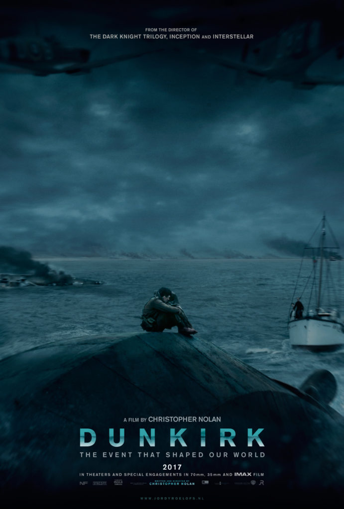
Dunkirk – The dominant signifier is the soldier stranded in the middle of the ocean. The code in the poster, is the soldier sitting alone on a downed aircraft in the middle of the ocean, this constructs the meaning of loneliness with a moody tone. The words Dunkirk signifies true events, based on the evacuation of soldiers during World War 2 from the beaches and harbour of Dunkirk.

Uncharted – The dominant signifier is Nathan Drake, played by Tom Holland. We know this due to headings. The anchorage within this poster is the background behind Drake to signify the location of the dominant signifier.

Venom – In the Venom poster, the dominant signifier is Venom himself, as this is a close shot from the shoulders upwards. The background is the code to represent good and evil, through one side being one colour and the other side being another.

film poster analysis

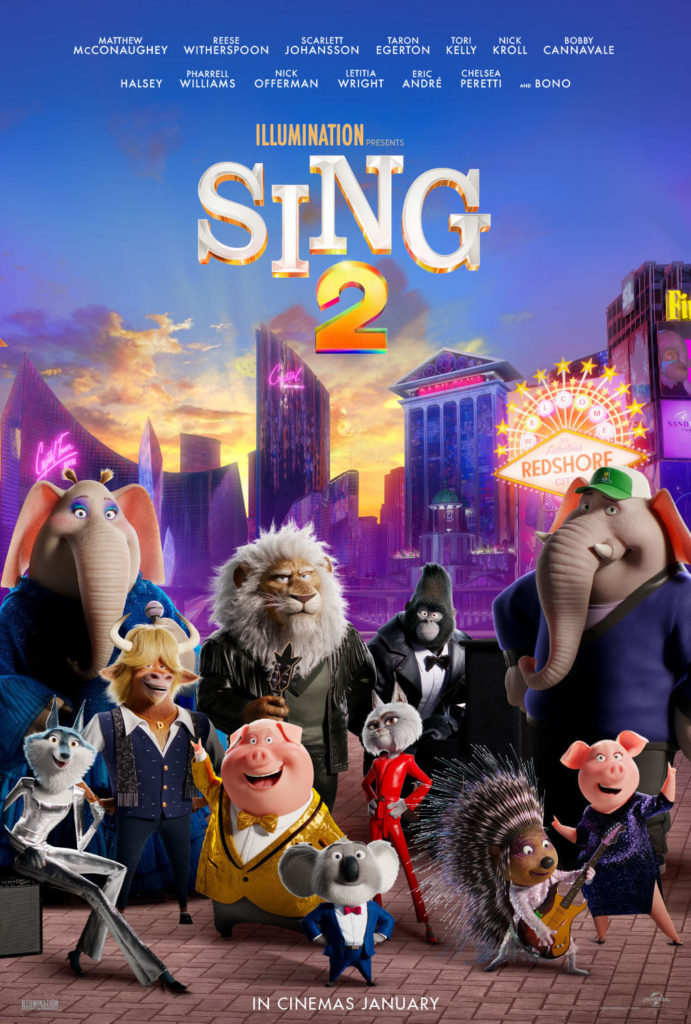
Sing 2: When looking at the poster we can see a anchorage related to the title “Sing 2” contrasting with the musical instruments and how a few of the dominant signifiers that clearly dominate the screen are wearing performers clothes such as tuxedos. The title contains a “2” in it which is an indicator that it is a sequel meaning it is the second instalment of the franchise. Looking at “Redshore” we can perceive that it is a fictional location that the movie will take place in and is based solely on fantasy.

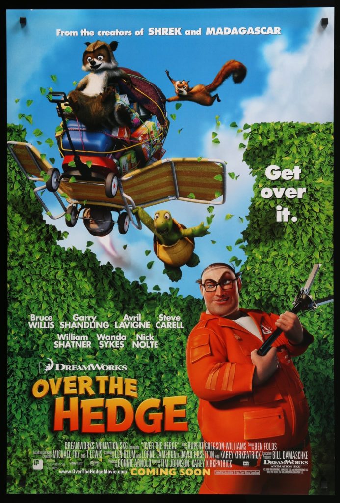
Over the Hedge: When looking at this poster we can see the dominant signifier in it is the man in the orange jumpsuit with some sort of capture device which can be assumed to be used against the animals that are flying over his hedge. Looking at the facial expressions on the animals it is easy to tell the movie is based on fantasy and is animated also. The title “Over the Hedge” is ironic due to indexical sign that the animals have broken through the hedge rather than getting over it.

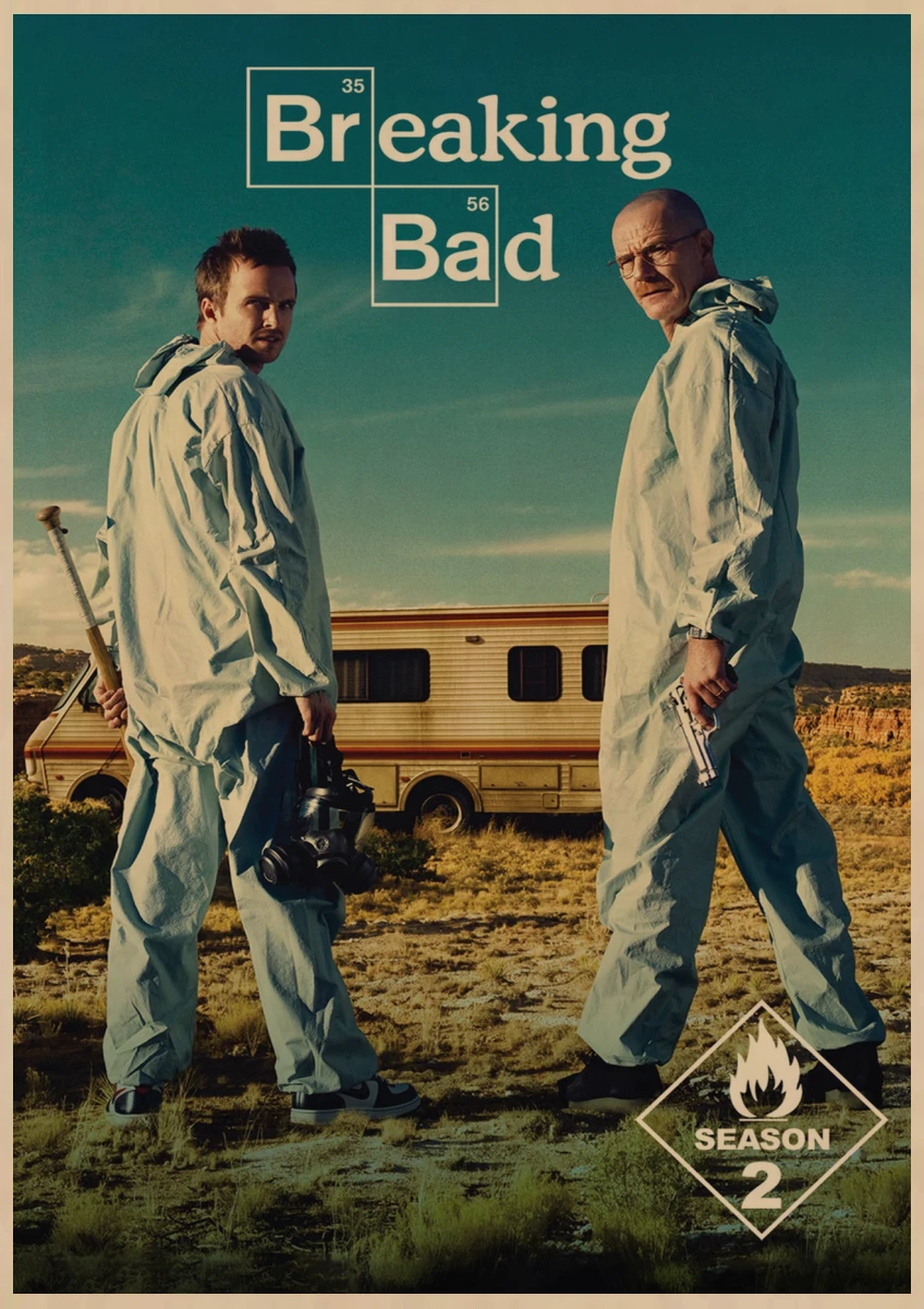
Breaking bad: When looking at the title of the poster we see the letters “Br” and “Ba” being highlighted in a certain way, upon closer inspection we also see there are periodic table numbers above the letters meaning that the title contains elements at the start of each word. These elements are Bromine and Barium which is information that most likely the average viewer will not know, and when suppling context from the show we know one of the dominant signifiers are a chemist which would explain the title and it’s anchorage to the poster which also includes chemical labelled barrels in the background. The bold yellow shown for their suits creates a reactionary idea that they’re wearing hazmat suits that may relate to the chemical barrels. The gun being held is a symbol for danger which also helps create an ideology to a viewer.

John Wick 3: In this poster we can see the dominant signifier and main character John Wick taking up most of the poster and then some sub signifiers in the background which are also characters in the movie. There is a paradigm of characters related to the movie.

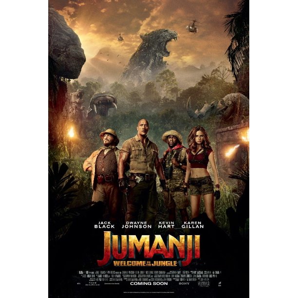
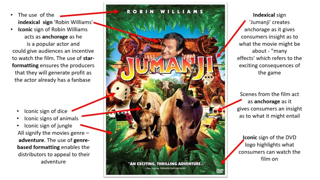
Jumanji: The dominant signifiers of the poster are in heroic poses in front of a hectic background and if you look closely you can elements of the movie and foreshadowing of what may happen. There is an anchorage of the sub-title “Welcome to the Jungle” where we can see a clear jungle-like setting with wild animals and also by how the main signifiers are specifically dressed in a safari like clothing and gear.

FILM POSTER ANALYSIS

Film posters

Movieposters.com - Original Movie Posters - Over 1 Million Posters
This avengers poster represents all the characters that are going to be in the film. It shows all of them overlapping each other and also emphasises the characters to all look up to the top left.
In this Spiderman poster, it shows a whole body shot. It makes it clear that there is a signifier, which foreshadows the fact that there will be action in the movie indicated by the two long cuts along the front of his suit.
This Breaking Bad poster also indicates what might happen and what will be coming in the season of the series. for example the two characters Walter and Jesse are shown with a gun in his hand and a meth cooking mask and with the famous RV in the background where they will be cooking the meth.
DUNKIRK on Behance
The Dunkirk poster shows a darker way of representing a movie. It shows 1 guy alone on a upside down boat. This shows the disaster that its foreshadowing that will happen in the movie. However it also shows on someone coming to save him on the right of the poster. Which makes the audience think what will happen next.
After Life Parents Guide and Age Rating | 2019-2022
This poster of After Life shows a lonely man alone walking his dog. This poster has a signifier of the sub title “Every End is a New Beginning”. The series poster clearly represents a melancholy life of a lonely man and a dog and features a sunset background to show the calmness.

CERAVE ADVERT: STATEMENT OF INTENT

My intention for this product is to represent the CeraVe moisturiser as an amazing brand which will sort out any dry. acne-prone skin within days. I want it to look very appealing to a youngish audience (eg. teenagers/ early 20’s) so it will have to look trendy and have a modern style to it. I am basing it off the Maybelline lipstick advert and some other adverts I have looked at which are for moisturisers. I will incorporate some of the features from these adverts such as the smooth textured waves going across the page and luxuriousness which would be great for someone seeking an escape. I will create a syntagm by combining a zoom in of my models face (dominant signifier) and a shot of my product with a headline and text to create meaning.

The elements I will include the brands famous tagline (“Developed by dermatologists”) at the bottom of the advert with a main headliner at the top saying “CeraVe: long lasting moisturiser, instantly transforming your skin!” Also i will have a close up of my model applying the moisturiser to her face and the outstanding results. There will not be too much writing and mainly use images to convince the audience that it will be worth them switching to this product. There will be some texture added to the modern day advert by using glitter like splashes to convey the excitement and miracle transformation when you use the product. The signified will be the white twirl coming of the bottle which is going to represent the moisturiser.

The advert will represent the dominant ideology that females should always do their best to keep their skin looking beautiful such as having a good skin care routine (wanting to have a moisturiser that is approved by others). It is a constructed reality which will influence many teens/ young adults. In some ways it could be seen as a negative stereotype because having perfect skin can be an unrealistic expectation. In the classic advert the model will be

I will be making two adverts one classic and one contemporary advert. The contemporary advert will consist of a reactionary stereotype of a teenage girl using the product but with a genuine smile not a fake staged one which is usually portrayed in modern day media. The type of audience that would consume it would be the mainstreamer or the succeeder because it is a product with a price range that is affordable for most people and those who want to seek control of how they look by making their skin smoother and performing to dominant ideologies about how a female should care about their appearance, based on Young and Rubicam’s physcographic descriptors

The kind of company that would make my product would be a popular magazine featuring celebrities or recent news that would interest those of a younger generation. I believe it could also be featured outside shops such as Boots or Superdrug which are places that the advert would be seen.

syntagym (Roland Barthes)

Index

Ferdinand De Sassaure

Conotation

Denotation

Radical

Reactionary

Symbol

Icon

David Guantlett – Constructed identity, collected idenity (only for females)

Male gaze, audience positoning, positive and negeative steroetypes, dominant ideology, hegemony

Two step flow of communication- Lazarsfeld

Uses and gratifications model- Katz and Blumler
Statement of intent

I intend to advertise a jewellery line. I will create two magazine print adverts, both with different representations in order to highlight how societal views on issues such as gender roles, social class and the LGBTQ+ community have evolved.

My reactionary representation, will resemble that of an old 1920s advert. the image will be faded and grainy to illustrate its age and how this representation is outdated. The dominant signifier will be a headshot of a woman wearing the necklace dressed in elegant, and sophisticated clothing which will signify that this product is aimed at female audiences of the upper class – supporting the conventional ideology at the time where typically only women wore jewellery – as well as their husbands who may want to buy this as a gift for their wives in the hopes it will make them look better presented. She will be represented through the eyes of the male gaze through the use of intimate body language and the iconic sign of a male’s hand reaching for her hand from the side of the shot reaching to administer this idea that the buyer will gain more male attention. The strap line will be ‘say nothing, just wear solitaire jewels’ creating anchorage for potential buyers as it insinuates that by wearing this product you will be able to attract anyone. My product will be sold by a designer company called Solitaire Jewels, similar to that of Tiffany & Co or Cartier, reinforcing the ideas that my high quality jewellery will be aimed at wealthier audiences, between the ages of 20 – 40.

My Radical representation will portray multiple images of both men and women wearing my product to contradict the dominant ideology that it is unconventional for men to wear jewellery. There will be three different images of each model wearing three different styles of clothing in order to illustrate that my product can be worn on any occasion with any style of clothing. The dominant signifier will of course be the necklaces around the neck of my models whose faces will be outlined and filled in with a block colour to symbolise that no matter your gender, sexuality, nationality, race you can wear this necklace. I will edit in iconic signs of the product also draping from the top of the shot to create a more pleasing and busy image. My product will be sold by a luxurious yet affordable brand called Ubiquitous Charms, similar to Oma the Label or Baublebar, so that it is accessible to anyone of any income and will be aimed towards people aged 16 to 30 however the style of jewellery is made to suit anyone.

maybelline

“Manny Gutierrez Is the First Man to Star in a Maybelline Campaign, and It’s a Huge Deal”

Y12 Media Studies: Shriya Patel: MAYBELLINE "THAT BOSS LIFE PART 1": CLOSE  CASE STUDY ANALYSIS

The Maybelline 2017 advert presents the mascara, by if you apply it the wearer, male or female, is instantly changed into a person with a life surrounded by finer things. In the advert the two people are shown to be in a nice New York hotel room, with glamorous clothes and a lot of confidence about there looks.

Notes:

  • This ad is very unique compared to others because it is an advert about makeup and has a males actors wearing makeup involved. Also the two main actors in the ad are a different race which is not very common in adverts.
  • At the end of the ad the actors change into glamourous clothing which could highlight the feelings of those buying the product. They seem to gain a lot of confidence as if they were a changed person.
  • The product can be viewed as the ‘finishing touch’ for looking the part. 
  • Manny Mua being male, can show that Maybelline is targeting their product to a wider demographic. 
  • The mascara is viewed as the one thing missing in our lives, which is the ‘golden ticket’ to living like they do.
  • The ad shows the company supports the gay community and race.


SCORE CSP 3

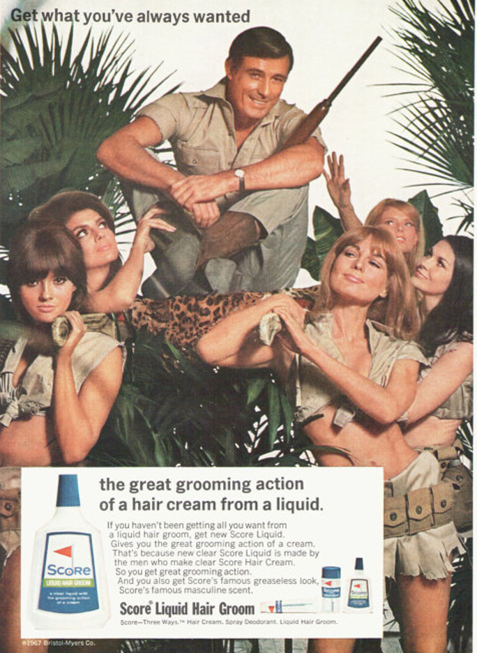
Textual analysis- looks like a safari theme in Africa. With the man being help up by a leopard print platform showing he is the most important. There is a background of trees but looks very old fashioned and not edited good because it is just a white background. The strap line is quite small and the copy box is very long and repetitive also a bit confusing as it is advertising 3 products.

Semiotics- indexical sign that all the women (excluding front left) are admiring the man due to their facial reactions and body language and possibly have a sexual desire. The signified is the hair gel and the signifier is the guys hair which is trying to show the product in a real life situation. The male is the dominant signifier. Has connotations that if you buy the product you too will be able to be as popular as the guy on the advert. Positioned at the top, connoting his higher status

Representational analysis- Clear signs of voyeurism (getting joy from having all the attention of the women). It is a selective representation of both male and females: males are only depicted as being heterosexual it being a very patriarchal society . Females are represented as having to do everything for men and that their only objective in life is to provide sexual pleasure for the men following the dominant ideology which was slowly being removed during the 1960’s. Also suggests the man was not worthy before he used the product.

Narrative- The woman in the front left is making direct eye contact with the person viewing the ad giving them a more personal experience and feel like the product is meant for them. The woman is looking very seductive to the male audience so will entice them to buy Score products so they too can seek this sexual pleasure. Trying to use sex to sell their products. appeal to an audience who want to conquer their own world and look good.  brand value is look good but don’t take yourself too seriously.

Audience- aimed at middle aged men who desire to receive this attention from females that the guy is receiving in the advert. They want to look as good as the guy being help up by all the ladies and have greaseless hair like the guy. Shows the brand values as being to help men in to succeed with relationships and the brand personality is highly sexually based. In the 1960’s this type of advert would have been seen as appealing and completely acceptable and very normal however, these days advert usually only feature one model which has a more reformed outlook on the product and sexualising women and men in this way wouldn’t be condemned. There is a lack of diversity. Persuasive techniques range from reeling them in with sexual pleasure to own confidence and better self esteem specially to do with their hair.

Historical, social and cultural contexts– 1967 can be seen as a period of slow transformation in western cultures with legislation about and changing attitudes to the role of women – and men. Score advert was produced in the year of decriminalisation of homosexuality. It was also the ending of Empire. Reference to body image and changes in what society deems acceptable and unacceptable representations has significantly changed over time.

revealing as much skin as the regulators in the 1960s might permit. Their tanned bodies, alluring black eyeliner and luscious hair also connote glamour.