Category Archives: Semiotics

Filters

Author:
Category:

THEORY REVISION

SEMIOTICS

ROLAND BARTHES – Concept 1: Denotation and Connotation

Barthes’ tells us by using a ‘denotative reading’ is how viewers decode media products. This occurs when a reader recognises the literal and physical content, e.g. an older man with his fist in the air, the style and colour of clothing. After this, readers quickly move beyond the recognition of the product and engage with what he calls ‘cognitive decoding.’ This refers to the deeper understanding prompted by advertisers to the emotional, symbolic/ideological significances, e.g. the older man’s fist may suggest defiance or aggression, the clothes may suggest a class.

WHEN LOOKING AT A MEDIA TEXT:

Image Features:Look out for:
POSE
(Subject positioning, stance or body language)
Breaking the 4th wall creates: confrontational/aggressive or invitational feel.
Off screen gaze: Right side – adventure/optimism. Left side – regret/nostalgia.
Body language: strong/weak/passive/active/open/closed
Subject Positioning: Where the person/people stand.
Proxemics: Their distance from people/things.
MISE-EN-SCENE
(Props, costume and setting)
Symbolic Props: rarely accidental
Pathetic fallacy: weather connotations to add meaning – character’s thoughts/tone
Costume Symbolism: Stereotypes help to decipher a character’s narrative function
LIGHTING CONNOTATIONSHigh-Key lighting: no shadows – positive and upbeat with a lighter feel
Low-Key lighting: Serious/ sad/moody connotations.
Chiaroscuro lighting: contrast lighting (light sharply cuts through darkness) – hopelessness/mystery
Ambient: infers realism
COMPOSITIONAL EFFECTS
(Shot distance, positioning of subjects in the frame)
Long shots: dominated their environment
Close-ups: intensifies emotions/impending drama
Open/closed frames: open- freedom, closed – entrapment
POSTPRODUCTION EFFECTSColour control: Red- anger, white – innocence
High saturation: Vibrant colours – cheerful
Desaturation: Dull colours – serious/sombre

Barthes’ recognised that text also gave meaning. He says it helps to ‘anchor’ image meanings in advertisements. Without anchorage, media imagery is likely to produce polysemic connotations (multiple meanings).

“a vice which holds the connotated meanings from proliferating”

Concept 2: The media’s ideological effect

Barthes’ suggests media replaces/replicates functions of myth making. The press, television, advertising, radio – convey the same sort of authority as myths and induce similar ideological effects. Anonymisation of myths shows it’s a collective view rather than singular –> media replicates this.

Naturalisation: Media products present ideas as natural/fact/common sense. When a range of media texts repeat the same idea, audience believe it is a fact rather than perspective, social norm.

Media myths are reductive: Media simplifies and reduces/purifies ideas to make it more digestible. – message reduction discourages audiences to question and analyse thoroughly.

Media myths reinforce existing social power structures: “the oppressor has everything, his language is rich, multiform, supple.” Those who have power tend to control the myth making process through the privileged access – maintain illusion that the system that benefits the powerful is naturally ordered and unchangeable.

C.S PEIRCE:

Peirce did not believe that signification was a straightforward binary relationship between a sign and an object, he viewed this innovative part of his triad as how we perceive or understand a sign and its relationship to the object it is referring to. The representamen in Peirce’s theory is the form the sign takes, which is not necessarily a material or concrete object. Peirce theorised that we interpret symbols according to a rule, a habitual connection. ‘The symbol is connected with its object because the symbol-user and a sign exists mainly due to the fact that it is used and understood. Peirce’s triad of signs concludes of:

Icon – A sign that looks like an object/person, e.g picture of a lamp.

Index – A sign that has a link to its object, e.g smoke and fire.

Symbol – A sign that has a more random link to its object, e.g colour, shape

FERDINAND DE SAUSSURE:

According to Saussure theory of signs, signifier and signified make up of signs. A sign is composed of both a material form and a mental concept. The signifier is the material form, i.e., something that can be heard, seen, smelled, touched or tasted, whereas the signified is the mental concept associated with it. C.S Peirce based his research off of Saussure.

Signifier – Stands in for something else.

Signified -Idea being evoked by signifier.

POSTMODERNISM

Key terms:

  1. Pastiche – Work of art, drama, literature, music, or architecture that imitates the work of a previous artist
  2. Parody – A work or performance that imitates another work with irony or ridicule.
  3. Bricolage – A creation from the diverse selection of items within the world.
  4. Intertextuality – A link/relationship set up to deliberately bring two texts together.
  5. Referential – A piece containing references or allusions to another piece.
  6. Surface and style over substance and content –
  7. Metanarrative – A piece that contains narratives of history, experience, knowledge or grand ideas.
  8. Hyperreality – Distinguishing the real from the signifier of reality.
  9. Simulation (sometimes termed by Baudrillard as ‘Simulacrum’) – A representation or imitation of a person or thing.
  10. Consumerist Society – The high value of items which people buy, despite not needing them.
  11. Fragmentary Identities –
  12. Alienation – A state of being alone and without company.
  13. Implosion – Something violently collapsing.
  14. cultural appropriation –
  15. Reflexivity –

Postmodernism: The truth is slowly depleting, as everything in the world becomes a slightly changed duplicate of another, we are going to live in a duplicated world with no real solid values beneath it.

The truth no longer is the truth, it is a pastiche of it.

3 Example of parody in “Love Box in your living room:

Lord Wreath played by Paul Whitehouse
The “Peaky Blinders” scene played by Paul Whitehouse and Harry Enfield, “AND HAIR CUTS” obvious joke about The Peaky Blinders.
The play on “Top Gear’s Smallest car episode” with the small 1 seater car joke.

PasticheRe-creation of a western film in the barn scene with infected pod.
ParodyParody of the film within the film.
BricolageMany different times within the film, 1950s, 1997,
IntertextualityThe link between each game being obviously set out, i.e.. the make out scene in the back of the game room “Building up emotional tension for the next game”, the diseased bio pod within the barn scene that came with them to the ski resort scene to be set on fire, the killing game creator from the story to the real film world.
ReferentialItself. Actors speak about the film story in the film. At the end in the circle of game testers, describing their characters and what they did/if they were satisfied.
Surface and style over substance and content
MetanarrativeEach scene seemed to be in a different era, the gas station scene was to be in the 1950s, midnight, big green trucks, nothing too advanced. 1997, where the film was made and where the testers are set to be. 1970s with the game room scene, very retro game room, looking like the very first game shops that originated in the 70s
HyperrealityThe actors can’t distinguish the game from real life, after many scenes of different very realistic scenes, they kill people, stab people, fight, make out, set fire to things. Then when it comes out the final scene, the dog isn’t what they think it is, it actually has 2 pistols strapped to its body, then when they kill the “game creator” the other “players” do not react, no screaming, no scares, they are not coded to, apart from the one character (the Chinese man) who was “coded” to react. This is an obvious indication that they are still in the game, its an “unfinished game playtest” so no wonder some of the characters don’t react, or have bad dialog, or bad accents or need their name screamed at them for attention or the specific voice line to move the game forward.
Simulation (sometimes termed by Baudrillard as ‘Simulacrum’) The whole film is a imitation of itself, each scene having something to do with the last however being set in a different place and time every time. Sometimes a gas station, a hotel room, a ski resort, a church hall. All the scenes have a the same actors and people but they have different characters and plots.
Consumerist SocietyThe characters within the game and the testers, actually don’t need that game sim, they don’t need any sort of games, however they’re still there trying it, wanting to buy it.
Fragmentary IdentitiesAllegra plays different characters along the whole film, a assertive female, a excited teenager, assassin, nervous murderer.
Alienation
ImplosionThe way it very quickly goes from trying to figure out what’s going on within the “game” to losing trust and killing everyone in the idea of winning and then at the final scene, killing the “creator”.
cultural appropriation
Reflexivity

Revision (How it applies):

Gears of war:

Simulation:

Hyperreality:

RADIO PRODUCTION

As with other MEDIA FORMS, there is a specific language associated with radio production. In other words, there are a number of codes and conventions that radio productions follow. You will need to be aware of these codes and conventions if you are going to produce your own radio productions for your course or if you have to write about radio in your exam.

What strikes everyone, broadcasters and listeners alike, as significant about radio is that it is a blind medium.Crissell, Understanding Radio 1995 p3

A good source of information about radio can be found in Andrew Crissell’s Understanding Radio who seeks to ‘determine the distinctive characteristics of the radio medium’. For instance, there is a proximity with radio communication, in that it appears almost interpersonal, using speech as the primary mode of communication and yet it is a mass medium broadcasting from a few to many. It is of course essentially and primarily auditory, consisting of speech, music, sounds and silence. A really good account of how radio communicates to individuals is provided by Crissell in chapter 1 ‘Characteristics of Radio’, for instance, the relationship between radio and individual imaginations.

This appeal to the imagination gives radio an apparent advantage over film and television

Crissell p 7

csp – magazine

Semiotics: how images signify cultural meanings

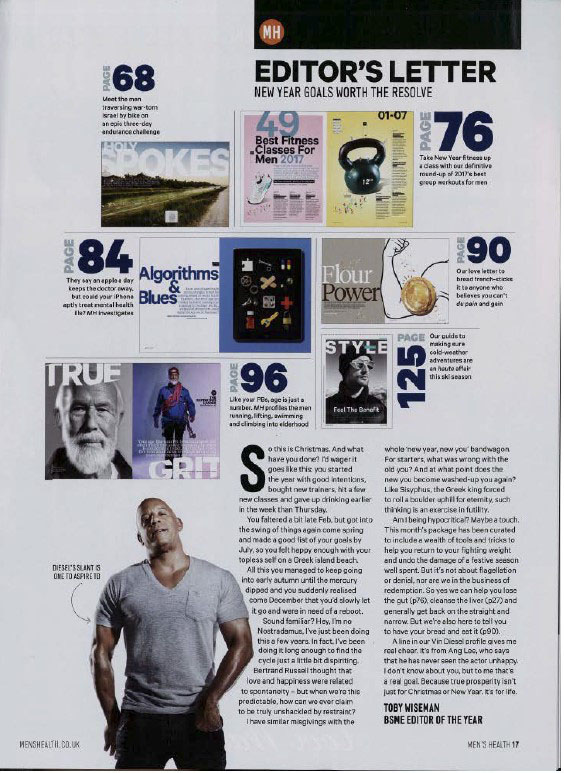
The dominant signifier (the actor Vin Diesel) in the image is the man stood in the front of the magazine, he is dominating the page and is the anchorage which more directly relates to the masthead which illustrates the message of the magazine which is ‘Men’s Health’. The use of a famous actor as the dominant signifier is used as a method to sell more magazines as a way for the target audience to trust the message of the magazine greater. There is a large syntagm of indexical signs, phrases and subheadings all following a theme of unrealistic conventions of health and how to lose weight.

The use of the dominant colouring of blue followed by headings such as ‘Best fitness classes for men’ shows a clear male target audience. The media naturalises ideas through repetition meaning the repeated use of similar phrases and themes of fitness is obviously the focal point of the magazine.

When evaluating the magazine it can be assessed that it follows a reactionary view. This is because when the magazine was made (early 2017) there was a more shallow and elementary view on fitness so it illustrates a conventional view on health for the time. But when applying more modern views on fitness and health, it may be considered a negative radical field due to the statements such as ‘103 shortcuts to t-shirt arms’, this radical statement dehumanises men, constructing a fabricated view on the male body as a method of control within media and to comprehensively sell more products.

Constructed identity:

  • The goal of this media product, a men’s magazine, is to generate a profit. So depending on the audiences the magazines identity will change, it will bend and appeal to the majority as a method of control. It will create a narrative that is most appealing to them, in this case, a narrative of toxic masculinity and a basis of the ‘cool man’ to push their men’s health ideas.

Lasswell’s model of comms:

  • Active vs passive consumption’s
  • WHO? The parent company, Hearst Communications UK, creators of the magazine specifically the main editor Morgan Rees
  • SAYS WHAT? Men’s Health and how to become stronger and lose weight etc, various other messages also
  • IN WHICH CHANNEL? Print, online, social media
  • TO WHOM? The target audience of the magazine, younger impressional men, and magazine subscribers. Men specifically interested in health and exercise, active adventurous people. 70% of all Millennials and 69% of all Gen Z over the age of 18
  • WITH WHAT EFFECT? Profit. Inspirational, perhaps aggressive.

Lazarsfeld 2 step flow of comms:

  • Use of opinion leaders in media products help as a theme of control and reinforcement, such as in ‘Men’s Health’, there is a dominant signifier of Vin Diesel on the front, a famous actor who is used as a tool for promotion, using him to endorse their ideas and products, it opens up to the consumer and the general public as a method of active consumption.
  • Page 6-7, use of the ‘Man of today’, an opinion leader used to sell a product (Hugo Boss aftershave) to the masses is a prime example of the 2 step model.
This image has an empty alt attribute; its file name is mens-health-contents-page.jpg
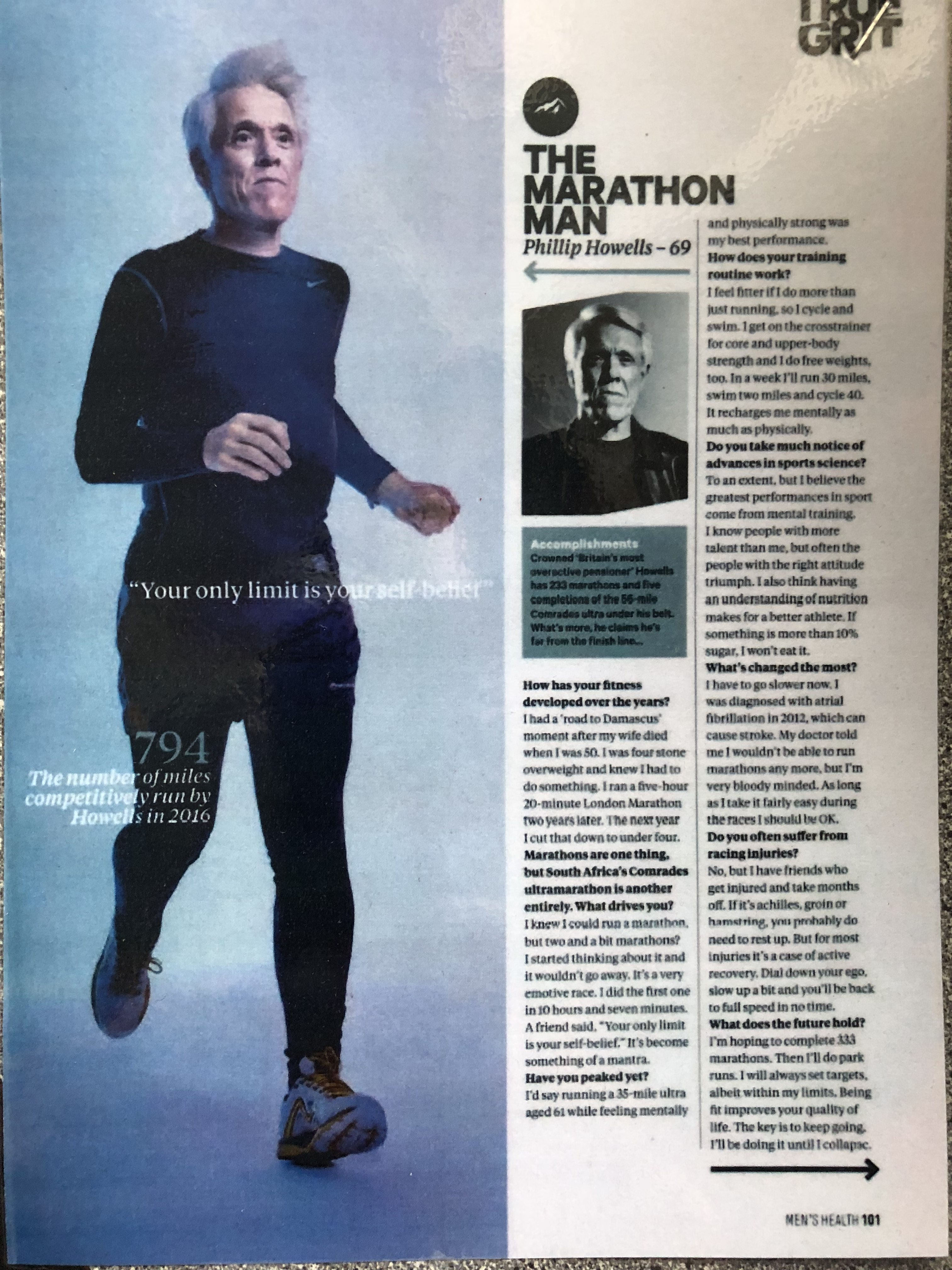
This image has an empty alt attribute; its file name is mens-health-article.jpg

The school of life produced a video called ‘How To Be A Man’, while this is not an academic theory, it nevertheless presents 2 versions of masculinity, the ‘Warm Man’ and the ‘Cool Man’. It is possible to identify these 2 versions in Men’s Health, thus supporting Gauntlett’s notion of fluid, negotiated and constructive identity.

For example, on page 1, (the front cover) there is a dominant signifier which is an example of constructed reality, the ‘Cool Man’, he is edited and surrounded by a paradigm of phrases and headings labelling items on how to become a ‘real man’ essentially. In reality, it does not matter what you do, these things do not make you more or less of a man, therefore supporting ideas of Gauntlett of constructed reality.

Statistics on Men’s Health Magazine: January to December 2021 and other statistics

89,811
CIRCULATION
(AVERAGE PER ISSUE)

  • Owner: Hearst UK
  • 74% of the years circulation is physical print copies, whereas 26% is digital copies.
  • Basic cover price = £4.50
  • UK annual subscription rate = £36.99
  • 10 made per year usually
  • On average, 5% of all Paid Single Copies during the period were multipacked with ‘Runner’s World’
  • Private limited company, meaning shares can not be bought on the stock market
  • Hearst owns newspapers, magazines, television channels, and television stations, including the San Francisco Chronicle, the Houston Chronicle, Cosmopolitan and Esquire.
  • Hearst UK reveals plunging revenue and £13.4m loss in Covid-hit 2020
  • Despite an 18% drop in revenue to £115.9m, the company  managed costs without using the Government’s job retention scheme, increasing its gross margin from 45% to 46%.
  • This year (after the 2020 results period) it made up to a fifth of its staff redundant, closed Town & Country UK magazine and sold the Net Doctor website.

PAID MULTIPLE COPIES:

  • Airports / airlines / international rail = 42
  • Trains / other travel points = 4
  • Leisure centres / club = 28
  • Hotels = 213 – Majority of the multiple copies payables is by hotels

Audience:

Has an audience of more than 165 million readers and site visitors, direct engagement with 70% of all Millennials and 69% of all Gen Z over the age of 18

Women’s Health Magazine:

  • Owned also by Hearst UK
  • Shows a reactionary view on women, the magazines covers have women with less clothing on compared to the men’s magazine it seems.
  • 1.6 million. social media followers

Market:

  • MARKET SHARE: 5.07% – They are not the dominating force of major magazine publishers based on combined annual circulation of consumer titles in the United Kingdom as of January 2020
  • Bauer Media is the leading force in the market with a market share of 27.7%, much larger than Hearst UK

– Laura Mulvey: The Male Gaze

Lazarsfeld – two-step flow of communication model hypothesizes that ideas flow from mass media to opinion leaders, and from them, to a wider population

Page 6-7, use of the ‘Man of today’, an opinion leader used to sell a product (Hugo Boss aftershave) to the masses is a prime example of the 2 step model.

WHO? The parent company, Hearst Communications UK, creators of the magazine specifically the main editor Morgan Rees
SAYS WHAT? Men’s Health and how to become stronger and lose weight etc, various other messages also
IN WHICH CHANNEL? Print, online, social media
TO WHOM? The target audience of the magazine, younger impressional men, and magazine subscribers. Men specifically interested in health and exercise, active adventurous people. 70% of all Millennials and 69% of all Gen Z over the age of 18
WITH WHAT EFFECT? Profit. Inspirational, perhaps aggressive.

4 Things to write about in essay + Theories to mention

  1. Institution – who owns it
  2. Examples of specific pages
  3. Language, how it’s laid up, representation
  4. Audiences
  • 1. Owner: Hearst UK
  • 74% of the years circulation is physical print copies, whereas 26% is digital copies

ANALYSIS OF FILM WEBSITES

Analysis of Film Websites


La La Land

https://www.lionsgate.com/movies/la-la-land

  • Contains background image of dominant signifier. Introducing the two main characters; their action in the image also linking to the theme of the film.
  • Information regarding when it is available to buy or watch: “Now available on Blu Ray”
  • Scroll down layout rather than linking to separate pages.
  • Links to social media accounts with symbols to represent the apps.
  • Film poster featured at the top of the page in a rectangular box.
  • Iconic sign of a ‘play’ button with the anchorage ‘Watch trailer’ including a link to the trailer for the film
  • Production stills alongside information to give insight into the contents of the film, a way for the audience to see snippets before watching or buying. A gallery of images included
  • Brief description of the making of the film and the release date
  • Information on the main cast and production team
  • Line of images at the bottom of the page which show the different versions of the posters. Also a line of links to watch related videos such as interviews, scenes and trailers.

Blinded by the Light

  • The film has distributed two different websites to correlate to how the film was produced by a indie company (Bend it Networks) which is owned and supported by the conglomerate (Warner Bros).

https://www.benditnetworks.com/filmography/blindedbythelight/

  • Scroll down layout rather than linking to separate pages.
  • Black background.
  • Contains link to YouTube film trailer.
  • Contains a overview of the film including; List of cast members and their credits and also the genre/inspirations/descriptions for the movie.
  • Quotes from the director and also comments from the writer.
  • Link to article and related videos and other media.

https://www.warnerbros.com/movies/blinded-light

  • Structured in different sections and links rather than one continuous page containing all of the information.
  • The header of the “home” page includes a production still and also a link to film trailer.
  • Information and symbolic signifiers on where the film can be streamed/bought from. Also providing information on release date, age rating, genre and social media.
  • About section provides information on the director and the link to Bruce Springsteen’s music.

Bombshell

https://www.lionsgate.com/movies/bombshell

  • Transition graphics displayed when opening the website.
  • Anchorage; “Available now on Digital, Blu Ray and Combo” under title and next to film poster. Also a link to where you can buy the film “Buy Now”.
  • Background image of the 3 main characters.
  • Structured in different pages with links on a drop down menu rather than one continuous page.
  • Additional information to connect to potential audience through displaying extra events called the “Conversation tour”
  • Pages called “Gallery” and “Videos” and an ‘About’ section which gives information on the synopsis and cast.

Tick, Tick, Boom

https://www.ticktickboommovie.com/home/

  • Header of ‘home’ page includes a video reel with snippets from the film.
  • Structured in pages rather than one continuous page.
  • Anchorage in a scroll down section which displays the synopsis.
  • Poster and information on production, cast and concepts.
  • Section which lists the cast, director and producers
  • Gallery of production stills
  • Anchorage with key information on where it can be watched (“ In select theatres and on Netflix”) and a button with a link to the trailer.

Television CSPs

Capital

`Capital’ is a drama adaptation of Peter Bowker’s best-selling novel of the same name. The story follows the impact of gentrification in a city, particularly focusing on a fictional Pepys Road, in South London. It was released in December 2015 and directed by Euros Lyn. Matt Strevens produced it and it originated in the United Kingdom.

Deutschland 83

Deutschland 83 is a 2015 German television series starring Jonas Nay as a 24-year-old native of East Germany who, in 1983, is sent to West Germany as an undercover spy for the HVA, the foreign intelligence agency of the Stasi. It premiered on the 17th of June 2015 and was directed by Edward Berger and Samira Radsi. It originated in the United States, and also partly in Germany.

Film sequence analysis

Task 4: moving image sequence inspirations

  • Switching the perspective of who you are viewing from very often
  • Doing closeups of the main character and long shots of people watching him from afar so you know they are
  • Blurring the background for attentions on character
  • giving background on what other characters are doing
  • Camera angle looking down on the insignificant characters and horizontal angle for main character
  • change scenery ie. different side of room
  • non-linear sequence with flashbacks at time of inciting incident
  • perpertia right at the end of clouds when the boy dies
  • Creates pathos through anchorage of sounds and video

FILM SCENE ANALYSIS

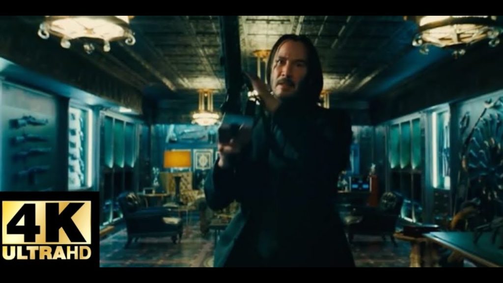
Film scene 1: John Wick Parabellum Hotel fight scene.

The scene starts with quiet, mellow opera/orchestra music that slowly ramps up over the course of the scene. This quiet mellow music is a connotation to how the scene takes place within a hotel where typically the music played in the lobby is opera/orchestra. As well as this the start focuses on the dominant signifier, John wick, picking out his preferred weapons knowing he’s being ambushed, the reason I know he’s being ambushed is the music slowly picks up in volume and Johns expression of intensity and heavy breathing is focused on. As well as this, the scene is a montage that switches between the upstairs and downstairs of the hotel, with the downstairs being John wick and his apprentice picking guns with close shots of their weapons, ammunition and faces to show their emotions, compared to the upstairs which is wide, still shots of the agents ambushing the building in full protective gear with assault rifles and flashbangs, occasionally a close up shot of the agents is shown to display to the viewers what john is going up against.

Film Scene 2: John Wick car chase

film poster semiotics

Joker Fan made movie poster on Behance

JOKER- In this film poster the joker stood dead centre is the dominant signifier therefore in my poster if like to use a human as my dominant signifier. The title of “JOKER” is a signifier within this poster as it shows what the film is going to be about. The writing underneath the title is an anchorage which is used to provide extra information about the film like release date and stars etc. The falling mask is an iconic sign due to the fact that it is a sign which looks like the object. Finally the background is an indexical sign as it has a link to the object or in this case the story.

Thriller Movie Posters: Art, Prints & Wall Art | Displate

ROCKY- In this film poster there is a signifier or resilience trying to be invoked as you can see by the iconic sign. The link can be seen as a symbol or code in the way the film has connections with the poster. There a high level of signification in the poster due to the blue background effect and the de4notation between the film and the poster.

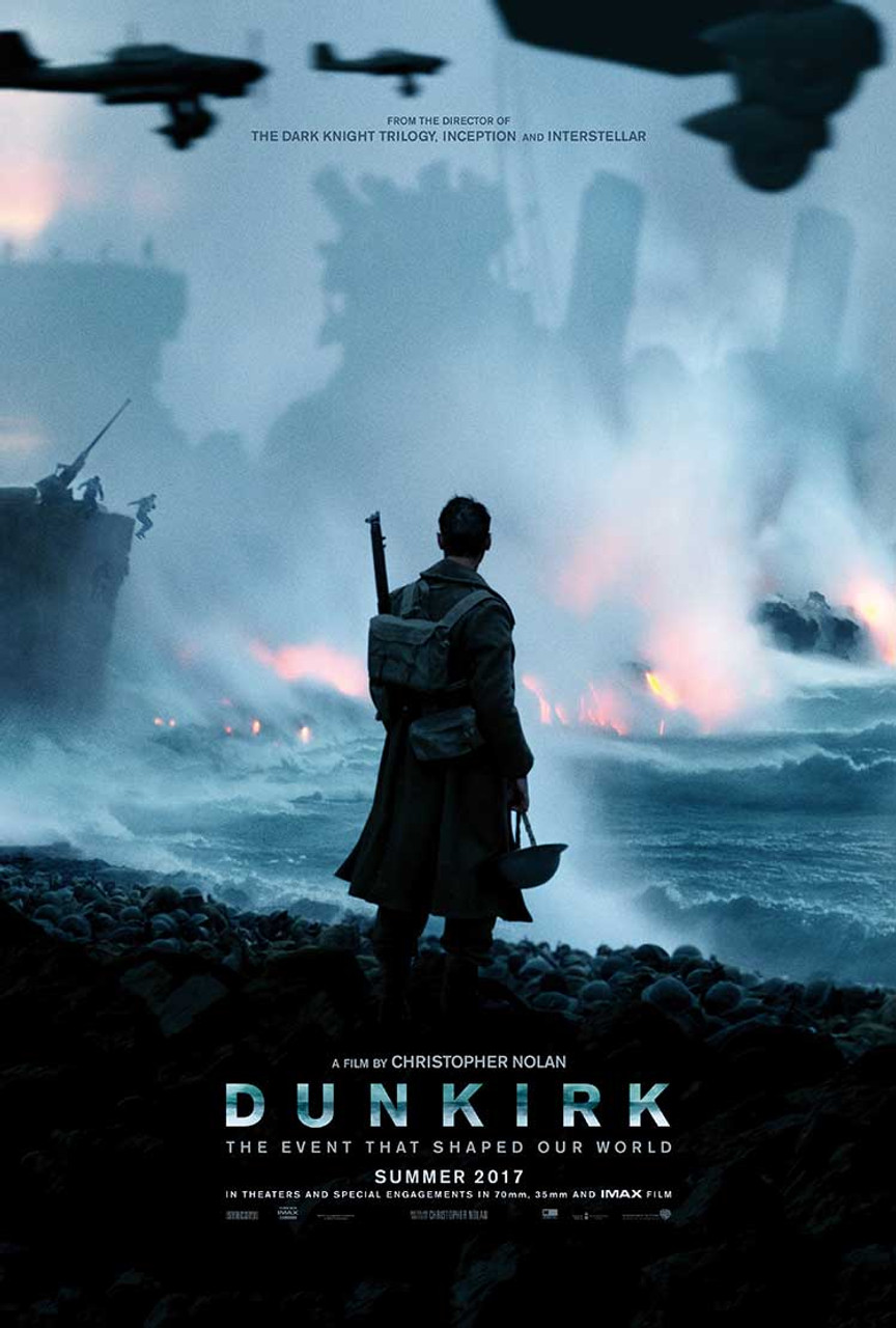
Dunkirk Original Movie Poster – Advance Style buy original film and movie  posters at Starstills.com

DUNKIRK- The dark colours in the poster represent a darker way of showing war and portraying across the theme of melancholy. The main dominant signifier is the actor stood in the centre of the poster looking over the war ridden sea presenting how much war destroys.

Leading Ladies? Iconic Film Posters Without Men | Kegel8

AVATAR- In this film the dark blue contrasting with the yellow represents the idea of within the darkness there is always hope which i can use within my film poster due to the panic of not knowing what your fate will be.

The Walk wallpapers, Movie, HQ The Walk pictures | 4K Wallpapers 2019

THE WALK – the minimalistic image presents the films title as the dominant signifier and draws the audiences attention more to the anchorage (information underneath the title) to grasp more information about the film more than the image which also is indexical to the film and films title.

Film post semiotics

The Best Movie Posters of 2016 - Paste
I think that the iconic sign in this film poster is the 3 stages of life, this is to suggest how it begins in a young teen life and grows into a young adult and then to a mature man (the beard makes him look older). The indexical sign is the consideration of use of colours as the title of the film is called moonlight and the background shows 3 different colours. This also links with a symbolic sign because of the colours that are being used.
Alfalfa Curated List of Best 2018 Movie Posters - Alfalfa Studio
The iconic sign in this film poster is to illustrate how he is a hero. This gives us the advantage of knowing what is to expect in the film. The indexical sign in this poster is the spider sign on his shirt, which links in with the title - spider man. The symbolic sign in this poster is the colour red, which could suggest that if he were a hero, then he would wear a suit and probably be the colour red.
This image has an empty alt attribute; its file name is bloodshot_xlg.jpg
The iconic sign in this film by vin diesel seems to be an action film as it is shown for him to be holding some sort of weapon. The indexical sign is in this poster is the white circle splatter on the word shot to suggests how their will be involved a lot of killing. The symbolic sign in the colour red to suggest blood as it is an action movie that has a lot of killing. 
Zombieland Double Tap - Woody Harrelson Emma Stone - Hollywood Action Movie  Poster - Life Size Posters by Kaiden Thompson | Buy Posters, Frames, Canvas  & Digital Art Prints | Small, Compact, Medium and Large Variants
The iconic sign in the zombie land film is very predictable as it gives you the idea that they are running away from zombies and they must survive. This is also given away by the title as it is very obvious. The indexical sign in this poster is that it could suggest that it will contain dramatic music and they use many props to illustrate they will be fighting some zombies to survive. The symbolic sign in this poster is the use of the colour orange which could suggest the colour of blood or fire. This seems to be an action film so there could possibly be some causalities.
The 30 Worst Movie Posters Ever! - Discount Displays Blog
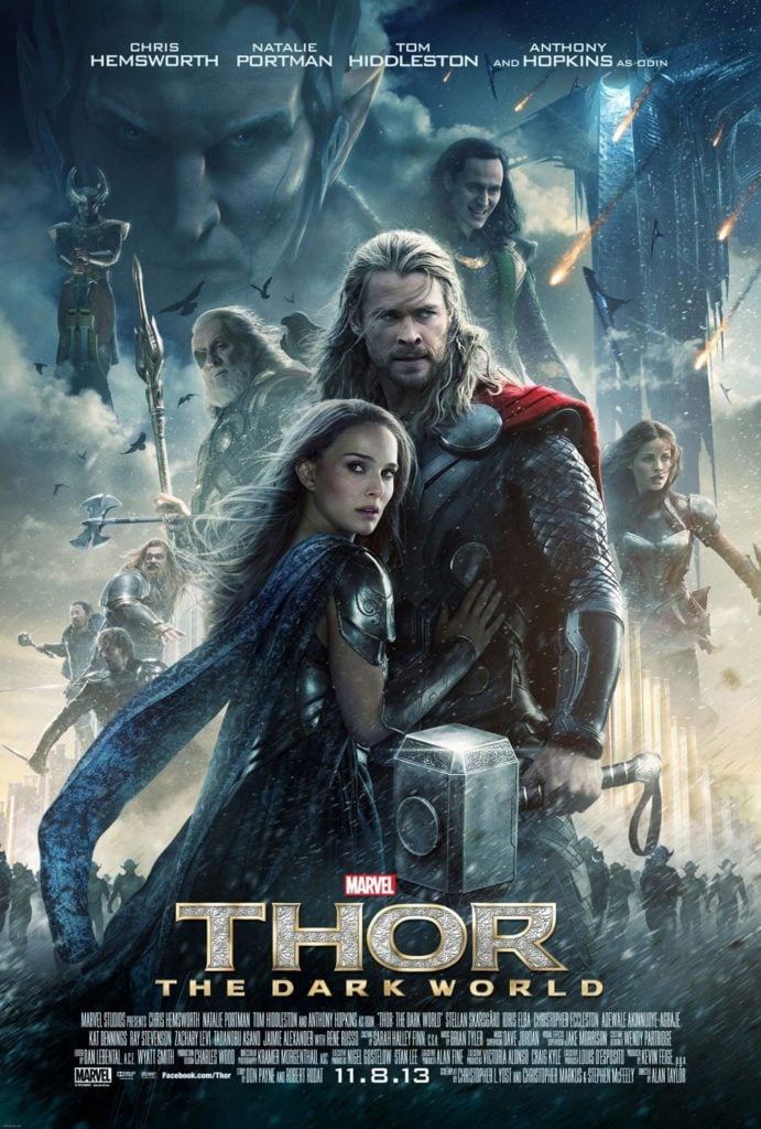
The iconic sign in Thor is you can predict that it is a fiction film where he must save the world. We can tell that the hero will encounter many villains, this is seen by looking at the background of the poster  which makes it intriguing to the audience. The indexical sign is being referred to the title seeing as we can see that a lot will happen. The title says the dark world which suggests that the climax will be major. The symbolic sign is the use of colours to reflect on the title seeing it will involve a lot of death and destruction. This will make it interesting towards the audience as the dominant signifier is clearly shown.