Category Archives: Production

Filters

Author:
Category:

statement of intent – nea

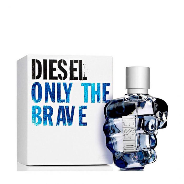
I intend to create 2 print adverts, one will be contemporary and reactionary and the other one will be radical. My product is going to be a perfume. My perfume will be aimed at women aged between 18-45. My product will be leaning more towards high end but still not quite there. The aim of the two adverts is to sell the perfume.

For my contemporary advert, my model will be wearing her prom dress with a brown fur coat to give an elegant look which will encourage the customers to want to buy the perfume as the advert will convince them to want to look as good as the model does. The main model photo will have a shadow behind her elongating her figure upwards to make her appear taller. The fur coat will drape over her shoulders revealing her shoulder with the one single trap that is embellished. Her hair, skin and coat all have similar colour palette with the the neutral and goldish tones.

The dominant signifier of the advert will be the perfume but I also want the customers to notice the female model dressed nicely. I will put a translucent image of my product on the bottom left of the image. That product imagine will have a black fur texture which will be overlayed the main model image.

The female model will be represented in a reactionary way for my contemporary advert. The advert should be positive as it will be positive and pleasing to look at.

sign, connotation, signified, icon, index, symbol, anchorage, ideology, denotation.

voyeurism, male gaze, patriarchy, mis representation, constructed reality,

david gaunttlett – fluidity of identity, negotiated identity, collective identity, constructed identity.

shannon and weaver, uses and gratifications, hierarchy, psychographic profiles.

Statement of intent – NEA

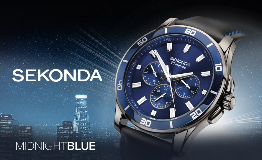
I intend for my product advert to be targeted towards young men between the ages of 16-30 to imply that the Sekonda watches are affordable, smart and functional. I will be using the watch in the centre of a crowded space to imply that life can become crowded and that buying a watch can help fix that issue , along with small text. The advert is meant to imply to people they should have a smart watch to make themselves smarter and liven up their dress, impressing people around them and at work. I will also attempt to use the quote “Find your watch today” implying that there are many options that a person can pick from and that there are multiple types to fit multiple outfits at a good price. In this advert I will be using a serif font to make the advert seem fancier, I will be using a box around the advert to make the customer focus on the actual product instead of the surrounding clutter and items, then I will add the Sekonda text to make the advert look smarter and seem like its from the actual company, not a student. I will be making the watch specifically jump out by making it a bit brighter than the surrounding objects. The watch will be layed out flat to show the full leather straps and the quality of it to impress customers and show how smart the watch is, also in the background I will be using womans perfume, mens body wash and female magazine page to signify that the owner of this watch has taken off the watch due to having a lady friend over.

I will be doing this by using my own Sekonda watch for the reactionary advert and will be using a Sekonda woman’s watch in the radical advert. I will be making the woman’s advert radical by making the advert wildly sexist and putting the watch on a wooden rolling pin then sprinkling flour around the scene to give the sexist ideology that woman belong in the kitchen, as well as this it supports the old stereotypes that woman are below men and that everything is patriarchal. I will be using my mums golden female Sekonda watch and putting it around the rolling pin. I will be using the quote “make sure nothing burns” to really display the targeted over sexist advert that I have made. Of course this is just for the idea of the advert and I do not agree with the message. I will be adding a cooking recipe page behind the scene to make nearly a copy of my modern, male advert to display the duality of adverts and advert styles. I will be using a lot of bright red and orange colours to give the ideology of the sixties, with a couple blurred areas, older style font, noise in the photo along with colourful flowery patterns to capture the sense of the sixties. I will also take the photo in the infinity screen with flash lighting with soft boxes to make the gold of the watch shine, the reason for this is to show off the quality of the product rather than to make the presumed woman wearer feel glamourous, this is the patriarchal sixties after all.

CSP 4 : MAYBELLINE

Colossal Big Shot Mascara.That Boss Life Pt. 2 ft. MannyMua and  Makeupshayla - on Vimeo
  • Companies are being more racially diverse within their adverts which gives them a better representation for who and what they support.
  • The influencer Manny spreads the positivity of using makeup on either gender with the tag, “lash like a boss”
  • The influencer, Shayla spreads the idea that its difficult for different races to wear different makeup due to tones and shades being different, Maybelline fixes this issue with their new product
  • The ads background presents the idea that it is an expensive product, however it is advertisement is implying the product is luxury but affordable.
  • The slogan displayed for the video is a catchy, inspirational moto.
  • Maybelline makes (USD)$146.82 million a year in sales with 4.48 million people using Maybelline eye products in 2020.
  • Founded in 1914, New York, United States.
  • The characters in the video are shown to be confident and good looking to imply that if you’re a different race, sexuality or gender it doesn’t matter and you can do whatever you would like and be great at it.

advertising: nea

This is an NEA (non examined assessment) task otherwise known as coursework. In other words, it is a good way to understand an area of Media Studies (in this case Advertising) and to prepare you for your A level coursework, which we will do in later in this A level course.

Things to bear in mind:

  1. You have 2 weeks to produce some advertising coursework / NEA
  2. You need to submit a statement of intent (it is worth 10 marks) guidance below
  3. You need to PRINT OUT YOUR WORK – if not you will not get any marks. This is print work and the expectation for your real coursework is to print your work out. So let’s set that expectation now!
  4. You will need to produce 2 x Portrait A4 magazine adverts
  5. Your adverts will follow professional conventions and look realistic and convincing.
  6. Try to create a new product (ie change or hide the label?) but if not don’t worry too much.
  7. You need to produce a contemporary and a historical print advert.
  8. You need to produce a radical and a reactionary advert.
  9. Make sure your adverts are produced at a high resolution 300 dpi so that the final quality is a professional standard.
  10. We are also going to try and produce a short video advert.

Task 1: statement of intent

Upload a statement of intent to your blog. It is worth 10 marks. It needs to be 500 words. So perhaps write about: what your intentions are (100 words), focusing in particular on: Media Language (codes, conventions, signs, elements of real print product). Put another way: how did if follow your style model? (100 words). Representation / content (use key language) (100 words). Audience, ie what kind of audience would consume it? (Again, 100 words). Institution: What kind of company would make your product? 100 words.

This will be assessed with the products and will allow you to explain the ways in which you will apply knowledge and understanding of media language and media representation to your products, how your products will target the intended audience, reflect the industry context they are created for This is a compulsory element of the non-exam assessment and you must complete the Statement of Intent using a maximum of 500 words.

Task 2: Produce your adverts

  1. Open up Photoshop – make sure it is a blank A4 PORTRAIT document (this should be 300dpi – THIS IS IMPORTANT AS OTHERWISE YOUR WORK WILL BE PIXELATED)
  2. Develop your use of the camera. Make sure you are able to change the settings on your camera (specifically FOCUS & LIGHT) to be able to take a good PRODUCT SHOT.
  3. make sure you are able to use the flash lighting set-up (YOU NEED THE TRIGGER FOR THE FLASH LIGHTS)
  4. Create an appropriate (AND ORIGINAL) logo and title for your product. Think about Font, colour, size etc etc
  5. Record and Produce all of your assets – product shot, model shot, text, copy, background images or textures, any other symbolic / creative features

Task 3: Edit,Publish and Print your products

  1. Edit all of your assets. Think about size, positioning and placement. Edit all of your assets appropriately into an A4 portrait document (I suggest you use Photoshop at 300 dpi)
  2. Post-produce your assets – so adjust as appropriate eg colour correction, size, scale and positioning
  3. Make sure that you save your PSD as a JPEG and upload to the blog
  4. Make sure you print out your finished products and pin up to the blue display board in our classroom.

ADVERTISING WORK

Textual Analysis:

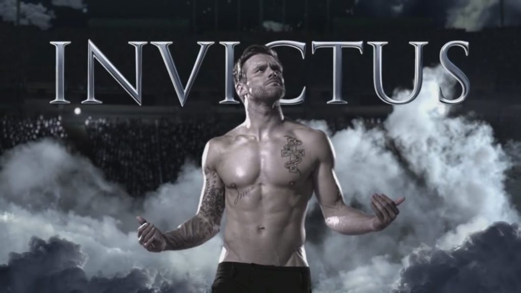
– Background of people, all watching in awe at this amazing man.

– Big font (Invictus).

– Clouds behind main character, showing he’s heavenly.

– Main model in the middle displays that having this aftershave makes you as amazing as him.

– Lighting is focused on the main character, showing him off.

Semiotic Analysis:

– Dominant signifier (Male in the centre)

– Paradigm (Collection of clouds to represent heaven)

– Icon (Crowd in the background)

– Anchorage (Clouds that signify the male is in heavan)

– Reactionary

Representation Analysis :

– Voyeurism

– Dominant Ideology

– Constructed Identity

– Patriarchy

– Negative Stereotype that strong, toned males attract everyone.

GRATIFICATION TABLE

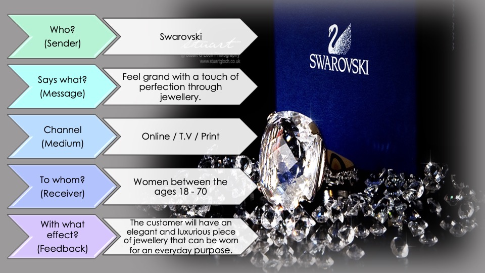
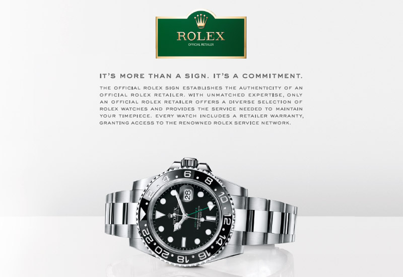
INVICTUS AFTERSHAVEROLEXSEKONDA WATCH
UNDERSTANDING SELFHelps you discover what you would like to smell like Helps you discover what jewellery you would want to wearHelps you discover what jewellery you would want to wear
ENJOYMENTYou have a nice aroma which you and other people can enjoy.You can read the time and see a beautiful bit of machinery.You can read the time and see a beautiful bit of machinery.
ESCAPISMHelps you escape being smelly.N/AN/A
KNOWLEDGE ABOUT THE WORLDN/AN/AN/A
SELF CONFIDENCEConfident about his smell, attracts people.Confident about the smartness of the watch and proud of what he’s wearing. Confident about the smartness of the watch and proud of what he’s wearing.
STRENGHTEN CONNECTION OF FAMILY AND FRIENDScan be bought as a gift to strengthen the relationship.can be bought as a gift to strengthen the relationship.can be bought as a gift to strengthen the relationship.
ANY OTHER THEMEN/AN/AN/A

PRODUCTION – ADVERT STYLE MODELS

Style Model Textual Analysis Semiotic AnalysisRepresentational Analysis
1.– Branding (Brand name and logo)
– Images of products
– Main image
– Trademark
– Additional information in smaller font
– Brand slogan
– Campaign slogan ‘curious cat’
– Dominant signifier of a woman using the product
-Anchorage, the brand slogan (‘evolution of smooth’) sets out the products purpose
– Iconic sign – Lip balm product
– Indexical sign – The bracelet the woman wears is the same pattern as the product
– Paradigm of signs that revolve around the product being promoted
– Reactionary representation – Women are often the face of skincare/beauty advertisements
– Stereotypical representation – The woman on the advert is of an idealistic beauty standard. The brand has selectively represented her to promote sales
– The audience is positioned to believe the statements the brand is making because they are viewing them as factual truth.
– The beauty of the woman could appeal to the male gaze.
– ‘Get noticed’ – Implies that the only reason for using the product is for gaining romantic attention, rather than it benefitting your lips.
2.– Main image of man using product being promoted
-Image and name of product
-Name of campaign (‘The Show’)
– Background image of a curtain
– Name of celebrity to increase sales.
– Magazine title
– Dominant signifier of the man using the product
– Iconic sign – Lipstick product
– Indexical Sign – The man is wearing other makeup products
– Symbolic sign – The red lipstick shade links to the colour of the curtains. The shade has connotations of luxury.
– Radical representation : Men who wear makeup, or take care over their appearance are not often represented in the media, more specifically adverts for makeup products
– Countertypical representation : Goes against the societal norm and counteracts the idea that only women should wear makeup
– The audience are positioned to accept and celebrate this representation
– Could be seen as a representation of the LGBTQ+ community
– Counteracts the hegemony that females hold in the beauty industry.
3.– Image of the product being promoted
– Brand name and logo
– Brand tag line/slogan
– Hard lines to section off the different sections of the advertisement ‘without it. A kiss is just a kiss’
– Additional smaller text
– Dominant signifier of the two people about to kiss on the top left corner
– Iconic sign – Chapstick/image of the product
– Iconic sign – Image of lips on the packaging. Linking to the message of the advert
– Anchorage – Smaller text relates to the purpose of the product
– Symbolic sign – Red pattern as background links to love and romance

– The product is over-sexualised and portrayed in a way only revolving around romance and love
-Stereotypical representation which implies that men only find women attractive when they use beauty products.
– Reactionary
– The inclusion of the definition of a ‘kiss’ reinforces the fact that the product is for the pleasure of the male
4.– Main image of a man using lip balm product
– Background : Gradient of yellow and orange
– Dominant signifier is of an ‘attractive’ man using a lip balm
– No anchorage
– Iconic sign of the lip balm stick
– Countertype – This representation goes against the social stereotype which encapsulates the idea that to be masculine and ‘manly’ you must neglect self care and care for appearance, as it is seen as a much more feminine trait to hold.
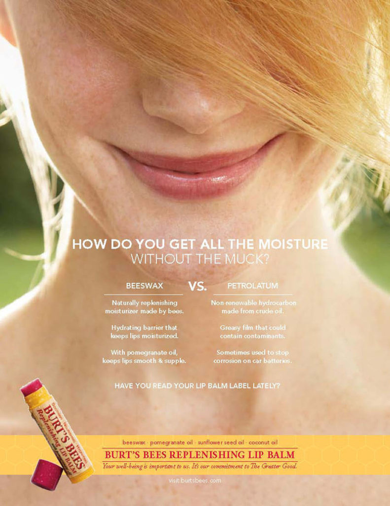
5.– Main image
– Brand logo and brand graphics
– Image of product being advertised
– Brands slogan/ tag line
– Iconic sign of the product
– Dominant signifier of the lower half of a woman’s face. Focused in on her lips which links to the products purpose
– Anchorage – Rhetorical question to directly communicate with the customer.
– Reactionary representation – Women are most likely to be featured in a beauty campaign because it fits with the social stereotype of the type of consumer who would use the product.
– Through the use of comparison of the product being advertised against other similar products, the audience is positioned to believe that this product is most beneficial.