Category Archives: Production

Filters

Author:
Category:

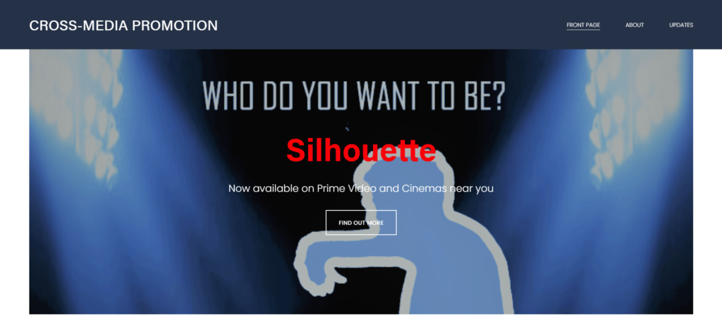
cross-media production nea

Statement of Intent for Film

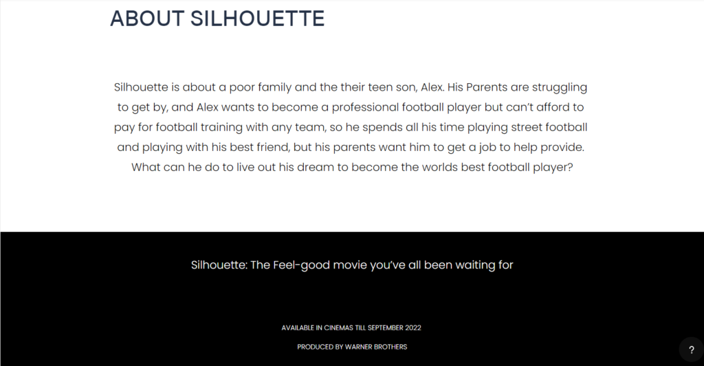
It’s about a poor family and the teen sons parents are struggling to get by, they have one son who wants to become a professional football player but can’t afford to pay for football training so he spends all his time playing street football and playing with his best friend, but his parents want him to get a job to help provide.

In this movie I will have the main character, the hero, being the teen who wants to become a football player. He will have a best friend at the start but then becomes the false hero, he then joins a rival team to his friend after the hero manages to get into a team through very hard work and training and being able to get free training due to his large skill and ability. The false hero will purposefully injure the hero out of spite that the hero is a greater player than him. So the hero has to go back home and start working for his family for a while. After being injured for a while we have a dispatcher (a coach) who convinces him to play again and carry on his training. To where he then gets scouted by a premier league team and this will be the anagnorisis where he earns enough money to provide for him self and his family.

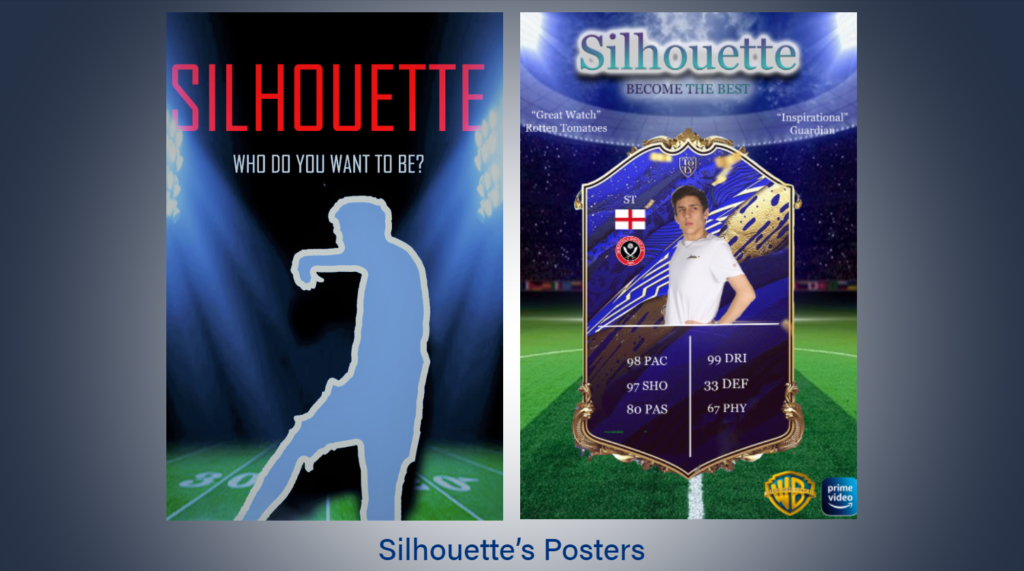
The film will be funded and produced by Warner Brothers. It should have a least a mid level budget due to the simple nature of the story not needing many high level filming attributes or techniques. The poster will have the main hero at the front holding the football in his hands or at his feet, with his friend next to him but slightly behind to indicate his insignificance compared to the main hero and as also a slight foreshadow of his false hero intentions.

The genre of the film will be a feel-good type idea that focuses on a classic and conventional base story line following ideas of the Tripartite narrative structure. The genre would loosely be based on the films techniques and genre of “Blinded By the Light” where he young teenager faces antagonists and hardships to make his dream come true of becoming a professional football player, making his parents proud and taking them out of poverty.

Statement of intent for the website

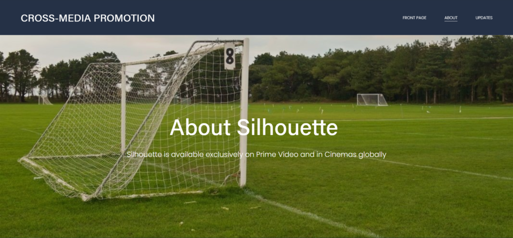
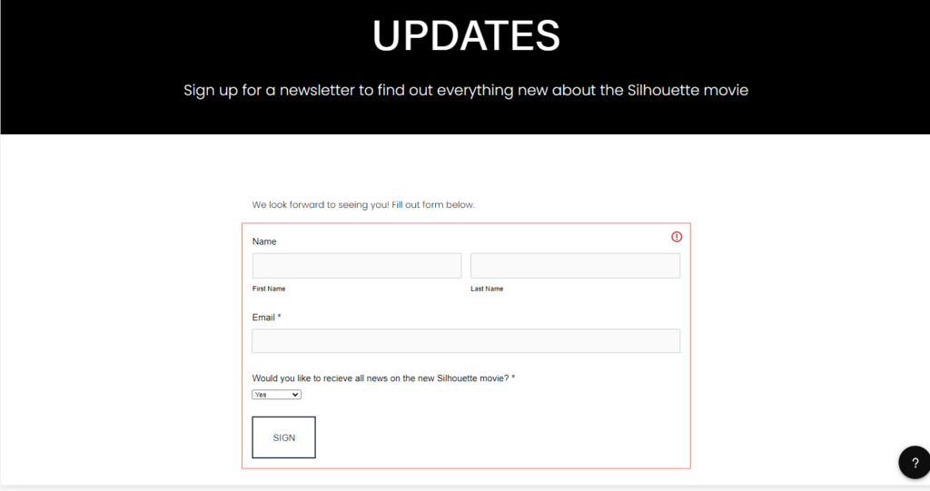
For the website I wanted to keep it simple and effective in a way. It features the main title and a banner at the top giving easy access to other pages of the website: “Front Page”, “About” and “Updates”. It has promotion for the film creators and where it will be featured easily seen throughout the website. The updates page features an email chain where users can receive updates on the movie as a marketing strategy. I made the website on “Square Space” and I will have to take screenshots of the website due to the fact I have to pay for a membership to make the website active.

ANALYSIS OF FILM WEBSITES

Analysis of Film Websites


La La Land

https://www.lionsgate.com/movies/la-la-land

  • Contains background image of dominant signifier. Introducing the two main characters; their action in the image also linking to the theme of the film.
  • Information regarding when it is available to buy or watch: “Now available on Blu Ray”
  • Scroll down layout rather than linking to separate pages.
  • Links to social media accounts with symbols to represent the apps.
  • Film poster featured at the top of the page in a rectangular box.
  • Iconic sign of a ‘play’ button with the anchorage ‘Watch trailer’ including a link to the trailer for the film
  • Production stills alongside information to give insight into the contents of the film, a way for the audience to see snippets before watching or buying. A gallery of images included
  • Brief description of the making of the film and the release date
  • Information on the main cast and production team
  • Line of images at the bottom of the page which show the different versions of the posters. Also a line of links to watch related videos such as interviews, scenes and trailers.

Blinded by the Light

  • The film has distributed two different websites to correlate to how the film was produced by a indie company (Bend it Networks) which is owned and supported by the conglomerate (Warner Bros).

https://www.benditnetworks.com/filmography/blindedbythelight/

  • Scroll down layout rather than linking to separate pages.
  • Black background.
  • Contains link to YouTube film trailer.
  • Contains a overview of the film including; List of cast members and their credits and also the genre/inspirations/descriptions for the movie.
  • Quotes from the director and also comments from the writer.
  • Link to article and related videos and other media.

https://www.warnerbros.com/movies/blinded-light

  • Structured in different sections and links rather than one continuous page containing all of the information.
  • The header of the “home” page includes a production still and also a link to film trailer.
  • Information and symbolic signifiers on where the film can be streamed/bought from. Also providing information on release date, age rating, genre and social media.
  • About section provides information on the director and the link to Bruce Springsteen’s music.

Bombshell

https://www.lionsgate.com/movies/bombshell

  • Transition graphics displayed when opening the website.
  • Anchorage; “Available now on Digital, Blu Ray and Combo” under title and next to film poster. Also a link to where you can buy the film “Buy Now”.
  • Background image of the 3 main characters.
  • Structured in different pages with links on a drop down menu rather than one continuous page.
  • Additional information to connect to potential audience through displaying extra events called the “Conversation tour”
  • Pages called “Gallery” and “Videos” and an ‘About’ section which gives information on the synopsis and cast.

Tick, Tick, Boom

https://www.ticktickboommovie.com/home/

  • Header of ‘home’ page includes a video reel with snippets from the film.
  • Structured in pages rather than one continuous page.
  • Anchorage in a scroll down section which displays the synopsis.
  • Poster and information on production, cast and concepts.
  • Section which lists the cast, director and producers
  • Gallery of production stills
  • Anchorage with key information on where it can be watched (“ In select theatres and on Netflix”) and a button with a link to the trailer.

Cross mEDIA pROMOTION

Website:

Synopsis with statement of intent : Film Idea – The Informal Messenger – 1916

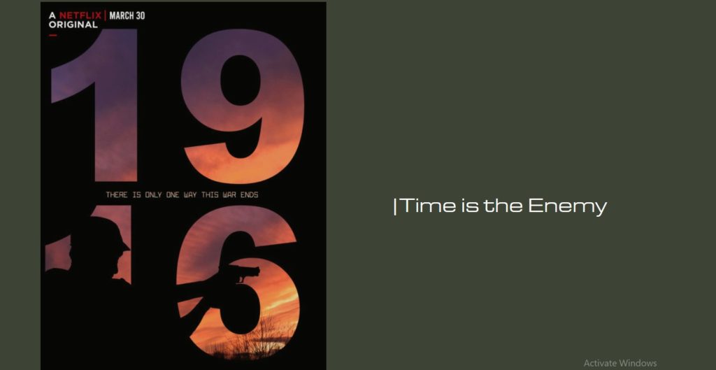
Description of Film: A young British soldier based in London, takes on a task to deliver a critical message to a Lieutenant Commander of Platoon 7 in Leicestershire. Not realising an ambush was about to take place.

My film will include a main character as the young British soldier, also known as the hero, as well as a victim who will be duped with the solider. Giving my ‘hero’ two roles within my film. This being a mid ranged Netflix film, consisting of a large amount of action and blood, leading to an age rating of 16+. I intend to create a poster with a male standing side on, looking away, as if he is at attention. Behind the writing of 1916, the background will be created as a peaceful sunrise to indicate part of my film, where the message has to be received by sunrise. My other idea for my poster is having a male character, point a gun side on as if he was about to shoot somebody with the same concept as my first idea, with the sunrise background and bold text. I hope to blur around the male so he is completely blacked out, so he’s not identifiable. Either picture I will have white text for the name of my movie – “1916” or “The Informal Messenger” with a quote below “There is only one way this war ends” or “Time is the enemy”.

My film is very similar and is based around the film 1917. My film is different to 1917 by the location it is based in, as well as the difference in genders between my film (1916) and 1917. On top of that, my film has a slight year difference.

CROSS MEDIA PROMOTION

Synopsis and statement of intent:

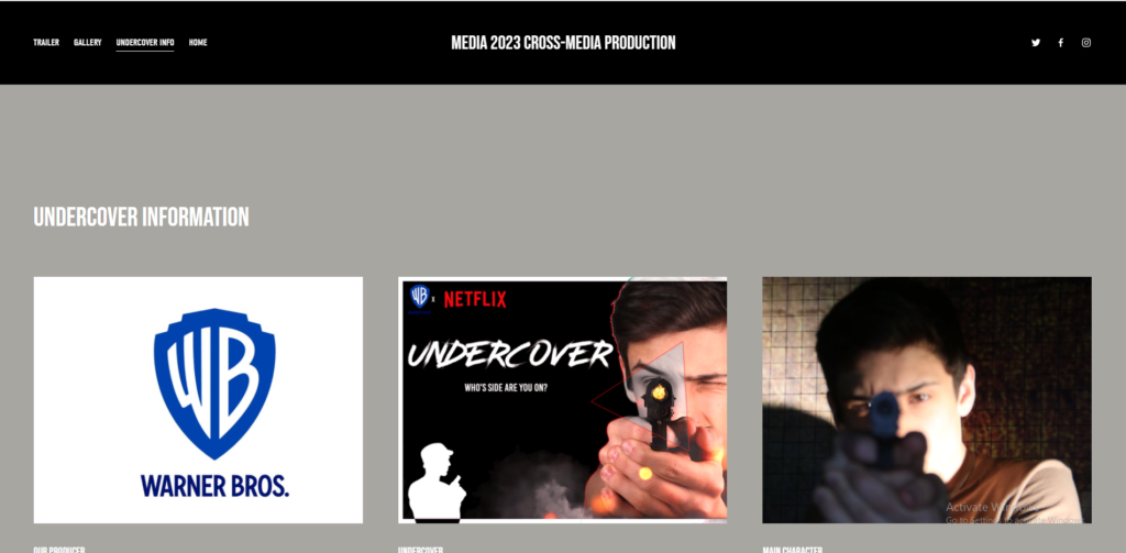
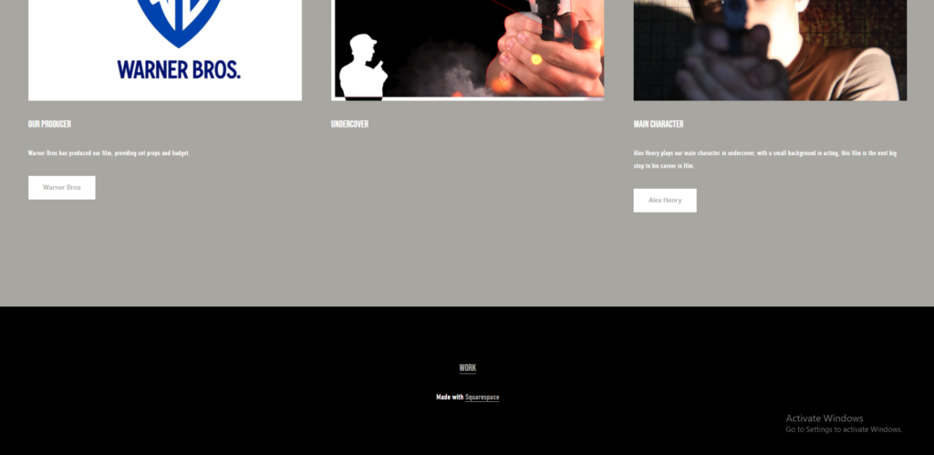
A British agent who thinks his father was lost at war investigates his fathers files and he never finds ever solid evidence, at long last he finds the last mission his father went on, “investigating and going undercover within a Nazi agency”, his son decides to go to the Nazi agency and try figure more about his father before his death. However when he’s in the agency people catch on that he seems to have incorrect German and is sneaking away without reason. But at very last, he finds out that his father…

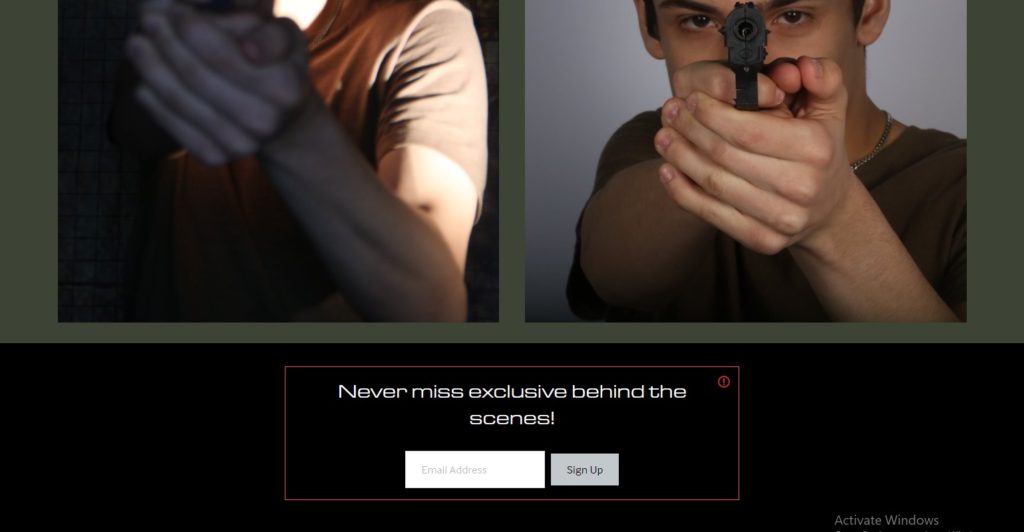
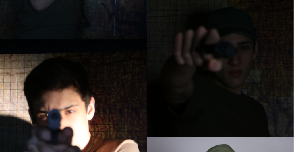
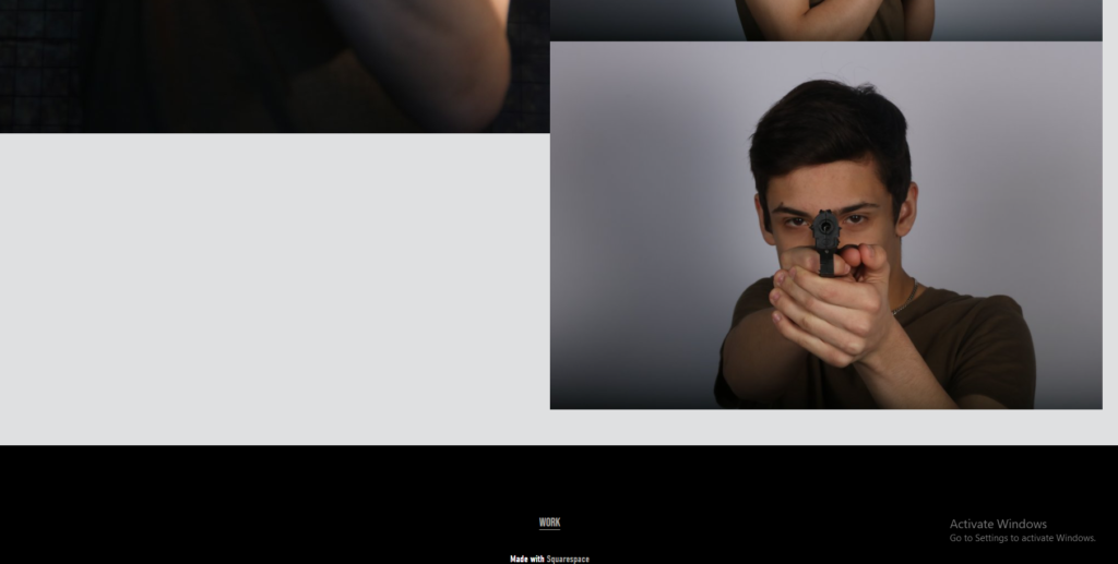
Within my film I’m going to have a hero (being the main character who is looking for his father), a villain (being a Nazi operator catching onto the hero’s lies) and a victim, being a love interest of the main character being hurt by the villain. With the major plot discovery being a heartbreak for the hero I want the audience to feel attached and emotional for the main character, otherwise known as pathos. I intend the film to be for ages 15 and upwards due to the emotional and violent film, it would be a major film developed on a large budget by Warner Brothers and the poster would be a half and half, blue light vs red light (good vs evil) back to back displaying multiple characters along with a large title of the film, this way the viewers are intrigued to find out who the characters in the poster are. I will be taking photographs of myself with an army based uniform on, a pretend gun and standing tall to show the main character to be bold and brave, whereas the villain will be arms crossed and an angry friend.

My film is similar to the James Bond 007 films, marvels captain America and red notice. However the film takes place within WW2 which is like Captain America but it focuses on a real life undercover not a fictional sub-division working on technology that uses a all powerful stone. Its like 007 but the star isn’t a standalone character going after a baddy because its his job and picks up woman along the way, its a young soldier looking for his family by fighting the war.


Statement of intent for website:

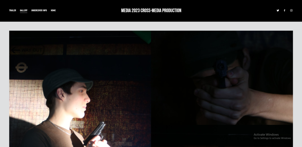
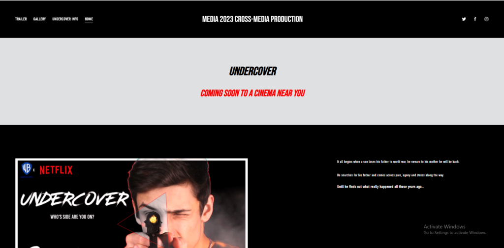
I’m looking for my website to be a dark, minimalistic and simple website with a small amount of text and focus on the physical elements like photos and trailers seeming’s this (personally) is what peaks my interest. When researching a film I’d rather see the footage or trailer and see on screen photos rather than read about it. I will have a home page, a trailer page, a photo viewing page and a short information section.

– Home page: The home page will be a general overview of the film and display the main info which viewers will be greeted with upon opening the website.
– Trailer page: The trailer page will be a small page which is designed to redirect viewers who want to see the film’s trailers straight to them.
– The gallery: The gallery will be to display key posters and photos from the film to give viewers a further understanding of the idea, story and setting of the film whilst not giving too much away to keep interest.
– Information section: The information page will be a page about the producers, actors and general information of the page so that if viewers want to read further into the background and production of the film, they can.

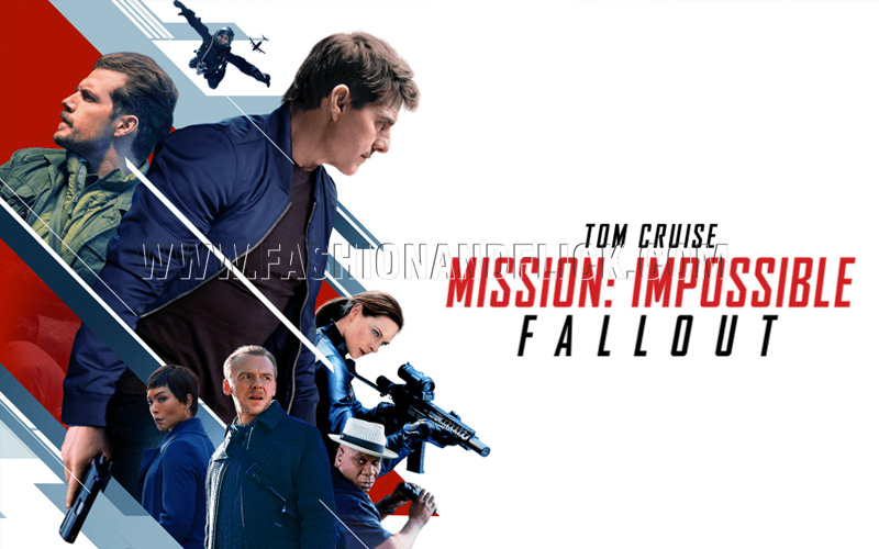
I want the font to be similar to that of the Mission impossible: Fallout poster (see below) so that the film website has an action theme to it. The website will be targeted towards making people interested in the film, whilst also giving more information to those who already are interested. The website will used interactive buttons for ease of use, large readable text for quick, precise reading for the viewer so they can get right to the information. The website, like the film is targeted towards teenagers and adults aged 15 and upwards, with the website having a dark theme to create a setting before the film is even released.

Mission Impossible: Fallout – poster

Website

https://nonagon-parsnip-ktby.squarespace.com/

password: media2023

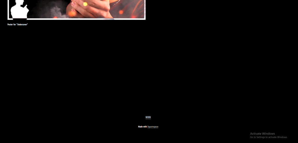
Website screenshots:


Clips

Media clip 1:
https://drive.google.com/file/d/1B8fTsSRlEwyjcJvPlwIgdN4ffMuLs_kp/view?usp=sharing

Media clip 2:

https://drive.google.com/file/d/1wy0-0NqOWcfVnr6I-JnIoo_WfqO_ozgX/view?usp=sharing

PRODUCTION – MOVING IMAGE (CROSS-MEDIA)

‘The Little Book of Loneliness’

Synopsis

Fred, a 17 year old boy, feels lonelier and even more lost than ever. To jot down his memories, thoughts and feelings, he begins to write an open diary as a way of coping with life. Every day he walks to his favourite spot on the beach and writes whilst sitting on the sea wall. One day, on his way back home, he leaves the book behind on the pathway. This story shows his journey through finding his prized possession.

Statement of Intent

I intend to produce two posters to advertise my film through including signifiers that link to the narrative I will create and introduce the central concepts, ideas and characters without explicitly revealing the details of the plot. My first poster will include the dominant signifier of a notebook, as the notebook is the central plot device in my narrative. I intend to put this image in the centre of the poster, the main focal point as a foreground on a black background. On top of the notebook, I will put the anchorage “He was lost, waiting to be found” , with the words ‘lost’ and ‘found’ in bold.

In my second poster, I will include a picture of a bench in front of a bush. On the bench, the male protagonist will be sat, writing in the diary with a rucksack next to him. On the wooden slats of the bench, I will edit in the title of the film “The Little Book of Loneliness” in a large font size. As well as this, I will put the text: ‘Featuring the music of Harry Styles’ as a way of advertising the link the film has to the artist through the use of his music. I will take inspiration from film posters for ‘The Fault in Our Stars’ (2014) and ‘Titanic’ (1997) as their narratives have similarities to mine. I will use their designs as a style model to ensure I have a structure I can loosely replicate and know which images I need to take.

I intend to create two different film sequences that would be featured in my short film. They would provide insight for my audience and give a teaser into how the whole film would look visually, how it would be edited and also how it would sound. My first sequence would introduce the setting, the main character and include the ‘exposition’ of the linear, chronological narrative structure. I intend to create a ‘morning routine’ montage which will be fast paced through incorporating sharp cuts between shots. This part will include different shots such as an alarm going off, a pan of a sunrise, a toaster and a kettle as a way of leading the audience into the storyline and introducing the character. I will also introduce the key signifier of the film; the main character’s notebook, to set up the object’s importance in the plot line. For audio, I will use a continuous background sound of a ‘nature soundscape’ which will include bird song and wind noises to link to the way in which my story has a link to nature through the character going outside each day. I will also include a recording of the main characters voice, reading the contents of his notebook, as an overlay, whilst a shot of him writing in the book is on screen.

I intend for the second sequence to document the main character’s daily walk to the beach where he writes in his notebook and jots down his thoughts and feelings. I aim to start by including a establishing, long shot of the beach landscape which slowly focuses into the character by using a series of medium shots of him walking, closeups of his shoes and an extreme close up of him writing in his notebook. To link back to the brief of including a link to a famous music star, I intend to include the song “Fine Line” by Harry Styles for audio as it creates an atmospheric tone. The climax of my film would occur in this sequence; when the character unknowingly leaves his notebook behind on the path.

I intend to create a website that provides information on the content of the film, about the brand identity and further information about the cast, crew and production elements. I aim to create 4 website pages; a ’home’, an ‘about’ page, a ‘production’ page and also a page called ‘take a look’ which will allow the audience to see my film sequences.

I imagine that my cross media production would be produced by a small, independent company which is owned by a large conglomerate such as ‘Warner Bros’. The two posters would be created for distribution on a streaming platform eg. ‘Netflix’. The production would project to ‘The Explorer’ audience who can connect to the main characters journey to discovery and also ‘The Mainstreamer’ who can connect to the cathartic aspects of the narrative.

Television – The Killing (csp)

Plot:

This dark crime drama follows two detectives, as they are put on the cases of the disappearance of a teenage girl, the murders of runaway children, and the massacre of a wealthy family. As the stories progress, the lives of those affected by the events intertwine.

Genres: Serial, Mystery, Thriller, Drama, Police procedural

Production companies: Fox Television Studios; Fuse Entertainment; KMF Films; Fabrik Entertainment

Executive producers: Veena Sud; Mikkel Bondesen; Søren Sveistrup; Piv Bernth; Ingolf Gabold; Dawn Prestwich; Nicole Yorkin

Based on: Forbrydelsen; by Søren Sveistrup (danish)

Television – No Offence (csp)

Context of whole show:

“No Offence” Follows a group of police officers on the front line wondering what they did to end up where they are now, on the ugly side of Manchester. Trying their best to keep the streets of Manchester free of crime. When all else fails, they decide to use unconventional methods to teach the perpetrators a lesson.

S1, E1: Plot

Dinah catches sight of a robbery suspect on her way home from a night out, but when she chases him into the path of a double decker bus, her candidacy for promotion to sergeant is thrown into question. Meanwhile, two young girls with Down’s syndrome have been murdered, and a third young girl is missing. Dinah notices a link between the cases, and it’s not long before the team find themselves running out of time to find the latest victim before the killer strikes again.’ – Wikipedia

Genres: Drama, Police procedural, Dark comedy

Network: Channel 4 and All 4, also broadcast in France.

Program Creator: Paul Abbott

Writers: Paul Abbott, Jimmy Dowdall, Paul Tomalin, Jack Lothian, Tom Grieves, Mark Greig.

Cast: The series stars Joanna Scanlan as the protagonist, Detective Inspector Viv Deering. which is radically represented to have not only one but a couple of lead female roles in a crime/mystery/detective genre.

Production company: AbbottVision

Exam Prep:

Example Question:

To what extent do television producers attempt to target national and global audiences box
through subject matter and distribution?
Refer to both of your television Close Study Products to support your answer:

Capital and Deutschland 83
OR
Witnesses and The Missing
OR
No Offence and The Killing

(Key ideas: Representation, Industry, Audience, Language)

This question is asking for: Representation, Industry and Audience.

  • Both CSPs attract global audiences by having different nations incorporated into the show. e.g in No Offence the main detective was polish. In The Killing, it was originally Danish.

television

Witnesses

Police investigate when bodies are taken from a cemetery and placed in houses for sale, along with a photo of retired police officer Paul Maisonneuve.

Witnesses is part of cultural phenomenon of the early twenty-first century which for the first time saw TV series not in the English language become part of mainstream UK broadcasting. That these series were dominated by the crime genre was part of a wider cultural phenomenon which saw the crime genre become the key form for exploring social and cultural contexts. The series used the genre to explore society’s fear of and desire for violence,
social isolation and changing gender roles.

The Missing

Tony and Emily Hughes go to France on a holiday with their five-year-old son Oliver. However, when their car breaks down one night in a small town, Tony suddenly loses sight of his son.

The Missing’s parallel storylines, set in the past and present foregrounds the Iraq war and the political debates and controversies about the British involvement in it. The role of popular culture in examining past history is relevant here. The institution of the army frequently operates as a microcosm of wider social and cultural contexts in the exploration of changing expectations of gender roles as well its relationship to family structures. Values and ideologies of different cultures are represented through different religious and ethnic beliefs. The economic context can be explored through patterns of ownership and production and how the product is marketed nationally and globally.

ANALYSIS OF FILM SEQUENCES

Analysis of Film Sequences

Opening sequence from ‘The Sound of Music’-Begins with a long, large establishing shot of the setting.
– This slowly and smoothly transitions from the long shot and zooms into a mid-shot into a close up of the main character (dominant signifier) of the sequence.
– The camera pans around the character in a circular motion whilst the character also does the same in the middle.
Opening sequence from ‘West Side Story’– Shot progression is used to introduce the setting and the characters in a way that audiences can be transitioned into the narrative methodically. It is a technique used to create verisimilitude (believability).
– This sequence is edited through cuts on action. For example, there is an extreme long shot, birds-eye view angle of the basket ball court. This cuts to a closer shot before zooming into a close up on a group of characters.
– Each of the characters in the group are given a close up shot which introduces them.
Sequence from ‘The Fault in Our Stars’ – Extreme close up on the main character allows the audience to be let into their emotions/ thoughts/ feelings.
– Zooming in shot – As if the audience is being let into her story.
– Different character introductions.
Montage sequence from ‘Up’Montage = The connection of images / ideas to create a new meaning and symbolism.
– In this sequence, the narrative uses flashback (creating a shift in time frame) to show a sped up life story of the main character. Montage is used as a way to cut aspects of the narrative together to save time.
– Even though the sequence is a time lapsed version of a whole narrative, there is still elements of equilibrium, climax and denouement as well as a beginning, middle and end. It is designed to create catharsis within the audience.
Non-diegetic sound is used alongside the montage to provide extra information and emotion into the character’s life’s (sound that is added during the edit, it is external and can’t be heard by the characters in the story).
Dialogue/ conversation sequence from ‘The Social Network’ External Reverse = Including both characters.
Internal Reverse = Closer than an a behind the shoulder shot.
– Insight into character relationships
– Rack focus changes to shift importance in scene.