- Companies are being more racially diverse within their adverts which gives them a better representation for who and what they support.
- The influencer Manny spreads the positivity of using makeup on either gender with the tag, “lash like a boss”
- The influencer, Shayla spreads the idea that its difficult for different races to wear different makeup due to tones and shades being different, Maybelline fixes this issue with their new product
- The ads background presents the idea that it is an expensive product, however it is advertisement is implying the product is luxury but affordable.
- The slogan displayed for the video is a catchy, inspirational moto.
- Maybelline makes (USD)$146.82 million a year in sales with 4.48 million people using Maybelline eye products in 2020.
- Founded in 1914, New York, United States.
- The characters in the video are shown to be confident and good looking to imply that if you’re a different race, sexuality or gender it doesn’t matter and you can do whatever you would like and be great at it.
Category Archives: NEA
Filters

advertising: nea
This is an NEA (non examined assessment) task otherwise known as coursework. In other words, it is a good way to understand an area of Media Studies (in this case Advertising) and to prepare you for your A level coursework, which we will do in later in this A level course.
Things to bear in mind:
- You have 2 weeks to produce some advertising coursework / NEA
- You need to submit a statement of intent (it is worth 10 marks) guidance below
- You need to PRINT OUT YOUR WORK – if not you will not get any marks. This is print work and the expectation for your real coursework is to print your work out. So let’s set that expectation now!
- You will need to produce 2 x Portrait A4 magazine adverts
- Your adverts will follow professional conventions and look realistic and convincing.
- Try to create a new product (ie change or hide the label?) but if not don’t worry too much.
- You need to produce a contemporary and a historical print advert.
- You need to produce a radical and a reactionary advert.
- Make sure your adverts are produced at a high resolution 300 dpi so that the final quality is a professional standard.
- We are also going to try and produce a short video advert.
Task 1: statement of intent
Upload a statement of intent to your blog. It is worth 10 marks. It needs to be 500 words. So perhaps write about: what your intentions are (100 words), focusing in particular on: Media Language (codes, conventions, signs, elements of real print product). Put another way: how did if follow your style model? (100 words). Representation / content (use key language) (100 words). Audience, ie what kind of audience would consume it? (Again, 100 words). Institution: What kind of company would make your product? 100 words.
This will be assessed with the products and will allow you to explain the ways in which you will apply knowledge and understanding of media language and media representation to your products, how your products will target the intended audience, reflect the industry context they are created for This is a compulsory element of the non-exam assessment and you must complete the Statement of Intent using a maximum of 500 words.
Task 2: Produce your adverts
- Open up Photoshop – make sure it is a blank A4 PORTRAIT document (this should be 300dpi – THIS IS IMPORTANT AS OTHERWISE YOUR WORK WILL BE PIXELATED)
- Develop your use of the camera. Make sure you are able to change the settings on your camera (specifically FOCUS & LIGHT) to be able to take a good PRODUCT SHOT.
- make sure you are able to use the flash lighting set-up (YOU NEED THE TRIGGER FOR THE FLASH LIGHTS)
- Create an appropriate (AND ORIGINAL) logo and title for your product. Think about Font, colour, size etc etc
- Record and Produce all of your assets – product shot, model shot, text, copy, background images or textures, any other symbolic / creative features
Task 3: Edit,Publish and Print your products
- Edit all of your assets. Think about size, positioning and placement. Edit all of your assets appropriately into an A4 portrait document (I suggest you use Photoshop at 300 dpi)
- Post-produce your assets – so adjust as appropriate eg colour correction, size, scale and positioning
- Make sure that you save your PSD as a JPEG and upload to the blog
- Make sure you print out your finished products and pin up to the blue display board in our classroom.

My product model
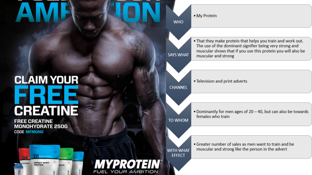
- QUANTITIVE:
- – Social class: Of all class – Middle and upper, but targeted mainly at middle
- – Income: Stable/ upper amounts – they’re a premium price so are targeted at more stable and higher amounts of income of people
- – Education: A above average education. A good understanding of the human body and what certain protein products do for you and your training
- – Target consumer: Adults who are aiming to become more physically fit, as well as being targeted at body builders and people who also aim to gain and produce muscle mass and/or burn fat
- QUALITATIVE:
- – The aspirer: Motivated by esteem and status, they want to be viewed and watched by others through their hard work in training. The training creates esteem for the user.
- – The succeeder: They are motivated by control, control in their lifestyle and health. They possess high self-confidence and a heavy goal-orientation.
Video Game design Cover
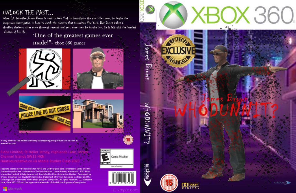
Game Cover

CSP 1&2 TOMB RAIDER AND METRIOD- NATASHA

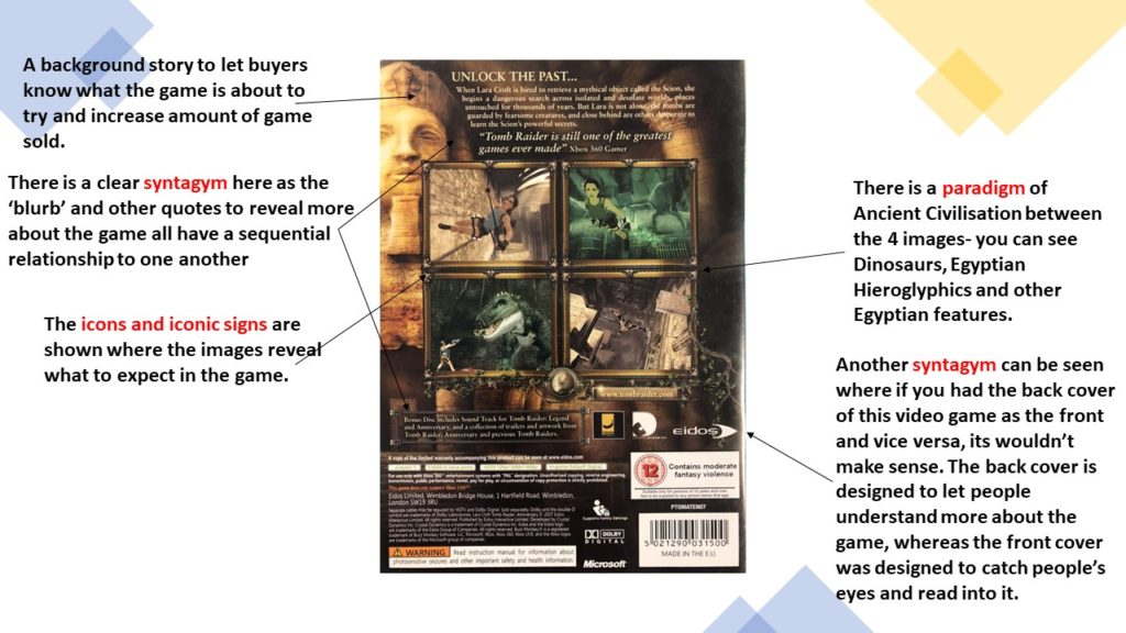

Video game design
- My intent for my product is to make an all inclusive game for people of the age of 15 and above. My game is about a detective who has moved from LA to New York to sort out the latest case; a serial killer on the loose. As the game progresses each clue reveals that the killer is actually another version of the detective (who has DID) and each morning he forgets the previous night. The game ends where he’s faced with the big decision of handing himself in or running away whilst he can. The cover I’m taking inspiration from is Tomb Raider.
- The dominant signifier will be similar with the main character being the centre of the cover. He is the main protagonist and his name is also included in the title. At the top of the front cover I have a masthead of the Xbox 360 banner to show what kind of console this video game it is used for. My cover has bright purple colours whilst the style model I’m following (tomb raider) has a bright gold, this makes the game look so much more enticing and encourages customers to buy this product. The main title has the same layout as my style model in the sense that the writing is over the dominant signifier and written in a font which corelates to the story line. F or my back cover I have written a blurb, which is my anchorage, to give context of what the games about but I’ve also left enough details out that it interests the consumer to buy the game to then play it. To make my product more realistic I’ve included a barcode (code) and some company logos, as well as the games rights on the back.
- My Games cover is reactionary in the sense that a male plays the main character and he is in the centre of the cover, however my game could also be considered radical because the game is about a quest but with no female character playing a damsel in distress nor using her as a trophy. The game is simply about the main character and his discoveries which end up being about himself and only rarely involving other characters. It could also be considered radical in the sense that the main colour of the background is pink/purple which aren’t typically seen as a manly colour and would often be associated with a female character.
- My product would be made by big companies such as Xbox, PlayStation, Nintendo. It would be consumed by audiences of 15 and above as the plotline is for more mature audiences.
Key language:
Semiotics
- Sign – Something that stands for something else
- Code – An object that signifies something.
- Convention – The way of doing something that is accepted by the majority
- Dominant Signifier – The main representative
- Anchorage – Text with an image to provide context
Ferdinand de Saussure:
- Signifier – The object itself
- Signified – The meaning in the object
C S Pierce:
- Icon – the thing that looks like the object but is not the actual object (eg. A picture of a cat)
- Index – the thing that has a link to the object, this may be coming from the object itself or something else. (eg. A campfires smoke, the smoke is coming from the campfire)
- Symbol – Signs that is understood as representing an object, idea or relationship.
Roland Barthes:
- Signification – The process of constructing meaning the from the sign itself.
- Denotation – The first level of analysis (what the person can see)
- Connotation – The meanings or associations we have with the image
- Myth – Information that is being told with assets which may differ the way you view it from reality of the information
- Ideology – To grasp the idea between relation and power
- radical – something that goes against people thoughts and ideas (eg. driving through a red light is normal)
- reactionary – something that everyone accepts (eg. like the fact that you should stop at a red light)
- Paradigm – A typical sign or ideal of something in a collection.
- Syntagm – Where objects have relations symbolic of each other in a sequence
SUmmer task
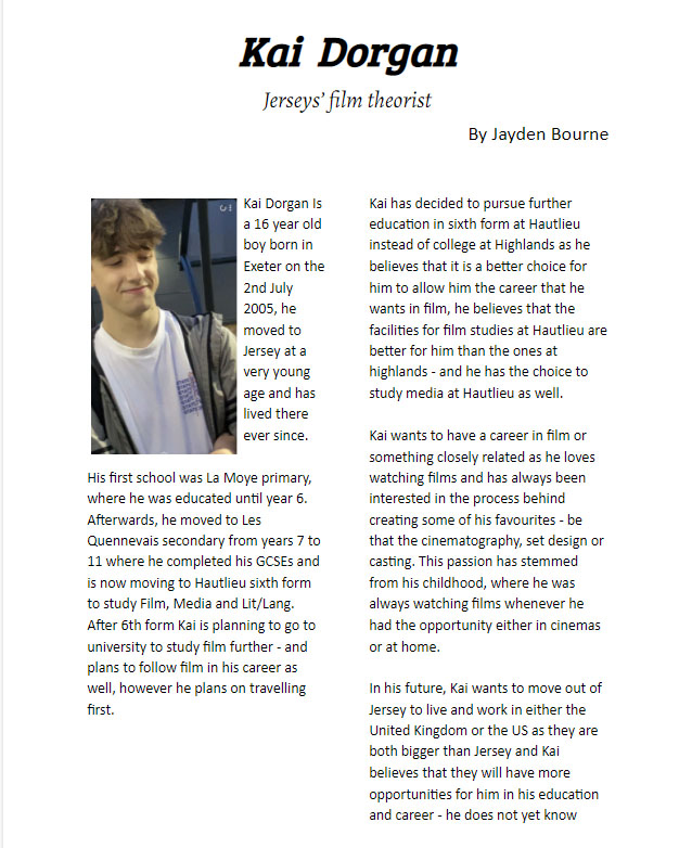
Induction task evaluation
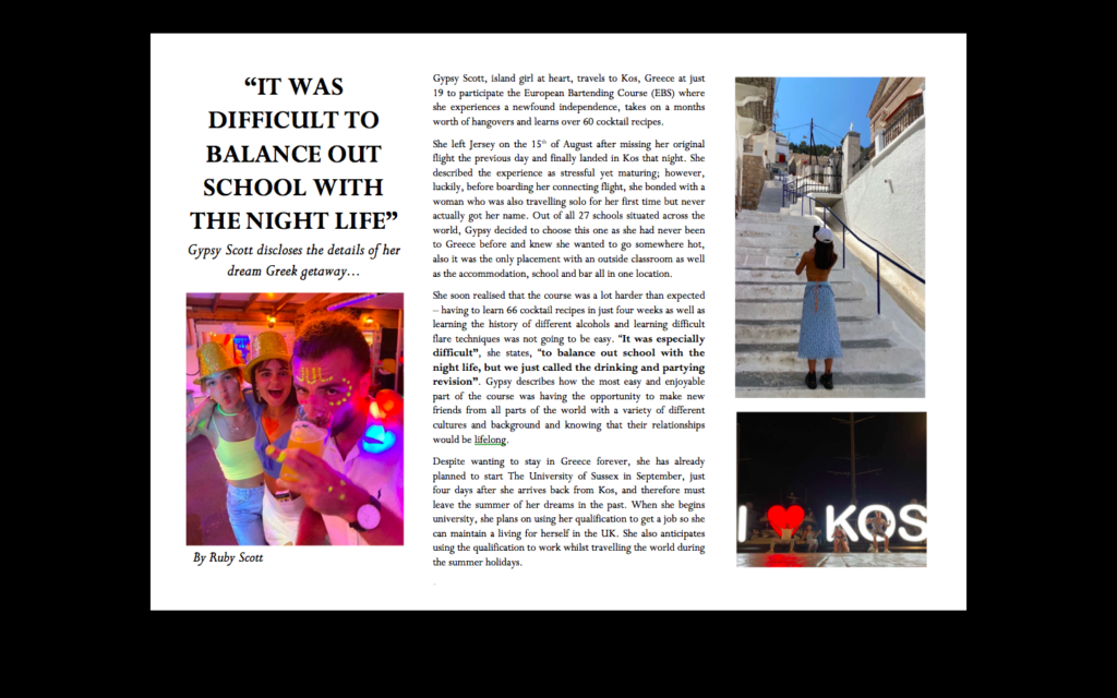
In my summer task, my intention was to recreate an article from a travel magazine. I did this by interviewing someone who was a less experienced traveller in order to capture the reality of travelling and that whilst it is very stressful, anyone is capable enough to get through it.
The language I used to distinguish my work from any other media form was heavily influenced by the ‘pyramid writing structure’; I began with a ‘lead’ where I quoted the most interesting part of the interview, next I wrote the ‘nut graph’ where I summarised who the interview was about and what I would be interviewing her etc., I then finished with the body where I described the interviewees trip in detail. I added
My article challenges the traditional teenage stereotype as, despite the common cliche that teenagers are incapable and constrained, my interviewee, at just 19, was able to travel alone and provided for herself for an entire month.
For my product, I anticipated that a mainstream travel magazine, such as the Sunday Times Travel Magazine, would publish my article as I was aiming for a more middle-upper class audience as the place in which I was talking about, Kos, Greece, doesn’t tend to be an extremely expensive place to accommodate yourself.
I am very happy with my finished product and although I love the simplicity of the layout, since starting the course I have become more familiar with photoshop and could therefore use it to improve my work by making it more visually exciting. I could use it to create a more colourful and lively or to arrange the text into a more abstract manner for example by warping it.
