Category Archives: Magazines

Filters

Author:
Category:

csp – magazine

Semiotics: how images signify cultural meanings

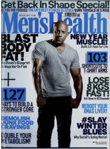
The dominant signifier (the actor Vin Diesel) in the image is the man stood in the front of the magazine, he is dominating the page and is the anchorage which more directly relates to the masthead which illustrates the message of the magazine which is ‘Men’s Health’. The use of a famous actor as the dominant signifier is used as a method to sell more magazines as a way for the target audience to trust the message of the magazine greater. There is a large syntagm of indexical signs, phrases and subheadings all following a theme of unrealistic conventions of health and how to lose weight.

The use of the dominant colouring of blue followed by headings such as ‘Best fitness classes for men’ shows a clear male target audience. The media naturalises ideas through repetition meaning the repeated use of similar phrases and themes of fitness is obviously the focal point of the magazine.

When evaluating the magazine it can be assessed that it follows a reactionary view. This is because when the magazine was made (early 2017) there was a more shallow and elementary view on fitness so it illustrates a conventional view on health for the time. But when applying more modern views on fitness and health, it may be considered a negative radical field due to the statements such as ‘103 shortcuts to t-shirt arms’, this radical statement dehumanises men, constructing a fabricated view on the male body as a method of control within media and to comprehensively sell more products.

Constructed identity:

  • The goal of this media product, a men’s magazine, is to generate a profit. So depending on the audiences the magazines identity will change, it will bend and appeal to the majority as a method of control. It will create a narrative that is most appealing to them, in this case, a narrative of toxic masculinity and a basis of the ‘cool man’ to push their men’s health ideas.

Lasswell’s model of comms:

  • Active vs passive consumption’s
  • WHO? The parent company, Hearst Communications UK, creators of the magazine specifically the main editor Morgan Rees
  • SAYS WHAT? Men’s Health and how to become stronger and lose weight etc, various other messages also
  • IN WHICH CHANNEL? Print, online, social media
  • TO WHOM? The target audience of the magazine, younger impressional men, and magazine subscribers. Men specifically interested in health and exercise, active adventurous people. 70% of all Millennials and 69% of all Gen Z over the age of 18
  • WITH WHAT EFFECT? Profit. Inspirational, perhaps aggressive.

Lazarsfeld 2 step flow of comms:

  • Use of opinion leaders in media products help as a theme of control and reinforcement, such as in ‘Men’s Health’, there is a dominant signifier of Vin Diesel on the front, a famous actor who is used as a tool for promotion, using him to endorse their ideas and products, it opens up to the consumer and the general public as a method of active consumption.
  • Page 6-7, use of the ‘Man of today’, an opinion leader used to sell a product (Hugo Boss aftershave) to the masses is a prime example of the 2 step model.
This image has an empty alt attribute; its file name is mens-health-contents-page.jpg
This image has an empty alt attribute; its file name is mens-health-article.jpg

The school of life produced a video called ‘How To Be A Man’, while this is not an academic theory, it nevertheless presents 2 versions of masculinity, the ‘Warm Man’ and the ‘Cool Man’. It is possible to identify these 2 versions in Men’s Health, thus supporting Gauntlett’s notion of fluid, negotiated and constructive identity.

For example, on page 1, (the front cover) there is a dominant signifier which is an example of constructed reality, the ‘Cool Man’, he is edited and surrounded by a paradigm of phrases and headings labelling items on how to become a ‘real man’ essentially. In reality, it does not matter what you do, these things do not make you more or less of a man, therefore supporting ideas of Gauntlett of constructed reality.

Statistics on Men’s Health Magazine: January to December 2021 and other statistics

89,811
CIRCULATION
(AVERAGE PER ISSUE)

  • Owner: Hearst UK
  • 74% of the years circulation is physical print copies, whereas 26% is digital copies.
  • Basic cover price = £4.50
  • UK annual subscription rate = £36.99
  • 10 made per year usually
  • On average, 5% of all Paid Single Copies during the period were multipacked with ‘Runner’s World’
  • Private limited company, meaning shares can not be bought on the stock market
  • Hearst owns newspapers, magazines, television channels, and television stations, including the San Francisco Chronicle, the Houston Chronicle, Cosmopolitan and Esquire.
  • Hearst UK reveals plunging revenue and £13.4m loss in Covid-hit 2020
  • Despite an 18% drop in revenue to £115.9m, the company  managed costs without using the Government’s job retention scheme, increasing its gross margin from 45% to 46%.
  • This year (after the 2020 results period) it made up to a fifth of its staff redundant, closed Town & Country UK magazine and sold the Net Doctor website.

PAID MULTIPLE COPIES:

  • Airports / airlines / international rail = 42
  • Trains / other travel points = 4
  • Leisure centres / club = 28
  • Hotels = 213 – Majority of the multiple copies payables is by hotels

Audience:

Has an audience of more than 165 million readers and site visitors, direct engagement with 70% of all Millennials and 69% of all Gen Z over the age of 18

Women’s Health Magazine:

  • Owned also by Hearst UK
  • Shows a reactionary view on women, the magazines covers have women with less clothing on compared to the men’s magazine it seems.
  • 1.6 million. social media followers

Market:

  • MARKET SHARE: 5.07% – They are not the dominating force of major magazine publishers based on combined annual circulation of consumer titles in the United Kingdom as of January 2020
  • Bauer Media is the leading force in the market with a market share of 27.7%, much larger than Hearst UK

– Laura Mulvey: The Male Gaze

Lazarsfeld – two-step flow of communication model hypothesizes that ideas flow from mass media to opinion leaders, and from them, to a wider population

Page 6-7, use of the ‘Man of today’, an opinion leader used to sell a product (Hugo Boss aftershave) to the masses is a prime example of the 2 step model.

WHO? The parent company, Hearst Communications UK, creators of the magazine specifically the main editor Morgan Rees
SAYS WHAT? Men’s Health and how to become stronger and lose weight etc, various other messages also
IN WHICH CHANNEL? Print, online, social media
TO WHOM? The target audience of the magazine, younger impressional men, and magazine subscribers. Men specifically interested in health and exercise, active adventurous people. 70% of all Millennials and 69% of all Gen Z over the age of 18
WITH WHAT EFFECT? Profit. Inspirational, perhaps aggressive.

4 Things to write about in essay + Theories to mention

  1. Institution – who owns it
  2. Examples of specific pages
  3. Language, how it’s laid up, representation
  4. Audiences
  • 1. Owner: Hearst UK
  • 74% of the years circulation is physical print copies, whereas 26% is digital copies

CSP – MENS HEALTH

Men’s Health

  • January/ February 2017 Edition

Front Cover

  • Use of hashtag to link to social media and perhaps trying to access a younger demographic
  • Reactionary, stereotypical text colouring through the different shades of blues and black. A typical symbolic (arbitrary) sign of masculinity
  • Semantic field of power and strength, connoting to something that needs to be destroyed. – “Lose, Demolish, Slay, Blast, Burn, Detox, Reboot”
  • Alliteration and plosives through ‘blast body’
  • Stereotypical representation of masculinity through the man as the dominant signifier on the front cover. He seems strong, physically fit and physically intimidating which mirror the masculine traits often portrayed in the media -‘what defines a man’
  • Alpha male – Muscles, standing pose, perhaps an enhanced/ edited image – “not a true window into the world”
  • ‘Gender as performance’ – Judith Butler (Gender is constructed through a repeated set of actions, sex is a biological factor)

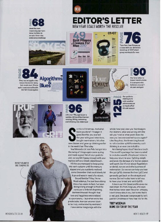
Contents Page

This image has an empty alt attribute; its file name is mens-health-contents-page.jpg
  • Links to online website ‘menshealth.co.uk’, perhaps encouraging readers to move online to view the magazine – Moving into the digital world of social media.
  • Reactionary representation of exercise, strength and fitness through links to articles within the magazine on the contents page. This is shown through image signifiers such as pictures of trainers, weights etc. Creating this unrealistic ideal that to be a ‘real’ man you must be physically at top performance. Although there is a radical representation through the inclusion of men of different ages and races.
  • Typical male characteristics displayed through linking to an article with a picture featuring spanners, lock and key, cogs etc. Perhaps, men are ‘meant’ to be good with construction etc.

Article (within magazine)

This image has an empty alt attribute; its file name is mens-health-article.jpg
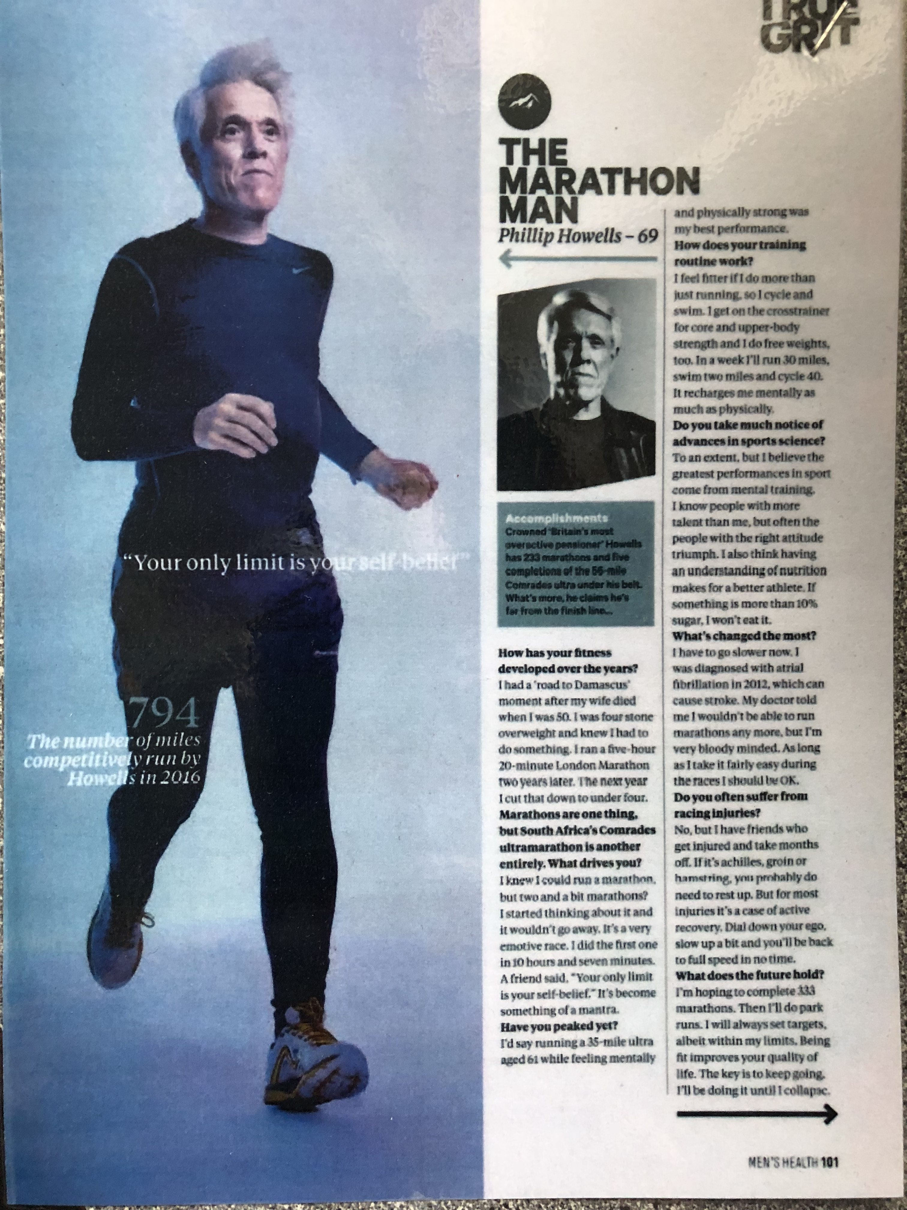
  • Main image of ‘The Marathon Man’ running.
  • Inclusion of a quotation from him – Motivation and drive – “Your only limit is your self-belief”
  • Q+A style interview signposted through bold font for question and different for answers.
  • Iconic sign of a arrow, clearly marking that he is the topic of the conversation.

Magazines CSP, MEN’S HEALTH

Paper 2 CSP:
Page 1:

Vin Diesel on Men’s Health magazine

Semiotics:

  1. Dominant signifier being Vin Diesel, we know this because he is the main focus within the first page, being the biggest and most outward object on the page.
  2. The title “Men’s Health” being indexical to men’s health and the gender performance of the male gender.
  3. The page is reactionary, supporting the typical view of strong, independent men.
  4. The syntagm of men’s gender performance and what men should be like. This suggestion is that men should be fit and strong with muscular developments. “Lose 8kg fast”, “127 ways to build a stronger core” “103 shortcuts to t-shirt arms”
  5. The title and Vin Diesel in the magazine provide anchorage that the magazine is targeted and made for men.

Representation:

  1. Gender is represented through the magazines choice of colours, the colour being an aggressive dark blue which can represent masculinity.
  2. The sub-title “Get Back in Shape Special” represents men and the typical stereotype that men are fit and strong.
  3. The model used (Vin Diesel) supports and promotes the idea of gender as a performance and fits the heterosexual gaze.
  4. The constructed identity of a typical man is represented on the front page, but also other pages. Firstly, Vin Diesel is seen to represent the typical male, being strong, fit and have a aggressive, alpha stance.


    Lazarfelds idea within men’s health:
    Vin Diesel represents the idea of a strong and fit man, therefore his supporters or followers are going to buy the magazine and follow its tips to try and end up looking like him, because its his idea and his opinion that says you should be fit and active, that’s why he is also fit and active himself.

    On page 6 -7 Gerard Butler can be seen as a model for the Boss aftershave “Intense”, the idea is that his supporters and people who follow him will look at this advert and think “he’s cool and he’s wearing that aftershave, so i should buy it to be cool like him”

    Page 2:
This image has an empty alt attribute; its file name is mens-health-contents-page.jpg

Semiotics:

  1. Icon – Vin diesel photograph in the bottom left
  2. Dominant signifier being the editors letter positioned in the bottom right, talking about new years resolutions.
  3. Anchorage being each photo posted with the page number it correlates to.
  4. The picture of Vin Diesel creates the strong male ideology.

Representation:

  1. The constructed identity of the Male gender is represented here through the selection and combination of images of vin diesel along with pictures of the other pages, some of these pages contain weights or running shoes, implying the stereotype of how men are fit and strong.
  2. The individual identity of different types of men, being the strong man (Vin Diesel) down the bottom left, the old man in the middle (True Grit) and the cool man also in the middle (Page 125).

The school of life released a video called how to be a man, while this is not an academic theory, it nevertheless presents two versions of masculinity, the warm man and the cool man. It is possible to identify these two versions in men’s health thus supporting David Gauntlets notion of Fluid, negotiated, constructive identity. For example, on page 125 you can see a calm and collected man who isn’t ridiculously built up and fit, however he is positioned to be inspirational and confident. This is the representation of the “Warm Man” who knows his anxiety’s and flaws, but makes the most of what he has and stays as he is, calm and relaxed. However on page 2, within the advert for Dolce and Gabbana, the male within that photo is seen to be strong and fit, fitting the typical constructed identity of a cool man. He’s holding a woman, and shirtless in the middle of the snowy cold Alpes, but he doesn’t care, he’s calm and relaxed, and confident within himself.

Media Industries (And Audiences)

Men’s health is owned by a company called “Hearst” which has business in the UK and US, it’s mainly based in New York and started after the Founder William Randolph Hearst took over his fathers newspaper, the “San Francisco Analyser”
Hearst is a media conglomerate owning 7 different companies,
Fitch Ratings – A Market analysis company
First Database – A pharmaceutical company
Hearst Television – Owns 34 different television channels.
A-E Networks – Multinational joint broadcasting company between Disney and Hearst.

Men’s health reaches on average 89,111 people in one year, this is through majority paid subscriptions to the magazine. However, per month in the UK it is seen that it reaches 708 men aged 15+ (study made from April 2019 to March 2020) which fits the targeted demographic group.

Hearst not only has men’s health, they also have woman’s health. Along with 10 other woman focused magazines, however only 1 for men.

Woman’s health reaches on average 96,350 people in one year, which is 7,239 more than men’s health. with 65,000 of them being monthly subscriptions which is 1000 less than men’s health. This supports the idea that the media conglomerate of Hearst is supporting and creating content for both genders and many different beliefs to maximise profits and followers.

Stuart hall in “Men’s Health”:

Page 12-13

Here we can see the creators idea that weightless, nutrition, health, fitness, style and muscle are the main things in your life to focus and produce upon. I could see how health fanatics and body building see that and agree with it because that the way they are and that’s what they focus on the most, however to someone like me I can agree that all of those things are very important but it shouldn’t be the be all and end all of your life, you should be with your family and friends, and focus on relationships rather than everything being for yourself and impressing others, however I can also see how someone who is unhealthy, sits at home eating takeaways constantly and is over weight would look at this page and completely disagree with it and continue on with their ideas of life rather than re-considering with these.

Magazines

This is an in-depth CSP and needs to be studied with reference to all four elements of the Theoretical Framework (Language, Representation, Industries, Audience) and all relevant contexts.

Print: Magazine. The magazine should be studied in depth – the front page and from inside, both the contents page and the one page article. If you wish to look at other areas of the magazine, look at the Jan/Feb 2017 edition. There is a digital version of the edition below, look at pages 17 and 101. The interview with Vin Diesel is pp 48-56. There is so much material to draw from this magazine, so be careful NOT to JUST FOCUS ON FRONT COVER as this will be a limited reading of this product.

You will also need to study the magazine looking beyond the specific edition to consider issues of ownership, production, funding, technologies and regulation (Media Industries) and targeting, marketing, sales and readership, audience interpretation, fulfilment, uses and gratifications ideas and theories (Media Audiences).

Media Language (the language of print)

Semiotics: how images signify cultural meanings

The magazine front cover and specified content should be analysed in terms of the composition of the images, positioning, layout, typography, language and mode of address etc. this will then provide detailed evidence for application of the other theoretical frameworks

Narrative and Genre

Genre theory ie Steve Neale

The cover and specified content can be analysed in the context of genre in terms of conventions of layout and composition – which will overlap with analysis of visual language – but also as part
of the genre of men’s health and lifestyle magazines.

Genre study would include an analysis of the conventions of magazine front covers – a study which would overlap with visual analysis and audience positioning. Students should extend their genre approach by analysing the conventions of content of the
magazine.

The genre conventions of the magazine cover will need to be studied. While narrative may be more familiar to students as an approach to apply to moving image forms, it can also be very
productively applied to print media as a way of examining audience targeting, positioning and interpretation.
• Consider the way the front cover creates a narrative about character and lifestyle in order to attract an audience
• The way in which the cover stories create enigma and anticipation for the reader – to be fulfilled by reading on.
• Narrative theory (Structuralism) including including Todorov, Lévi-Strauss

Task 1: Start by looking at the key theoretical frameworks of SEMIOTICS, PRINT LANGUAGE, NARRATIVE, GENRE & REPRESENTATION. As before, have a look at the products, front cover, contents page and article, and discuss in a small group as to whether you consider these to be RADICAL or REACTIONARY REPRESENTATIONS OF MASCULINITY, AGE, PHYSICAL AND MENTAL HEALTH AND . . . etc. Try to come up with 12 points in 12 minutes.

This image has an empty alt attribute; its file name is mens-health-front-cover.jpg
This image has an empty alt attribute; its file name is mens-health-contents-page.jpg
This image has an empty alt attribute; its file name is mens-health-article.jpg