Category Archives: Induction

Filters

Author:
Category:

Summer project EVALUATION- natasha RAWLEY

Statement of Intent

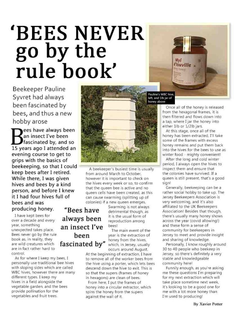
The intent of my summer task was to create a magazine interview that could be published in a Political Magazine or Lifestyle magazine. The reason behind me choosing a more political, job focused interview is because I found it interesting about how they got to the job position they’re at now, from GCSE subjects to future goals and meeting people that are well-known. I wanted to create an A3 spread that looked aesthetically pleasing but also allowed people to gain an understanding of a job in politics.

The colours, form, positioning and size clearly show that my summer project is an interview. The big, bold title with the easy-to-follow font allows readers to understand the overview of the interview but also lures them in with an exciting storyline so they carry on reading. I wanted to have a yellow boarder around the pictures because it gives a clean finish and makes it nice to look at, it also goes with the yellow theme.

In my interview, I decided to portray the interviewee [My cousin] as hard-working and clever, which is the typical stereotype of someone working in politics.

I think that my interview would be published by a magazine brand such as ‘Prima’ magazine, this is because as much as it is a political piece, it can be very interesting to the public eye to see how they got to the job they have now. The audience/target market would be middle aged women ages 30-60+. This is quite a large, broad and mainstream audience, as most people who read magazines are middle aged women.

When reflecting on my work, I would think about laying it out differently- having the interview in 2-3 columns instead of each topic having its own section. I would probably add in a drop cap and change the font to be more aesthetically pleasing. I believe that I have done well with creating my product because when you look at it, you already get a sense of what it is about and most people would want to read the entire interview just from looking at the title, which is what magazine companies want.

INDUCTION TASK – EVALUATION

I intended to create an informative interview to educate students who were deciding whether or not to go to university and wanted to find more about what the university experience was like. I wanted to create a aesthetically pleasing A4 page, whilst allowing it to contain lots of information.

My product included two different sections, one which was a light-hearted Q and A style interview, this ensured that the reader could get to know a bit about the interviewee’s personality before reading the full interview. I used harsh lines to section off the main interview, the bi-line and title. I used colours to complement the image that I included, however on reflection, I would have used more than one image that related more to my subject so that the majority of the page wasn’t just copy. I used a slightly larger title but, now, I would increase the size of the title and decrease the main copy text. This would be similar to a stereotypical magazine product.

The person I interviewed was my cousin, Nina, who had just received a first class degree in ‘Media and Communications’. I wanted to celebrate her hard work, dedication and success through the product. This representation is somewhat radical as it creates a countertype to a stereotypical young adult who often doesn’t really care or put enough effort into their education or contemplate their imminent future and decisions.

I created my product to be published in a Student magazine, perhaps a small, independent company, or a specific universities magazine. My magazine interview would most likely be written by student writers, talking about their own education experience and interviewing others regarding their own. The kind of audience that would consume my product is a range of students, probably at ages 16-23, who want to research into what university life would be like or those already studying who would like to hear about others and events happening on campus.

If I re-created this product, I would include a larger image and wrap my text around it. This would create a main focus to the magazine page. I would use a drop cap to add a bit of variety to my text, this would help to keep the reader engaged. I would increase the size of my title and reduce the size of my copy.

Summer Task evaluation

  1. I wrote my summer task as if it were for a local mechanics news/magazine, only really for people in Jersey that enjoy working with vehicles. I also wrote it to learn more about someone that I’m slowly becoming good friends with so that I can relate and speak to him about his past and current projects.
  2. Personally I based my project upon a online newspaper style, trying to use a bit of colour to grab attention when needed. I put the most important info at the top to keep the reader engaged and the less important info near the bottom. I also used two photos to show off Jerzy’s portfolio but also include one of the newspapers conversation topics, his bike(s).
  3. I made my summer work off of the idea of “supporting” as it supports the view and wanting of people in the local area helping out the community and those who don’t know as much. For example a local lesser known company could produce and sell these pieces. In addition to that I displayed Juicy as a positive character.
  4. A narrow, niche company that produce a small amount of pieces at a time that you have to either pay for in a store or subscribe to online for a new piece every month. So that the audience taking in the info about whoever or whatever it is will actually use and act on the information they have consumed.
  5. Personally I believe I could have made the text flow a little better and make the piece more visually appealing for readers. I also think that I could have made my pyramid scheme a little better as I left some of the vital info until the very end. However I believe I spoke well about my subject and covered all the point i wanted to about them.

induction task evaluation

In my summer task my main aim was figuring out a different perspective on friendship, I did this by asking a close friend multiple questions about her views and thoughts on particular situations involving friendship. I asked how she observes others in a friendship and how they present their friendship, also how she projects hers onto others and how its shown.

The language used in my interview was based in a Q and A format, I used a main image which captured our friendship and revolved my questions around that. I used colours and highlighted certain sentences to make them stand out more as they were more straight forward and short answered.

In this interview, friendship is portrayed as accepting and understandable whilst being trustworthy and respectable. My friend who I interviewed (Adora) is not a stereotypical teen as she gets involved with anything she can get her hands on which shows she is reactionary.

Induction task evaluation

SUMMER TASK: Write up the following in a single post. The aim is to link your summer task with the assessment criteria for your A level coursework (NEA):

  1. statement of intent (50-100 words)
  2. Media Language: “The way in which specific signs are put together for specific media forms” (codes, conventions, signs, elements of real print product – “things like colour, shape, size, positioning etc“). Put another way: how did if follow your style model? (50 – 100 words) (don’t forget your Pyramid writing structure!) (don’t forget graphical features!)
  3. Representation / content (use key language from Kahoot quiz) (50 – 100 words) – supporting or challenging dominant ideas ie radical / reactionary; stereotype / countertype, (“what is the advantages of using . . . “)
  4. What kind of company would make your product? What kind of audience would consume it? (50-100 words) (niche, mainstream, broad / narrow, conglomerate / indie)
  5. evaluation post, what would you do differently? what did you do well? (50-100 words)