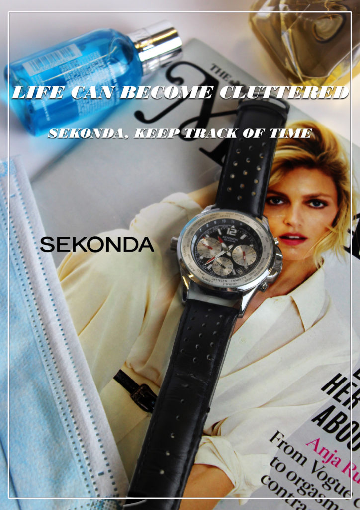
NEA: MODERN ADVERT


I intend to advertise a jewellery line. I will create two magazine print adverts, both with different representations in order to highlight how societal views on issues such as gender roles, social class and the LGBTQ+ community have evolved.
My reactionary representation, will resemble that of an old 1920s advert. the image will be faded and grainy to illustrate its age and how this representation is outdated. The dominant signifier will be a headshot of a woman wearing the necklace dressed in elegant, and sophisticated clothing which will signify that this product is aimed at female audiences of the upper class – supporting the conventional ideology at the time where typically only women wore jewellery – as well as their husbands who may want to buy this as a gift for their wives in the hopes it will make them look better presented. She will be represented through the eyes of the male gaze through the use of intimate body language and the iconic sign of a male’s hand reaching for her hand from the side of the shot reaching to administer this idea that the buyer will gain more male attention. The strap line will be ‘say nothing, just wear solitaire jewels’ creating anchorage for potential buyers as it insinuates that by wearing this product you will be able to attract anyone. My product will be sold by a designer company called Solitaire Jewels, similar to that of Tiffany & Co or Cartier, reinforcing the ideas that my high quality jewellery will be aimed at wealthier audiences, between the ages of 20 – 40.
My Radical representation will portray multiple images of both men and women wearing my product to contradict the dominant ideology that it is unconventional for men to wear jewellery. There will be three different images of each model wearing three different styles of clothing in order to illustrate that my product can be worn on any occasion with any style of clothing. The dominant signifier will of course be the necklaces around the neck of my models whose faces will be outlined and filled in with a block colour to symbolise that no matter your gender, sexuality, nationality, race you can wear this necklace. I will edit in iconic signs of the product also draping from the top of the shot to create a more pleasing and busy image. My product will be sold by a luxurious yet affordable brand called Ubiquitous Charms, similar to Oma the Label or Baublebar, so that it is accessible to anyone of any income and will be aimed towards people aged 16 to 30 however the style of jewellery is made to suit anyone.
The product I am advertising is Lush’s ‘Rosy Cheeks’ face mask. I am using fellow student Kate McKenna as the face of my brand. In both adverts, I will take on a reactionary stance, which fits in with the ideals of the era in which the adverts supposedly take place in.
In my first (modern) advert, my target audience will be women aged 12-25, who are looking to get smoother, glowing skin on their faces. The aim of this advert will primarily be emphasising the positive qualities of my product through a clean, pretty aesthetic and informative description. The adverts colour palette will mostly consist of pink / nude shades because these colours are usually associated with love, kindness, calmness, and femininity. I will apply this by using a pinkish background, and by dressing my dominant signifier/face of the brand (Kate McKenna) in pinky colours. I also photoshopped a pearl earing onto her ear. Pearl earrings are a symbol of class and riches, and so by including one in my advert, it suggests to the audience that the product is a luxury one. It also makes the advert look prettier. Furthermore, I used photoshop extremely liberally in this advert (see my post titled ‘BEFORE / AFTER PHOTOSHOP‘). I smoothed out Kate’s skin, took away any moles, spots, and blemishes, thickened out her eyebrows, lightened her skin, coloured in her eyes to make them bluer, took away her eye bags, made her skin lighter / clearer, and filled in her lips to make them thicker, redder, and a more idealised shape. In my view, adverts shouldn’t use photoshop at all, and to me, Kate looked just as (if not more) beautiful in the unedited picture of her. However, as almost all adverts (especially skincare ads) use photoshop to make their product look more appealing to their target audience, it is essential that I use photoshop in order to fit in with the ‘reactionary’ stance I decided to take with my ad. The main selling point of the product will be the soothing, calming influence it has on the skin. The tagline (indexical sign) will be “give your skin the love it deserves”. This reinforces the calm, kind, and loving feel (the anchorage) of the product which I’ve tried to connote. My style model is unfortunately a landscape ad (I am required to do mine portrait) and so I will be taking most of my influence from the adverts ‘feel’ rather than its layout. The most obvious way that I’ve taken influence from my style model is by using a flower as part of my backdrop. The type of flower I decided to use was a rose because the name of my product is ‘rosy cheeks’, and a pretty pink flower connotes feelings such as love, kindness, calmness, and femininity. Also, the font I used on the company and product name (‘Lush’ and ‘Rosy Cheeks’) is slightly similar to that of my style model, and it connotes a luxury, posh feel. Finally, I directed Kate to use a pose that slightly resembles the pose Kate Winslet uses in my style model (head turned slightly to the right with a natural – but elegant – expression). I differed from my style model by placing Kate smack bang in the middle of my advert. I did this because I want the audience to immediately be drawn to Kate’s face because that is the dominant signifier of my advert. Hopefully, Kate’s beauty and clear skin will attract the attention of the target audience, who will likely yearn to have skin as clear and beautiful as hers.
In my 60s era advert, my marketing strategy will be slightly different. Instead of targeting strictly women aged 12-25, my target audience will be women and men aged 18-35 (however the advert will be directed towards women). In this advert, I followed my style model much more strictly. The theme of the advert will again be reactionary (for the time period). The reactionary stance of my advert is most clear in my slogan – “Give your man a face he wants to touch”. This slogan suggests to the target audience that she needs to use this product, to appeal to the sexual desire of men. Degrading slogans such as this one were extremely common in advertising during the 60s, and so it is important that I made my slogan creepy and politically incorrect (by modern standards). My picture will follow the same theme as my slogan, as I will have a man (me) caressing a woman’s face (Kate). This is extremely similar to my style model, which also pictures a man touching a women’s face in a loving manner. However, one area in which the two pictures are different is that in my advert Kate is looking towards the camera, whereas in the 60s advert the woman is looking at the man. I made this change because I believe that by having Kate look at the camera, the passive viewer of the advert will be more interested in the product. I again matched my style model through the use of colour, with the dominant signifier of the advert (the picture of me and Kate) appearing in black and white, and the banner at the bottom of the screen appearing in a creamy white colour. The dark colour palette of the advert connotes a dark, sexy vibe, which captures the viewer’s attention and creates feelings of passion and energy.
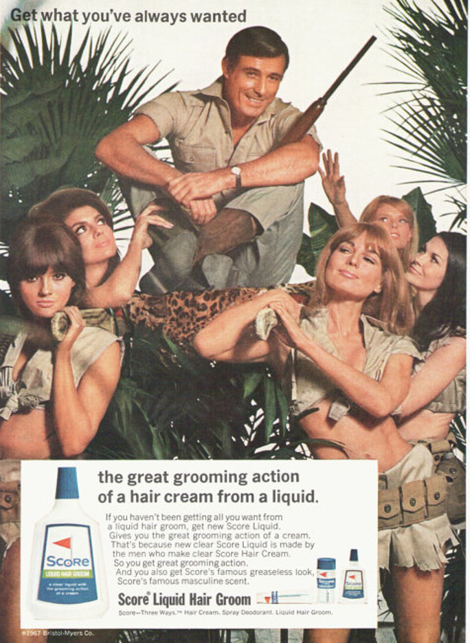
1967 advertisement.
Male directed as mentions the ‘Scores famous masculine scent’. The advert sexualises women as they are wearing tight revealing clothes. Sexist approach of the male being ‘admired’ by females around him.
Similarly, feminist critical thought became much more prominent and pronounced during the counter cultural movements of the late 1960’s and early 1970’s, which heralded, among other changes a greater acceptance of birth control and divorce, abortion and homosexuality.
There was also the abolition of hanging and theatre censorship, and the Obscene Publications Act (1959) which led to the Chatterly trial. Nevertheless, as Johnathon Dollimore wrote: ‘all this should not be seen as a straightforward displacement of dominant conservative attitudes‘ (1983:59).
The Score advert was produced in the year of decriminalisation of homosexuality and as such, the representation of heterosexuality could be read as signalling more anxiety than might first appear. The reference to colonialist values can also be linked to social and cultural contexts of the ending of Empire.
I intent my product to be seen in two different views and ideologies. First my advert will contain a modern approach set as a reactionary view of men, that all men wish to be manly and want to be strong and have muscles. It will be a target market of 18 – 45, young adult to older men who wish to be fit and stereotypically attractive to women. On the other hand, the second advert will be a radical view in the sense that the dominant signifier will be a female based in an earlier era such as the 60’s and the whole idea will be based around that woman can work out and be strong and muscular too.
In the first advert, it will be a sort of personal attack and a bit degrading in a sense, like modern advertising now. I will be using methods to subtly manipulate the target audience to believing that they need the protein powder to be fit and muscular as well as instilling a toxic ideology that all men want to be strong to also be stereotypically attractive to women. To generate more sales, the dominant signifier, a man will wear a fake muscular outfit with the idea that you don’t need to fake it, you can be it, by buying the “my protein” product. I’ve recently tired to portray this by using certain features in the advert such as a indexical sign that stands out to say something along the lines of “Build more muscle now!” and other symbols to try to steer the customer to buy the product and assure that this is what they want. The main object, being the protein will be held by the main subject in the ad who is also the dominant signifier, or instead placed in front of the flash lighting with soft boxes, it will create a professional image for the protein to created a signified field. It will attain a negative stereotype that all men want to be muscular, this follows the ideas of the score SCP that the man can get what he’s “always wanted”. The ad is trying to construct an identity amongst the market for everyone to fit and healthy and the only way to do so is to consume protein powder, it doesn’t promote exercise itself, just promotes the protein powder itself. There will be an anchorage with the indexical sign and tagline “It doesn’t have to be fake, it can be real” with the idea that the dominant signifier and the customer will be ashamed with their appearance and will want to be big and muscular. The image of the anchor will be the dominant signifier. The denotation of the ad will be to obviously generate more sales for my product as if it were a real product to be sold. I will be trying to professionally recreate and generate my own ideas for an advertisement with both radical and reactionary ideas. I will be bringing my own protein powder to be used in the ad as well as sporty clothing and something to substitute for the reactionary idea of men wanting to be strong. I followed the style model by following the ideas of the very muscular man pared with the protein in a syntagm to show that the protein powder helps the man become very strong. A health and fitness company would make my product in order to sell to the large market. This is directly related to the company in the style model “My Protein”.
On the other hand, we have the second ad that will be based on radical ideas. It will be a female, perhaps based in the 60’s/70’s, an era where woman were subjects to sexism and degrading advertising in a voyeuristic manner to take advantage of the male gaze to produce more sales. However, my ad will be a radical representation as the female will not be sexualised at all and will follow an idea that women can be strong and muscular too. This is a counter-stereotype to oppose ideas that women are below men and cannot do what men can do. I will do this by getting a female in non-sexualised clothing who looks serious and strong whilst holding the protein, the idea is that the female is very serious about the idea of fitness and becoming strong also, which is a clear radical idea, specifically in the era the ad will be held in, this all fits to be a syntagm. The audience of this advert will be women who wish to be strong and muscular also and to be respected and feared, to oppose to typical social constructs. In a sense the ad is a rebellion for women to break out of the sexist society of the era.
I intend to create two print adverts to promote a “Jimmy Choo” perfume, both with different representations; radical and reactionary. I imagine these adverts to be professionally printed in beauty catalogues/magazines such as Vogue. I will include iconic signifiers displaying the products, a dominant signifier of the model’s back profile in a mirror, anchorage to provide information about the product and indexical signs that sell the product based on feelings.
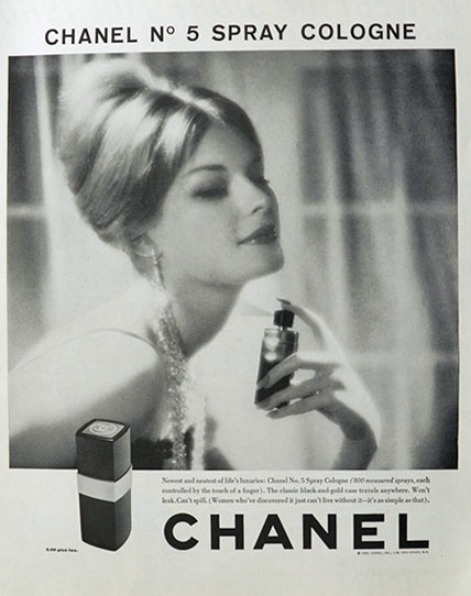
The reactionary product will be set in the 1960’s historical period. My model will be facing the camera and holding the perfume in her hand and spraying it onto her neck to make her seem even more attractive. She will be wearing a dress to represent her wealth and glamour which will be associated with the perfume. This links to the “Male Gaze” as as she will look expensive and attractive and her clothes will be planting the seed that her purpose is to attract men which is a reactionary representation of women as they are believed to be designed at a males disposal. my slogan is going to be “you’re not the same, be different” this gives the impression that by using this product you are of more worth and special; better then other women who are not using this perfume. This will go for both my adverts but convey different meanings based on the images. I intend for an older audience to buy this product ranging from the ages 25-45. This is designed for heterosexual women who are of an upper class who believe their wealth, desire and ability to pleasure men will come from buying this product.
My radical product will be a modern version. This will include my model’s face and and front profile. She will be wearing a suit which is quite controversial and challenges the dominant ideology of what stereotype women are usually seen wearing, to juxtapose ‘societal gender norms’. Also raising awareness that clothing is expressive meaning people should be able to wear what they feel comfortable in. This perfume is being used to advertise this which gives the connotation that it will give people the confidence to be themselves and be bold. The slogan is going to be “you’re not the same so be different” the “so” changes the meaning to embracing the differences within people in a healthy way rather then putting others down. I intend for an audience ranging from (18-45) to buy this product. Its designed for bold women who are learning to embrace themselves, the kind of women that inspire other women to be the better version of themselves; creating a positive and diverse representation of what it means to be a woman and femininity.
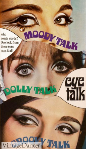
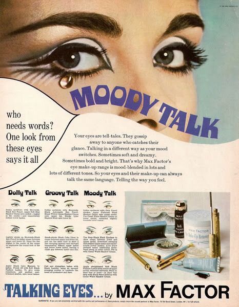
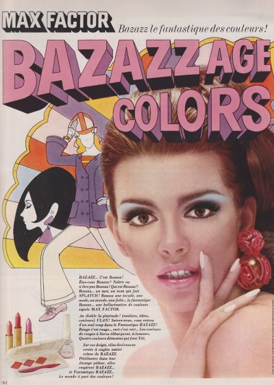
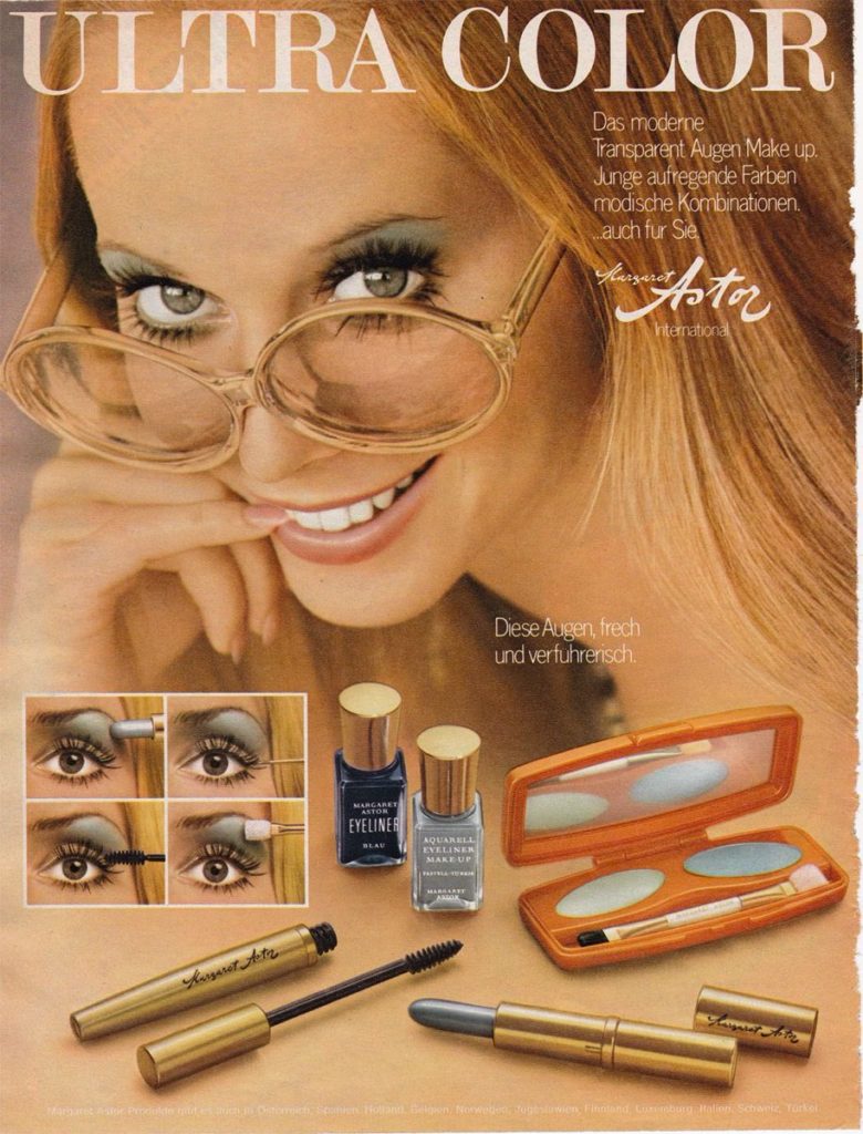
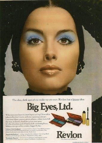
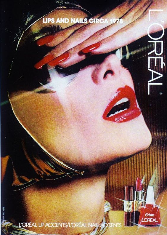
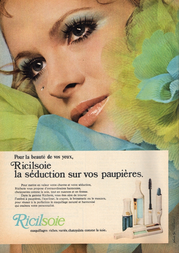
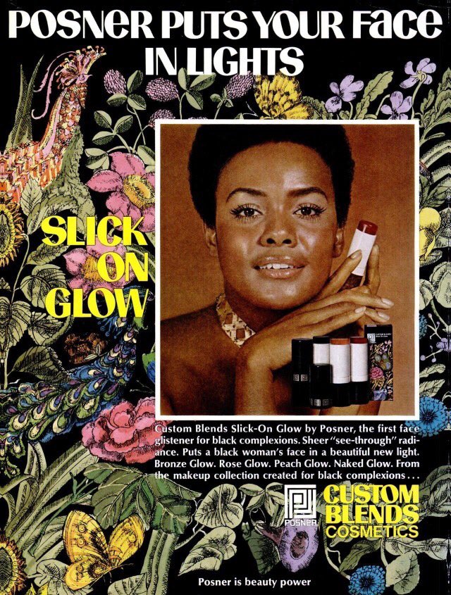
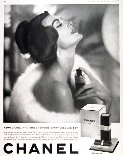
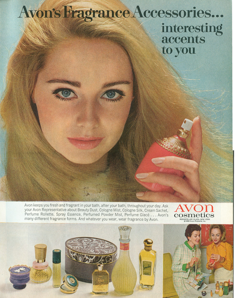
I intend to create an advert for the Rimmel London product ‘Wonder Ink’ Eyeliner. I will produce two adverts- a reactionary, modern piece and then an ‘Old-Style’, Radical piece. To achieve this, I will use a female wearing the eyeliner in an up-to-date way for the modern advert. A way in which it makes this reactionary is the fact I am using the stereotypical gender seen in beauty adverts with an up-to-date eyeliner look which will allow the audience to relate more. I will use a male wearing the eyeliner in a 70’s way to emphasise the era I am setting it in. A way in which it makes this radical is the fact that I am using a male to wear the eyeliner. In modern day beauty cosmetic adverts, males are still not being included, so to really accentuate this, I thought it would be clever to use a male for the old-fashioned advert, as typically, males wearing makeup was usually frowned upon in the 70s.
My target market for the product I am advertising are typically women but anybody who is interested in makeup between ages 17-30. The product can also be worn anywhere, so people who enjoy going to concerts and festivals or just simply want to wear the eyeliner for whatever reason would purchase it.
For my reactionary and contemporary advertisement, I am taking inspiration from a style model while still putting my own twist on it. I liked the idea of having the page split into two to three segments to show off the eyeliner on the model, the model having fun (to show off the fact that if you wear the eyeliner you will have a fun time), and the product itself, which is the dominant signifier. These are the iconic signs that will show off the product. Copying a few style models, I really liked the idea of having a swirl/twist around the eyeliner pen to show it off and have it come across as cool. I also saw from one style model that the eyeliner had ‘written’ the slogan, so I thought it would be nice to add that iconic sign in. For my radical and historical advertisement, I am taking inspiration again, from my style model. I intend on
I will be including representations of gender inclusive products and gender inclusive beauty adverts, allowing more people to buy the product. I will also be including representations of ‘having fun if you wear the eyeliner’ and ‘it will make you much happier’.
The type of company that would make my product would be Rimmel London as that is the brand of the product I am advertising, but any other makeup brands such as Maybelline and L’Oreal Paris. This is because these are all typical beauty brands. When I make my advert, I intend on using style models from these brands (L’Oreal, Maybelline, Rimmel London etc) to make this more realistic.
I intend to create 2 print adverts, one will be contemporary and reactionary and the other one will be radical. My product is going to be a perfume. My perfume will be aimed at women aged between 18-45. My product will be leaning more towards high end but still not quite there. The aim of the two adverts is to sell the perfume.
For my contemporary advert, my model will be wearing her prom dress with a brown fur coat to give an elegant look which will encourage the customers to want to buy the perfume as the advert will convince them to want to look as good as the model does. The main model photo will have a shadow behind her elongating her figure upwards to make her appear taller. The fur coat will drape over her shoulders revealing her shoulder with the one single trap that is embellished. Her hair, skin and coat all have similar colour palette with the the neutral and goldish tones.
The dominant signifier of the advert will be the perfume but I also want the customers to notice the female model dressed nicely. I will put a translucent image of my product on the bottom left of the image. That product imagine will have a black fur texture which will be overlayed the main model image.
The female model will be represented in a reactionary way for my contemporary advert. The advert should be positive as it will be positive and pleasing to look at.
sign, connotation, signified, icon, index, symbol, anchorage, ideology, denotation.
voyeurism, male gaze, patriarchy, mis representation, constructed reality,
david gaunttlett – fluidity of identity, negotiated identity, collective identity, constructed identity.
shannon and weaver, uses and gratifications, hierarchy, psychographic profiles.
For my print adverts I plan to advertise a can of deodorant. I will create two adverts, with one version being much more modernised and reactionary, and another being one which you would encounter a fairly long time ago, being more traditional and radical. Taken together, these adverts will show the contrasting features of traditional adverts compared to contemporary, more modern ones.
For the contemporary (new) advert, the dominant signifier will exhibit a more confident and dominant pose and wearing more realistic, modern clothes, relating to the idea of the “cool man” and appearing in a conventional way to show the product off. I will also include a sleek, non-obtrusive background, adding to the more modern approach to the product and to promote values of modest beauty. The symbolic sign of the text will be more polished, adding to the cool and trendy connotations that the product gives off. The planned audience positioning here is that younger, more impressionable young men will show a positive reaction to the product, and want to buy it after seeing how calm and collected the dominant signifier is, and thus they would be provided with a role model to aspire to. This would lead to a constructed identity as described by David Gauntlett of self-esteem upon buying and using the product, which I believe is a rather positive idea. A potential downside to this however is the chance that this could be relating to voyeurism and patriarchy, particularly if the theory of errors in encoding/decoding messages as described by Shannon and Weaver comes into effect. I think that this type of advert would be produced by a company selling beauty products at a professional standard, trying to coerce impressionable young people into buying their products.
For my traditional (older) style of advert, the dominant signifier will be wearing more traditional clothing and be wearing a wig, which gives connotations of wildness. In addition, the iconic signs, being the images of the product itself, will use more clashing colours. I will also include an indexical signifier which is random and arbitrary, similar to that which you would find in a comic, labelling the product as new and adding to the theme of wild ambition. This will represent the deodorant in a more radical way, suggesting that the model doesn’t care as much about how he looks or what he smells like, while still encouraging the consumer to purchase the product because of the idea that they will want to obtain the self-confidence, which the advert gives off, for themselves. I think that the target audience who would consume this is an older demographic than the modern advert, because the style is obviously from some time ago. This means that a wider age bracket would be interested in buying the product, although that audience is likely to be less impressionable. I think that the institution likely to be creating an advert like this is one which was formed a fair amount of time ago, selling products that could perhaps be considered a tad outdated nowadays, however they would clearly still know how to find their target audience effectively and consequently sell a fair amount of products.