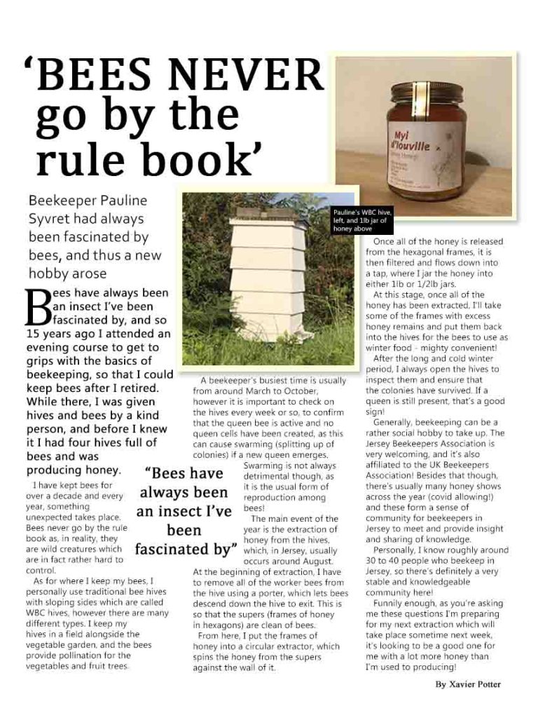
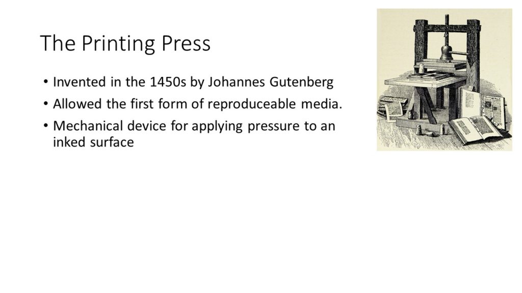
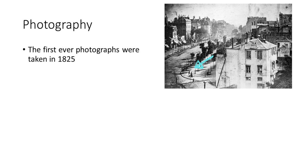
For my Summer Task, my intentions were to communicate how interesting one of my grandmother’s hobbies is (beekeeping) and offer insight into what goes into it. One of my further potential goals was to make people even consider taking up beekeeping for themselves! I wanted the article to read well, be easy to consume and present an out of the box subject in an understandable way.
My summer task followed my style model in various ways, such as using similar headlines, subtitles and font layout (columns). Additionally, I used shapes, pictures and an in-line quote and laid them out in a way similar to that of the style model I attempted to follow. I also paid close attention to font style, size and position, changed various colours and used a drop cap to show exactly where the article started.
In my opinion, my article was reactionary as it went along with what most would consider normal, stereotypical beekeeping processes. It added insight into these, leading to a more involved understanding of what would occur if you were a beekeeper yourself, and it in my opinion presents a positive viewpoint on beekeeping.
I think that my article would be created by a local company and that it would be shown in local newspapers, or perhaps a few magazines. I think that the audience would be relatively broad, however it would probably be focused on an older demographic. It’d be consumed by everyday people looking for an interesting topic to casually read about.
I think that I did well regarding the layout and readability of my article, with a good focus on how to present the elements of my article as well as information clearly. However, I should have asked permission to include a picture of the person I was interviewing, and perhaps implemented a more interesting background rather than the plain white to make it more interesting to look at and make it more eye catching.


