The Leveson Review was a judicial public inquiry into the British press’s culture, practices, and ethics. This came after the phone hacking scandal at News International. In November 2012, the Leveson report was released, which examined the culture and ethics of the press and presented proposals for a new body to replace the existing Press Complaints Commission. The inquiry’s full terms of reference were released in July 2011, along with a six-person panel. Sir David Bell (former chairman of the Financial Times), Shami Chakrabarti (director of Liberty), Lord Currie (former Ofcom director), Elinor Goodman (former political editor of Channel 4 News), George Jones (former political editor of the Daily Telegraph), and Sir Paul Scott-Lee QPM (former Chief Constable of the West Midlands Police) were among those in attendance. The overall cost of the Leveson inquiry, according to a response published in 2013, was £5.4 million.
All posts by Xavier Potter
Filters
NEA: Traditional Advert

NEA: Modern Advert

Advertising NEA – Statement of Intent
For my print adverts I plan to advertise a can of deodorant. I will create two adverts, with one version being much more modernised and reactionary, and another being one which you would encounter a fairly long time ago, being more traditional and radical. Taken together, these adverts will show the contrasting features of traditional adverts compared to contemporary, more modern ones.
For the contemporary (new) advert, the dominant signifier will exhibit a more confident and dominant pose and wearing more realistic, modern clothes, relating to the idea of the “cool man” and appearing in a conventional way to show the product off. I will also include a sleek, non-obtrusive background, adding to the more modern approach to the product and to promote values of modest beauty. The symbolic sign of the text will be more polished, adding to the cool and trendy connotations that the product gives off. The planned audience positioning here is that younger, more impressionable young men will show a positive reaction to the product, and want to buy it after seeing how calm and collected the dominant signifier is, and thus they would be provided with a role model to aspire to. This would lead to a constructed identity as described by David Gauntlett of self-esteem upon buying and using the product, which I believe is a rather positive idea. A potential downside to this however is the chance that this could be relating to voyeurism and patriarchy, particularly if the theory of errors in encoding/decoding messages as described by Shannon and Weaver comes into effect. I think that this type of advert would be produced by a company selling beauty products at a professional standard, trying to coerce impressionable young people into buying their products.
For my traditional (older) style of advert, the dominant signifier will be wearing more traditional clothing and be wearing a wig, which gives connotations of wildness. In addition, the iconic signs, being the images of the product itself, will use more clashing colours. I will also include an indexical signifier which is random and arbitrary, similar to that which you would find in a comic, labelling the product as new and adding to the theme of wild ambition. This will represent the deodorant in a more radical way, suggesting that the model doesn’t care as much about how he looks or what he smells like, while still encouraging the consumer to purchase the product because of the idea that they will want to obtain the self-confidence, which the advert gives off, for themselves. I think that the target audience who would consume this is an older demographic than the modern advert, because the style is obviously from some time ago. This means that a wider age bracket would be interested in buying the product, although that audience is likely to be less impressionable. I think that the institution likely to be creating an advert like this is one which was formed a fair amount of time ago, selling products that could perhaps be considered a tad outdated nowadays, however they would clearly still know how to find their target audience effectively and consequently sell a fair amount of products.
CSP 4 – Maybelline Notes
Maybelline have recently created new ad campaigns featuring male models, such as Manny Gutierrez. This is the first time males have been associated with makeup products in this way, and it tells us that makeup is not just for women, but for men as well. This is big because after decades of only making makeup products and depicting them as things that should be worn by women, impressionable men are being given role models to look up to who can reinforce their thinking that they can wear makeup too.
New Notes
The Maybelline advert tells a story of a man and woman checking into a hotel room, and then finding makeup products from Maybelline. After simply applying the mascara, both the wearers (male and female) are instantly transported to a more sophisticated cosmopolitan life surrounded by the finer things: a Manhattan hotel room, glamorous clothes and the promise of admission to the hottest clubs in the world’s greatest city. The ad, like its 1960s counterpart, uses an aspirational image showing two friends who do not conform to masculine and feminine ideals but are nonetheless powerful: happy in their own skin, confident
in their bodies and their sexuality.
The tone and attitude of the advert is one of upbeat positivity, with the people involved clearly having strong, confident personalities. This is effective because the impressionable and potentially young audience is given role models to look up to, and so they may feel more confident in themselves through watching the advert and buying the product.
Score Csp Notes
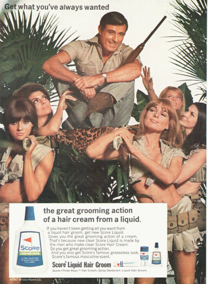
Textual Analysis – In the CSP, I see a white guy who is on top of a sedan chair with lots of women who are surrounding him, wearing very revealing clothes. The women are all white and look conventionally attractive, and they are trying to touch him and are admiring him, almost as if trying to worship the man. The background is one which suggests that is is a Jungle, and it gives off a sense of an African king because of the fact that the man is above everyone else.
Semiotic Analysis – The dominant signifier is the male character who is above the women in the picture. There is also a paradigm in that there is a collection of women surrounding the man, and the CSP is also reactionary because it would satisfy the stereotypical heterosexual male’s viewpoint. The indexical sign of a gun which the man is holding gives connotations of violence and gives the audience impressions of masculinity, and how he is the dominant person who is in control. It also shows what he could do to the women if they did not abide by his expectations.
Representational Analysis – The fact that the man is above the woman relates to the idea of patriarchy, which was particularly poignant in the time of this advert’s release (the 1970s) when women were still fighting seriously for their rights. In addition, there is selective representation in that even though the entire CSP has an African atmosphere, everyone in the CSP is white, and not black, so consequently the advert is holding back the entire truth. Finally the body types on the females show that back then, there was a common way that women were supposed to look and had to be like in order to somewhat succeed in society.
Narrative – I think that there is a story being told in the CSP, which, in short, involves the man previously being ignored and sad, but then after he applied the product advertised, he started to become the man in the advert, and started being loved by women and living a happier life.
Uses and Gratification Advertising Table
| RESEARCH PRODUCT 1 (Cristiano Ronaldo Shampoo) | RESEARCH PRODUCT 2 (Nivea Shampoo) | MY PRODUCT (Deodorant) | |
| UNDERSTANDING SELF | Shows you that you can smell and appear more likeable/attractive to others. | Reveals to you that you can become someone who takes care of yourself. | |
| ENJOYMENT | Person is smiling and confident – seems happy. | Character using the product is smiling and seems to be enjoying the use. | Advert depicts someone who is taking pride in using the product. |
| ESCAPISM | You can escape worries about your appearance with the product. | ||
| KNOWLEDGE ABOUT THE WORLD | Makes you wonder about what Cristiano Ronaldo gets up to. | ||
| SELF CONFIDENCE, SELF ESTEEM | Dominant signifier appears bold and confident, gives a role model. | Feel more connected to who you want to be. | |
| STRENGTHEN CONNECTIONS WITH FAMILY AND/OR FRIENDS | You could show the product to others you know and they might recognise the celebrity on it and you could talk about it. | You could recommend the product to other people. | You can be confident and have minimal self-conscious worries around people. |
| ANY OTHER CATEGORY OR THEME | Expensive and symbolises positive people. | May be easy to use and offer longer term effects. |
Audience Theory Notes
Hypodermic model (passive consumption)
Harold Lasswell was a key figure in the development of understanding how media is consumed. In 1927 he wrote Propaganda Technique in the World War which “highlighted the brew of ‘subtle poison, which industrious men injected into the veins of a staggering people until the smashing powers . . . knocked them into submission’” – which effectively means, how did the leaders in the first world war convince civilians that war was worth fighting and that it was worth dying for?

Two Step Flow of Communication (active consumption)
At the same time Paul Lazarfeld recognised that a simple, linear model may not be sufficiently complex to understanding the relationship between message sent > message received. As such, in 1948 he developed the Two Step Flow model of communication.

QUANTITATIVE v QUALITATIVE
Approaches to audience theory will either adopt a QUANTITATIVE ie number based approach (so counting sales, audience figures, costs etc) OR QUALITATIVE (a more individual interpretative approach considering not how many, but why audiences consume or engage)
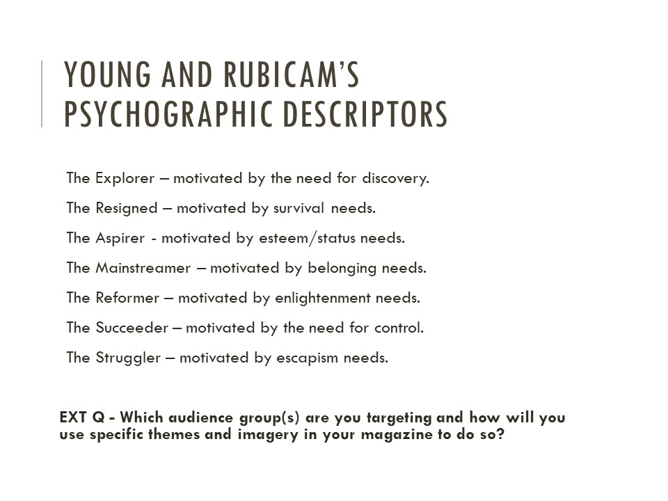
There are many different categories of people, as described by Young and Rubicam:
| RESEARCH PRODUCT 1 (Cristiano Ronaldo Shampoo) | RESEARCH PRODUCT 2 (Nivea Shampoo) | MY PRODUCT (Deodorant) | |
| Quantitative | Middle/upper class, 16-25 year old men, lots of disposable income, relatively decent education | Middle class, 16-50 year old men, fair disposable income, fair education | Lower/Middle class, 12-40 year old males, fair amount of disposable income, fair education |
| Qualitative | Mainstreamer, Aspirer | Mainstreamer, Reformed | Mainstreamer, Struggler |
Advertising Style Models – Shampoo
- Cristiano Ronaldo Shampoo Advert
Textual Analysis – Iconic sign of shampoo, dominant signifier is Cristiano Ronaldo who is a famous and well known celebrity along with details about the product.
Semiotic Analysis – The advert shows a reactionary representation around masculinity, with the dominant signifier appearing confident and calm, appealing to the idea of the “Cool Man”.
Representational Analysis – The advert presents a patriarchal outlook, with the dominant signifier wearing posh, well-fitting clothes. You could say that the advert targets young men who are rather impressionable, and the audience positioning may be one of positivity, with the advert giving the target audience a role model to look up to. It could also be one of negativity with the target audience comparing themselves to unrealistic representations of men shown in the advert.
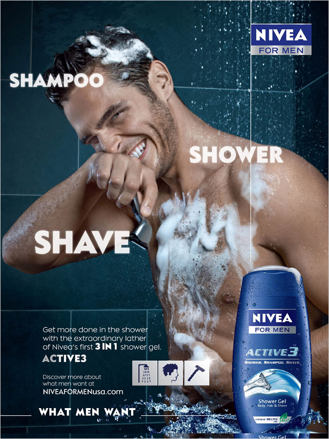
2. Nivea Shampoo Advert
Textual Analysis – Iconic signs of man and shampoo which promote conventional methods of showering, along with details and information about the product. There is also a background which denotes a bathroom or shower, which shows the consumer where the product should typically be used.
Semiotic analysis – The advert shows the dominant signifier in the process of using the product, who looks to have unrealistic bodily features. The paradigm of signs relating to the idea of washing and cleaning the body convey the conventional method of doing so, which may be a positive idea in that more impressionable people in the target audience (men) will start carrying out these actions.
Representational Analysis – The advert promotes the idea of patriarchal hegemony as it uses the phrase “what men want” which implies that all men must try to use such cosmetic products to make themselves appear more attractive. Consequently, it may be a misrepresentation of masculinity as not all males aspire to have such a mindset and it is forcing these myths to the consumer. This may mean that the advert gives a negative representation of masculinity and one that is not necessarily correct. On the other hand, the advert could be said to be radical ans there is not a woman accompanying the man as would be seen in a stereotypical reactionary advert.
3. Clear Shampoo Advert
Textual Analysis – Advert shows an iconic sign of shampoo surrounded by bright, sparkly auras, with a faint image of a human person in the background and fancy font used for the text.
Semiotic Analysis – The dominant signifier, being the shampoo, is encased in positive imagery with a bright and sparkly background. This may convey false ideas that you will also experience similar ideas to the ones shown in the advert, and this may encourage consumers to buy the product. In addition, the person in the background has an almost “godly” appearance, which is very unrealistic and does not give the target audience an appropriate role model to loom up to.
Representational Analysis – The advert is reactionary in that it follows the stereotype of men using cosmetic products in order to appear more positive and powerful than they are in reality. This could mean that the advert is showing us a negative representation of masculinity in that men may not be nearly as dominant in society without the products made for them.
Alternate Game Cover Redesign
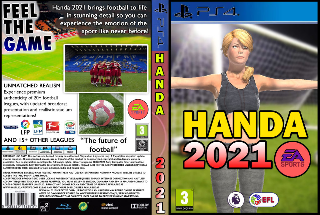
Changes Made:
Replaced male main character with a female one.
Changed game title from Foota 2021 to Handa 2021.
Changed EA SPORTS logo background from white to pink.
Changed spine background colour from green to pink.
Changed accents on image of football from yellow to pink.
Edited one of the screen grabs to show a women’s football stadium.
Changed title gradients to fit a more feminine perspective.

