| MEDIA FORMS | CHARACTERISTICS | EXAMPLE | |
| 1. | Newspaper | -Advertisements included – Small writing -On news about that day/previous day | The Guardian |
| 2. | Magazines | -Specific to readers niche -Layout and images much more aesthetically pleasing -Not too lengthy | Prima |
| 3. | Television | -Advertisements in between -Larger niche audience -Visual | The Great British Bake Off |
| 4. | Radio | -Variety of media forms: Music, News and more -Takes a lot to produce and present -Audio | BBC Radio 1 |
| 5. | Video Games | -Single and Multi player use -Visual use/entertainment -Usually includes a plot or storyline in order complete game | Dragon’s Lair, Space Invaders |
| 6. | Music Video | -Audio and Visual entertainment -Most times has a storyline to go along with the song -Can be solo or groups depending on the artist/director | Old Me- 5SOS, Can We Dance- The Vamps, Not Your Summer- The Academic |
| 7. | Films/Movies | -Creates profit and expensive to create -Takes a long time to put together -Can be seen in many places: Cinemas, and online streaming services such as Netflix and Amazon Prime | Enola Holmes, Paddington, Mamma Mia |
| 8. | Marketing/Advertising | -Commercial Reasons -Have to pay to advertise: more expensive the more places it will get seen (Tv ad breaks, Billboards) -Competitions | Shampoo, Children’s Toys, Smart Devices |
| 9. | Social Media | -Interactive -Great for communication -Good for businesses and advertising purposes | Instagram, Facebook, Snapchat |
All posts by Natasha Rawley
Filters
natasha rawley- summer task


key language- natasha
Semiotics
- Sign– An object or thing that stands in for something else
- Code– Symbols that create meaning in something
- Convention– Ways of using code in media
- Dominant Signifier– The main representative
- Anchorage– Images that has words to create context
Ferdinand De Saussure- A Swiss linguist, philosopher and semiotician
- Signifier– An object that conveys meaning/stands for something
- Signified– The meaning expressed from the signifier/sign
C S Pierce- An American Philosopher
- Icon– A sign that looks like the object its representing
- Index– A sign where the link is caused by the object
- Symbol– A sign that has a rule to link to its object
Roland Barthes-
- Signification– Representation of the meaning
- Denotation– The literal meaning
- Connotation– The interpretation of a meaning
- Myth– Naturalises events, turning history into nature
- Ideology– Codes that reinforce structures of power
- Radical– Things you wouldn’t usually expect, counter typical
- Reactionary– Things you typically expect, stereotypical
- Paradigm– A typical example/pattern of something
- Syntagm– A set of linguistic forms that are in sequential relationship to one another
Media banner- natasha rawley

My banner is made up of iconic, indexical and symbolic signs according to CS Pierce. For example, the entire banner has many symbolic signs such as the different shades of the colour blue, and other colours in the social media logo icons.
The social media icons above the word ‘studies’ is an indexical sign as it has a link to the study of media, likewise the speech bubbles, microphone and signal icons.
An example of an iconic sign in my banner would be the picture of the phone- it looks like its object. The signal icon and the microphone could be argued as iconic signs too, as they are pictures that look like its object.
Summer project EVALUATION- natasha RAWLEY
Statement of Intent
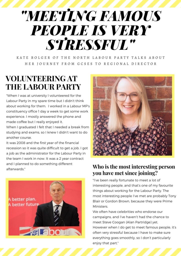
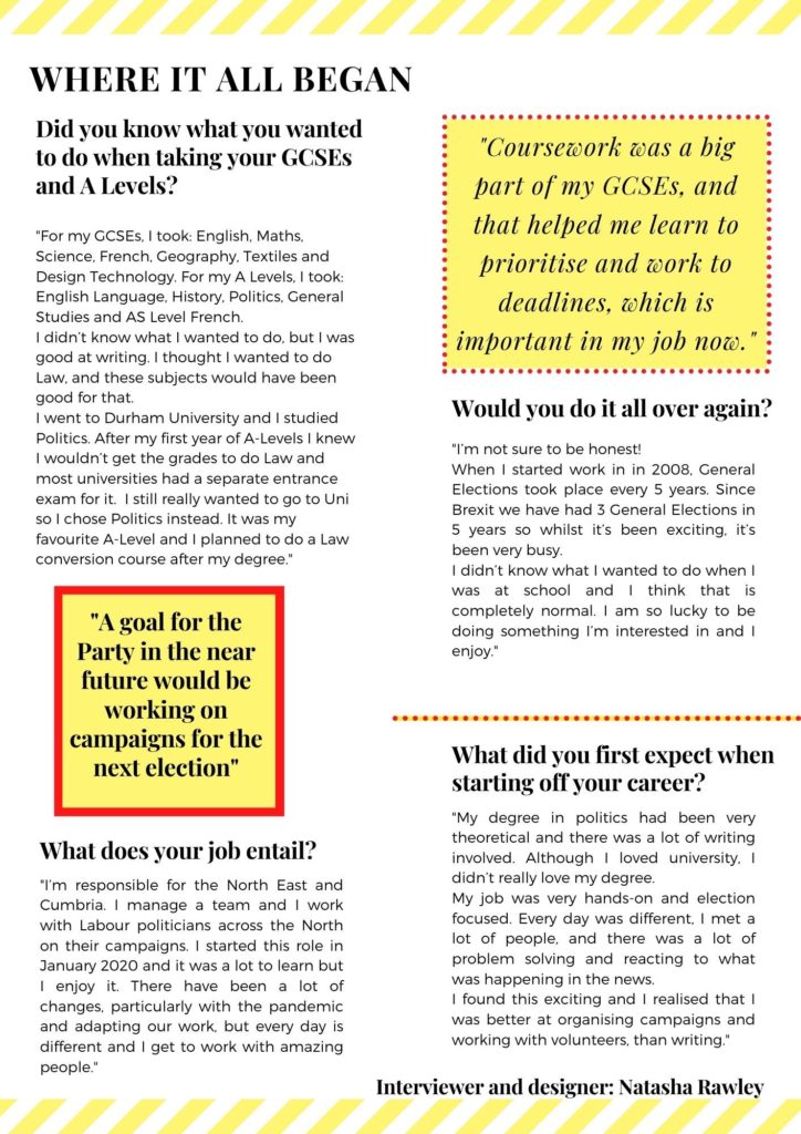
The intent of my summer task was to create a magazine interview that could be published in a Political Magazine or Lifestyle magazine. The reason behind me choosing a more political, job focused interview is because I found it interesting about how they got to the job position they’re at now, from GCSE subjects to future goals and meeting people that are well-known. I wanted to create an A3 spread that looked aesthetically pleasing but also allowed people to gain an understanding of a job in politics.
The colours, form, positioning and size clearly show that my summer project is an interview. The big, bold title with the easy-to-follow font allows readers to understand the overview of the interview but also lures them in with an exciting storyline so they carry on reading. I wanted to have a yellow boarder around the pictures because it gives a clean finish and makes it nice to look at, it also goes with the yellow theme.
In my interview, I decided to portray the interviewee [My cousin] as hard-working and clever, which is the typical stereotype of someone working in politics.
I think that my interview would be published by a magazine brand such as ‘Prima’ magazine, this is because as much as it is a political piece, it can be very interesting to the public eye to see how they got to the job they have now. The audience/target market would be middle aged women ages 30-60+. This is quite a large, broad and mainstream audience, as most people who read magazines are middle aged women.
When reflecting on my work, I would think about laying it out differently- having the interview in 2-3 columns instead of each topic having its own section. I would probably add in a drop cap and change the font to be more aesthetically pleasing. I believe that I have done well with creating my product because when you look at it, you already get a sense of what it is about and most people would want to read the entire interview just from looking at the title, which is what magazine companies want.
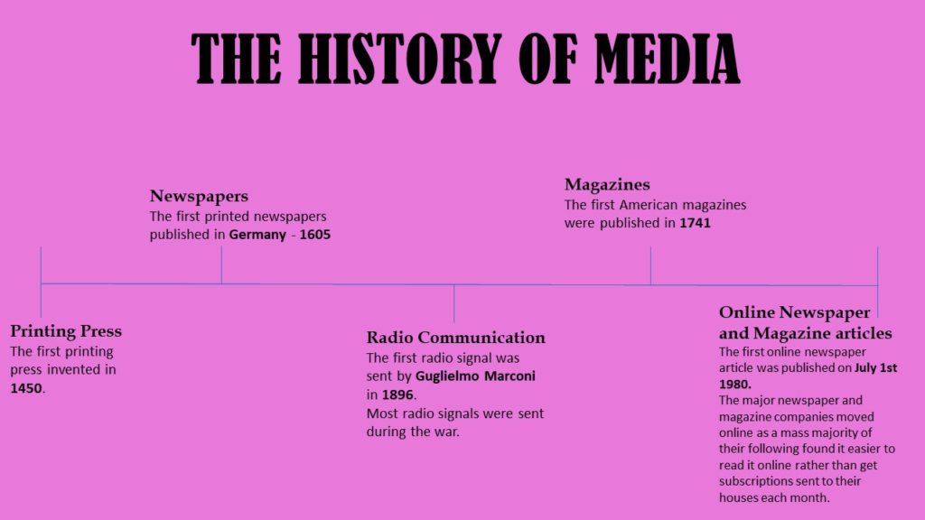
Media Timetine

