All posts by Natasha Rawley

Filters

Author:
Category:

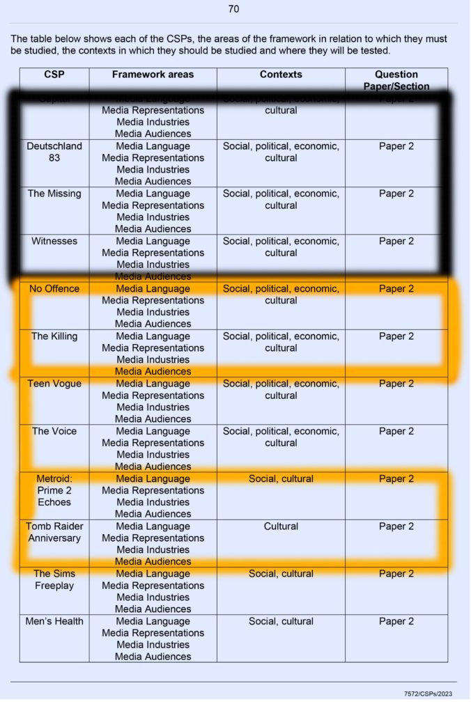
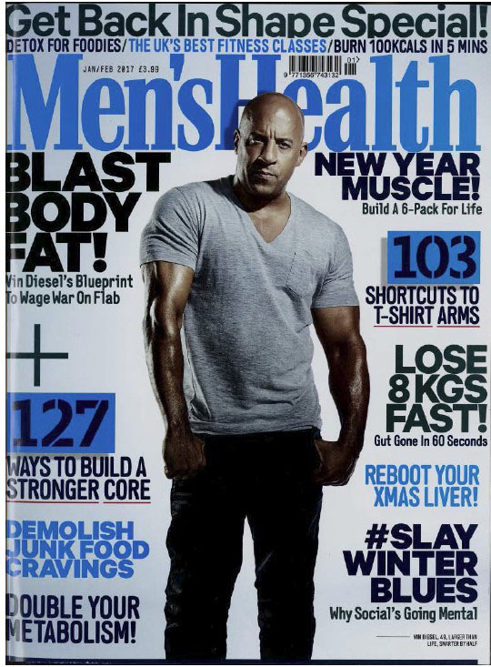
CSP: MEN’S HEALTH

PRINT MAGAZINE

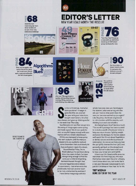
  • Big clear graphological features
  • Society’s stereotypical, ideology of a man ‘Alpha male’
  • The dominant signifier is the man standing in the middle looking ‘strong’
  • Reactionary representations of masculinity and physical health
  • Target audience/Ideal audience are men
  • Alliteration and Onomatopoeia ‘Blast Body Fat’
  • Lexical pattern
  • Judith butler- gender is a performance
  • Semantic pattern of physical power and strength
  • Symbolism of physical health (Weights) throughout 3 pages
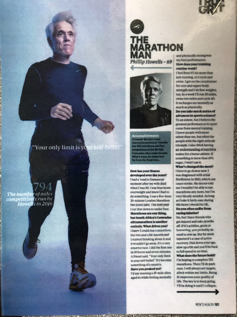
  • The main icon is a picture of the interviewee runny- making links to the article: him being a marathon runner

Representation-

The school of Life:

Produced a video called ‘How to be a man’, while this isn’t an academic theory, it nevertheless it presents 2 versions of masculinity: the warm man, and the cool man. It is possible to identify these 2 versions in men’s health , thus supporting Gauntlett’s notion of Fluid, Negotiated, Constructed identity.

For example, on page 167,

On page 44, they are warm men

Page 6, cool men

RECAP- PRESS, EPISODE 3

Key Themes seen in Episode 3:

  • Truth
  • Regulation
  • Accountability

POWER:

The abuse of power: Habermas- The transformation of the public sphere:

  • Holding the elite to account of their actions.
  • When someone of high power abuses this power, the press will call them out and hold them accountable- just because you are rich and have ‘power’ doesn’t mean you can abuse this and do what you want.

The links between those in power at the expense of those who are subservient: Chomsky- The Manufacture of Consent:

  • Chomsky says ‘don’t believe what you see or read or hear’. People of power comply with each other and help each other out.

RULES AND REGULATION:

The substantiation of Truth and Reality: Baudrillard- how can we prove the truth based on morality, ethics. religion, science, empirical evidence.

The rise of new technologies which impact and disrupt all the above.

A Level Coursework NEA

STATEMENT OF INTENT

For my NEA Coursework, I have chosen Brief 2, where you create a front page and a double page spread from a regional newspaper reporting on a social and/or political issue of interest to its broad local audience. 

For my main story, I will focus on the United Kingdom’s teenage mental health. This is a serious subject and by doing this, I can raise awareness and explore into the causes of mental health. 

For my campaign flyers, I will create three that raise awareness for mental health. To make these, I will use Photoshop along with Canva. All three flyers will have the hashtag #YouAreNotAlone as a social media challenge for people to connect people together going through the same thing. 

For my first flyer, I intend on using the main text to read ‘You are NOT alone’ the same as my newspaper headline. I intend on creating a digital design of a head that has a bouquet of flowers coming out, which will represent how amazing the mind is, and how we should look after it. I will add a floral print background behind the head with flowers, this is to add depth and carry on the floral theme, symbolising that you should treat everything like it is a flower, even yourself. 

For my second flyer, I intend to create a blue gradient background, with a brain in a dark colour to symbolise the fact that you need to take care of your brain/mind. I intend on writing ‘Be kind to your mind’ as this will hopefully remind people, they must be kind to themselves. I will also write ‘It’s okay to not be okay’ inside a speech bubble coming from the brain, to show people that it is okay to not be okay. I will add a QR Code that takes you to the helpline page on Mind’s website so people can get the help they need. 

For my third flyer, I aim to imitate the google search bar. To make this, I will create the ‘Google’ logo and I want this to be a pink gradient to match the pink/orange background. Google frequently changes a letter to an icon; I will imitate this by putting a brain icon to symbolise mental health. I will make it look like somebody is typing into the search bar ‘It’s okay.’ to which I will put the ‘answers.’  

Newspapers all have different Political Compasses/Political bias, where the readers and audience also have those same political views. I will make my newspaper Libertarian left wing, as this will represent my political bias, and the fact that my story is on Mental Health. As theorist James Curran said ‘Reflect a wide range of opinions and interests’, and this is exactly how I intend on my newspaper being. 

For the front cover, I will take a photo of two teenagers talking. I will use the headline ‘You are not alone’ to match with the hashtag on the flyers. The masthead will have a blue background and will read ‘The Island Local.’ This will have a picture of the Jersey flag. I intend on 5 complementary plugs along the side and above the main story. I aim to include an advert at the bottom of the front cover with a barcode, and a contents line underneath to inform my audience what they can find in the newspaper. I aim intend on having the Subheading ‘Teen’s mental health has been worse than ever, how do we make it better?’ and the strap line: ‘Looking into the reasons why teens mental health needs more attention, Natasha Rawley explains how to help young adults in need.’ 

To write the body of the article, I will use Microsoft Word, and then I will import it into ‘InDesign‘, which will allow me to shape the body easily. To design my work, I will use photoshop. For my images, I will take photos and upload it onto InDesign.  

For the double page spread, I aim to take a candid photo of the same teenagers and caption it underneath. The header will say ‘You are not alone: Teen Mental Health.’ The main story title will read ‘Teenager’s mental health reports have increased significantly. What can we do to help?’ To fabricate the newspaper, I aim to write a plug article linking to mental health. I will also write a notice article on Mental health awareness month explaining what the newspaper have done to help. Following my style model, I will have a headshot photo of myself next to my name showing that I am the reporter. Looking into THEORISTS HERE!!!!!!!!!!!!!!!!!!!!!!!!!!. My main article will have a drop cap on the first letter of the story, along with my plug article. I intend on creating a header too, this will state the date, page and the name of the newspaper.

newpaper statement of intent

I will be creating a front page from a regional newspaper that will report the tragedy of the Manchester Bombing in 2017.

Newspapers all have different Political Compasses/Political bias, where the readers and audience also have those same political views. I intend on making my newspaper Libertarian left wing, as this will represent my political bias. As theorist James Curran said ‘Reflect a wide range of opinions and interests’, and this is exactly how I intend on my newspaper being.

I will make the main story about new evidence found about the bombing in Manchester at the Ariana concert. To do this, I will use a photograph I have taken recently at a concert, so I wont have to go out and take one. My newspaper will be called ‘The Manchester Daily’, where it reports everything going on in the city. I intend on having three minor ‘sneak peek’ stories at the top of the newspaper, where it shows off some stories in the rest of the newspaper. The headline of my main story will be ‘New evidence found for Manchester bombing 5 years ago.’ I chose it to be this because it is short and gives all the details needed to allow the audience to be interested in the story. I then intend on have the sub heading ‘Police say they found additional evidence from the terrorist attack at the Ariana Grande concert in 2017.’ This is because it gives extra information to help the audience and readers understand the story more. Finally, for my strapline, I intend on writing ‘We chat with policer officers to get their side of the story.’ This is because in the main story, I mention three different Police Officers, therefore having it in the strapline allows the readers to get an idea about what they are about to read.

To visualise the design and graphology, I will be following a style model- The I, where I will be able to follow a formal structure. I will have the picture, possibly two, with captions underneath explaining what was happening. Following my style model, I will but above the title ‘A Source of information you can trust + Manchester’s finest newspaper.’ I will import my own long shot photographs that I have taken into InDesign, where I can then adjust them to the size and area I would like them to go.

To write the body of the article, I will use Microsoft Word, and then I will import it into ‘InDesign‘, which will allow me to shape the body in an aesthetically pleasing way. To design my work, I will use photoshop.

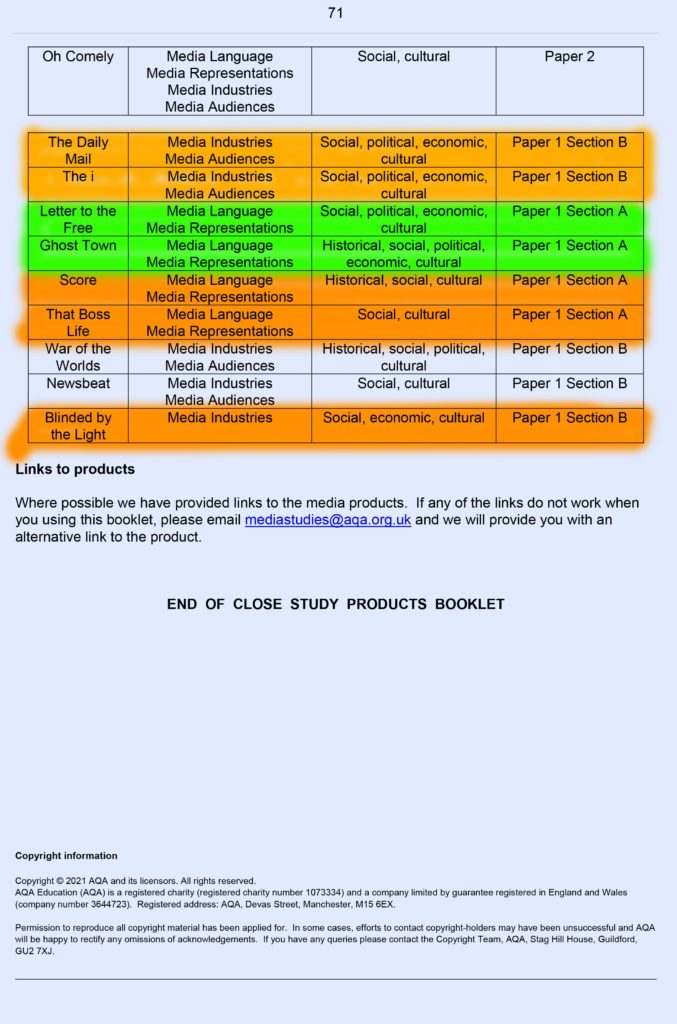
THE DAILY MAIL AND THE I

Political Compass- Key Terms

Right Wing- Conservative (Biased to economy)

Left Wing- Labour (Biased to humanity)

  • Class superiority
  • Business over humanity
  • Racial superiority
  • Freedom of people
  • Patriotism
  • Restriction of immigration
  • Militarism
  • Globalisation
  • Abortion
  • Protectionism
  • Regulation
  • Monopolies
  • Discipline
  • Commodities
  • LGBTQ+ Rights
  • Religion
  • Charity
  • Education
  • Tax
  • Disability

Statement of intent and posters

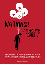
I intend to create 2/3 posters on the topic of hateful social media comments. I will show the receiving end of this and how it affects people. I intend to create a hashtag (#tpwk) which will/can be recognised as a campaign in order to stop the harmful comments an negativity on all social media platforms.

The first poster I will edit on photoshop and I intend on having a picture/headshot of someone in the middle and I will blur their face out and make aggressive scribbles on the face to represent their mental health after reading the hateful comments. I will have the hateful comments from different platforms (Twitter, Instagram etc) around the person’s head to highlight how it always sticks with someone forever.

Jar with phone in. chains around jar lid to lock phone away. phone on/message saying something about the addiction.

person using phone. chains around phone to show how addicted they are

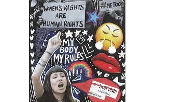
The second poster I intend on creating is a mixed media collage representing this same idea. I will have photos cut out and stick them on the page, again, aggressively scribbling on the head. I will put the hate comments all over the page as if it’s an intrusive thought as a result form the comments. I will use paint to represent the depression and anxiety that can be caused from the hate comments.

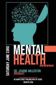
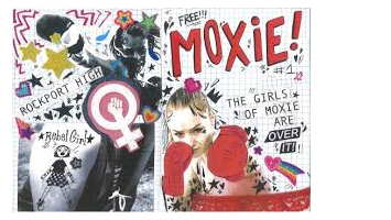
Here are some examples that I will be taking references from:

Media Regulation

Key QuestionFocusSpecifics
Why Regulate?-Truth
-Child protection
-Political bias
-Privacy
-Human morals and ethics
-Relative/subjective “good behaviour”
-Specific/particular political opinions
-Deformation/slander/libel/reputational damage
-Ownership to avoid monopoly
-Good working practices
-Johnny Depp V Amber Heard case (Libel/Slander)
-Rooney v Vardy (Privacy)
-Elon Musk buying Twitter (Ownership)
-Life of Brian (Good behaviour)
-China banning social media/1 hour limit on it
-Activision Blizzard’s court case (good working practices)
Who regulates what?-Government
-Specialised bodies [eg Ofcom]
-Individuals
-Internal company/structural regulations
-Self regulation [code of ethics/practice]
-Key individuals [Celebs/influencers]
-PEGI (Video games)
-BBFC (Cinema)
-IPSO (Newspapers)
-MCPS (Music)
-Individuals
-Groups/bodies


How will regulation be put in place?-Copyright
-Logos
What gets regulated?-Radio
-Social Media
-Newspapers
-Television
-Books
-Video Games
-Music
-Films/tv shows
-Magazines
-Advertising

CROSS MEDIA PRODUCTION:

Website:

It won’t always be like this website.pptx

Synopsis:

Film sequence 1

Evangeline, 17 year old girl will find an odd looking tree and goes to have a look at it. Only, it is cursed so if you go up to it, you get stuck in a time loop. Evangeline tries to get out of the never-ending loop. How will she do it?

Film sequence 2

A 17 year old boy, Charlie, is lost and finds a really tall tree and goes over to look at it. He then disappears and can’t get out. All his friends are worried. How will Charlie find his way back?

I intend on creating a thrilling, on edge film, that explores the adventure of a teenager trying to find their way back to reality, with all their friends and family are worried about where they are.

Statement of Intent- Movie poster

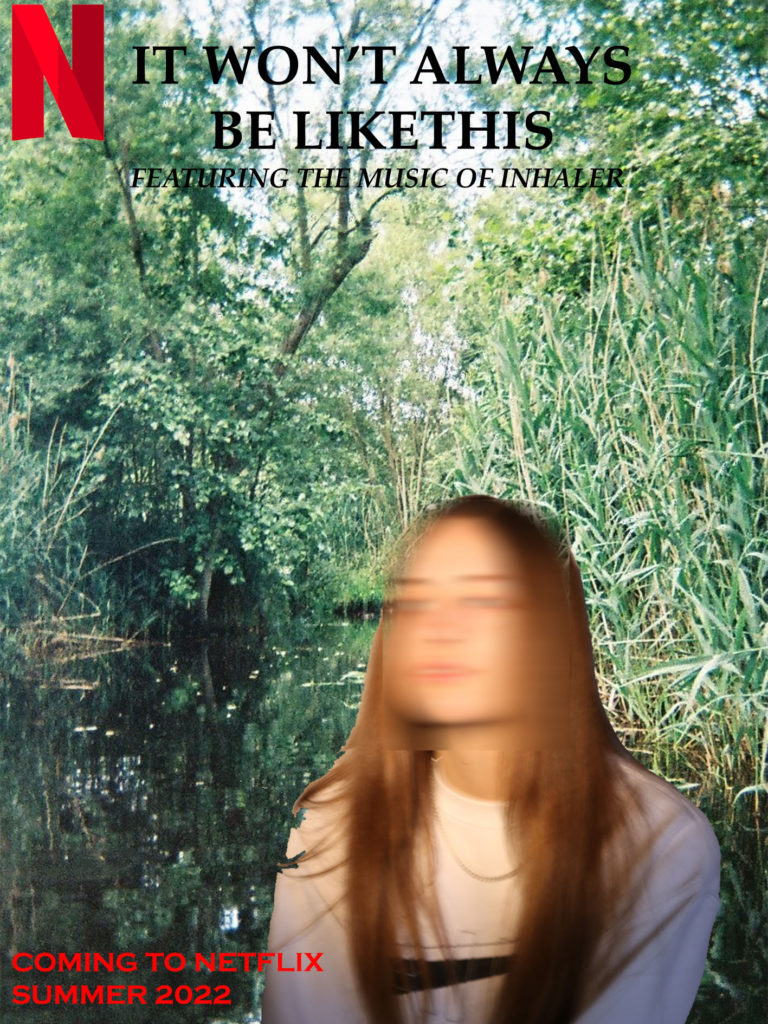
For my first movie poster, I will include the sign the female character reads out and has it as the main focal point. The background will be the forest in which she gets stuck in and this will go on into the distance to symbolise the fact she gets stuck in a time loop. I will have two silhouettes of the main characters, this is because I want to put focus on the characters, without pulling the focus away from the background and sign. I will edit the movie title ‘It Won’t Always Be Like This’ in an eerie yet playful font, which should capture the playful and ominous feeling of the movie. I will write in ‘Featuring the music of Inhaler’ in a smaller font to promote the music soundtrack in the movie. The genre of my film is Sci-Fi, like the movie ‘Palm Springs’ but different in the sense that it is predictable yet unexpected.

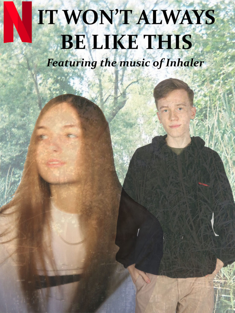
For my second movie poster, I will have the forest in the background, but only the top of the trees with the sky, this also symbolises the time loop as the sky is never ending, but also includes the trees that will give away the setting of the movie. I will include the photos of the main characters but these will be the main focus this time, not silhouettes. The title will be edited in, in a typewriter font, in the sky but just as the trees stop, so it doesn’t take away from the main focus of the poster. To include the music artist into the movie poster, I will write in a slightly smaller font, but big enough to read it clearly, ‘Featuring the music of Inhaler’ to promote the music soundtrack in the movie.

MOVIE POSTERS: