
Audience THEORY


In this essay I am going to apply a semiotic analysis to both Tomb Raider and the Metroid’s video games covers, I will argue that the representation female protagonists is radical in comparison to the reactionary representation of a male protagonist.
The cover of Tomb Raider provides a dominant signifier of the main protagonist Lara Croft who is being presented as overly feminine. This corresponds to Laura Mulvey’s theory of the male gaze which is, a feminist view that in almost all forms of media the representation of women is altered to appeal to the average male consumer. However despite being represented as very feminine there is also some radical elements in this front cover, such as the inclusion of guns. This is radical because it shows that the female protagonist can protect herself without the need of a male protagonist, this radical representation also juxtaposes the idea of “The Damsel In Distress” which says that women in media are simply used as plot devices that the male protagonist needs to rescue to satisfy the story. This creates a positive representation of women as, contradictory to most games, Lara Croft does not need to rely of the help of a male protagonist, This also creates a positive impression on the gaming community as a whole because it shows that female protagonists can still be strong and independent without a male protagonist and that it does not impact enjoyment of the game as a whole.
Even though the representation on the front cover of tomb raider may provide a brief break from the normal representation of women it is not without flaws. The main example of this is Lara Crofts clothing the use of skimpy and revealing clothing could be harmful to younger audiences as it provides unrealistic standards for people to aspire to, it may also have been used to appeal to the average male gamer, this would have been done because males take up the majority of the gaming industry in terms of both creation and consumerism therefore appealing to the male audience provides the biggest profit margin. The paradigm of tight clothing ,provocative stance and a seductive facial expression makes up an objectified persona, this reflects upon Laura Mulvey’s notion on the male gaze in that the dominant signifier is designed in such a way that she appears sexualised. In other words the character is designed so that it appears sexual and erotic in order to appeal to the sexual and erotic standards for women in the video game industry. By dressing Lara Croft in this revealing and skin tight clothing the game developers are taking away from the representation of Lara being able to defend herself without the help of a male protagonist. With that you can argue that this is a reactionary representation of women in video games.
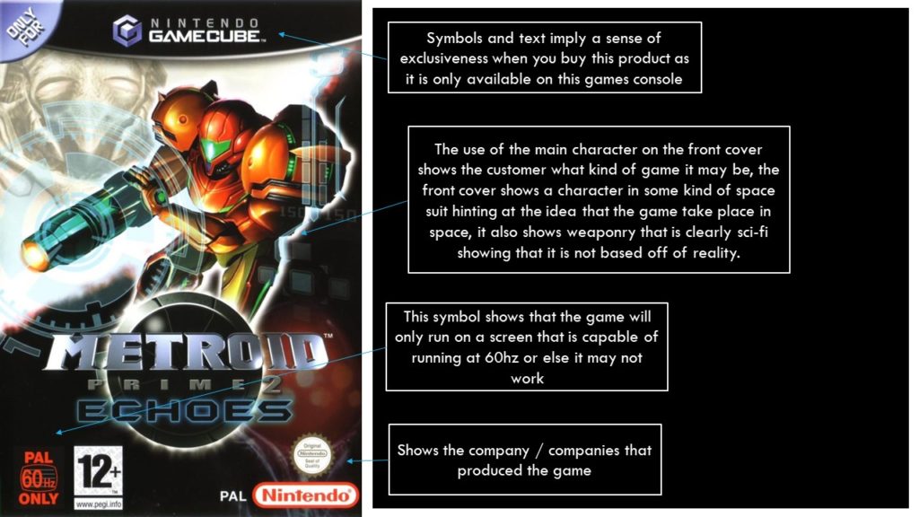
In comparison the front cover of Metroid provides dominant signifying image of a robotic suit , presumably the main character, and is presented as masculine even though it is never stated whether or not they are male or not, the protagonist is presented to be muscular and broad which are characteristics that have been universally recognised as masculine. This creates a reaction representation of men in video games this is because the front cover displays a stereotypical representation of a male hero which is presented as strong and powerful so that they can complete their goal which is normally defeating a big evil and saving a damsel in distress. The inclusion of a large gun attached to the robotic suit implies that there will be themes of violence and combat, this further portrays the male character as fearless and a warrior. This juxtaposes the idea that the sexualisation of women is always used as the main selling point of video games, This also avoids the theory of the male gaze as it does not include any sexualisation towards women. The representation on the front cover of Metroid also shows that games can have extreme success without the sexualisation of women on the front cover.
In conclusion, both Metroid and Tomb Raider portray two rather similar representations of their respective gendered protagonists this is because they are both presented as radical due to their either exaggerated features or their stereotypical features, this is not a good theme as it provides unrealistic body standards for both genders and could possibly be harmful to younger peoples mental health.
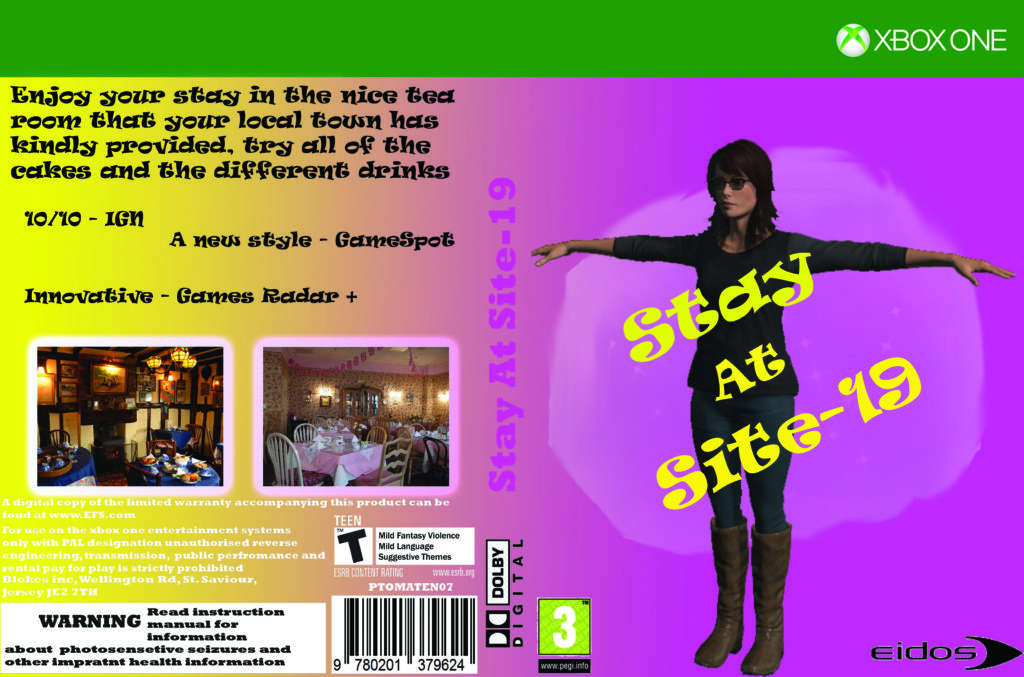
I produced a horror survival game that includes both male and female characters however the dominant signifier indicates that the game is primarily masculine, this links to Jean Kilburn’s theory of men also being objectified as well as women however when men are objectified is it in a more masculine and strong manner. This is shown by the fact that the main character is muscular and strong without needing help from others to complete his goals.
Further to this I have exaggerated the muscular attributes of my character with muscular arms, legs and torso. I also included clothing that was war-like and confrontational, signifying combat, aggression, conflict etc. In some ways this inverts Laura Mulvey’s notion of the male gaze in that my main character is there to be objectified and looked at, in the words of Laura Mulvey he is a character “establishing ways of looking and spectacle”. However, the notion of the male gaze is quite distinct as it relates to the sexualisation of the dominant signifier, which is not the case for my character.
Nevertheless, I believe that it is generally accepted in society that masculinity is seen as much more aggressive, confrontational and violent than femininity. So in this sense my product is a reactionary representation of masculinity.
However, I don’t think this is a positive representation of masculinity, I personally believe that an over-aggressive representation of masculinity is not healthy for males to aspire to. As such, if I was to create this product again, I would avoid a stereotypical representation of an over-muscular, over-physical character and create a character that is more radical in the way they are represented and portrayed. Perhaps using a range of signifiers that would indicate a more feminine character could make the character less masculine. I could do this by adjusting my characters physical appearance, this could include their clothing and their posture. As such, I would be sending out a much more positive message about masculinity, this would also provide an image that men can aspire to without presenting impossible standards.
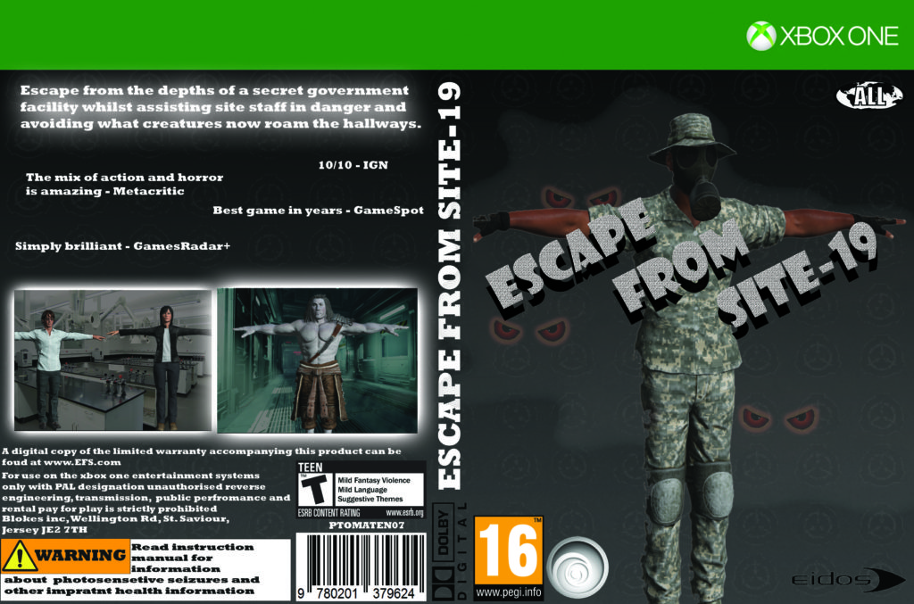
My games cover will largely be targeted at a male audience in the age bracket of ages 16 and above, it will be made by a large company with loads of funding to assure that the game is well made, I can also use this factor to include better reviews on the game. The game will be based off of several different survival horror games with supernatural elements. Weapons will also be included such as high end counter-insurgency gear, as the game will take place in a top secret government facility. The front cover will include the main character who will be an African American man who is dressed in full military uniform.
I will also include different hints to the theme of the game being supernatural by using common elements used in other forms of media such as thick fog or glowing eyes peering through said fog. These will hopefully help to catch the eyes of potential customers. On the back of the games cover I will include all of the relevant information such as age ratings and safety warnings, I will also include a brief description of the game, some reviews from popular game review company’s and some sneak peek photos of the game.
Diversity Quotes –
“You can use it to help people with disabilities, or people who are just less experienced at games. While playing, instead of taking the controller away from them.”
“We have a very diverse staff, including a big number of LGBTQ people who went through the same challenges that many of our LGBTQ fans are going through right now,”
Levelling Up Quotes –
“Over time, representation has become more frequent, and more importantly, more authentic within the realm of video games.”
“The International Game Developers Association found that 81% of developers identified as White/Caucasian and 2% identified as Black/African-American/African/Afro-Caribbean.”
Laura Mulvey Quotes –
“She falls in love with the main male protagonist and becomes his property losing her outward glamourous characteristics.”
“Once he actually confronts her his erotic drive is to break her down and force her to tell by persistent cross questioning.”
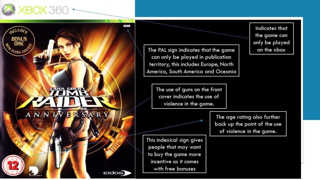
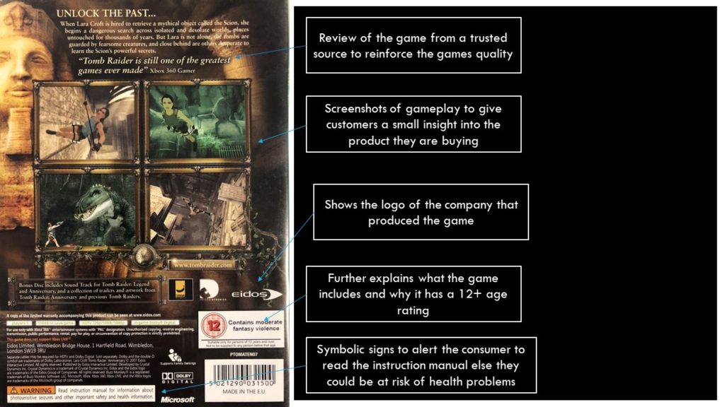
The front cover of Lara Croft may be seen as reactionary as it is a stereotypical portrayal of a female character however it may also be seen as radical due to the use of guns which is not something that you see all the time when games are portraying women

Semiotics
Iconic Signs :
-Picture of a newspaper
-Picture of some app icons
-Picture of advertisement billboards
Indexical Signs :
-The app icons signify what apps they lead to
-The billboards display what show is happening at the theater
-The shape and design of the paper indicates that it is a newspaper
Symbolic Signs :
-The word media may mean different things in different languages and different cultures
-Some countries or cultures may have different designs of newspapers