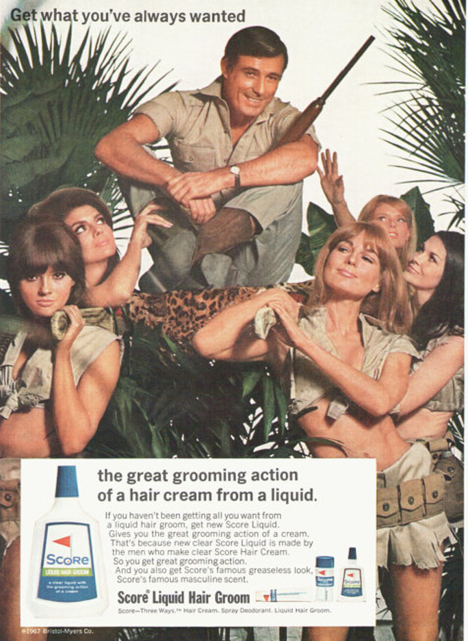
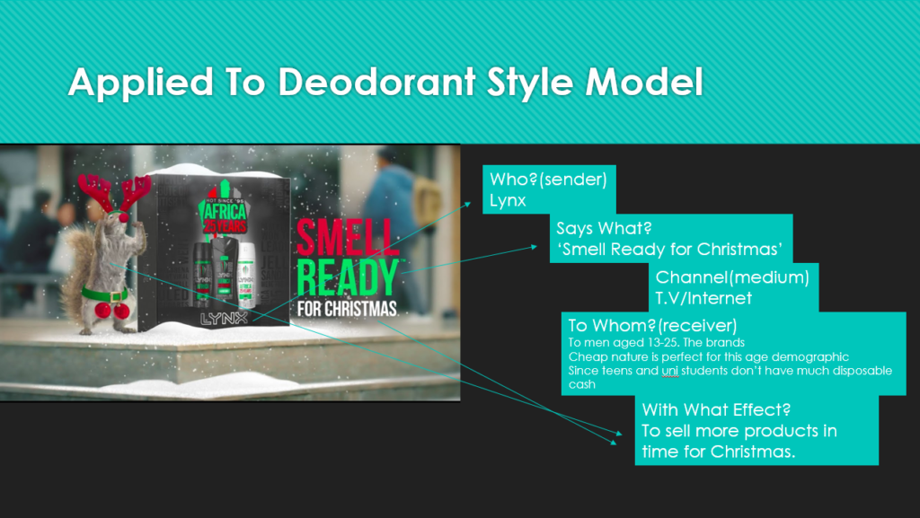
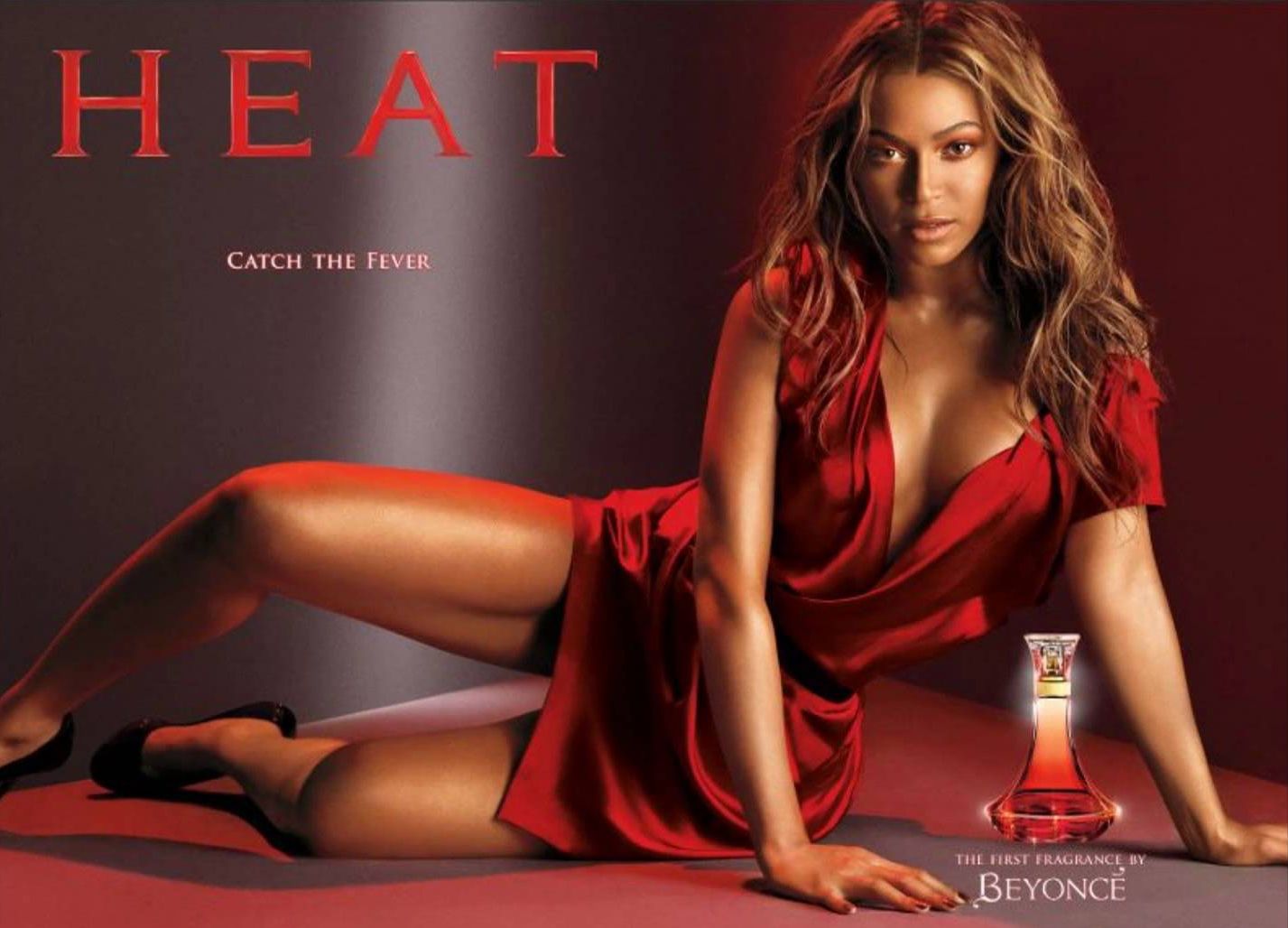
For my print advert I plan to use a can of Lynx. I will use a black can for the modern ad and a white can for the old ad, by doing this I’m attempting to demonstrate the progression of racism since the 60’s. In other words, I plan to do one ad representing a modern outlook and the other being an ad with more outdated values. I intend to make both look professional by using style models for similar products that were/are used in the time which both ads are set. The ads will be aimed at a younger male audience, being between ages 12-25.
Focusing more on the semiotic aspect of it, I can use my style model (Calvin Klein DEFY) to distinguish the signs and conventions which are used in professional print products to therefore improve my product by making it look more professional. By attempting to look at the print as a potential consumer I can immediately spot a paradigm of blue/denim imagery which emphasises the colour of the aftershave
patriarchy, dominant ideology, hegemony, audience positioning, P+N stereotypes.
David Gauntlett: Fluidity of identity constructed identity.

