All posts by Jayden Bourne

Filters

Author:
Category:

CSP TOMb raider & metroid

TOMB RAIDER FC

The front cover uses Lara Croft as an iconic sign to show buyers who the main protagonist of the game is – Lara as a sign can be seen as radical as she is shown holding guns, something not typically seen everyday. The title is also a symbolic sign presenting an idea of the atmosphere of the game and shows the name of the main character – Lara Croft – and which edition of the game it is, it does a good job of presenting a lot of information with a small amount of text. Furthermore on the front cover there is the symbolic sign of the age rating – this symbol tells buyers that only people aged 12 and above are allowed to play the game. In addition, the iconic sign of the xbox symbol represents which system the game is played on – and that it wont be played on any others.

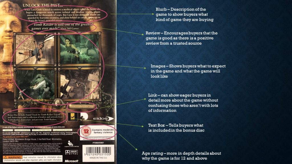
TOMB RAIDER BC

The back cover uses an iconic sign of an Egyptian relic to further help show the atmosphere of the game to buyers, and draw in those interested in the subject. Furthermore there is another symbolic age rating sign – reminding buyers only people aged 12 and up can play the game.

METROID FC

The front cover uses the iconic sign of the main character – Samus Aran – in a space suit to present immediately what the game will contain and be about. The front cover also uses the title as an indexical sign to help further this as it has a futuristic design connoting that the game will be set in the future, which also tells buyers what the game is called. In addition it also has the Gamecube sign, telling buyers that the game can only be played on gamecube. Furthermore, this cover also has the symbolic age rating sign – also reminding buyers that only people 12 and over can play the game. There is also an indexical sign of the nintendo logo, showing that nintendo is the company who published the game. Finally there are 2 PAL symbols on the front cover – showing that the game can only be played in PAL regions and will not work elsewhere.

Games cover statement of intent

I intend to create a games cover similar to the ones of games that I enjoy i.e., Destiny 2. I wish to create my own character to show off on the front with an original title. I want to create a back cover similar to those of other games with information and pictures to show buyers what the games will be about. I intend to have the main character as an iconic sign in the middle of the front cover with a bold title to catch the eye and set an atmosphere for the game, and have some images on the back with a small blurb to describe the game. I intend to represent both radical and reactionary views through different versions of the same games case – one where the protagonist is a man and one where the protagonist is a woman. The company creating my game would be bungie and the audience would be similar to that of destiny 2 as my game would be a sequel.

semiotics definitions

Semiotics

Sign – Something that indicates a meaning or conveys information

Code – A tool used to convey/construct meaning.

Convention – Ways to use codes in media

Dominant Signifier – The most important and typically most obvious sign

Anchorage – Words that go along with images to give those images meaning.

Ferdinand De Saussure

Signifier – An object that conveys a meaning

Signified – The meaning of said object

C S Pierce

Icon – Type of sign that has a direct link to the object its representing e.g. a picture

Index – Type of sign where the link is caused by the object e.g. smoke caused by fire

Symbol – Type of sign where the link only exists through rule e.g. words and their meanings

Signification – The representation of meaning

Denotation – The literal meaning of something

Connotation – Any interpretation of something

Myth – A chain of concepts accepted to have a specific meaning

Idealogy – The ideals and ideas that form the basis for a meaning

Radical – Something that goes against conventions and isnt expected

Reactionary – Something that is stereotypical/expected

Syntagm – How signs are positioned with each other to make sense

Paradigm – A collection of similar signs

Summer task evaluation

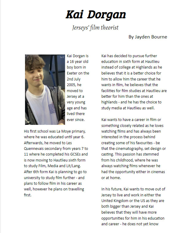
My intent in making this interview was to produce a minimalistic interview on one of my friends’ interests and share it with others. I also intended on seeing his view of film as it is a common interest that many share and has many critical opinions that spark conversation.

My interview had few media elements due to the minimalistic design, but the information (I believe) is structured well into 2 columns and a quote, giving a backstory to Kai, what he is doing now, and his future. I also included a caption relevant to the interview telling readers what the interview will centre around. However, I feel that I could have added much more and the image I included could also have been bigger and centred more instead of joining it into a column. 

The minimalist design of my interview is a countertype to a typical magazine interview, the interview would have a very niche audience as it is a local story about someone in Jersey. I believe it would be published in a local newspaper or magazine (either local to Jersey or to the Parish) and the audience that would read this would be local to the area it is published in.

To make my task better, I would include much more of the media content that I have learned since making the interview to make it more eye catching and interesting to read, I think I have conveyed the information well but the design is uninteresting and too empty.