All posts by Diana Quintal

Filters

Author:
Category:

Essay Prep

I produced a racing car game and I created a dominant signifier image that all genders would be intrigued to play. In my games cover there is a connotation within the image to explain how there are varies of car games and alongside with a story line. This might target the audience more as people enjoy taking part in the story rather than just playing the game as it wont be as interesting. The only production there is a clear focus on my female character and the racing cars. This can be identified in the posture that I created for my main character, it is a slumped, which when I tested it on my target audience they recognised as “a typical female character!”.

Further to this I have exaggerated the feminine attributes of my character with thin arms, legs and torso. I also included clothing that was simple but intriguing and comfortable. In some ways this inverts Laura Mulvey’s notion of the male gaze in that my main character is there to be objectified and looked at, in the words of Laura Mulvey she is a character “establishing ways of looking and spectacle” (Mulvey, p. 883, 1999). However, the notion of the male gaze is quite distinct as it relates to the sexualisation of the dominant signifier, which is not the case for my character as I am trying to keep the game clean.

Nevertheless, I believe that it is generally accepted in society that females should be seen as less violent and aggressive rather than males. This is because there have been many games that males tend to save the mistresses in distress, however i also believe that females can be portrayed as how they want to be as they all have different personality’s. Therefore my games cover is a radical image for my main character and my dominant signifier is the car as it stands out to everyone who will play the game as you can simply tell what sort of game it is.

I think this is a positive image as I think that it influences females that they can do whatever they enjoy and shouldn’t be ashamed of something they are not capable of doing. This is also seen as saying males are better drivers than females. My games cover represents to all genders as i think society has a wide range of ideology, however I disagree to agree that, ‘yes’, there are more things that males are better at doing but that doesn’t mean that females weak and always in distress. I avoided the stereotypical of representation so that my image would stay radical rather than reactionary. The reason for creating a female character is because I want to target my audience to all genders without having to sexualise my character.

statement of games cover

For my games cover I am going to create a female character with a racing car as the story behind the game is that the she has to win the races in order to earn the money to save her father from the terrorists that have placed a bet on her to win the races.

For my front cover the female character will be wearing black track suit bottoms with a black tight tank top. My female character isn’t very revealing but intends to show off her skills and look interesting enough. The racing car is a Lada looking all black with blue lights coming from the outside.

My title for my games cover will be succeed to live.

Representation

The male gaze – Laura Mulvey and John Berger

This is a key idea of feminist film theory, which visual media believed that men tends to sexualise women for a male viewer. The male gaze theory is when women in the media are portrayed from the eyes of a heterosexual man and that these women are represented as passive objects of male desire. This suggests that the female viewer must experience the narrative secondarily, with the male. John Berger observed that by no means been overcome, men act and woman appear. Men look at women and women watch themselves being looked at.

Quotes

  1. “It is said that analysing pleasure, or beauty, destroys it.”
  2. “Woman’s desire is subjugated to her image (…) as bearer, not maker, of meaning.”
  3. “In herself the woman has not the slightest importance.”
  4. ” I still see storytelling for men by men that is always reinforcing the male gaze
  5. “Sheer male interest filled his gaze which was entirely focused on her. She’d never before felt so female, so utterly desirable, so wanton.”
  6. “The “male gaze,” as a shaper of my life’s choices, is largely incidental.”
  7. “There are plenty of images of women in science fiction. There are hardly any women.”
  8. “The girl anchors the stage, sucks in the male gaze, and, depending on who she is, throws her own gaze back out into the audience.”

Key Language

Semiotics:

  1. Sign – Possible to stand for something else
  2. Code – Technical and Symbolic codes
  3. Convention – the general ways of doing something
  4. Dominant Signifier, – Something that stands out
  5. Anchorage – an image with context to give meaning

Ferdinand de Saussure:

  1. Signifier, – the material form, seen, heard, touch etc
  2. Signified, – the mental concept

C S Pierce:

  1. Icon, – looks like the object
  2. Index, – something that relates to the object
  3. Symbol – random link to the object, numbers, colours, alphabets

Roland Barthes:

  1. Signification, – a code that we read
  2. Denotation, – a description of what you can see in the image
  3. Connotation – the meaning we have with the image
  4. Myth – to communicate cultural and political meanings
  5. Ideology, – a world view of how society should function
  6. radical – challenges dominants ideas
  7. reactionary – confirming dominants ideas
  1. Paradigm – create differentiation in meaning
  2. Syntagma – an orderly combination of interacting signifiers which forms a meaningful whole

Media Banner

Iconic Sign

Pictures with images of a TV, a Phone, and Radio these are all examples of what they all look like an object.

Indexical Sign

3 examples are smoke coming from fire, or hearing a bee ‘bzzz’.

Symbolic Sign

A symbolic sign is when you can see the colour black and everyone agrees with it, it also links to how you can see the letter M or S etc, also like a shape as in I can see a square and others agree too.

EVALUATION OF SUMMER TASK

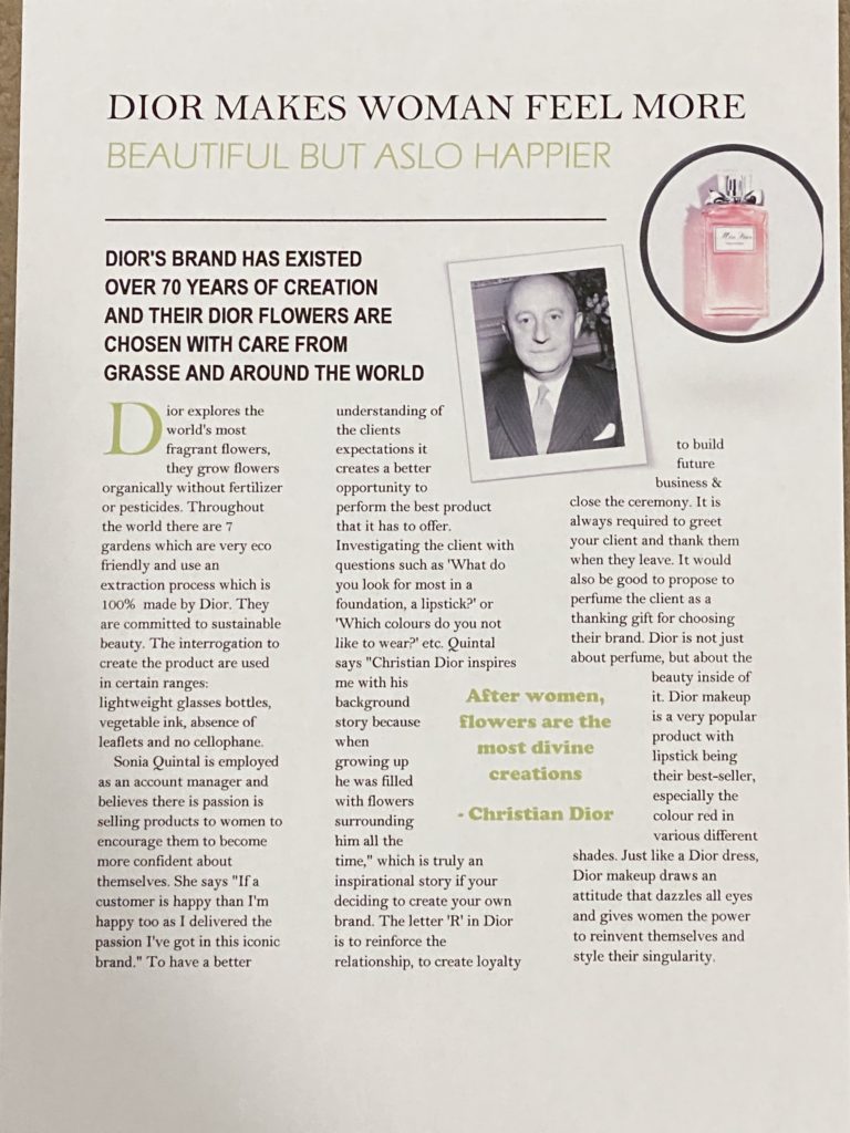
For my summer task, I wasn’t sure what I had to do as I thought that I had to try and copy a magazine that we liked, however I realised my mistake and did it again as I wanted to get it right, so I interviewed my mum about the brand that she works for (Dior). I explained the backstory of Dior and how it was created and included what stands out to the clients.

My summer task followed in varies of different ways. I got inspired by many different magazines. They all had the same set of ideas that I was looking for. However, I took all of the ideas I liked and created one of my own and tried to add as much colour as I colour.

When I presented my article I thought it was better giving the audience more rather than less, this is because I was trying to make the key points interesting and reactionary. I added images to make the article look vivid and colourful.

The kind of company that would make my product is a magazine company as I prefer to explore the nature in the idea that I am gathering. This is because I am trying to create more interest in the product that people will enjoy listening to.

As I said in the beginning I made a mistake and I corrected my mistake by doing it again. I really liked how my set out was and how it add more colour onto my article, however what I found really difficult was to decide which fonts to use as many of them didn’t look good. I also found challenging doing the header as it was difficult trying to create a line underneath.

Media Forms

Characteristics Examples
1Magazinewritten, cheapModels
2Social MediaVisualFacebook
3FilmsFiction, visual, expensiveSpiderman
4NewspaperswrittenDaily news
5TelevisionAdverts, non fiction, cheaperWorld of sport
6AdvertisingVisual, expensive, propagandaclash of clans advert
7Video gamesVisual, expensiveMinecraft
8Music videosVisual, voiceHoliday
9RadiovoiceBBC