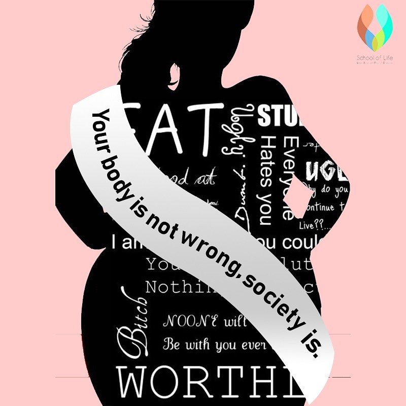
Within my regulation practical work, I intend to create two posters and a billboard photo to support the “Stop body shaming” campaign. I chose to base my practical work on body shaming because I feel that society and the media have become obsessed with ‘perfect’ bodies, specifically woman’s bodies. This campaign relates to the issue of young peoples mental health and the mental feeling that they require to change themselves to become ‘their perfect selves’ and gain attention whether that’s sexual or public attraction. This project will focus on young people such as teenagers within the age group of 14-19 years of age. The reason I chose this age group and target audience is due to the demand of young people being ‘expected’ to look like runway models. On top of that I feel that teenagers have a significant amount of insecurities and doubts that both women and men have from hurtful comments on their physique, as well as the need to edit their instagram posts to achieve likes and comments. My work will be highly based around women due to the larger percentage of the population being female that go through body shame the most.
I intend to create a poster, magazine cover and a billboard relating to body shaming, I will do this by using photoshop and inspiration from below. For my poster, I aim to create a female body outline, specifically from the neck to the waist, using comments and insults that women and even men may have been confronted with. I will then, either at the top or bottom use the phrase “Words do not define who you are” with the hashtag ‘#StopBodyShaming’ in the bottom left or right or the top left or right. The colours I will use in my first poster will be cyber grape (a shade of purple) with a gradient of a heavenly pink (a shade of pink) and white. The purple will be used for the background of the poster, the light pink will be for the ribbon around the waist to symbolise women being sexualised and the white will be used for the text. To add texture to my poster I will add a drop shadow to the two ellipse on the breasts to create a zoomed in effect, as well as using a gradient on the left hand text to create a shadow, so the ‘picture’ is seen from an angle.
For my magazine cover I intend to do a model magazine cover to express that all sizes of women are equal and should feel confident in their bodies without feeling ashamed by the media. My cover will outline positivity for those hidden affects of body shaming such as being anxious to show off ones body or think less of themselves due to their shape. I will achieve this by placing two outlines of two different body shapes in the centre of my A4 page. The women will be sized to slightly cover the title of the magazine, which will be called “BE YOU – THE POSITIVE YOU”. I will then have text around the bodies, one being just between their heads – “SIZE 18 & 0 FASHION MODELS” and others around the lower part of the bodies. These will aim to focus on positivity for women. My text colour will be white or a slight brown, and my background will be a blue circular gradient. I chose these colours because I feel that a baby blue represents calmness and serenity and I believe those feelings are what women should feel when posting themselves on the Internet. I also chose white for my text as I believe it represents purity. At the bottom right or left of my cover I will have the hashtag #StopBodyShaming to show that the cover is made or sponsored by the campaign.
For my billboard, I intend to represent body shame through the positivity side of the campaign. I will complete this with filling the background in a light pink (shade of heavenly pink) with five clipart clouds located at the top of my picture. Following this I will have the text “No matter the body, you’re always bikini bod ready!” in the font size 30 to 40 to show the large fonts on billboards as well as the campaign hashtag ‘#StopBodyShaming’. Below the text I will edit six female silhouettes and fill each one in with a different skin tone using the paint bucket tool to show equality in races as well as making sure each female has a different body shape to represent my campaign and the belief that no woman should be judged by the shape of their body.
Finished Products:

My Poster 
My Magazine Cover 
My Billboard Picture
Inspiration for my poster, magazine cover and my billboard:


