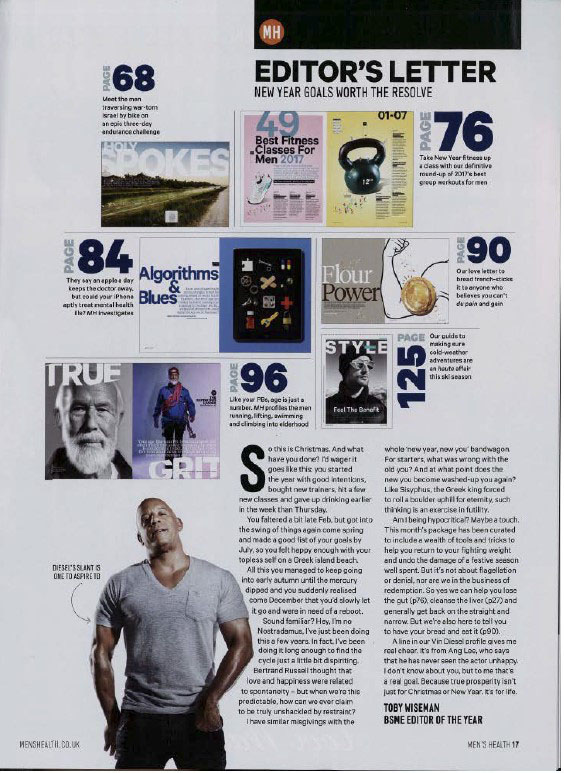
- Dominant signifier (Vin Diesel), we know this because he is the main focus within the front cover, being the biggest and most outward object on the page.
- The title “Men’s Health” – indexical to men’s health and the gender performance of the male gender.
- The page is reactionary, as it can be argued to support the typical view of strong, independent men.
- The syntagm of men’s gender performance and what men should be like. Suggests that men should be fit and strong with muscular developments. “Lose 8kg fast”, “127 ways to build a stronger core” “103 shortcuts to t-shirt arms”
- The way he’s standing (stance) is a way as such to ‘flex’ / show off his biceps and triceps.
- The font is in bold which can come across as stronger and more masculine.
- Suggests to the target audience that if they read the magazine they can look like Vin Diesel

- Dominant signifier of Vin Diesel, however is significantly smaller than the front cover
- Semantic pattern of physical power and strength
- Repertoire of elements (men)
- Shows a reactionary representation of exercise and fitness through links to articles. Shown through signifiers such as pictures of trainers and weights. This could be suggested to be creating an unrealistic view that to be considered a ‘real’ man you must be physically at top performance.
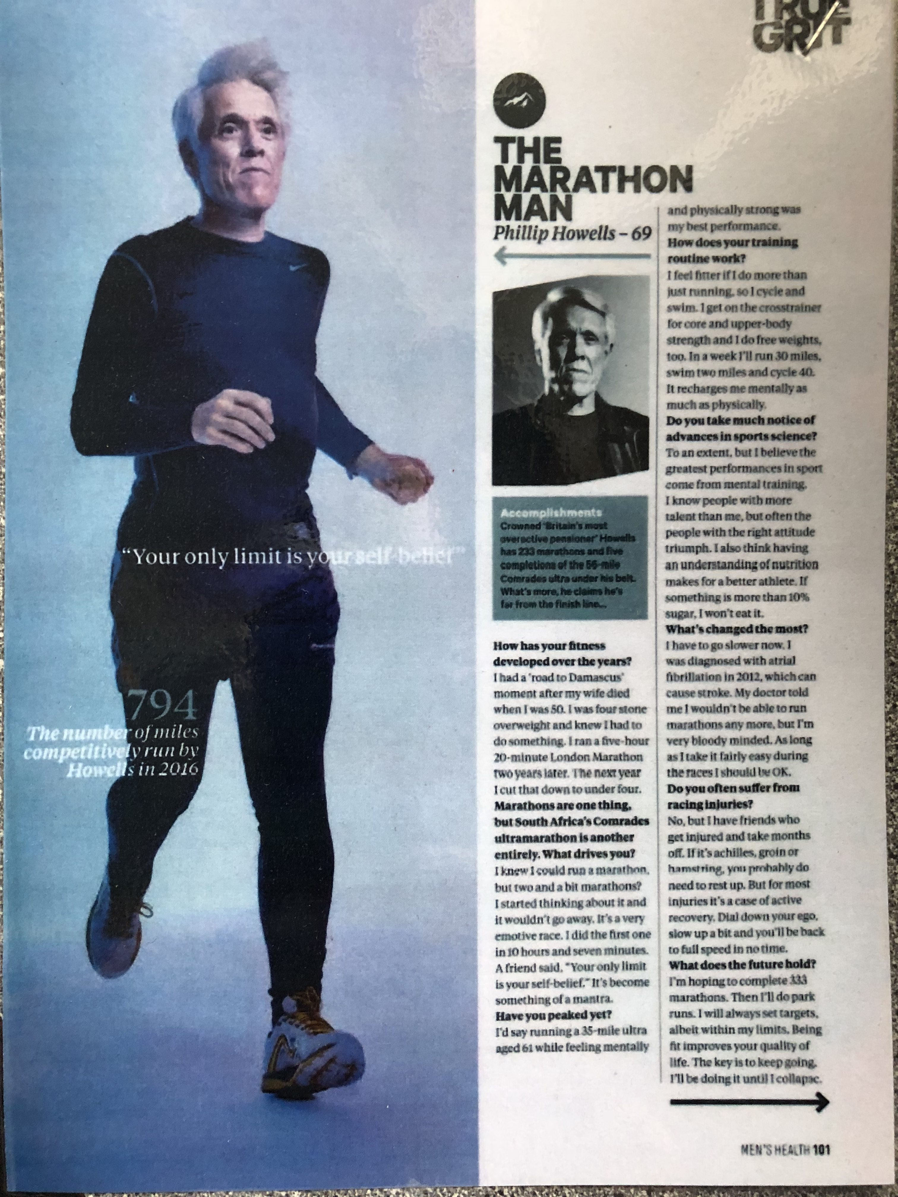
- Radical representation through the use of men of different ages and races
- Constructed identity (David Gauntlett)

Mens health magazine had an average monthly reach of around 1.8 mil individuals in the united kingdom from April 2019- March 2020. Reach was lower with households with children and women. Paid subscriptions were a lot higher then paid single copies with a difference of 44,557.
