A Level NEA – Brief two

Statement of Intent:

My NEA products will relate to the ‘protection of a pregnant women’s liberty to choose to have an abortion’ (Roe V Wade). This project will focus on all age groups of heterosexual women, and I have chosen this specific target audience because typically heterosexual women become pregnant through choice and sadly through some violent acts such as rape.

My NEA project can show clear links to theorists, such as Antonio Gramsci, whose theory on cultural hegemony describes the way a dominant government or ruling class establishes dominant / ruling ideas. Furthermore, my project can also link to Feminist Critical Thinking for example, Judith Butler and Laura Mulvey, the act of the establishing dominant ideas through gender.

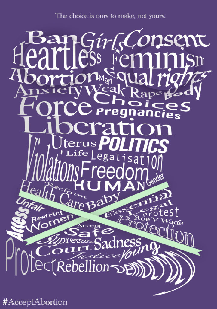
I intend to create three unique flyers which will be printed as an A5 piece relating to abortion and female rights. For instance, I aim to create a female outline, specifically from the neck to the hips, using words that describe or relate to the Roe V Wade campaign. This will be done by warping and shaping the text to the outline. Then, at the top section, the phrase “The choice is ours to make, not yours.” with the hashtag ‘#AcceptAbortion’ in the bottom left. The colours will be a shade of purple, white and a light green. Purple will be used for the background; light green will be for the ribbon around the waist as the colour symbolises abortion and hope and white will be for the text. To add texture to my poster, a drop shadow will be added to the two ellipses on the breasts to create a 3D effect. I will then use a gradient on the left-hand text to create a shadow, as if the shape is seen from an angle.

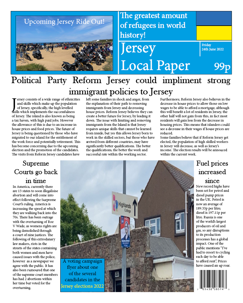
For my newspaper I will use ‘The Guardian’ as my style model, drawing upon the colour scheme (yellow, blue, red, and white), a similar masthead, “Jersey News” in a bold white front with a blue background. Above the masthead there will be ‘plugs’ to inside stories such as the Ukraine Crisis, with a page number next to a quote. Below the masthead, in black bold font will be the title of my newspaper “Roe V Wade Overturned by Supreme Court – investigation of the crucial life decision by DC Peddlebanks. The central photograph of the front cover will be a woman in business attire to represent a governmental member. The photograph will be angled as if she is talking to another person.  The layout of my right side of my double page spread will consist of text on the bottom half of the first page with grey lines separating each paragraph for clear reading and professional look to replicate my inspiration. In the main text, there will be a quote in a red speech bubble, also in red will be the editors name with a black bold quote above with grey lines operating the two text boxes. The title will read “Outrage on the streets as abortions rights taken away- ‘Infuriating tensions’ with a picture placed above. The picture will be of the Jersey Government house in St Helier and be edited to look artistic to match the inspiration. The right page will have side stories covering the bottom half with one on the far right and a paragraph acting as the newspaper company

Inspiration for my Newspaper:

Finished Newspaper Pages:

Inspiration for my campaign flyers:

Finished Flyers:

Practice NEA: Newspaper

For my Newspaper NEA, I intend to produce a newspaper based around politics within Jersey, specifically the political party known as Reform Jersey. I have decided to base my front cover on the party’s intentions of lessening the amount of immigrants in Jersey and discuss whether or not it is best for Jersey and if it is a well thought out manifesto. My newspaper cover is inspired by The Guardian, a British national newspaper founded in 1821. `The following are examples of The Guardian’s classic newspaper cover.

I will produce my front cover in ‘In Design’ to provide myself with a realistic newspaper design. Within the application I will set the document layout to 350 mm in height and 280 mm in width. I will then begin to layout my text and making the text boxes into 3 columns through the text frame options.

Finished Product:

NEA STATEMENT OF INTENT

I am going to create two different products: a three-minute video promoting a new fictional TV programme which will be called “Crisis” and 3 print advertisements which will focus on diversity, issue raised within the programme and the genre. It will be targeted at a young adult audience and be available on Channel 4 TV and the streaming service All 4.

I will base my TV programme off the current mental health crisis that is occurring due to the effects of the pandemic as i believe it is an important issue which teenagers are interested in and in some cases can relate to. It will make clear links to some of the theories we have looked at in class such as Stuart Hall’s reception theory: I will encode the message to speak out and get help and I aim to attract the dominated reader ( where the reader will accept and understand the message) and also possibly the negotiated reader (where an audience accepts and understands some of the messages but disagrees with others). Additionally my poster work will make links to the theory of semiotics such as those dervived from CS Pierce about icon, indexical and symbolic signs which will help to create meaning in the product.

In terms of how I will create this product I will base the video off of the YouTube promotional videos for Skins. This will included having a montage of what happens in the series and use of different handheld camera techniques such as panning, medium/ close-up shots. I will also not use any dialogue but have music playing in the background because if people are watching on their phones then they might not have their volume on, which is true for the young audience. While the style model focusses on the characters mine will take more of an approach towards the setting as well as characters.

Visual branding will be shared through the logo and colour scheme to show it is a part of a unified campaign. The first poster will be based off the issue raised (being mental health) will be conveyed through the glimpse of mise-en-scene presented in polaroid like frame (images relating to a hospital). The second one will show the genre of psychological drama based on the Ladies and Gentlemen packaging design and concept which is a medication packet. For the third one i will base it off The Mean Girls film poster which has a range of diverse characters featured. It will be linked to print product theories such as subverting to the male gaze and portraying women and men as equal and their struggles being the same.

I will use Adobe Premiere to edit for the video and Adobe Photoshop to form my 3 posters.