These three posters are part of a collection, and they all contain close up shots of one key dominant signifier. These signifiers show the main characters, being sports players, in a dominant, powerful light and this is reactionary to the audience that would usually consume this kind of product (young to middle aged men). The settings in these film posters are of football pitches/stadiums, and these give connotations of physical activity. The title text is all clearly defined and easy to see, and is often the second sign you will notice after the main character in the centre.

Firstly, this film poster shows a dominant signifier of a sports player, dressed in sports clothing which connotes ideas of physical activity. Unlike the other posters above, however, it contains a lot more text than just the title, such as credits, release date, and the company licensing it. These bits of text are nicely indented to the point that they to not obstruct the view of the dominant signifier, but can be read easily. This creates a paradigm of signs which give information about the film.

This poster shows a similar dominant signifier, but here he is presented in the middle of running, giving connotations of physical activity. The other signs, such as the text, company logo and licensing label are neatly arranged, and the title text makes use of different colours to stand out from the rest of the elements. The number in the title has a different colour to highlight it, as this is a separate edition of the same film series. The signs cover the dominant signifier in such a way that their face is still showed clearly, and his facial expression remains easy to read in the bullseye shot.

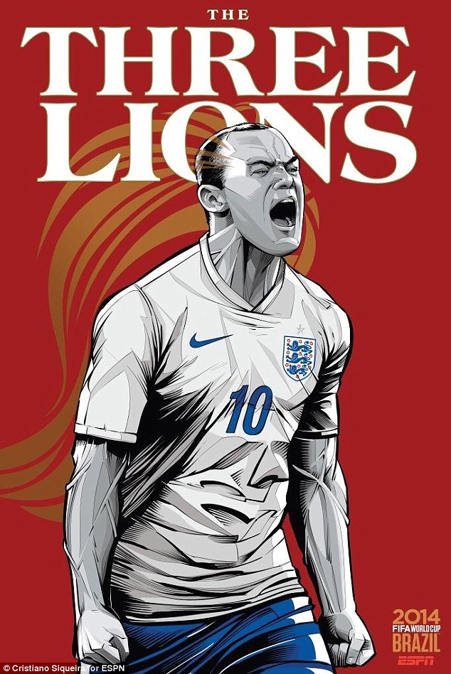
This poster shows once again a single dominant signifier in a similar posture, with details such as copyright information and the event the poster is referencing. The title text, being an icon, is slightly hidden by the dominant signifier. This makes it seem like anchorage and makes it more supplementary than this kind of title text should be, however I think this makes it pleasant to look at.

This poster has many images of the dominant signifier, being a football player, partaking in many different sporting actions. They are arranged in such a way that you can easily tell what his facial expressions are, giving connotations of head work and physical activity, and the icons of age rating and company branding are neatly positioned in a way which makes them only relevant if you look for them.
