physcographic profiles

Quantitative:

My product is for ages 12+ and for a person who has an average income that they can afford to spend £60 on a pair of sunglasses. The main target consumer for my product is a middle aged person (male or female) who are in the need of a good pair of sunglasses.

Qualitative:

My product can be linked to The Explorer. This is because the person who buys a pair of the sunglasses could wear them whilst exploring, discovering new things, setting new challenges and when adventuring outdoors.

Essay

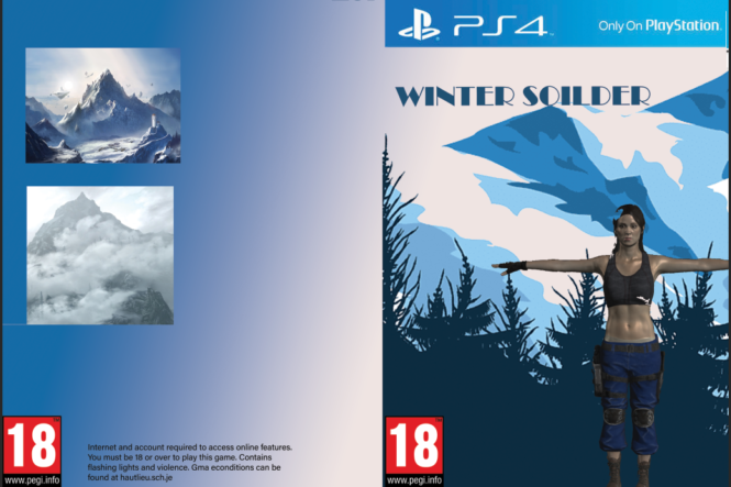
In this essay I am going to compare the two CSP front covers of Metroid and Tomb Raider using semiotic analysis. I am arguing that both games present their main character to be objectified due to them being female, however both games explore this in many different ways. Tomb Raider displays their female main character to be oversexualised with poses and body parts. Metroid displayed their character as a masculine strong character which implies that females are less superior than males.

The front cover of tomb raider presents a dominant signifier of a female character it is clear that Lara is a woman from the cover you frist see Lara’s gun which may seem radical and different from what people are used to however it is quickly seen that this cover is the same as many others For example the position that Lara is in manages to show off both her breasts and her behind in addition to this her clothes don’t help either Lara is shown to be wearing a tight shirt and tight shorts Both of these examples set an unrealistic example for women, that they should sexualize themselves to be seen as sexual objects This matches with the male gaze and Laura Mulvey’s views “woman displayed as a sexual-object is the erotic spectacle” Overall, whilst Lara’s guns show that she can be tough and fend for herself which is contrasting typical views of women in video games where they are normally “the damsel in distress” the front cover of the game also feeds into the stereotype of sexualizing women in games. The quote “For every forward step however, there is often a reminder of how far is left to travel” from the article “diversity matters” perfectly describes how this front cover portrays Lara Croft. 

 Furthermore I believe that the representation of women and the ‘Male Gaze’ are shown in an overall more positive way in the Metroid cover image than the Lara Croft Tomb Raider cover image This is because there is some evidence of an effort to cover up the once again over-exaggerated body of the character The armour she wears also creates a reactionary response within the audience as they are led to believe that Metroid is a male character from what is displayed in the iconic sign Neither of these CSPs support the ‘damsel in distress’ theory that I mentioned previously This theory is described as how the female character in numerous storylines is more often than not the one who needs rescuing or saving from a typical antagonist by the male hero These images and game contents are trying to point people in the direction of knowing that women are very able to defend themselves against themselves and others This may not always be the case however Once again the excessive sexualisation and violent nature of these video games may not have a positive impact on the audience outside the target

In conclusion I believe that neither CSPs present women in a good way This is because of how their bodies are used as pleasure for the targeted audience more so with the Lara Croft example The Metroid cover does make some effort to cover up Samus’ body with the classic Metroid armour as well as to cover up some of the contents of the game itself Both games covers prove Laura Mulvey’s theory of the Male Gaze true The use of these images can also bee seen as disempowerment This can easily be improved by games cover designers creating countertypes of the covers This would flip the negative effect they give on its head making it positive People in the further audience may then be more inclined to buy the products increasing sales and revenue Some other developers might take the same idea on board and follow along

the currently ‘over-the-top’ sexual exaggeration and representation of women overall may be improved over time

Advertising: NEA statement of intent

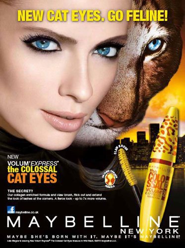
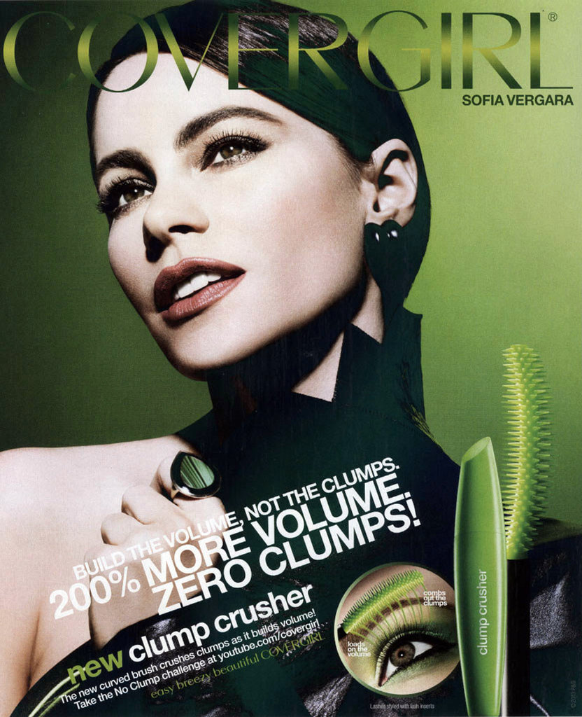
I would like to advertise my product on focusing on the product itself and also involving images of hair so that it could be an example and a demonstration of what will be shown on the advert. I would like my image of the product to be very clear and readable as I would like to see the product itself. I would also like if I could have a model as it would indicate what the product is used for.

For my advert I would like to create it with my own imagination and try to experiment with all sorts of techniques. I would like to make it vivid but not with extreme colours. There will be 3 different images of my style model who will have different poses to demonstrate how my product makes them feel. I don’t want to add a lot of information as the audience prefer more visionary pictures rather than wordy images. I am still not very confident with the final colours that I will be using, however I think I will just experiment with all the colours that go well with he image. The aim I have with my image is to attract the audience to look at my style model because then the audience will gain the impression that they will look like them. Therefore, my first advert will be something to experiment with and make the audience believe that the product could change their lives.

For my second advert I would like to follow the example of some other adverts, but adding my own ideas instead. I think I will have my style model being the main image with the product at the bottom of the corner or at the side. There will be a heading and a slogan on the image as the product will stay on their mind. I would like this image to be very creative and radical. This is because then the icon of the image will look realistic. Ferdinand de Saussure helps us realise that the signified will stand out and it will imply to the audience what I am trying to attract.

My product will be the dominant signifier as it will be the main image of the front cover of the article. Additionally, my product will also be anchorage as my product is shampoo and will need context in whom it is aimed for. For my product their will be an index symbol as their will be a model that will relate to the product. Therefore, my product will be reactionary and less of radical. Roland Barthes gives us the knowledge to create the advert we want to make to look in a certain way. However, I would like to add more radical ideas.

This product will be targeting women as varies of women struggle with hair products and I will like to portrait how my product is better and it will give a boost of confidence towards them. This is also known as the aspirer as women will feel motivated by esteem and status needs. This could also explain how giving the positive and negative stereotypes to give the impression of how they feel towards the product. I would also like to add the mainstreamer to motivate the audience that it is something they need that should belong to them. The reason for giving both adverts the sense of fluidity identity is because I would like to give the ability for the audience to see how they could change themselves. Overall, I would like my audience not to feel lied to and believe what they see and what it does.

Statement Of Intent – Advert

My aim is going to be to create two contrasting (one reactionary, one radical) advertisements to promote a Molton Brown body wash product. The two styles of advertisements will portray varying representations. I am going to try and replicate something that would be shown in a print magazine. The style model I am going to attempt to recreate is a Revlon Research Flex Formula advertisement for a hair product that was shown during the 80s. To do this, there will be a few things that must be included in my advertisements.

The main component of my advert will be a dominant signifier including the hands of my model and the product being spilt over them. I am aiming to have no harsh joints/lines between the images that I will insert during post-production to have a softer looking advertisement in general. For the reactionary advert, these images will be kept in colour with slight editing to the colour tints and textures. This will be done using Adobe Lightroom software accessible via the school computers. This will help match the Head and Shoulders style model as closely as possible. I am going to use a female model as this will create a reactionary response from the audience. This advert will be directed towards the Aspirer and Mainstreamer audience groups, with the target age group ranging from 10 and up. Either gender would be able to purchase and use the product, I just preferred to use a female model as one is used in my style model. The strapline will be: “The only wash you will ever need”, as it is similar to the original. This will present the idea that the model feels good about the way they smell and how their skin looks and feels.

For my radical advert, I am going to use both a male model and a female model. It will target the male audience only. I will do this by getting my models to pose in a position where the female is clinging to the male that men find attractive, accompanied with a strapline stating: “Drench your skin in the smell of health”, with accompanying text underneath explaining the benefits of using a Molton Brown product. Other features will include a small Molton Brown logo in either of the bottom corners and an image showing the products themselves.

Male Gaze, Dominant ideology, Audience Positioning, Counter-types, Patriarchy.

David Gauntlett – Collective. and constructed identity.

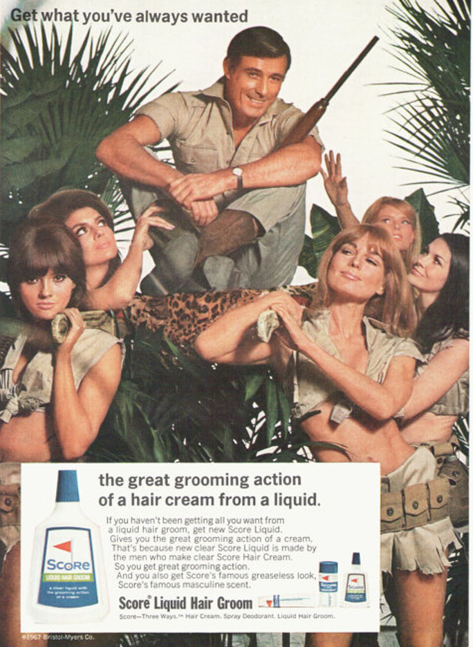
score

1967 advertisement.

Male directed as mentions the ‘Scores famous masculine scent’. The advert sexualises women as they are wearing tight revealing clothes. Sexist approach of the male being ‘admired’ by females around him.

Similarly, feminist critical thought became much more prominent and pronounced during the counter cultural movements of the late 1960’s and early 1970’s, which heralded, among other changes a greater acceptance of birth control and divorce, abortion and homosexuality.

There was also the abolition of hanging and theatre censorship, and the Obscene Publications Act (1959) which led to the Chatterly trial. Nevertheless, as Johnathon Dollimore wrote: ‘all this should not be seen as a straightforward displacement of dominant conservative attitudes‘ (1983:59).

The Score advert was produced in the year of decriminalisation of homosexuality and as such, the representation of heterosexuality could be read as signalling more anxiety than might first appear. The reference to colonialist values can also be linked to social and cultural contexts of the ending of Empire.

statement of intent

For my advert, I will be advertising a curling hair cream . My product will be aimed at females with curly hair aged 16-45. I will advertise this product in the media form of magazines as magazines are popular for my target audience and I think this will reach a large group of people.

The advert with contain my class friend Honor Wade holding the hair product with her hair down to show her curly hair as if she uses the product regularly. This convinces the audience that this product will give you gorgeous curls as Honor has naturally curly hair. This is to represent how adverts show you what you want to see instead instead of the truth.

For the advert, I will have a simple background so the attention is on the curling cream and model so you cant miss it.

Statement of intent: nea Personal product

I intent my product to be seen in two different views and ideologies. First my advert will contain a modern approach set as a reactionary view of men, that all men wish to be manly and want to be strong and have muscles. It will be a target market of 18 – 45, young adult to older men who wish to be fit and stereotypically attractive to women. On the other hand, the second advert will be a radical view in the sense that the dominant signifier will be a female based in an earlier era such as the 60’s and the whole idea will be based around that woman can work out and be strong and muscular too.

In the first advert, it will be a sort of personal attack and a bit degrading in a sense, like modern advertising now. I will be using methods to subtly manipulate the target audience to believing that they need the protein powder to be fit and muscular as well as instilling a toxic ideology that all men want to be strong to also be stereotypically attractive to women. To generate more sales, the dominant signifier, a man will wear a fake muscular outfit with the idea that you don’t need to fake it, you can be it, by buying the “my protein” product. I’ve recently tired to portray this by using certain features in the advert such as a indexical sign that stands out to say something along the lines of “Build more muscle now!” and other symbols to try to steer the customer to buy the product and assure that this is what they want. The main object, being the protein will be held by the main subject in the ad who is also the dominant signifier, or instead placed in front of the flash lighting with soft boxes, it will create a professional image for the protein to created a signified field. It will attain a negative stereotype that all men want to be muscular, this follows the ideas of the score SCP that the man can get what he’s “always wanted”. The ad is trying to construct an identity amongst the market for everyone to fit and healthy and the only way to do so is to consume protein powder, it doesn’t promote exercise itself, just promotes the protein powder itself. There will be an anchorage with the indexical sign and tagline “It doesn’t have to be fake, it can be real” with the idea that the dominant signifier and the customer will be ashamed with their appearance and will want to be big and muscular. The image of the anchor will be the dominant signifier. The denotation of the ad will be to obviously generate more sales for my product as if it were a real product to be sold. I will be trying to professionally recreate and generate my own ideas for an advertisement with both radical and reactionary ideas. I will be bringing my own protein powder to be used in the ad as well as sporty clothing and something to substitute for the reactionary idea of men wanting to be strong. I followed the style model by following the ideas of the very muscular man pared with the protein in a syntagm to show that the protein powder helps the man become very strong. A health and fitness company would make my product in order to sell to the large market. This is directly related to the company in the style model “My Protein”.

On the other hand, we have the second ad that will be based on radical ideas. It will be a female, perhaps based in the 60’s/70’s, an era where woman were subjects to sexism and degrading advertising in a voyeuristic manner to take advantage of the male gaze to produce more sales. However, my ad will be a radical representation as the female will not be sexualised at all and will follow an idea that women can be strong and muscular too. This is a counter-stereotype to oppose ideas that women are below men and cannot do what men can do. I will do this by getting a female in non-sexualised clothing who looks serious and strong whilst holding the protein, the idea is that the female is very serious about the idea of fitness and becoming strong also, which is a clear radical idea, specifically in the era the ad will be held in, this all fits to be a syntagm. The audience of this advert will be women who wish to be strong and muscular also and to be respected and feared, to oppose to typical social constructs. In a sense the ad is a rebellion for women to break out of the sexist society of the era.

Statement of Intent

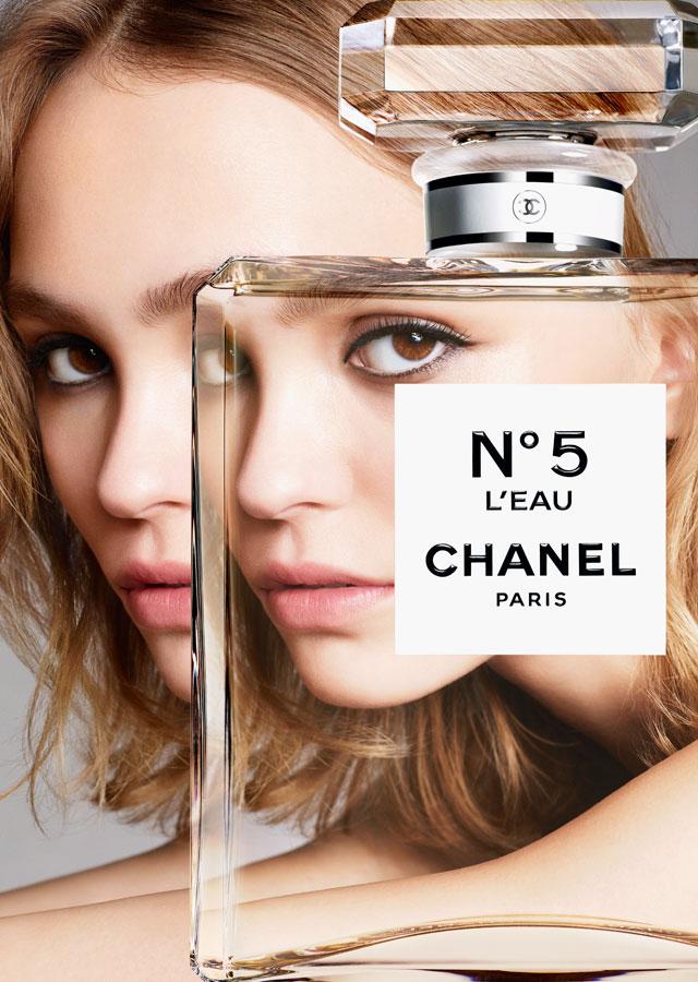
I intend to create two print adverts to promote a “Jimmy Choo” perfume, both with different representations; radical and reactionary. I imagine these adverts to be professionally printed in beauty catalogues/magazines such as Vogue.  I will include iconic signifiers displaying the products, a dominant signifier of the model’s back profile in a mirror, anchorage to provide information about the product and indexical signs that sell the product based on feelings.

The reactionary product will be set in the 1960’s historical period. My model will be facing the camera and holding the perfume in her hand and spraying it onto her neck to make her seem even more attractive. She will be wearing a dress to represent her wealth and glamour which will be associated with the perfume. This links to the “Male Gaze” as as she will look expensive and attractive and her clothes will be planting the seed that her purpose is to attract men which is a reactionary representation of women as they are believed to be designed at a males disposal. my slogan is going to be “you’re not the same, be different” this gives the impression that by using this product you are of more worth and special; better then other women who are not using this perfume. This will go for both my adverts but convey different meanings based on the images. I intend for an older audience to buy this product ranging from the ages 25-45. This is designed for heterosexual women who are of an upper class who believe their wealth, desire and ability to pleasure men will come from buying this product.

My radical product will be a modern version. This will include my model’s face and and front profile. She will be wearing a suit which is quite controversial and challenges the dominant ideology of what stereotype women are usually seen wearing, to juxtapose ‘societal gender norms’. Also raising awareness that clothing is expressive meaning people should be able to wear what they feel comfortable in. This perfume is being used to advertise this which gives the connotation that it will give people the confidence to be themselves and be bold. The slogan is going to be “you’re not the same so be different” the “so” changes the meaning to embracing the differences within people in a healthy way rather then putting others down. I intend for an audience ranging from (18-45) to buy this product. Its designed for bold women who are learning to embrace themselves, the kind of women that inspire other women to be the better version of themselves; creating a positive and diverse representation of what it means to be a woman and femininity.