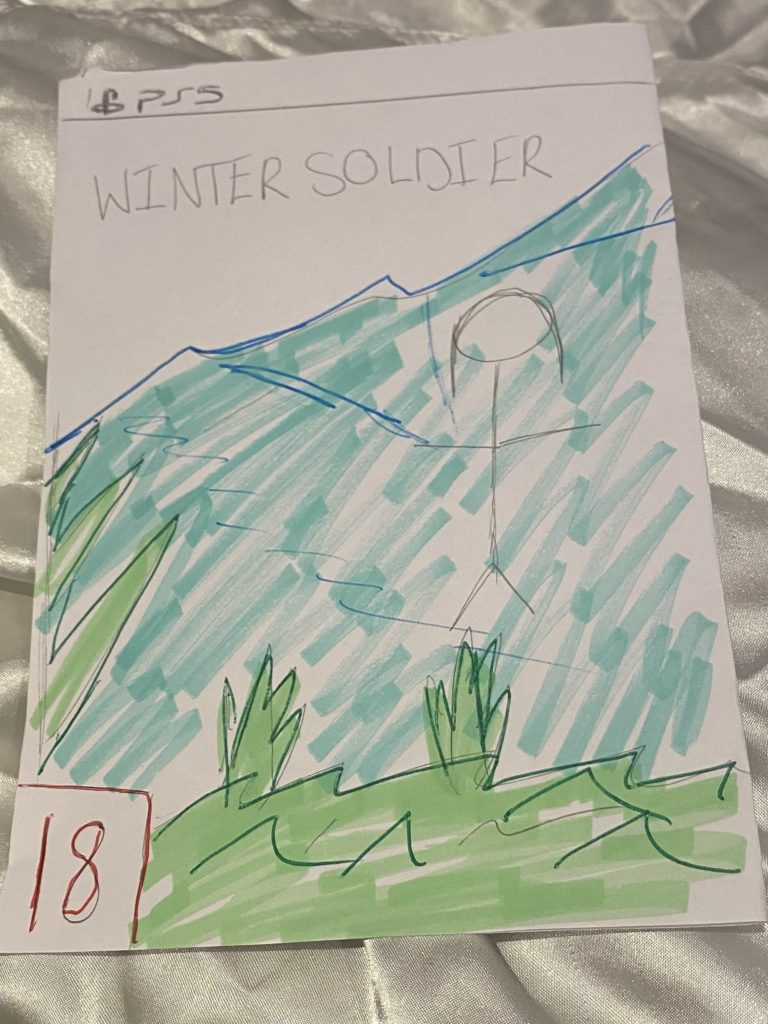
Game cOver sketch


In this essay I am going to apply a semiotic analysis to both the Tomb Raider and Metroid video games covers. I will argue that both Tomb raider and Metroid represent women in two different ways and will be arguing about the sexualisation to Lara croft and link this back to Laura Mulvey and the ‘Male Gaze’ and then the radical representation to Metroid and the main character Samus Aran.
I think Tomb raider takes advantage of the main character Lara Croft as she is dressed in revealing and clothes which is used to sexualise her and attract the straight male to buy their game. This is degrading to women as it sexualises her and draws attention away from the actual point of the game. Lara Croft is also positioned in a way to show her body as she is positioned to show her female attributes, for example her butt and breasts. They have also given her a very unrealistic body by enlarging her breasts while giving her a very petite torso. This then contributes to unrealistic beauty standards where many women and men believe that this is what women should look like. On the other hand, I can also argue there is a radical view as Lara doesn’t rely on any Male help during her quest. This then influences the gaming community to change their mind about women being the ‘damsel in distress’ and that only male characters should be the ones fighting.
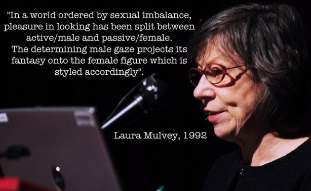
This links back to Laura Mulvey and the Male Gaze in that the dominant signifier is designed in a way that she is sexualised. Laura Mulvey said “she is a character who’s appearance is coded for a strong visual and erotic impact”. Laura also states that women are presented as sexual objects to satisfy the heterosexual male.
The Metroid game cover completely covers the main characters body and hides her gender and identity by doing this. This then focuses the gamers on the actual game rather than the body and features of the character. The armour she is wearing shows a powerful and strong character. Most people believed the main character was a male, this links back to the reactionary view of women as women are believed to be the ‘damsel in distress’ whereas male characters are the heroes. Metroid counteracts the stereo type and shows a radical representation.
I intend to advertise a jewellery line. I will create two magazine print adverts, both with different representations in order to highlight how societal views on issues such as gender roles, social class and the LGBTQ+ community have evolved.
My reactionary representation, will resemble that of an old 1920s advert. the image will be faded and grainy to illustrate its age and how this representation is outdated. The dominant signifier will be a headshot of a woman wearing the necklace dressed in elegant, and sophisticated clothing which will signify that this product is aimed at female audiences of the upper class – supporting the conventional ideology at the time where typically only women wore jewellery – as well as their husbands who may want to buy this as a gift for their wives in the hopes it will make them look better presented. She will be represented through the eyes of the male gaze through the use of intimate body language and the iconic sign of a male’s hand reaching for her hand from the side of the shot reaching to administer this idea that the buyer will gain more male attention. The strap line will be ‘say nothing, just wear solitaire jewels’ creating anchorage for potential buyers as it insinuates that by wearing this product you will be able to attract anyone. My product will be sold by a designer company called Solitaire Jewels, similar to that of Tiffany & Co or Cartier, reinforcing the ideas that my high quality jewellery will be aimed at wealthier audiences, between the ages of 20 – 40.
My Radical representation will portray multiple images of both men and women wearing my product to contradict the dominant ideology that it is unconventional for men to wear jewellery. There will be three different images of each model wearing three different styles of clothing in order to illustrate that my product can be worn on any occasion with any style of clothing. The dominant signifier will of course be the necklaces around the neck of my models whose faces will be outlined and filled in with a block colour to symbolise that no matter your gender, sexuality, nationality, race you can wear this necklace. I will edit in iconic signs of the product also draping from the top of the shot to create a more pleasing and busy image. My product will be sold by a luxurious yet affordable brand called Ubiquitous Charms, similar to Oma the Label or Baublebar, so that it is accessible to anyone of any income and will be aimed towards people aged 16 to 30 however the style of jewellery is made to suit anyone.
The product I am advertising is Lush’s ‘Rosy Cheeks’ face mask. I am using fellow student Kate McKenna as the face of my brand. In both adverts, I will take on a reactionary stance, which fits in with the ideals of the era in which the adverts supposedly take place in.
In my first (modern) advert, my target audience will be women aged 12-25, who are looking to get smoother, glowing skin on their faces. The aim of this advert will primarily be emphasising the positive qualities of my product through a clean, pretty aesthetic and informative description. The adverts colour palette will mostly consist of pink / nude shades because these colours are usually associated with love, kindness, calmness, and femininity. I will apply this by using a pinkish background, and by dressing my dominant signifier/face of the brand (Kate McKenna) in pinky colours. I also photoshopped a pearl earing onto her ear. Pearl earrings are a symbol of class and riches, and so by including one in my advert, it suggests to the audience that the product is a luxury one. It also makes the advert look prettier. Furthermore, I used photoshop extremely liberally in this advert (see my post titled ‘BEFORE / AFTER PHOTOSHOP‘). I smoothed out Kate’s skin, took away any moles, spots, and blemishes, thickened out her eyebrows, lightened her skin, coloured in her eyes to make them bluer, took away her eye bags, made her skin lighter / clearer, and filled in her lips to make them thicker, redder, and a more idealised shape. In my view, adverts shouldn’t use photoshop at all, and to me, Kate looked just as (if not more) beautiful in the unedited picture of her. However, as almost all adverts (especially skincare ads) use photoshop to make their product look more appealing to their target audience, it is essential that I use photoshop in order to fit in with the ‘reactionary’ stance I decided to take with my ad. The main selling point of the product will be the soothing, calming influence it has on the skin. The tagline (indexical sign) will be “give your skin the love it deserves”. This reinforces the calm, kind, and loving feel (the anchorage) of the product which I’ve tried to connote. My style model is unfortunately a landscape ad (I am required to do mine portrait) and so I will be taking most of my influence from the adverts ‘feel’ rather than its layout. The most obvious way that I’ve taken influence from my style model is by using a flower as part of my backdrop. The type of flower I decided to use was a rose because the name of my product is ‘rosy cheeks’, and a pretty pink flower connotes feelings such as love, kindness, calmness, and femininity. Also, the font I used on the company and product name (‘Lush’ and ‘Rosy Cheeks’) is slightly similar to that of my style model, and it connotes a luxury, posh feel. Finally, I directed Kate to use a pose that slightly resembles the pose Kate Winslet uses in my style model (head turned slightly to the right with a natural – but elegant – expression). I differed from my style model by placing Kate smack bang in the middle of my advert. I did this because I want the audience to immediately be drawn to Kate’s face because that is the dominant signifier of my advert. Hopefully, Kate’s beauty and clear skin will attract the attention of the target audience, who will likely yearn to have skin as clear and beautiful as hers.
In my 60s era advert, my marketing strategy will be slightly different. Instead of targeting strictly women aged 12-25, my target audience will be women and men aged 18-35 (however the advert will be directed towards women). In this advert, I followed my style model much more strictly. The theme of the advert will again be reactionary (for the time period). The reactionary stance of my advert is most clear in my slogan – “Give your man a face he wants to touch”. This slogan suggests to the target audience that she needs to use this product, to appeal to the sexual desire of men. Degrading slogans such as this one were extremely common in advertising during the 60s, and so it is important that I made my slogan creepy and politically incorrect (by modern standards). My picture will follow the same theme as my slogan, as I will have a man (me) caressing a woman’s face (Kate). This is extremely similar to my style model, which also pictures a man touching a women’s face in a loving manner. However, one area in which the two pictures are different is that in my advert Kate is looking towards the camera, whereas in the 60s advert the woman is looking at the man. I made this change because I believe that by having Kate look at the camera, the passive viewer of the advert will be more interested in the product. I again matched my style model through the use of colour, with the dominant signifier of the advert (the picture of me and Kate) appearing in black and white, and the banner at the bottom of the screen appearing in a creamy white colour. The dark colour palette of the advert connotes a dark, sexy vibe, which captures the viewer’s attention and creates feelings of passion and energy.

Male Gaze:
In feminist theory, the male gaze is the act of depicting women and the world, in the visual arts and in literature, from a masculine, heterosexual perspective that presents and represents women as sexual objects for the pleasure of the heterosexual male viewer.
The Male Gaze describes the practice in which where media is filtered through the lens of heterosexual men. In other words, the viewpoints of the heterosexual men is accepted as the norm, whereas the perspectives of all others are largely ignored.
Some examples of the male gaze in media include: Extraneous nudity by female characters. Slow camera pans of women’s bodies. Women wearing tight or occasion-inappropriate clothing when male characters are appropriately dressed.
Laura Mulvey:
Laura Mulvey is a British feminist film theorist. She was educated at St Hilda’s College, Oxford. She is currently professor of film and media studies at Birkbeck, University of London.
Laura Mulvey is a feminist film theorist from Britain, best known for her essay on Visual Pleasure and Narrative Cinema. Her theories are influenced by the likes of Sigmund Freud and Jacques Lacan whilst also including psychoanalysis and feminism in her works.
Quantitative:
My product is for ages 12+ and for a person who has an average income that they can afford to spend £60 on a pair of sunglasses. The main target consumer for my product is a middle aged person (male or female) who are in the need of a good pair of sunglasses.
Qualitative:
My product can be linked to The Explorer. This is because the person who buys a pair of the sunglasses could wear them whilst exploring, discovering new things, setting new challenges and when adventuring outdoors.
