Statement of intent – NEA

I intend for my product advert to be targeted towards young men between the ages of 16-30 to imply that the Sekonda watches are affordable, smart and functional. I will be using the watch in the centre of a crowded space to imply that life can become crowded and that buying a watch can help fix that issue , along with small text. The advert is meant to imply to people they should have a smart watch to make themselves smarter and liven up their dress, impressing people around them and at work. I will also attempt to use the quote “Find your watch today” implying that there are many options that a person can pick from and that there are multiple types to fit multiple outfits at a good price. In this advert I will be using a serif font to make the advert seem fancier, I will be using a box around the advert to make the customer focus on the actual product instead of the surrounding clutter and items, then I will add the Sekonda text to make the advert look smarter and seem like its from the actual company, not a student. I will be making the watch specifically jump out by making it a bit brighter than the surrounding objects. The watch will be layed out flat to show the full leather straps and the quality of it to impress customers and show how smart the watch is, also in the background I will be using womans perfume, mens body wash and female magazine page to signify that the owner of this watch has taken off the watch due to having a lady friend over.

I will be doing this by using my own Sekonda watch for the reactionary advert and will be using a Sekonda woman’s watch in the radical advert. I will be making the woman’s advert radical by making the advert wildly sexist and putting the watch on a wooden rolling pin then sprinkling flour around the scene to give the sexist ideology that woman belong in the kitchen, as well as this it supports the old stereotypes that woman are below men and that everything is patriarchal. I will be using my mums golden female Sekonda watch and putting it around the rolling pin. I will be using the quote “make sure nothing burns” to really display the targeted over sexist advert that I have made. Of course this is just for the idea of the advert and I do not agree with the message. I will be adding a cooking recipe page behind the scene to make nearly a copy of my modern, male advert to display the duality of adverts and advert styles. I will be using a lot of bright red and orange colours to give the ideology of the sixties, with a couple blurred areas, older style font, noise in the photo along with colourful flowery patterns to capture the sense of the sixties. I will also take the photo in the infinity screen with flash lighting with soft boxes to make the gold of the watch shine, the reason for this is to show off the quality of the product rather than to make the presumed woman wearer feel glamourous, this is the patriarchal sixties after all.

CSP 4 : MAYBELLINE

Colossal Big Shot Mascara.That Boss Life Pt. 2 ft. MannyMua and  Makeupshayla - on Vimeo
  • Companies are being more racially diverse within their adverts which gives them a better representation for who and what they support.
  • The influencer Manny spreads the positivity of using makeup on either gender with the tag, “lash like a boss”
  • The influencer, Shayla spreads the idea that its difficult for different races to wear different makeup due to tones and shades being different, Maybelline fixes this issue with their new product
  • The ads background presents the idea that it is an expensive product, however it is advertisement is implying the product is luxury but affordable.
  • The slogan displayed for the video is a catchy, inspirational moto.
  • Maybelline makes (USD)$146.82 million a year in sales with 4.48 million people using Maybelline eye products in 2020.
  • Founded in 1914, New York, United States.
  • The characters in the video are shown to be confident and good looking to imply that if you’re a different race, sexuality or gender it doesn’t matter and you can do whatever you would like and be great at it.

Statement of Intent: Advertisement

I intend to advertise the product ‘Celebrations’ – a miniature chocolate bar collection by Mars, Incorporated. I will create two different adverts – one radical and one reactionary.

For my radical advert, I am going to base it around an 80s and 90s themed advertisement. I want to present the excitement of a literal celebration to appeal to all ages and races (specifically a younger audience ranging from ages 7 – 25), so I will include bright colours and lights. I also want it to be aimed towards friends and families – so it might include a diverse group of people, to show that the product is available to share with everyone. This will also coincide with the ‘Celebrations’ tagline: “Share the joy”, which I shall include in a bold font with a contrasting colour to the background to make it stand out. The product being advertised will be the dominant signifier and this will be placed at the front of all the layers to draw attention to it.

For my reactionary advert, I am going to design it in the style of a modern advertisement. I want to feature Laura Mulvey’s idea of the male gaze. My dominant signifier will be a man in the centre of the advert surrounded by women gazing lustfully at him. This will entice other men into purchasing the product due to the voyeurism that consumes the hegemonic masculinity in our society.

dominant signifier /

ideology

paradigm

icon

index

symbolic

signifier

signified

David Gauntlett

fluidity of representation

collective identity

male gaze /

patriarchy

voyeurism /

dominant ideology

hegemony /

Advert statement of intent

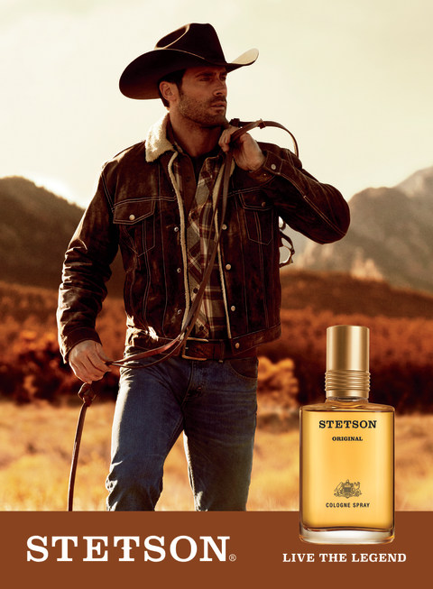
Stetson Cologne - CVS Pharmacy

For my AD I want it to be similar to other cologne ads that are seen in the media, like the AD above. However whilst I want it to be similar to this AD shown, I do not want to copy the style completely and would like to go for something more modern instead – that would be seen today. I still want to have a dominant signifier of a well-dressed man taking up most of the ad, with the product, its name and a slogan at the bottom. The model will be well dressed as to symbolise wealth, with a gold waistcoat and sunglasses.

As I want my ad to be more modern I feel like a minimalistic approach would be more appropriate, with no background in the AD – this will help keep focus on my product -instead of distracting the audience with background elements – and still keep the AD looking how I want.

My AD is targeted towards predominantly richer men shown in the gold waistcoat and gold box on the bottom of the AD – an iconic signifier of wealth and luxury. I want my AD to have a connotation of dominantly wealth and luxury, and link the cologne to being wealthy as to make it fancy and to show that the product is prestigious.

My AD will come out as quite reactionary and stereotypical, possibly helping promote the ideology of the patriarchy and men being powerful as my male model will appear powerful due to the symbolism of wealth.

As mentioned earlier, I have positioned my audience to be predominantly richer men, those who can afford luxury items, which fits into Young & Rubicam’s audience model

Icon(ic) – Index(ical) – SymbolConnotationDominant SignifierIdeology – Reactionary – Signifier

David Gauntlett – Constructed Identity – Collective Identity

Audience Positioning – Positive/Negative stereotypes – Selective representation – Patriarchy

Young & Rubicam (The Aspirer and/or succeeder) And Opinion Leaders

ADVERTISING NEA : Statement of intent

AFTERSHAVE AD

For my advert, I would like to show the result of what the product would look like on someone. This product will ideally be only for men, and shows a reactionary view. It will have a reactionary view in the sense that the dominant signifier will be males that look smart, formal and smug, to create the desire for the product so that the buyer could look the same way to make the target audience buy it.

I will place the product along side the dominant signifier to show what its going to look like when bought. Its going to be highlighted in a outer glow to emphasize the product and how glorious it is. The model presented in the advert would have a index to the aftershave product and the product is a symbol to the model. The whole advert is a icon as it represents the whole product in one.

The name of the product will named in the language French to make it sound posher and further demonstrate how fancy it is.

In order to do this, I will be the model and dress up with formal clothes and shades to create a desire for the product.

Iconic, dominant signifier, reactionary, index, symbol, connotation, signified, ideology

David gauntlet – Constructed identity, collective identity

Constructed reality, Male gaze, positive and negative stereotypes, Audience positioning

The aspirer, The reformer.

CSP 3: Score

Media language Analysis

Semiotic Analysis:

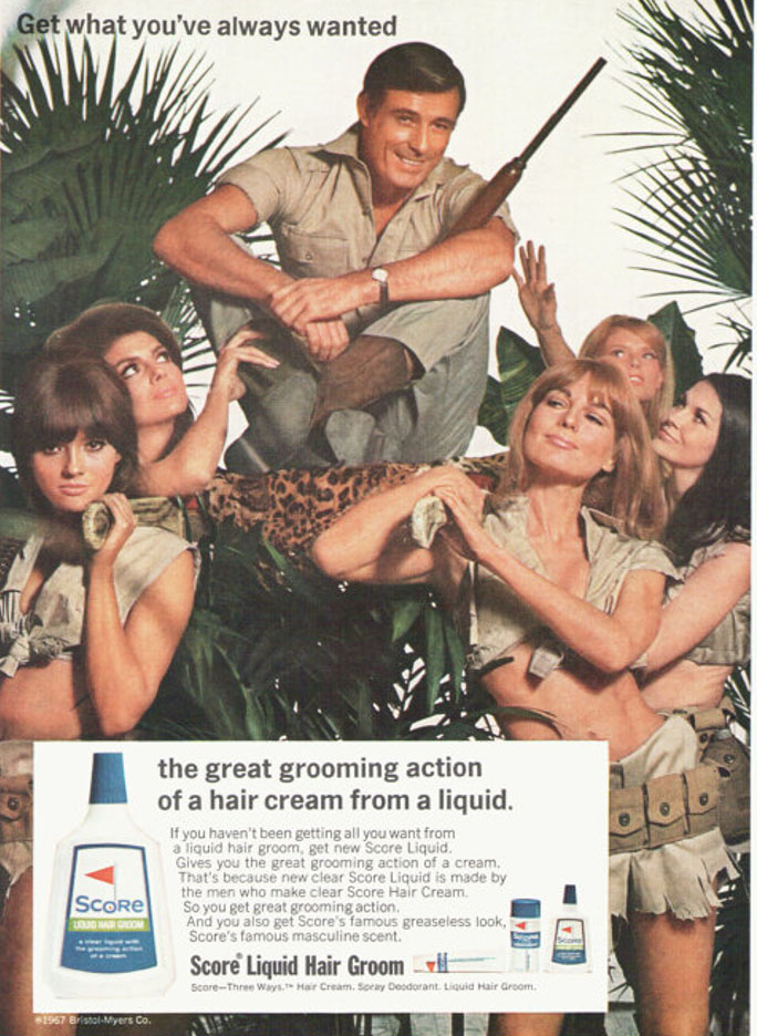
  • The Dominant signifier is the male who has been placed above all the women. He is surrounded by a paradigm of women who clearly are holding the man in a higher status, they are beneath him both literally and metaphorically. There is a code where the man is holding a weapon and seems to be in a dangerous jungle like area, this holds meaning to the fact that the man is strong and supposed to be shown as attractive to women, saying if you use their product it will make you manly and irresistible to women. This is a reactionary view of the time as during the era of this advert it was normal for women to be discriminated and seen to be beneath men, hence the use of women holding the man above them. The anchorage of the phrase “Get what you’ve always wanted” followed by the image of the man being held above the women all under the theoretical spell of his masculine appeal.

Textual Analysis:

  • They’re in a jungle type setting, which allows the females in the ad to wear their supposedly safari clothing, which is just clearly a over sexualised type outfit, to clearly be attractive to the presumed straight male that the ad is targeted at.
  • A main male character, with a well cut clean shave, (to promote the product of course).
  • The main heading “Get what you’ve always wanted” – Text that attracts the customers and the target market.
  • 5 Female characters being used as a marketing strategy to appeal to the target market.

Representational Analysis:

  • This ad is a clear representation of the Patriarchy, the women are clearly being used in this constructive reality where they are here only to serve to men, the ad is trying to create a collective identity that if men use their product they will “Get what they’ve always wanted”. Based on contextual ideas, this is all a tool used to generate more sales and produce more loyal costumers, which of course, is a main purpose of an advert.
  • The text clearly follows some voyeuristic ideas, as well as the use of the male gaze, to once again, like mentioned before, appeal to the target market of the presumed straight male.
  • This ad is an bold representation of body positivity values and the fair and equal representation of women during the time period. From my own knowledge, during this era women were discriminated against and were not treated anywhere near as equal to men. Men were considered protectors of women and that women were to do as they were told by their husbands. As men went out for work and earned the majority, if not all of the money for the family, the wife would stay home and take care of the kids and the home. I believe that therefore, the use of the women in this advert, represents this old ideology and tradition.

The narrative:

The narrative of this advert is that if the man in the advert was not using the score hair grooming product, he would not be worshiped and wouldn’t be attractive to women, that he would not be as manly. The main title and strap line of “Get what you’ve always wanted” directly points out to the audience of the advert and uses a subtle manipulation of the reader, that in fact YOU do want what is being shown in the ad, that YOU want Score grooming product. It implies that that all men want it, this is a toxic masculine idea which clearly creates some issues but yet, it’s what “you’ve always wanted”. It also follows ideas that men want to be better than everyone and want to be attractive to women, but it can only happen, the thing that they’ve “always wanted”, if they buy their product and shave using their grooming products.

statement of intent

For this advertisement, I intend to present a perfume as admirable through clever persuasion, through media. Written in a golden font the phrase ‘Be desirable, wear Gucci” suggesting a reactionary approach. This is due to the idea of perfume adverts usually inflicting the idea that wearing perfume will mean you are admired and wanted all of a sudden. I have used a women’s magazine as a prop, identifying the audience positioning of the perfume to be those who choose to wear a female scent. I envision the magazine to be casually positioned, with the perfume standing upon it. The magazine features a model on the front due to her article being published in the magazine. With my product being next to it, the elegance of a model wearing it could possibly be inferred.

The colour of my product, red, is sharp and mysterious. This adds a sense of richness, possibly identifying the target audience as aspirers and those willing to spend more on perfume, additionally. I want my advert to have a golden toned background reflecting against the gold font on the product. The metaphor of royalty is almost suggested through this, demonstrating my product as expensive. I also do not wish to feature additional pictures or text as I am taking a simple approach to the advert, portraying the minimalism of the scent and the perfume itself.

The text ‘Wear Gucci, be desired’ signifies the message that perfume adverts try to influence over consumers ‘ wearing the product will increase attractiveness’. I have chosen a gold coloured font to match with the gold font already present on the original Gucci product, making it more realistic.

I did not use any sexualising marketing techniques with intention. However, the magazine of which is seen to be present in the advert reads sexual language. This language relates to connotations of femininity so links with my ‘female targeted’ product. The patriarchy and drive for male gaze is not something that I believe is pronounced through this and is a misrepresentation of what I target to promote.

STATEMENT OF INTENT (NEA)

Statement of intent – My intention is to create an advertisement by using a shampoo bottle which I brought in. Then to take a photo of it, import it into photoshop and add effects to it. For my theme I am going to try and match the colour of the product. The product will be directed at any gender and ages from 20 – 60. The advertisement will be related to the environment and being eco-friendly. I am going to create two print products which will be the size of A4. I am going follow my style model. I am going to make sure the picture is of a high quality and that it looks like an actual advertisement.

Media Language – The dominant signifier of the advertisement will be my product. The code of the product will be nature and naturalness. And I will try to create a signification with this. The symbols will be in the background of my product. I am going to add text to my product along with nature. My product will give a reactionary reaction as the product is accepted by many. There is Katz, Gurevitch & Haas theory by giving the consumers their social needs and giving the consumer self-confidence, stability and self-esteem.

Representation  – The assets of my product will provide connotation to nature and being eco-friendly, such as leaves and grass. The signified meaning in my product will that it will be used to clean your hair in the shower and once used you will throw it away in the bin from Ferdinand de Saussure. So the advertisement could be seen as a myth as you’re not really helping the environment by throwing away plastic. With David Gauntlets theory there is going to be collective identity in my advert in the sense that we care about our planet and want it to be healthier which my advert relates back to that. There is also going to be a constructed identity in the sense that it creates a false reality that you are helping the planet and being eco-friendly by using this product when in fact the product is polluting the planet with its chemicals inside of it.

Audience – The audience of my product would be people who are earning any income are in their 20’s to 60’s and are any gender. The audience positioning would also be people who want to help and save the environment as well as having natural and healthy hair creating a positive stereotype.

Institution – The kind of company who would make my product would be shampoo manufactures who are looking to make money. They people are either looking to capitalize or promote friendliness to the environment and help it.