STATEMENT OF INTENT FOR GAME COVER

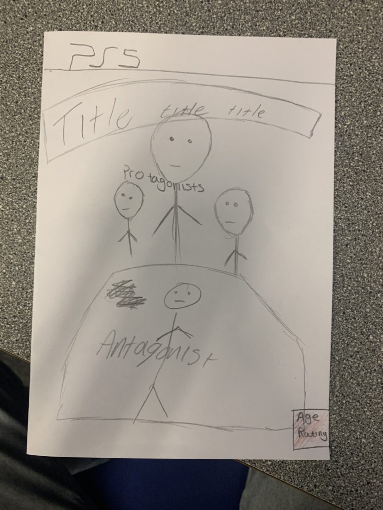
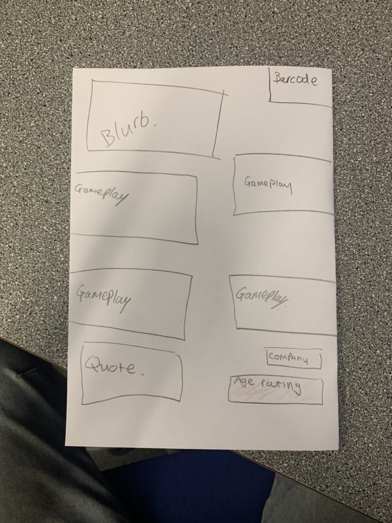
I’m aiming for my game cover to be directed towards teens and adults above the age of sixteen, I’m doing this by making a similar game cover to the well know Call Of Duty franchise with soldiers in the front and a battleground behind, however when I go to my radical cover, I’m going to have oversexualised males and females on the cover which goes against the typical fighting games. As well as this I’m going to specifically focus my characters so that it is Caucasian Male.

I would utilise dominant signifiers with weapons (assault rifles) which is an icon and a sign for war, As well as this I would have a dark background that focuses the attention to the main character, who is the main embodiment of the game and what it is about. As well as this an index sign to refer to the companies that “produce” the game, I’m going to use the typical game makers logos to fit the cover properly.

I’m including weapons and vehicles that correspond with the idea of war. I’m going to dress my character in the typical navy green, camo soldier costume and include pictures of nature and an American flag around the cover, this is to set the scene and idea behind the game where you are fighting within a safari and within the home county of America

I would want my game to be made and produced by the large company Activision. The reason why is because the followers of Activision are normally the type that play war games and fit within the bracket of players that I would like to target my game too. My game is typically targeted to people above the age of 16.

CSP TOMb raider & metroid

TOMB RAIDER FC

The front cover uses Lara Croft as an iconic sign to show buyers who the main protagonist of the game is – Lara as a sign can be seen as radical as she is shown holding guns, something not typically seen everyday. The title is also a symbolic sign presenting an idea of the atmosphere of the game and shows the name of the main character – Lara Croft – and which edition of the game it is, it does a good job of presenting a lot of information with a small amount of text. Furthermore on the front cover there is the symbolic sign of the age rating – this symbol tells buyers that only people aged 12 and above are allowed to play the game. In addition, the iconic sign of the xbox symbol represents which system the game is played on – and that it wont be played on any others.

TOMB RAIDER BC

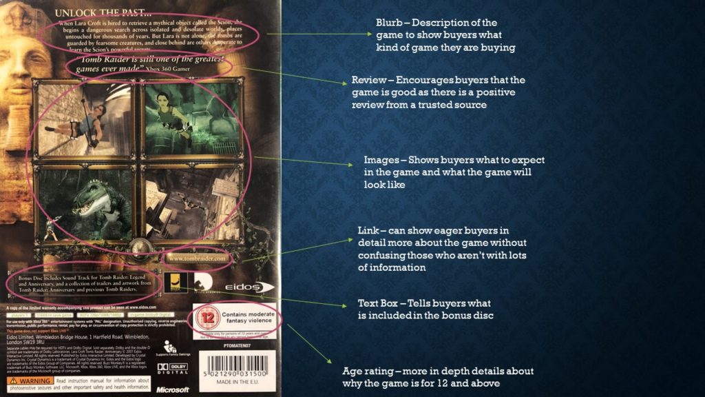
The back cover uses an iconic sign of an Egyptian relic to further help show the atmosphere of the game to buyers, and draw in those interested in the subject. Furthermore there is another symbolic age rating sign – reminding buyers only people aged 12 and up can play the game.

METROID FC

The front cover uses the iconic sign of the main character – Samus Aran – in a space suit to present immediately what the game will contain and be about. The front cover also uses the title as an indexical sign to help further this as it has a futuristic design connoting that the game will be set in the future, which also tells buyers what the game is called. In addition it also has the Gamecube sign, telling buyers that the game can only be played on gamecube. Furthermore, this cover also has the symbolic age rating sign – also reminding buyers that only people 12 and over can play the game. There is also an indexical sign of the nintendo logo, showing that nintendo is the company who published the game. Finally there are 2 PAL symbols on the front cover – showing that the game can only be played in PAL regions and will not work elsewhere.

Statement of intent

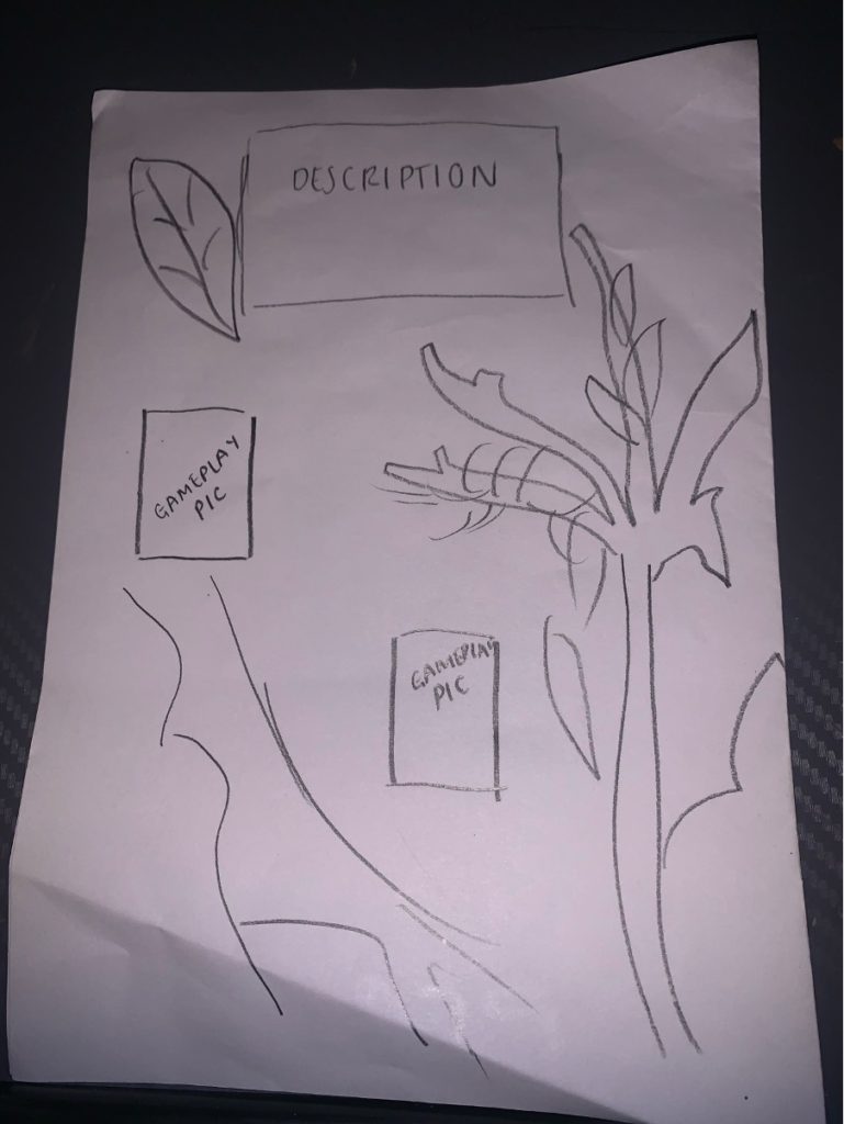
For my video game cover I want a bold background it will include the brands logo along with the company of the gaming manufacturer. I will include the PS4 logo along the top above the initial background which will include a desert with a orange sky and a pyramid in the background, this is because I would like my game to consist of a set difficult highly skilled tasks for the levels based inside of the pyramid that need completing to move higher up in the game. I will be using a female character dressed in clothing that does not sexualise her and she will be able to do the tasks efficiently, I want to do this to go against the sexist stereotype that women get from the gaming industry from being sexualised and them being seen as weaker than male characters.

Representation

How women are sexualised in video games, it largely remains unclear whether sexualized video games can have an impact on attitudes toward women. Often game designers change the camera angles to sexualise the female characters body shape and extenuate their walk to show off their purposefully widened hips. They also advertise the game covers with the female characters contorted in ways which can show off their whole body, they do this to appeal to men which entices them to buy the game. Laura was the women who came up with the idea about the male gaze as they were many issues with gender in film and other media. She is a feminist and says that films are made in the view of a heterosexual men trying to sexualise a woman by camera angles, zoom-ins or other strategies. John Berger devised the theory called “Ways of seeing” suggesting that the way woman are seen by men and the way they are taught to see themselves is wrong and creates a bad relationship between the two genders.