Summer task

Summer evaluation

Statement of Intent

This summer task interview was intended to inform and educated people what it’s like to grow up in Switzerland and to learn how to ski. It shows people how much different it is than growing up in jersey or the UK, and gives you a insight into what it like to live there. The audience it targets are people that are interested.

Media language

 I would add more colour and something that grabs the reader’s attention to make it less dull. I could’ve also spoke in a more enthusiastic and exaggerated way to more fit the magazine style. I could also have made my whole page more colourful and brighter.

Representation

I could have used more content about the subject such as skiing and talked more about it and what it is. I would say that this task is more radical as it shows the background of where she grew up and how she learnt to ski, and less reactionary as it doesn’t stereotype the working mum.

Audience

The audience that these targets are for people who are interested and willing to learn more and read about different lifestyles and places around the world. It would most likely be posted up in the JEP newspaper so the information can be spread around jersey.

Evaluation

For the summer task I would have changed how the whole page looked and made it much more desirable and colourful to better grab the reader’s attention and make it more presentable. I could have also made the writing more exaggerated and interesting .

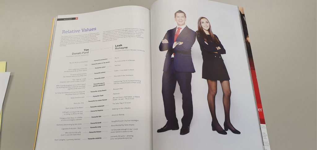
Summer task evaluation

My intent in making this interview was to produce a minimalistic interview on one of my friends’ interests and share it with others. I also intended on seeing his view of film as it is a common interest that many share and has many critical opinions that spark conversation.

My interview had few media elements due to the minimalistic design, but the information (I believe) is structured well into 2 columns and a quote, giving a backstory to Kai, what he is doing now, and his future. I also included a caption relevant to the interview telling readers what the interview will centre around. However, I feel that I could have added much more and the image I included could also have been bigger and centred more instead of joining it into a column. 

The minimalist design of my interview is a countertype to a typical magazine interview, the interview would have a very niche audience as it is a local story about someone in Jersey. I believe it would be published in a local newspaper or magazine (either local to Jersey or to the Parish) and the audience that would read this would be local to the area it is published in.

To make my task better, I would include much more of the media content that I have learned since making the interview to make it more eye catching and interesting to read, I think I have conveyed the information well but the design is uninteresting and too empty.

Summer task evaluation

Statement of Intent

In my summer task, I interviewed my sister on her love for movies. The style of the article was meant for an online magazine article, as it featured a picture (go the person being interviewed), text (formatted in the style of an online article), and it was a 5-10 minute read. The article is intended to give an insight into the thought process of a movie critic, whilst also giving appealing takes on some of the interviewee’s favourite and least favourite movies.

Media Language

I did not strictly follow a style model. However, I did draw inspiration from a few different magazines. For instance, the font I used, Cormorant Garamond, is the font used by popular online magazine, The Cut. Also, the format I used is similar to one used in another online article which I studied.

Representation

The article I have written is fairly reactionary because it focuses on movies, which are liked by almost all people. However, you could also argue that the article is radical because the audience it is targeting is quite specific. Most people aren’t aware of who ‘Wes Anderson’ is and almost everyone won’t be familiar with the site mentioned, Letterboxd. Therefore some sections of the interview appeal to the small number of people who are interested in those subjects.

Audience / Platform

The article would be best published in an online magazine because it follows the traditional format of one. The audience targeted in the article is fairly niche. Yes, an article about movies could interest a wide range of audiences, however as I touched on earlier, the subjects looked at in the article may appeal to a slightly more select audience, who are into slighter nerdier film topics.

What kind of company would make your product? What kind of audience would consume it?

An online magazine would be the type of company making my product. The audience most likely to consume it would be movie lovers, who love to study and analyse film techniques as well as write reviews.

Evaluation

Overall, I am pleased with my summer task. I think the interview that I gave my sister was engaging and well-written, and I am also pleased with the picture used of her because I utilised Photoshop to edit a bag of popcorn into her hands. However, after viewing the work of other students in my class, there are a few things that I wish I’d done differently. Firstly, I think the layout is fairly formulaic, and in future, I’d like to get more inventive with it. Also, I think I’d try to include more interesting media techniques, such as composition, editing style, structure, sound design and more. Unfortunately, at the time when I wrote my article, I had little to no knowledge of how to successfully implement these techniques in an aesthetically pleasing manner, and so the end result of the article isn’t quite up to the standard that I hope to achieve in future projects.

summer task evaluation

 With my summer task I intended to get the point across of how terrible the Government of Jersey is and what a horrible job they are doing at running the island. I intended to show Kelsie Chapmans perspective of what the government do wrong in the act of attempting to help the island. I put in some of my own thoughts and opinions on the matter to show a deeper in-depth evaluation on what the Government do which brings jersey down. I intended to get Jersey Citizens to rethink who they elect to be in the government as teenagers aren’t benefitting from anything their government are doing at the moment. 

I used a newspaper interview as my style model for this project. I used colour to highlight key points within my project and show the importance of what the Government do wrong within helping the community. I positioned my interview link a usual newspaper one to create the affect that this interview went into a newspaper. I used a readable font and so it becomes understandable for the reader and to spread a clear message. 

Kelsie’s thoughts and opinions on the government are reactionary as the government has let a lot of people down and broken a lot of promises to people. It is very stereotypical for people to hate the government. Whether it’s because of lack if jobs within the island or tax’s increasing. The members of the government pay themselves more than others who wo0rk more and so it does create upset and anger towards them which is why Kelsie’s thoughts are considered to be Stereotypical as she’s not the only one on the island who thinks like this. There are thousands who think like this. 

The audience that would consume this product would be from the ages 15 above due to the fact that this article is written about teenagers and so teenagers can explore what a teenage representative has said on behalf of them to adults and members of the government.  Adults would consume this to create an understanding as to why teenagers act like they do and what movement to make to help teenagers out to get the government to show more attention to teenagers than to tiny things like increasing their own pay check. Out of all newspaper companies the Jersey Evening Post would be the best to post this article on as this newspaper company is spread to all of Jersey and placed in shops 

If I were to-do this project again, I would change my layout and chose a subject to question about which is more relatable to all citizens on the island of Jersey. I would change my layout more to create a better newspaper article affect and make it look more appealing to readers to make them want to read on. I would also choose a more intriguing headline to entice a better audience to read my article. I think some aspects I did well in my article was showing Kelsie’s true thoughts and feelings on the matter and creating a sense of urgency for change, as the teenagers of Jersey are disappointed with the government and what they believe might be right for the teenagers in fact isn’t right at all. 

Evaluation of summer task

Statement of Intent

For my media summer work, I planned to design my work in the style of a modernised newspaper. The colour grey represents a modern style, but the font is in the style of an article. I feel that the font size could have been smaller, and the style could have been changed to something in the present day. Some of the photographs should have had a small caption underneath to explain to the reader what the pictures are.

I hoped to achieve an interview on my mum’s career in the police due to the amount of success she accomplished during her 20 years and continuing. I also decided to do my mum because she has qualifications that barley anyone has in England and in the Channel Islands.

The companies that I think would produce my product would be business that are involved with currency and fraud, along with any police branch to show off the sort of qualifications you can gain. I feel that the audience aimed at my article would be adults ages 20 and over, as younger pupils wouldn’t understand the strong language used.

I could have improved my summer task by making a drop cap to express the style that I was copying. As well as using a different app/document to have more options of effects and presentation. Furthermore, if I did the task again, I would make it into a stronger style of a newspaper.

INDUCTION TASK EVALUATION

Statement of intent – I found the news article I wanted to re-create. I took a photo of it on my phone. I want to add my own twist to it, I replaced the people and questions of the interview with a friend of mine and a celebrity, henry cavil. The article is local and the celebrity and friend is also local so it made a great match.

Media language – I started off by re-creating the page size dimensions. I then used the guide tool in photoshop and combined it with maths to get the exact same measurements as the article so I could do a perfect match. I liked the simplicity of the article and how easy it was to read for the consumer which resulted in me re-creating it. I used very similar font and text size to maintain a sense of consistency which ties in with the minimalism of the article. I had an image with 2 of my subjects in black and white to match the font, I also had a headline and textboxes.

Representation – The article I re-created was reactionary and countertype because it shows how celebrities and normal people can be the same. It could be countertype because some people may not expect a celebrity to like similar things compared to a typical person. But it is also reactionary because people can understand how they don’t like similar things and interests.

Audience – The type of people who would consume my product would be people who like news articles and locals who wants to know what’s happening in Jersey. Both genders will consume the product and mostly older people will consume it more than younger people.

Evaluation – Something I learned is that I should use Illustrator and InDesign next time if I were to do this again, I should also pick a real person, as finding questions for my project was very hard and time consuming.

I based my Summer Project off this

Evaluation of summer task

I created my media interview with the intent of showing how not all teenage girls are interested in smoking and getting drunk.  Also, to share Carolina’s (my friend) weird but fascinating love for pigeons which are usually viewed as feral birds that no one really cares about. She wanted to make more people aware of how nice these pigeons can be and why they should legalise them as pet due to the many benefits.

I followed the style model which was a magazine interview on the internet. By using red coloured writing for the title to make it stand out and put the opening line in bold to grab the reader’s attention as to what the article is about very similar to the style model to make the audience feel curious. The features I included which show it is a magazine are the hardlines, captions, three column layout and a picture. I structurally made my article using the inverted pyramid meaning that my first few paragraphs contained the most important and exciting details and then the tail of the article is just little bits of extra information that could have been cut off if it was too long.

My friend’s perspective on pigeons is quite radical and she is presented in this article as a countertype because a typical teenager is portrayed as trying to fit in and be cool whereas she doesn’t care how people view her and just wants to be happy and unique. The advantages of the product being radical is that it will draw more attention and people will be more likely to read it. Additionally, it is great evidence to remove the barriers of stereotyping all teenagers in the same way because we are all different and has a positive outlook.

I think the type of company that would make my product is somewhere like a British local kind of magazine as Carolina isn’t a celebrity so wouldn’t fit into a magazine for famous people, however her story is quite interesting so could maybe be shared with the rest of the UK or places where there are judgements about teen but also the view on pigeons. It would be aimed mainly at the older generation to give a radical response to the youths of today.

 To improve my product, I could have made the picture more inclusive of the article and use more media language like shapes and boxes to make it more interesting. Furthermore, I believe my print work would have been more appealing if I used bold Caps and italics with more freedom on how the words ar portrayed like wrapping the text around an image, so it flows better.

evaluation of summer task

In my summer task, my main aim was to inform and persuade the reader to maintain a healthy lifestyle and improve their fitness. I did this through a conversation with Lucy Kerr (a personal trainer) where she exposes her top tips and tricks and how she became a personal trainer. She describes what interests her in the fitness industry and why having a healthy lifestyle is important.

I created my magazine page with bright colours and a picture of Lucy so that it was catchy to the eye. The background of the article is a textured picture of Lucy lifting a weight, I did this to draw in the intention of the reader whilst still leaving it looking tidy and organised.

with my article, I tried to create a radical image of a personal trainer as she is now 46 years old, is still training clients and is in great health. She exceeds the standards of personal trainers being young and in their twenties, I wanted to show that no matter what you can reach your goal, and she has shown this through her business.

Evaluation of Summer Task

Statement of intent:

For my summer task my intention was to give an insight on the life of an aspiring nurse. I got in contact with one of the nurses from the General Hospital; over the phone I gave Crystal questions varying from ‘Where did she study’, to ‘What she finds difficult about working in her environment’.

Media Language:

For my summer task I wanted its presentation to be simple and noticeable; I made the headline a text size of 42, and the colour theme I focused on was mainly red. I also made the text justified, and highlighted dialogue to make it stand out to a reader.

Representation/content:

I wanted to represent a nurse almost as a soldier; risking their lives for the betterment of others, “because it’s their line of duty”. It’s common that nurses are seen as just assistants to patients and doctors, but I wanted to challenge the typical stereotype of nurses being soft and caring, so I radicalized that common view point by comparing them to soldiers; who are known for giving their own lives for the betterment of their country and their people; which is picture that isn’t commonly associated with nurses.

What kind of company would make your product? What kind of audience would consume it?

I see the ‘Nursing times’ as being one of the best fits for my article. The ‘Nurses times’ is accessible to all, and is commonly viewed by nurses in the UK. Alternatively there are various nursing blogs that publish articles and news for nurses.

What would you do differently? What did you do well?

In terms of my graphic design; I would change the colour scheme to light blue, and blue; since the colour blue is associated with nurses attire. I would also add more graphics, such as background images, and a more modern article style. I aimed my article to be more fitted for newspapers, but after looking through more nurse blogs I noticed that the majority of articles were in a more modern format style. I’d say that I manged to succeed in representing a nurse in a new form.

evaluation of summer task

statement of intention for my article was: My intent for my summer task was to highlight the beauty of this island that we live in so I took a picture of St Brelade’s beach and spoke about how beautiful it was but highlighted all the rubbish that littered the beautiful beach. As I was down at Brelade’s beach I interviewed some of the by standers that were around to see what they thought of the beach. the main issue was the litter that scattered the beach. these people were local and tourists a like some said that they were disappointed with the state of the beach.

Media Language:

in my summer task I wanted my article to be eye catching by using a photo of the beach with the headline: Plastic Beach in bold writing in order to catch the attention of the reader. I used a grey back lining to high light the text in the paragraph.

Media Representation:

In my Summer task homework i wanted to represent jersey as a beautiful place with locals and tourists that care for this island and to show that they are against plastic pollution. instead of being by standers and becoming a participant in this global phenomenon so I emphasised the title as Plastic Beach to highlight the state of the beach and what the condition is like and to gather a group of people who wish to change the beach from a plastic beach to a beautiful beach.

what company would make your product?

the company that would make my product would be Jersey Evening Post because the product is related to the island itself and has relevance to people who live in st Brelade.

what went well, what would you change?

if I was to change my article I might of changed the subject that I wrote about. what I think went well was how I tried to draw readers in with a flashy title that makes you wonder what it is. I think my lay out was good I could of changed the font size I used. I Think I could of interviewed some of the staff that worked in some the restaurants.