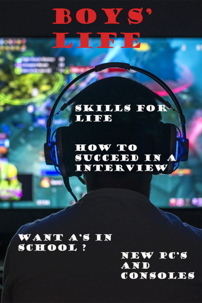
In my Boys Life magazine I wanted to create a positive image that could motivate and influence readers. I decided to use the Google Science Fair winner as my background because it shows how young inventors can be successful and resolve current world problems such as climate change, It can also set an example for readers to follow. It also challenges male stereotypes as it focuses more on studying and science rather than adventures and activities. I then added a subtitle that said “Work Hard”, this was implemented to try and get readers to strive to achieve their goals and targets inside and outside school.
Category Archives: Uncategorized
Filters
Boys’ Life Choices
I chose a selection of ‘nerd ‘ and school skills which are useful in the real world. This challenges the stereotype of a masculine boy with the usual imagery of adventure, for a more realistic view that not all boys are in to hiking and sport because many are rather into video games and books. I chose to apply to skills such as social and interview skills which are useful for people who want to do well in jobs rather than how to get a girlfriend. Normally, most societies have a dominant ideology of the rules of men and boys in society, so this mean that boys should be interested in football, girls and cars. However lots of boys aren’t into all these things and that can be looked down upon by society, so this alternate magazine targets those who don’t fit into the societal norms. Also in normal boys’ life magazines, the character is shown in a medium size with context of doing an activity, my cover shows a close up of someones back and head as it focuses on someone as a person, not what someone does.
Review of Boys’ Life
With my personal attempt at making a Boys’ life magazine, I wanted to oppose the stereotype of a Males exploring and doing dangerous activities by including a Female having fun and doing an extreme sports. This may shock people because you expect a man to be surfing, and not a Female.
I chose the words “Wild”, “free” and “you” because of the freedom and excitement to show and support of opposing to dominant ideology in the sense that, people picture Females staying home, out of danger and doing more practical activities and tasks. The word “you” implies that anyone can do anything and is designed to make the reader feel included and apart of the movement and targeted to feel welcome and motivated. “Free” can also show that you have no limits and you can do anything you want to do and be who you want to be.
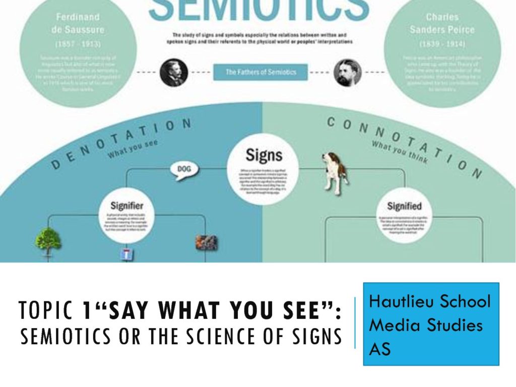
INTRO TO SEMIOTICS
Boy’s Life Alternative Cover
Timeline


Gaming magazine cover
- iconic signs;
- city background
- suits
- jackets
- hair
- light in heading of Detroit
- Sony logo
- RP logo
- red bar
- white underline
- blurred crowd background
- Indexical signs;
- blurred crowd background(bottom right corner)
- “heavy rain”
- “two souls”
- “night in the woods
- “dawn”
- “o” in Detroit- LED light
- “human”
- “worried facial expression”-(Kara Left Middle)
- round LED Light on the side on the peoples heads-not human or super human
- the text style for the heading-futuristic
- blue clouds/mists-imply futuristic
- symbolic sign:
- determined facial expression(Markus right side)
- “worried facial expression”-(Kara Left Middle)
- headings
- subheadings
- small text
- orange text
- red bar
- the dominant blue colours in the magazine
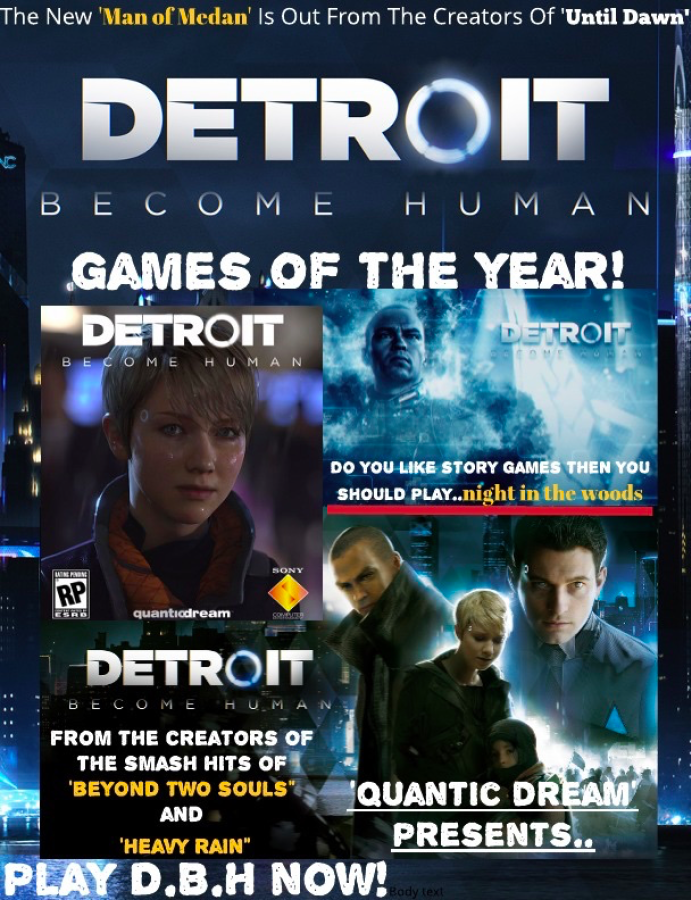
For this summer project of designing a video game magazine cover I started off listing my top favourite games I’ve either played or watched playthroughs of. My list contained; “Detroit Becomes Human”, which is my most favourite game I’ve ever played that is filled with diversity,amazing graphics, great story lines and more. “Night In The Woods” is a story line game with cute graphics and lovable characters. “Little Nightmares” a horror adventure game that explores this odd world filled with suspense and mystery. And the final game on my list was “Man Of Medan’ it’s a sequel to the classic horror decision game “Until Dawn”.
So after listing my favourite games I started to look at different professional video game magazine covers, and I noted the similar things the covers had in common. Most would showcase one game as the main interest of the cover, and put smaller titles for other games. To catch the interest of the audience, if the first game wasn’t as appealing.
When creating my magazine cover I used a gaming cover about the ‘Last Of Us’ as a reference. I did this because it could help me create a more realistic and professional gaming cover, almost like a template.
To follow the plan of having one main game to present I decided to go with “Detroit Becomes Human’ because It firstly was my number one game on my top 5, and It had the most usable material for a gaming cover.I started the process of making this cover by finding a collaging software, were I could add text, and photos together to create my cover.
I ended up finding this software called, lucid press which was free, and easy to use. When I loaded up lucid press I started playing around with the order and arrangement of screenshots to see what would look the best, whilst leaving room for subheadings.
After I chose the correct order of the pictures I looked back at my reference to see how its subheadings where placed and with what colours,language, and font they used to intrigue their audience. With the cover I was referencing from they would put their subheadings in bold, to make the audience enticed to read it. They also changed the fonts; size, colours or shape to make the names of the games stand out more.
To make the cover stand out more, they chose a dramatic photos. Which would intrigue the audience to want to know more about what the game is about. Also when choosing a photo for a magazine cover usually they place the main character for the big heading since more people will recognise it and want to read it. I took this into account and put the main 3 characters of the game on the magazine cover.
With designing a magazine cover, colours matter a lot. The colour palette of a magazine cover, can contribute to if the magazine gets sold or not. So it’s very important to not over power the colours or leave them to bland.
When creating my cover I tried to make it look dramatic whilst not over filling the page with titles. I think it turned out well, and im really pleased with the outcome. I think my magazine cover is more aimed at the audience of ages late teens to early twenties.
Media Header
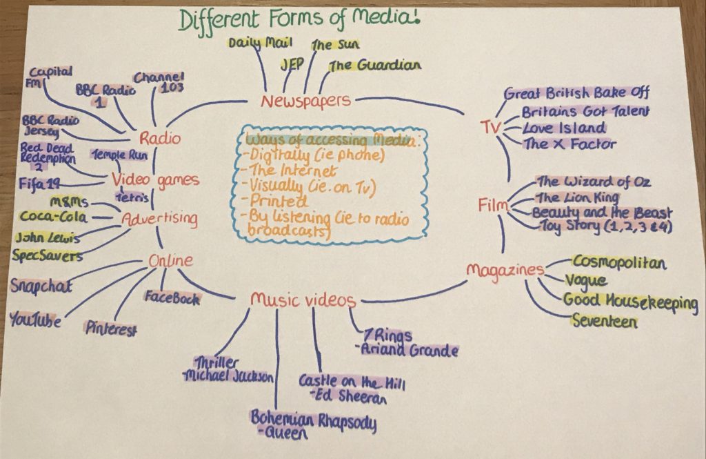
Different Forms of Media: Flowchart
Summer Tasks – Front Cover
Signs
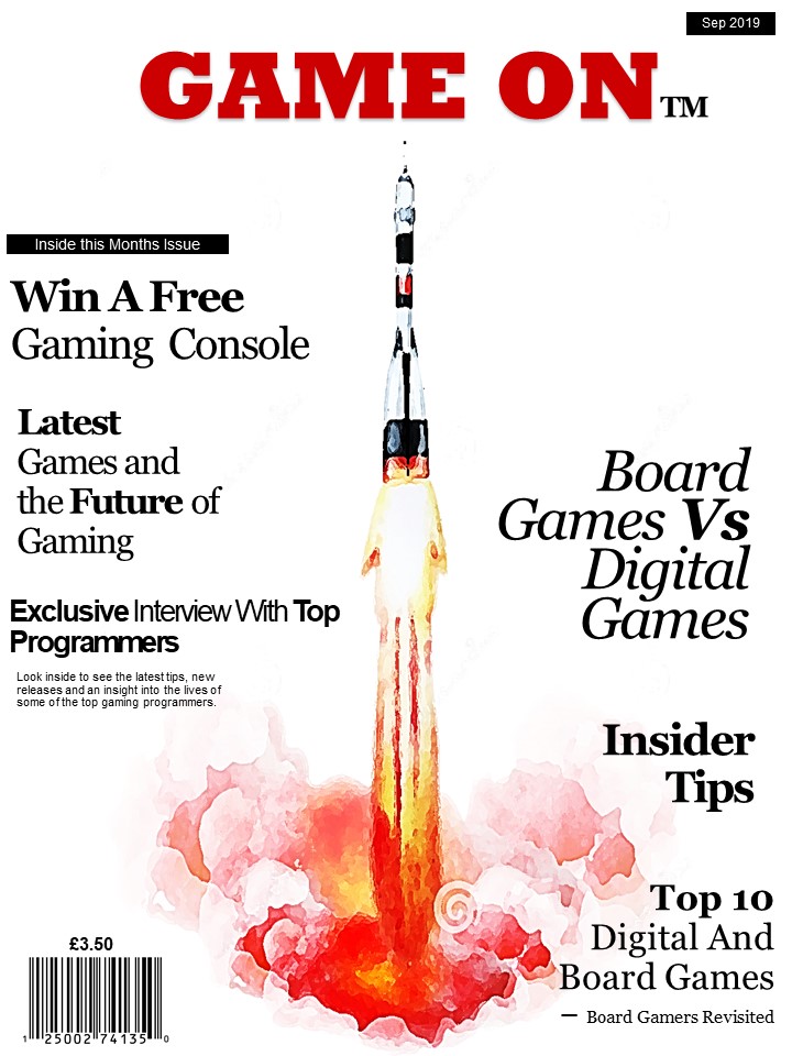
Iconic Signs
- Rocket
- Flames
- Smoke
- Title
- Headings
- Bar Chart
Indexical Signs
- Smoke sent
- Smoke indicates fire and heat
- Sound of a rocket
- Power/force
- Colours coming from the rocket – flames
- Colour of title – red = fire, hate, love ect
Symbolic signs
- The colour red – power, hate, anger, danger
- The colour black – neutral, dark, sinister
- Light colours from rocket – hope, success etc.
- White colour – new, hope, peace
- Title
- Header
Summer Tasks – Communication of Ideas and Intentions
The title of my new magazine for gamers is ‘Game On’. I have named it this because it has alternative interpretations, for example the Gamer colloquium for the game has started as well as the continuation and future of gaming. I have made the title much larger and in a different font to the rest of the text with the intention of it standing out from a distance to try and capture attentions. It is bold and the colour red as red is a colour associated with fire, energy, danger, hate, strength/power, as well as passion/desire, and love, typical themes associated with modern digital gaming. It is located in the centre and the top of the cover with little other text around it so that it draw more attention to the title itself.
I have included a price of £3.50 and date on the cover as this magazine is intended to be monthly and issued on the 1st week of each month.
I have included many subheadings of article and information contained within that particular issue on the front cover. The items inside this issue are varied including a mixture of board gaming articles and digital gaming articles with constant comparisons of the benefits between the two. It includes tips and advice that might appeal to serious or armature gamers. Interviews with programmers which gamers or those with an interest in that particular field or career may find appealing. Competitions to actively involve buyers of this magazine, and luxury prizes to encourage more people to purchase the magazine. I have included this particular selection of articles on the front cover with the aims of appealing to a varied audience and trying to broaden the market of this magazine to encourage different interests and buyers of the magazine.
For all text, excluding the title, on the front cover, I have used the same font and colour. However, have varied the size and positioning of the text and put certain words in bold with the aims of drawing focus to the key words and inciting intrigue however, there is no particular order on structure to the size of text, only the explicit aims to make it varied and entertaining, such as gaming itself. I have used all black text on the cover to stand out from the background and title, it is a universal colour that is not heavily associated with either board or digital games as this magazine addition is equally focuses on both.
The background colour of the front cover is plain white, white is often associated with things that are brand new, (digital games,) however, can also be associated with tradition, (traditional games/board games). As it is plain it can represent the start of a game e.g. an empty board or new level etc.
The background image is a simple design of a rocket taking off an object off which could be associated with the start of a game or an object within a game. It is a simple, plain image so that its contents and headings are more focused on as that is the main function of the magazine.