All posts by Lynn Magowan
Filters
That boss life advertising and marketing csp
CSP VIDEO GAME – TOMB RAIDER ANNIVERSARY
STATEMENT OF INTENT HELP
Media Audiences: Audience Profiling Task
Start by finding a suitable picture of a person (from stock images on the internet) then construct a fictitious audience profile for a consumer outlining basic demographic features e.g. age, location, race, gender, occupation and mention hobbies, newspaper/magazine readership, favourite Films and TV programmes , music and preferred consumer brands.
Next identify which NRS category, Psychographic Group and New Class type they belong to and justify why they fit this group by matching their lifestyle preferences and characteristics to the profile for each categorisation.
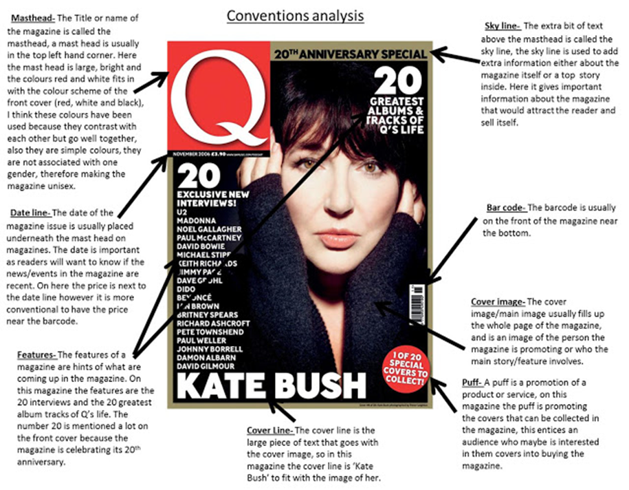
ACTIVITY: DECODE A COVER
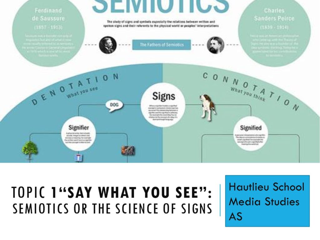
Choose a magazine cover and label the key features (signifiers). Go on to identify the producers intended messages through the selection (paradigm) and combination (syntagm) of these visual elements (connotations/signified meaning). Place your diagram on the blog.

Images on magazine covers/feature articles need to be of “pin sharp” quality. The top third of a magazine cover needs to be visually striking. A magazine title needs its own specific branding to make it stand out. Covers should not use too many fonts or colours – font colour and images should be unified where possible. Coverlines should be visible from at least two meters away. The key function of the front cover is to sell the product.
MAGAZINE COVER LAYOUT KEY TERMS:
Masthead Puff Coverline Dateline Skyline Cover Image/ Cover Star (dominant signifier) Features


