| Technical Code | Denotation (ie what is it – simply describe what you see / hear) | Connotation (ie what does it signify) |
| Setting | New York city, streets, hotel room and back alley. then gold room. | expensive city, nice room connotes rich and elite. |
| Clothing | normal clothing, normal hotel staff uniform/ dark colours, then gold clothing/gold uniform/sparkly clothing. | gold connotes rich and luxurious. |
| NVC | ||
| Dialogue | ‘lets get bossed up’ | connotes that the product will make you a boss. the word boss has connotations of being in charge and being important |
| Sound Effect | sparkly sound when the gold case comes in. | connotes the case has something in it that is special and expensive. |
| Music | music in the background after they get ‘bossed up’. | connotes that life gets more exciting after they are ‘bossed up’ as the music gets louder. |
| Camera shot size | ||
| Camera movement | ||
| Editing |
All posts by Abigail R
Filters
Maybelline POWER POINT
Gender representation in Men’s Health and Tomb Raider.
In this essay, I am going to compare the way that gender has been represented in Men’s Health magazine and the cover for the video game Tomb Raider. In particular, I am going to argue that in both media forms the representation of gender is an idealistic stereotype of how males and females should look. However, I am also going to argue that Lara Croft (tomb raider) is an iconic sign that is heavily sexualized for the male gaze whereas the images in Men’s Health aren’t represented sexually or targeted for a female audience.
The cover for Tomb Raider features ‘Lara Croft’ who is a character from the game. There are five images of her on the cover where she is repeatedly wearing revealing clothing. Shown through David Gaunlet’s identity theory, this creates a constructed identity around the character, Lara Croft, that she is the only featured as a sexualized image for the audience. However, she is also represented as strong as she has guns and the back round colours of yellow, black and red connote danger and fear. Also, the man on the cover of Men’s Health is represented in the same way as strong and having an idealistic body. For both, the audience positioning helps to create this representation and as the images are both the center of the front page. Although the image of Lara Croft is sexualized for the male audience. This representation is influenced by the socials norms of society that woman is sexualized in media.
However, both Men’s Health and Tomb Raider represent gender very differently. The main image on the cover for Tomb Raider is the iconic sign, Lara Croft. She is represented as a strong female game character as she is carrying guns and breaking the dominant ideology that only men can fight. However, she is wearing minimal clothing and her bottom and breasts are visible which creates anchorage for the target audience that she will be visible the whole game. The stereotypical audience for video games is male which why the cover for tomb raider is a reactionary text as she is only represented sexually to suit the male gaze, however it could also be seen as radical as its a woman fighting which goes against dominant ideology. In contrast to that, the images in Men’s health are represented in a more aspirational way rather than a sexualized way. For example, the image and article of Phillip Howells, a sixty-nine year old man who runs marathons, which is immediately against the dominant ideology of marathon runners. This target audience for Men’s Health is men which is why some images of men are represented as more inspiring rather than sexualized. All together this represents males as having more authority over females as females are sexualized for men and men aren’t sexualized for women.
The typography in Men’s health is also reactionary. Throughout the pages, the print language supports the dominant ideology of masculinity and fitness. On the front cover, the plugs have a semantic field of fitness and looking good using words and phrases like, ‘muscle’, ‘#slay’, ‘blast body fat!’. These plugs connote that the magazine is about fitness for men which links to the muscular, idealistic image of a stereotypical man on the front cover. Also, the typography in the inside pages uses words that all link to fitness and working out, ‘best fitness classes for men 2017’. Altogether this represents the male gender in a positive manner and that they care about themselves and are trying to become more healthy. The reason behind this representation is to attract the target audience, who are aspiring to be better, to the magazine. The typography on the Tomb Raider cover is facts about the game and the usual title banner, institutional information and age rating. However, the paragraph is on the back page is radical as it states about how Lara Croft has to go on an adventure that challenges the dominant ideology around the fact that men are usually used to fight an go on adventures rather than women. In contrast to how the image of Lara Croft is sexualized and represents her as a strong and empowered woman. This shows a similarity between both the media forms as both genders are represented as empowered and portray the constructed identity around both the genders featured. The reason for this is that it makes the audiences aspire to be like the personalities they have represented.
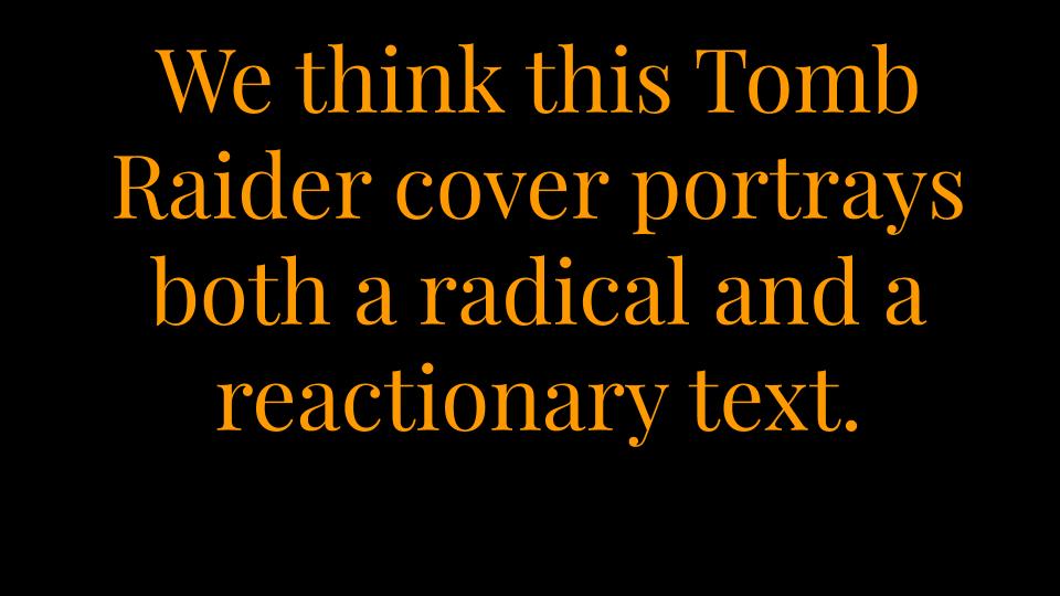
In conclusion, I think that the Tomb raider cover is both radical and reactionary as it supports the dominant ideology around how a woman is sexualized in the media but also represents her as strong and independent which goes against the dominant ideology that a woman needs a man. Overall I think that the female gender is represented with negative connotations. Whereas Men’s Health is reactionary and represents the male gender with counter-types as strong and with positive connotations. It also presents a wider demographic of the male gender and represents the audience, male, as self-caring and headstrong.
defintions
Positive and negative stereotypes= a stereotype is a fixed image and idea over a person or thing based on appearance, nationally and other aspects of the person. A positive has good connotations and a negative has bad connotations.
Counter-types= like a positive stereotype, a counter-type emphasizes the positive aspects of a person.
Misrepresentation= When something or someone is given a representation or label that is incorrect. Also a false view on something.
Selective representation= the way a specific group is represented more than another.
Dominant ideology= the main idea behind a media form. It denotes the attitudes, beliefs and values shared by society.
Constructed reality= the reality and the way humans behave due to the media.
Hegemony= the dominance and authority of one sociolect group over another.
Audience positioning= the techniques used by the creator to control how the audience sees and understands the ideology of the media form presented.
Fluidity of identity= an identity that can be changed so its not fixed to a person.
Constructed identity= when an identity has been constructed by the media and society.
Negotiated identity= the agreement of people when they agree who is who in their relationships.
Collective identity= the identify of a group all together.
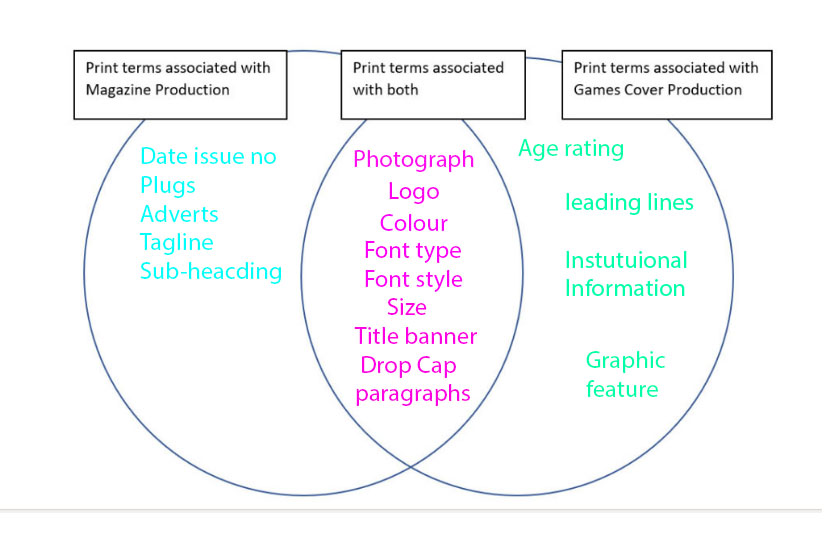
VENN DIAGRAM / PRINT TERMS
Power point
magazine cover and statement of intent
Statement of intent;
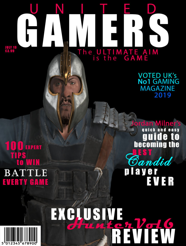
The main intention of my magazine was the create a gaming magazine that was inclusive to both males and females. To do this I did some research on some existing magazine covers including PC GAMER and GAMES TM. I found the majority of the covers were using dark colours and featured characters. Using this research, I decided to layout my magazine with 4 plugs and the main image of a character from a game. I also made the background black as it connotes death and mystery which link to the theme of my magazine.
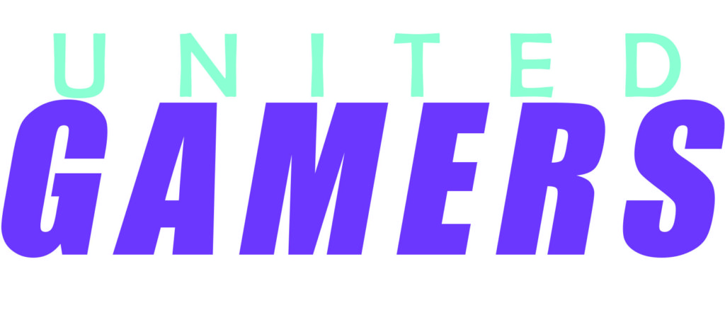
My gaming magazine is called ‘UNITED GAMERS’. The target audience for my magazine is teenagers (12-19 years old) who are male and female, who have an interest in gaming. I named my magazine ‘UNITED GAMERS’ as the word united immediately connotes that everyone is joined by a common interest and the word gamers indicates that the magazine’s topic is gaming. I used the fonts Impact and Mydrid Pro which are bold fonts that are eye-catching for the target audience. The colours I used for my cover are black, red/pink, blues and white. I used black and white as they are both shades and are not linked to a specific gender. I then used the blues and red/pink as these denote male and female which again portrays that the magazine has content for both girls and boys. Also, the colour red links to danger which relates to the plugs which are about battle and war games.
The main image is a cartoon man from one of the games mentioned in the plugs, this will be instantly recognizable for the target market that plays the game and knows the character. My cover has 4 plugs which are all in the same 3 fonts to make it cohesive. I n the plugs I used words like “exclusive”, to make them stand out and appeal to the target audience by implying that this magazine is the only place to get the information. I also have a barcode, date and price as these are part of the codes and conventions.
Representation;
The dominant ideology of my magazine cover is about war and battle games. I used a male character from one of the games who follows the stereotype of a male, which features large muscles and angry expression. This image represents the ideal male this makes my magazine a reactionary text. As my target audience is teenage males, they will be able to engage with the cover as they might idolize the character. Also, the name of my magazine is ‘UNITED GAMERS’ which is an iconic sign and provides anchorage for the target audience.
Audience theory;
- The encoded message of my magazine is war and battle games.
- appeals to my target audience because emphasizes there interests.
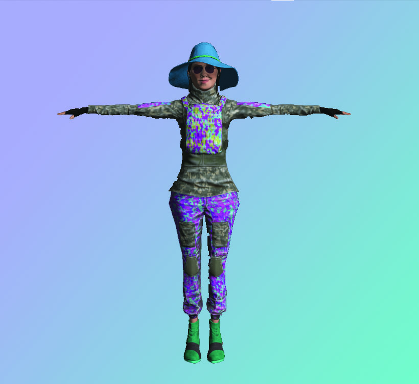
3D Character
Statement of intent
- target audience
- the message of the magazine
- reason why for masthead, images etc
- what it represents
- what uses and gratifications my magazine uses
Magazine masthead