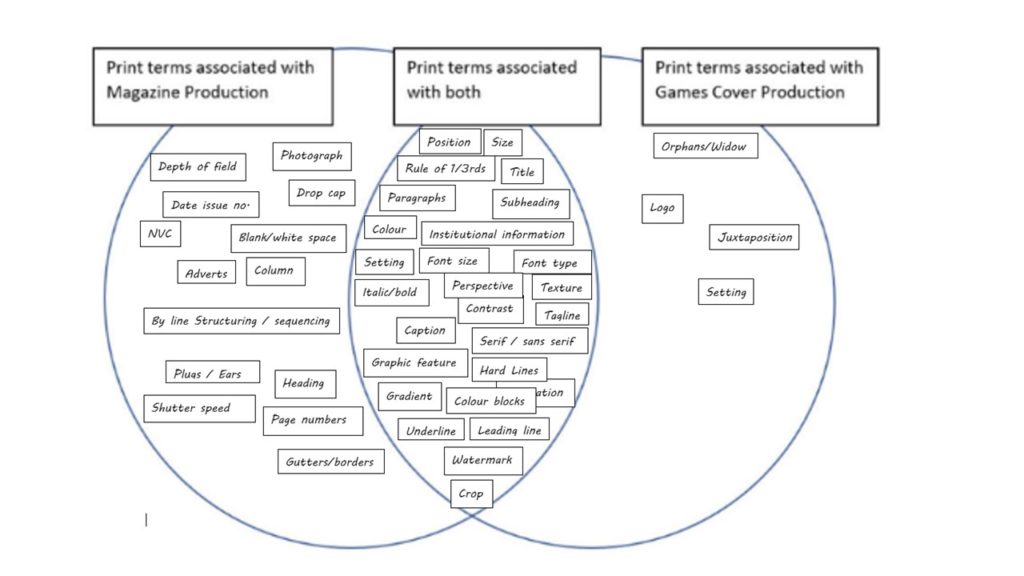
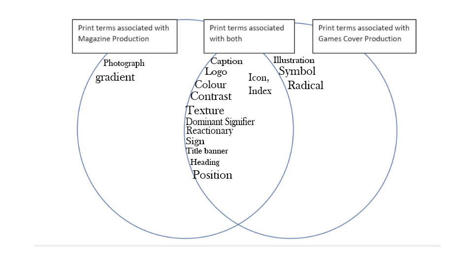
Venn Diagram


I have closely studied the front page, contents page and a double page spread of the Men’s Health magazine and the front and back of the cover sleeve for the popular game, Tomb Raider. In this essay I will explore how gender is represented in magazines and identify features such as the mis-en-scene of the cover images of both these media sources and how the Tomb Raider cover misrepresents the dominant ideology of females. I will also identify where each media source has followed David Gauntlet and his theories of identity. After identifying how gender is represented in these two media sources, I will conclude with how they can make the main images appear either radical or reactionary to modern day life.
To begin with, Men’s Health and Tomb Raider are two sources of media that represent gender very differently. Men’s Health has a target audience of males who are into fitness, however, Tomb Raider is aimed at males, even though the conventions of a male orientated video game are broken by using a female as the protagonist, as explained by one of the creators of Lara Croft, Heather Gibson, “The story goes that within the industry it wasn’t easy to sell a female heroine…Up until then they were quite masculine characters because your main market was men or boys.”. What is similar about these media sources is that they are both aimed at a target audience of young adult men, as Men’s Health only consists of images of men and Tomb Raider has a central image of a beautiful young girl, which attracts males, the target audience, to play the game by using Lara Croft, who in a report conducted by the BBC, was designed to be a “cybersex symbol”, as identified by her hourglass shape body, large breasts and minimal clothing being worn. However, Men’s Health follows the dominant ideology of males and follows the gender stereotype of males being muscular and regularly attending the gym, thus being represented as quite reactionary. However, the cover of Tomb Raider is represented as radical as the main image of Lara Croft goes against the dominant ideology of females, as shown by Lara Croft holding a gun, which appears radical as Lara Croft breaks the belief that men were more self-reliable than females, who were believed they were unable to defend for themselves. According to an article on Lara Croft, “If we’re talking true female empowerment, it’s important that we experience the less-common mother-daughter plot. It is an example of how women can fend for themselves without male reliance. Too often in media we see women pitted against each other, which reduces the common bond and power that women share. LEGEND breaks this trend – and proves a two-woman plot can break records”. Therefore, this highlights that this is a radical text as Lara Crofts role and personality contradicts the dominant signifies which emphasizes male independence in comparison to females, whereas the Men’s Health ca be seen as reactionary due to the male protagonist, who appears on the font cover and contents page, following the dominant ideology of males.
The Men’s Health magazine cover uses lots of blue and blacks, as they are colours stereo typically associated with males, however, the Tomb Raider game cover goes against the gender stereotype of females, as the cover uses oranges, blacks and greens, colours that associate with fire and adventure, which goes against the ideology of females. The mis-en-scene of the Men’s Health magazine follows the dominant ideology of males, as signified by the image of the interviewee running, which fits in with the ideology of the magazine as it is based around sports. However, the mis-en-scene used on the game cover of Tomb Raider goes against the dominant ideology of females because Lara Croft is holding a gun in front of a ring of fire, which presents her as radical, rather than reactionary. The settings of both the media sources counteract against each other because Men’s Health uses a very soft background against their images, which could be misinterpreted and seem as if males are being represented as quite feminine. Alternatively, Tomb Raider does the opposite of Men’s Health, by representing females as quite masculine and against the dominant ideology of females, as suggested by putting the central image against a dark colour and fire, which typically signify danger, thus identifying that Lara Croft goes against the regime of females.
The connotations and denotations of both these sources of media represent gender very differently. For example, the ruling of thirds on the Tomb Raider front cover brings our attention to the centre “square”, which happens to be Lara’s Croft’s breasts, thus suggesting that the intentions of the game cover it to place attention on her large breasts, as she was originally created to be a cybersex symbol for games aimed at young males, who themselves may be looking for love, thus representing Lara Croft as beautiful and a source of escapism for males who have no girlfriends and may feel lonely. The connotations and denotations of the Men’s Health magazine counteract the ideas and radical message that is portrayed through the Lara Croft game sleeve. For example, the Men’s Health contents page and front cover feature a skinny, muscular male, and is positioned so that the iconic sign of Vin Diesel is surrounded by plugs such as “Blast Body Fat” and “Lose 8KGs fast”, thus suggesting that the consumer should be more like Vin Diesel, which then links back to David Gauntlet’s theory of negotiated identity, as the consumer may attend the gym and be muscular, however they question whether they are doing the right thing as the magazine is telling them to be more like Vin Diesel.
Finally, using David Gauntlet’s theories of identity, the font and back cover of the game sleeve for Tomb Raider has made Lara Croft be represented as having a negotiated identity because she follows the dominant ideology of males, as shown by her going against the female regime by holding a gun, however, she also follows the dominant ideology of females by being positioned sideways on to show the feminine features of her bottom and large breasts, as well as minimal clothing to reveal her and make her come across as a “cybersex symbol” for males who play the game. This negotiated identity of Lara Croft also creates a constructed identity of Lara Croft as a more masculine figure, because her positioning and characteristics within the game make her come across as more masculine, thus changing the player’s beliefs about females, due to the creators of the game intentionally using a female protagonist that goes against the dominant ideology and expectations of the female.
To conclude, Men’s Health and Tomb Raider contrast in the representation of gender. This is shown by the mis-en-scene of both the central image of the products, which is reactionary as they follow the dominant ideology of what females and men aim to look like. The colouring of the media sources also represent gender very differently as Men’s Health uses colours that are stereo-typically associated with females; however, Tomb Raider goes against this by using colours associated with danger, thus going against the dominant ideology of females. The setting of the media sources also represent gender very differently, as Men’s Health uses a soft background, which is a bit misleading as it could appear quite feminine. Whereas, Lara Croft on the Tomb Raider game cover uses fire and an Egyptian style background, which also misrepresents females as it could appear quite masculine, which then presents Lara Croft as being quite masculine and a figure who goes against the dominant ideology of females in media.
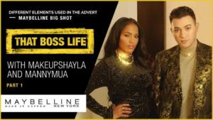
For our next CSP (number 3 of 9) we are looking at the area of ADVERTISING AND MARKETING, in the exam, you may well be asked to respond to this set text in terms of MEDIA LANGUAGE AND/OR REPRESENTATION. This CSP will appear in Section A of your exam paper.
So first of all here is the CSP that we are looking at:
TASK 1: TECHNIQUES OF PERSUASION
As this is looking at advertising the first task is to think about (and make some notes on) the way in which advertising persuades a specifically targeted audience to consume its product. In terms of the expectations from the exam board:
Students should be able to demonstrate knowledge and understanding of the persuasive techniques used in the advert and issues surrounding brand values, brand message, brand personality and brand positioning should inform the analysis.
So please watch this advert a couple of times, discuss with your friends and be prepared to feedback your answers to the whole class, think specifically about the following questions:
Have a look at some of the following articles to help your understanding (and note-taking)
https://www.glamour.com/story/manny-gutierrez-maybelline-campaign
https://yourstory.com/2017/01/manny-gutierrez/
Maybelline Recruits Manny Gutierrez as Its First Male Beauty Star
You should also read page 15 of this Media Magazine ed 63 and you could try reading small sections of this academic paper called: Persuasive Techniques used in Marketing and Advertising, a thesis by Elizaveta Baryshnikova
Finally think about how you are going to feedback your ideas and share your notes.
Oh and also . . . don’t forget about how different audiences may interpret the same message in different ways . . . (remember? Stuart Hall and the Theory of Preferred Reading?)
It is possible to look at the Language of moving image from 2 perspectives 1) TECHNICAL CODES & 2) NARRATIVE. So firstly, make up a table that looks like the one below and in small groups fill in as much information as you can – you will need to watch the clip several times to do this. Upload the completed (shared) table to your blog. You may find this page useful: http://mymediacreative.com/blog/2019/04/20/language-of-moving-image-2/
| Technical Code | Denotation (ie what is it – simply describe what you see / hear) | Connotation (ie what does it signify) |
| Setting | ||
| Clothing | ||
| NVC | ||
| Dialogue | ||
| Sound Effect | ||
| Music | ||
| Camera shot size | ||
| Camera movement | ||
| Editing |
Next apply the following 3 narrative theories to the maybeline advert:
Again use a table to show your understanding. You may find this page useful: http://mymediacreative.com/blog/2019/04/22/narrative/
| Theorist | What does it mean (in your own words) | How does it apply to the advert (in your own words) |
| Equilibrium | ||
| Binary Opposition | ||
| Character Types |
advertising and marketing
magazines
video games
If this CSP comes up in the exam you can expect your question to be based around discussion of the Maybelline advert mainly on representation of gender, age, ethnicity and lifestyle with opportunities for direct comparison with other advertising CSPs.
Therefore make sure you are confident in this area and to test your knowledge can you present a comparison between this CSP and one other CSP that we have looked at so far. Again think about how you wish to organise your ideas and feedback your presentation.
Make sure you analysis is focused on MEDIA LANGUAGE and REPRESENTATION. Try to make some insightful points rather than stating the obvious, for example, discuss the use of semiotics, the notion of preferred reading and the concept of self-identity in Modernity (Giddens) see below.
I suggest you look at this post of mine about Media Language to make sure that you understand what it means ie it is much more than spoke or written communication and is specific to each media form.
Read this extract from a book called Modernity and Self Identity: Self and Society in the Late Modern Age, written by Anthony Giddens.
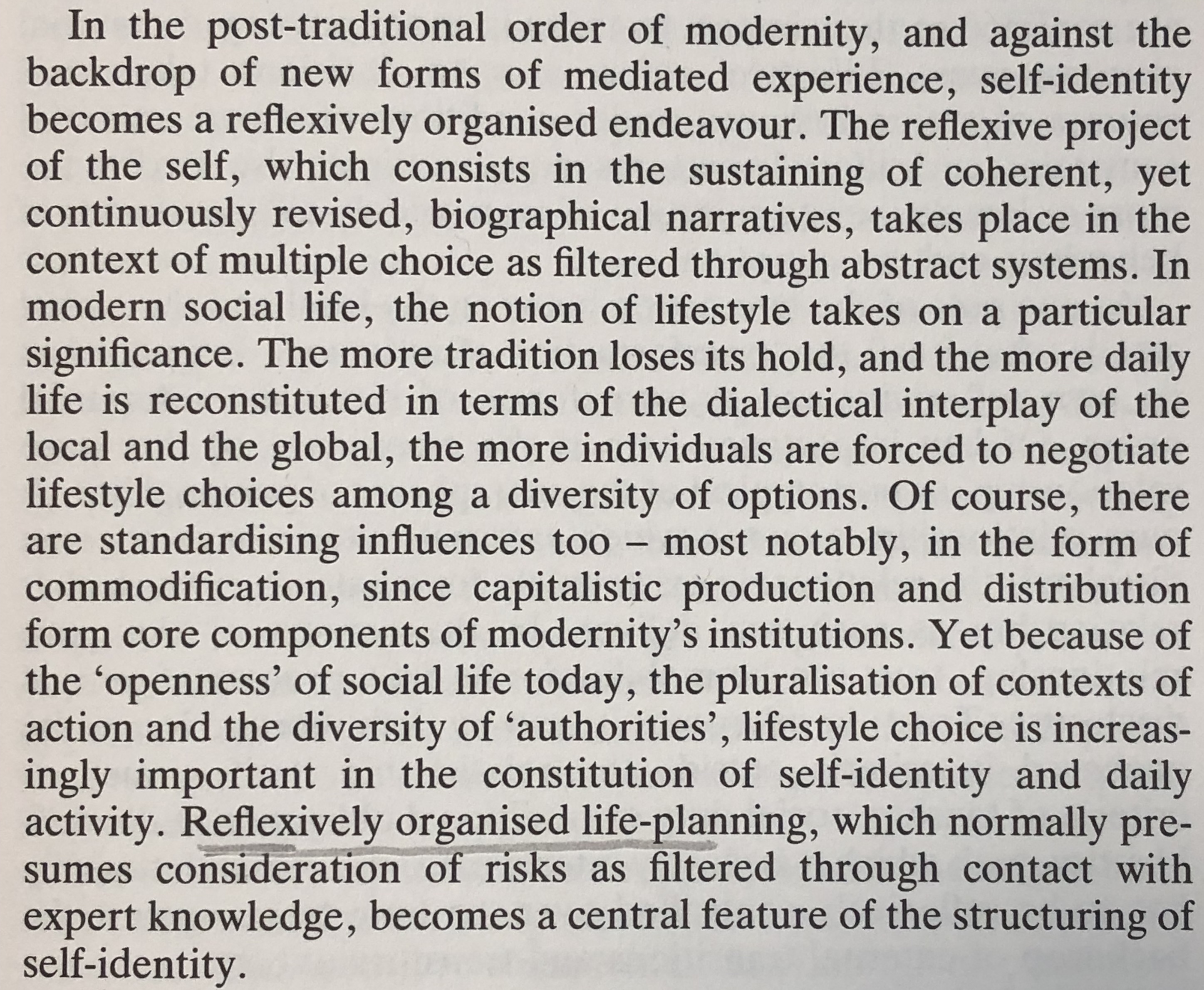
here is an edited version:
“The reflexive project of the self, which consists of the sustaining of consistent, yet continuously revised, biographical narratives, takes place in the context of multiple choice as filtered through abstract systems. In modern social life, the notion of lifestyle takes on a particular significance. The more tradition loses it hold, and the more daily life is reconstituted . . . the more individuals are forced to negotiate lifestyle choices among a diversity of options. Of course there are standardising influences . . . Yet because of the ‘openess’ of social life today, the pluralisation of contexts of action and the diversity of ‘authorities’, lifestyle choice is increasingly important in the constitution of self-identity and daily activity.”
Can you translate some of his ideas? For example, what is reflexivity? If you need more help you can read this post from my own blog: Representation, Identity & Self
Ayesha Tan Jones is a non-binary artist and musician who goes by the stage name ‘YaYaBones’
Once you have thought about this, think about the concept of a ‘non binary identity’. Follow this link to find out more. What does this mean to you? How do you feel about it? What about the concept of CIS? Or Intersex?
Do these concepts help you to understand the idea behind the Maybelline marketing campaign?
Again discuss this with your group of friends, make notes and be prepared to feedback to the rest of the class.
So how is the traditional male representation adjusting to this new world from the perspective of Advertising & Marketing?
I have chosen to call my gaming magazine ‘Player 1’. I got the inspiration from the magazine ‘Retro Gamer,’ and chose to follow a similar layout. I have designed my masthead in a bold font and included a shadow on the text to emphasize its importance on the cover. The byline reads ‘THE ULTIMATE GUIDE TO THE CLASSICS.’ Again, I got the idea for this byline from the magazine “Retro Gamer” which reads something similar.
The dominant signifier on my cover is the main image, which is an original game console. This connotes the idea that my magazine cover (and inside pages) have a theme of nostalgia. I also added fire to the background of the main image sparking out of the console, to draw the readership’s attention to the main image and to signify its importance.
The text around the dominant signifier reads “100 REASONS WHY THE ORIGINAL CONSOLE IS THE ONE TO TREASURE.” This again adds to the nostalgic sense. Focusing on the target audience, I have made it clear that the cover is aimed at those who experienced 80s gaming as my text reads “Back to the 80s.” This signifies that predominant readership will be adults in their 30s/40s.
I have incorporated a puff into my cover, in order to persuade my target audience to obtain an interest on what features there are inside.
As a whole, I chose not to bombard my magazine cover with too many codes and conventions in order to gain my receivers full attention. As the predominant target audience are adults, I decided not to fill the cover with bright images and symbols. Therefore, I focused on more copy and one principal image (along with the fire background) that links to the whole retro concept of the magazine.

Active audience: Not just receiving info but actively being involved.
Passive audience: Merely observing television.
Positive stereotypes: A subjectively favorable belief held by society.
Negative stereotypes: Widely held belief about an individual or group which displays them in a poor light and is normally entirely unrepresentative of the situation.
Counter types: positive stereotype and emphasizes the positive features about a person.
Misinterpretation: the action of interpreting something wrongly,misleading account of something.
Selective representation: Selective representation is when groups of people are represented more in government than others.
Dominant Ideology: Denotes the attitudes, beliefs,values and morals shared by the majority of people in a given society.
Constructed Reality: Manufactured reality of environments eg, Made in Chelsea.
Hegemony: Leadership or dominance, especially by one state or social group over others.
Audience positioning: Refers to the techniques used by the creator of a text to try to get the audience to understand the ideology of the text. This could mean that the audience is being convinced to identify with a character or buy a product.
Constructed identity: Shaping values and beliefs influenced by cultural systems and individual actions.
Negotiated identity: Process which reaches agreements of “who is who” in relationships and friendships.
• Fluidity of identity– The meaning that gender is fluid, from sociologist Zygmunt Bauman.
• Constructed identity– Identity is how we construct and view ourselves through experience, emotions, connections and rejections.
• Negotiated identity– This is a reason behind someones or and how they construct their identity around culture, religion, ethnicity, gender and sexuality.
• Collective identity– How someone identifies themselves around or in a group. The identity of the group is a collective and so it becomes part of someones individuality.

• Positive Stereotypes – Positive stereotypes are traits and characteristics that are favorable.
Negative Stereotypes – Negative stereotypes are traits and characteristics that are unfavorable.
• Counter-types – When a producer tries to break stereotypes. For example changing the main signifier.
• Misrepresentation – The action or offence of giving a false or misleading account of the nature of something.
• Selective representation – When a group of people are more represented than others, this is used to push forward the idea.
• Dominant ideology – Dominant ideology denotes the attitudes, beliefs, values, and morals shared by the majority of the people in a given society.
• Constructed reality – The belief that we act and behave in a certain due to the influence media has on us.
• Hegemony – Media hegemony means the dominance of certain aspects of life. The dominance a group has over other groups.
• Audience positioning – Techniques used by a text producer to get the audience to understand the ideology of the text.