All posts by Ilinca Platica
Filters
Pan’s Labyrinth
| Pans Labyrinth Del Toro 2006 | Critical score 7/10 I enjoyed the plot being that a princess was lost in the human world and had to venture through un-human things to return home. I also like the cinematics of the unworldly creatures and how realistic they looked for unrealistic characters. I didn’t like certain parts like the in the tree scene since it felt off and didn’t match the pace of the movie | Memorable scene My favourite scene was when Ophelia first goes down the labyrinth and meets the faun, this is my favourite scene because it’s an impressive way of using CGI to create unrealistic models. It also sets the scene for the rest of the movie. |
Your notes:
- 10 things that the viewer knows in the 1st 10 mins.
Theres another world not like earth
A princess ran away into the human world
The ran away princess died
The main characters name is Ophelia
The mother is pregnant
They’re apart of the captain’s family
Ophelia isn’t the biological child of the captain
They’re traveling through the woods to get to a mill
Theres a labyrinth next to the mill
Spain is in a War and opheilas dad died in the war
- Cinematic breakdown of the 1st 3 mins.
The camera starts by pushing in towards Ophelia lying of the floor then it tilts which leads to a canted angle and zooms into her face and into her eyes. This leads to a zoomed out shot of the other kingdom and a pan right tracking the princess running up the stairs into the human world. The camera then looks up directly into the sun where it transitions into an abandoned ancient building, this is where the camera pans right revealing the skeleton of the lost princess. After that there’s a fade transition into the captain cars where Ophelia and her mum are. This is all done very smoothly and no noticeable cuts.
Micro-elements:
- Sound
The Sound Design of the effects that accompany the violence is very realistic. This is most likely enhanced in post-production by Foley artists. As parts of this film fit a horror genre this adds to the horror and emotional impact of those violent actions on the viewer. There is also a music motif in the Lullaby that is sung to Ofelia. It can be diegetic when sung by an on-screen characters (the Mother or Mercedes) but it becomes the theme tune for the film taking on a number of different musical forms (orchestral) adding to the suspense in places or the emotional state of Ofelia (rather like the ‘Time Goes By’ tune is manipulated in ‘Casablanca’.)
- Cinematography
The Cinematography in Pan’s Labyrinth is very smooth and intricate. Theres a lot of different uses of camera angle which adds to the confusing and complicated nature of te film. For example, when we first see the Faun in the labyrinth it’s a close up shot of his fac which highlights how superhuman creatures are. Theres also a use of a long shot at the end of the movie when Ophelia has returned to being the princess. The long shot shows the room she is in and adds to the supernatural atmosphere
- Mise-en-scene
The use of costuming plays a big role in the movie. All the soldiers at the captain are often seen in their uniforms, although we don’t know most of the characters’ names, we still know roughly who they are based on their appearance. This is also the same for the soldiers on the communist side that hide in the woods; they all wear similar clothing, much poorer than the captain and has an army. In the tree scene the set design showcases how Del toro was known for his Cgi. The toad in the tree looked realistic in proportion to a typical frog but still had a supernatural vibe to it.
- Editing
I think the editing in this movie added a lot to the supernatural aspect. For example, I think the transitions and the cuts between each scene made the film feel almost real especially since it was natural editing for the most part.
Representation (Gender)
How are men and women represented differently and how does this position the viewer?
Ofelia – daughter of Carmen: Starts of by being mistreated by the captain when she offers to shake his hands and instead, he grabs her wrist and tells her she wrong. Shes often neglected by everyone including her mum (other than Mercedes) and isn’t seen as much of a help of concern since she’s a woman. Shes also only acknowledged by people when she is wearing a pretty dress which only adds to the women are too be seen and not heard.
Carmen – heavily pregnant ‘new’ wife of the captain: she is only seen as a baby maker for the captain and other than the baby (son) Carmen herself has no real use to the men. She is also not listened too; this is shown when she says she doesn’t need a wheelchair but is forced to anyways since a man told her too.
Captain Vidal – Soldier in Franco’s Army: he is stereotypically hyper masculine with a power complex because he is the head man. He has no care or respect for women and this is shown wen he says ‘what will she do she’s just a woman’ to Mercedes after he’s taken her captive. He also treats woman like baby makers or cleaners which is why he has no women working under him as soldiers or anything other than cooks or cleaners.
Mercedes – housekeeper: Alpough she has some stereotypical woman traits such as being a mother figure to Ophelia Shes also much stronger than the stereotypical woman. This is shown when she runs away from the captain and his army to save her rother and kills the captain at the end showing how she’s not going to be a victim to his sexism.
The King and Queen of the Underworld – In the final scene where we see them, the queen of the underworld is seen as sitting lower down that the king, this shows that even in the underworld
Aesthetics
What is the ‘look of the film’? How has this been achieved?
Consider colour palette / music, realism v fantasy, magic realism (find out what this means in literature), Lighting.
The film has creatures that are being generated by artists a costume designer. Del Toro was very specific by saying he doesn’t want any seen before creatures he wants pure originality. Thye use animatronics and puppets to create different forms of movements in the charterers. For example, the ears of the faun are animatronic, and the Root had metal rods controlling it. Alot of the effects were added or some thigs were removed postproduction in editing such as the frog that couldn’t move in real life but was made livelier postproduction.
History and Social Contexts
During when the film is set, it’s during the remanence of the Spanish civil war between the communists and nationalists. The nationalists won the war in 1939.
The way society was represented in the movie was accurate, this is shown during the take scene when the captain invited over guests and the persist of the church while talking about how poor the people of Spain were because of the war. The irony here is that they were eating a feast while everyone else was starving.
Watch video embedded into last slide on powerpoint (in RED)
Instiutional context
This movie is a Spanish film even though del toro is Mexican. Del Toro put most of the money into himself which makes this a passion project. When bigger investors / studios get involved, they get more of a say over Del which he didn’t want.
BUDGET $19M
BOX OFFICE TAKE $83M
Won 3 Oscars in cinematography
Wild Tales analysis
Wild Tales (Szifron, 2014) – Analysis Sheet for Evaluative Commentary
Film 1: Pasternak
| What did you like about the film? I like how the antagonist was never actually seen but he still felt present | What didn’t you like? I didnt like the abrupt ending |
| What ideas could you use? Narrative or style? The use of dialoged to explain a lot of what’s happening in the short movie | What ideas won’t you use? Why? I won’t use that many characters because it gets tricky with scheduling |
In-Depth Study – Film elements
| Film element | Example |
| Cinematography | Example 1: The long shot of the plane coming towards his parents made it clear that the parents were involved and that’s where the plane would end up Example 2: I like the use of medium shot down the isle showing all the characters together, this added a lot more stress in the scene because you could see the panic on all of them |
| Editing | Example 1: the editing in Pasternak as natural and you couldn’t notice it making the whole thing feel real and like thr audince was also involved Example 2: The cut from the panic in the plane to the parents in a lawn calm made the movie feel more intense. This is because we knew (as the audience) that those were the parents and that they were somehow going to die but the parents aren’t aware of that. |
| Sound | Example 1: The sound at the start of the suitcase rolling immediately told us as the audience where we were and the theme of the short film Example 2: The plane slowly getting louder as it got closer towards the end of the movie gave the feeling of impending doom. |
Inspirations – what ideas did this film give you for your own short film?
| Cinematography: I enjoyed thre different angle types and the wide variety so i will hopefully be able to use a lot of angles and shot types as well. | Editing: i engoyed the use of sudden cuts to chnage the feel completly of a scene (the plane to the parents cut) so i will also try to use this. |
| Sound: The music and sound did a great job at Addington the movie and making some scenes feel more intense which i also want to achieve | Other: |
Film 2: The Rats/Las Ratas
| What did you like about the film? I liked the colouring of the movie and how consistently scary it felt | What didn’t you like? I didnt like |
| What ideas could you use? Narrative or style? I could use the already established villain hos story gets told by the character’s and isn’t acted out | What ideas won’t you use? Why? I won’t use the set location of a restaurant because it gets busy and loud |
In-Depth study – Mise-en-scène
| Feature | Example – how does it convey meaning or create an effect |
| Set Design | The set design was old and broken down which conveyed that they weren’t a popular Restuarant and it also added to the horror feel of the short film |
| Costume | The costumes in these short films are well made and show the worth of each character and who they are. For example, it’s easy to tell who the waitress is because of her outfit and it’s easy to tell that the guy is rich because has wearing expensive looking cloths and a jacket. |
| Space | Space played a big role in showing character dynamics, for example the kid sat right next to the dad showing their close relationship while the waitress didn’t want to get near him showing her hatred |
| Lighting | The lighing in the whole film is dim making it hard to see and it also shows its night out which is when most crimes typically occur. The darkness adds to the spooky ambience of the film. |
| Composition | At the beginning, the car pulls into the driveway into the center of the scene directly underneath the large ‘Restaurant ‘sign. The only things lit in this frame are a part of the sign and the windows which makes the light focused in the middle of the frame and dark surroundings. |
| Hair and makeup | The waitress has her hair half up half down which shows slight respect for her job since waitresses typically must have their hair up. She also has a little make up while the cooking lady has none showing she has less care for her appearance. |
Inspirations – what ideas did this film give you for your own short film?
| Cinematography/Sound/Editing: I liked the use of a pan left and smooth camera movements, it makes the film feel more alive and I’d like to use that. | Narrative structure: I would like to use the linear structer this film has and howe they didnt break away from the order even while tellling stories from the past. |
| Establishing characters, setting, plot, theme: I liked the way the main villain was introduced by the waitress who talked about why he was a bad person, i would like to also have a similar effect with one of my characters. | Creating enigmas: |
Film 3: Bombita
| What did you like about the film? I like the editing style being full circle | What didn’t you like? How randomly it ended with no explanation as to where they were or how much time had passed or what happened after |
| What ideas could you use? Narrative or style? It being a full circle Causality | What ideas won’t you use? Why? The whole plot just doesn’t make sense |
In-Depth study: All elements
| Feature | Example |
| Narrative structure | I like how the narrative structure was causality, which means that one thing (the main character) causes all the events in the movie such as the explosion and the divorce and the car towing’s |
| Establishing characters, setting, plot, theme | The main character is established in the first shot when he is loading up the building with explosives. This shows us his job which |
| Mise-en-scene | I think the set design of this whole movie was incredible. For example, the long corridor that was large and made the main chacarera look small in comparison added to the feeling of alone in the society he lives in |
| Cinematography | The use of a long shot when the explosion went off made the scene more dramatic and intense. |
| Editing | I thiught the editing in this movie was naturalistic and very seemless, this made the movie feel more immersive and helped get the message across to the audience better |
| Sound | The sounds in the movie such as the loud explosion sounds at the start and end of the movie made the movie feel more real |
Inspirations – what ideas did this film give you for your own short film?
| Cinematography/Sound/Editing: A variety of different camera angles to make the movie feel wider and more imersive. | Narrative structure: |
| Establishing characters, setting, plot, theme: | Creating enigmas: |
Film 4: Til Death do us Part/Hasta que la muerte nos separe
| What did you like about the film? I liked the use of music in certain areas to make the scene seem more layed back compared to other scenes | What didn’t you like? How bizzar the end was |
| What ideas could you use? Narrative or style? I liked how diverse the emotions were throughout the film and how it was constantly a rollercoaster going up and down and how this was portrayed through all the characters. | What ideas won’t you use? Why? I wouldn’t use the costuming since i thought it was ugly and outdated. |
In-Depth study: All elements
| Feature | Example |
| Narrative structure | I liked how the movie had a close ending when they ‘make up’ after everything that happened (equilibrium). I also like how the movie is a rollercoaster of issues and solutions, and it maintains this through the whole movie. |
| Establishing characters, setting, plot, theme | Both main characters are established well at the start through the picture cycles on the wall and them entering through with a literal spotlight on them. |
| Mise-en-scene | I think the costumes were ugly and didnt add anything to the movie other than letting you know the basic fact that shes the bride and hes the groom. |
| Cinematography | Some parts of the movie had good use of angle. Such as when the groom was going up the stairs and it was a high angle shot looking down the stair well. |
| Editing | I think that the editing in this movie was seamless and natural with no overly harsh cuts. This worked well for the movie since it made you feel like a wedding guest watching it all happen. |
| Sound | There was a good use of diegetic sound in the movie. Some of the songs were a part of the movie’s world such as when the DJ was told to play the music, but it still added so much to the scenes feels |
Inspirations – what ideas did this film give you for your own short film?
| Cinematography/Sound/Editing: | Narrative structure: |
| Establishing characters, setting, plot, theme: The characters were well established through their costumes and the scenery; I’d also like to usethis effect since it would help cut back on time in establishing scenes. | Creating enigmas: |
La Jetee
La Jetée (Marker, Korea, 1962) – Analysis Sheet for Evaluative Commentary
Part 1: Brief Reference
| What did you like about the film? I enjoyed its uniqueness and the plot | What didn’t you like? How it ended so abruptly |
| What ideas could you use? Narrative or style? I like the idea of time travelling being used and how they used 3 different time periods, present future and past | What ideas won’t you use? Why? I wouldn’t use the use of the images simply because it takes a lot of effort to keep all the images in order and in sense. |
Part 2: In-Depth Study – Narrative
| Narrative Feature | Example | Your own example |
| Establishing protagonist – what information do we find out? How is it conveyed? | Introduced only in narration – first in third person as “a man marked by an image”; then in first person -memory of incident at the airport. We don’t see him until the first experiment is shown. This shows how core the act of remembering is to his identity – indeed we find out very little about him (he remains nameless) apart from his ‘remembering’ (even when he is travelling in time). | We see the scientists at the very start of the movie. One specific scientist stands out because of his glasses; this is the same scientist that goes back in time and kills the main character. The use of mise-en-scene costume keeps him sepret from the others and shows his importance in the short movie. |
| Establishing other characters – what information do we find out? How is it conveyed? | The Woman is the first person we see (“the only image to survive the war”) – and she is defined only by the fact the narrator remembers her. Feminist critics may comment on the fact she barely seems to exist outside the experiences of the narrator and her growing belief in him. | The scientist that ends up killing the guy at the end. We find out that he was using prisoners to travel into the future. Once the main character managed to travel into the future the scientists were planning on killing him. We are also told that ‘his jailers will not spare him ‘we also see the scientist in a low shot looking up to him |
| Establishing location (time and place) – what information do we find out? How is it conveyed? | We are told immediately that the location is Paris. The bombed out wreckage of the city (real WW2 images) don’t immediately establish that this is the future until the narrator mentions radiation. The underground location beneath the Palais de Chaillot is shown by intercut images of broken cherubs and other sculptures. | We are told we are in a museum and see a collection of frames that show art pieces in the museum. This is conveyed through mise en scene where we can see that it’s decorated with artifacts and skeletons of dinosaurs which shows how its a museum for old items. |
| Creating Enigmas – what are they? How are they created? | The image the narrator obsesses over is the central enigma: who is the man he witnesses dying? How does he die? Who is the woman? The still images and voiceover powerfully evoke the nature of memory. | What other questions are posed throughout the narrative? The other question is how did society get to where it is in the future? The use of character makes up and costume help convey a totally different timeline from the present where everything is rubble and ash from WW3 to super humans |
| Narrative binary oppositions | The ‘Living Present’ vs Past/Future. As the film progresses, what constitutes the ‘present’ (for the protagonist) seems to shift from his dystopian subterranean society to the ‘past’ of pre-apocalypse Paris. This is conveyed by the faster rhythm of the montage and the sequence (18:00-18:49) where the images almost become like traditional cinema. | Repeated use of the speed up heartbeat track and the murmuring of the scientism show the dystopian and horror feel the movie has. |
| Crisis – how was this conveyed? | Is it the first experiment? The moment the man spots the woman from the airport? Or is it when the future society offers him the chance to escape to the future? | What do you think is the crisis point? How does this affect the rest of the narrative? I think the crisis is how the world became so damages after ww3. We see images of the world and Paris in shreds which shows us as the audience that the potential of war could be detrimental and a Crisi that people are so desperate to solve, they’re willing to do human experiments. |
| Resolution – is it closed or open narrative? | The narrative is closed – but it is also in a loop: the narrator is both the dying man and the child watching the scene. This ‘time paradox’ has inspired films as diverse as The Terminator and Looper (as well as 12 Monkeys which is almost a remake). | What do you think about the end? Is it closed – or endlessly circular? I think the ending is closed since this movie shows that everything that will happen is going to happen regardless of what you do. No matter how hard he tries to escape death by fleeing timelines he still dies the same way each time (by the scientist ) |
Part 3: Meaning and Effect
| What did you think was the intention of the filmmaker(s)? Intellectual message? Emotional response? Everyone is trapped in their time – they cannot escape it, even through memory. It is also about concept of photography and cinema itself, trying to ‘freeze’ time with images despite time always being in motion. | How was this achieved? The use of photomontage separates each frame of the story into a frozen image – even though these are joined together using traditional narrative film techniques such as voiceover, dissolves, fades and music. As the man begins to ‘live’ more and more in the ‘past’ with his lover, the space between these frames speeds up to resemble ‘motion picture’ speed at one point. The stuffed animals in the museum are also ‘frozen’ in a single moment. Your own idea: I think they were trying to show that everyone is apart of one timeline and the domino effect is very real and happens to everyone. This was achieved by the array of different characters introduced. For example, the woman who the main character met was affected by the entire plot ran against the main character. This is shown using close up shots of the woman at different points of the movie, both in the past while the protagonist was young and the ‘past’ when the protagonist was travelling through time |
| Aesthetic binary oppositions The use of still photo images are combined with traditional narrative cinematic techniques that bring them ‘to life’… until the moment around 18:00 when they flow together. | Effect of these oppositions? Shows the intensity of emotion the narrator feels with his lover: like he is finally ‘living’ in moving time rather than a series of frozen, separated moments. Your example: The repeated use of the thumping heartbeat and the mumbled voices of the scientist whenever they are injecting the main character. The repeated audio shows how many times they have done this and how it still feels the same every time. |
Bonnie and clyde new hollywood
Task 1 Bonnie and Clyde casting
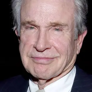
Warren Beatty – Clyde Barrow
movies – Dick Tracy , Heaven Can Wait , Bugsy
Faye Dunaway – Bonnie Parker
Movies – Mommy Dearest , Chinatown

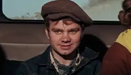
Michael J. Pollard – C.W. Moss
Moivies – Morbo , Hannibal Brooks
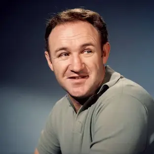
Gene Hackman – Buck Barrow
Movies – the French Connection , Superman , Hoosiers
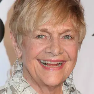
Estelle Parsons – Blanche
Movies – Rachel. Rachel
Denver Pyle – Frank Hamer
Movies – Gunpoint , Bandolero!
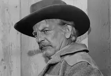
Dub Taylor – Ivan Moss
Movies – Creature from Black lake , Conagher

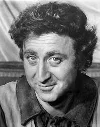
Gene Wilder – Eugene Grizzard
Movies – Charlie and the Chocolate factory , see no evil hear no evil
Mise en scene
On location shooting not shot on a backlot due to funds, filmed in Texas for accuracy .Arthur Penn shot far from LA so there would be less people trying to stick their heads into the movie
The sets look real and like the age of bonnie and Clyde (1930’s) which is when the great depression happened, and it gives us a sense of how life was during the period since they turned to crime for money
Cars were loaned, the costumes and props look 1930’s for the most part other than Bonnies look which was 1960’s inspired, this caused her to become a fashion icon for women at the time
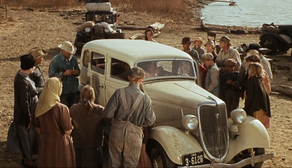
A scene where the GD is showed is when the farmers are all huddled round together which shows the poverty of farmers and people at the time, also their willingness to help with what little they had.
Editing
The editing in Bonnie and clyde was not classical hollywood since you can tell it’s moving and the first shot shows nothing but Bonnies lips however you do see both main character’s for the first time in depth at the start, you’re also aware it is happening at Bonnies house since you can see her walk around and lay on the bed . The editing at times is very unconventional and inspired by the French new wave instead of classical Hollywood, although it sometimes does in order of following the story.
The movie starts off with a extreme close up of bonnie which does give us a establishing shot. Most classical Hollywood movies would use a extreme long shot as the intro since it would give the audience a rough idea of the area.
The editing throughout the movie involves a lot of jump cuts between scenes which doesn’t make the movie seem naturalistic but it definitely follows the French new wave editing styles.
Representation
women – Bonnie Parker is seen as the stereotypical woman character that is always beautiful and well dressed. However, unlike the stereotypes during this period (1930’s when the film was set) she wasn’t just a side character to a strong man she also got heavily involved with the shooting and the violence which wasn’t standard for the time. As the movie progresses she become more and more free form the gender stereotypes, for example at the start of the film she is seen naked and holding onto the bars on her bed frame, simulating that she’s trapped and wants to escape.
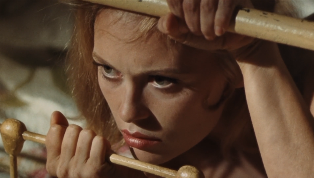
(2:50)
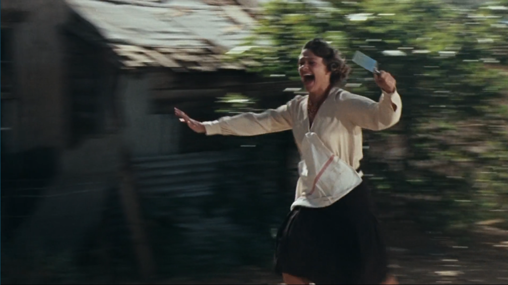
A female character that doesn’t escape the gender barrier is Blanche barrow. Throughout the entire movie she is constantly screaming and panicking representing the thoughts that the women in this time period were weak and useless. (45:50)
Men – Clyde Barrow is the standard attractive strong male character. Throughout this movie he showed that he wasn’t scared of anything and towered over everyone else. One thing that did break the stereotype is his reluctance to fall in love or be with Bonnie which most men in this time period wouldn’t think twice about. C.W moss is an example of a male character who wasn’t very strong nor attractive but he believed himself to be. He was also one of the only male characters to be single in the movie which showed how little of a man he was presented as.
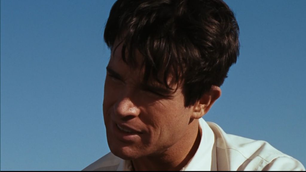
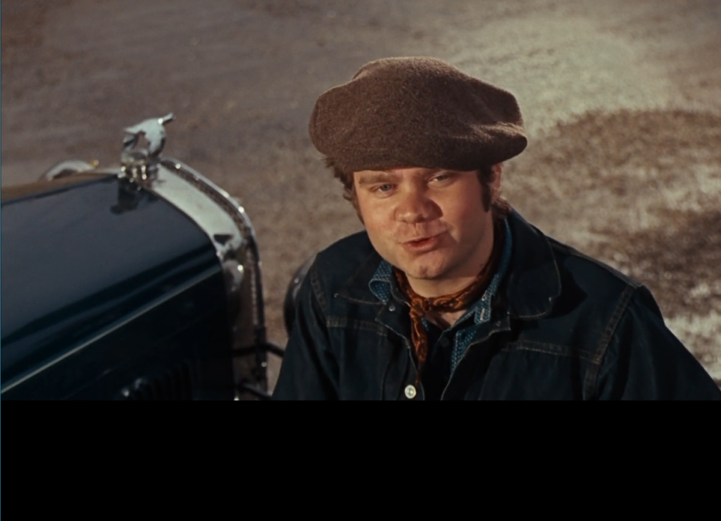
Authority figures –
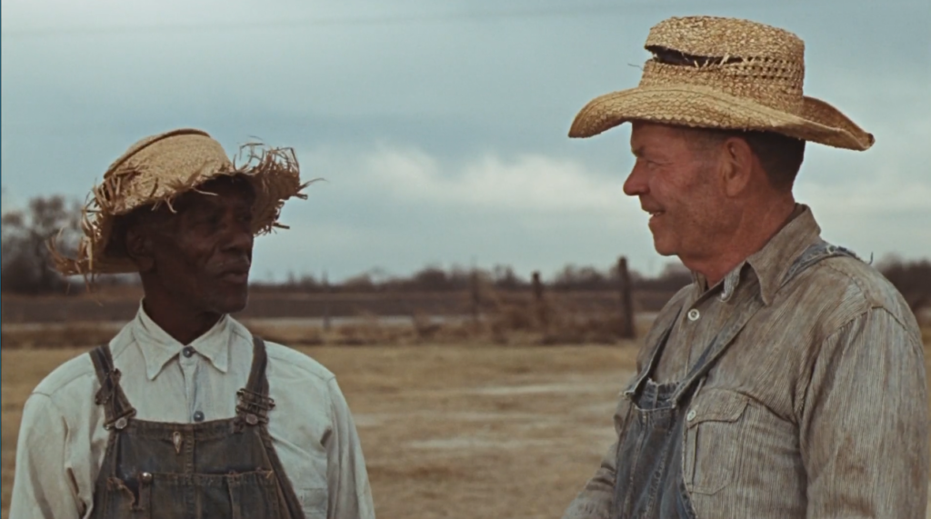
people of colour – In the movie , there was only two black characters and they didn’t make much of an appearance. The first one to appear was towards the start of the movie although he didn’t have ay dialogue which shows how little they were recognized for the time.
The other character was at the ed of the movie after Bonnie and Clyde got shot, he also didn’t have ay dialogue
With the lack of people of colour you can assume that at the time of the movie being released, they weren’t see as important of that they didn’t have many/ any opportunities for work in the film industries.
Class of america – During the 1930’s wheer this film was set, America was going through the great depression which meant that a lot of the American population (30%)had no work. This was nicely represented in the scene below where ex-farmers that had been kicked off due to lack of funds helped injured Bonnie and Clyde. Although they didn’t have much to offer they age what little they could since they understood struggle and had compassion for humans to not want them to struggle either.
They also recognize Bonnie and Clyde and don’t seem to have a bad opinion on them. This could be because Bonnie an Clyde were only taking from the rich which shows they stood with the mistreated working class.
Bonnie and clyde first response
First impressions of Bonnie and Clyde
2/10
I gave this movie a 2/10 because of a lot of the scenes and the repetitive nature of the movie. The movie randomly skipped through scenes without warning and the audience had to understand what is happening based on new context clues. The characters dying was strange since they would fall over or move in a weird way which made it more funny than serious. We never really get to meet and understand any of the characters since the movie jumped straight into the robb
My favorite scene in the movie is when they take pictures of each others and the pictures are the same as the actual bonnie and Clyde images. This little addition adds to the fact that the movie is based of real people.
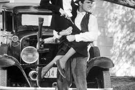
Casablanca
produced by pal Wallace
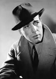
Humphrey Bogarthe (Rick Blaine) had a contract with warner bros and he was in several different movies, mainly noirs such as ‘high sierra’. He was already famous before Casablanca, he signed a contract with Fox Studios then moved to the warner bros and eventually left to start his own production company ‘santana films’. Ronald Reagan was originally supposed to play his role.
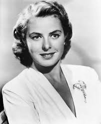
Ingrid Bergman(Ilsa Lund) Due to her being from Sweden, Casablanca was one of her first American films, she was chosen because of her accent since it fir her character the most. She stared in other movies such as gaslight and Notorious however she became famous from Casablanca.
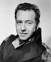
Paul Henreid(Victor Laszlo) He was famous before casablanca since he was a producer, writer and actor and featured in movies like ‘dead ringer’ and ‘hollow triumph’. He had a contraxct for wander bros which ended with him in the movie casablanca.
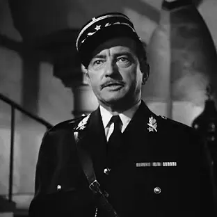
Claude Rains(Captain Louis Renault) He was chosen to play in Casablanca mainly because he was already well known in the industry for his incredible acting. He was in other movies such as ‘Notorius’ as Alexander. Rains signed a long-term contract with Warner Bros. on 27 November 1935, with Warner able to exercise the right to loan him to other studios.
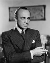
Conrad Veidt (Major Heinrich Strasser) He was already successful in other film industry before Casablanca, he was in movies The Man Who Laughs (1928) and Different from the Others (1919). He was in the movie Casablanca due to hiss background (German) and along with his accent which made him sound and look more authentic.
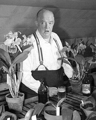
Sydney Greenstreet (Signor Ferrari) Sydney Greenstreet was a British and American actor who didnt start acting until he was 61, however he had a run of significant motion pictures in a Hollywood career. He was know for the movies – The Maltese Falcon (1941), Casablanca (1942), and Passage to Marseille (1944) which were all by Warner bros meaning that Sydney Greenstreet had close relations to Warner bros.
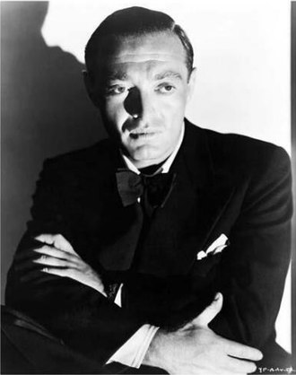
Peter Lorre (Ugarte) He was a Hungarian who had to flea from his country due to the fact he was Jewish, this is where he started making English movies like The Man Who Knew Too Much (1934),He eventually made it to Hollywood where he started working for Warner Bros in films such as Mad Love (1935) and My Favorite Brunette (1947).
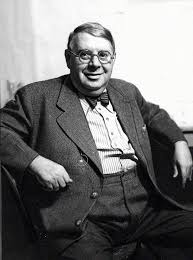
S.Z. Sakall (Carl (as S.K. Sakall)) His first prominent role was In Casablanca as Carl which led to him being in other movies such as Christmas in Connecticut (1945) and In the Good Old Summertime (1949). He was loved by magnate Jack L. Warner because opf his round and lovable appearance which led to his contract with warner bros.
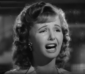
Madeleine Lebeau (Yvonne (as Madeleine LeBeau)) Before marrying her actor husband Marcel Dalio in 1939 she was in the movie Young Girls in Trouble as a uncredited student. After alort of difficulty getting to the USA she ended up in Hollywood with her first movie Hold Back the Dawn (1941) and in the following year she appeared in the Errol Flynn movie Gentleman Jim. Warner Bros. signed her to a $100-a-week contract for twenty-six weeks to be in a number of films and the contract ended shorty before the movie release
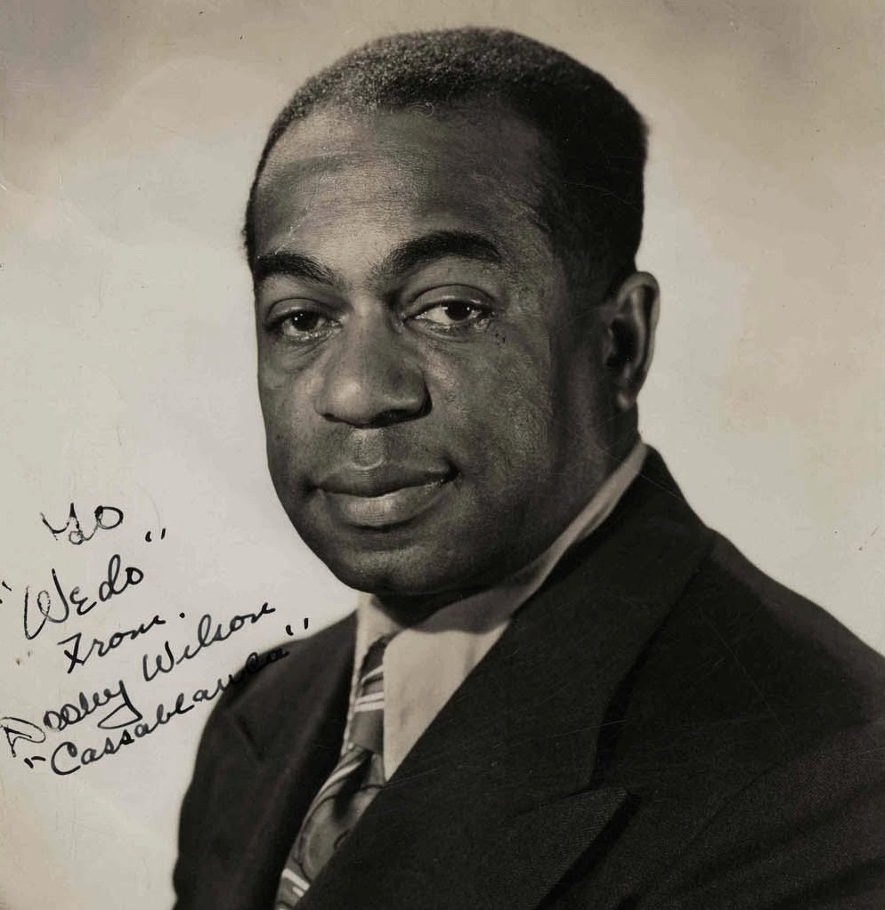
Dooley Wilson (Sam) he was an American actor, singer and was a musician in his own band in the 1920s, touring nightclubs in London and Paris. In the1930s he took up acting, playing supporting roles onstage on Broadway however his most prominent role was in Casablanca. He was contracted for Paramount however he was lent over to Warner Bros for seven weeks.
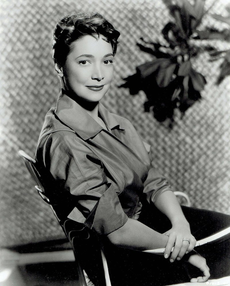
Joy Page (Annina Brandel) Her first movie was Casablanca when she was 17 despite her thinking the movie was old fashioned. Warner Bros studios didn’t sign her to a contract and she never appeared in another Warner Bros movie again. Instead she was in other movies like Kismet in 1944 and shorty retired after the first season of Disney’s miniseries The Swamp Fox in 1959.
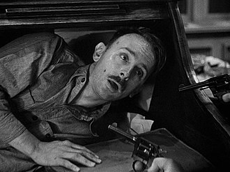
John Qualen (Berger) He began working with warner bros in 1927 for the film Lights of New York. He was in many different movies but his most known are angels over Broadway, an American romance and Hollow Triumph
Mise En Scene
Locations
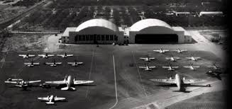
Casablanca, despite being set in Morocco, was filmed in two regions- The Warner Bros lot in Burbank and for the airport scenes they filmed in the Metropolitan Airport at Van Nuys

Sets
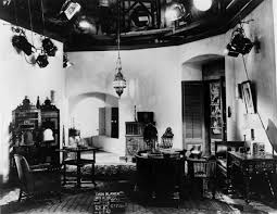
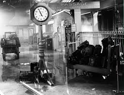
The old Hollywood style mean that the sets had to look realistic which Casablanca managed to do well. The sets had to give of and exotic and tense atmosphere to mimic the world war II feel. All the sets were either made by warner bros to achieve the romantic appearance of the movie, however some sets e.g. the train station were taken from other movies and re designed to fit with the Casablanca aesthetic.
Costume
The costumes in Casablanca helped distinguish all the different nationalities in the city which was a big part of the historical context of World War II. All the costumes where elegant and helped represent the power level of each character, for example Heinrich Strasser was always in a formal suit which showed he was in charge of the German soldiers. The women in the movie also all looked put together which showed how they were more for appearance other than wealth or power.
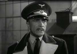
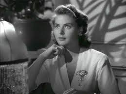
Props
props are used in Casablanca to not only add to how the characters feel or some characters wealth/ power, but also as a tool to showcase the time period and the opinions of the war, for example when the Vichy France bottle was thrown in the bin it showed how the character Captain Renault was no longer supporting the Germans.
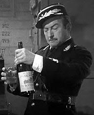
Editing
During the old Hollywood time period, Invisible editing was common which meant that the editing would go unnoticed and wasn’t prominent this adds to the verisimilitude. This would also mean that there would be no sudden cuts/ jump cuts ands everything would feel smooth and natural
A good example of this is when Rick was helping the couple leave Casablanca and make it to America, in this sequence of different cuts you can see the expressions on everyone’s face which helps us as the audience feel touched by Ricks actions. You can also see the zoom in on the poker chips which add to the scene since the audience feels more involved and understanding of it.
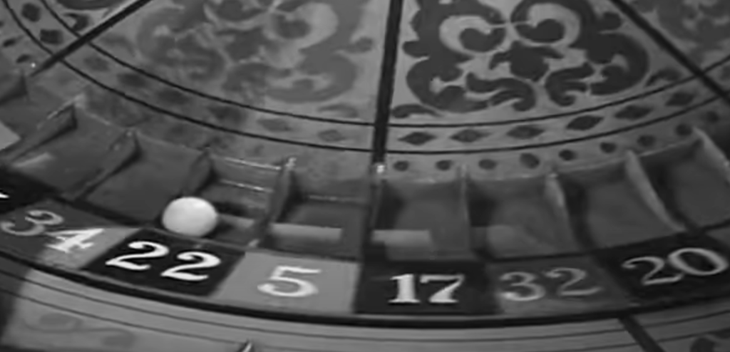
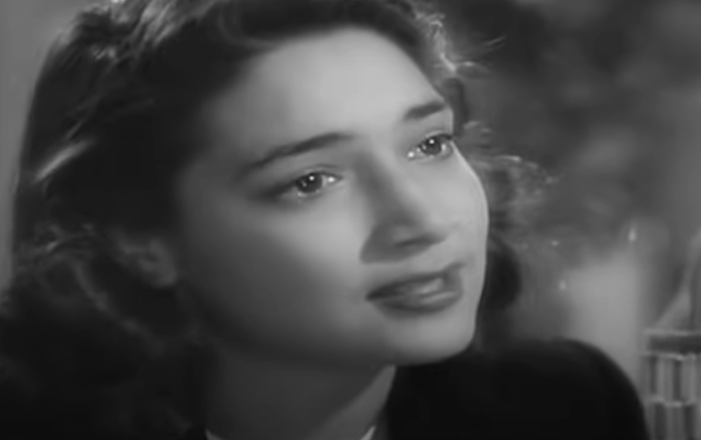
( close up image )
Sound
There is a sound motif for the character Isla and Rick, this song is called ‘as time goes by’ and is representative of her and Ricks relationship. It is most prominent i the train station scene where Rick discovers that Isla is not following him, this leads the song to have more backstory and touch the audience. This song was composed by Max Steiner, also famous for the music in King Kong.
There’s also a large use of Diegetic sounds, i the same train scene you can hear the rain which added to the already gloomy atmosphere. There’s also a use of diegetic sound when the doors of Ricks bar slam open when the police enter, this adds shock and fear to the already dramatic scene.
Representation
Black people – The only non white person in Casablanca was Sam an African American musician for Rick. However, Sam is displayed as a stereotypical form of entertainment for white people and is seen as property, this is shown when someone offers to buy Sam from Rick which shows how little Sam is valued as a person. During World war II black people were already a target and this movie simply added to it.

Women – There aren’t many female characters in the movie other than Isla , Yvonne and Annina Brandel. All of these women are always seen looking well put together and beautiful, this is because women at the time were seen as an accessory to the men they were with. Annina Brandel is a good example of this because although she was a poor woman who was newly wed and needed help with money from rick to escape, she still managed to look expensive and like she wasn’t struggling. All these women had a relation ship with a man and felt almost dependent on them. Specifically Isla who’s entire role in the movie was to chose which man she wanted to depend on the most.
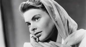
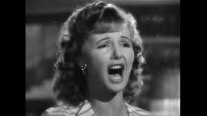
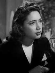
Men – There were alot of men in Casablanca. Despite alot of these men being from different backgrounds and having a different level of power, they all looked and acted superior and much more wealthy than they were. All of the men were seen in suits or they’re uniform which showed how they could afford to live comfortable despite the war happening. The only characters that had any authority the whole movie where white men which included : rick and Heinrich Strasser.
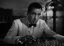
Aesthetics in Casablanca
Themes and issues
isolationism – World War II was a dispute between foreign nations and that the United States had no good reason to get involved
What was Americas view on ww2 – America believed that it shouldn’t get involved since they didn’t want anymore young American men to die in war unless absolutely necessary (Pearl harbour) 96% of Americans don’t want to get involved and would rather stay neutral
The character of rick in Casablanca is a cynical at the start of of the movie and represents the 96% of Americans who chose to stay out of the war, this is shown by the fact he doesn’t lean much either way politically and just wants money. However after he helps the couple with the visa out of Europe he start to become a sentimentalist and patriotic.
Historical and Social context for Casablanca
the allies – UK, USA AND USSR
The axis – Germany, Japan, Italy
France was occupied by Germany in June of 1940 and surrendered to the Nazis. The Free French still fought for the allies, this was in southern France which was renamed Vichy France because of the new capital. The new government was a German puppet.
Morocco is part of the French empire which is where Casablanca was set
World war 2 started in September 1st 1939, however America didn’t join until 1941 after the surprise attack from japan on pearl harbour
Operation Torch – The invasion Allowed the British to take control of north Africa while allowing the American forces to start their fight with Nazi Germany. (November 8, 1942)
‘it captured the zeitgeist’ – Uses the mood / feelings of a specific point in history, (ww2 for Casablanca)
Casablanca Conference -When Whiston Churchill and President Roosevelt had a meeting in Casablanca about the allied powers and plans on how to fight against the axis. (Jan 14, 1943 – Jan 24, 1943)
The first screening of Casablanca was 26 November, 1942 was in New York, it goes on general release in January 1943
People used to get their news from newspaper, movie reels and the radio
The Birth of Hollywood

1.Why did film makers and producers move to Hollywood?
The mountains and the large untouched land made it ideal to establish studios
2.Name some of the big stars, directors and pictures from the Silent Era of Hollywood? (at least TWO of each)
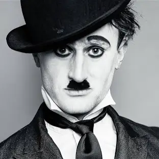
director – Charlie Chaplin April 16, 1889
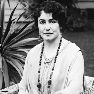
director – Lois weber June 13, 1879
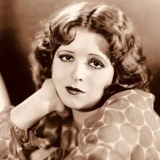
actor – Clara bow
actor – Harold Lloyd
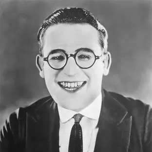
3.In what ways were the early Hollywood studio system like a factory or production line or even the Premier League (football)?
the early system made actors worth very little and could be loaned over to other film companies similar to how footballers could be sent over to play for other teams. Actors were told what they were and were not able to do making them very dependent with their managers.
4.When and what was the first “talking picture”?
The Jazz Singer, which premiered on October 6, 1927. A major hit, it was made with Vitaphone, which was at the time the leading brand of sound-on-disc technology.
5.Why did the end of the silent era cause problems for some performers working in the film industry?
When actors were able to use their voice, some actors didn’t match their characters persona which made the characters appear confusing.
6.What was happening in America(and around the world) at this time?
WW1 , GREAT DEPRESSION , wall street crash 1929. These all made holly wood more successful since they were realising up to 800 films a year, meanwhile we only release less than 400 in todays date
The Hollywood studio system
•1) What were the Big 5 studios & what type of movies was each studio famous for?
MGM – musicals, melodramas, literary adaptations (Wizard of Oz)
Fox – Musicals (The Grapes of Wrath)
RKO – musicals, comedies (Bringing up Baby)
warner bros – melodramas , gangster movies (The Public Enemy)
Paramout – comedies (Morroco)
•2) Explain what vertical integration and block-booking was?
block-booking – selling films to theaters in units
vertical integration – when a Media Company owns different businesses in the same chain of production and distribution. For example, a 20th Century Fox owns the studios in Hollywood, they also own the cinemas, the TV channels and the DVD rental shops
•3) Why and when did the original studio system collapse?
In May 4. 1948 , the USA rules that Paramount and 8 other companies violated anti-trust laws since they were exercising an unfair monopoly by dictating what movie go into their own theaters.
•4) What was happening in America(and around the world) at this time?
The great depression and wars
•5) What genres were popular and why did people go to the movies in this period?
Westerns, comedy , musicals and animated cartoons were popular. During the great depression people could only afford to watch movies for entertainment.
classical Hollywood style
- what is meant by the invisible style of story telling?
it is when in classical Hollywood they chose to hide the artistic choice from directors in order to present a more natural story to the audience.
2. what is continuity editing?
it is when they edit the scenes in a film together to make it feel seamless and that there isn’t a cut. In classical Hollywood they didn’t use jump cuts and made sure it wasn’t obvious to keep the natural feel.It emphasis dialogue reaction cause an effect.
This is England Micro-elements
Sound
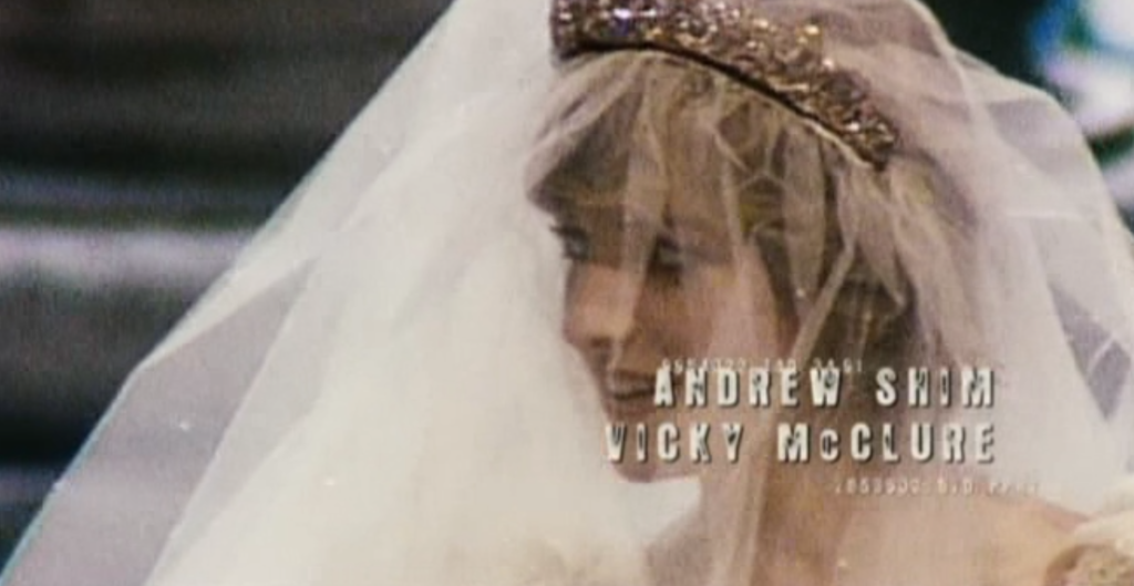
The movie starts of with an upbeat song over the credits. The song started the movie on a positive note which made me feel like the movie was going to be light and happy which was partially true since the movie included a lot of humor however it was mostly negative. The music was a form of non-diegetic sound since it didn’t come from the world of the movie.
cinematography
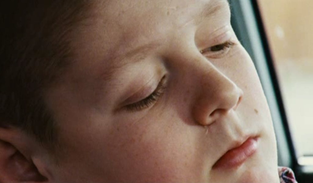
The cinematography throughout This is England makes the movie feel more personal to the audience. In this specific scene there is a close up of Shaun while talking Combo about how he feels. This close up shows how much the two characters are getting along especially since its switching between the two characters (POV shot). Not only does the close up make the characters feel closer, but it also makes the audience feel closer as well.
mise-en-scene
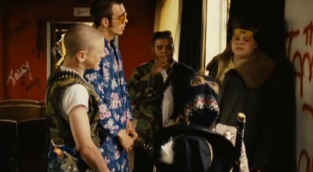
The mise en scene in the movie is consistent and gives the movie a overall chaotic feel. In this shot specifically, it shows how unserious the characters are since their costuming is random and not sensible. The setting they are in is also an abandoned house filed with graffiti which shows how they don’t tend to follow the rules and live life freely. A final mise en scene factor in this image is the coloring on Woody, while everyone else is wearing dull colors and balding in, Woody is wearing a bright blue which shows how he’s the ‘leader’.
editing
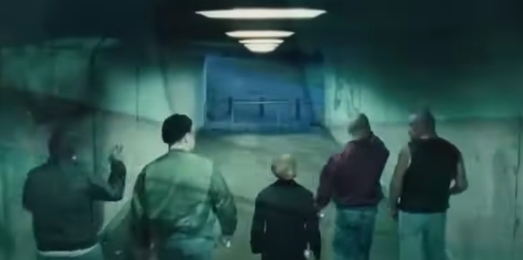
Throughout the movie, the editing is subtle and adds small but necessary visuals for the scene. The editing in this scene is particularly impressive since its a fading transitions of the English flag. This adds to the movie since its a bold way of showing what every character in this image stands for. Its also only a short insert and only slightly visible so it doesn’t take away from the visuals of the scene but it servers as a reminder of why the characters are connected.
Aesthetics
aesthetics definition – The overall style of a film and the visual appearance. This can include the costumes and the set design throughout the movie
Aesthetics term 1-realism
definitions
Realism – a way to represent real life issues / characters through film
verisimilitude – The appearance of being true or real; believability
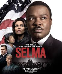
Example– Selma is an example of verisimilitude since its based on real events that happens (the fight to pass the voting act right)
social realism – Effects on the environment and the factors of the development of characters throughout
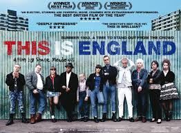
Example – This is England is an example of social realism since in the movie represents real life England and its issues, including the racist development of Shaun.
magic realism – a literary or artistic genre in which realistic narrative and naturalistic technique are combined with surreal elements of dream or fantasy
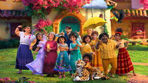
example – Encanto (2021) is a magic realist film since the movie has surreal elementals like magical powers the a realistic feal from the community and village
hyperreality definition – over dramatic version of reality or reality that is emphasized / too real to be real
Example – The Barbie (2023) movie is over emphasized and a dramatic look of reality
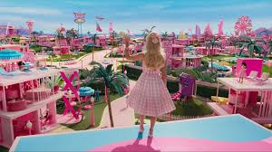
aesthetic term 2 – Visual style
Visual style – the look and the feel of a film / language
iconography – the visual images and symbols used in a work of art or the study or interpretation of these
example – The boy in the stripped pajamas (2008). The reoccurring pajamas symbolize the holocaust and the people who suffered throughout
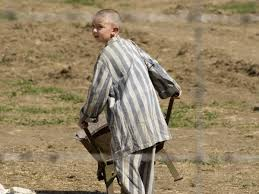
intertextual referencing – when films and other arts/literatures collide in a movie
Example – In Monsters inc other Disney movies are referenced like in the scene where they are trading plushies of nemo
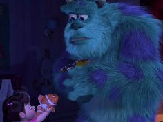
visual / sound motifs – a recurring sound element that is associated with a particular character, theme, or idea within a film or audio-visual work
Example – The movie jaws has the memorable sound track whenever the shark is nearby
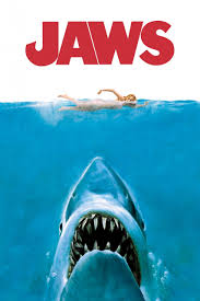
colour grading – digital tools used to make videos or films look better or change the colour tone and mood
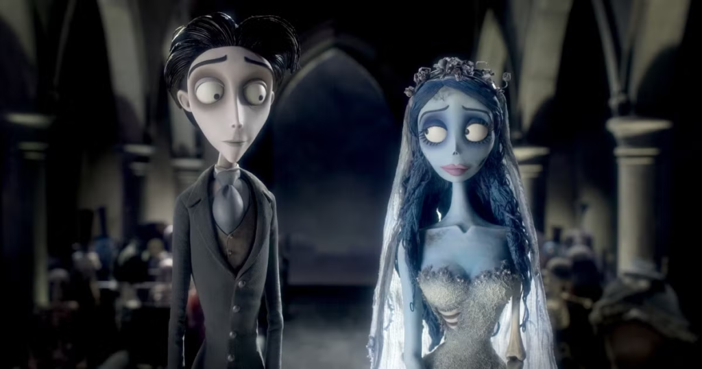
Example – In the movie corpse bride, the colour grading waw a cool toned blue throughout adding the the eerie feeling
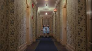
auteur trademark – something used by directors to make sure no one else steals their work
Example – Stanly Kubrick has a signature style of symmetry throughout all of his movies e.g. the shining
Aesthetics terms 3 – Tone
Tone – The overall mood/ atmosphere
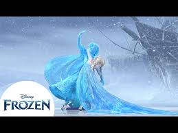
Pathos – capture audience through emotion
Example – In the movie Frozen when Anna freezes , the emotion displayed on Elsa can be captured to the audience
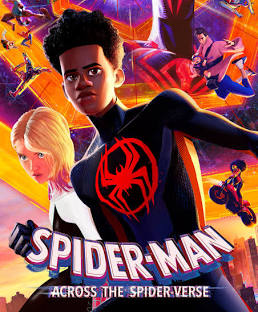
bathos – an anti-climax, when the audience is expecting bigger and better and the outcome is not what expected
Example – Spiderman across the spider verse. This movie ends on a part 2 right before the action part is about to begin
suspense – holding something back form the audience and increasingly adding to the tension building
Example – Zodiac is a great example of suspense especially since we never find out who is the zodiac killer in the end
comedy – a humor themed movie with jokes and the aim is to make the audience laugh, sometimes comedy is mixed with other dark genres to create a more textured movie theme
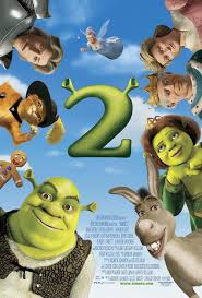
Example – A great comedy movie was sherk 2 since the main characters were alraedy established making more room for jokes
dramatic irony – when the audience understands more of the situation than the characters
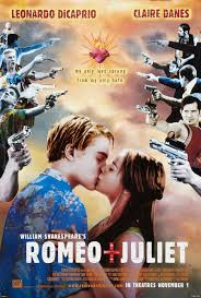
Example – In Romeo and Juliet the audience is aware that Juliet is only pretending to be dead when Romeo finds her
distancing effect – a sense of distance between the characters and the audience