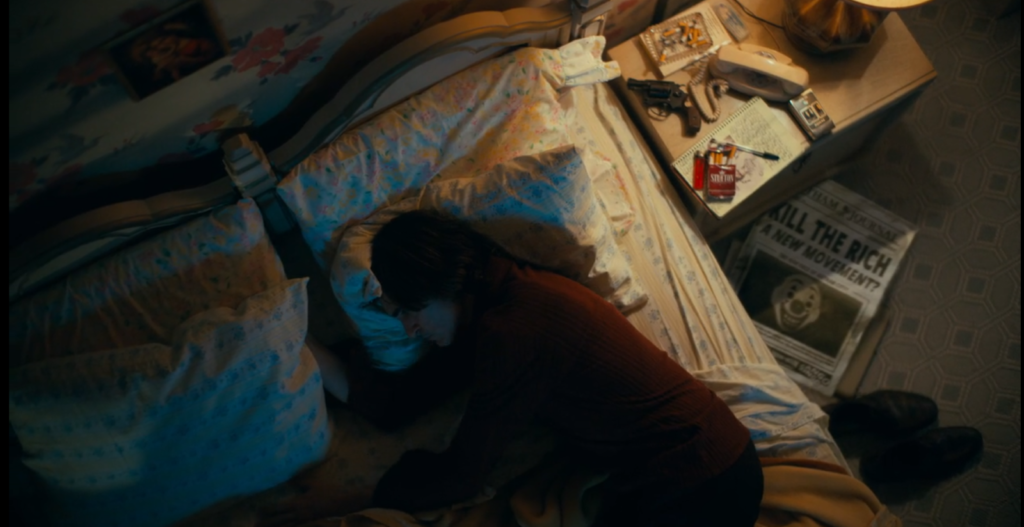
(Todd Phillips, 2019)

Mise en Scene element: Props.
I chose this one because everything that is on Joker’s bedside table really represents his character- the gun could potentially be seen as foreshadowing or a hint of his madness. There are also cigarettes and a lighter which are precisely placed so that he can grab them at any time, portraying maybe his addiction. Finally, the newspaper on the floor is extremely significant as it is a silent way for the audience to understand what is going on within the world that this film takes place in (verisimilitude). It drives the narrative. It also raises tension, and the words “A new movement” are an indication of an underlying theme that the movie will address. Overall, it just makes the character feel more real and it connects the audience to the film much more.

Mise en scene element= Composition
This is the second screenshot, and it shows a lot of elements of mise en scene. Firstly, there is set design. In the alleyway there are plenty of trash bags that can be seen, just thrown carelessly, and this gives the impression that the city is dirty and filthy-this helps build the world that the film takes place in. Then there is also the poster which has graffiti painted on it that says “Resist” in an ominous black pen- this further emphasizes the feelings of the rioters in Gotham and adds to the story of the film. Finally, a wide-shot angle is used which makes the viewers feel like they are watching from afar as something very bad is about to happen, and the lighting is dim and dark, making it feel creepy.

Mise en scene element= Cinematography
In this shot, they are using a medium close-up shot (MCU). This shot is used to clearly show the emotions on Joker’s face in this specific scene while he hauntingly fakes a big smile while feeling the complete opposite. It focuses the viewer completely on the character as he is the central figure and helps them fully immerse themselves and understand.

Mise en scene element= Makeup and costume
The colours of Joker’s costume and makeup are stark and very vivid which add a lot of depth and visual impact- every time Joker is on the screen the audience is attracted to the bright colours so it’s very clear that Arthur is the focus. Also the makeup on Joker’s face can be seen as a metaphor for his hatred for society and how out of place he feels, like a joke, which clowns are seen as.

In comparison, at the beginning of the film the makeup and costume for Joker’s clown persona is much less serious looking and a bit goofy. The red nose can be seen as childlike, and the wig is misplaced and cheap looking- this can be seen as a reflection of Arthur’s feelings towards this terrible job. As we watch the costume develop throughout the movie, it tells the audience the story of Joker’s downfall spiral into the murderous character he becomes. It’s a subtle way of storytelling but it works very well.
Well done luana. I like the way you are already working key terms (verisimilitude) into your writing in a way that shows clear understanding and sophistication.