Joker, Todd Phillips released 2019

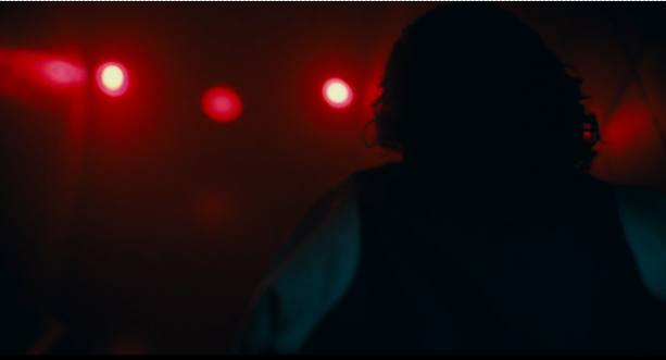
Mise-en-scene is everything that you see in the frame of the camera, this can include the lighting, placement of characters, colours / costume and symmetry. This scene is from the key part in the middle of the movie where the joker starts the uprising after killing three men on the train. I chose this scene because of the variety of different elements that were used to capture this one scene. The first main element that stood out is the lighting, this is because the dim warm colored light gives and eerie sensation and adds more intensity to already action-packed scene, it also creates harsh shadows that make the scene appear bolder and more dramatic. Another element is the character placements in the scene, the Joker is much taller in the scene which shows his authority and power, while the man is on the floor crawling which makes him seem weak and helpless. They are both at an equal distance away from the camera which makes the audience look at both characters which signifies both of their importance in the scene.

Colours signify a lot in this film, for example in this scene it is primarily red which shows how evil the joker is. It also makes the joker stand out in this scene since he is just a shadow figure which gives him a more sinister look. The red lights beaming at the audience makes the color the focus of the scene which also makes the evil and blood the color could represent feel unavoidable, it is also the only light in the scene which highlights its importance, it also depicts how the joker is heading down a villainous root that he can’t return from.

Composition plays a big part in this scene because all the props, colours and characters complement each other well. The background of the scene is red and the joker (which is standing in the center) is also red .All the background characters are faded, this causes the joker to stand out, furthermore the light reflecting from the movie makes him appear brighter and more colorful which draws the audience attention to him. Everything in the scene fits together well, which turns it into a memorable scene, it is also showing its importance.

The makeup in this scene is particularly important and represents the whole scene. The standard clown makeup the joker normally wears is smudged which shows how great the impact of the crash was, it also represents society at the time since everyone was rioting and was falling apart. The use of blood to fix his clown makeup adds gore which reminds the audience about who the joker is and what he represents. You can also see people in the background with similar makeup to the joker which shows the revolution he is starting and how important the makeup is.

Costuming in this scene highlights how the scene is only in Arthur’s head, this is because Arthur and everyone else round him are all wearing formal clothing which we know is not normal for Arthur to wear since he cannot afford it. It also shows how Arthur views himself now, which is sophisticated and not much different from the rest of society other than his laugh. The blue colours he is wearing make him blend in with everyone instead of sticking out, which is important since it shows how he just wants to ‘belong’ with everyone. The blue could also represent his calm personality at the time and how outspoken he is because he is wearing a muted blue. The people around him are also wearing similar clothing to him like dark colored suits or polo shirts, this represents the class division in the movie where the rich are unaware of the poor and all the rich people are alike.

The use of location filming in this scene gives the audience a visual depiction of the city of goth ham that the movie is set in. It also allows the audience to see how large the city is and how dull the atmosphere feels. The road down the middle of the scene makes the image look more symmetrical and it could also show the divide between the rich and the poor. The taller buildings in the background line up so the highest points are in the center which draws the audience into the middle of the scene. This adds height to the scene which helps make it look less flat and more realistic for the audience.

The props in this scene are laid out towards the front, this makes them obvious and noticeable to the audience especially because of their brighter colours. The broken sign placed Infront of Arthur shows physically how he is feeling since the sign was important to him and his job. The overflowing garbage and the trash on the floor make the scene dirtier and shows how terrible the conditions of the city are especially for the lower class.
One of the main things to say about set design is that most of this films looks like it’s shot on real locations – the level of ‘verisimilitude’ is very high (Try and work terms like that into your work) .