Joker – Mise En Scene

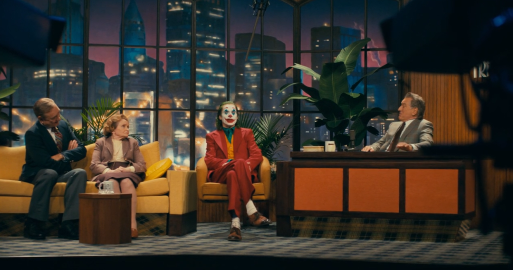
In the scene below of Arthur and Murray at the talk show studio, Mise En Scene can be seen through this scene very well. For example, the use of makeup for Arthur. You can clearly see that the makeup shows the joker and represent who the joker is. The use of costume is well represented as you can see the iconic suit for the joker- the use of yellow and red could connote clown and how Arthur used to work as a clown. Furthermore, the way the Murray has been dressed it shows that he is more professional and cleaner and takes his job very serious. The set design is of Murrays studio for his talk show. From the props being used like desk and chairs, you can tell that it is an interview for a talk show. The backdrop of the city is made to look like you are in a building and outside is this amazing view whereas it isn’t. You can easily tell that this has been created by people however it looks very similar to other famous talk shows which shows us that this part of the movie is quite relatable for people as many people might watch talk shows. In the scene you can see that there is space but not much. Most of the space has been filled with props like furniture for the show e.g., sofa, desk a few plants, a small table. Is this scene you can see that Murray franklin is Infront of the others telling us that he is the host but also making him seem more superior and more powerful in this moment. In this scene the lighting is high key lighting suggest that the talk show will be a comedy, and it bring a happy and upbeat mood however all the other scenes in joker the lighting is low key suggest the film is quite dark and the genre is more of a thriller and crime movie. The composition of this scene is quite balanced. You can see why the director may have chosen to film this scene from the angle and view it show who is superior and who is he guests. The aspect ratio of this scene shows that the way this has been filmed is a widescreen, this helps to capture the whole scene and shows the essence that the scene is trying to prove. The film stock has been shot in colour which really help to understand outfit choices and lighting, perhaps that why they chose to make the joker suit red and orange. Red could connote death and blood but also danger.

In this scene it captures one of the main mise en scene categories, makeup. On his face he has been painted in white and there is red strike splattered on him from when was killing his friend. The use of red blood shows danger, blood and death. It helps emphasises what has just happened in the scene before. Normally the colour white connotes cleanness and innocence. However, most of the white face paint has been covered in red which could imply that Arthur is no longer innocent and clean. The might make the audience start to realise that he is turning into the joker.

In the scene where he is applying his make up the lighting used is very low-key lighting this could suggest to the audience that the film is very dark, and the genre of the film is thriller and crime. The low-key lighting helps emphasises that Arthur is very depressed and sad and that he perhaps views his life as a sad, dark place. The depressing light is the starting to show how the joker is quite depressed which shows the audience that this film is about him being quite sad.

In the Scene of the interview with Murry, the set design being used is of a studio. I like this seen for the set design because it looked very real. On the right there is a camera showing that this interview is being filmed. It looks like the set design has been made and built as it would be hard to find a place to use to film this seen, especially with a shooting seen. I really liked the use of props like a desk, sofa and table- this made the seen come alive as it looked very verisimilitude. This helps the audience to feel like that this will being a real interview even though they know something will happened at any time.

The use of costume in this seen shows that there is a bit of happiness in the scene. We can see that Arthur is dressed in bright colour and is dancing for the children at the hospital. Through this scene you can see that Arthur seems to be innocent and is just trying to make the children smile by being a clown, however this contrast of how is normally. The scene might show the audience that he has a slight bit of innocent and wants to make those kids happy.

In this scene, Arthur has just been fired from his job and is leaving the premises of his job. The tight and dirty space kind of represents Arthur as he is in a tight living crisis as he can’t afford many things and lives in an old apartment. This might make the viewer feel bad for him as that is how he lives. There isn’t much in this scene except for some stairs and a sign that say, “don’t Forget to Smile”. However, Arthur rubs out forget to which starts to show his true joker self.

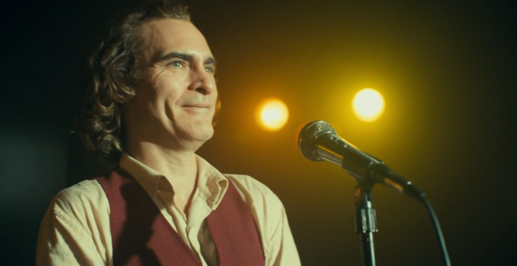
The composition in Joker shows the arrangement of lighting, for example in the scene where Arthur is performing to be like a comedian. The lighting he is being used to make it look like he is on the stage with all the lights on him. The blurry background almost make it seem overwhelming for Arthur and it is quite hard trying to be a comedian. As the audience it makes you feel quite sorry for Arthur as it must be hard to be a comedian.

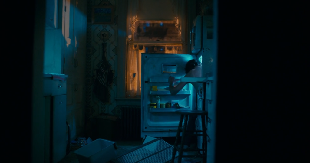
Aspect ratio in this scene is used to create a tight space, in this scene the kitchen is quite messy showing that the joker is messy. This might show the audience that Arthur is quite enclosed and has not have the power to be more open and perhaps keeping his feeling quite close to him.