This is a mix-down of different musical tracks that i edited together for my first thriller film, note that i did not actually use this, it ended up being removed and replaced by a different track .
Comparative – Structure Planning
To what extent have modern science fiction films changed since the birth of the genre, shown with The War of the Worlds (dir. Byron Haskin, 1953) and The World’s End (dir. Edgar Wright, 2013)?
Introduction: Establishing the concept of genre and some of the conventions of science-fiction. Defining terms like modernism and postmodernism. Introducing the two films and their context, with brief summaries of the plots.
Comparison Point 1: The World’s End as a homage/pastiche of The War of the Worlds. References to intertextuality.
Comparison Point 2: The reality of The War of the Worlds vs the hyper-reality of The World’s End. The War of the Worlds has a sense of verisimilitude (despite the alien invasion). The World’s End lacks a sense of verisimilitude, as the characters behave in very exaggerated ways and the film includes many stereotypes – for example the design of the pubs.
Comparison Point 3: The World’s End as a commodity, due to the stars in the film and the fact that it is part of a trilogy. The War of the Worlds is more traditional as it aims to tell the story.
Conclusion: Summarising the main points
Noir narrative techniques
There are certain narrative techniques which are common across both the film noir and neo noir movements and these traits have not changed across history – one of he best examples of these techniques is the use of voice over by the main character , this is a trope within itself and it is similar to the archetypal characters that are used within the genre in the sense that they are expected as part of the genre. Voice overs are often used while the main character is speaking to another character and this gives us a unique insight into what the characters are actually thinking – for example , at the beginning of Blade runner , Bryant recruits Deckard to hunt down the rouge replicants and while Bryant is talking Deckard is holding a neutral expression and his interior monologue tells us that Deckard dislikes Bryant and this is not something that would have been immediately evident by just his facial expression alone.
Voice over is only one technique that is a hallmark of the style of film noir and it helps to create a casual tone and it makes the audience think that they personally know the protagonist. Additionally , the intimacy that is created between the main character and the audience serves to raise the stakes of the action due to the fact that a personal dialogue has been created between the main character and the audience , who come to like the main character because they are afforded a unique insight into the minds of the characters and their thoughts and feelings.
Sunset Boulevard (1950 , directed by Billy Wilder) is an example of film noir where voice over is used by the main character in order to give the audience context as to what is going on in the narrative.
The voice over technique also serves a symbolic purpose due to the fact that one of the main themes in film noir is the duplicity of individuals and this is literally reflected in the way that the voice over technique is used to create a disconnect between what the main characters thoughts and their words and actions and this helps to create a sense of moral ambiguity because the audience doesn’t know if the main characters are reliable narrators because the aforementioned disconnect between the characters thoughts and actions sows seeds of doubt in the minds of the audience because it creates uncertainty as to weather the protagonist is good or evil.
Comparative study
How do the early films of auteur director Stanley Kubrick compare to his later works in terms of the use of cinematography as a principal storytelling device?
(Explained using examples from “2001: A Space Odyssey” – 1968 and “Full Metal jacket” – 1987
What is an Auteur Theory ?
Auteur theory is a theory of filmmaking in which “The director is viewed as the major creative force in a motion picture” (1)
“The auteur theory, which was derived largely from Astruc’s elucidation of the concept of Caméra-Stylo (“camera-pen”), holds that the director, who oversees all audio and visual elements of the motion picture, is more to be considered the “author” of the movie than is the writer of the screenplay.” (1)
In essence, An auteur is a director who is in full creative control of their film, this is usually identifiable by having original traits or styles that they may have popularised / invented or are known for using often.
What are Kubrick’s textbook characteristics/ styles/ themes than run through most of his films?
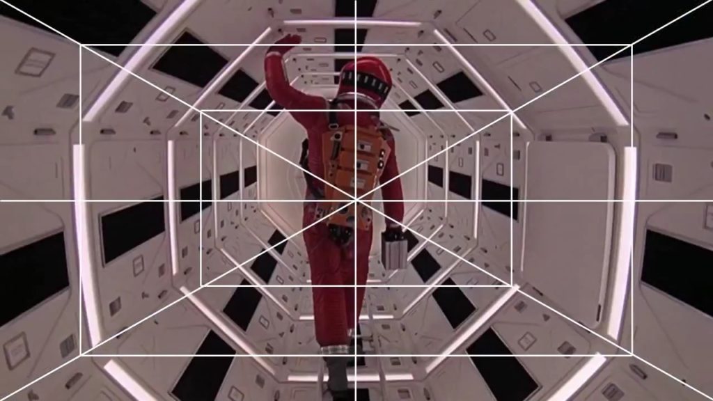
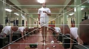
Symmetry – the use of one point perspective. Although one point perspective is not an exact representation of symmetry in cinema, it is a way of creating cinematic shots with near perfect symmetry. O.P.P is perfect for drawing the viewers attention into the center, Kubrick used it to encapsulate the viewer in his fictional environments, this is so effective due to the fact that there is only one way out – forward, for example in “The Shining” – 1980 When following Danny through the halls, the viewer is constantly moving forward with Danny, therefore immersing the viewer into the film as if they are in just as much danger as Danny. It can be very subtle but many films have used it especially 2001 and Full Metal Jacket
Tracking shots – especially the “Steadicam”. This is another technique used in many of his films. Tracking shots are any shot where the camera moves forwards, backwards, or along the side of / with the subject as it moves. Usually tracking shots are constructed by putting a camera on a Dolly then on a track however if following in front or behind the subject, the tracks will be seen. This is the reason for the invention of the Steadicam, not only is it easier to maneuver and set up (no need for a track) but there is no trace of presence unlike a track. Kubrick uses this constantly to help connect his audience with the characters and incite all the different emotions the subject might be exposed to. In 2001 the tracking shots helped preserve the symmetry as Dr Bowman moved through the space station’s tunnels because the camera moved with him. In Full Metal Jacket, tracking shots follow the sergeant as he speaks to each of the soldiers in a line, its a smooth way to follow him looking from soldier to soldier whilst preserving symmetry.
Wide angle lens – Kubrick was extremely interested in the wide angle lens in his early photography and he has carried it into his films as a beautiful technique that he likes to pair with one point perspective. The wide angle lens is like a feast for the audiences eyes as there is much more to take in, its subtle and extravagant at the same time, enough to become a staple technique but no enough that it seems disruptive or uncomfortable. Kubrick has created a perfect balance of subtlety and originality. This is what makes Kubrick such an amazing film maker.
Monolithic themes: Kubrick often uses monolithic beings/elements in his films that are far more powerful than our characters, these beings / elements convey a sense of dystopian control. This can be obvious in 2001 in the example of HAL: being a super computer with immoral intent and nearly full control over our protagonist and his surroundings. Or it can be very subtle like in full metal jacket the idea of war being a type of dystopian control, as if referencing to a future world where everyone fights for survival. This links to the timeline of Kubrick’s films where before “A Clockwork Orange” – 1971 Kubrick’s films presented these monolithic beings/ elements in very visual ways like in 2001, The Shining and Dr Strangelove – 1964. Whereas after Clockwork, the style did slightly change, and these monolithic elements started being displayed in a more conceptual way. In fact, a quote from Gilles Deleuze talks about these monolithic beings / elements as being products of a “cinematographic brain”. He talks about how the Mise En Scene is a brain and the beings inside it are on a journey through it, these monolithic beings / elements are catalysts for change and evolution and propel our character through not only the story, but through the cinematographic brain. However it is worth mentioning that in Full Metal Jacket the drill sergeant also represents the monolithic themes, He is extremely harsh and inhumane. But as well as that he is a catalyst for change, similar to the obelisk / monolith in the 2001. He is the reason these characters become what they are and is a very big part of the “Cinematographic brain” that Deleuze talks about. This obviously is a very visual representation of the monolithic themes, similar to 2001, which begs the question how much of Kubrick’s cinematographic auteur style, relies on Alcott, and how much is influenced by him?
“If we look at Kubrick’s work, we see the degree to which it is the brain, which is the Mis[e] En Scene. Attitudes of body achieve a maximum level of violence, but they depend on the brain. For in Kubrick, the world itself is a brain, there is identity of brain and world, as in the great circular and luminous table in Dr strangelove, the giant computer in 2001: a space Odyssey, the overlook hotel in the shining. The black stone of 2001 presides of cosmic states and cerebral states, it is the soul of three bodies, earth, sun and moon. But also the seed of three brains, animal, human, machine. Kubrick is renewing the theme of the initiatory journey, because every journey in the world is an exploration of the brain“ (3) –
Gilles Deleuze
Here, it seems, Deleuze is referencing to how kubrick’s style is exponentially more than what can just be seen on the screen. Each different component seen in his film is like a catalyst to spark emotions, they all work together interchangeably and form a giant “brain”
“For in Kubrick, the world itself is a brain, there is identity of brain and world, as in the great circular and luminous table in Dr strangelove, the giant computer in 2001: a space Odyssey, the overlook hotel in the shining.” (3)
Even though Kubrick’s later films did not have Alcott as a D.O.P, regardless of how it visually looks, Kubrick’s ability to create a deep and incredibly complex world that’s almost representative of a brain is still there and that plays a big part in distinguishing his style.
How did Kubrick’s Style Develop and where did it come from?
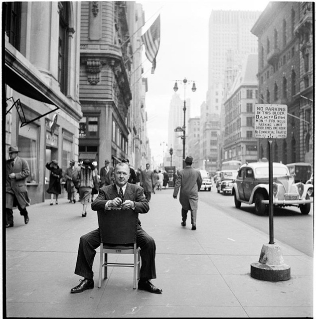
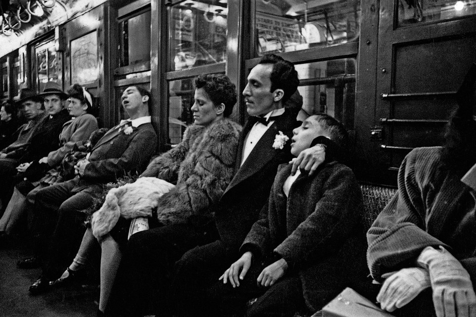
A large proportion of kubrick’s visual style was derived from his previous work as a street photographer, capturing the highs and lows of life in New York.
most notably his use of the wide angle lens and O.P.P – the vanishing point:
At this age, Kubrick’s style was still developing, however we can see some early inspiration for the deep focus that is an important factor in the wide angle shots we see in his later films, especially 2001:
Kubrick’s partnership with Alcott
Kubrick first started to work with Alcott on the film “2001: A Space Odyssey” (1968). It is evident here that Alcott helped Kubrick to voice his style, all the early ideas blossomed into reality during this partnership. 2001 was a breakthrough in cinematography and Visual effects, in fact, it won an academy award for best visual effects. This was kubrick’s first film that left an immense impression on the world and brought his name to the top. Alcott & Kubrick introduced multiple beautiful cinematographic techniques into this film like the O.P.P, tracking shots and the wide angle lens + deep focus. And although there was evidence of these techniques earlier on in his career, Alcott really helped him to bring it into practice in his films. After 2001 Alcott worked on 3 more films with Kubrick as his cinematographer:
Clockwork orange – 1971. Barry Lyndon – 1975. The Shining – 1980.
These were all visual masterpieces, anything from the Mise-En-Scene in Clockwork Orange to the cinematography in Barry Lyndon and The Shining. However The Shining was the last film that they worked on together due to Alcott’s death in 1986. This leads us to Full Metal Jacket where the cinematographer is now Douglas Milsome.
How does his visual storytelling change throughout his career.
In order to answer this i will have to closely look at the cinematography in from one of Kubrick’s earlier films: “2001: A space odyssey” 1968. And compare it to one of his last films “Full metal Jacket” 1987. I will assess the range and volume of cinematographic techniques and decide whether each one is narrative driven or visually driven – through the cinematography.
[ Research done on separate document looking at specific examples to compare cinematography ]
research:
2001:
timestamp 17:12 starts with a establishing shot of the current world, although this isn’t the first shot in the film, it is establishing the narrative jump in time, from a more primitive time with primitive basic shots to this futuristic society, we get to see the earth from the space as if to represent mankind evolution and colonization of space. The cinematography is able to express the narrative without any human subjects or dialogue
if we compare this to full metal jacket where at 1:16 we have another establishing shot, we can see that the scene is more narrative based, rather than using the cinematography as its own device by enticing the viewer with brilliant cinematic shots, it directly follows the character to keep them in shot, moving with them – the narrative moves the camera.
2001 does this constantly throughout it’s film, extraordinary shots of space with little to no human subject, creating the narrative on its own. Whereas full metal jacket uses many simple tracking shots to represent the narrative pulling it along with the characters.
This uncovers the foundation of my argument about Kubrick’s use of cinematography as a story telling device changes throughout his career:
during the start of his career his films were heavily based on beautiful cinematography, i believe that Kubrick’s partnership with Alcott inspired him and drove him to create these masterpieces. In films like 2001 or the shining, the magnificent shots are what create the narrative and story, to the point where it seems that if the human subjects were removed, the story would continue. We can be introduced to their worlds without any context, just what we can see, however in Full Metal jacket it felt very narrative based, we move with the subject and every shot seems to be based around the character.
It is evident then, that in Kubrick’s later films (specifically after the loss of cinematographer John Alcott) the narrative carries a heavier priority in the end product over the cinematography.
2001: 24:38 camera not moving but the moon in the background is represents that the film is less based upon the characters and the narrative but rather of the evolution and progression of that cinematic universe.
older films seem artificial because the cinematography is so innovative, however newer films are made so cinematography brings viewer into the narrative, the Steadicam brought the viewer in whereas 2001 kept them away, stopped them empathising and rather made them watch.
2001’s cinematography seems artificial because it very obviously is. Practical effects were used over CGI to make it seem like the characters were actually in zero gravity, large spinning sets were actually created to simulate the ship, the camera would stay fixed as the set rotated and the actor walked to stay upright, because the camera moved with the set, it made it look like it was the actor that was the odd one out and was moving giving it a impossibly weird, centrifugal gravity effect, because 2001’s cinematography was so stylistic and artificial, it pushed the viewer away, this mean’t that the viewer would view the film from an outside perspective, as a member of the audience rather than being immersed into the narrative. By the time FMJ was released, Kubrick had started to value the importance of narrative and immersing the viewer into it, additionally, with the invention of the Steadicam, Kubrick was able to do combine beautiful shots with perfect immersion to help encapsulate the viewer into the narrative.
Additionally, the way Kubrick used the camera as a narrative device changes by the time we get to FMJ. In 2001 the monolithic themes are represented very literally in the example of the obelisk type monument. From 48:07 onward in that scene, Kubrick
FMJ – monolithic theme is the camp and the drill sergeant is the output for it. In fmj we have an emotional connection and we interact with the monolithic themes through joker – immersing us into the narrative, in 2001, there is no emotional connection between HAL and Dave. in 2001 moon scene with obelisk, the absence of dialogue, facial close ups and emotional connection helps portray the scene as more aesthetic than as narrative progression to the story.
2001 in 1:29:36 the close up of Dave reminds us of private Pyle, dehumanised by the situation, however unlike in FMJ there is no counterweight, no output to connect emotionally to the situation, there is no Joker for us to see the world through, since there isn’t this emotional connection, once again, it seems an aesthetic move rather than a method of storytelling. The audience has to force themselves into the film (2001) because there is no perspective to see the world through like Joker is to us in FMJ.
The drill sergeant is never flinching even up to his death.
quotes:
1: https://www.britannica.com/art/auteur-theory
2: http://www.mediafactory.org.au/natalie-milidoni/2014/03/14/astrucs-camera-stylo/
general research:
David Fincher information
born August 28, 1962 Alien 3 (1992)
Se7en (1995)
zodiac (2007)
Gone girl (2014)
The social network (2010)
panic room (2002)
the game (1997)
Golden globe for best director
BAFTA for best direction
IMPROVED SCRIPT
This is the version of the script that I have revised – I have made some changes so that a sense of mystery is created , due to the fact that in the old script some crucial elements of the narrative were revealed too early and that rids the film of its suspense.
URL : https://hautlieucreative.co.uk/film20ib/wp-content/uploads/sites/37/2019/06/A-Woman-Alone-script-1.docx
Auteur theory – The Maltese Falcon
Auteur theory is the idea that the director is the major creative force in creating a film and this means that any film bears the unmistakable stamp of its director.
The Maltese Falcon would not be considered to be an auteur film by the standards of the 1940’s due to the fact that it was produced by a major studio (Warner Bros) and that it conforms to all of the cliches that are typical of the genre – the filmmakers were also working within the constraints of the Hays Code which was the set of industry moral guidelines that was applied to most United States motion pictures released by major studios from 1930 to 1968 , and this meant that the filmmakers could not show certain subjects within their films and this links to the way that the filmmakers only hint at Joel Cairo’s sexuality.
However , Blade Runner is not an entirely an Auteur film due to the fact that it is not entirely Ridley Scott’s original vision , as there were multiple directors and writers who were attached to the project before Scott took control of the project – but the sci – fi hallmarks that are typical of Scott’s work are present in Blade Runner so this film is immediately identifiable as one of Scott’s films , so it could be argued that Blade Runner is an Auteur film – Blade Runner is more of an auteur film than the Maltese Falcon because at the time of its release , it presented an original vision of the world to the audience while the Maltese Falcon was unoriginal at the time due to the fact that film noir was already a popular genre.
Dr Caligari – cinematography
Lighting is very simple within Dr Caligari as it mainly involves the stark yet deliberate contrast off dark against light and black against white. A prime example of this comes from the makeup of Cesare. As I previously explained, black is used to represent darkness and evil within his character; that of the implication that he is a murderer by the unreliable narrator of Francis. The remarkably white tint of his face stands out sharply against the black hair, makeup and background. White and black are interesting colours to contrast because they are considered opposites; innocence and evil representatives. The surrounding of darkness suggests that Cesare is being affected by evil and this malevolence is slowly spreading. This interpretation can be considered corrupted by Francis’ warped mind which makes us question everything.
Shadows are actually used to show Cesare killing Alan. Throughout the film, we see Cesare as a dark, twisted character. However, by not actually showing him murder Alan, and instead using his shadows; we are given the implication or perhaps foreshadowing that he is not actually a murderer. But by this point, we do not know this so we assume that he is this evil, dark character. Murdering Alan in darkness and hidden by shadows serves as a good representation of Cesare as a dark character himself. We are led to believe this because the darkness hides his true character. Visually, the shadows contrast against the limited lighting to show the audience exactly what is happening. I don’t think the murder would be as effective if shown in broad daylight because by this, we never actually see Cesare do it; this shows that he is not truly evil to the point where Francis’ twisted memory cannot even conjure the image of him murdering Alan
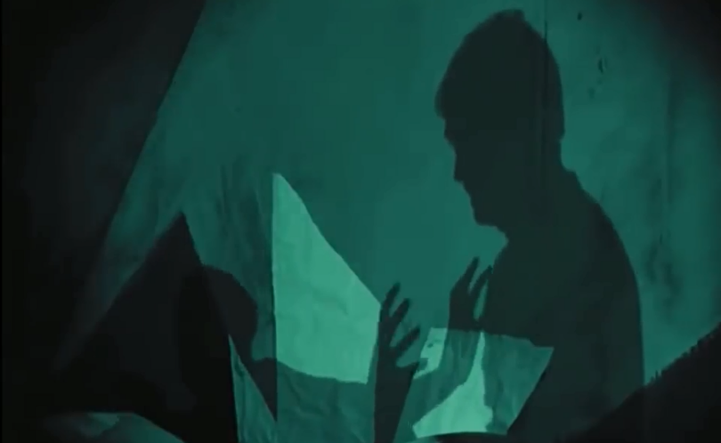
Another main focus of lighting, is that of the contrast between light and dark. Most of the characters wear black, or dark colours aside from Jane. This stands out against the brighter lights and interior designs which are typically white or grey as seen in the picture. Since the characters are usually depicted in darkness, we get the assumption that Francis perceives others as evil and not to be trusted. Since we are watching the film from his ‘flashbacks’, we assume that he is telling the truth. However, his deranged world is fiction and the characters shown in darkness are simply reimagined people from his environment. The contrast is significant to show the clear difference between the characters and the set. This can be derived from the idea that although the people themselves are real their characters created by Francis were not and we are actually not viewing an environment but instead trapped inside the warped mind of Francis
Since the film is filmed entirely within a studio, there is also the idea that there is no access to the real world and the characters are trapped within this hellish nightmare. Fear is a main feelings imposed upon the audience by the unnatural approach to the set. This is very significant in setting the mood for the rest of the film and suggesting that the characters are trapped within this world. We are given a look into the mind of Francis from his perspective since we did not know that his story is fabricated. However, this separate world is disrupted by the elements of normalcy shown through certain sets such as that of Jane’s house. This is a shortened and edited version of the essay, the rest can be found on the blog not in the film role 2 category*
Dr Caligari – editing
The editing within Dr Caligari is unique and innovative because it reflects the unsettling atmosphere of the film. Iris wipes are frequently used to make the transition between scenes much smoother which continues the fraught tension. This technique is adapted and utilised throughout the film’s entirety and many versions are used. In this particular scene, a diamond shaped iris wipe is used to unsettle the audience by showing Cesare. Since we can only see him within the setting, fear is successfully achieved because everything else is blacked out. A fade is used to cut in and out of the scene, giving a smooth transition which is significant in retaining the tension created by the dark, ghoulish lighting. In this particular sense, the iris wipe is vital in keeping the scene as fluid as possible since it can be considered one of the most anticipated and exciting scenes so needs to run smooth. Since we are engaged in the film, the idea of darkness surrounding us ensures verisimilitude because not only does it make us feel part of the film but it represents how we are viewing the film from Francis’ mind and observing his story.
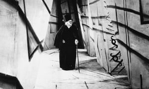
However, iris wipes are also used to represent a flashback. When Francis; the narrator retells the story of the fair, an iris wipe is used immediately after to physically show us a difference in scene which can represent the time period difference; signalling a flashback. The cut emphasises that this is a flashback because the camera’s iris is shut slowly then re-opened. This can represent the reopening of Francis’ ‘memories’ to narrate what happened that day. The physical change in scenes reminds us that there will be clear differences because we can see the change on screen between both the two scenes but also the different time frames. This is vital in showing that there is a clear difference to not confuse the audience as to whether the flashback is actually happening now. This the film does not follow a clear linear, and the flashback demonstrates that there is a time difference. The fluidity of this transition was very significant to show that there is actually a difference because it should not confuse the audience.
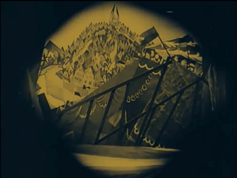
There is a lack of intercutting within the whole film due to the difficulty occurring with manual cutting, changing and addition of the film. This meant that it relied on fades and iris wipes to smoothly transition each scene to the next which was important for a horror film but especially for one which builds up tension. However, since the film is silent there are period where scenes cut to title cards which narrate and explain what is going on. This gives us background knowledge and also separates each scene clearly which is useful to ensure that the audience know what is happening and when. This is important because it ensures that we fully understand Francis’ story. As he is the narrator, we trust everything that he tells us without the dialogue to prove this.
Shots vary in length to keep the audiences engaged. For example, when Cesare is first introduced to the audience; the shot lingers on Dr Caligari and Cesare to ensure that the audience realize how significant the characters are. There is also the element of delaying the anticipation, as the audience eagerly await to see how the onscreen audience will react to Cesare. But the shot is dragged out so the tension builds as the audience continue to wait for the reaction. However, when it finally cuts to the audience, the frame only lasts a few seconds before flitting back to Caligari and Cesare. This could perhaps represent the significance of the two characters by getting the audience to focus on them. This is an edited and shortened version of the essay because of the high word count, the rest ids avaibile on my blog but not for film role 1 category*
Breathless – cinematography
The jerking, sometimes hard to follow visual style is interesting because it continues the abrupt, jarring editing style within the film. Since this represents Michel’s character, we can assume that he is not behaving rationally because the camera style is shaky and out of control, perhaps representing his wild and careless thoughts.
Monologues were not typically common at the time, during the year of release, there were many French drama and crime films produced which led to the need for diversity. Many films, such as ‘The Hole’ (1960, by Jacques Becker) utilise action and short shots to keep the audience on the edge of their seat. Whereas Breathless breaks this convention and uses long shots to ensure verisimilitude by keeping the audience fully engaged and ready for what will happen next. Although the sequences and shots seem sometimes unnecessarily long, they keep a chatty and unique element to the film which makes it so influential
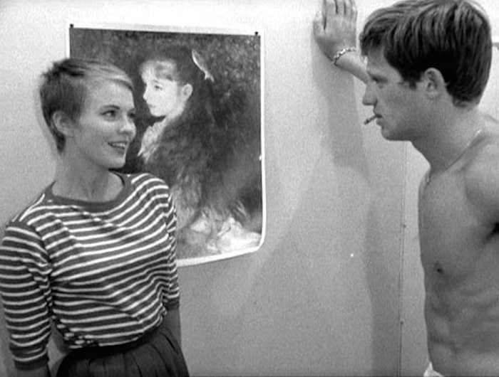
Another innovative technique used by Godard is the lack of colour stock in favour for black and white. This creates a unique effect by setting Breathless apart from the other films which were typically in colour at the time. Although colour film was still very expensive in the 1950’s, more popular films were beginning to use it. This technique may seem intentional as Godard may just be using black and white to save money, but the lack of colour can represent the honesty of the film because it does not hold back.

