There are five important soviet montage techniques, these include:
Metric editing
rhythmic montage
tonal editing methods
over tonal methods
the intellectual method
In this essay however i will only need to cover three of them:
The “Intellectual Method” (Eisenstein’s favourite,) rhythmic editing, and tonal editing.
First I will discuss the use of rhythmic editing. Rhythmic editing is when cuts are made based on time, sometimes it is also coupled with music and this shows a deeper meaning than metric editing does. It helps to keep the fluidity of the film as the cuts are in places you would expect. One example in Strike (Sergei Eisenstein, 1925) is when the building is burning down at the end: cuts are being made however it is not being cut mid action like in metric editing – where it doesn’t matter what is happening it must still cut. Here, cuts are made thoughtfully and create a sense of fluidity.
Next it is important to look at tonal editing. Tonal editing is when the emotional meaning of shots is considered – the tone of the film. For example a sleeping baby would emote calmness and relaxation. In Strike, tonal editing is used towards the end when a speech is being given at the time of the burning building. The civilians are being persuaded and pushed into rioting by fellow residents of the town. Here multiple close-ups of the person giving the speech is used, the tone of each shot here shows the determination and confidence that is emanating from him. The tonal editing of cutting between him and the crowd entices the audience and brings them into the moment. It makes the audience feel as if they are there and being cheered on. It further creates a sense of determination and power that the civilians have over the police / government / people in charge.
Finally i will explain the intellectual method of montage. This is the combination of shots to create a meaning. By themselves they may not be very meaningful or easily understandable however when combined, a greater meaning is produced. For example in Strike when the shot of the striking workers is shown it creates a sense of violence, however it is not bringing anything new in. No new ideas have been brought up. However when combined with the shot of the cow being killed it creates a metaphor to show that the workers are being treated like cattle. This relates back to the core meaning of the meaning – showing how poorly the workers are being treated.
At this time, many movies were closely managed and in some cases used as propaganda for the government. Strike is a prime example of this. It is almost saying to the people “if you think it’s bad now remember what it used to be like, or what it could look like” It shows the audience what is happening from the worker’s perspective. For example more of the film is based on the workers and their point of view rather than the upper class. This film was meant to connect to the audience. Since much less of the film is focused on the authorities it almost dehumanizes them, which once again helps the audience to connect with the workers. This was a way that the government could idolize the Russian revolution and gain the support of the lower class.
Eisenstein’s work is incredibly influential on modern day cinema. His montage techniques that i have discussed in this essay can be seen in countless modern mainstream films. One example is in “Rocky IV” (Sylvester Stallone, 1985) in the famous training montage. Continually using Intellectual montage, cutting between Rocky and Drago – showing the good and the bad, these quick cut shots create tension just like they do in Eisenstein’s work. Additionally, just as Eisenstein’s work was idolizing the communist system, in Rocky, capitalism is being idolized int he form of Rocky Balboa. It is as if Eisenstein’s techniques are being used against him / for the opposite purpose. Additionally Eisenstein’s use of montage influenced one of, if not the, greatest films of all time “Raging Bull” (1980, Martin Scorsese) “Raging bull” is shot in black and white as an homage to European silent films. Not only that but during a very important fight, Scorsese cuts from Black and white stills from the fight to full colour home videos, which, just like in Eisenstein’s work, provide great contrast and show the two sides of him. Showing how he works like an animal during the fight, but also how loving he is with his family.
Finally Eisenstein’s work in montage has influenced modern day music videos immensely, the technique of cutting the beat came from Eisenstein’s work, if it wasn’t for him, music videos would probably look incredibly different.


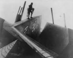
 First, throughout the film the Mise-En-Scene of the film was unique compared to anything that had come before it. Objects in the scenery, such as buildings, chairs and doorways are made to look extremely distorted, compared to reality. This was mainly done to reflect what Germans people’s minds were thinking at the time. They had just co
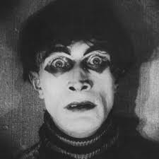
 Another good example of things not looking how they should, is the character
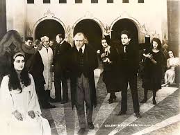
  The cinematographer for this film, Willy Hameister, famously uses an iris in this film for certain shots. He uses an iris in order to force the audience to focus in on a certain character. F