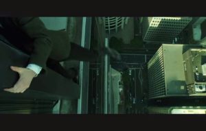
Blade runner uses many elements of mise en scene when introducing Deckard to the audience. Ridley Scott wants the audience to understand clearly who the protagonist is as well as the kind of world he lives in. As many other elements in the movie are very complex, it is understandable why Scott and his team wanted to help the audience get a grasp of the kind of world they will be entering.
SET DESIGN
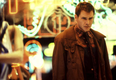
I think that set design is arguably one of the most important parts of mise en scene for introducing an audience as it has the potential to immerse the audience right from the very start of the movie, creating a sense of immersion and verisimilitude. When the film was 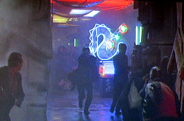 released in 1982, it had critical acclaim due to its realistic looking future (created by Syd Mead) as many people believed that the future would look similar to that of Blade Runner’s. The way that Mead and Scott created such a believable world using neon signs similar to that of the already futuristic city of Tokyo, or the high rise skyscrapers that tower over downtown Los Angeles, all of these elements were fairly accurate to real life and what has happened since the movie’s release. However there were still many elements that Mead was incorrect about such as the billowing smoke towers or flying cars. The introduction to Deckard in this cramped and busy environment, perfectly sets up the rest of the Blade Runner world, and manages to easily immerse the audience into the film.
LIGHTING

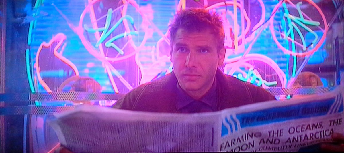
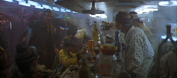
Lighting is yet another key feature in Blade Runner throughout the film, however the opening to the film when Deckard is introduced, is very different to much of the other lighting in the film, yet it still has undertones of the darker and more gritty world that the director wanted. This scene is very bright and the neon signs that litter the streets provide a top lit effect on Deckard. This effect creates shadows on Deckard’s face, and this combined with the rain and darkness of this scene shows the bleak undertones brought to us in the rest of the film. Throughout the First scene, Deckard is predominantly lit from above, or behind by artificial light, whether from the neon signs or the lights above him when he enters the noodle bar. Compare this to the minimal lighting used in the chase through the abandoned building between Deckard and Roy Batty. There is much less light and is lit mostly by shards of light from billboards outside, which is a huge contrast to the bright artificial light of Deckard’s introduction
COSTUME

Costume is incredibly important in a movie such as Blade Runner as it must be expertly designed to look how Syd Mead imagined it. The introduction to Deckard shows that he is out of place as many of the clothes worn by the mixed race culture that surrounds him are very different to his own. Similarly to the undertones of set design and lighting, Deckard is wearing a very bland and bleak outfit, with different shades of brown and black, where as many of the other people around him are wearing colourful, over the top outfits. Combine this with the bright colours of the neon lighting, and it makes Deckard seem very out of place in the current environment.
COMPOSITION
The composition in this scene is crafted incredibly well as the use of sound as well as the use of the rule of thirds. Deckard is shown in many of the Shots to be off to the side of the frame, while there is something else happening on the other side of the frame. This helps give the film a satisfying and professional look. The use of sounds help achieve verisimilitude by giving the audience a feeling of the busy and cramped world.

SPACE
The use of space in the Scene where Deckard is introduce shows the crowded and overwhelming world that the audience is stepping into. The use of extras walking through the busy street to give the city a feel of being alive and lived in makes the world much more believable and increases the sense of verisimilitude. The panning shot that opens the scene does not focus on anybody specifically until it reaches Deckard, showing the audience quickly and easily who the protagonist is.











 released in 1982, it had critical acclaim due to its realistic looking future (created by Syd Mead) as many people believed that the future would look similar to that of Blade Runner’s. The way that Mead and Scott created such a believable world using neon signs similar to that of the already futuristic city of Tokyo, or the high rise skyscrapers that tower over downtown Los Angeles, all of these elements were fairly accurate to real life and what has happened since the movie’s release. However there were still many elements that Mead was incorrect about such as the billowing smoke towers or flying cars. The introduction to Deckard in this cramped and busy environment, perfectly sets up the rest of the Blade Runner world, and manages to easily immerse the audience into the film.