Activity 4 – Camera Movements

Crab Left – Ghostbusters (dir. Paul Feig, 2016)

A crab left camera movement is when the camera moves left, showing the audience more of the scene. In this clip, the camera does a crab left movement at 0:28-0:32, when the camera moves over all four of the girls firing their proton guns. The director has chosen to use this movement at this moment to show the first main use of the guns in the film. It is a very powerful shot, and works very well with the rest of the scene, as it makes the audience feel like the girls have a new sense of power. If the camera had stayed fixed on the Ghostbusters instead of moving along, then it wouldn’t have given the same effect and wouldn’t have been as impressive to the audience.

Zooms – Shaun of the Dead (dir. Edgar Wright, 2004)

This scene uses a number of quick zoom shots, which each focus on a different thing. These shots give the audience a brief but specific glimpse of how average Shaun’s life is. It helps them to understand his character more, as the shots focus on more simple tasks in his morning, rather than anything majorly significant. It also creates a lighthearted sense to the film, as the audience wouldn’t expect a serious drama to use shots like these. These shots come near the beginning of the film, and they help to set the comedic tone that the rest of the film has. They also help to establish Shaun’s character to the audience, so that they understand the actions that he takes later on in the film.

Ped down – Psycho (dir. Alfred Hitchcock, 1960)

A ped down shot is when the camera moves down in the scene. In the famous shower scene in this film, the director has used a ped down shot to show Marion as she’s dying (1:24-1:30). The camera tracks her as she slides down the wall after being attacked and murdered. This shot has been well thought out by the director, as it emphasises her death for the audience, and makes it seem more real. It also helps the audience to sympathise with Marion and to be fully immersed in the scene. This shot follows her face as she falls down, which makes the audience feel like they’re experiencing the scene with her.

Depth Of Field (Activity 5)

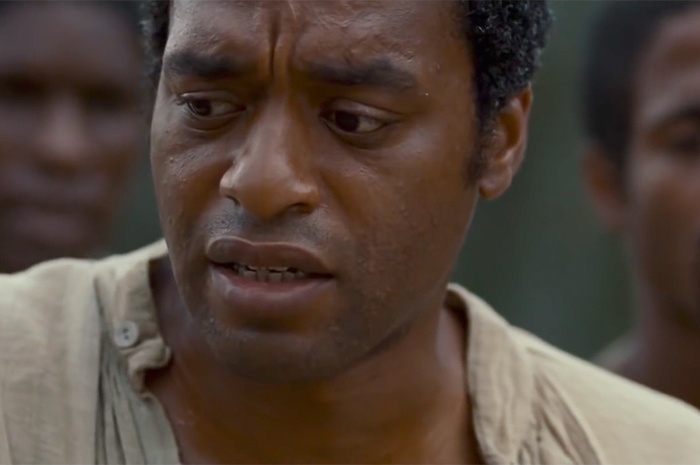
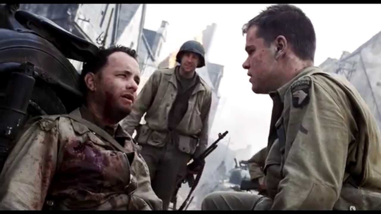
The Depth of Field is controlled by the focus and aperture of a camera and is the distance between the nearest and furthest image in the frame. For instance, if a shot is using a shallow focus, the background will be more blurred out, making it easier to have a specific character stand out to the audience.

you can see that the people in the background are blurred due to the shallow focus.

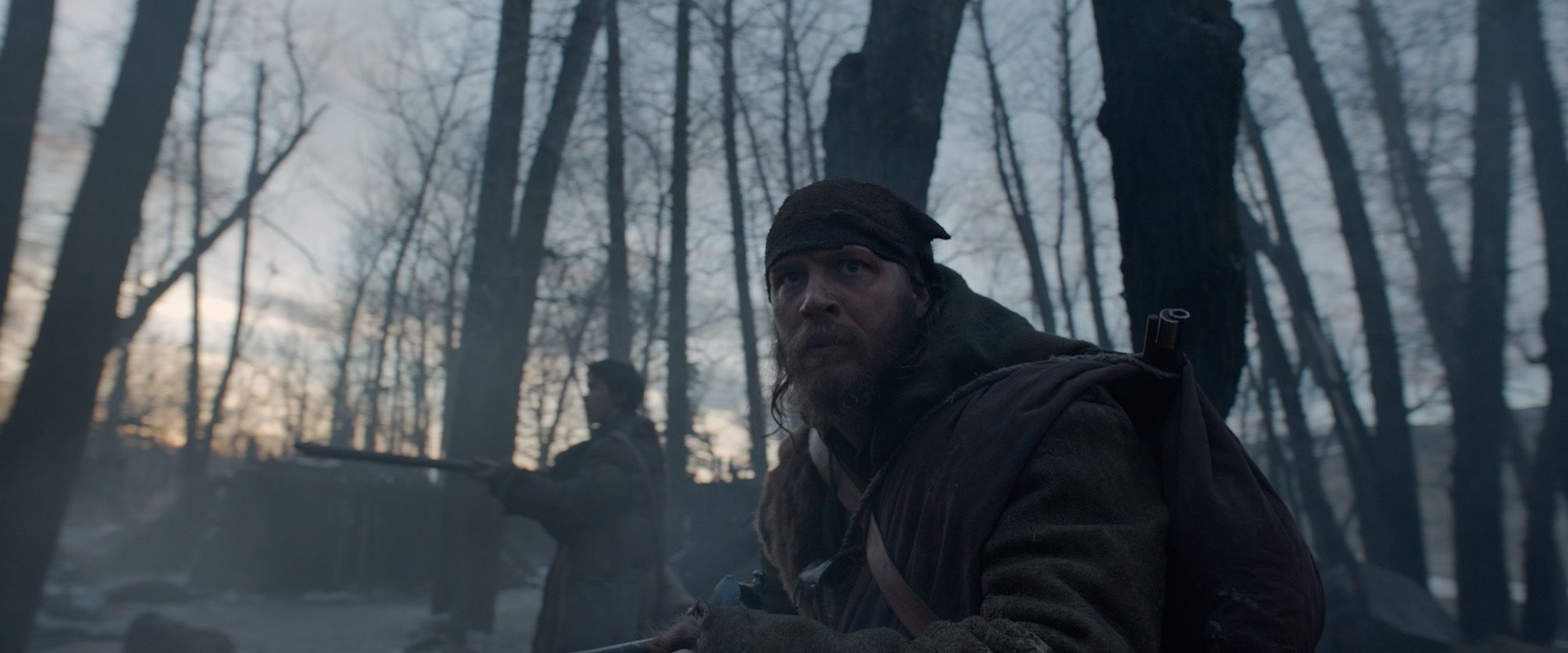
Whereas a deep focus will have everything in the frame in focus, with nothing necessarily standing out more than anything else. For instance, The Revanant (Alejandro González Iñárritu, 2016) used a a lot of deep focus shots throughout so as to keep everything of equal importance in the frame.

You can see that the Background of this shot is much more crisp and clear than the previous image.

Camera Angles (Activity 3)

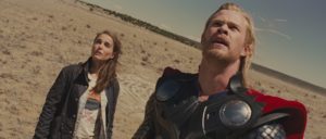
Thor (Kenneth Branagh, 2011)

Canted/Dutch Shots:

The Director of Thor has stated many times that he was not sure how to shoot the 2011 movie Thor. Along with the director of photography, Haris Zambarloukos, they decided to use a lot of canted/dutch angles. Most  of these kinds of shots are reserved for scenes where a character is dazed or confused, as it makes it seem like there is something off-kilter and strange going on. Unfortunately, because there were so many in Thor, it made many elements and scenes in the film feel clunky and not quite right; an effect the director was not after.

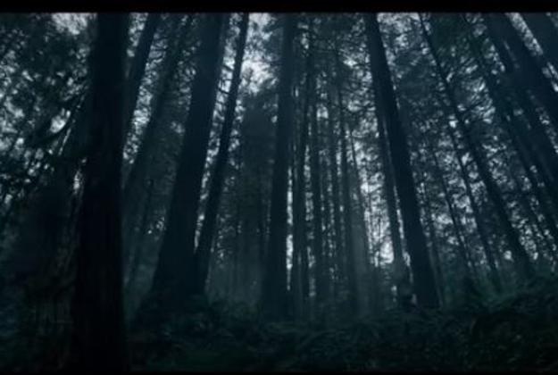
The Revanant (Alejandro González Iñárritu, 2016)

Worms eye Shots:

The Revenant utilities very low, swooping low angle shots to portray to the viewer the sense of scale and wonder that surrounds the protagonist. Many filmmakers tend to stick to using telephoto lenses when shooting landscapes, where as director of photography Emmanuel Lubezki, predominantly used wide angle lenses whilst shooting to make the world feel bigger and more life like.

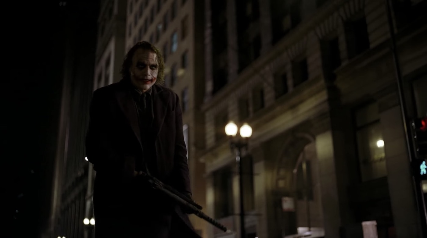
The Dark Knight (Christopher Nolan, 2008)

Low Shots:

Nolan uses mostly Low and eye level shots when filming the antagonist of the film; the joker. This helps create a sense of humanity to the character and even though he is shown throughout the movie to be crazy, it helps keep the character grounded in reality, instead of making him seem like an over-dramatized villain.

Activity 3 – Camera Angles

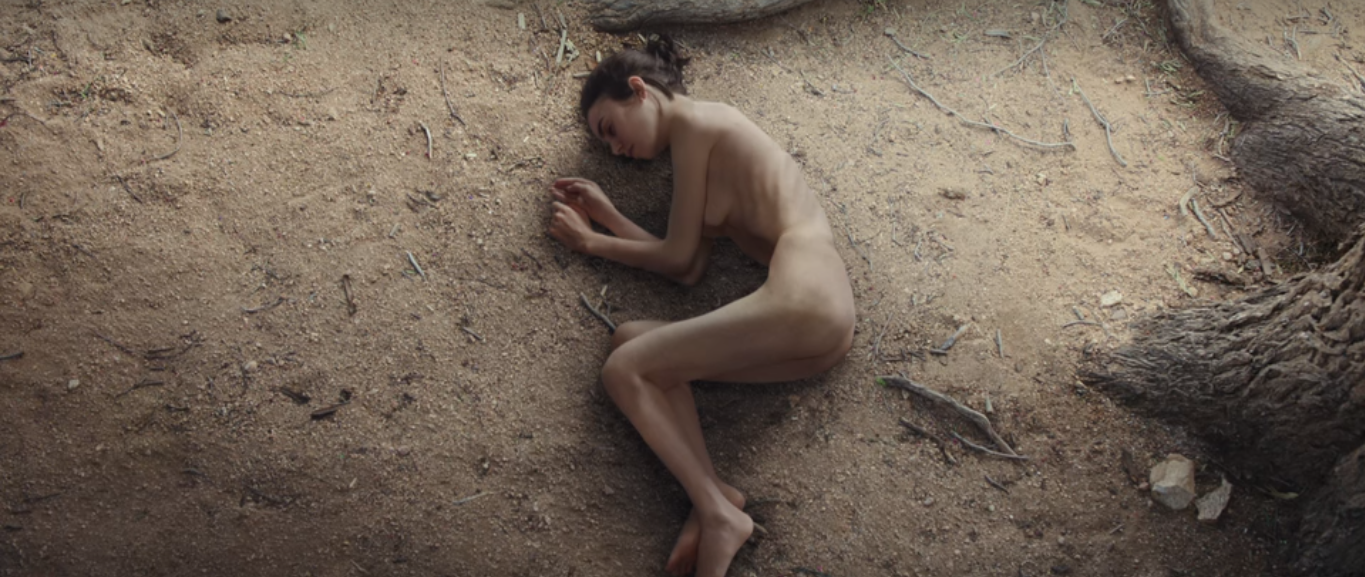
Bird’s Eye – To The Bone (dir. Marti Noxon, 2017)

A bird’s-eye shot is when the scene is shown from a very high place, as a bird would see if it was watching. This particular scene is one of the most significant in the whole film, as Ellen realises what her body has started to look like because of her struggles with anorexia. The director’s choice to have a bird’s-eye view show this scene where she looks down at her body is very effective, as it reflects the out-of-body experience that Ellen is experiencing. This shot emphasises the shocking change in appearance that she has gone through in the film, and serves as a pivotal moment towards Ellen’s recovery.

Canted – Inception (dir. Christopher Nolan, 2010)

A canted angle is made when the horizon isn’t level, and it often gives the sense of something not being quite right in a scene. Inception uses a number of different shots in this famous corridor scene. The canted angle is created as the corridor tilts around, which is caused by the characters’ bodies swaying around in the real world. This shot helps to create a dream-like effect, which works very well in this part of the film, as it emphasises that none of this scene is really happening. It also increases the audience’s sense of confusion, as this shot makes the already weird scene ever stranger.

High Angle – Back to the Future (dir. Robert Zemeckis, 1985)

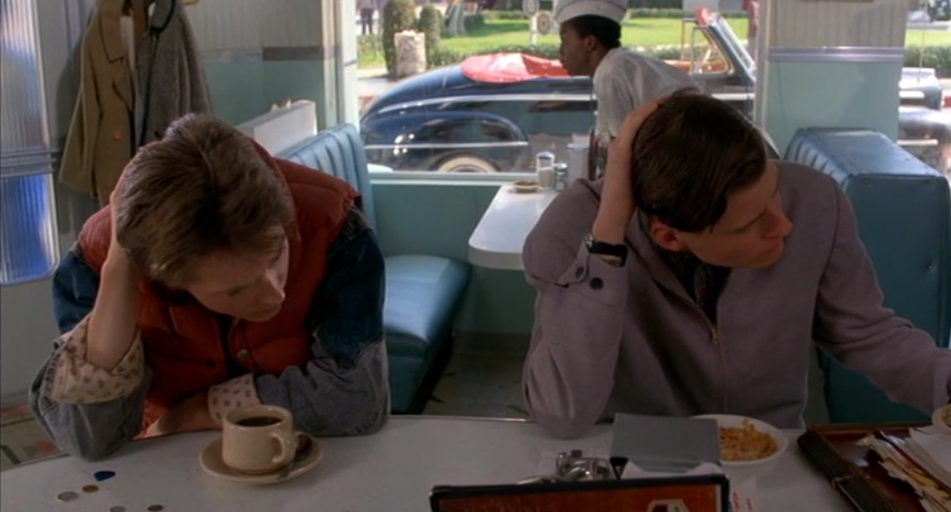
A high angle is a shot when the camera is tilted down, looking at the characters below. The use of the high angle in this scene is powerful as it shows the similarities between Marty and his father. From this, the audience can clearly see that it is his father, even if they weren’t aware of it yet, because of the way they are acting so alike. This angle also gives the audience a good look at the 50’s diner, so they can be fully immersed in the film. There are many details in this shot that help with this immersion – including the costumes, the style that the diner is decorated in, and the car outside of the window.

Cinematography and digesis activity 4

This dolly shot is from Malcom X (1992 , directed by Spike Lee) and in this scene , Malcom is on his way to give the speech where he will be assassinated. Lee has put both the actor and the camera on a dolly and this makes Malcom look like he’s floating like a ghost which may make the audience feel a sense of foreboding because they know what is about to happen.

This is the opening shot of Touch Of Evil (1958 , directed by Orson Welles ) and it is one continuous tracking shot which follows the main characters through a crowded street. The audience will be jolted out of their expectations because continuous tracking shots are notoriously difficult to execute and hence they are rarely attempted.

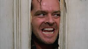
This example of a zoom shot is from The Shining (1980 , directed by Stanley Kubrick) and it makes the audience feel uncomfortable because before this scene , the audience were unsure weather Jack was going to go insane and in this scene we go from Jack hacking down the door to a close up of his deranged face and this would scare thee audience.

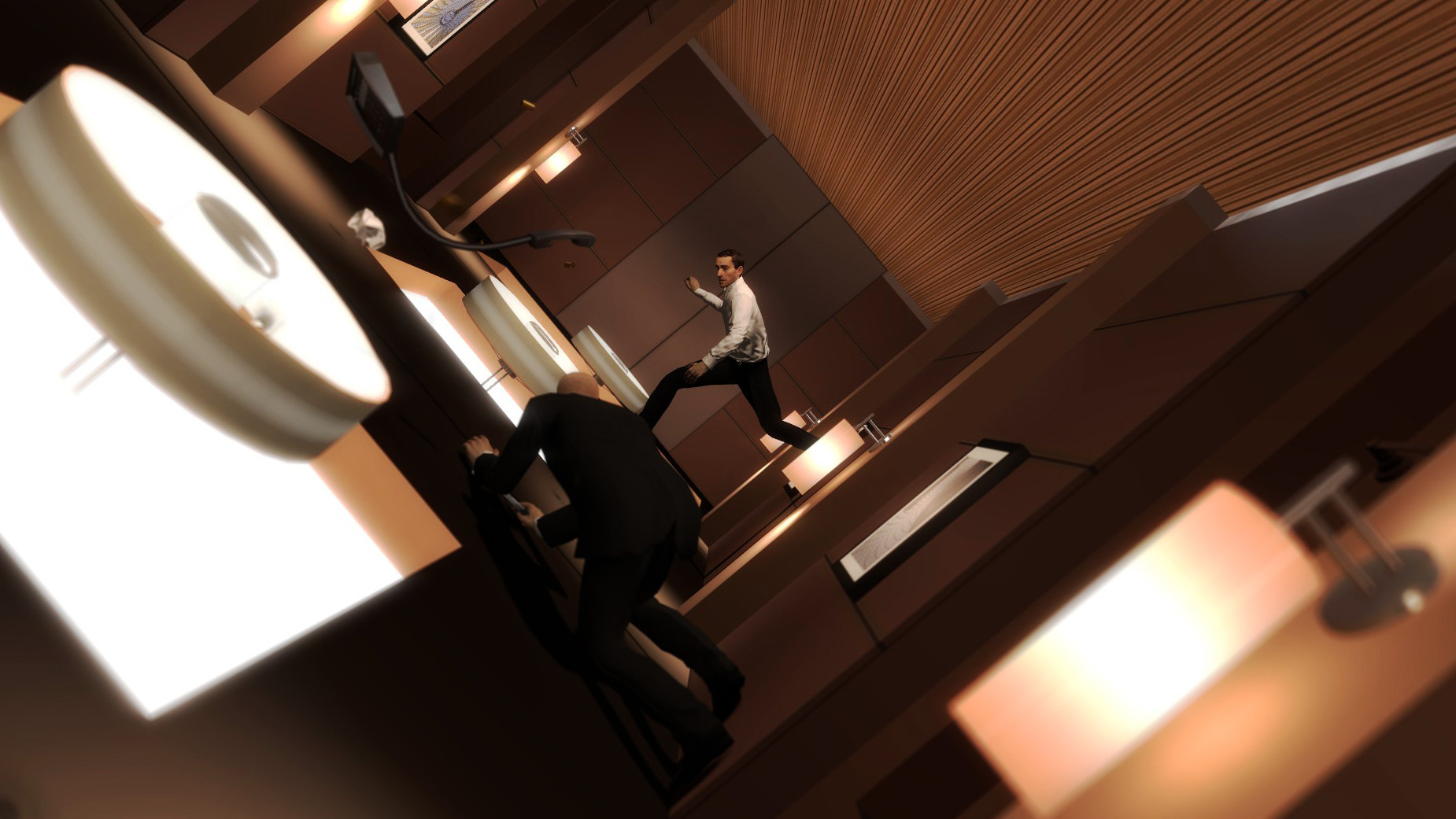
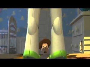
This pedestal shot is from Toy Story (1995 , directed by John Lassiter) is the establishing shot for Buzz Lightyear and it immediately makes it seem like he thinks he is superior to everyone else and this may make the audience begin to dislike him because they may think that Buzz is vain and has a superiority complex.


Shot Distances (Activity 2)

Baby Driver (Dir. Edgar Wright, 2017)

Eye-Level Close Up:

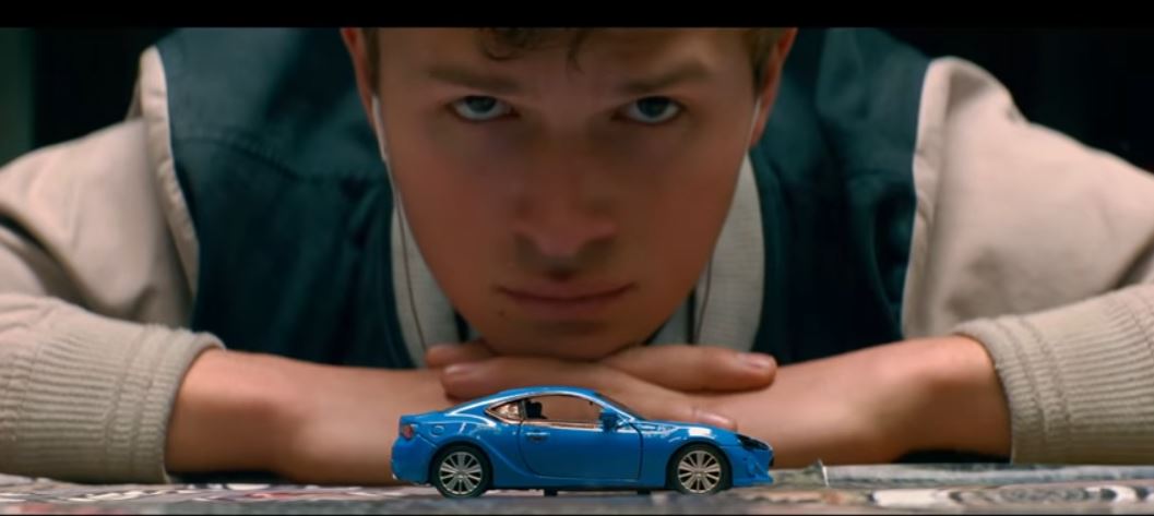
 In this scene from Baby Driver, the DoP (Bill Pope) has created a shot where the Main Character, Baby, is looking towards the camera, however he is not in focus. the camera is focused on the toy car and this is used as foreshadowing as later in the same scene, the car is pushed off of the table – hinting towards the car crash that happens later in the film.

The Shining (Dir. Stanley Kubrick, 1980)

Extreme Close Up:

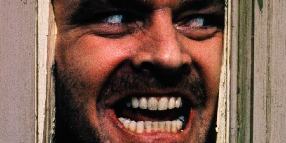
This famous scene from the Shining Uses an Extreme close up on the character of Jack Torrance (played by Jack Nicholson) to portray the levels of insanity that the character has gone to, and is also used to unsettle the audience. The use of this extreme close up also helps show the audience that there is nothing left of Jack Torrance, as we cannot see his body. it effectively shows how the character has completely changed, to the point where they are almost different people.

Logan (Dir. James Mangold, 2017)

Long Shot:

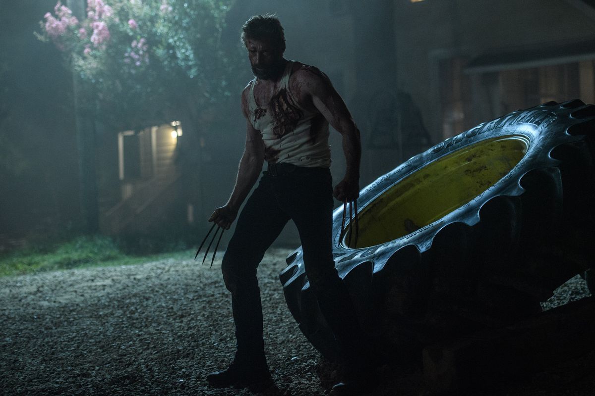
This Shot gives the audience time to realize how hurt the protagonist of Logan (Hugh Jackman) is. In this film, his power is the ability to heal his wounds, and while it was hinted at previously in the film that he was becoming weaker, this shot confirms it to the audience.

cinematography and digesis activity 2

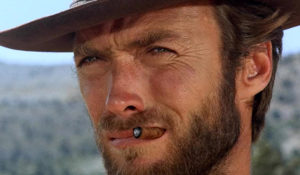
This extreme close up is from The Good , The Bad and The Ugly (1966 , directed by Sergio Leone) and it helps the audience to empathise with Blondie because we get to see his facial expressions. Furthermore, the extreme close up shot helps us to understand what is going through the characters mind because we get to sse his face in minute detail.

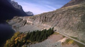
The opening scene of The Shining (1980 , directed by Stanley Kubrick) is a panoramic shot and this conveys the vastness of the environment and it also displays the isolation that the characters will experience because there is only one moving object in the scene which is Jack’s car and everything else is completely still and there is no movement whatsoever.

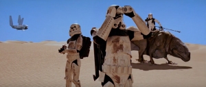
This medium – long shot from Star Wars (1977, directed by George Lucas shows the Stormtroopers and it gives the audience a full view of them and at this point in the film , the audience doesn’t know what  a big threat the Stormtroopers are so they may feel a sense of curiosity.


Activity 2 – Shot Distances

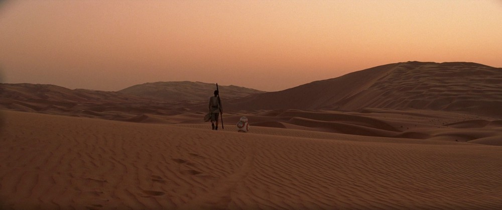
Long Shot – Star Wars: The Force Awakens (dir. JJ Abrams, 2015)

In this scene, Rey and BB-8 are the main focuses of the shot, as they are the only significant things in view.  The use of the long shot helps to show the extent of the desert, to capture the mood of the scene. It is also a good way of showing the scenery, as the shots far into the distance help to immerse the audience into the idea of Rey’s life on an alien planet. This helps the audience to understand her situation, as she has been living on this desert planet for most of her life. The director could also have used an extreme long shot in this scene, but then the audience would have been more concentrated on the surroundings of the desert than of Rey and BB-8, who are the main focus here.

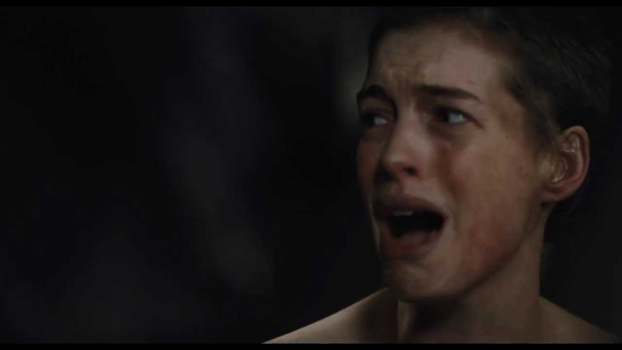
Close Up – Les Miserables (dir. Tom Hooper, 2012)

A close up shot is when the camera focuses on either props or characters in great detail. Throughout this film, there are many close-ups of different characters while they’re singing. This is an effective choice by the director, as it helps the audience to fully see the emotion in the character’s faces. For example, this shot focuses on Fantine, and it is clear to see the sadness in her eyes as she was just forced into the life of a prostitute and raped. This close up shot highlights the fact that she’s broken and has hardly any hope left within her life. If the director decided to use a different shot, for example a medium long shot, it wouldn’t have created as much of an intimate atmosphere and therefore, the audience wouldn’t have understood the intention behind the scene.  

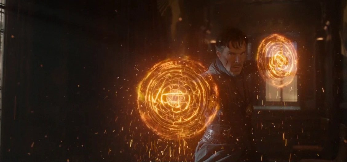
Medium Long Shot – Doctor Strange (dir. Scott Derrickson, 2016)

A medium long shot is a good way of structuring a scene as it allows a lot of information to be seen by the audience, while still focusing on the central character. This shot from the film allows the audience to clearly see Doctor Strange’s powers, showing how he has developed over the course of the film to get to this point. This type of shot also allows the audience to get a good look at the set behind the characters – in this case it is of the New York Sanctum. It shows the level of detail that went into the design of the set, to make it believable for the audience. However, it doesn’t show as much detail in the characters’ faces that would have been shown if a close up had been used instead.