Ralph Eugene Meatyard

Ralph was an optician who practiced photography. Ralph spent three months looking through an unfocused camera in order to learn to see ‘no focus’. He began this project due to his attraction to the out-of-focus backgrounds in some of his…

One of ralphs photoshoots know as ‘zen-twigs’ had a strong focus on experimenting the focus on branches and twigs. He achieved this by using a very large aperture, creating the background subjects to be blurred and the branches to be the main focus.

Focal Length

The focal length tells us the angle of view determining how much of the scene will be captured as well as the magnification. It is the optical distance from the point where the light meets inside the lens to the cameras sensor and is usually measures in mm.

Lenses that have a shorter focal length will have a larger depth of field.

55mm

35mm

24mm

55mm

35mm

24mm

18mm

All of these photos were taken in the exact same position with a tripod, making the only difference in these photos the focal length. 55mm was the longest focal length available on the camera. As you can see from the photos the pictures taken with the focal length of 55mm more of the scene was captured showing jasmine and all of the background. As the focal length gets shorter such as 18mm there was less of the scene captured making jasmine the main subject with less background.

Paper experiment

we did a experiment using different paper shapes, lighting and iso

This photo has a high iso we used a spotlight to add more light to the photo to make it stand out more we used a pretty low iso to darken the background to make our paper shape more vibrant.

I like this photo because the shadow in the back makes the photo stand out more and it adds more detail to a small detailed image.
this photo i also used a lower ISO and we added red tint paper but we only put it halfway through the spotlight and it made the actual paper that was photographed red and then it made the shadow of the paper normal light colour

by using light room i edited the original photo. and made it darker and added a lower exposure and higher colour temperature witch then added a blue colour (cold colour) instead of the original white colour by doing this it adds more detail to the normal photo that was half red half white because we covered half the camera with red tint paper

this is the last photo I chose, I used low ISO setting I used an artificial light to highlight the subject in the photo which is the paper origami, additionally I edited the photo a bit to make the shadows more clear. I cropped the photo to leave out the black space from the photo and zoom in on the subject.

Christiane Feser

Christiane Feser creates three-dimensional photographic based work. They are photographs of complex assemblages of repeated forms and shadows with actual elements from the assemblage projecting three-dimensionally from the surface of the photograph. Feser flattens a sculptural object through the act of photography and then reconstitutes that dimension in a new way by turning the photograph into a relief sculpture. The works challenge our perception of dimension and perspective as well as our assumptions about what a photograph is. They also introduce a tension between the past and present: the original photograph is of a thing that has existed, but it has been transformed into a new object that now exists. And in this new form, the constant change of light and shadow across the relief surface will continue to keep the work in the present moment. The works are therefore about both photography and sculpture. They are simultaneously images and objects that play with flatness and depth, and engage with the histories of the photograph as a physical thing in space.

this is one of the photos that she took and that is in one of her museums in America

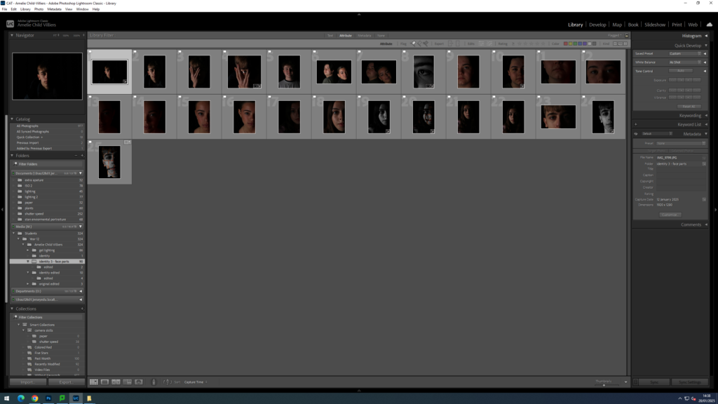
Lightroom Classic

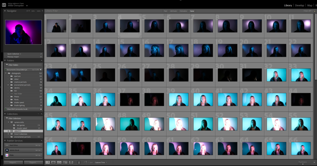
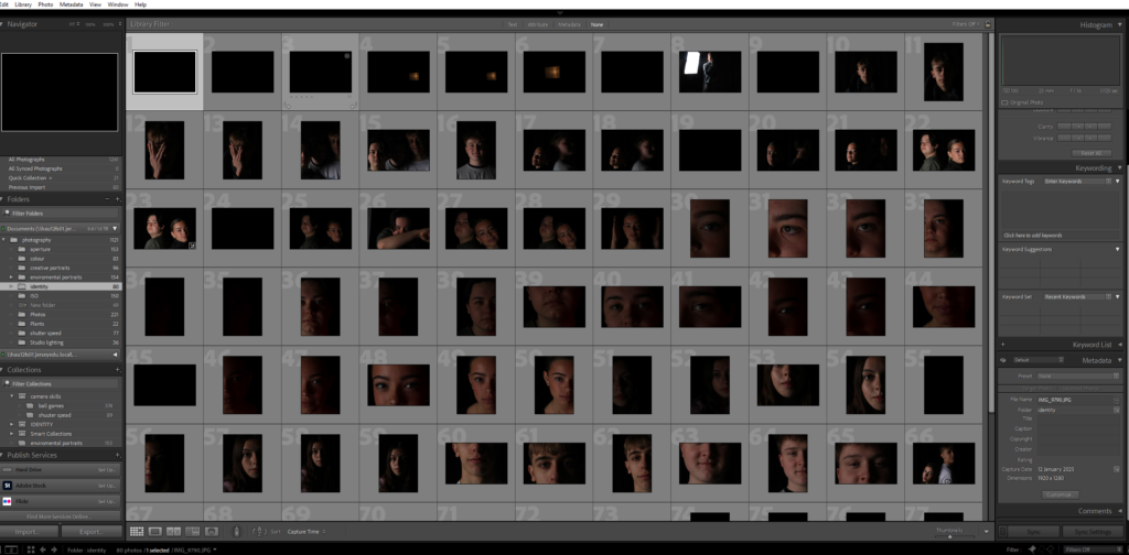
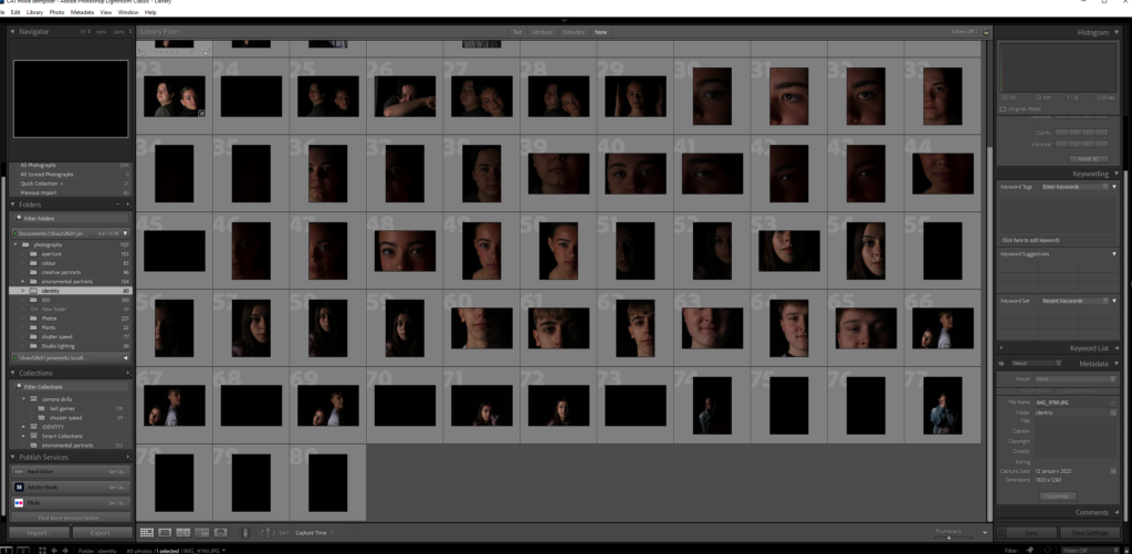
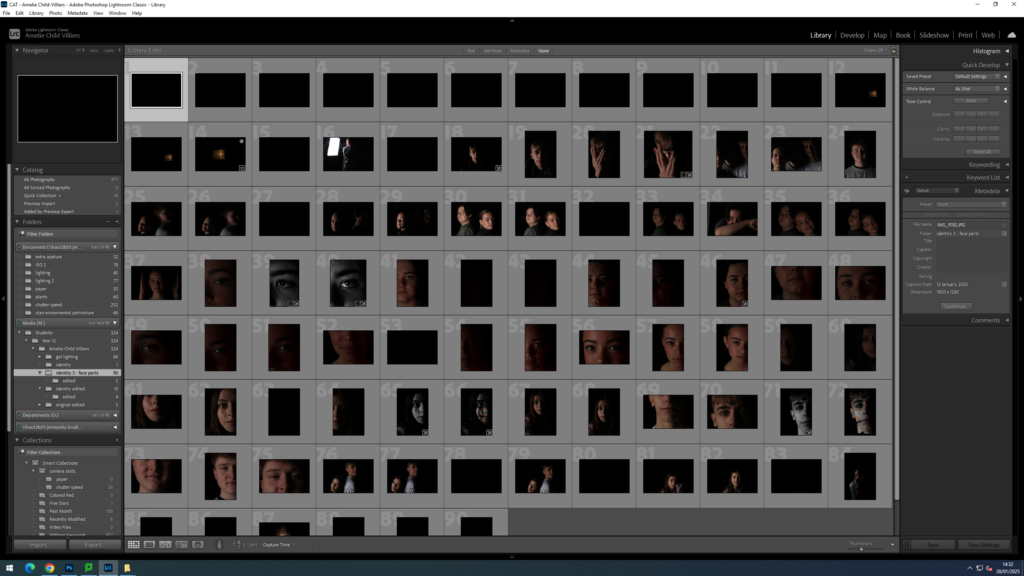
I began by transferring my shutter speed images into Lightroom, as you can see below, where I pressed ‘import’ at the very bottom and picked which images to upload into Lightroom.

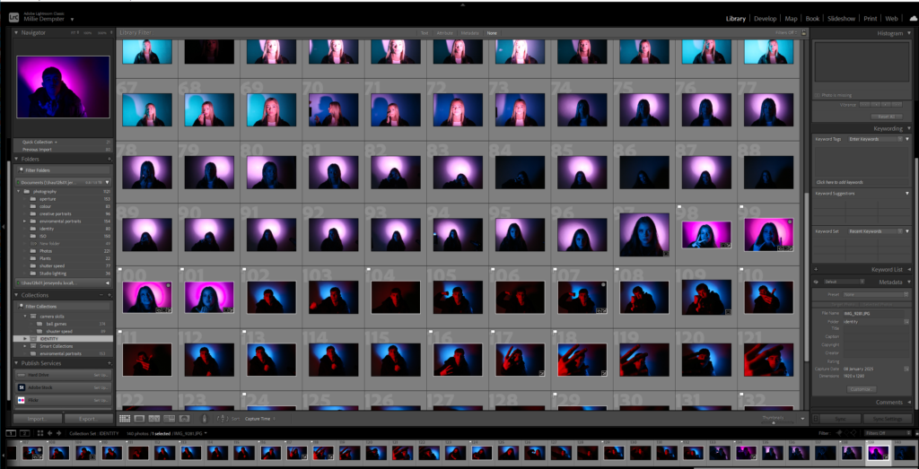
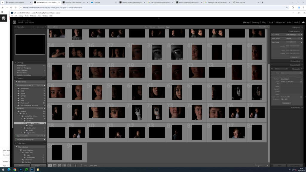
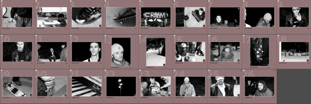
After moving my images, I learnt how to flag the photos I wanted to keep, and leave the others blank that I decided I wasn’t going to use. I also discovered how to rate my images by using stars (1 being the worst and 5 being g the best) to show which ones I liked the most.

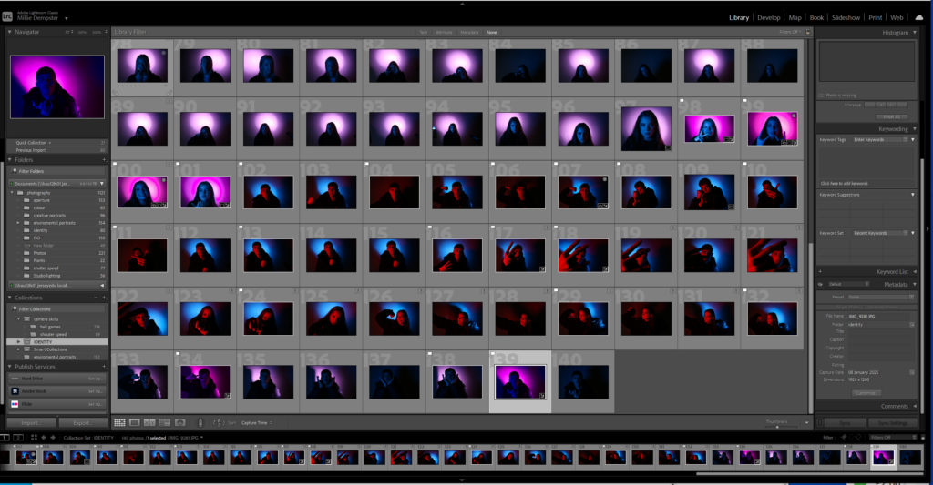
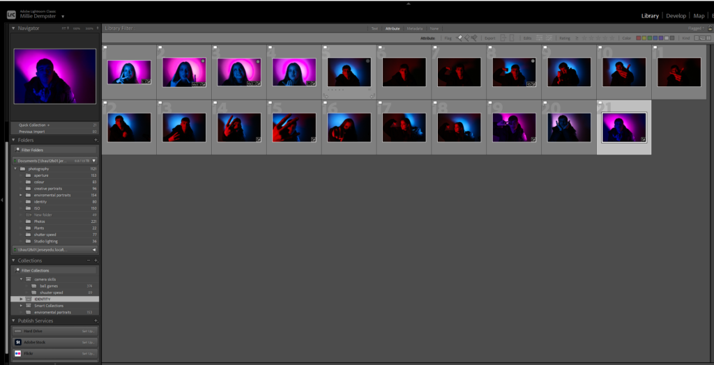
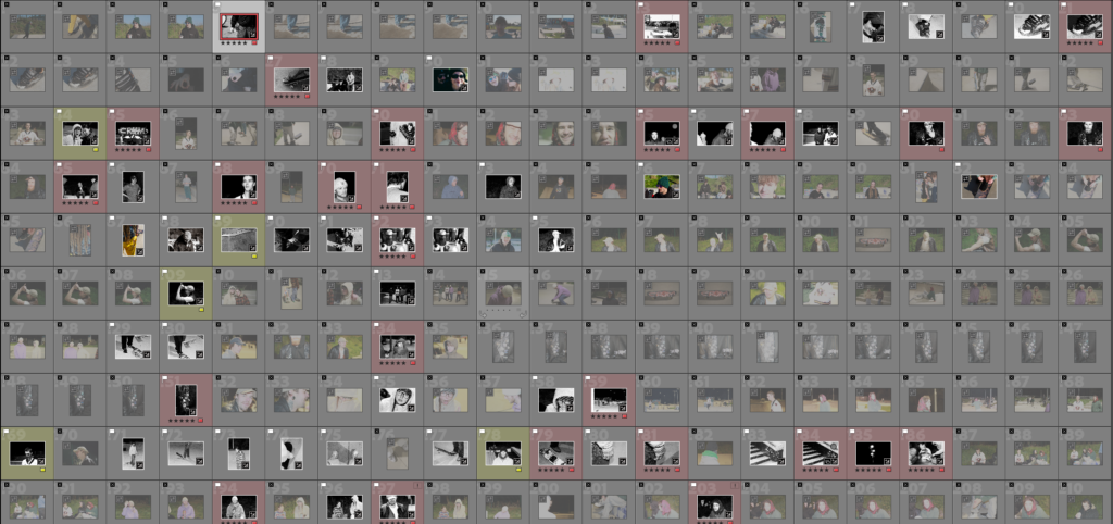
Here’s an overall view of both the flags and ratings:

Then I discovered how to colour code my images to make them more noticble and easier to detect when I edit my images in photoshop so I know which ones to edit.

I started off with an image then right clicked it as you can see below, then I clicked on ‘code rating’ so I have the option to colour them ‘red’ ‘yellow’ or ‘green’, they also have blue and purple as an option, but I decided to stick to these three as it is easier to organise.

Once I did a few, I decided to show what it looks like and as you can see below, it is easier to see which ones are good and which aren’t.

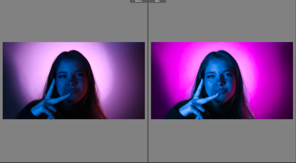
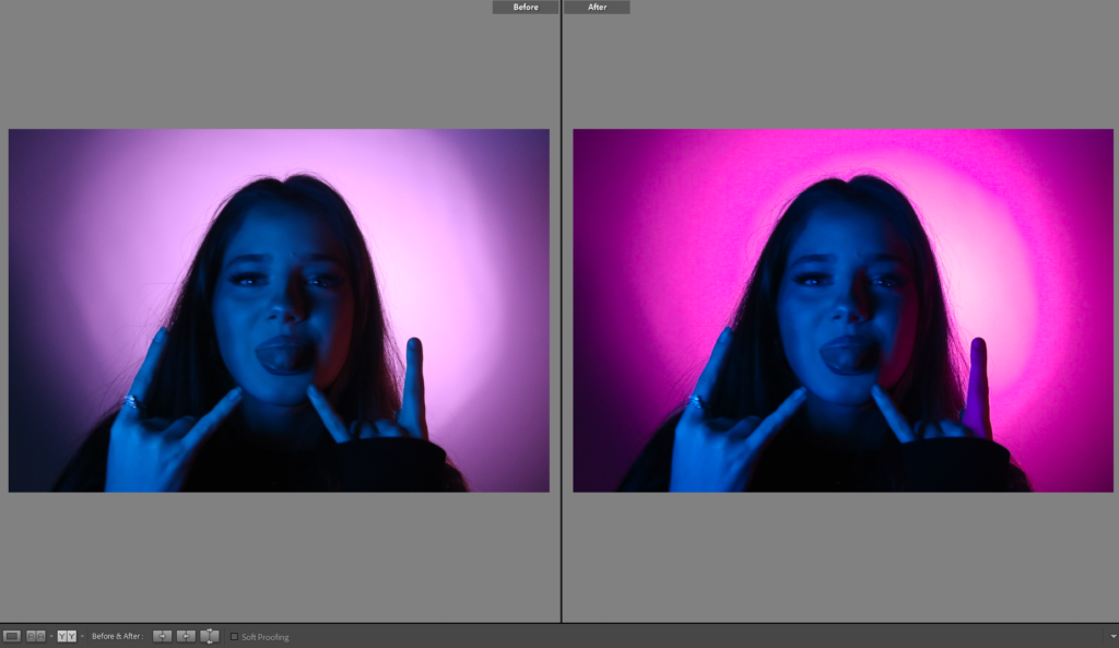
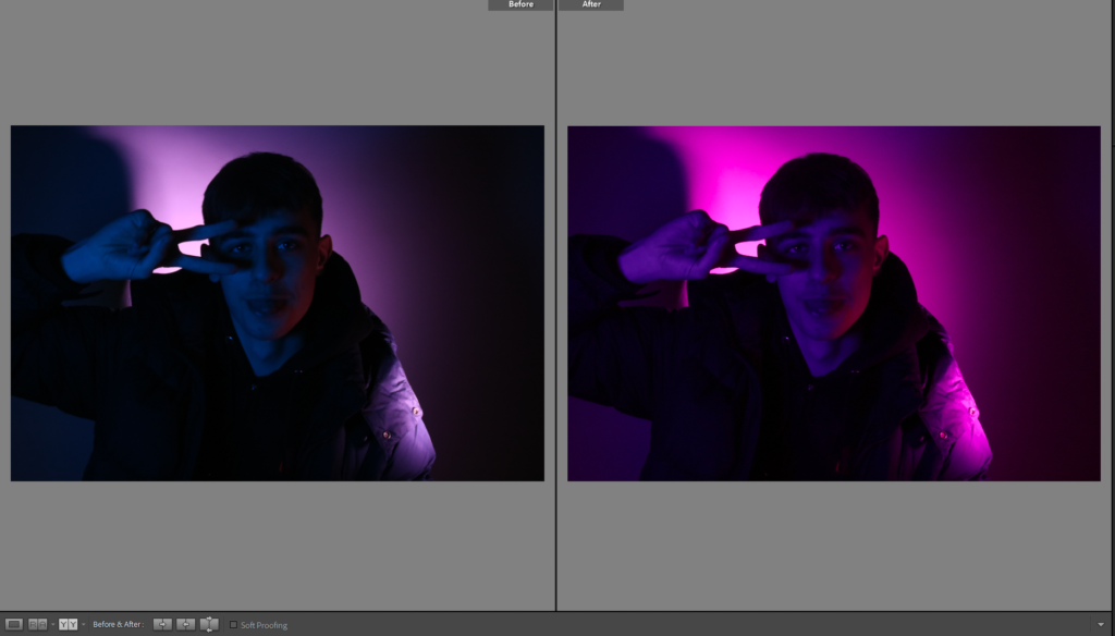
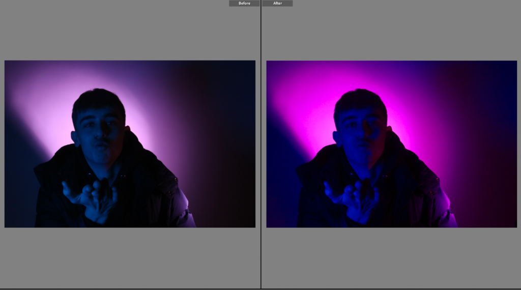
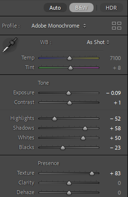
I also wanted to experiment and see what I could do, so here’s a before and after of this image where I cropped it, and adjusted the ‘temp’ and ‘tint’ to brighten and exaggerate my image to make the slow shutter speed more noticable.

You can find the ‘temp’ and ‘tint’ by looking on the far right ride of the screen when you are on the image, and you should see this image below:

Texture Homework

‘Untitled’ – Guy Bourdin c.1950s

Original Photos:

ISO – 800
ISO – 800
ISO – 800
ISO – 800

Edited Photos:

I started by cropping the image just so you’d be able to see the texture of the item. I then decreased the exposure (-1.75) so the image would be darker and the lines more visible, this helped see the texture even more. I added only a little bit of contrast (+16) just so the top of the image, which is lighter, would be a little darker. I played around with the highlights (+81) and shadows (-39) reverting the image back to how it looked yet still giving it a different look. I did the same with the white clipping (+35) and the black clipping (-37) trying to figure out what it would look like with these edits. Furthermore, I added some texture (+11) and upped the clarity (+40) so the lines would be more crisp. Lastly, I added some dehaze (+19) so the colour of the photo would be a bit warmer and the shadows more visible.
I started by decreasing the exposure (-0.18) so the light from the flash would be as bright. I then upped the contrast (+67) so the image would be a brighter orangey brown, this was because it added a different tone to the image. After, I fully decreased the highlights (-100) so the whites on the wood would lower so it wouldn’t be as bright. I then also fully decreased the white clipping (-100) so the shadows would be even more visible in between the gaps. Furthermore, I added texture (+42) so the wood texture would be more crisp and distinguishable. Lastly, I added some clarity (+14) which didn’t do much but it helped the image look more put together.
I started with decreasing the highlights fully (-100) so the image wouldn’t be as bright, this helped with the texture on the zip and on the bag next to it too. I then decreased the shadows (-33) so the zip texture would be more visible and the overall image would be slightly darker. I played around with the white clipping (-100) fully decreasing it so the highlights that were olef ton the image wouldn’t be seen. Furthermore, I decreased the black clipping (-60) to try and get the zipper texture even more defined. I then added a little texture (+39) which helped the lines and stitching on the bag become more evident. Lastly, I added some clarity so the shadows in the image were darker to create a contrast between the cream colour and the navy blue.
I started by decreasing the exposure (-1.75) making the image darker to take away the flash lighting. I also turned up the exposure (+32) trying to get the brightness of the top of the image lowered so the patch could be one colour. However, I then decided to try and create a gradient from light to dark which is why I fully maxed out the highlights (+100). Lastly, I added some shadows (+19) so the top of the patch would be a bright beige.

Technical:

Visual:

Contextual:

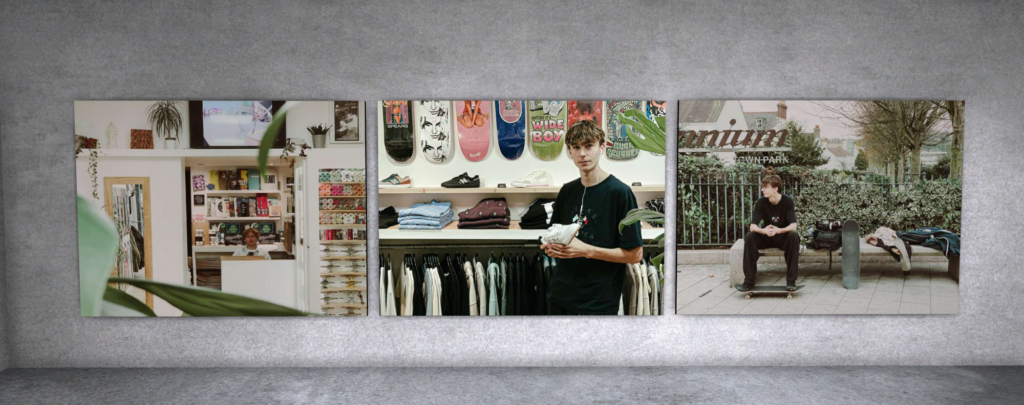
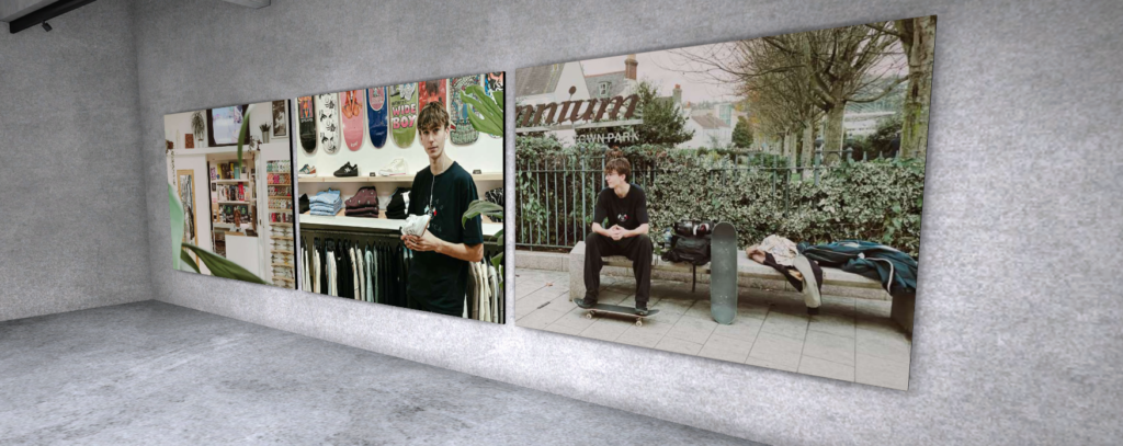
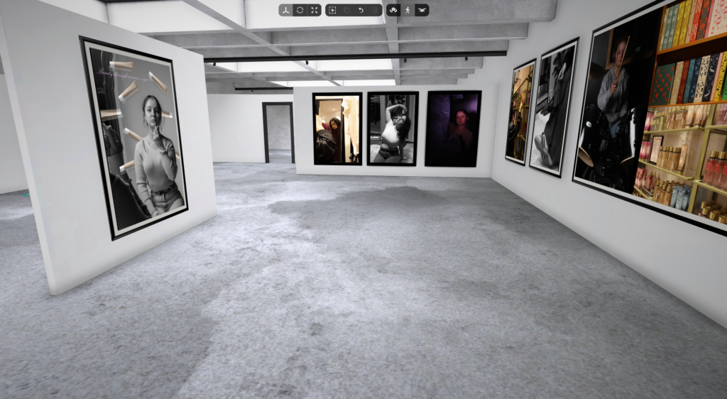
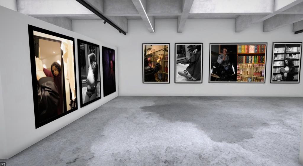
I created a virtual gallery to show off the pictures I thought were the best. This also allowed me to arrange them how I would like and choose different borders for each image, interchanging the black and white frames. I chose images with different lighting and texture to show my range of skills, I made sure to put three images of each subject: paperballs and ripped ripped paper. I also made two perspectives to show the different colours and how lighting can affect how the shadows can look.

Overall, I think I interpreted the paper balls theme well as i showed texture and a range of different backgrounds which allowed me to use different ISO’s and shutter speed. However, I wish I used different lighting instead of white or red as it would of been good to see other colours and how the shadows would be.

TEXTURE

Bill Mangold

FORMAL ELEMENTS

Photography is composed of several basic elements; Line, Shape, Pattern, Tone, Texture, Space and Colour. These elements are key to producing meaningful and interesting photos with proper composition and editing.

LINE

Lines in photography are a very important element, proper use of leading lines guide the eye around the image, often placing emphasis on the subject matter, creating depth through perspective or conveying a sense of movement.

SHAPE

Different shapes in photography can portray different atmospheres, for example; organic, rounded shapes or curved lines may imply a calming or peaceful atmosphere, while the rigid, sharp angles and edges of rectangular shapes might seem aggressive or pronounced.

PATTERN

Pattern photography utilizes elements that are repeated, and the repetition of other visual elements can create interesting images. Some photographers also use patterns as the main subject of an image (shown above).

TONE

Tone refers to the levels of brightness in the photograph, from solid black to pure white. Shadows are dark tones; highlights are bright tones. The majority of nature photographs display a wide range of tones, from black or near black to white or near white.

TEXTURE

Capturing texture in a photograph can add visual interest, highlight unique patterns, or even evoke emotions. Texture photography overlaps with many kinds of photography, including everything from fine art to classic portraiture.

SPACE

The element of adding visual space in your photography implies that an object is moving, looking or pointing to imply motion and direction and to lead the eye of the viewer to a specific point.

COLOUR

We use colour in photography to create visual contrast, direct attention or even evoke mood. Of all the Elements, colour is perhaps the most complex, but also, often has the most immediate impact. Colour can impact our viewers’ emotional response to an image.

Lightroom

After taking some photos I decided to put them in Lightroom and see what I could do with the.

With this photo I shifted the perspective off it by using the transform feature in Lightroom.

I chose auto and let Lightroom decide the shift but I didn’t end up liking it so I decided to slightly change what it had done to what I personally found to be the most aesthetically pleasing.

I used the colour grading wheel to shift the original colour of the image completely, I chose random colours that went well together to create a weird abstract feel in the photos and because I chose bright and vibrant colours which gave the photo a happy vibe to it, I also put grain on the photo because I find it aesthetically pleasing and enjoy the retro look it gives the photos.

This photo is a portrait of me

Yet again I decided to put random colours on it and added grain to change the texture of the photo giving it a vintage feel, I also cropped out all the unneeded background space to make me the main subject of the photo.

We took this photo of me walking with a very scenic background.

When editing this photo I made the midpoint dark blue, which gave the photo a cold feeling to it.

Visual elements

A visual element is any characteristic that we can see. This includes:

Line: Lines are the foundation of pictures. There are a vary of different lines including curved lines, horizontal lines, vertical lines or even jagged lines. Lines can express different qualities of an object/picture such as a curved line suggesting comfort and ease or thin lines expressing delicacy.

Shape: Shapes come in a variety of ways. Shapes can be 3D, 2D, natural or man made, flat, regular or irregular. Shapes establish a focal point. They can be used to control feelings within the composition within a shape.

Space: Space is the area in, around and between objects. Space can be useful to emphasize the subject.

Repetition: Repetition communicates a sense of rhythm, balance, contrast and harmony. This includes patterns, shapes and colours.

Colour: colour has the strongest effect on our emotions as this creates the mood/ atmosphere of a photograph. It draws attention to the photo.

Texture: Texture is the surface quality such as the roughness or smoothness of the material. This adds interesting features within the object and picture.

Value/Tone: Tone is the lightness or darkness of a colour. tone can be used in many ways like to create a contrast of light and dark, a dramatic atmosphere or a sense of depth and distance

paper experiments shoot

I imported a selection of photos I took of paper texture onto adobe Lightroom. I the went through the photos and narrowed my selection to the ones I thought were the best.

For this experiment I scrunched up a piece of paper into a ball to make a boring plain piece of paper into a creative shape that includes irregular patterns and repetitions of lines and shadows. In the process of taking this photo I used artificial light in order to intensify the shadows within the scrunched up paper ball. Before editing this photo it was white with average shadows so in order to develop this photo further I intensified the saturation, vibrancy, temperature, tint and shadows which gave the paper a purple tint and deepen the shadows within the piece of paper to make this photo more interesting. The purpose of this exercise was to explore both the visual elements but also the key functions of the camera and the lighting system.

For taking this photo I As the exposure is 0 it shows that this photo is balanced.

Instead of editing colour into this photo, I made it black and white to make tones and shadows the main subject of this photo. There are many different tones within the lines and crevices of the piece of paper, some light tones and some darker tones adding depth and help define this shape.

Paper Project


Visual Elements

Visual elements in photography are a key factor in creating a well composed, eye catching and successful image in photography. These elements include ;

  • Line: Lines can guide the viewer’s eye through the image, create depth, and emphasize specific areas. They can be straight, curved, horizontal, vertical, or diagonal, each conveying different feelings and movements.
  • Shape: Shapes are formed by the lines in the image and can create visual interest. They help to establish a focal point and can be geometric or organic.
  • Space: The use of negative space (the area around the subject) can enhance the composition by providing breathing room and emphasizing the subject. It can also convey isolation or create a sense of balance.
  • Repetition: Repeating elements can create rhythm and harmony within a photograph. This can include patterns, shapes, or colours that draw attention and create unity.
  • Texture: Texture adds depth and interest. It can evoke a tactile response and make the viewer feel a connection to the subject. Highlighting texture can also enhance the overall mood of the image.
  • Colour: Colour influences mood, emotion, and attraction. It can draw the viewer in or create contrast and tension. Understanding colour theory can help in making more impactful choices.
  • Value/Tone: The use of light and dark tones helps in defining shapes and adding depth. High contrast can create drama and clear separation, while softer tones can embrace calmness and mood

James Welling

James Welling is a prominent American photographer known for his innovative exploration of texture, color, and abstraction. His work often blurs the boundaries between photography and other art forms, reflecting his deep engagement with the medium.

Welling’s approach to texture is particularly notable in several series, where he uses various techniques to emphasize surface qualities. For instance, in his “California” series, he captures the textures of natural landscapes, highlighting the interplay of light, shadow, and color. This creates a sensory experience, inviting viewers to engage with the physicality of the images.

In other works, like his “Glass” series, Welling uses transparency and reflections to explore the texture of glass itself, playing with the viewer’s perception. His use of layering and digital manipulation further enhances the tactile qualities, making the viewer aware of the medium’s limitations and possibilities.

Overall, Welling’s exploration of texture serves not only as a visual element but also as a means of challenging traditional notions of photography, inviting contemplation about the relationship between image and reality. His work encourages viewers to engage with the physical and conceptual aspects of texture in new ways.

Photoshoot 1

I approached this project by experimenting with various lighting setups on paper to explore how light affects its texture and form. I used different angles, intensities, and even colors of light to create a variety of visual effects. Each shot offered a unique interplay of highlights and shadows, allowing me to capture different moods and visual textures.

Once I had taken the photos, I exported them into Lightroom to begin the sorting process. I used the PNX process to streamline my collection. This method helps me quickly narrow down the shots, highlighting the ones that stand out and removing any that don’t fit vision.

To make things more organized, I also applied Lightroom’s star rating system, assigning ratings to my favourite shots. This makes navigating through my best photos much easier, ensuring I focus on the strongest images as I move forward in editing for the final selection. It’s a practical and efficient way for me to manage a large batch of images and stay focused on my vision.

For this shot, I used a long shutter speed and a low ISO to maintain the image’s quality while allowing sufficient time for the light to fully interact with the subject. The low ISO setting helped avoid introducing noise into the image, ensuring the paper texture remained sharp and clean.

The extended shutter speed was crucial here, as it allowed the camera to capture all the available light. This technique ensured that the image was perfectly exposed, balancing both the highlights and shadows in the frame. The crumpled paper was illuminated beautifully, while the long exposure helped enhance the depth and richness of the colors.

What really makes the image stand out is how the long shutter speed also created the neon red glow above the paper. As I moved a light source—or perhaps used a continuous light like LEDs—over a longer period, the camera captured the movement, which resulted in those dynamic light trails. This not only added a sense of motion but also emphasized the futuristic and abstract feel of the photo. It’s a technique that blends still life with light painting, creating a dramatic yet controlled effect.

ISO 100 30mm f/29 3.2 sec
100 ISO 18mm f/14 6 seconds

In Lightroom, I further enhanced the images by making key adjustments to emphasize the lighting effects. I raised the contrast to create more separation between the highlights and shadows, which brought out the textures of the paper and made the light trails more striking. Lowering the exposure helped deepen the darker areas, creating a moody atmosphere while keeping the lighting sharp and vibrant.

I also increased the white balance, which enhanced the warmth and intensity of the lights, particularly in the red and neon tones. Finally, I deepened the blacks, which made the lights stand out even more against the dark background, creating a stronger visual impact. These adjustments allowed the photos to feel more polished, with the lighting effects taking center stage while still retaining the crisp details of the paper.

100 ISO 20mm f/ 16 3.2sec
100 ISO 20mm f/14 3.2 sec

In this series of photos, I explored the interaction between light and paper, using long shutter speeds to blend creative lighting effects with crisp, detailed images. Each photo allowed me to play with different lighting setups, whether it was coloured lights, moving light sources, or a combination of both. By using a long exposure, I captured not just the stationary subject ( crumpled paper, in this case) but also the movement of light around it.

The long shutter speeds gave me the flexibility to introduce dynamic lighting effects, such as light trails or glowing neon tones, while keeping the paper itself sharp and textured. The extended exposure times allowed the camera to fully process the movement of light, creating ethereal and abstract patterns that contrasted beautifully with the stillness of the paper.

The key was balancing the technical settings. I used a low ISO to retain image quality and minimize noise, while adjusting the shutter speed to capture the perfect amount of light for each shot. This combination allowed me to achieve a unique blend of crisp textures and flowing light effects, resulting in visually striking images.

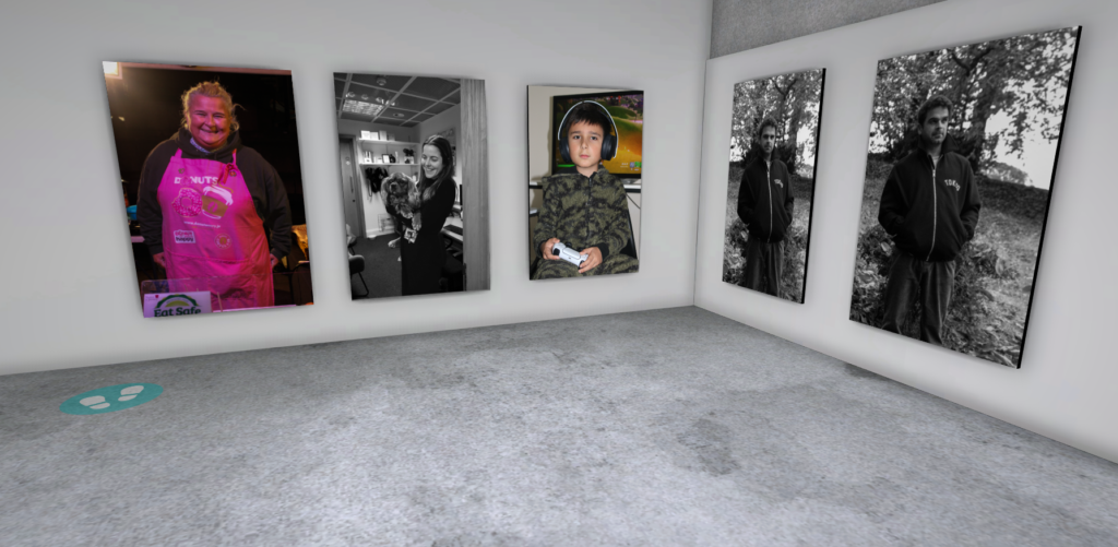
Virtual Gallery

https://www.artsteps.com/

I recently created a virtual gallery on Art steps to showcase my photography of paper and lighting. It was exciting to curate a selection of my images that explore the unique interplay between textures and light. Using the platform, I designed an immersive experience that allows viewers to navigate through my work, which feels like a personal journey into my artistic vision.

As I arranged the images, I focused on creating a harmonious visual flow throughout the gallery. For example, I grouped photos with similar colour palettes together, which helped create a cohesive look. This intentional matching not only draws the viewer’s eye across the space but also enhances the overall mood of the exhibition.

GIF!

https://www.canva.com/learn/how-to-make-gifs

I decided to create a dynamic GIF featuring a paper ball illuminated by light in motion. To start, I took a series of burst photos while rotating a light stick around the paper ball. This technique allowed me to capture the movement of the light when putting the photos in a repetitive sequence.

Once I had my burst photos, I turned to Canva.com for the editing process. I uploaded all the images into a new project, carefully arranging them in sequence to create a smooth transition. Canva made it easy to adjust the timing between frames, allowing me to fine-tune the speed of the GIF to emphasize the swirling light effect.

After finalizing the design, I exported it as a GIF, and the result was a smooth animation that effectively conveyed the interplay of light and texture.

PHOTOSHOP