Typologies

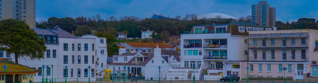
What is a typology in photography?

A photographic typology is a single photograph or more commonly a body of photographic work, that shares a high level of consistency. This consistency is usually found within the subjects, environment, photographic process, and presentation or direction of the subject.

What is the method or approach by photographers who use typology?

Through the methodical photography and presentation of a specific subject or theme, a typological photographer makes a space that invites a viewer to simultaneously identify both consistencies and distinctions in a series, building up a more nuanced whole. The typology is a genre built on differences and correlations.
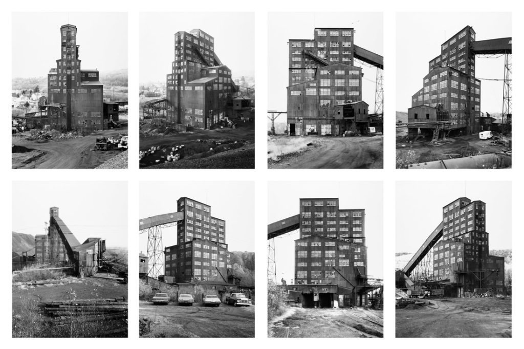
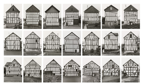
The Bechers

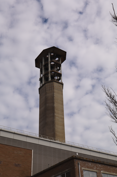
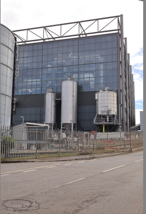
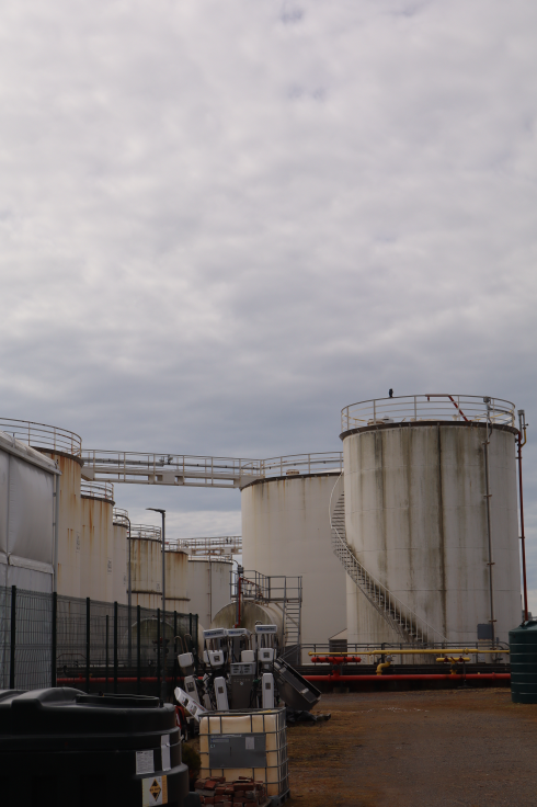
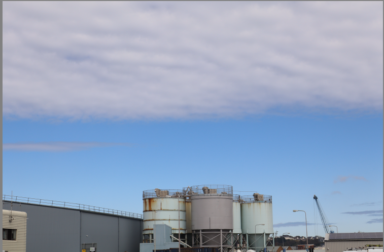
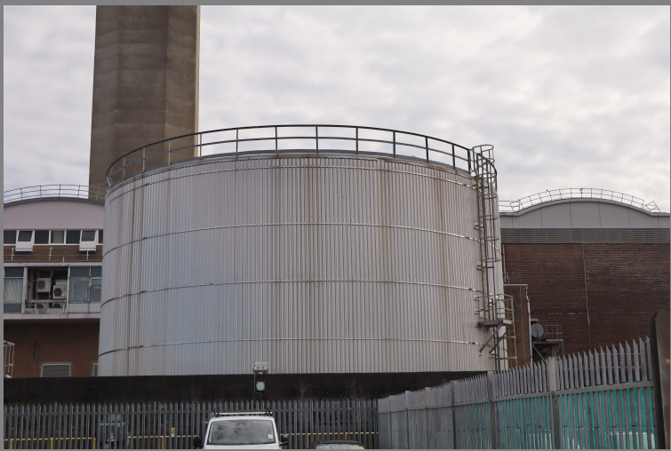
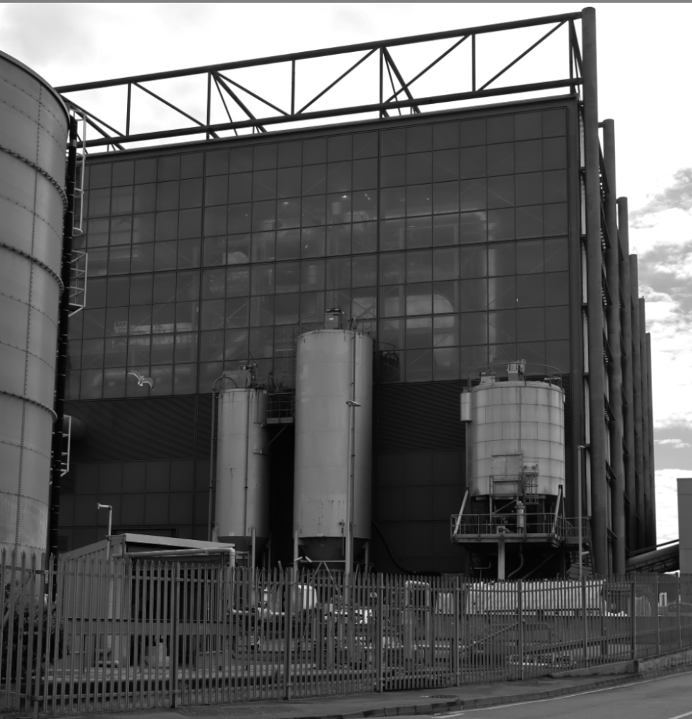
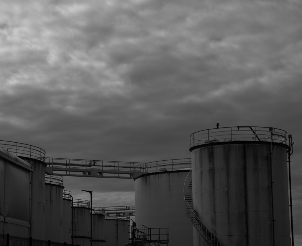
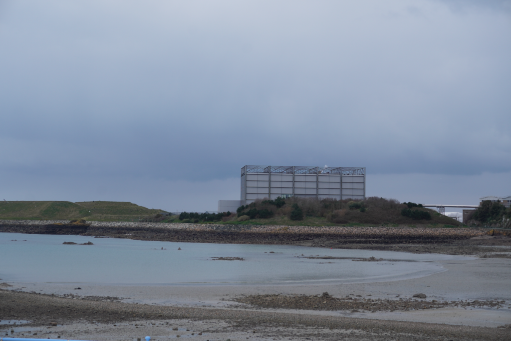
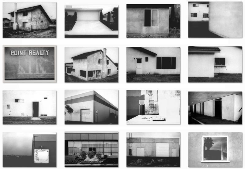
The term ‘Typology’ was first used to describe a style of photography when Bernd and Hilla Becher began documenting dilapidated German industrial architecture in 1959. The couple described their subjects as ‘buildings where anonymity is accepted to be the style’.

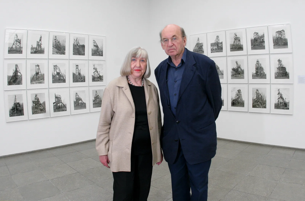
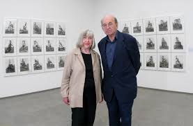
How did Hilla and Bernd Becher become a duo?

They began collaborating together in 1959 after meeting at the Kunstakademie Düsseldorf in 1957. Bernd originally studied painting and then typography, whereas Hilla had trained as a commercial photographer. After two years collaborating together, they married.

What camera did Bernd and Hilla Becher use?

Together, the Bechers first photographed with a 6x9cm camera and then (after 1961) mostly with a large format Plaubel Peco 13×18-centimeter (5×7-inch) monorail camera. They photographed these buildings from a number of different angles, but always with a straightforward “objective” point of view.

What inspired them to begin to record images of Germany’s industrial landscape?

They were fascinated by the similar shapes in which certain buildings were designed. After collating thousands of pictures of individual structures, they noticed that the various edifices – of cooling towers, gas tanks and coal bunkers, for instance – shared many distinctive formal qualities.
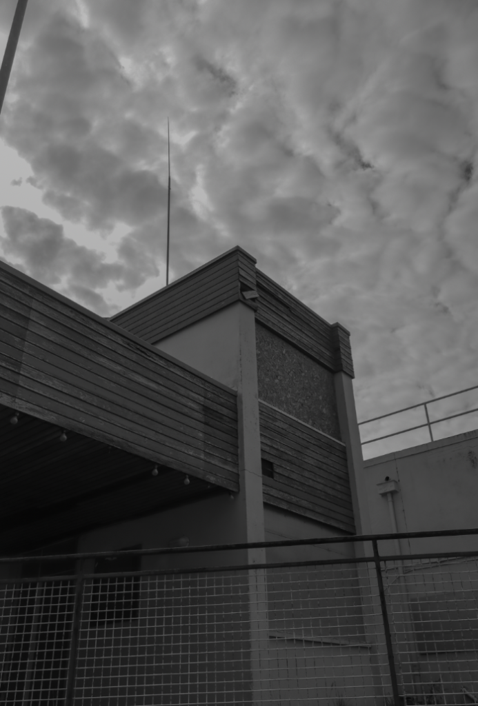
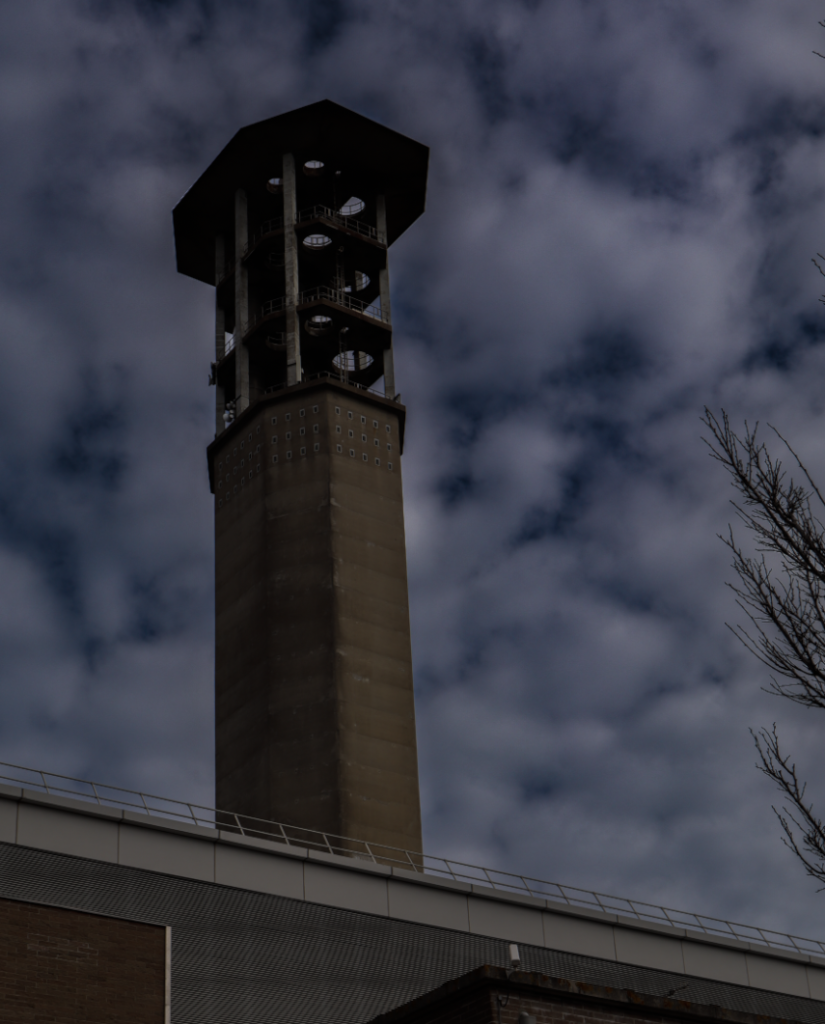
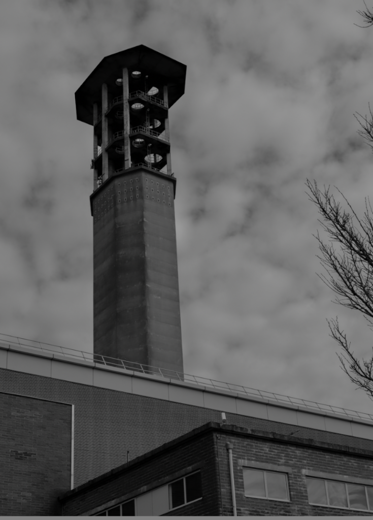
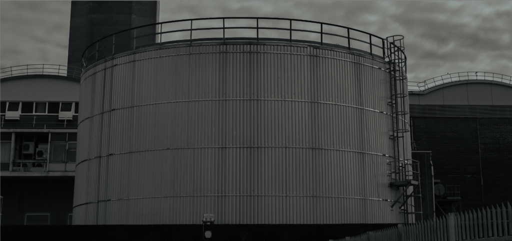
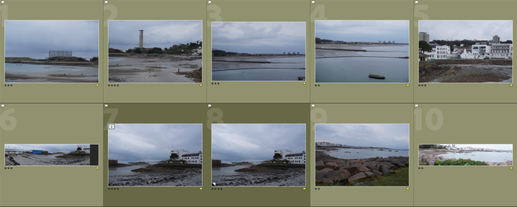
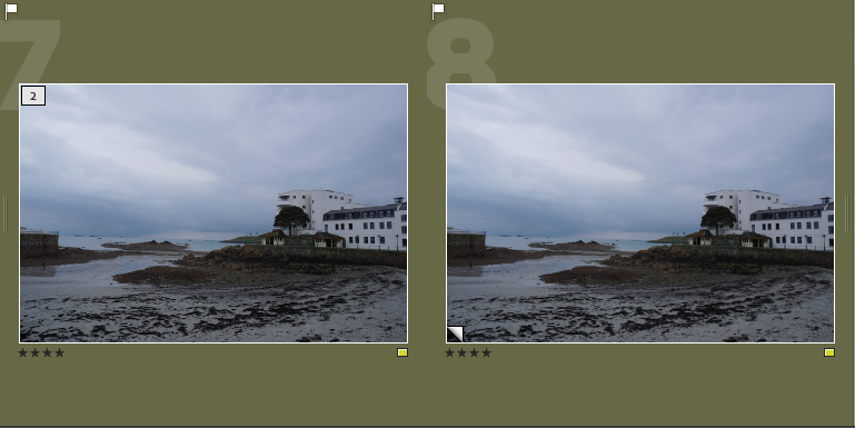
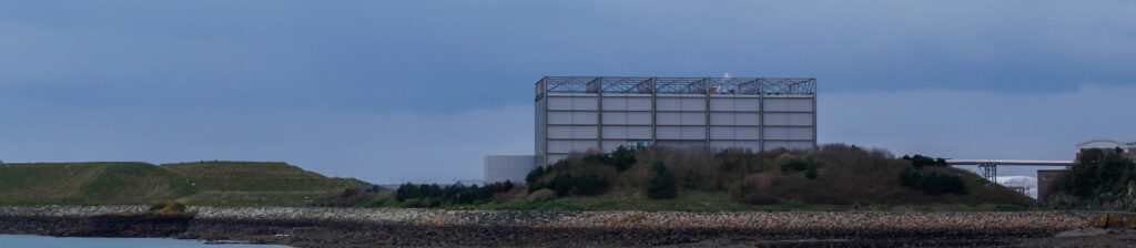
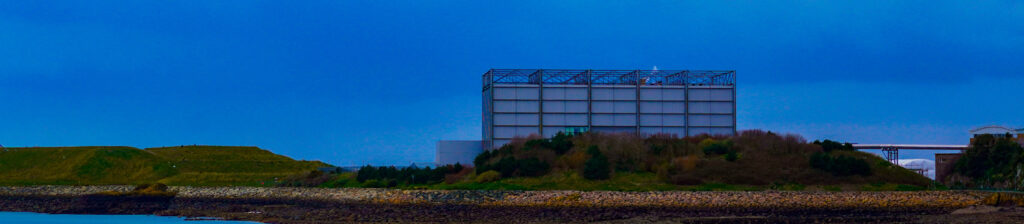
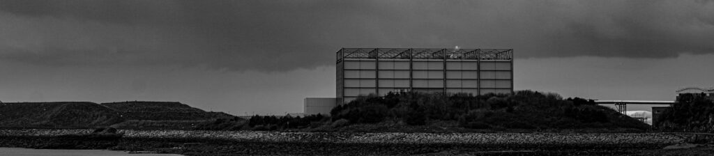
My images

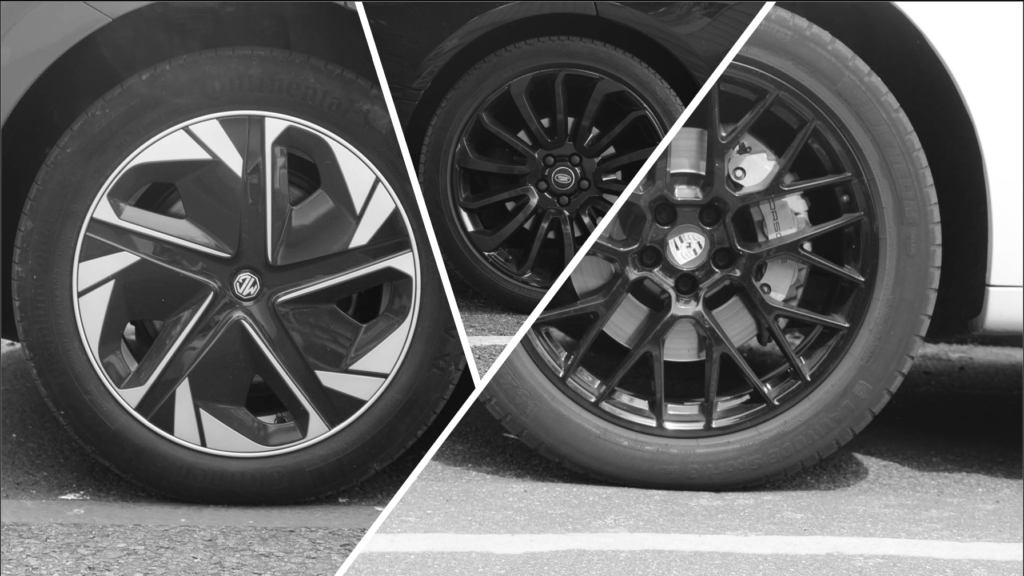
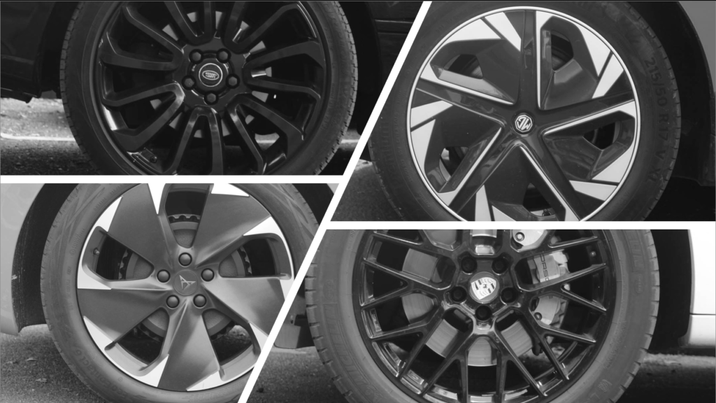
I decided to use the idea of car wheels for my typologies. I went around and took multiple photos of random wheels that i found. I then put them all into black and white and cropped them all to a square.

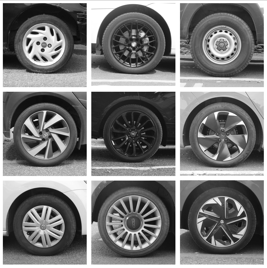
I also decided to try and set them out in different, more creative ways.

Typologies Photoshoot

Contact Sheet

For this photoshoot, I went to the old sea cadet unit for some images and for the rest I went to La Collette industrial estate so I could capture Hilla and Bernd Becher typologies ideas.

Image Selection

These are the six images I have picked for my typologies photoshoot to edit. I like these images because they have industrial value which links to Hilla and Bernd Becher.

Image N01

This is the image I’m going to edit.

This is the edited image.

This is the filter I used to edit the image.

This is how I edited this image.

Black and White

This is black and white image I have edited.

This is how I edited my black and white image.

Image N02

This is the image I want to edit.

I have cropped the image because it was unequal and wasn’t matching the rule of thirds.

This is the filter I’ve used to create this image.

This is the image I’ve edited.

This is how I’ve edited my image.

Black and White

This is being cropped due to much negative space in the foreground.

This is the final edited image, this image didn’t need a filter since white has stood out in the sky and makes the incinerator look tall and towering.

This is how I edited my image.

Image N03

This is the image I want to edit.

I have cropped this image due to lots of the foreground being exposed.

This is the edited image.

This is how I’ve edited my image.

Black and White

This is the edited black and white image.

this is how I edited my image.

Image N04

This is the image I want to edit.

This is being cropped due to lots of negative space in the background and the foreground.

This is the edited image.

Black and White

This is the cropped image.

I have darkened the mage to bring out the rust on the container.

This is how I edited my image

Image N05

This is the image I want to edit.

This is the cropped image due to unequal symmetry in both halves of the image.

This is the edited image.

This is how I edited my image.

Black and White

This is the final image with further editing.

This is the filter I have used.

This is how I edited my image.

Image N06

This is the image I want to edit.

This is the cropped image. Its been cropped because it want the container centred so it follows the rule of thirds.

This is the edited image.

This is how I edited my image.

Black and White

This is the final image.

I have used this filter because it gives a lovely industrial effect and it really brings out the pattern on the container.

This is how I edited my image.

Final Images

I like these images because they give off industrial vibes and they link with Hilla and Bernd Becher typologies collection.

Landscapes

In photography, landscapes refer to images that capture the beauty of natural or urban environments. This genre focuses on wide, scenic views such as mountains, forests, coastlines, or city skylines. Landscape photography often aims to convey a sense of place, mood, or atmosphere, using elements like light, weather, and composition to create impactful visuals. Photographers typically use wide-angle lenses and techniques that keep the entire scene in sharp focus, highlighting the depth and scale of the surroundings.

When did it start to become popular?

Landscape photography began gaining popularity in the mid-19th century, around the 1850s to 1860s, with the development of early photographic processes like the daguerreotype and wet plate collodion. It became especially prominent during the exploration of the American West, when photographers like Carleton Watkins and Ansel Adams later helped establish landscape photography as both an art form and a tool for conservation. By the early 20th century, it had grown into a respected genre, admired for its ability to capture the grandeur and emotion of the natural world.

What prompted the rise of Landscape Art during the late 18th / 19th century?​

The rise of Landscape Art in the late 18th and 19th centuries was driven by a mix of cultural and societal shifts. During the Enlightenment, there was a growing fascination with nature, influenced by thinkers like Rousseau who saw it as pure and unspoiled. This paved the way for Romanticism, which embraced emotion and the sublime in nature, with artists like J.M.W. Turner and Caspar David Friedrich creating dramatic, awe-inspiring landscapes. At the same time, the Industrial Revolution caused rapid urbanization, and the countryside became idealized as a symbol of a simpler, more natural life, prompting artists to capture rural landscapes as a contrast to industrialization.

John Constable

John Constable (1776–1837) was an English landscape painter renowned for his depictions of the English countryside, particularly the area around his home in Suffolk, which became known as “Constable Country.” While he is primarily celebrated as a painter, there is no historical record of him working as a photographer, as photography had not yet been invented during his lifetime.

Constable was good of capturing natural light, atmosphere, and movement in his paintings, often working air to study the effects of changing weather and seasons. His most famous works include The Hay Wain (1821), Dedham Vale (1802), and Salisbury Cathedral from the Meadows (1831). His technique of using loose, expressive brushstrokes and his dedication to painting nature as he saw it were highly influential, especially on the later Impressionists.

Although he struggled to achieve commercial success during his lifetime, Constable’s work gained recognition in France, where his naturalistic approach inspired the Barbizon School and later artists such as Claude Monet. Today, he is considered one of Britain’s greatest landscape painters, whose art continues to captivate audiences with its deep appreciation for nature and rural life.

Panoramic/joiner photographs overview

A panoramic/joiner image is showing a FOV (field of view) approximating, or greater than, that of the human eye – about 160° by 75°, it generally has a aspect ratio of 2:1 or larger, the image being at least twice as wide as it is high. The resulting images take the form of a wide strip.

1. Josef Hoflehner

  • An Austrian photographer known for large-scale, minimalist panoramic landscapes and seascapes, he usually did them in black and white.

2. David Hockney

  • David specialised as a painter, he used photography to create panoramic collages, capturing scenes from multiple angles and putting them together, his work is conceptual rather than traditional panoramic.

3. Ken Duncan

  • An Australian landscape photographer known for his panoramic images of the Australian outback and other landscapes.

4. Thomas Struth

  • Known for panoramic museum interiors and cityscapes.

5. Michael Reichmann

  • A Canadian photographer who was an early advocate of digital panoramic photography.

6. Andreas Gursky

  • While not always working in a traditional panoramic format, his ultra-large-scale images often span enormous horizontal spaces and can be considered panoramic.

Here are some panoramic photos I made:

Panoramics

Contact Sheet

The Selection

I decided to colour code them yellow to be able to tell them apart from the rest of the photos. With this I was able to find images in which I would be able to make my own panoramic images. To help me I’ll be creating a virtual copy so they’ll be differentiated from the original photo.

Seen like this.

Original Images

Editing

  1. I chose to create an edited ‘natural’ version of the image, I did this because before the picture looked dull so in doing this, I enhanced the sky and upped the brightness.
  2. For this image I decided to create a full saturated version to show a HDR effect. This also helps me see a creative outlook on the images even though they’re just panoramics.
  3. I put the last image in black and white to create a juxtaposition between the first two images. In doing this, I had to enhance the image and deepen the contrast so the sky would be more dramatic against the man-made landscape.

I decided to increase the dehazing to give the sky a more dramatic look. This helped me create a contrast between the natural sky and the man-made horizon. In the over saturated image, I managed to make the sky seem unnatural by making it super blue and having the clouds more enhanced. I did the same thing for the black and white version enhancing the sky even more to create a juxtapositional tonal range which is clearly shown in the clouds also referring back to Ansel Adams zone system to help.

I chose to create an overly saturated version of all images as it expands my creativity and shows an almost childlike imagination of a ‘bright’ and ‘colourful’ life. The 2 picture especially creates what I imagine as you’re able to clearly see the vibrant colours of the skyline e.g. the yellows, red and oranges.

These photos show Jersey for how it is as there are a variety of building which show the newer created ones and the older ones. This also shows the man-made land of Jersey as its cluttered with many building, benches, lamp posts etc. The vibrancy of image 1 shows its natural colour way with a little editing, this shows that colour plays a big part of photography because if it were dull colours the image wouldn’t of ‘popped’ as much.

Lastly, I used the rule of thirds to show the contrast between natural land and man-made buildings. I enhanced the sky using a mask to give it a different tone to the rest of the photo, I’d also say I used a dead pan approach when taking this picture because I am eye level to the skyline.

My Favourite

The New Topographic Photoshoot

I am planning to take photos to achieve the industrial side of Jersey as many of the New Topographics are highly based around that. I am aiming to take photos of various locations such as Pier Road Carpark, La Collette, and The Old.. These are similar locations that I can find that link closely to the New Topographics in Jersey,

Image Selection

I carefully went through each individual image and colour coded them red, yellow and green to help highlight the best images when I edit them in photoshop. This is convenient as it minimises time-loss from searching through each image to select my favourites. As I went through these photos, I noticed a reoccurring pattern where the images were not clear as I moved the camera before I took the image, leading to a imprecise image.

Best Images

The following images are my best images for this photoshoot, as I used Lightroom to select them and I uploaded each one to Photoshop. Once I uploaded them, I enhanced the levels and brightness of each image as I felt they would look dull otherwise. Some of the images I decided to make black and white, since the New Topographics had photos only in black and white, so I wanted to have that similarity in some of them. I also managed to include a photo of the street like Stephen Shore did in his images, as that was a key part of his photography.

This last image reminded me of a New Topographic image, as the photo looks plain and generic, like a lot of the images. I also edited this in monochrome colours, to replicate those photos. They also used a dead-pan aesthetic, with a rejection of emotion so I ensured that I did the same, since there is no emotion happening.

The New Topographics

Topographics focus on capturing man altered buildings, like parking lots, suburban housing and warehouses. Topographics translates to the arrangement of the natural and artificial physical features of an area.

In 1975, William Jenkins used the term “New Topographics” to describe a group of American photographers whose work shared a similar aesthetic, focusing on the overlooked aspects of urban landscapes. Their photographs were formal, black-and-white images that signified the influence of man made development on the environment. Key photographers associated with this include Robert Adams, Lewis Baltz, Nicholas Nixon, and Bernd and Hilla Becher, who were all inspired by the presence of man-made structures.

This image has an empty alt attribute; its file name is baltz-00-featured-800x554.jpg

What was the New Topographics a reaction to?

It acts as a response to the mainstream influence of idealised, suburbanised landscape of photography, which intends to glorify the elemental aspect of the natural world. This type of photography counteracts it and opposes the natural beauty by taking images of man made buildings.

Robert Adams

Robert Adams is an American photographer, who has focused on the changing landscape of the West in America. His work first had significance in the mid-1970s through his book ‘The New West’ and his participation in the exhibition New Topographics: Photographs in 1975. He’s famously known for counteracting against the idealised, beauty of the world by capturing images of the generic world.

His images

This image above is a mixture of his new topographic images. Adams uses a range of natural landscapes with manmade buildings/creations, to highlight the difference humans make in the natural world. He shows the significance in the geometric shapes of each element (natural and created), and how we create generic, plain buildings. In some images, he bases the images solely on these buildings, to create a sense of what the world has become.

Bernd and Hilla Becher

The renowned German artists Bernd and Hilla Becher (1931–2007; 1934–2015) changed the course of late twentieth-century photography. Working as a rare artist couple, they focused on a single subject: the disappearing industrial architecture of Western Europe and North America that improved the modern era. They began collaborating together in 1959 after meeting at the Kunstakademie Düsseldorf in 1957. Bernd originally studied painting and then typography, whereas Hilla had trained as a commercial photographer. After two years collaborating together, they married.

Image Analysis

Technical

Visual

Contextual

Conceptual

Typologies

Typologies in photography are a way of taking pictures of similar things in the same style. The photographer uses the same angle, lighting, and setup for each photo to show how the subjects are alike and different. Bernd and Hilla Becher are an example of this method, as they took many photos of buildings like water towers and factories in a very simple, repeated way. When these photos are shown together, we can see patterns and small details we might not notice in just one picture. This photographic style enables people to look closely into objects we see everyday.

Topographics Photoshoot

Contact Sheet

This is my contact sheet, I took the images at Fort Regent to gather the geometric shapes.

Image Selection

These are the six images I have picked to edit for my new topographics photoshoot. I have chosen these due to the crisp cut lines and the geometric shapes.

Editing

Image N01

This is the image before editing. I will be editing in colour and into Black and White.

To edit this image I have cropped it so I could get rid of the shadow that was present.

I have used these settings to edit the image.

Black and White

This is the edited image

This is how I edited my image.

This is filter I used so I could get different shades of grey

Image N02

This is the image I will be editing.

This is the edited image which is in colour.

These are the settings I used to create the image above.

Black and White

This is the image, it has been cropped due to the shadows covering some important parts of the buildings and the roads.

This is the edited image and above it has been cropped.

These are the settings I used so I could achieve this image.

This is the filter I have used to really enhance the black in this image.

Image N03

This is the image I’m going to edit.

This was the image with just the filter on

This is the final edited image with the filter and adding highlights and a little bit of shadow.

These are the settings I used to edit the image.

This is the filter I used .

Black and White

This is the edited image. I have decreased the highlights on the white buildings, so a pattern was created of a square on top of the buildings.

This is what I used to edit the image.

Image N04

This is the image I’m going to edit.

This is the edited image.

This is what I used to edit the image.

Black and White

This is the image with only the filter.

This is the edited image with the filter and also additional editing.

This is what I used to edit my image.

This is the filter I used.

Image N05

This is the image I’m going to edit.

This is the edited image.

This is the filter I used and I set it to 162 so I could achieve the sky in a certain way.

This is how I edited the image.

Black and White Image

This is the black and white image.

This is how I edited my image. This is what I used to make the image lighter in some particular parts , so it didn’t look to dark. I also adjusted the contrast because I wanted a clear difference between black and white.

Image N06

This is the image I’m going to edit.

This is the edited image. I have made sure that the clouds spread. This has happened due to the filter I have used.

This is the filter I used to edit this image.

This is what I used to edit this image.

Black and White Image

This is the edited Black and White Image.

This is the Pre-set I have used to create some of the image.

This is how I edited this image.

Final Images

I like these image due to the patterns and the lines, it makes the object really stand out. The filters I have used also makes the white stand out onto the buildings. I like how the clouds are shaped in the background. I creates a calm atmosphere in the setting of the images.

Texture

Me and my group went outside to cry capture different elements of texture, we went out with an open mind and explored around the outskirts of the school to see all the different types of texture which we could find in our daily life!!!

Here’s a photo we took of a crossing on the road, the road had moss growing over the top of it which was a really cool texture and created a unique and abstract pattern throughout it, this is the original photo.

This is the photo edited.

This is a photo I took of a metal fence.

In the background of the photo you can see cars and bikes next to a building which helps to translate which it was taken in a car park.

The photo has a grain texture which gives it a vintage feel.

Double exposures

This is my original photo I took off my model with a white background.

Here are the photos after I went into photoshop and edited double exposure onto them.

This is a photo taken off me, this is the original version and it was taken with 2 constant lights that had different coloured see through plastic sheets, one was orange and one was green.

Here is the photo after I edited it in photoshop experimenting with double exposure.

I took this photo of two students doing a photo shoot

I then edited it

I then edited some double exposures onto the photo.