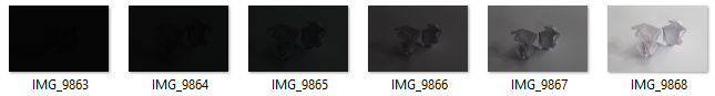
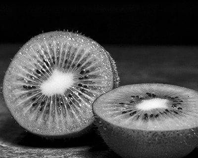
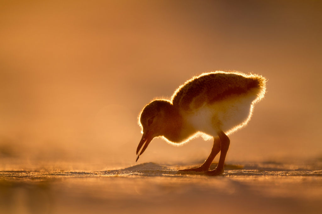
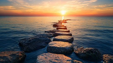
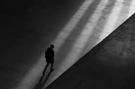
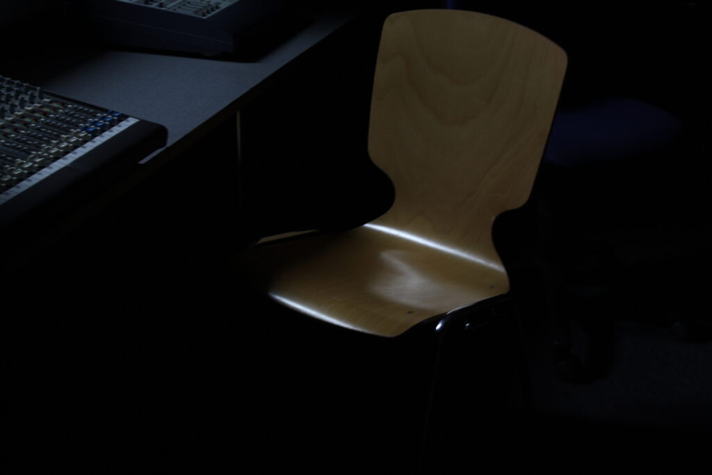
ISO is used to determine how much light is let into your camera, and is useful when trying to make your images look neat. A high ISO is typically used for low lighting, as it can make your image look more clean, but can also make your image look noisy if you aren’t on the correct ISO needed for the image. Whereas, a low ISO is usually used for a light lit image, so it doesn’t look noisy. An image can end up looking noisy if you are using a high ISO when it’s not needed (like if your image doesn’t have low lighting).
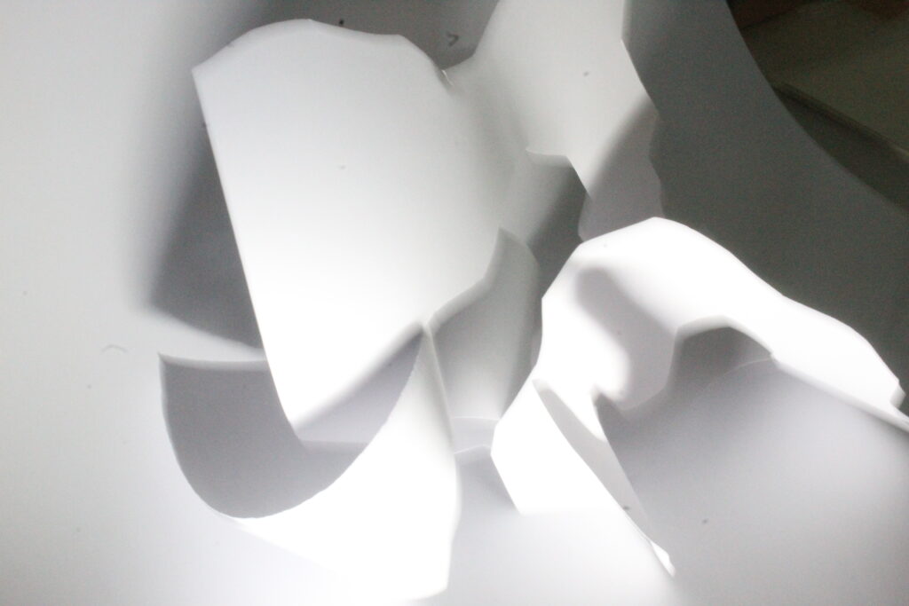
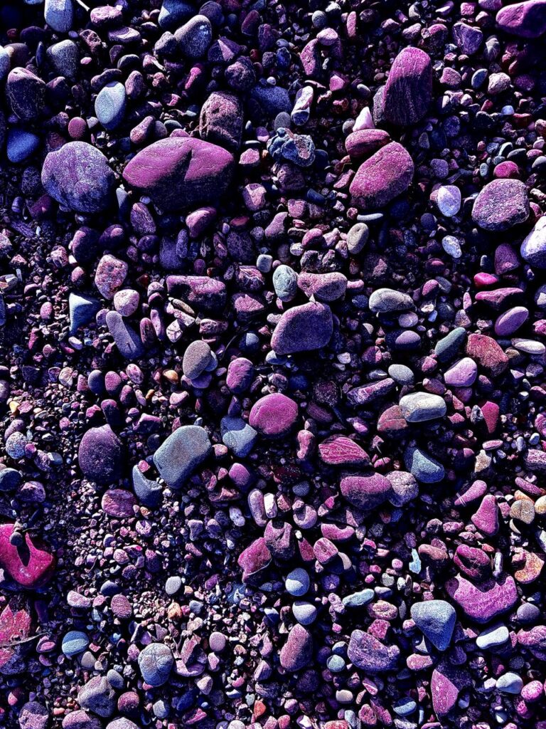
In the image above, you can see that the high ISO makes the image look grainy and noisy, which isn’t ideal when you want a clean look for your image. To prevent this, you need to ensure the lighting is good and that you are using the right ISO.
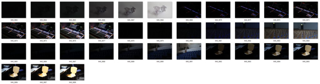
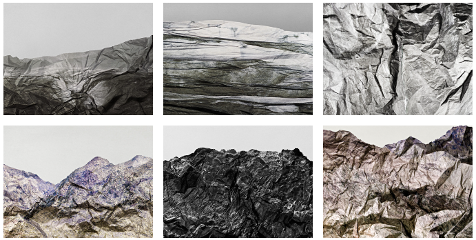
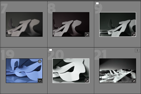
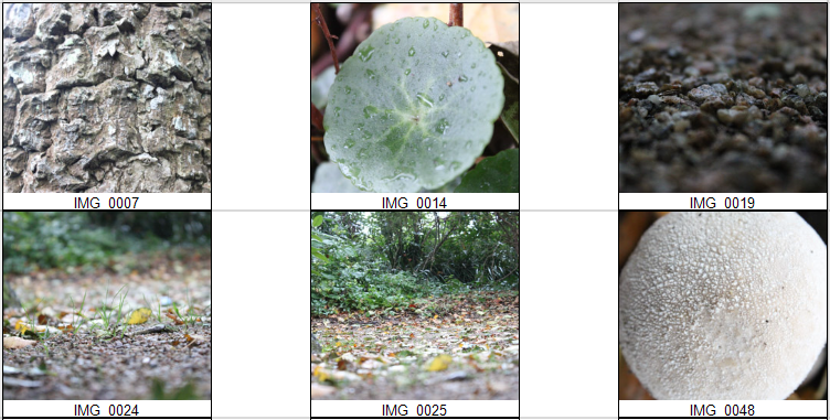
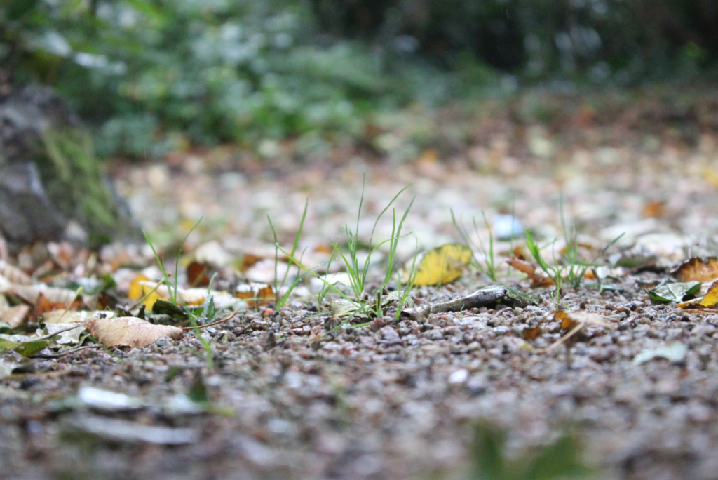
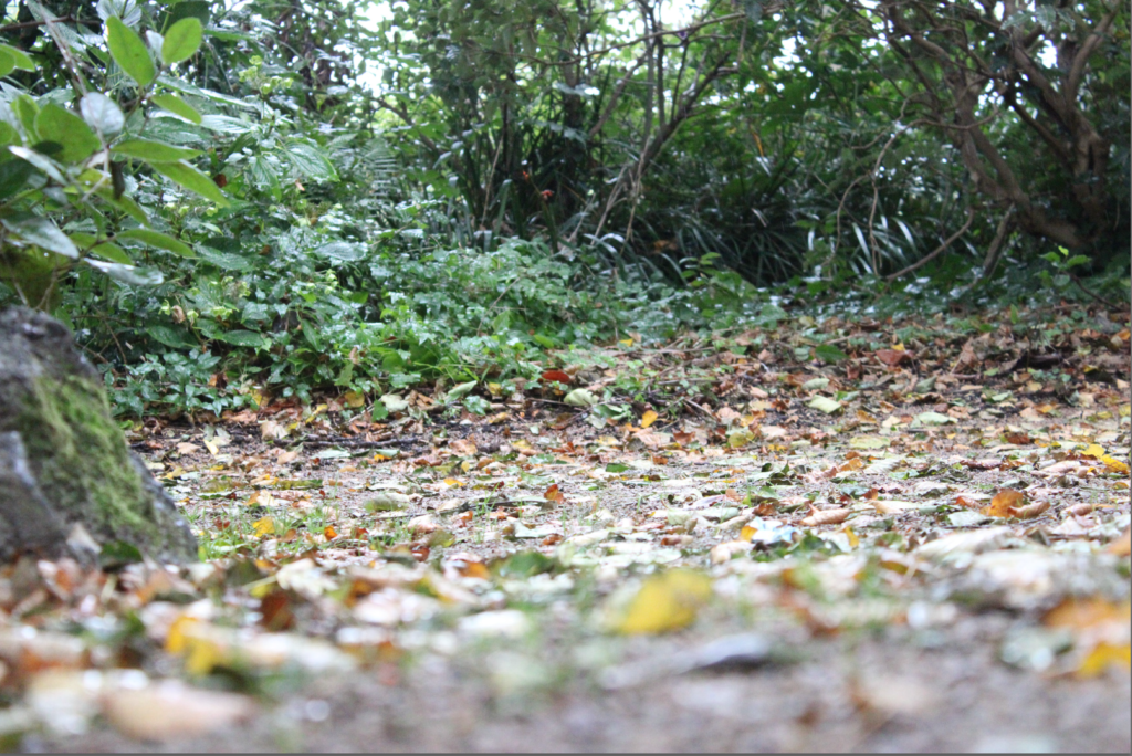
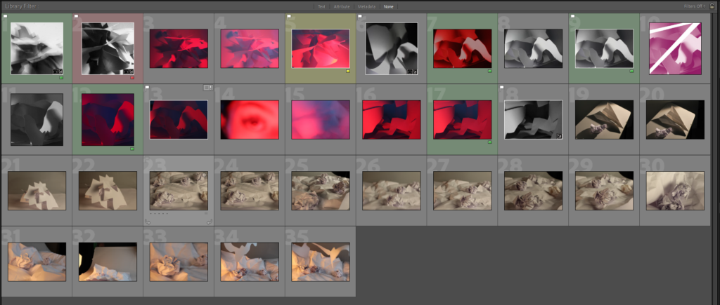
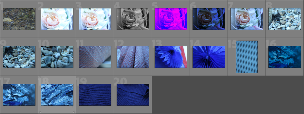
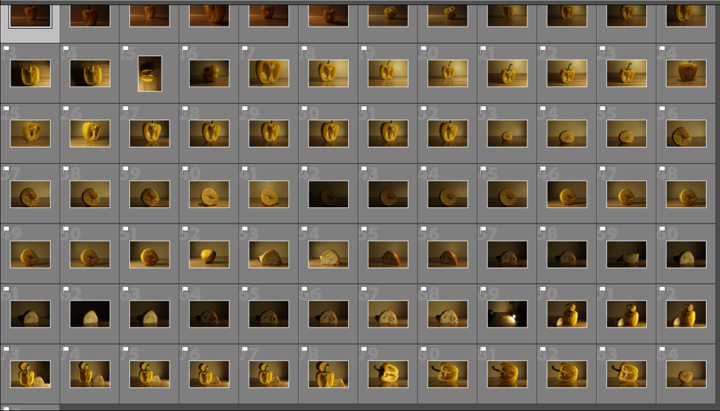
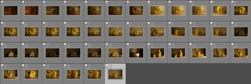
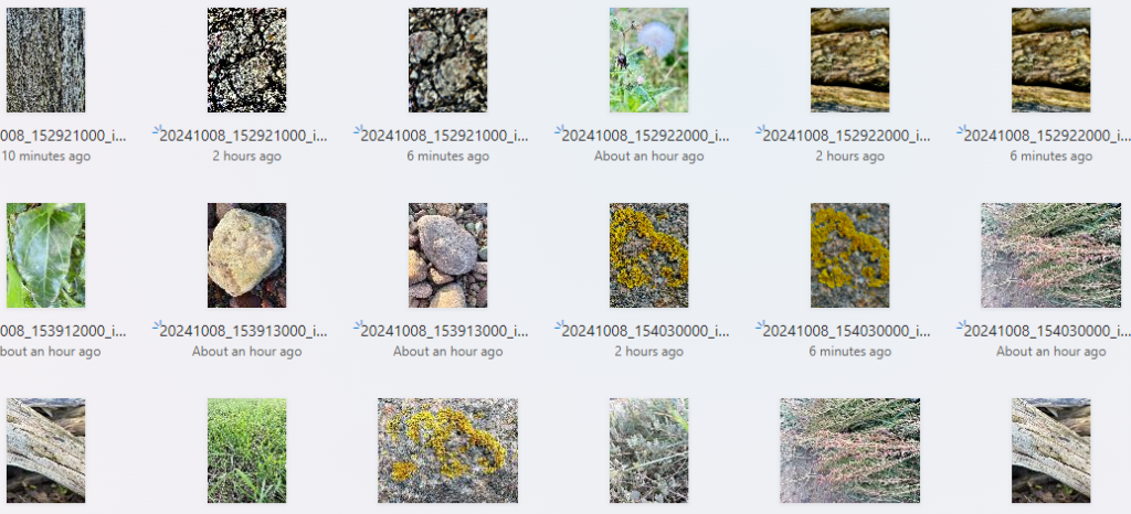
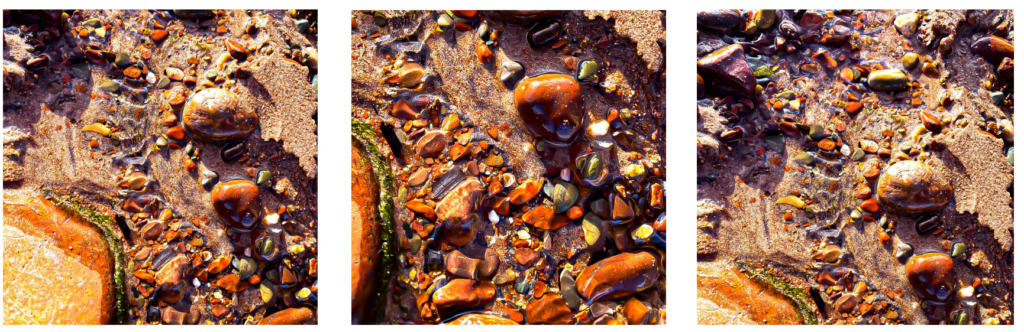
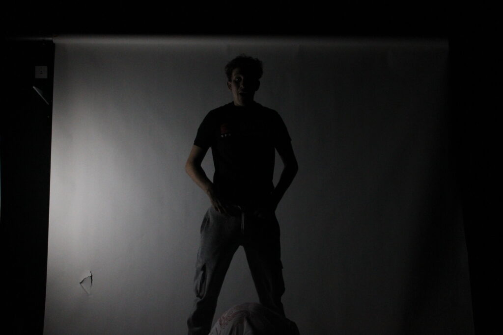
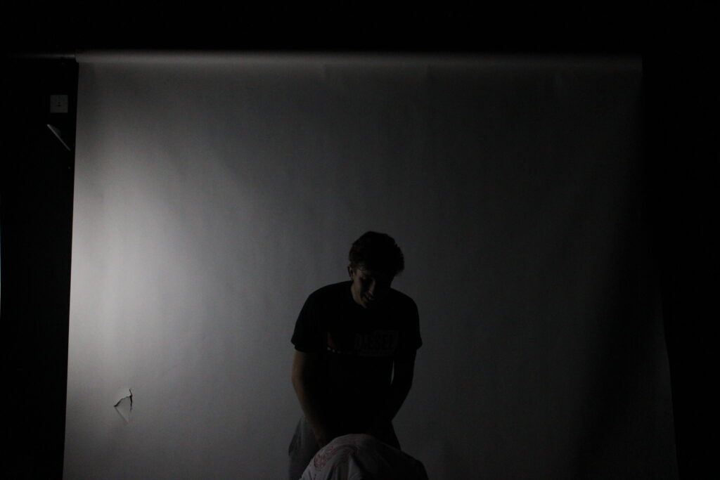
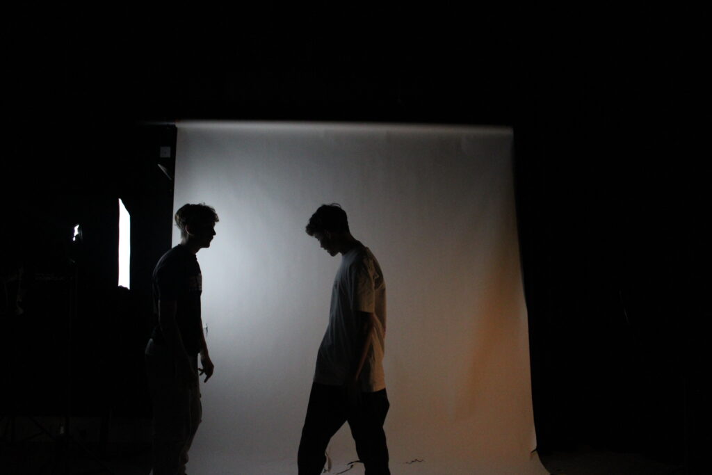
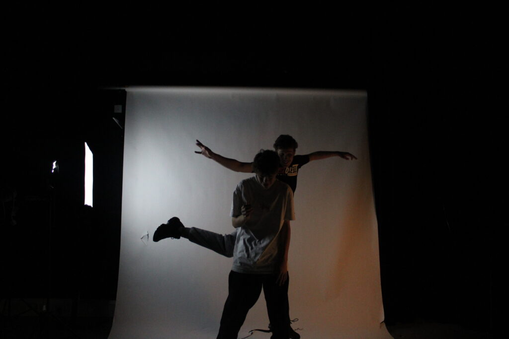
My Contact Sheet
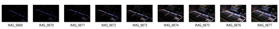
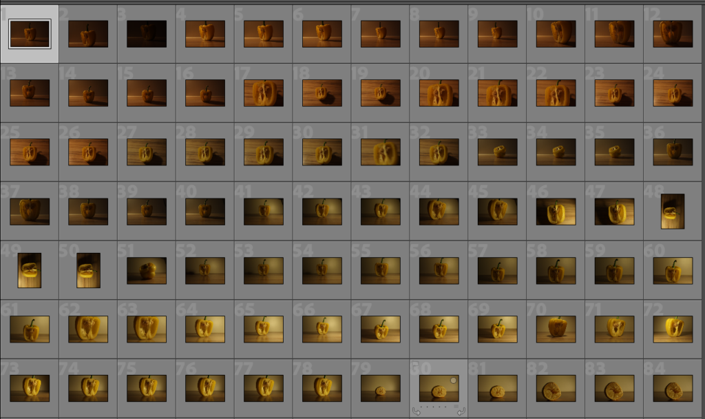
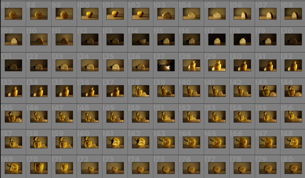
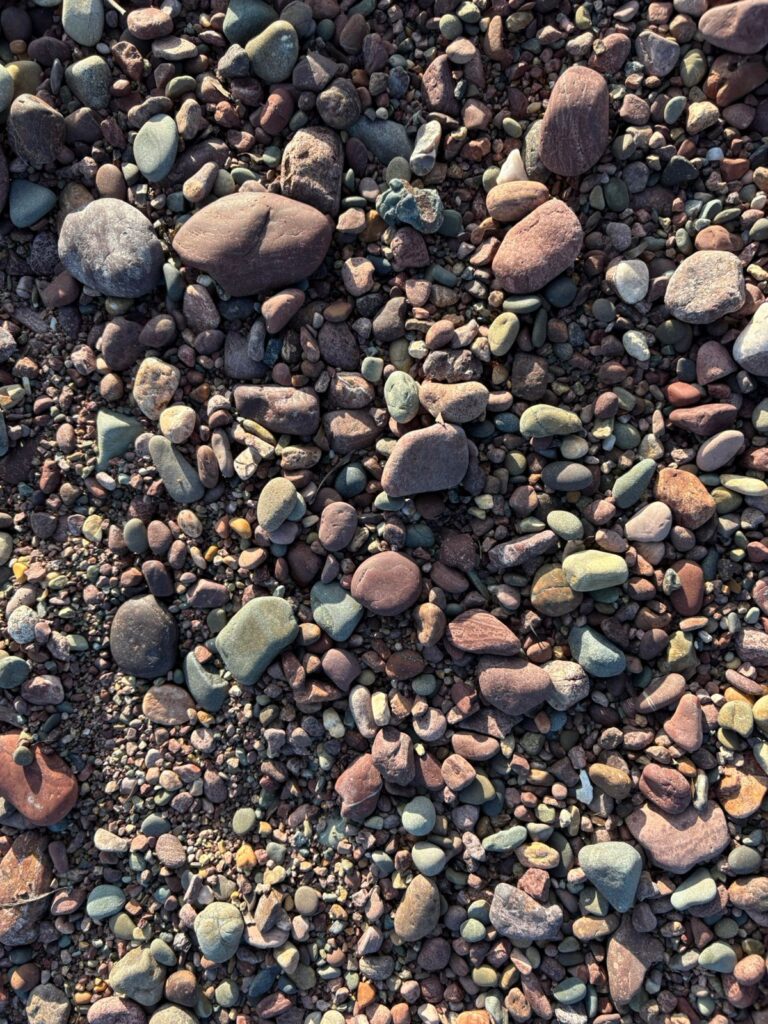
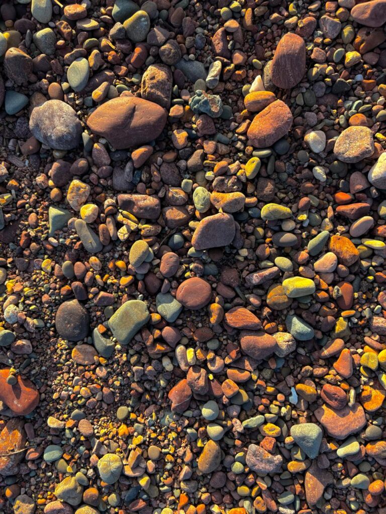
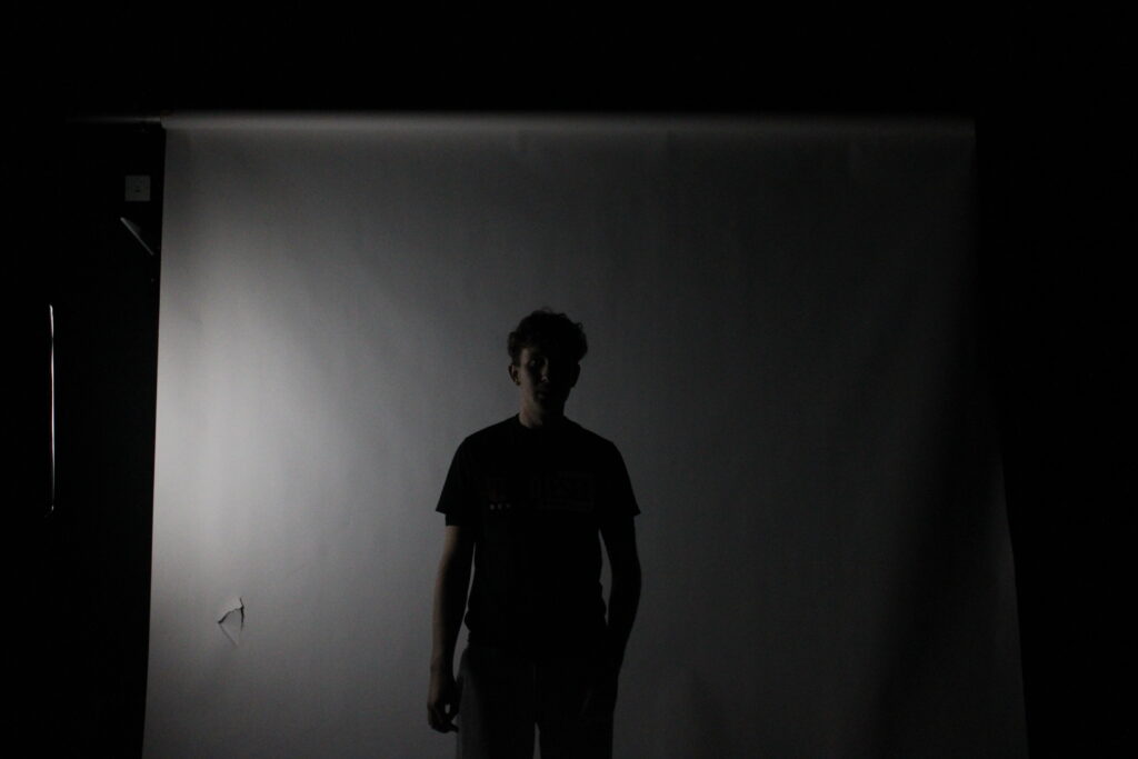
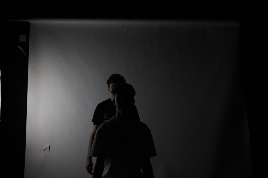
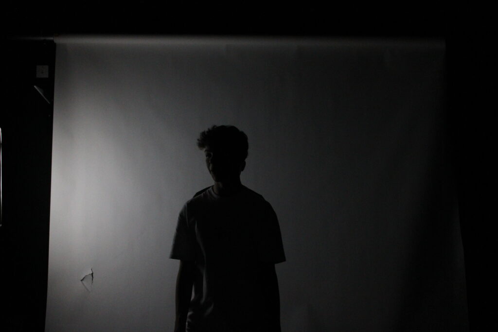
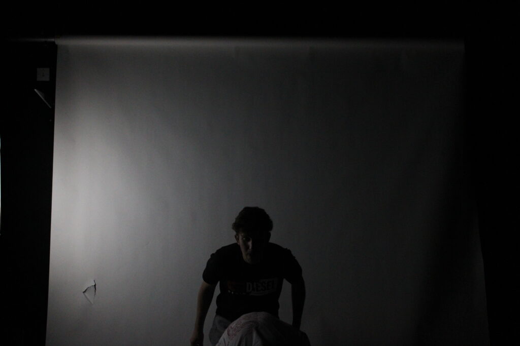
These are the images I took to show the contrast in lighting and the ISO difference by increasing and decreasing the ISO number.
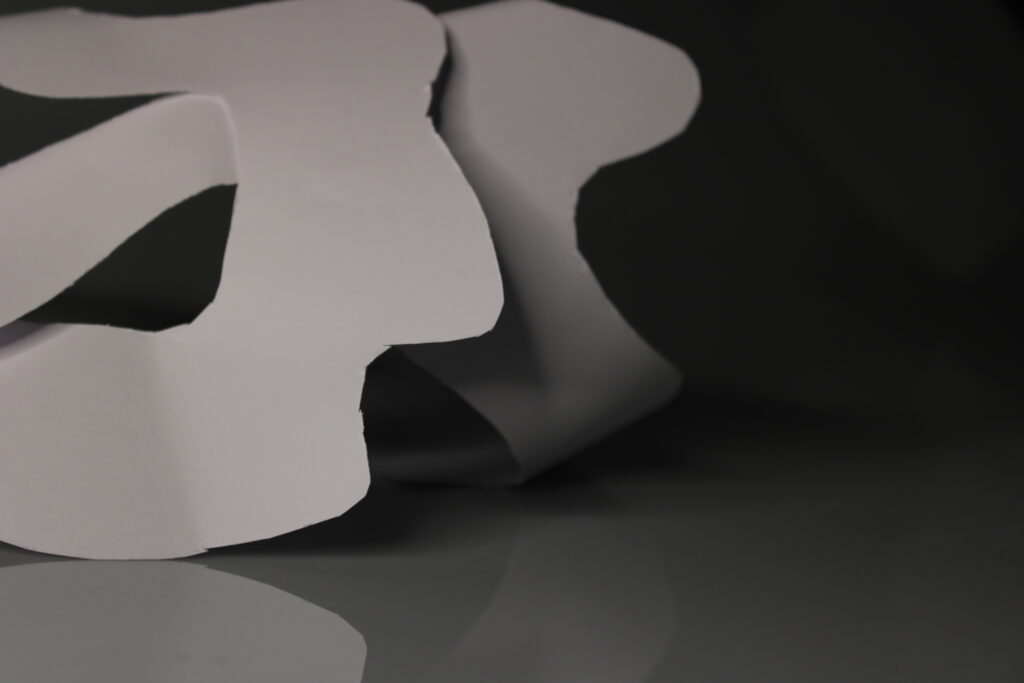
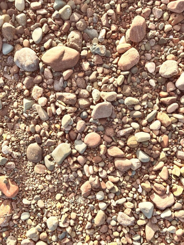
I put the two images above to present a change in ISO and the lighting, so you can see each stage of the process.
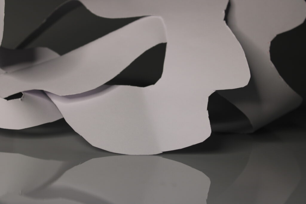
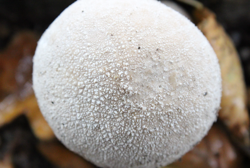
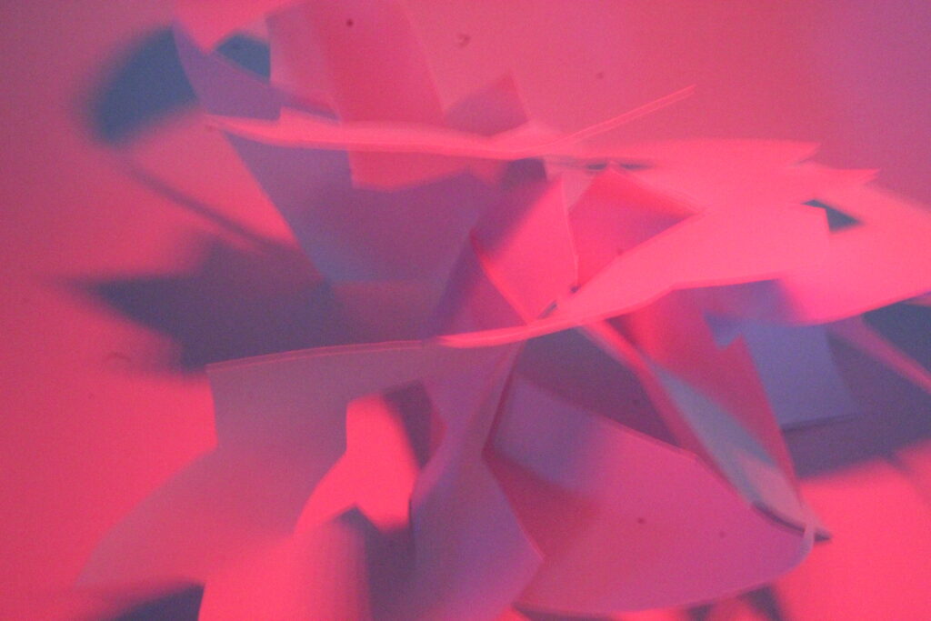
I also decided to include this image above as I feel as though it represents the noisy ISO that we are usually trying to avoid in our images. As you can see, the lighting isn’t the best in this image, and the ISO number is on the lower side making the image not look the best it can.
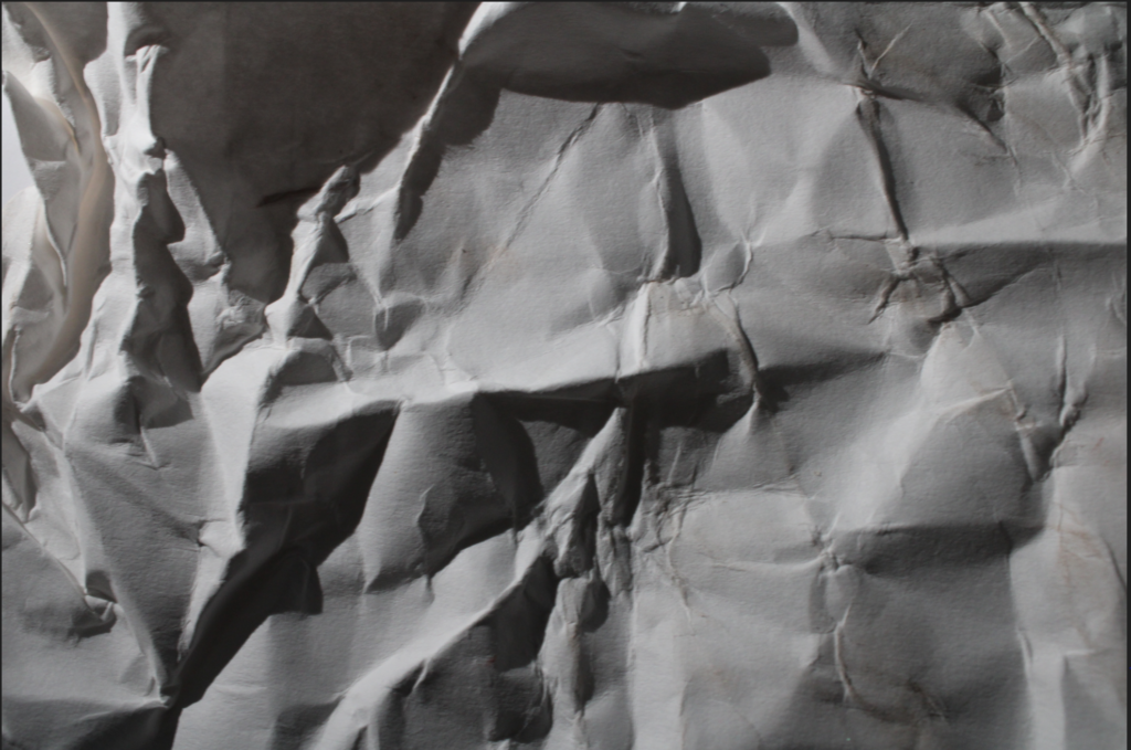
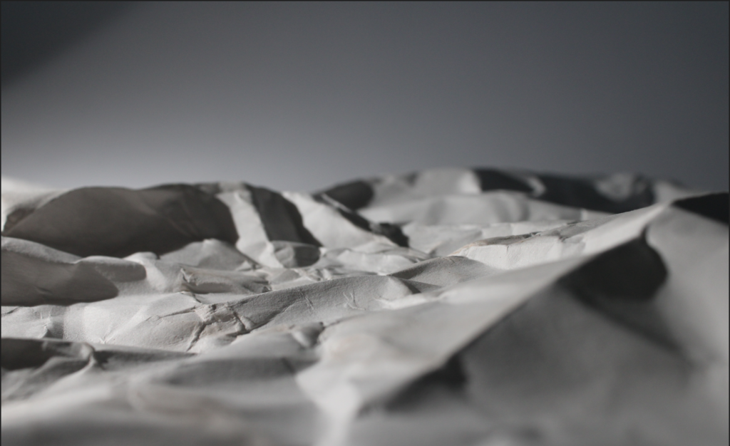
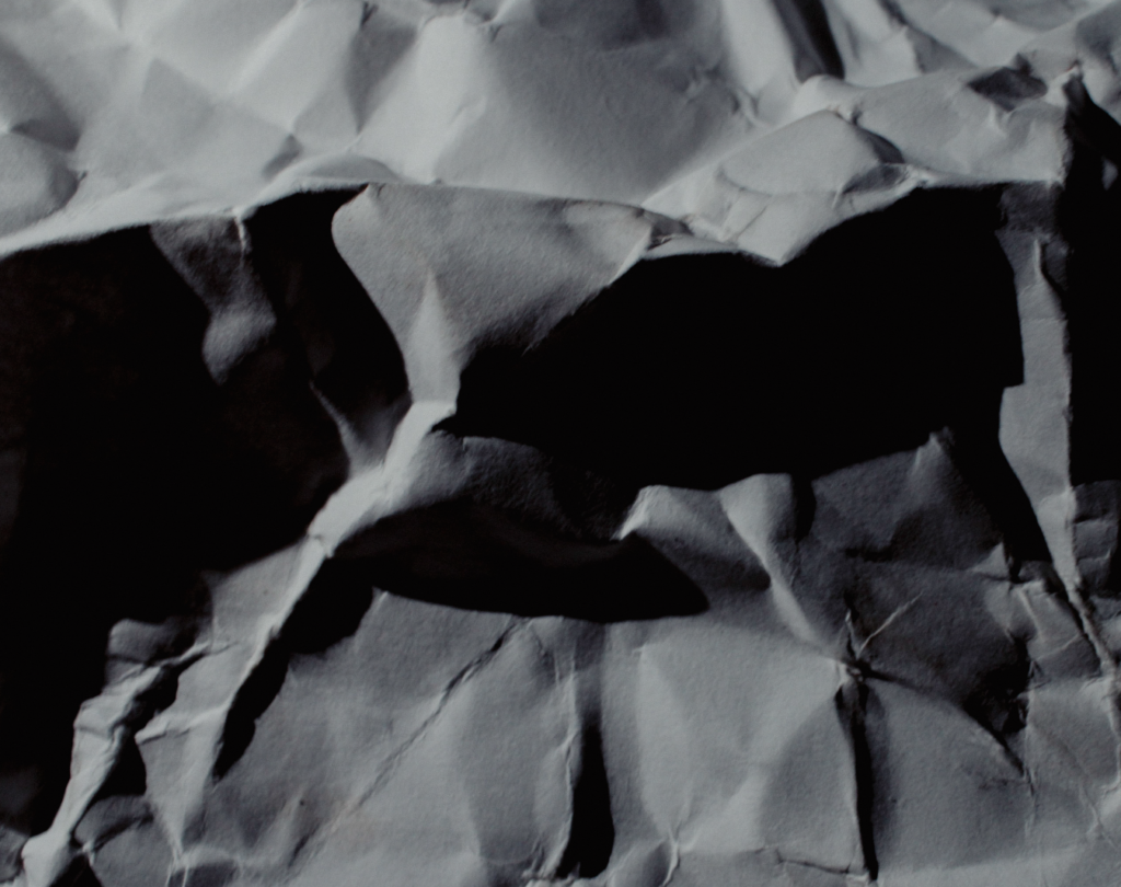
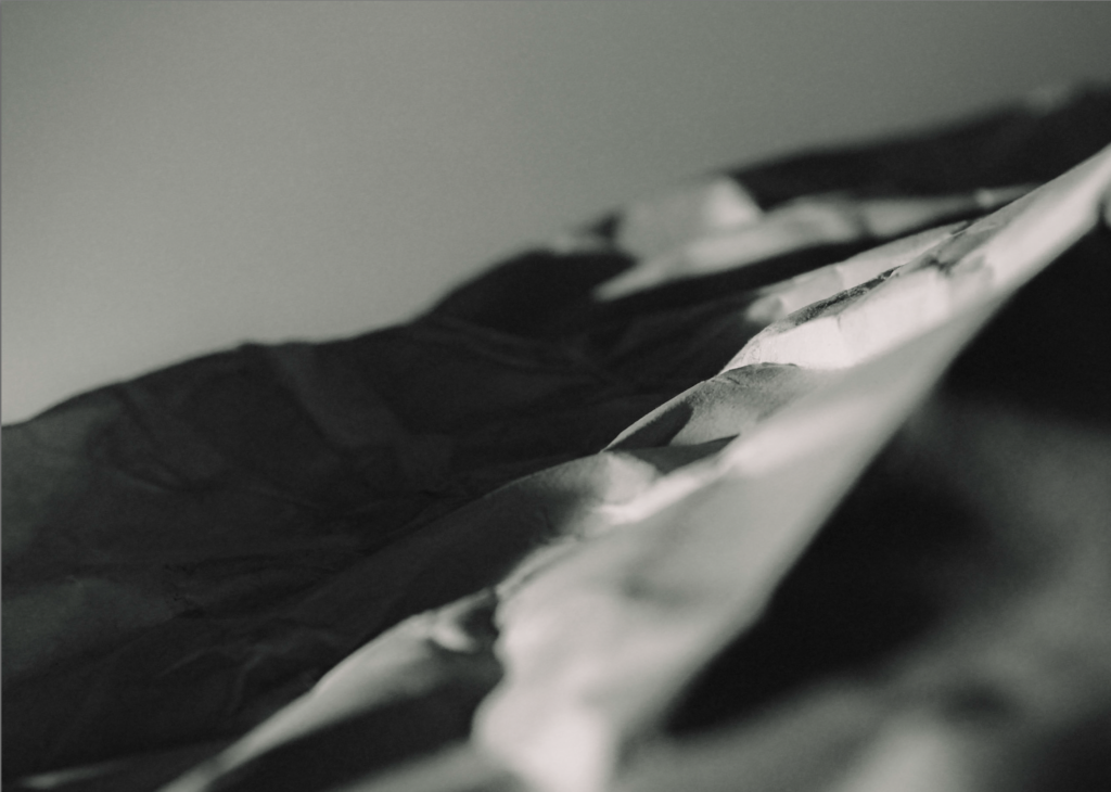
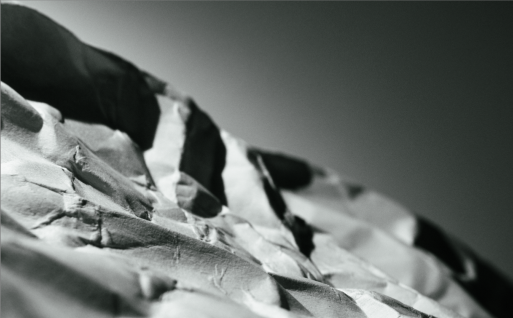
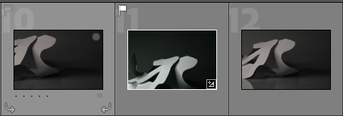
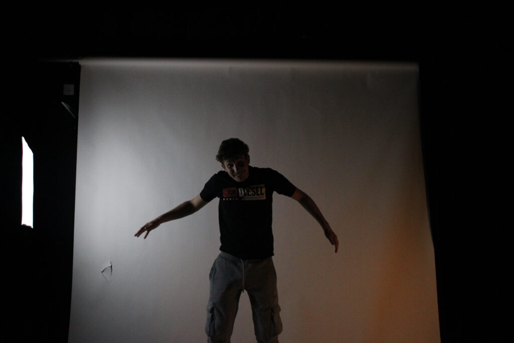
This was my first photo but I don’t think it matched his style enough so I took a few more at different angles.
These photos were better as they matched his style more and looked like a terrain sort of thing.
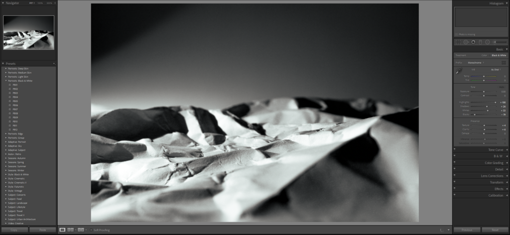
Editing:
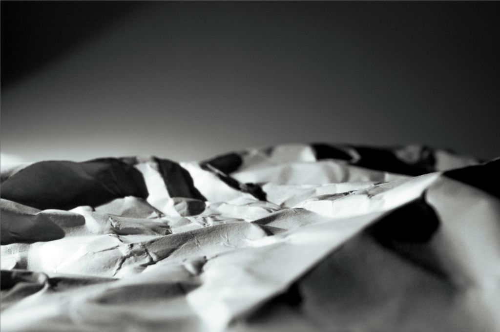
Final Photo:
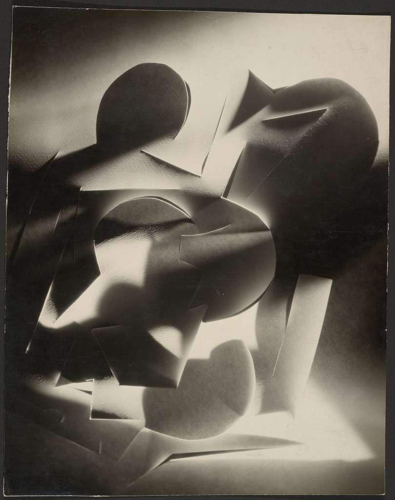
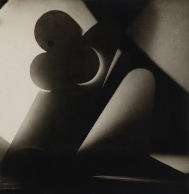
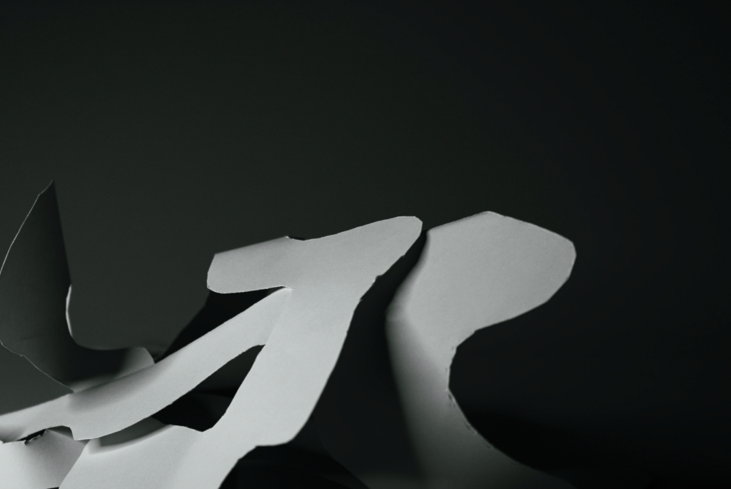
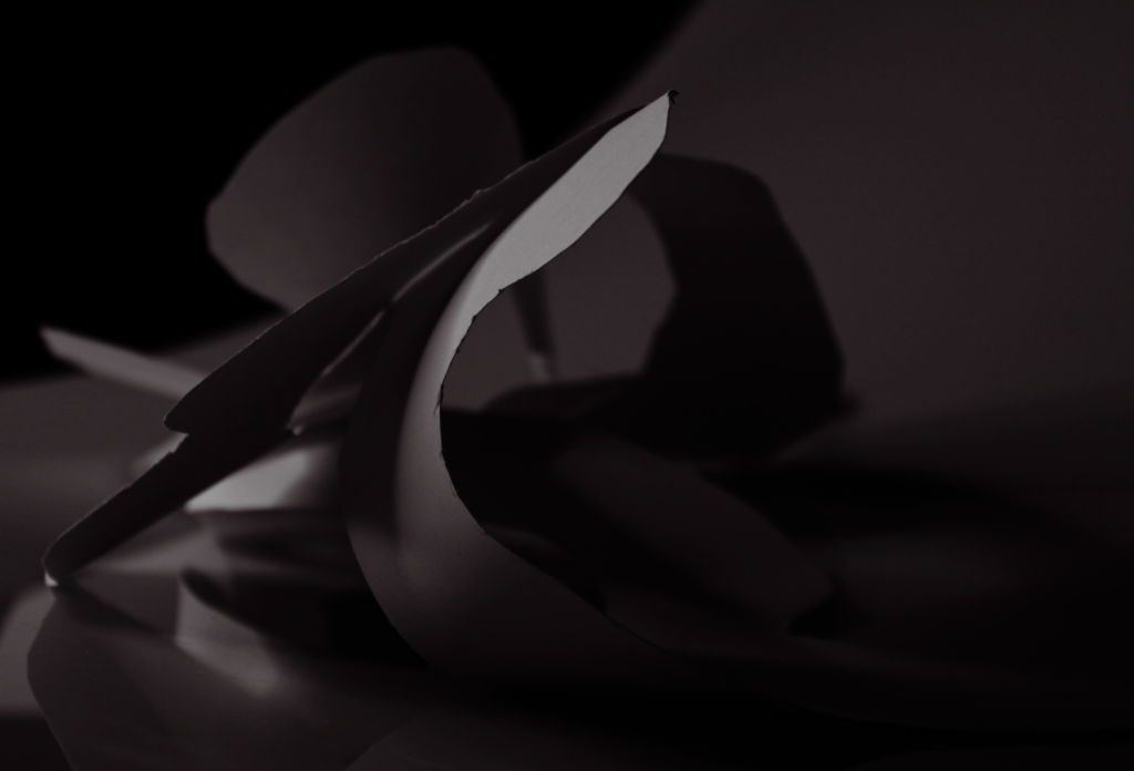
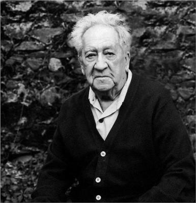
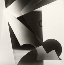
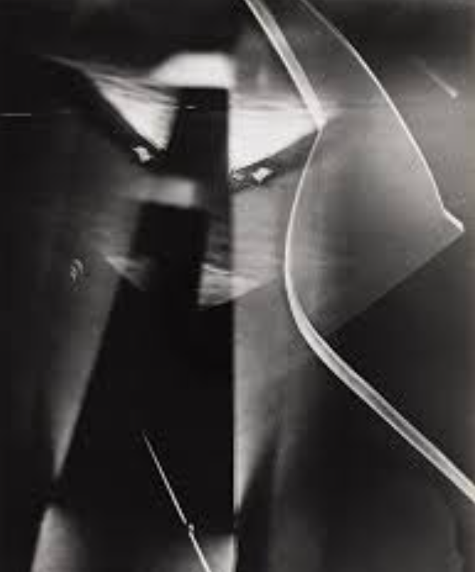
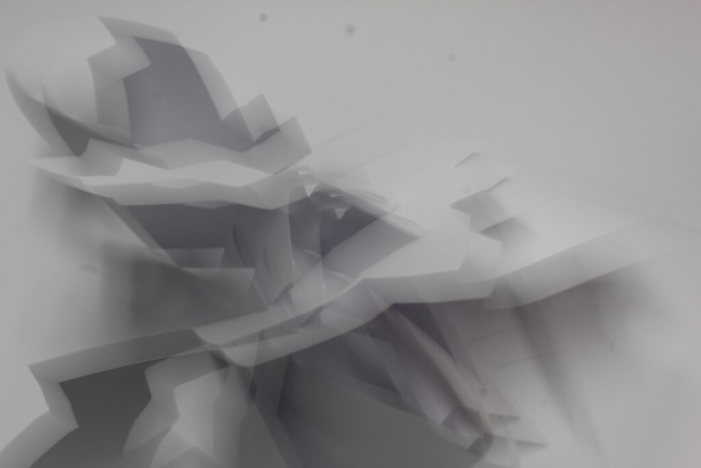
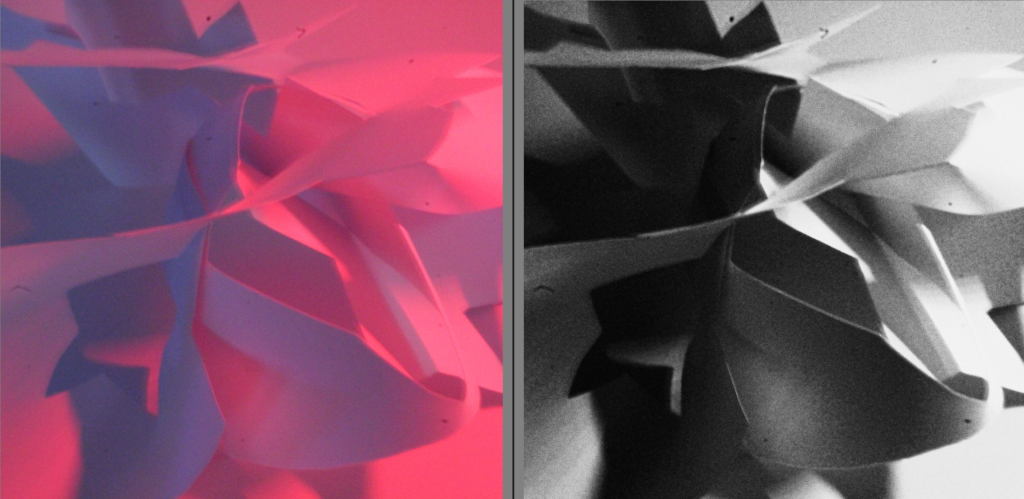
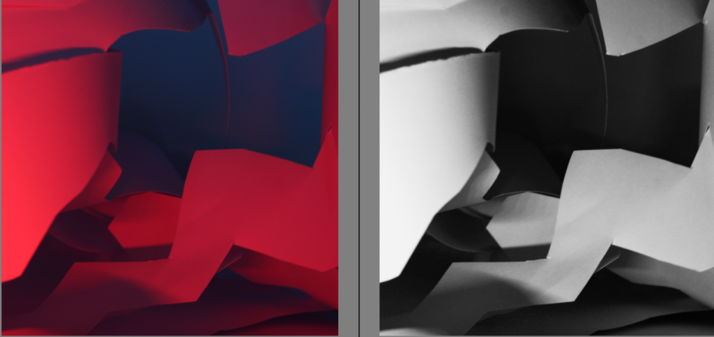
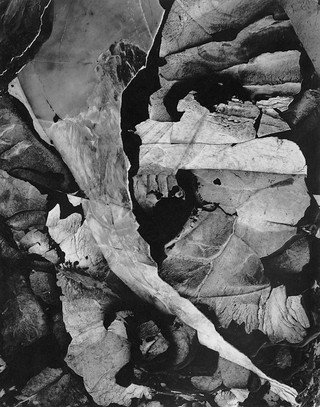
Francis Bruguiere
Bio
Born the youngest of four sons into a wealthy San Francisco family, Francis Bruguière was interested in painting, poetry, and music, and became an accomplished pianist. Upon his return from Europe, where he studied painting, he met Alfred Stieglitz at the 291 Gallery in New York and soon took up photography. While studying with Frank Eugene (Smith), Bruguière joined the Photo-Secession. Although he returned to San Francisco, Stieglitz published one of Bruguière’s photographs in Camera Work and included several in the ground breaking 1910 Photo-Secessionist exhibition at the Albright-Knox Gallery in Buffalo, New York.
Around 1912 Bruguière began to experiment with multiple exposures. In 1918 he published a book of Pictorialist views of his hometown, titled San Francisco. Soon thereafter, he returned to New York, where he opened a new studio, and began his famous series of cut-paper abstractions. In 1928 he moved to London where he designed stage sets and photographic murals. The later years of his life were spent mostly in New York, where his attention turned increasingly to painting and sculpture.
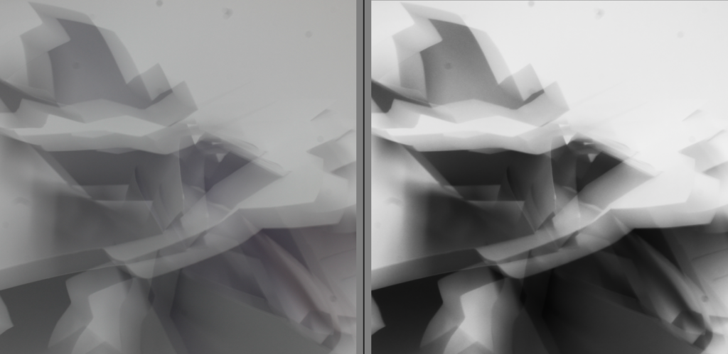
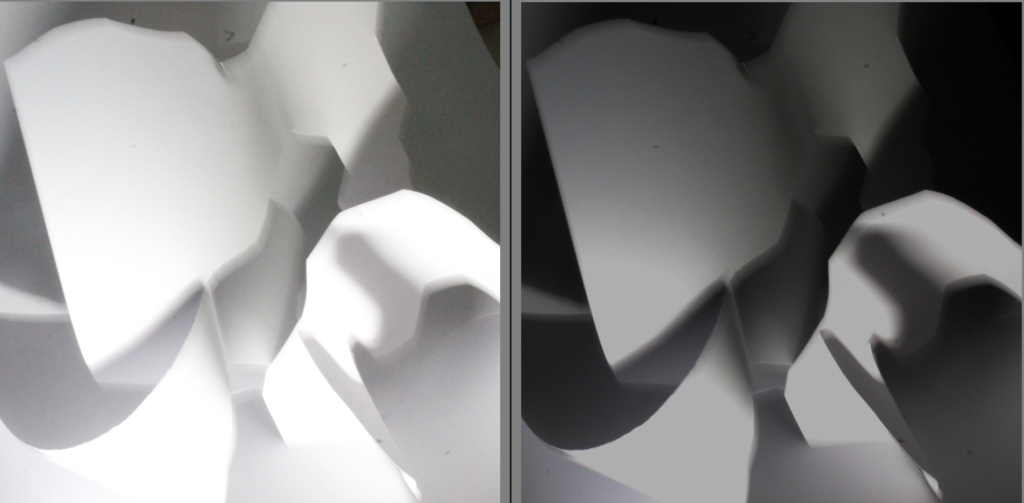
image 1 image 2
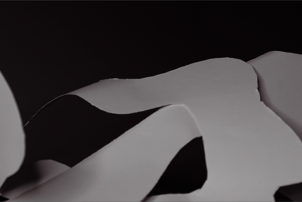
Overview of the photos
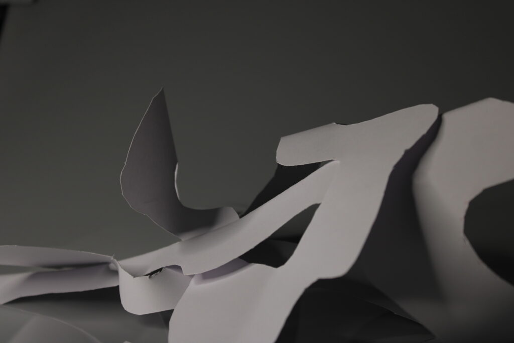
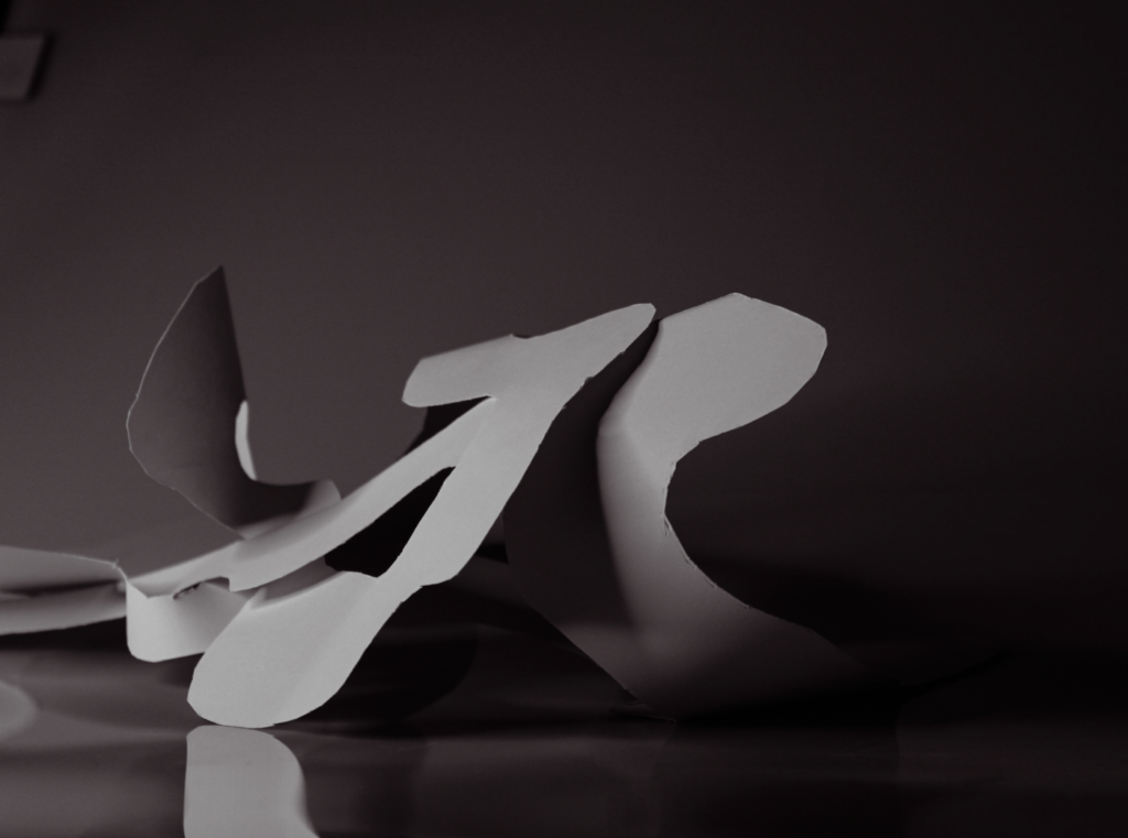
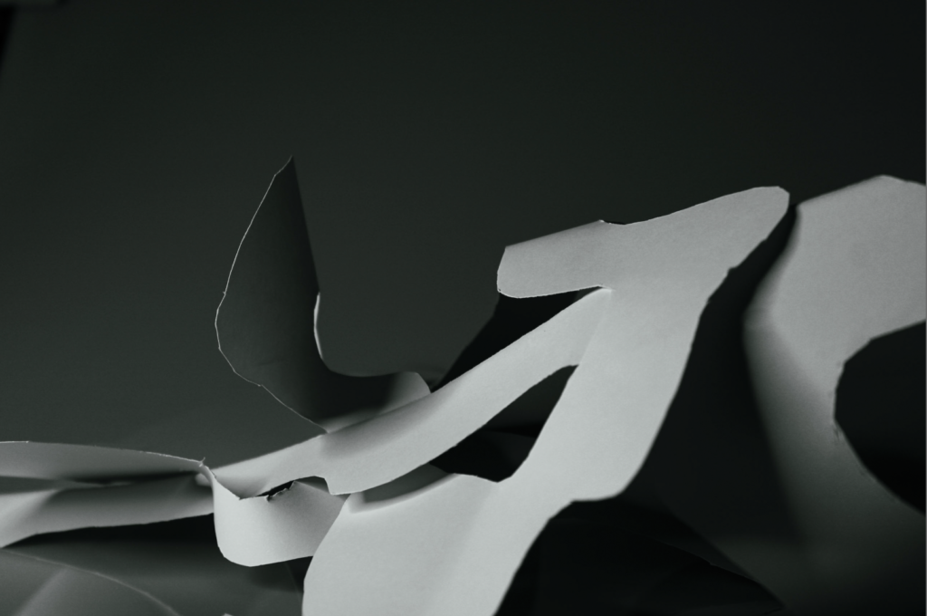
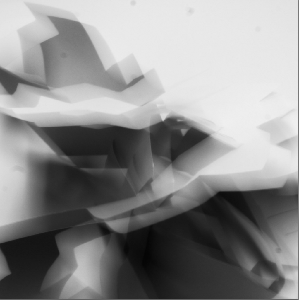
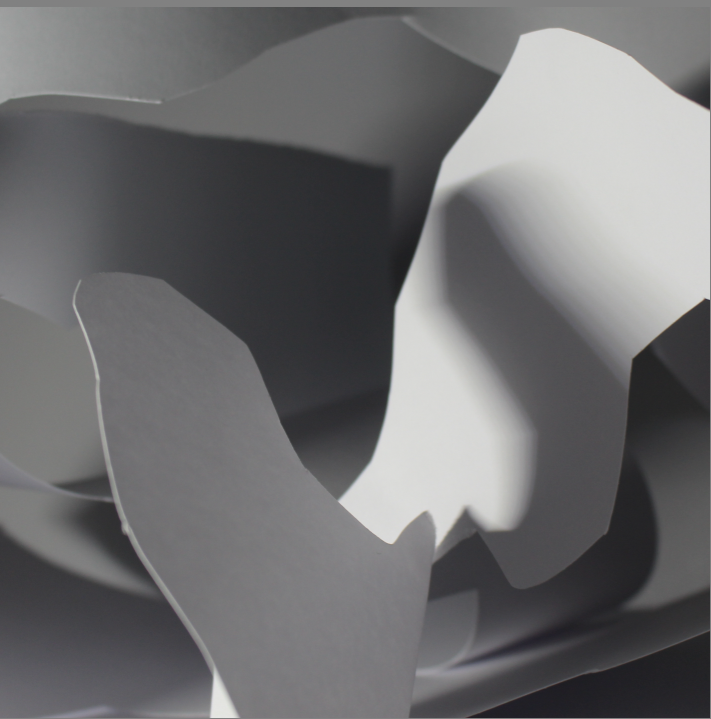
I like these photos because of there abstractness. The cuts in the paper are so random and the cropping she has done to the photos are so effective in hiding what the photos actually are.
Light
With the use of light, which travels through the cuts and folds of the paper, Bruguière has managed to create two alluring abstract photos and it is difficult to formulate what the image is. In both the photos, it’s the light catching the paper that creates patterns and textures that travel across the photo in the form of light and shadows.
Colour / Value & Tone
The monotone prints remove any distractions of colour and draw your attention to the tonal values created by the light and shadows.
Balance / composition
Within the first image, you can see the darkest shadows through out the frame. The random shapes in the photo creates diss balance to the image and draws your attention to the mess of textures and tones in the centre. The sharp, cuts and decorative detail of the paper sits largely in the centre of the frame, with softer light travelling to the top right and bottom left corners of the frame.
Camera techniques
The aperture of the camera allows for a sense of depth through the image, particularly in the photograph. Your eyes are drawn to the sharp folds of paper in the foreground, in contrast to the soft multi tonal background
My Response:
Strongest Photo Selection:
I took the image into Lightroom and did some editing and this is how it came out.
FurtherEditing
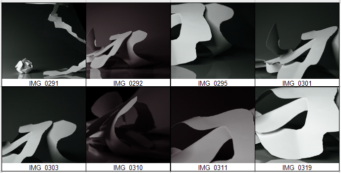
I then cut and cropped my favourite 8 photographs and edited them this is the sheet of them.
This is the images separately:
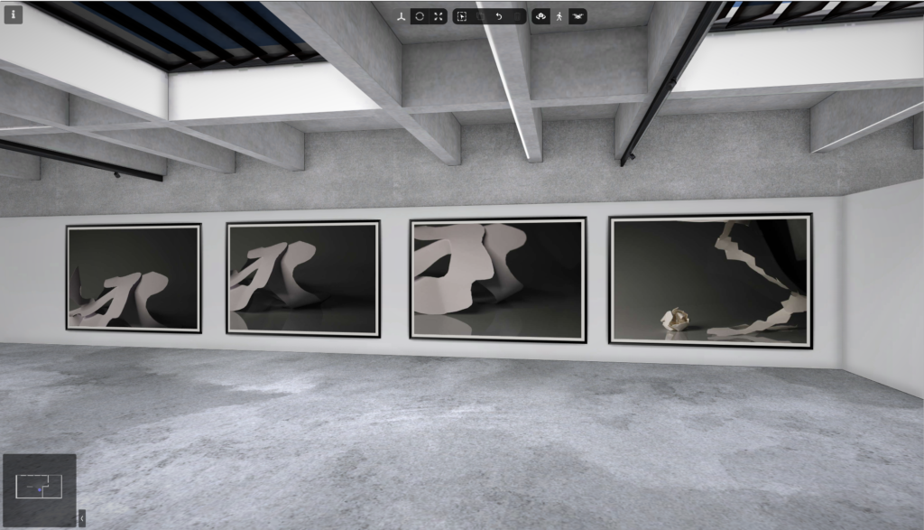
I used art steps to see my photos in a gallery in real life this was a final step to presenting my photos.
Photoshoot 2
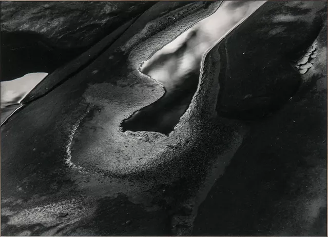
Aaron Siskind
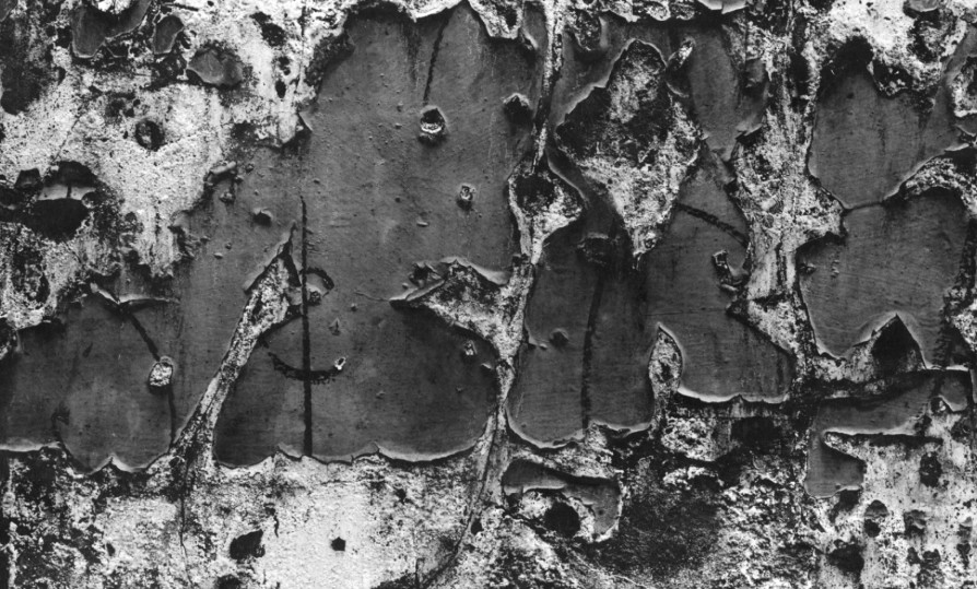
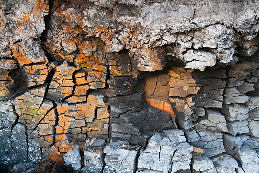
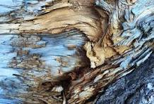
This one of his photos helped inspire me to take similar photos with paper the amazing textures of the rotting wood make the photo really amazing. The photo is taken with a dead pan angle which makes it look unreal, you cant tell what the photo is. The fact its in black and white also pulls out the dark and light tones.
Aaron Siskind was an American photographer whose work focuses on the details of things, presented as flat surfaces to create a new image independent of the original subject.
Jaroslav Rössler was a Czech photographer. He was a pioneer of Czech avant-garde photography and a member of the association of Czech avant-garde artists Devětsil. Today he is considered an important exponent of Czech modern photography and avant-garde art. He often photographed objects against stark backgrounds, or used long exposures, to reduce subjects to their elementary lines and geometric shapes.
These are two of Jarvoslav Rosslers famous photos with paper.
In the first photo he uses paper to create geometric shapes using the shadows and the light. the lines are straight and sharp causing the photo to look neat and put together by him.
However the second photo looks more natural and has no significant shape, you wouldn’t be able to tell what it is unless someone told you.
Formal elements.
LINE:
Objects in the photograph that act as lines, they could be straight curvy, thick or thin. They could create different effects on the photograph.
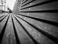
this is an example of line
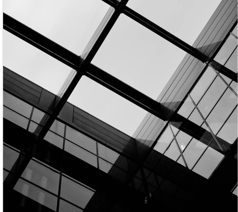
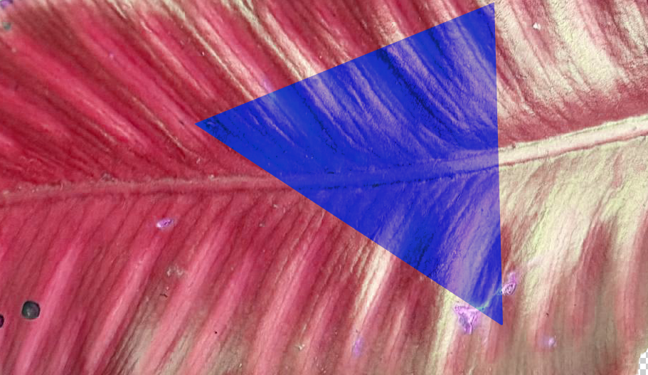
SHAPE:
Shape elements are often found in photography in the form of patterns. There are two basic types of shapes: geometric or regular and organic. Geometric shapes are – circle, square, triangle ect.
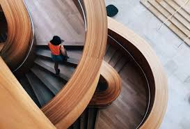
This is an example of when shape is represented in a photo
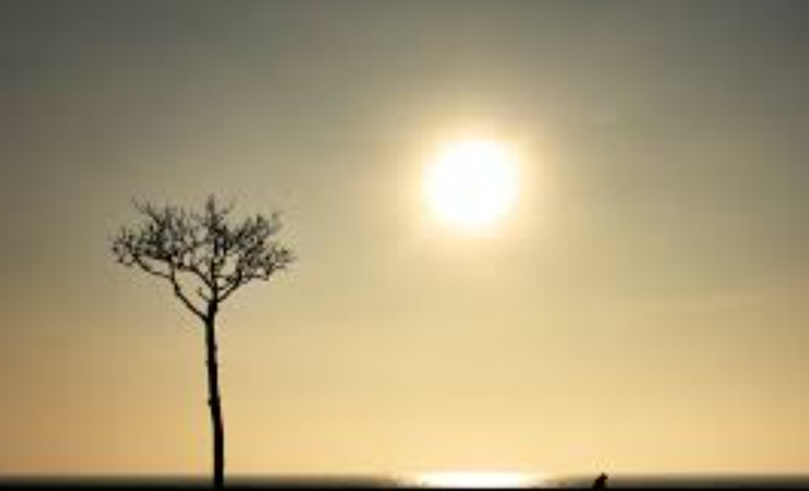
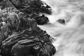
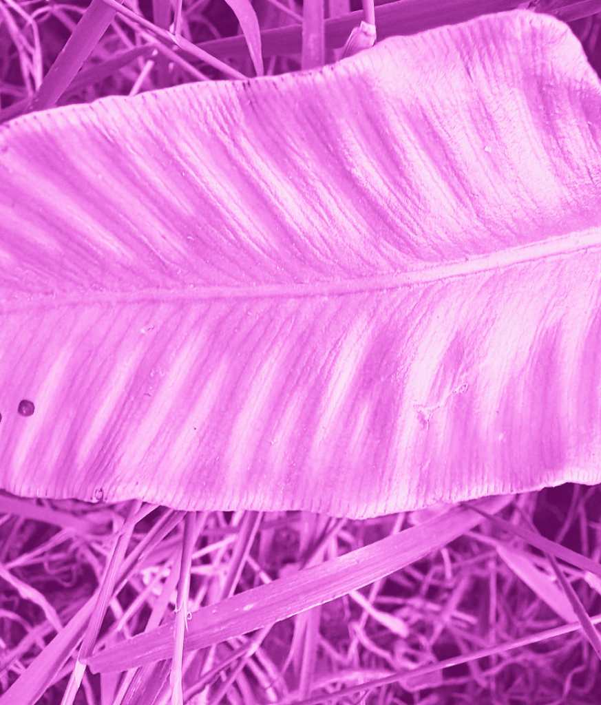
SPACE:
positive space is the actual subject while negative space (also called white space) is the area surrounding the subject. E.G a boat in the middle of the sea.
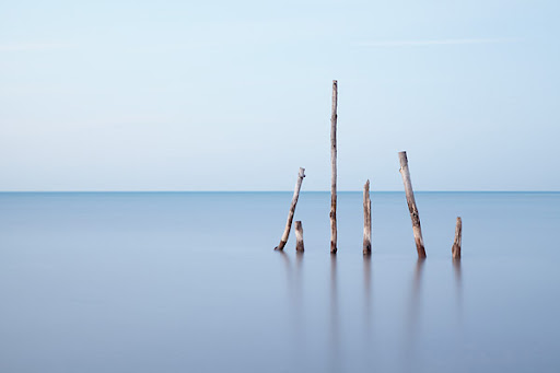
This is an example of when space is used in a photo, it highlights the tree as that is the boldest part of the photo
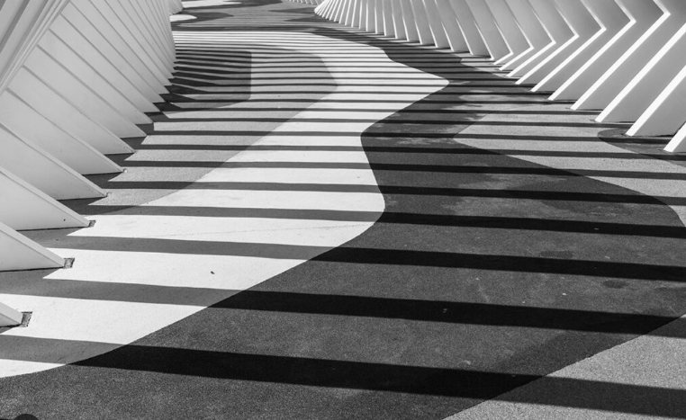
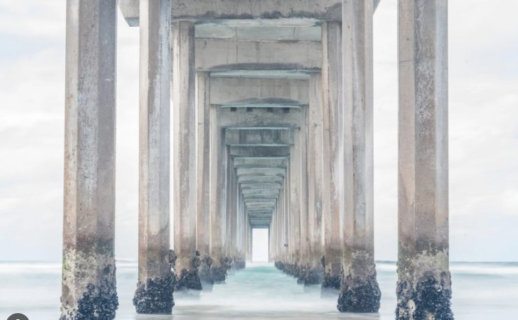
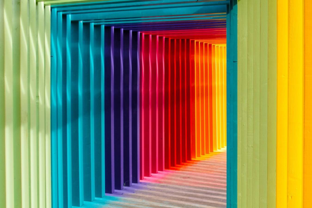
REPETITION
Repetition in photography refers to the technique of integrating recurring elements, patterns, or themes in a composition to produce a sense of rhythm and balance in an image.
In this photo, the repetition of the pillars helps makes dramatic rhythm
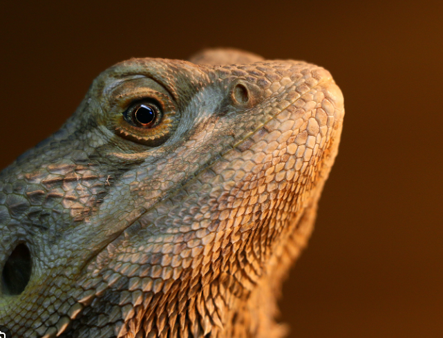
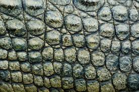
TEXTURE
texture helps role in adding depth and a tactile dimension to images by emphasizing the surface quality of the subject.
The detail/texture of the lizards skin makes the photo have more depth, as the image is highly focused.
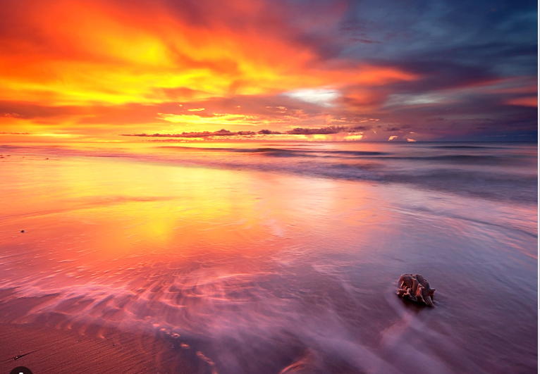
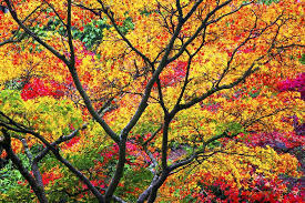
COLOUR
Colour in photography plays a major role in composition, affects balance, and determines the weight of visual elements. Bright colours, for example, are perceived as happy, fresh, and joyful. Dark colours may evoke sadness, fear, or repulsion.
This photo of a sunset is really nice to look at as the many different colours energise the photo. The composition in this photo helps create the mood. it also creates a lot of visual contrast.
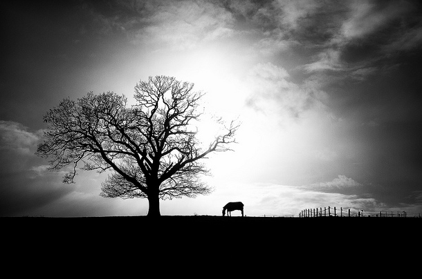
VALUE/TONE
In any painting, photograph or design, the area of highest contrast between light and dark will always demand maximum attention.
As this photo would also look good in colour, the tone makes a nice silhouette of the horse and the tree, it helps highlight them in the photo. The tone also creates visual interest to engage the viewer.
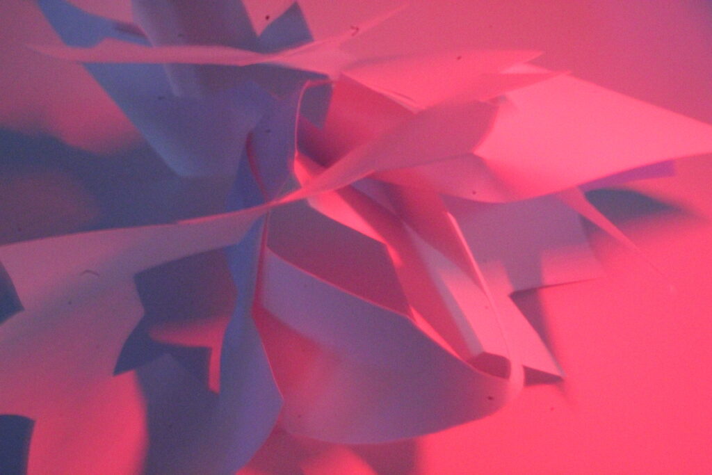
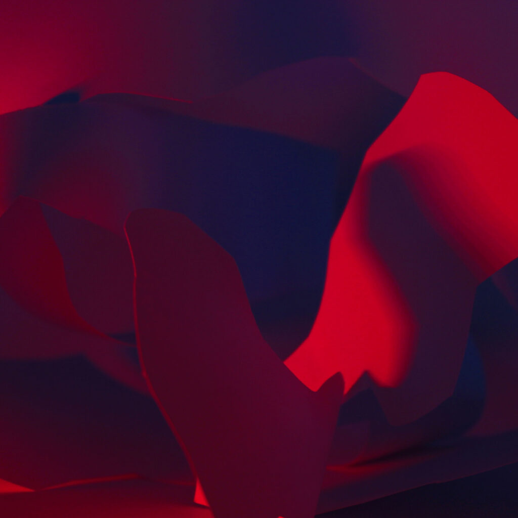
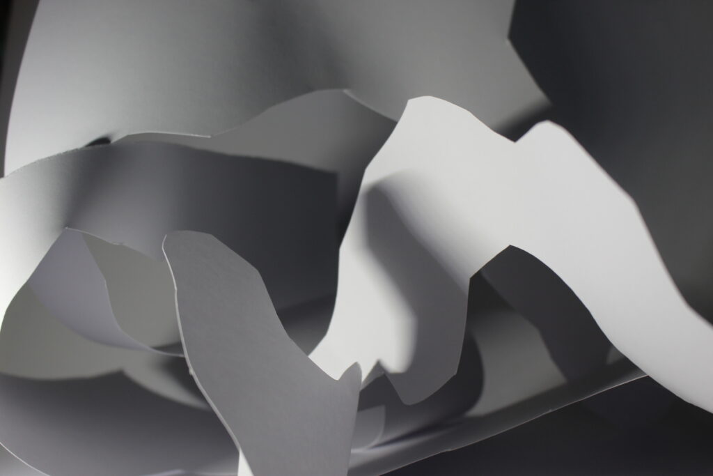
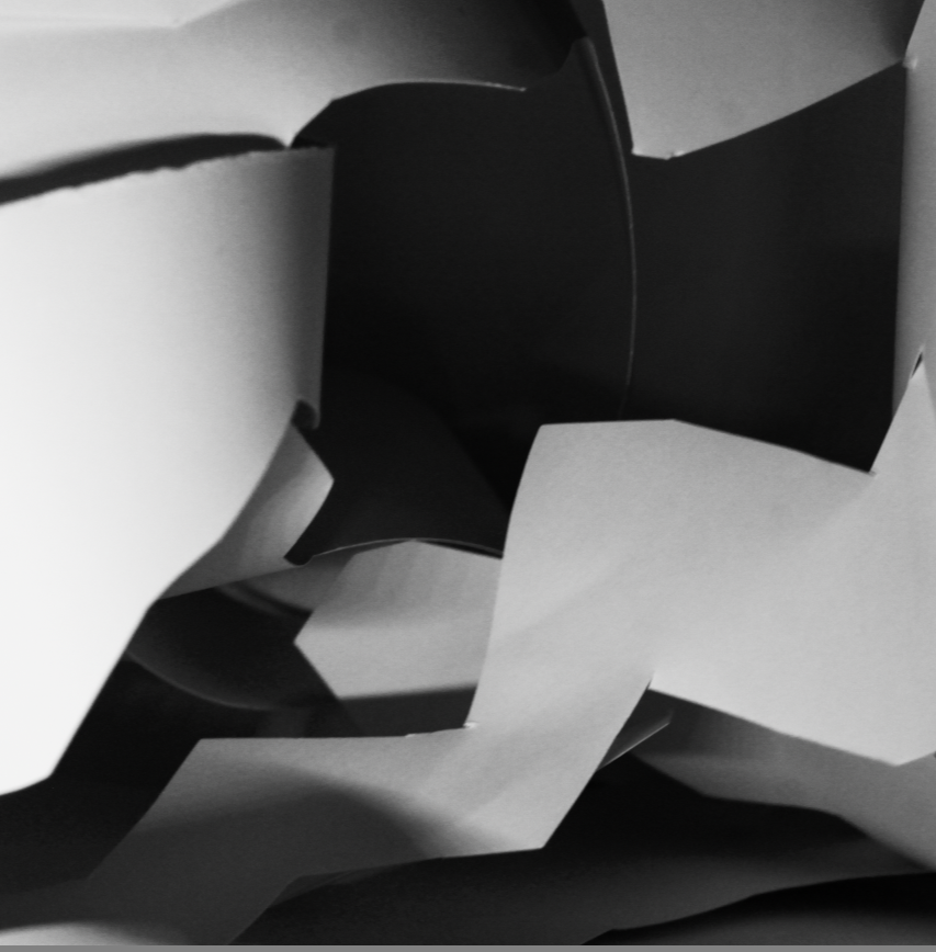
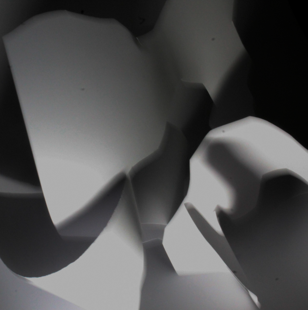
My paper photoshoot
This is my contact sheet. I’ve colour coded it so I can easily find the photos which I prefer. All of these photos are taken by myself. I went into the studio and used the ring lights to help create the shadows which helps add effect to the photo. I used a table with a white background and placed my cut up paper and put it into different shapes.
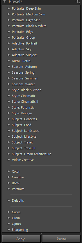
This is the presets, which helped me quickly auto edit my photos.
Strongest Images:
Soft focus / Long exposure photos:
This is my photos before editing
Editing:
This is the before and after of my soft focus photos. I cropped both of the photos and enhanced the contrast and the tone to make it look better. the tone helps create visual interest and helps set the mood of the photo.
Sharp Focus:
Editing
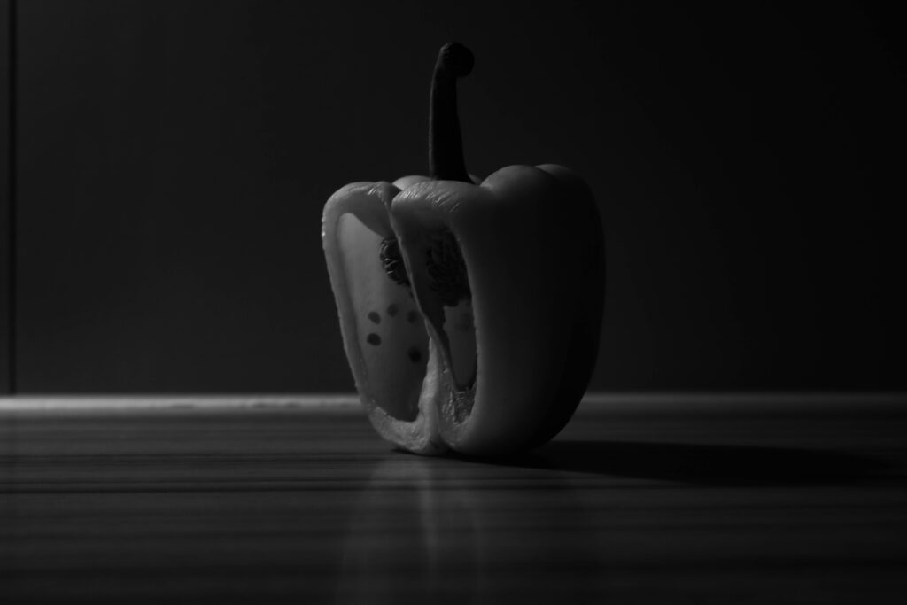
I edited this photo however I don’t like it as the ISO was too high, making the photo too grainy / too much noise.
I edited this photo into black and white, therefore next to my other photos they will look neat.
My favourite photo
before editingafter editing
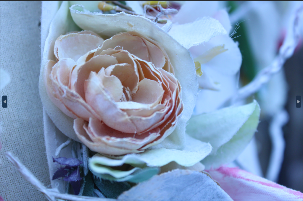
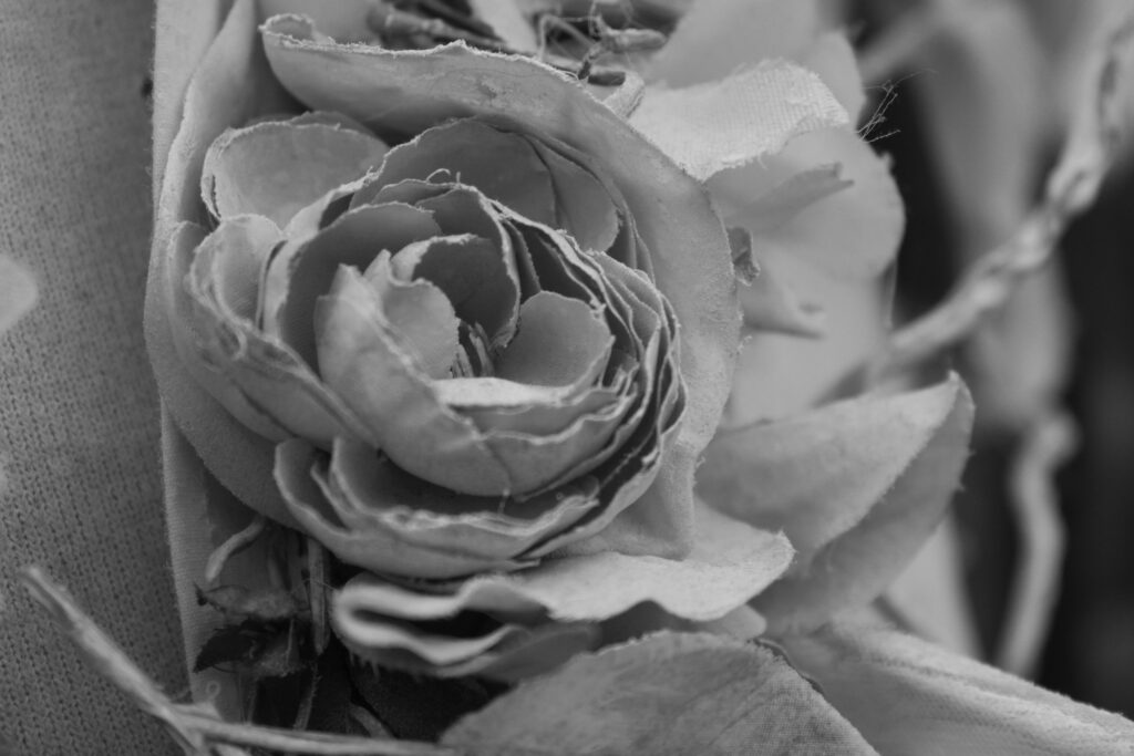
I really like this photo as its clear and has no photo noise. This is before and after editing one of my photos. I have changed the colour of this photo to black and white. The variations in tone in this image also allows the elements of shape, texture, and pattern of objects to be distinguished.
My Final Photos.
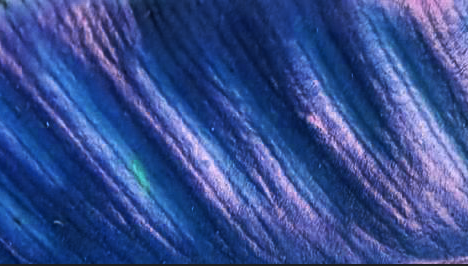
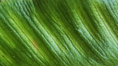
TEXTURE
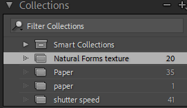
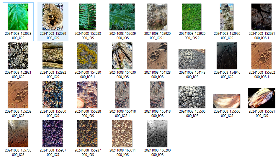
This is my contact sheet for texture, i added them all into Lightroom and edited my favourite ones.
Ive added a collection on Adobe Lightroom and called it natural forms texture.
This is the presets, which helped me quickly auto edit my photos.
I edited this photo 3 different times.
the first photo I added a monotone overlay and then adjusted the brightness and saturation. The black and white stops people from getting distracted by the colour of the photo
I added a gradient map, colour overlay then adjusted the contrast, brightness and saturation.
On the third photo I changed the colour balance and added some blue tones, however it looks quite dark and hard to see the details.
before editing
After editing.
The line and repetition in this photo. The black and white gives the photo lots of depth and doesn’t distract the photo by the colour. however I could have made the ISO a bit too high so I could have lowered it to make the photo more clear. the texture in this photo makes the geometric shapes come more to life.
Line in photography refers to utilizing lines to generate visual appeal and communicate a message within an image. Lines can be utilized to guide the viewer’s focus, establish a feeling of distance, and even suggest motion.
Shape
Patterns are frequently seen in photography as shape elements. They can be utilized to highlight a specific section of the frame as well. Different shapes can be used to establish a stark difference between the subject and the surrounding area. These are only a few examples of the possible applications.
Space
Space in photography refers to the gap between objects and their surroundings in a photograph. It can be utilized to add dimension, highlight an item, or focus on a specific aspect of the arrangement.
Repetition
Using the same design element multiple times, such as a shape, line, color, tone, or texture, can be a valuable tool in the composition of both fine art and photography. Using this one element repeatedly can be utilized on its own or together with other elements to form designs, which can then be adjusted to produce a rhythm.
Texture
The appearance of an object’s surface, showcased by differences in form, shade, and depth of color. Texture adds vitality and liveliness to pictures that would seem dull and uninteresting otherwise.
Colour
Three characteristics of color are hue, value, and saturation. Hue is a basic term used to denote color, such as blue, red, and yellow. The brightness or darkness of a color is known as its value. Saturation refers to the strength or vividness of a color.
Value/Tone
Tonal value in an image describes the brightness or darkness of a color. It is crucial to differentiate various components in the photo and to establish a feeling of depth.
Edward Weston is a pivotal figure in 20th-century photography, renowned for his ability to transform ordinary objects into visually arresting compositions through careful attention to texture, form, and light.
Weston is most famous for his still-life studies of natural objects, such as seashells, vegetables, and landscapes. He worked primarily in black and white, using large-format cameras to capture extraordinary levels of detail. What set him apart was his commitment to presenting subjects with clarity and precision, which allowed viewers to see familiar objects in entirely new ways. This is where texture becomes key in his work.
The Role of Texture: Weston used texture to convey the essence of his subjects. In his photographs of peppers, for example, he highlights their smooth, undulating surfaces. These images feel tactile, making viewers want to reach out and touch them. By emphasizing surface detail, Weston transformed the mundane into the sublime, revealing complexity in seemingly simple forms.
Texture as a Visual Language: Texture in Weston’s work acts almost like a language , conveying more than just what the object is, but how it feels, its weight, and its materiality. This was particularly effective in his portraits and nudes, where the texture of skin becomes a focal point, bringing out the softness and imperfections that make each subject unique.
Lighting and Depth: Weston’s mastery of light allowed him to accentuate texture. Whether photographing sand dunes or the rough bark of a tree, his controlled use of light created a strong sense of depth. Shadows played a crucial role in defining textures, giving the objects dimension and life.
lighting plays a crucial role in how texture is perceived in photography. Different lighting setups can either enhance or diminish the visibility and impact of textures in your subjects. Here’s a breakdown of various lighting techniques and how they affect texture:
1. Natural Light
Soft Diffused Light: On overcast days or in shaded areas, the light is soft and diffused. This type of lighting reduces harsh shadows and can make textures appear smoother. This is ideal for capturing the subtle textures of skin or delicate fabrics, as it minimizes the risk of unflattering shadows.
Direct Harsh Light: Direct sunlight creates strong contrasts, accentuating textures and details. This is effective for subjects with rough surfaces (like bark or stone), as it brings out the details. However, it can also create unflattering shadows on smoother textures, so it’s best used with care.
2. Side Lighting
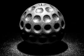
Texture Enhancement: Side lighting, where the light source comes from the side of the subject, creates shadows that define and accentuate textures. This technique is often used in portrait photography to enhance facial features and in still life to bring out the texture of objects.
Example: When photographing a crumpled piece of fabric, side lighting can cast shadows in the folds, highlighting the texture effectively.
Original photograph of paper ball.
3. Backlighting
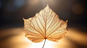
Silhouette and Edge Definition: Backlighting occurs when the light source is behind the subject. This can create silhouettes and emphasize the edges of textured subjects, but it might obscure finer details unless the subject is translucent (like a leaf).
Example: A backlit leaf can show intricate veins and textures if the light shines through it, but a backlit rock may lose its details.
4. Top Lighting
Flat Texture Effect: When light comes from above, it can flatten the texture, making it less pronounced. This is often useful for creating even illumination in food photography, where you want to show the overall look of a dish rather than its texture
5. Low Angle Lighting
Dramatic Texture: Low-angle lighting can create long shadows and enhance textures dramatically. This is especially effective for landscapes or architectural shots, where the texture of the ground or building surfaces is emphasized.
Example: Photographing a rough stone path at sunset with low-angle light can create long shadows, enhancing the texture of the stones.
6. Coloured Light
Mood and Texture Perception: Using coloured gels or filters can affect how textures are perceived. Warmer tones might make textures feel softer or cosier, while cooler tones can give a sharper, more clinical feel. Experimenting with coloured light can help you convey different moods through texture.
Photoshoot + PnX process to slim down options
Finalised Selection of Photographs
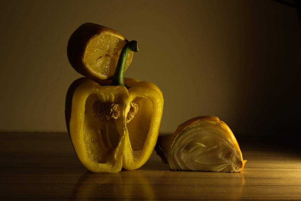
Original ISO 100 f / 5.6 1/15 sec 24mm ( settings carried on for all photos except focal length)Edited SAT -100 Shadows -100 Expo – 0.78 contrast +23 Texture +50 ( same settings used further on)
Shoot summary
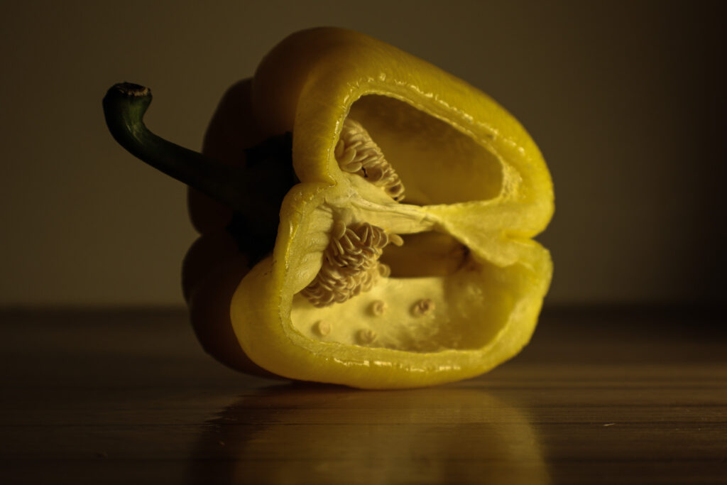
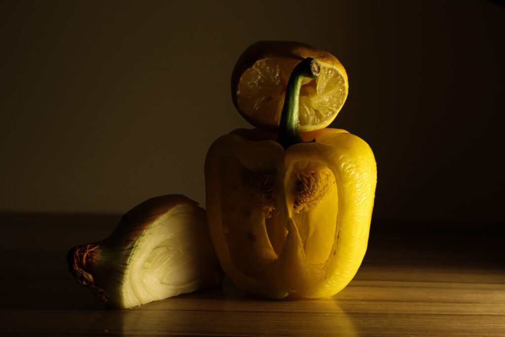
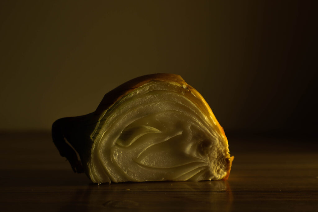
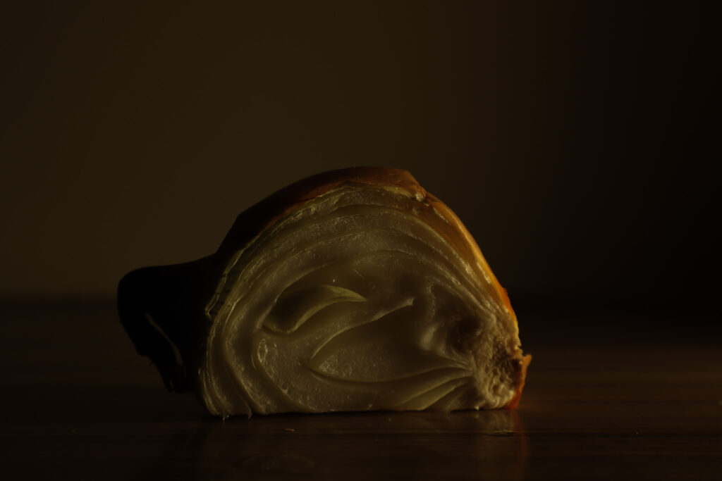
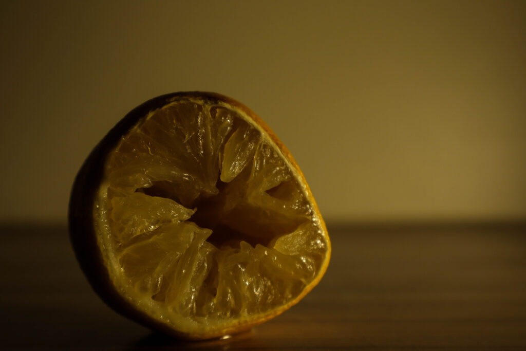
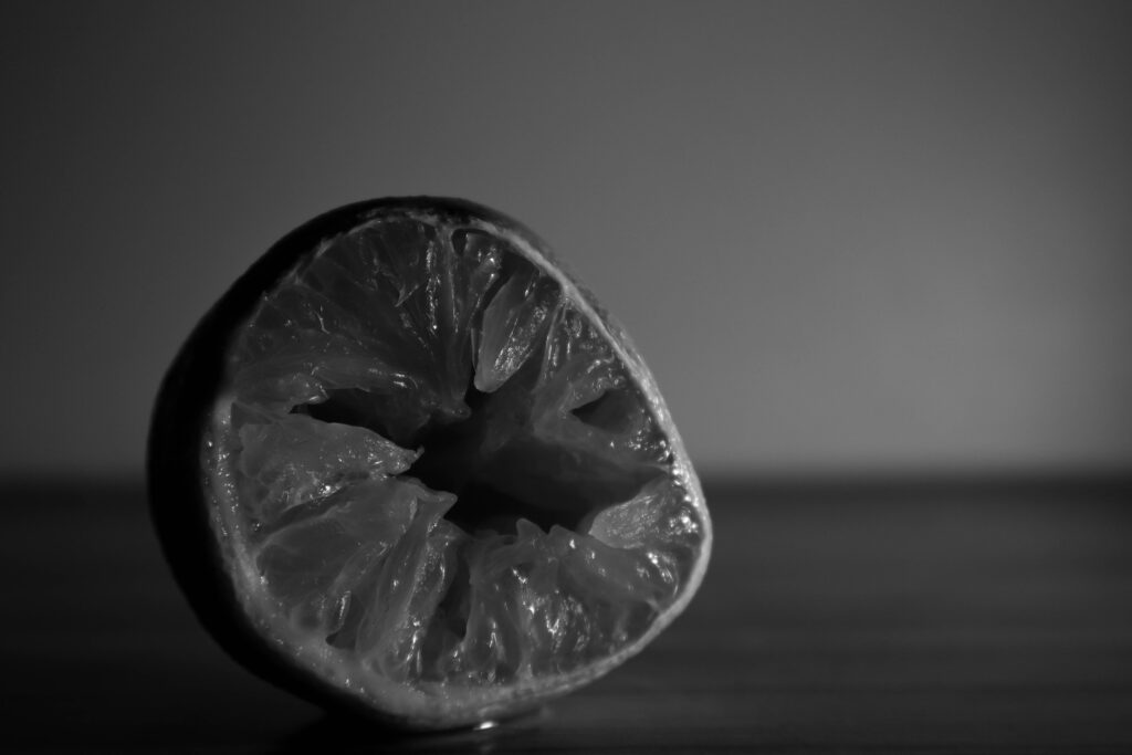
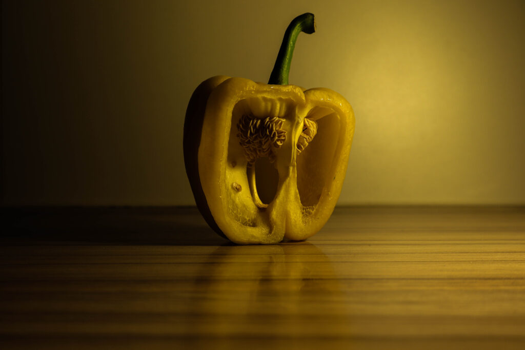
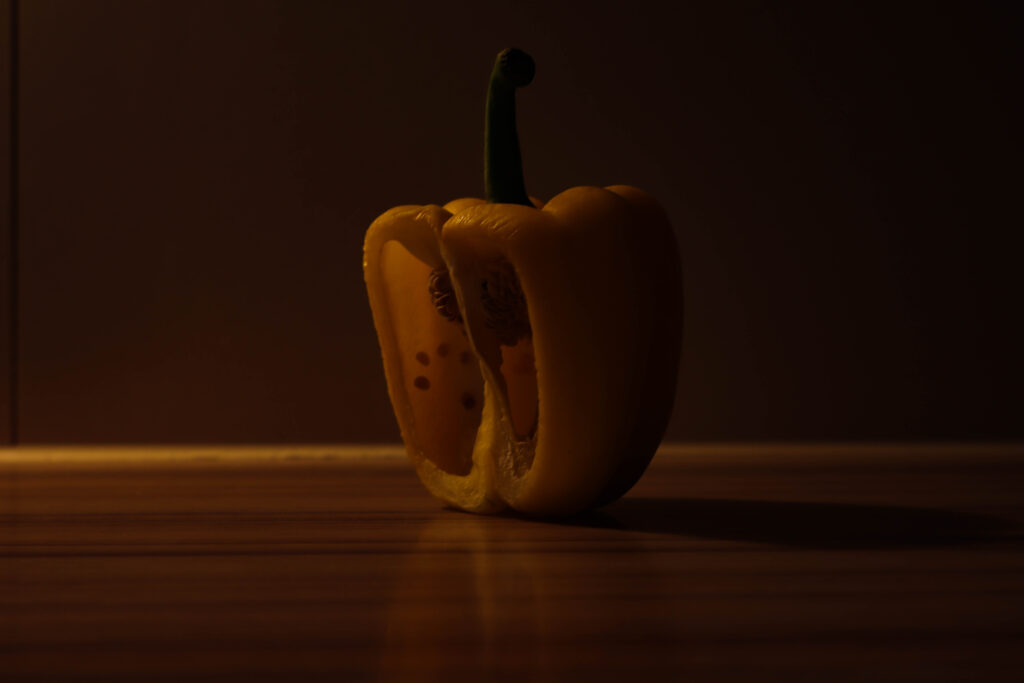
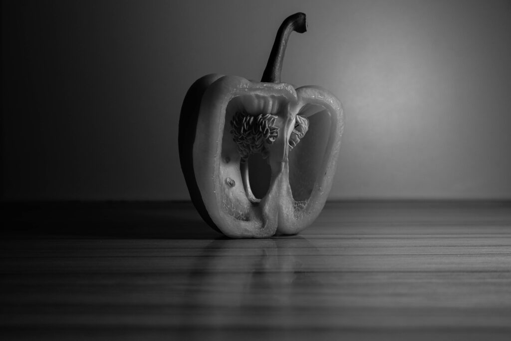
In this series of images, my goal was to capture the intricate textures of the yellow pepper, onion, and lemon. To achieve this, I left them sliced open for a day or so, allowing their skins to dry and develop more pronounced wrinkles and edges. This added an organic, tactile feel to the subjects, which is a nod to Edward Weston’s approach of emphasizing texture in his work. By letting the surfaces age slightly, I could highlight the roughness and imperfections, which contrast beautifully with their smoother interior sections.
I used hard side lighting across the series to accentuate the edges and ridges of the fruits and vegetables. The strong light source really made the textures pop, casting shadows that enhance the contours and fine details of the dried surfaces. It was essential to bring out those natural lines and depth, giving the objects a more three-dimensional quality.
To add a sense of freshness and visual interest, I coated the vegetables, fruit, and the wooden surface with water. This created a dynamic reflection and added to the textures, balancing the dryness of the skins with a sense of moisture and life. The water coating helped elevate the visual impact by introducing contrast between the dry textures and the glossy reflections, giving the series a fresh yet natural feel.
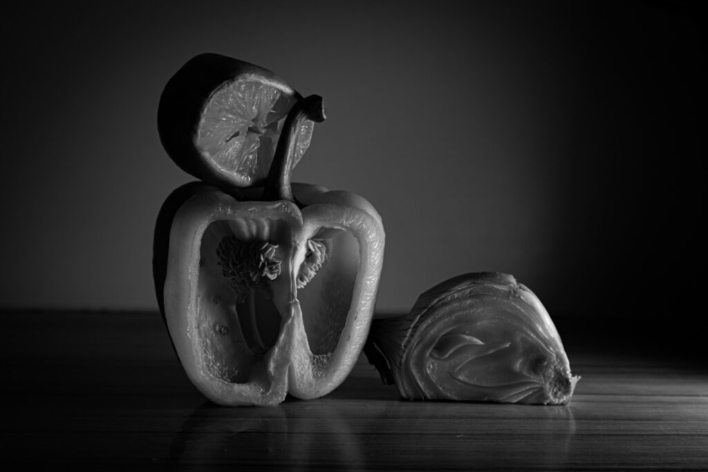
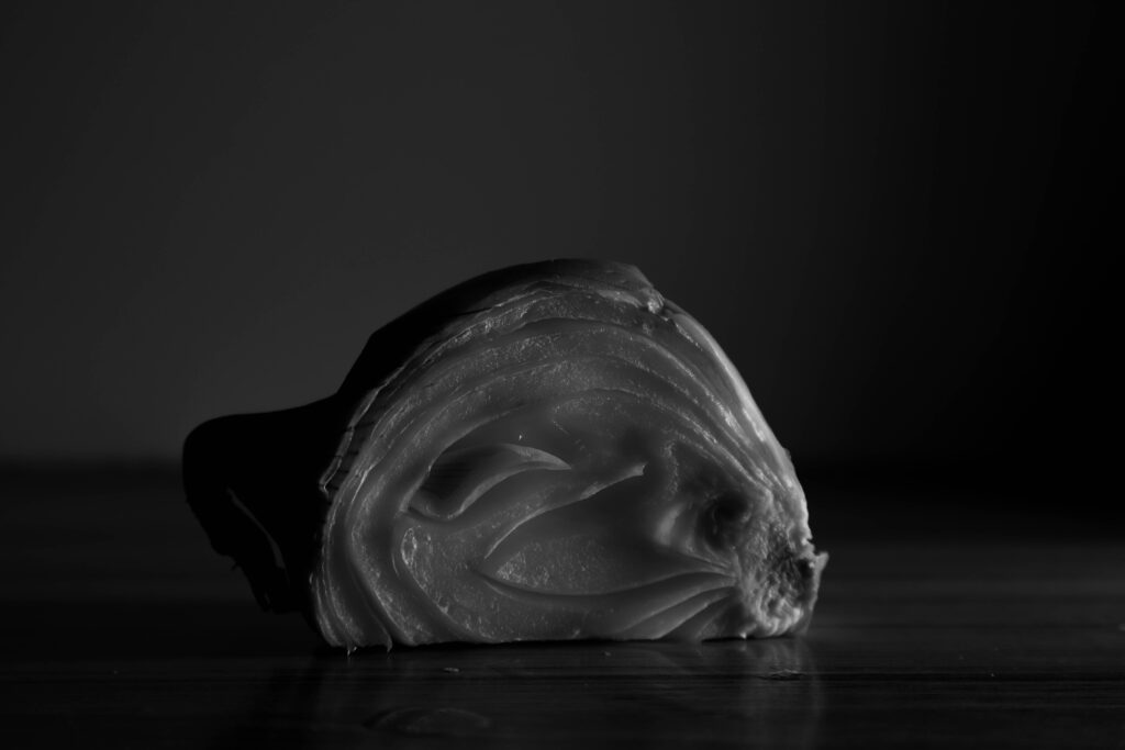
Editing
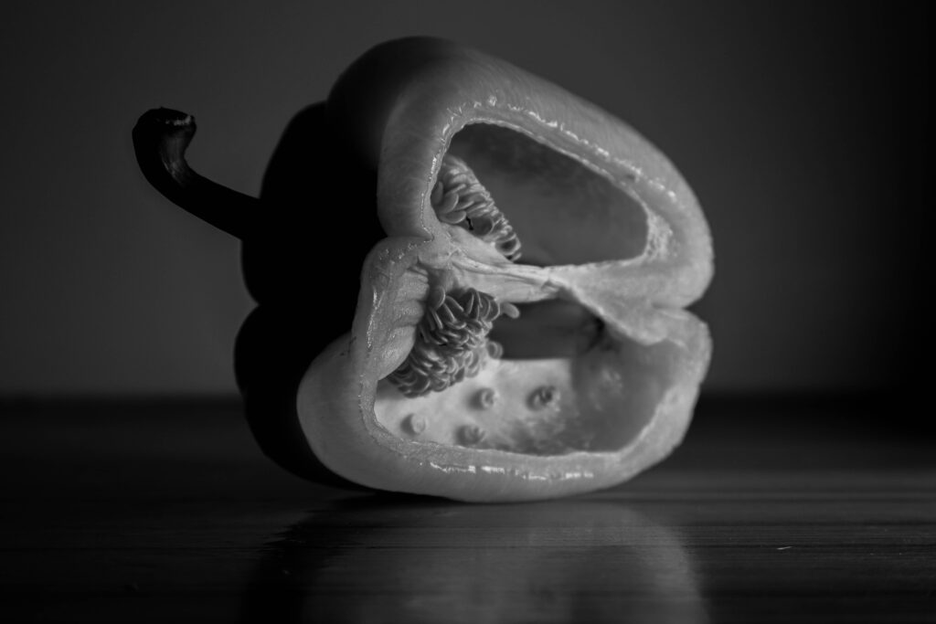
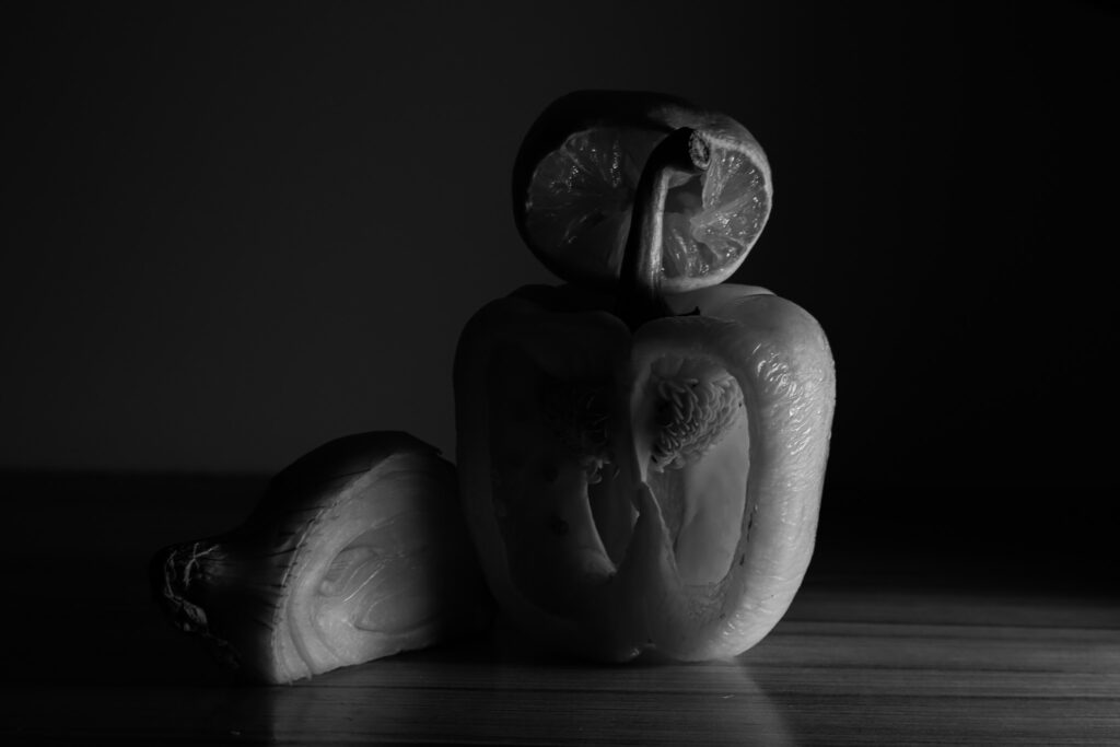
Just like Edward Weston, I chose to convert my images to black and white, which further emphasizes the textures I wanted to capture. By removing the distraction of colour, it lets the viewer focus more on the contrast between the light and shadows. The monochrome palette heightened the details of the dried skin, the wrinkled surfaces, and the organic forms of the pepper, onion, and lemon. The lack of colour allowed the intricate textures to become the main focus, highlighting every ridge, crease, and line. This decision, inspired by Weston’s approach, helped enhance the sense of form and texture, making the photograph feel more dramatic and rough.
I also decided to turn down the exposure on the original image due to the artificial lighting of my lamp, the lighting is very strong and bright , and i wanted to add a more natural feel and diffuse the light slightly.
Lines are a great starting point when thinking about formal elements, as they are almost everywhere.
Start by looking for lines in your composition that can guide the viewer through your shot or to a specific focal point. These are known as leading lines. Your lines don’t necessarily need to be straight, horizontal or vertical; they can be curved, angular, or random too. Angular lines that converge into a central point, commonly known as a vanishing point, will add perspective to your image. Think of how a straight road or railway line naturally disappears to a central point on the horizon – this is a classic example of a vanishing point.
Shape
Regarding shape in photography, this usually means a 2D subject outline. In contrast, form refers to a shape with a more 3D appearance. We’ve put these two together for this video as one formal element.
Effectively representing shape and form in your compositions can turn objects, landscapes and figures into defined, striking focal points. Using various lighting techniques, such as backlighting, silhouettes, and paying attention to shadows, will help elevate the shapes and forms in your shot.
Space
Building space into your compositions creates a sense of scale and brings added depth to your shot. It can also provide breathing room for your image’s main subject, allowing the viewer to focus on the scene’s primary features.
Adding space to your compositions is particularly useful with outdoor photography, where you may want to emphasise the scale of geographical features – such as mountains and bodies of water. However, you can add space effectively when shooting almost any photographic subject.
Repetition
Repetition in photography refers to the technique of integrating recurring elements, patterns, or themes in a composition to produce a sense of rhythm and balance in an image.
Pattern and repetition in photography hold the viewer’s attention by using strong repetitive elements. The patterns can keep the eye anchored or move it around an image using line
Texture
Texture in your composition can bring your image to life by giving the viewer a tangible connection with it, and is particularly popular in macro photography. You can draw textures out of all kinds of surfaces and environments. And to do this, you can use a wide range of lighting setups and shoot with a variety of depth-of-field.
Textures are ideal for experimenting – try different setups and see what you like. You can use flat light with the camera head-on to bring out the surfaces of a weathered wall. Or, use backlighting for ripples in dunes, shallow depth-of-field for intricate materials, and long-exposure to get the silky-smooth look of flowing water.
Colour
A prominent colour in your image whether it’s a concrete colour block or a set of similar colours that form a palette can make a bold statement in your shot.
Colours can also convey a mood to your image that will be emotive to the viewer. And you could also single out one particular colour to make a striking statement and have it ‘pop out’ of your shot.
Tone
Focusing on tone in your image means using variables of contrast and light and dark areas to bring depth to your image.
The tone is fundamental in black-and-white photography, where it should be used to guide the viewer through your image where there is no colour present to focus their attention.
Practice makes perfect when it comes to tone, and we recommend trying different lighting scenarios and contrast levels for your preferred aesthetic.
ISO regulates how much light is allowed to enter your camera, determining the brightness or darkness of your photos. A greater ISO number signifies increased sensitivity and better light-capturing capability, resulting in potential graininess in the image. A cleaner image is achieved when a higher amount of light is required to properly expose the image, resulting in a lower ISO number. High ISO is typically ideal for low-light conditions, particularly when a quick shutter speed or a small aperture is needed to meet creative objectives. Texture in photography refers to the visual aspect of an object’s surface, which can be seen through variations in shape, tone, and colour saturation. Texture brings life and vibrancy to images that might appear boring otherwise.
Exploring the effects of ISO:
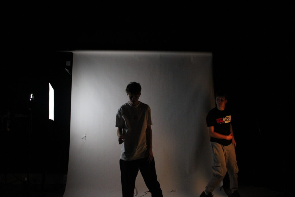
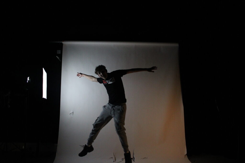
I focused on using ISO for these images to create light and dark images. In both photos I had a set shutter speed on the automatic focus ,however I changed the ISO in both images ,so in the first photo I used a low ISO at 200 which created the shadows to appear darker. Where as in the second photo I used a high ISO at 800 which created a shine within the lighter parts of the image giving the photo a reflective realism.
Texture is how colours and shapes are captured in an image, allowing you to visualize the texture and quality of an object/objects.
Minor White
Minor White was a key American photographer and writer who made a big impact on photography. He was especially known for his artistic approach and the way he explored deep themes in his work.
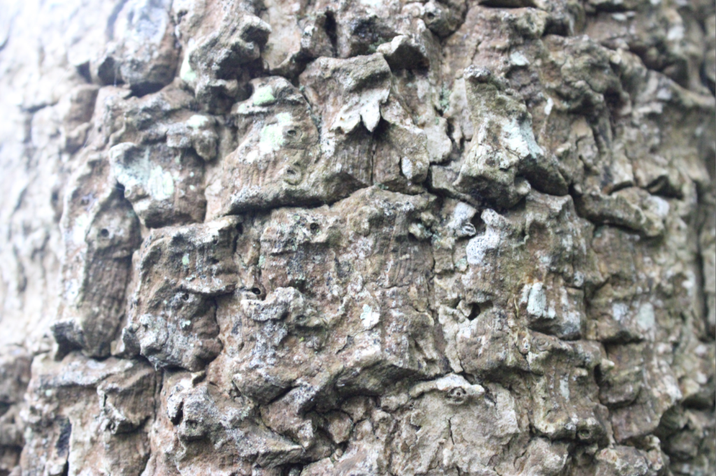
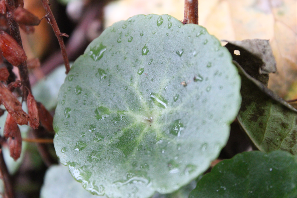
Minor White’s nature textured photos are a really interesting l part of his work and they have inspired me to use natural forms for this texture experiment.
He had a knack for capturing the little details and beauty of the natural world. His images often focus on textures in landscapes, plants, and other natural forms, playing with light and shadow to create depth, which I have utilised in my images.
By getting up close and using shallow depth of field, he makes those textures stand out, giving his nature shots a really intimate feel. His love for nature comes through in his photos, making them not just pretty pictures but also something to think about. They evoke feelings and spark contemplation, making them relatable on many levels.
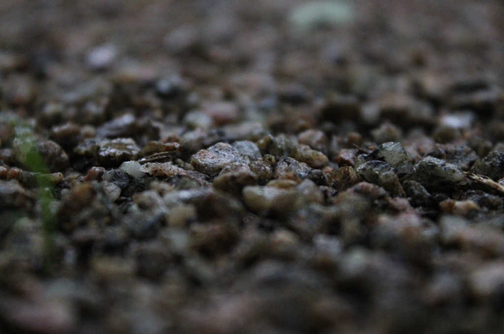
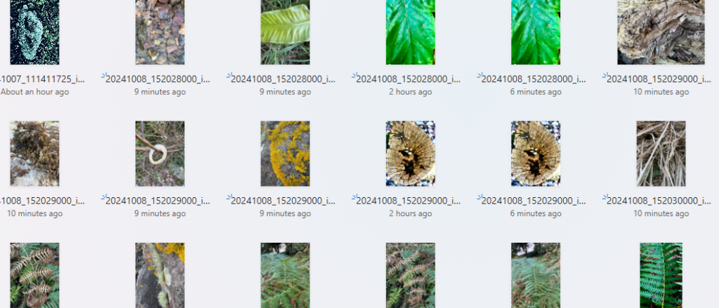
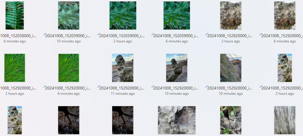
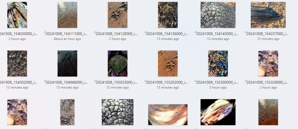
Contact sheet – all photos I have taken
Strongest Images – with preliminary editing
I took the majority of these images up-close in order to capture the texture of the materials. This resulted in a couple of the images become abstract and unrecognizable which I like. Many of the images are deadpan images which create a sense of detachment and sharpness throughout.
My Best Images
Unedited ImageOne edited version of the ImageAnother version I edited of the Image
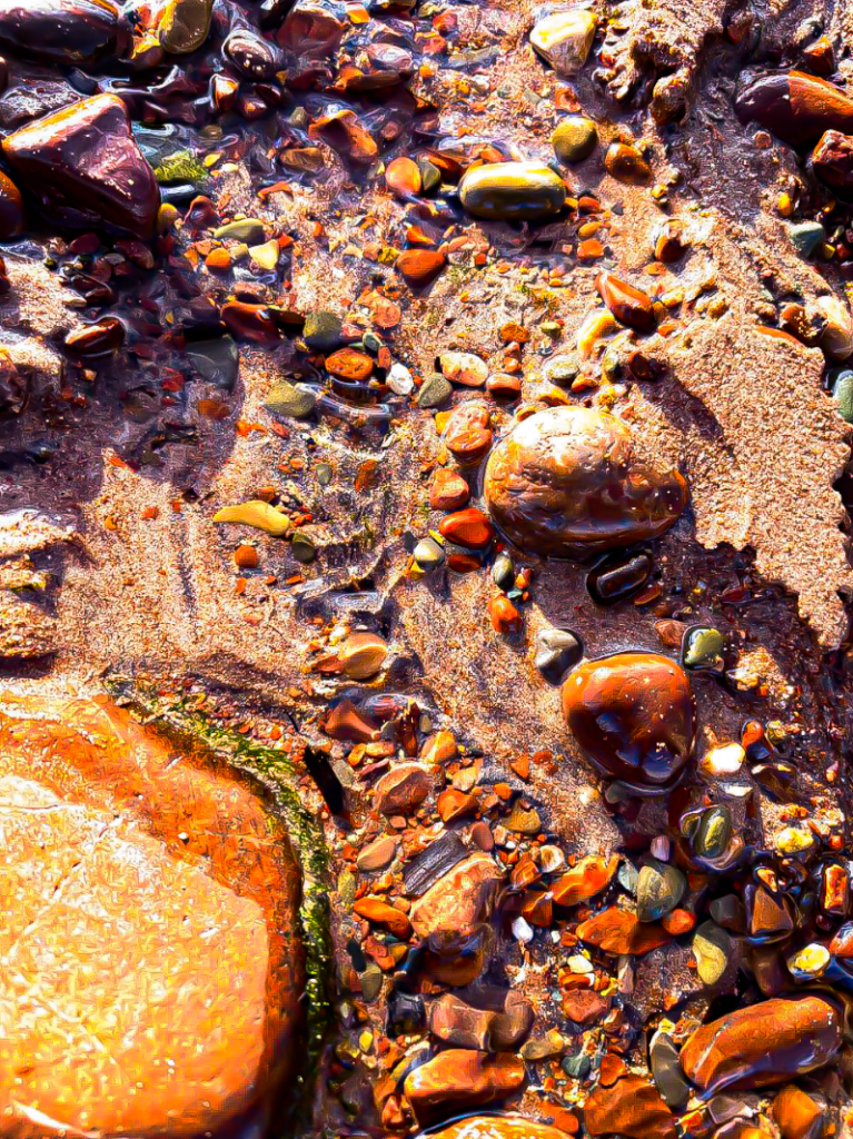
This is my favourite version of the image that I edited on my phone. I like this image because it creates a sense of ‘golden hour’ as it looks like the sun is casting golden light over the pebbles. I did this by increasing the warmth in the image and turning up the exposure which exaggerated the light areas. I like how the light hits the high points of the pebbles because the light creates shapes on the pebbles surfaces, enhancing the image. I also increased the contrast which allows the texture of the pebbles to become more apparent.
Unedited Image
This is the edited version, I like this image because you can’t immediately recognize what it is, so you aren’t distracted by the material itself, your only focused on the texture. I like how there is a vague pattern in the texture which enhances the impact of the image. With editing the silvery colours are exaggerated which gives the surface a metallic appearance.
Unedited image
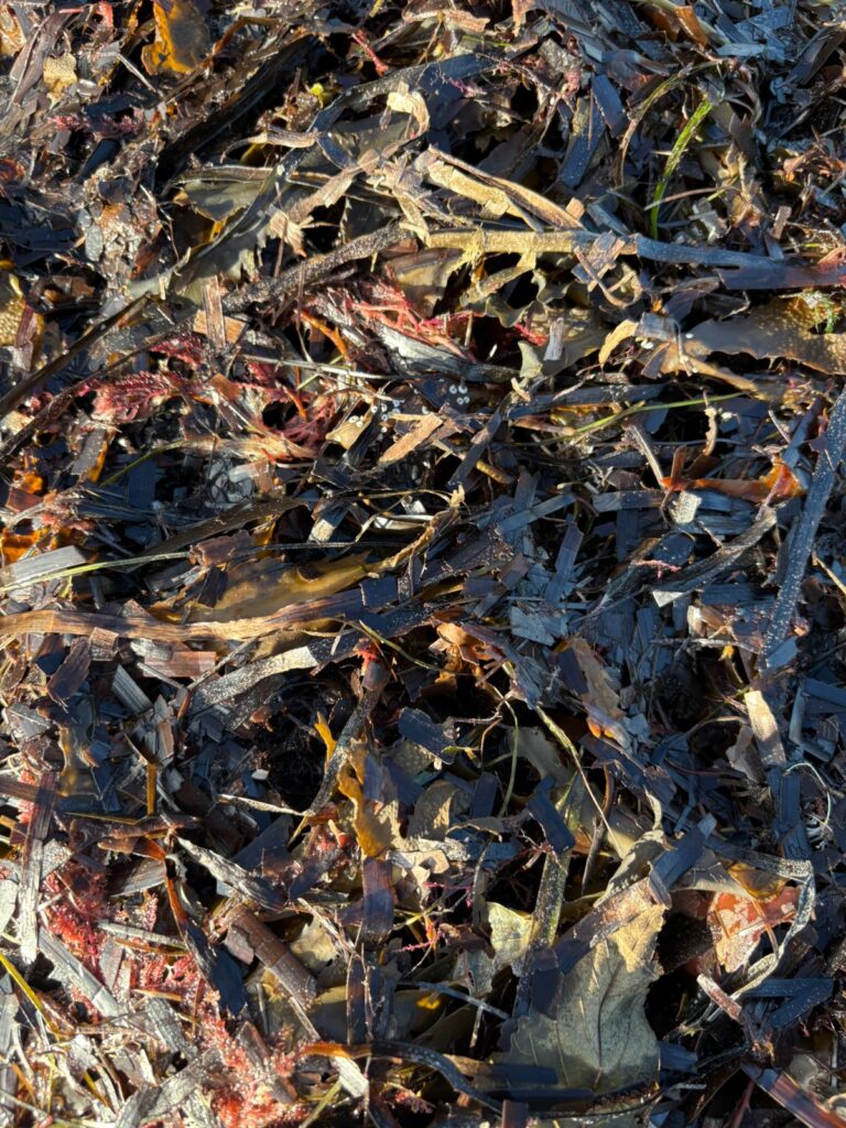
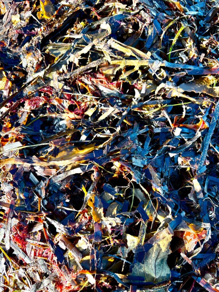
This is the image after I edited it on my phone. I like this image because of the texture created by the overlapping of the sea weed. I increased the exposure in order to contrast the lighter and darker areas. I also increased the saturation and vibrancy which made the dull colours become brighter.
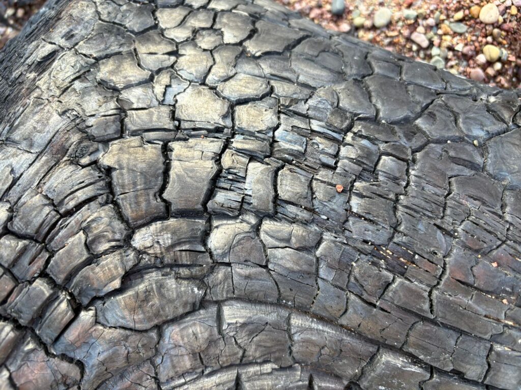
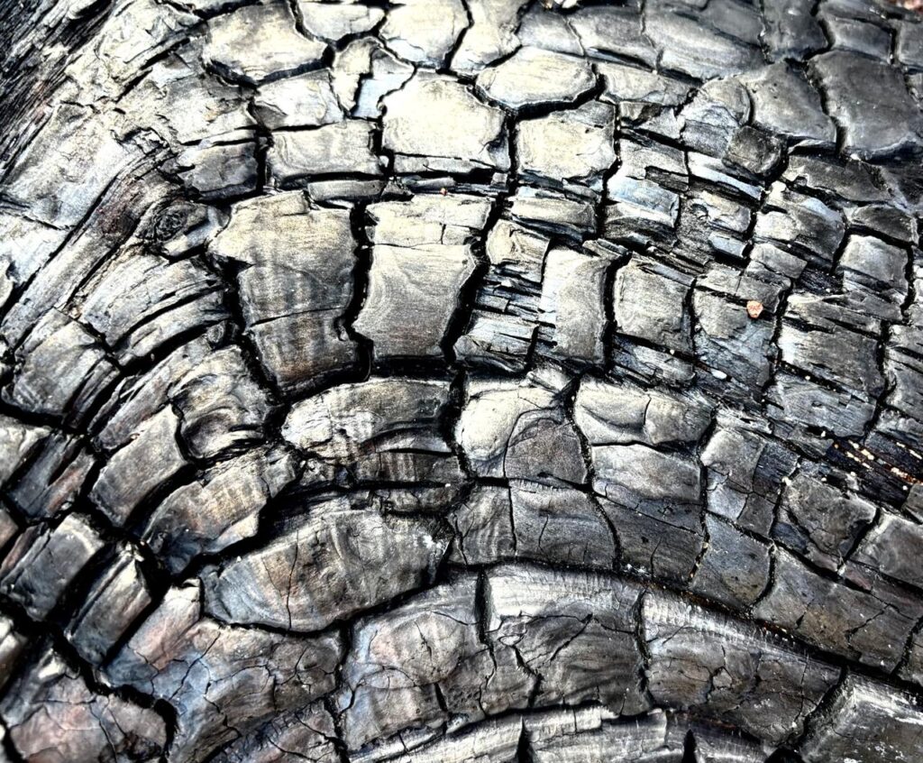
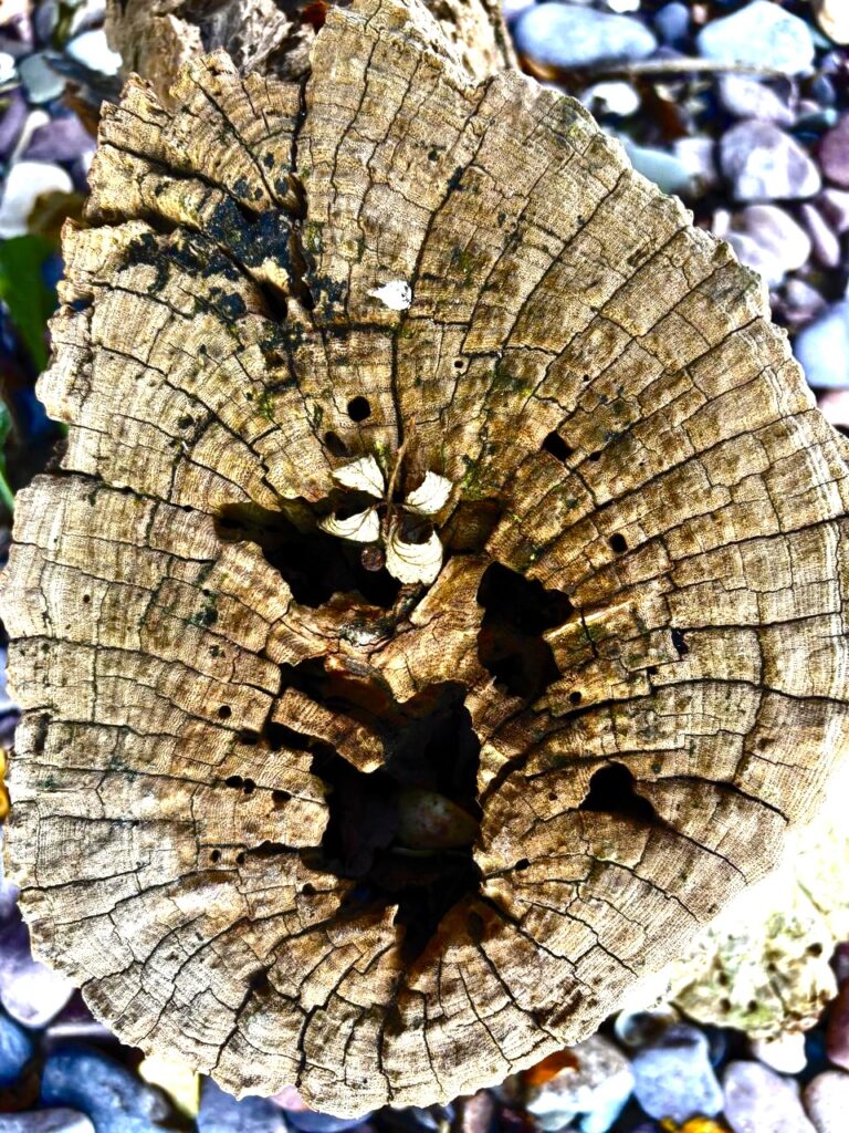
I love this image as you can clearly see every line and crack in the wood. I contrasted the light and dark in order to make these lines stand out even more and create an even wider range of tone. I also like how there is a ring of warmer colours which fade into lighter, cooler colouring. The focus is on the wood whilst the stones around it have a softer focus, I think this creates sharpness and definition as it is being contrasted with the background.
Edits on lightroom/photoshop
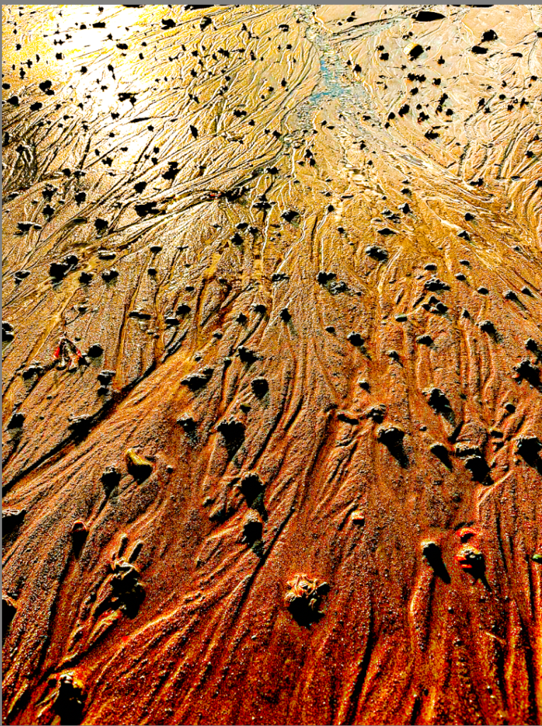
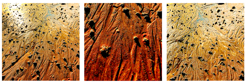
I like this image because of the warm tones throughout which are contrasted against the dark markings in the sand as this creates texture. I decreased the exposure which exaggerates the darker red tones up close and makes the reflections in the background appear lighter.
Original Image
I edited this image to be black and white to take the focus of the colours in the image and allow the texture to be the main point of focus.
Experiments
I used photoshop to experiment with editing this image:
Using the sepia tool to change the colours in the image:
My Final 3 images
Cropping
Here I cropped each image 3 times to see which version was the best.
Layout Experimentation
Final Images
Images in Virtual Gallery
Evaluation
Overall, I have used organic shapes, combined with busy textures and a vibrant use of highlights and shadows. All these elements enhance the formal elements throughout my photos.
Throughout my images I have focused on organic natural shapes and enhances the highlights, which creates a consistent warm tone throughout the group of photos. Throughout this collection I have also tried to achieve consistent shadows to add depth which also enhances the organic textures and shapes.
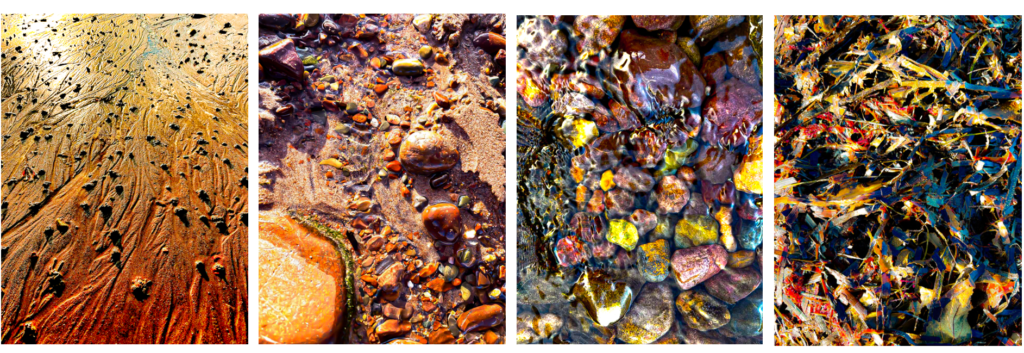
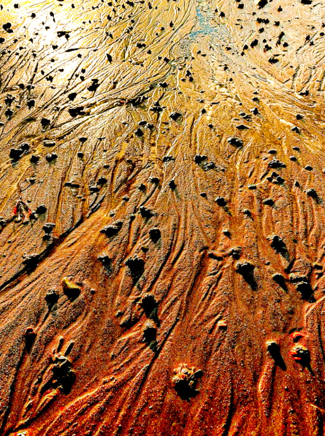
My first image I edited multiple times, this version is my favourite due to the use of textural lines that create a path that pulls you through the image. adding depth and perspective. The foreground of the photo has a darker tone of deep burnt orange which blends to a bright yellow towards the top (background) of the photo. This variation in tonal range adds balance to the composition. This creates a wide tonal range within the image. The lines also break up the texture of the sand by enforcing some areas to seem smother and others to appear more texturized. The bumps of sand exaggerate the shadows and highlights as they are raised and some areas are hit by the light and others aren’t, this adds to the overall texture of the image.
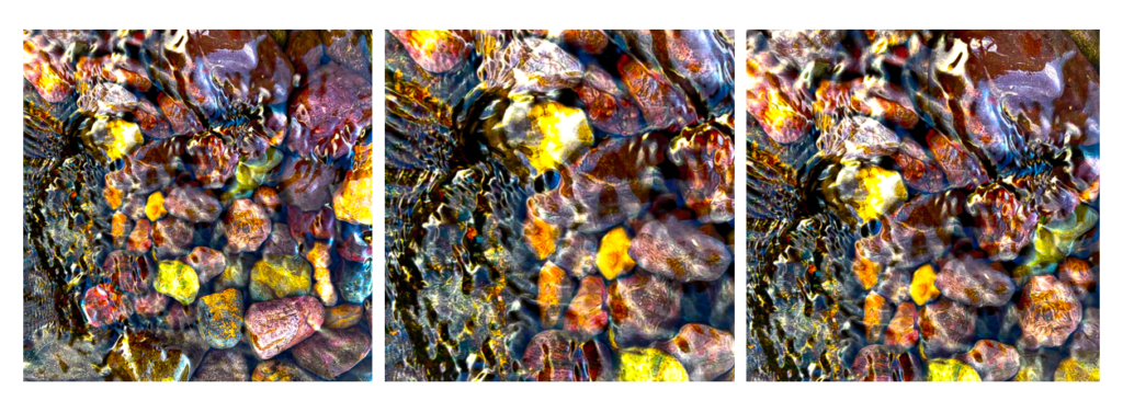
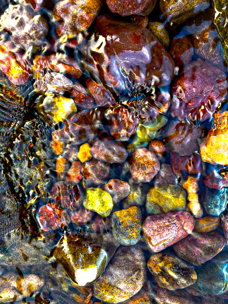
In contrast, this image has less depth to it and it’s been taken at a deadpan angle. Unlike the first image which takes you on a path, this image focuses solely on the shapes of the pebbles and the reflective surface of the water. The vibrant areas on the pebbles stand out which creates a bright formation of colours, beneath the rippling water. These colours are framed by the shadows around the pebbles, this creates texture and contrast within the image.
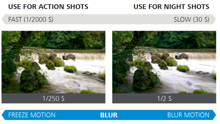
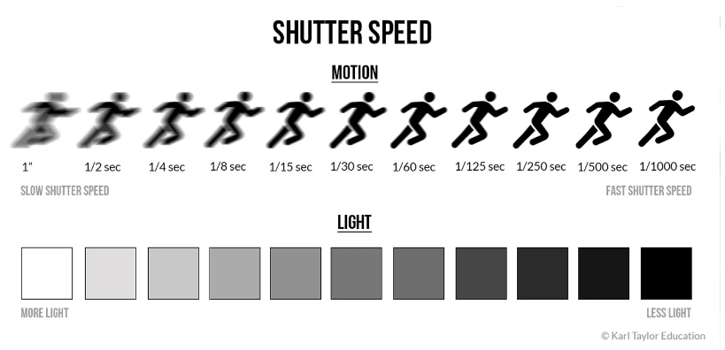
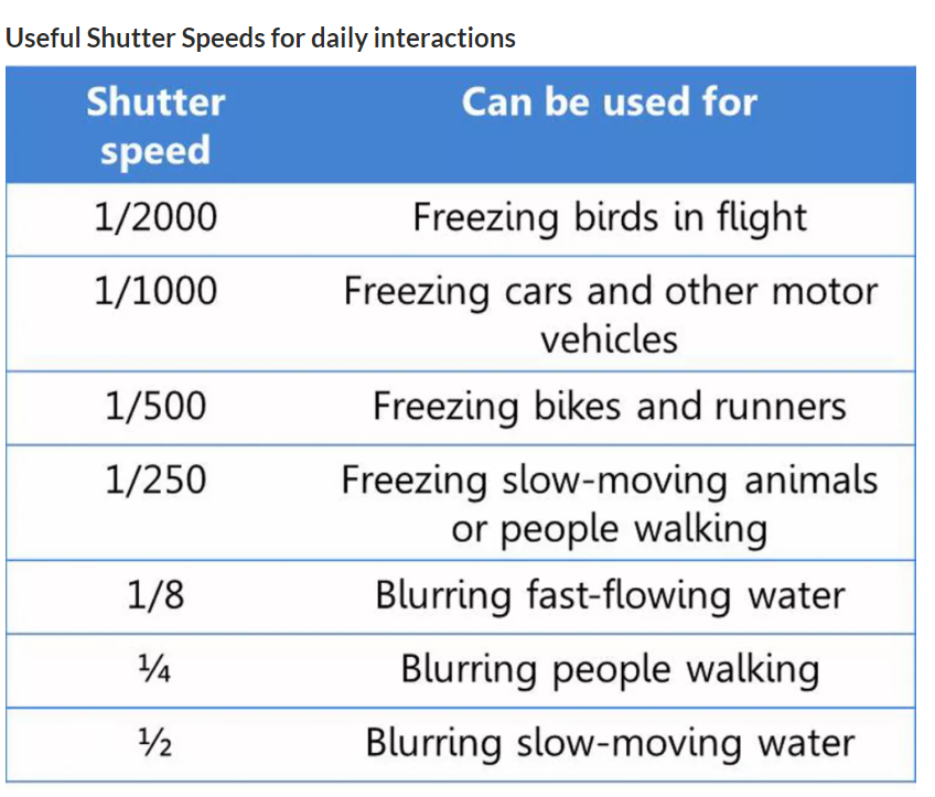
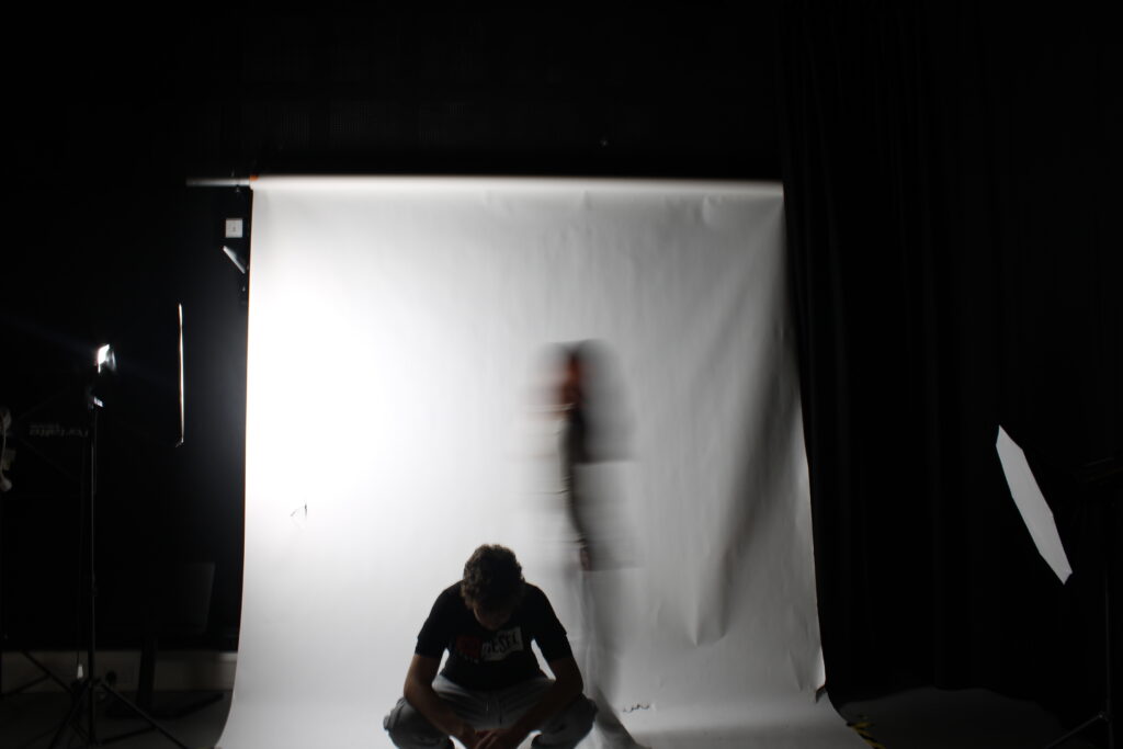
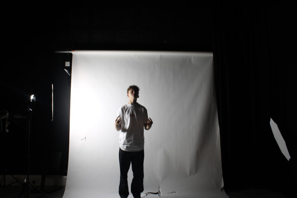
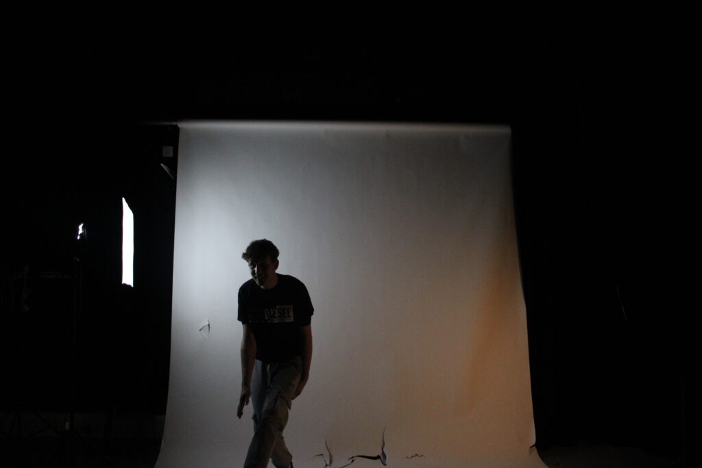
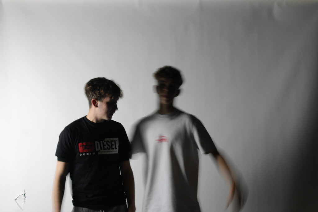
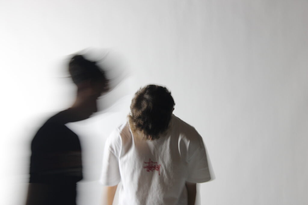
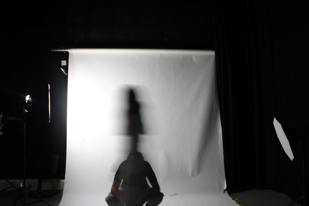
its the speed at which the shutter of the camera closes, there is different types of shutter speeds
a slow shutter speed setting which allows a greater amount of light. changing your cameras shutter speed is one way to adjust the overall exposure of an image, also it allows you to be creative by being able to control the amount of blur or lack of it in your images.
the slower the shutter speed the more motion blur your camera will be able to capture when shooting fast moving subjects. but with long shutter speed from two to 30 seconds, any movement in the image will blur. this can create a cool effect with landscapes and the sky, as water and clouds turns soft and streaky.
when we take the photo, the cameras shutter opens, which allows light to reach the recording medium, where an image is made. by controlling hoe long the shutter stay open, we are able to control the resulting image will be like.
which is also known as “exposure time”, shutter speed is measured in seconds or fractions of a second, for example a slow shutter speed of 1/2 means the shutter remains open for half a second, while faster speed of 1/2000 which means it only remains open for one-two-thousandth of a second.
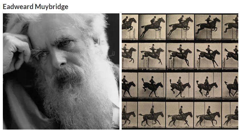
Eadweard Muybridge used fast shutter speeds, around 1/1000th of a second, to capture motion in his famous 1878 The Horse in Motion series. This allowed him to freeze the movement of animals and humans, pioneering motion photography and laying the groundwork for early film technology.
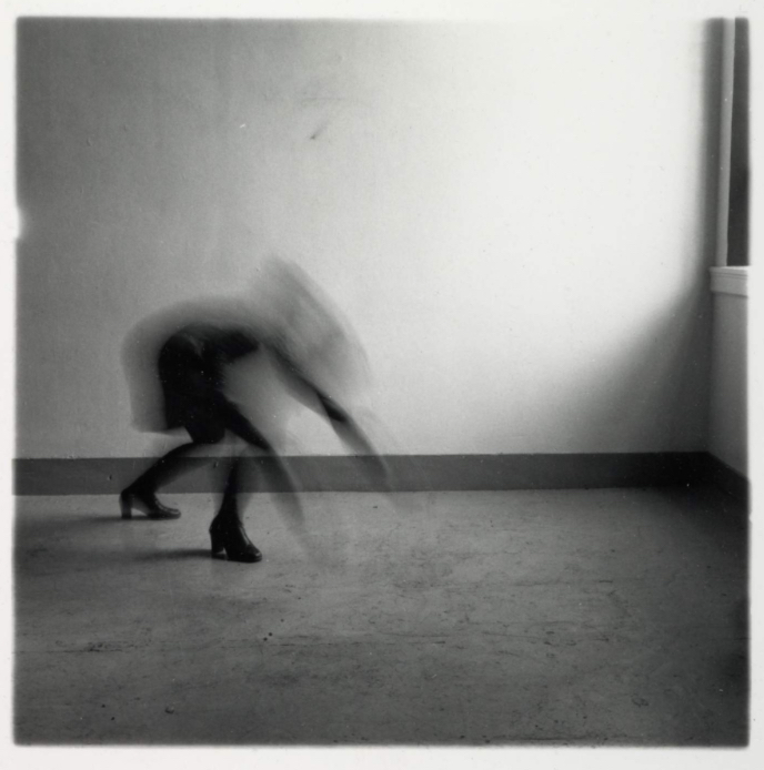
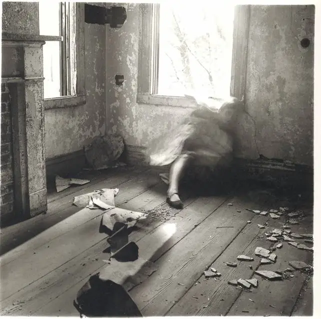
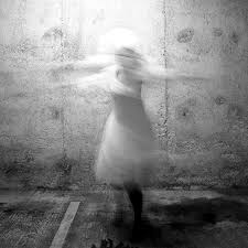
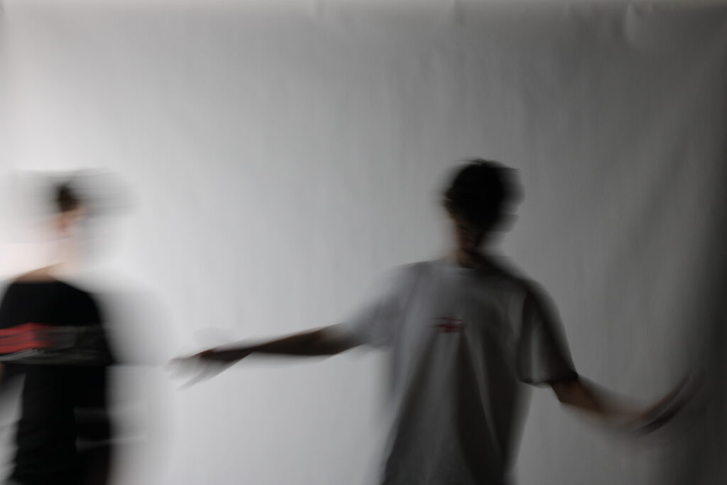
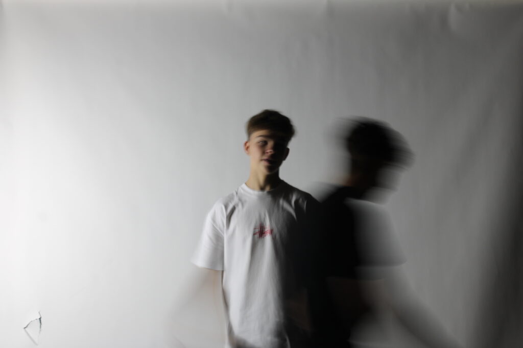
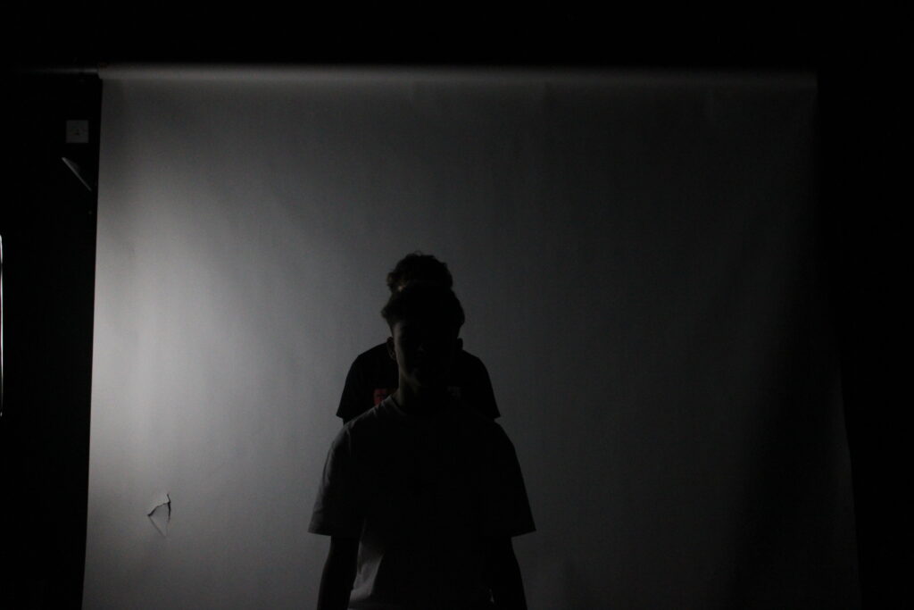
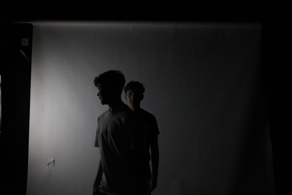
Francesca Woodman – slow shutter speeds
Francesca Woodman often used slow shutter speeds in her photography, which contributed to the dreamlike and ghostly quality of her images. By using long exposures, she created blurred, ethereal effects, particularly when capturing herself or her subjects in motion. This technique added a sense of fleeting presence and emotional intensity to her work, emphasizing themes of identity, fragility, and the passage of time.
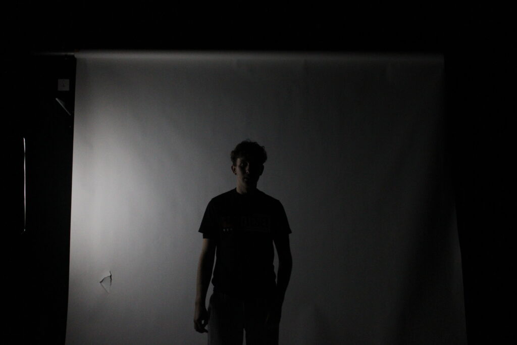
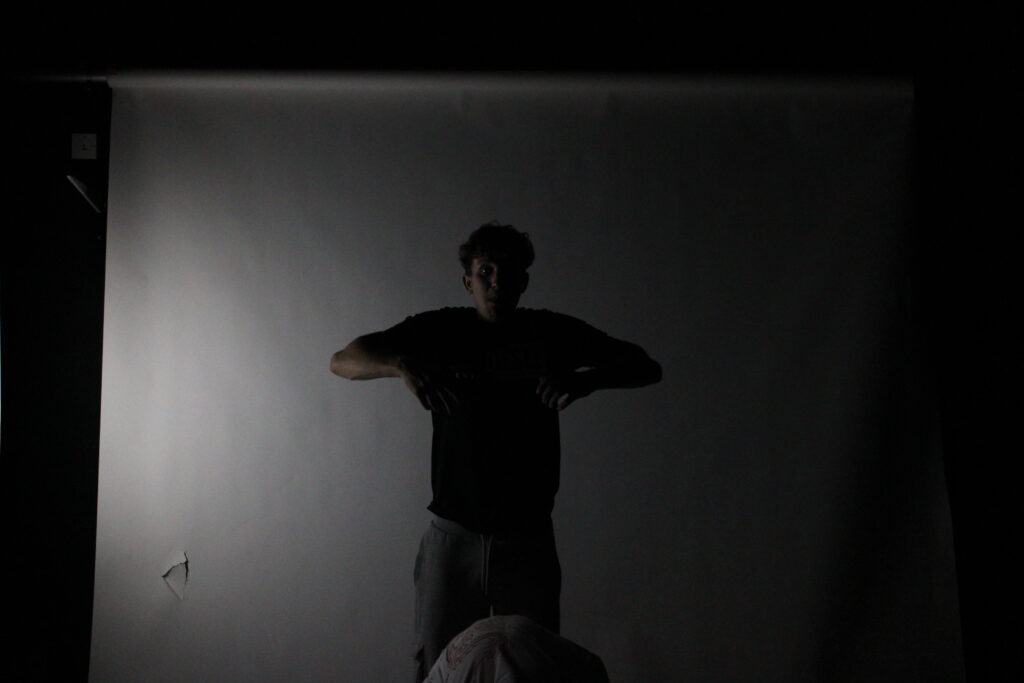
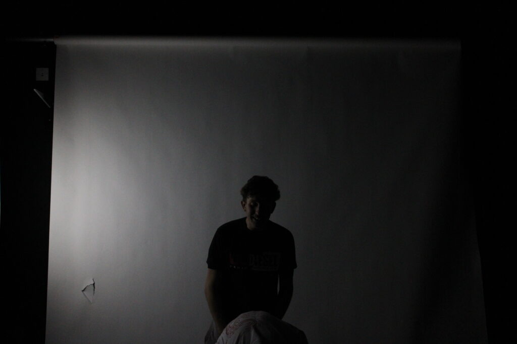
Some of my examples with a high and low shutter speed