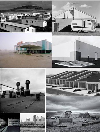
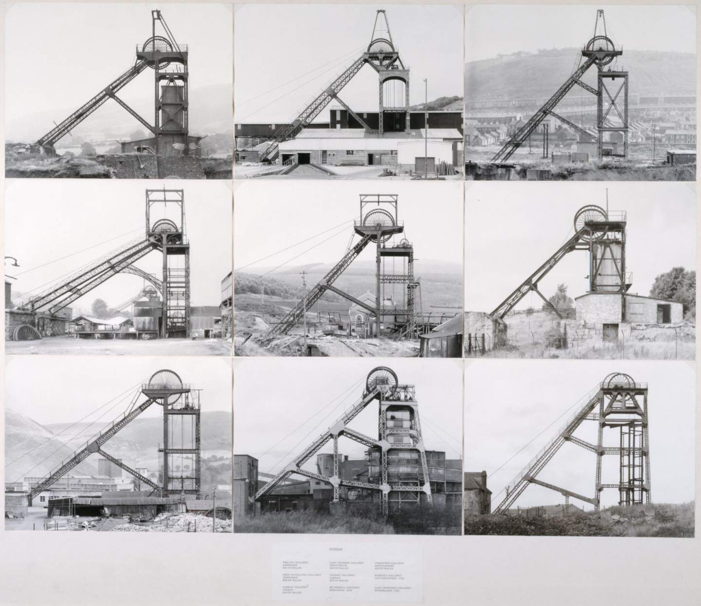
The new Topographics was a term made by William Jenkins which was used to describe a group of American photographers whose photos had a similar banal aesthetic. in that they were formal and mostly taken in black and white, there photos also consisted of the urban landscape around them.
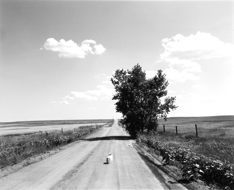
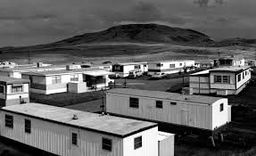
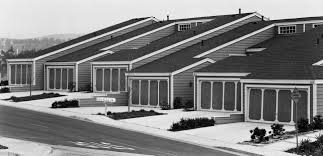
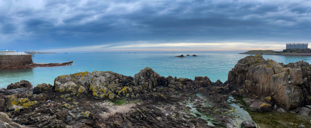
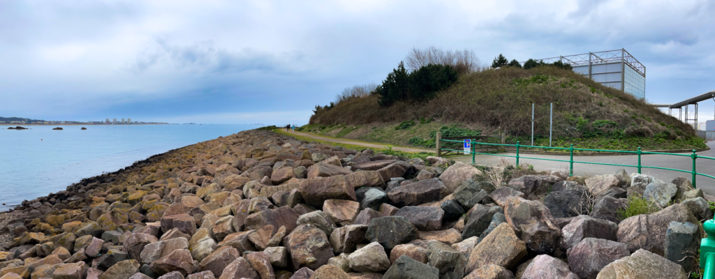
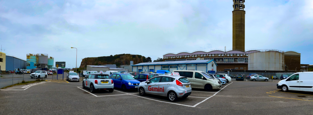
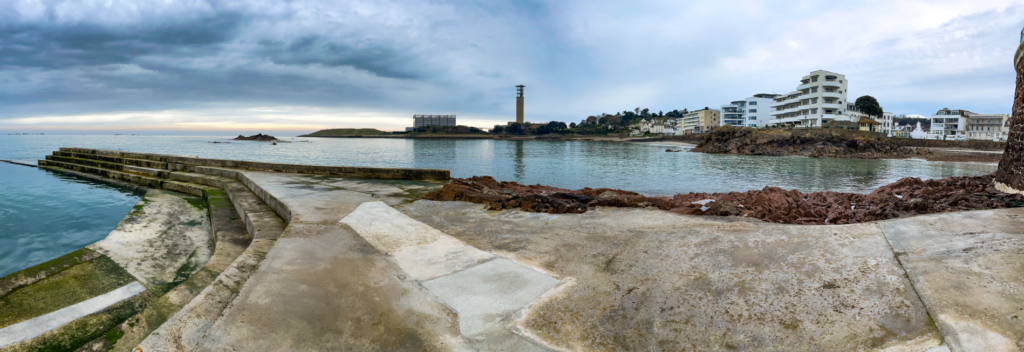
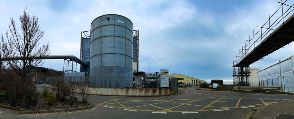
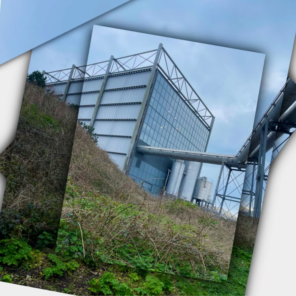
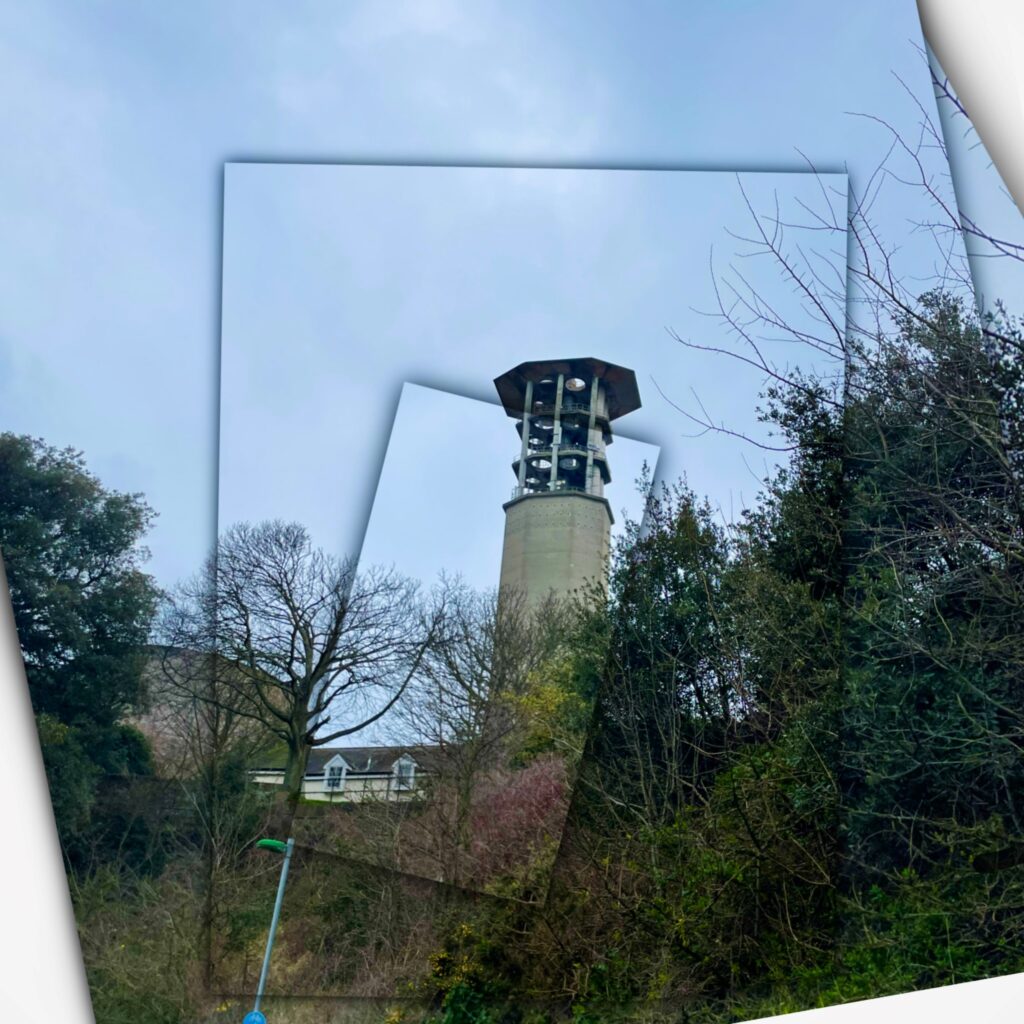
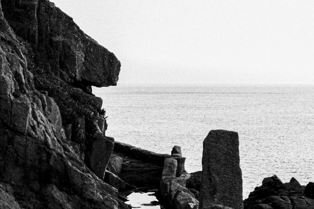
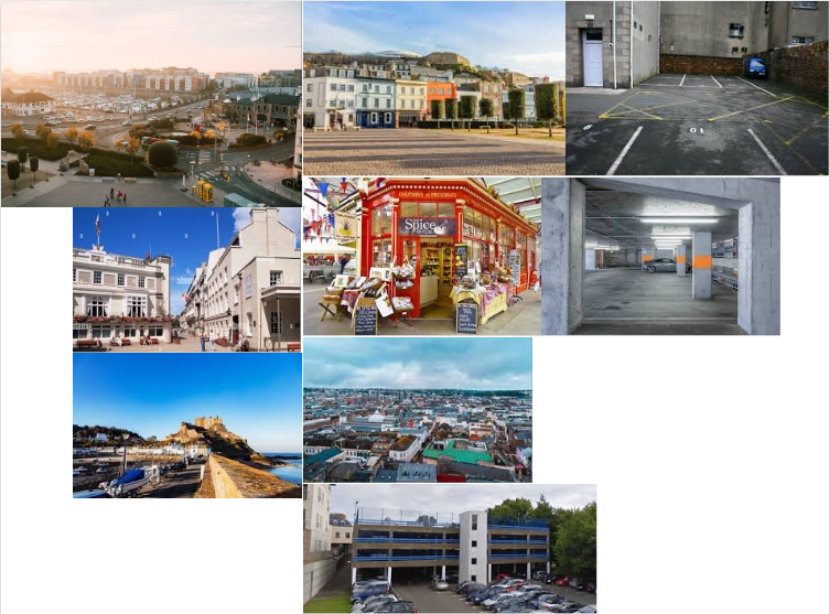
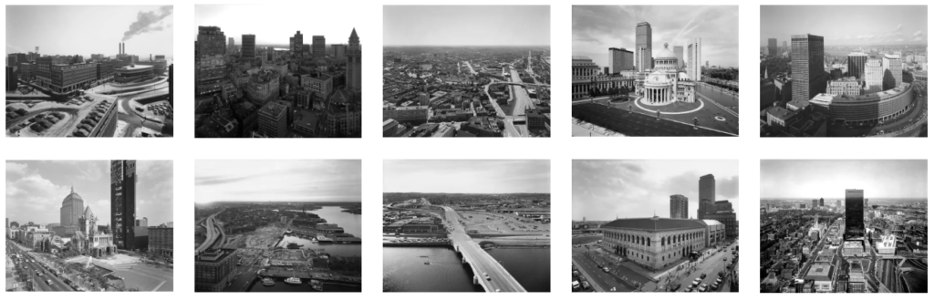
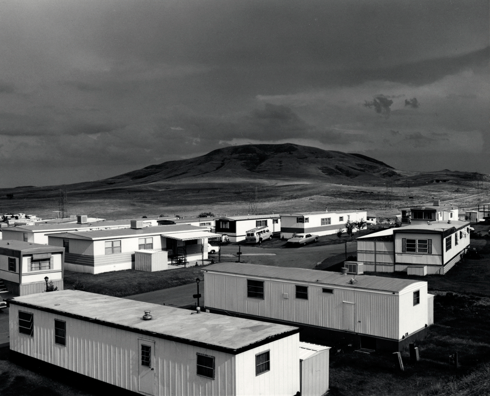
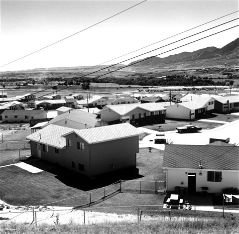
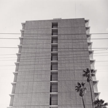
The New Topographics mostly focused on Man-altered landscapes such as homes packed together, industrial buildings, roads and anything that disrupted the view or area of natural landscapes.
Historical context
The New Topographics were mostly made in response to the fast increasing suburbanised world around them. Topographic photos were taken around the 70s and the historical context of why America were becoming more suburban is that in post-war America, to accommodate all the returning soldiers coming home and to keep up with the new innovations in the industrial sector, they decided to build more buildings and more homes as well as more roads so vehicles (which were rising in popularity more and more) could drive along these paths. As a result it ended up transforming areas, which were previously natural and contained good views of the landscape ahead into buildings and roads which expanded for 100s of miles in each direction which resulted into landscapes beyond these buildings being barley visible and big natural areas being removed in order to build these man made structures.
Why were Photographers interested in these structures?
Most photographers took pictures of these manmade structures to show the growing unease of how natural landscapes were being replaced and removed by industrial development. Places once natural and untouched were now cleared and terraformed in order to make space for buildings and roads which would be placed instead.
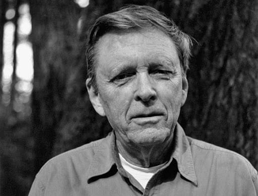
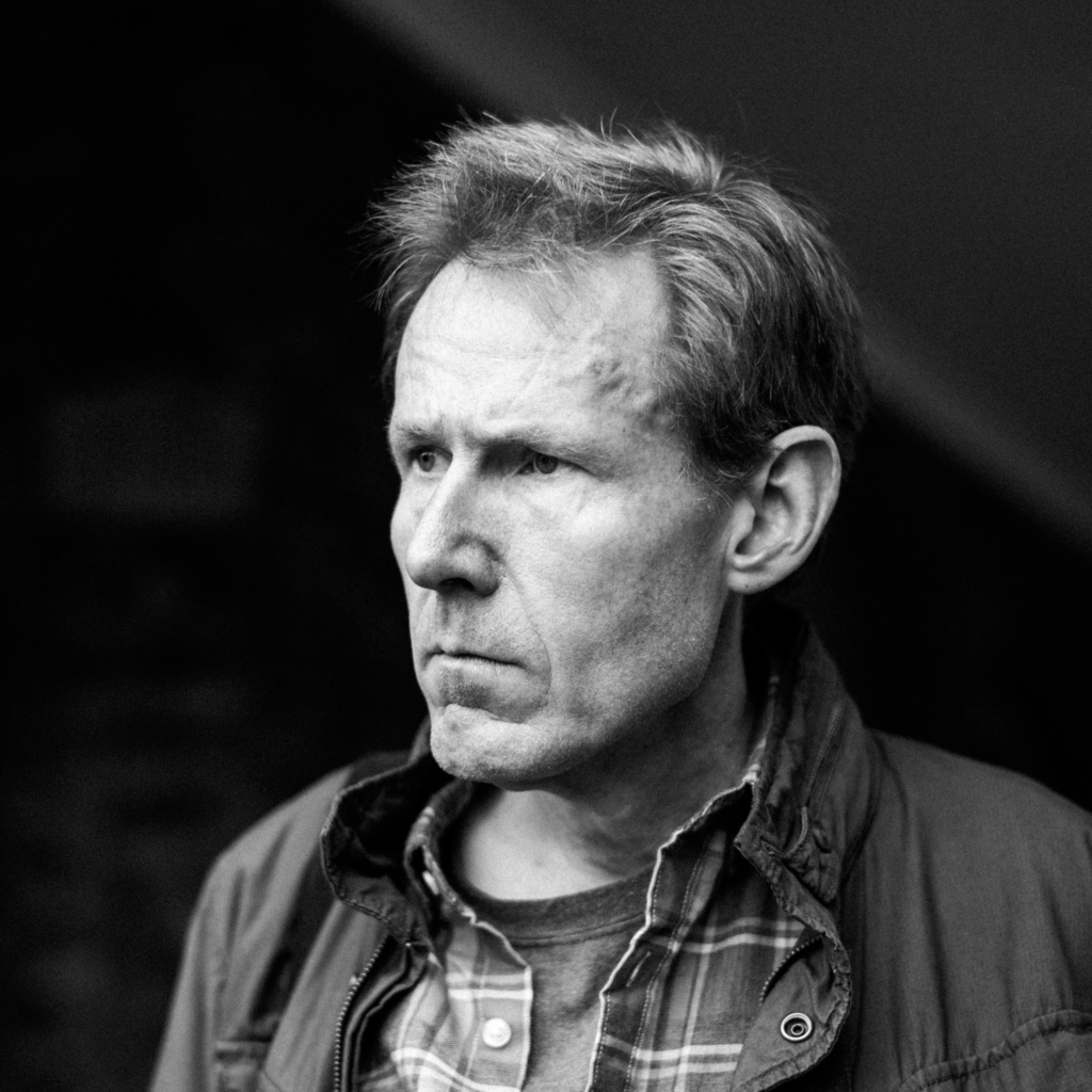
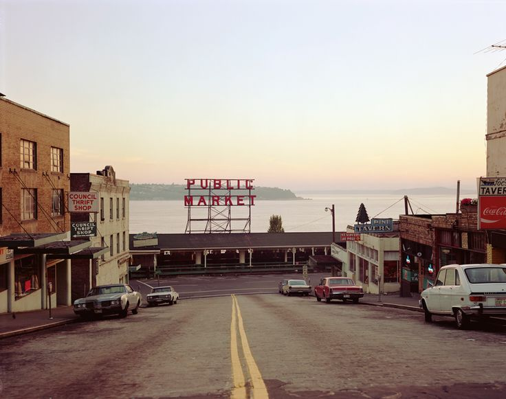
Artist Reference – Stephen Shore

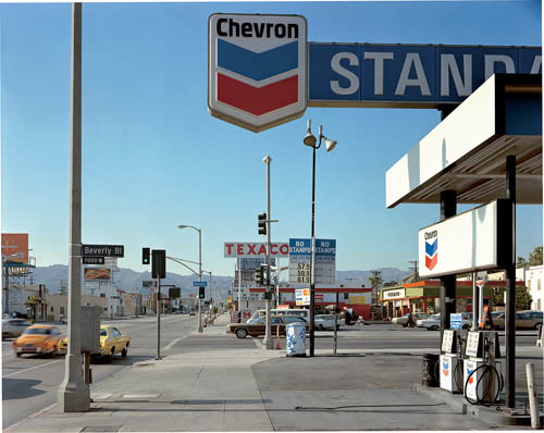
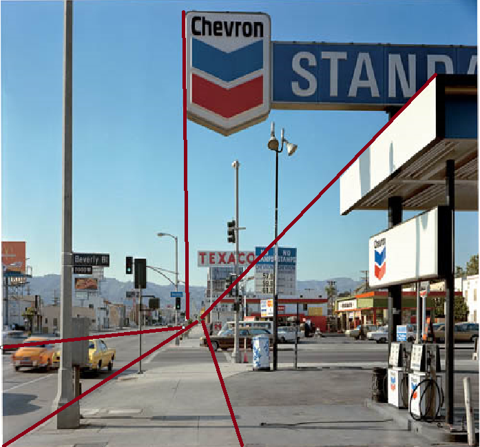
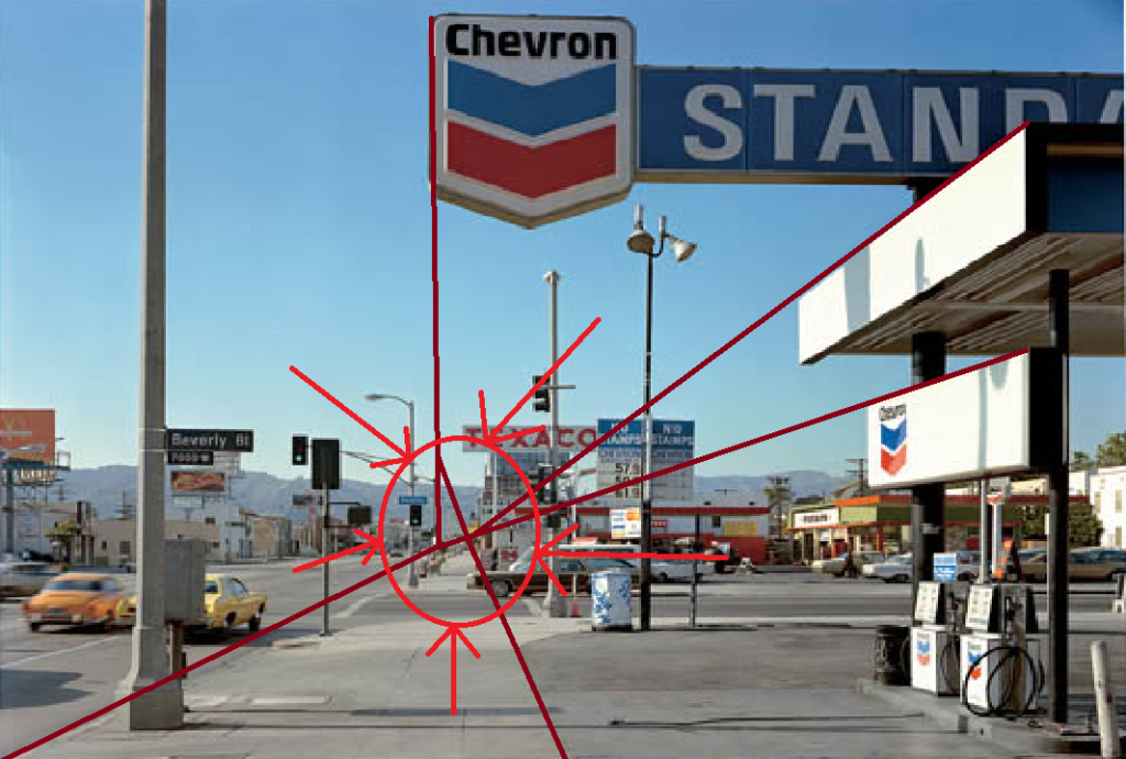
Technical
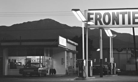
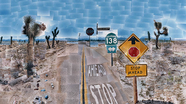
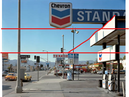
The photo uses natural daylight in this image which lights the image up quite strongly as their is no clouds in the sky to cover up the suns light. You can also see the image uses a slow shutter speed as we can see the cars on the left side of the image appear quite blurry. The temperature of the lighting is cold as the image contains more of a blue hue than a yellow hue of colour. We can also see that due to the way the lighting is projecting towards the object, it ends up creating hard edged shadows of the objects/structures in the image.
Visual
With this photo you can see the hard edged shadows that form around the objects and structures. The image is aligned in a specific manner that it resembles some aspects of the rule of thirds. We can also notice that starting from the top of the image with the bright blue skies and then moving towards the bottom half of the image that it starts to become more cluttered with buildings, signs and lamp posts obstructing the view ahead. The photo is in a square format which allows the focus of the image to be more concentrated towards the bottom and the picture appears to be pointed towards nature by the way some objects are pointed like the signs or the direction the cars are driving towards.
Contextual
This picture might be focused on the achievement of cars and how prices for them have gone down meaning lots more people are able to afford them and drive hundreds of miles and have the freedom to go anywhere. We can also see nationalism on the gas station sign as it uses the iconic colours of the American flag.
Conceptual
This image might be showing us the gradual change from natural landscapes to man-made structures which is starting to benefit the majority of people. From the cheap cars to the wide range of options of where to go for food or shopping in town areas. This photo could also be seen as a depicting the start of the American dream and how it looks to live in America.