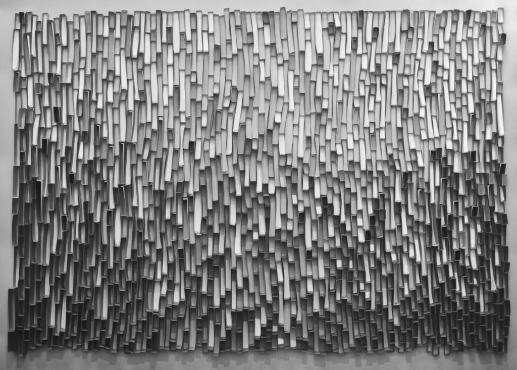
Texture is how colours and shapes are captured in an image, allowing you to visualize the texture and quality of an object/objects.
Minor White
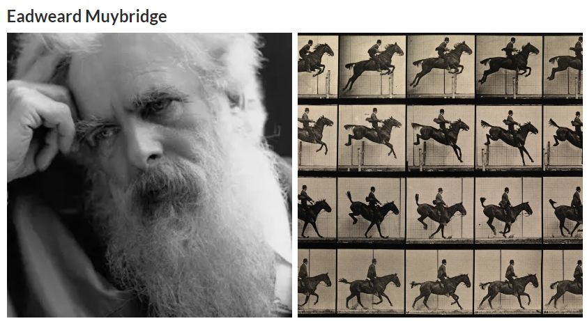
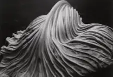
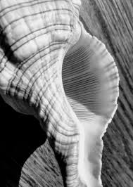
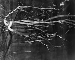
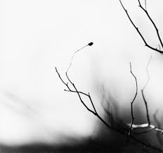
Minor White was a key American photographer and writer who made a big impact on photography. He was especially known for his artistic approach and the way he explored deep themes in his work.
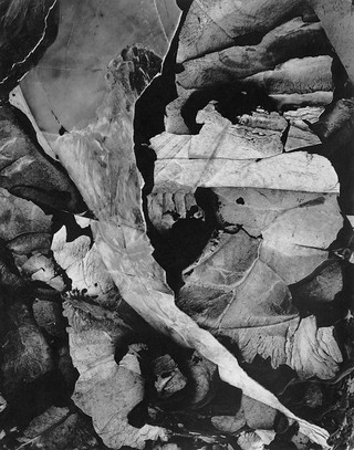
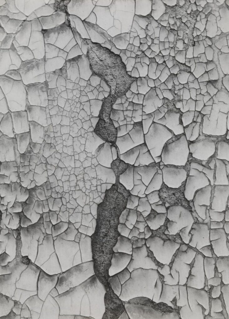
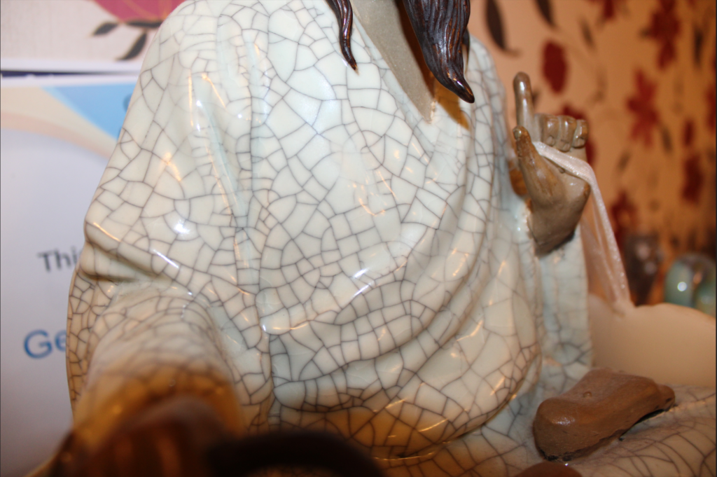
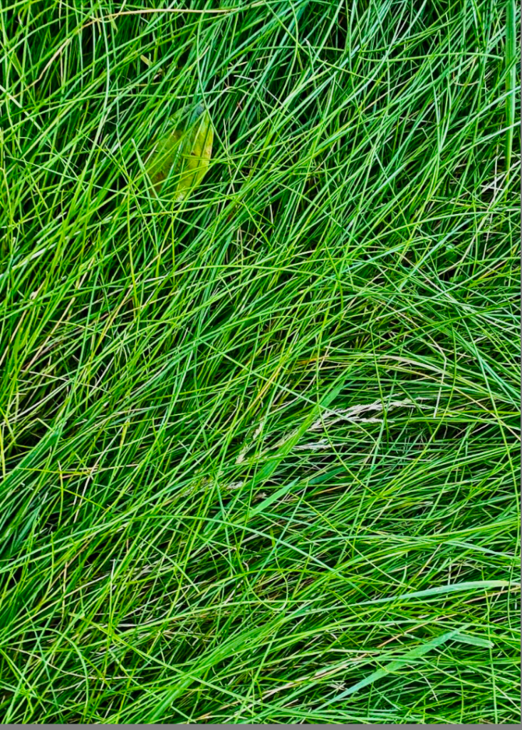
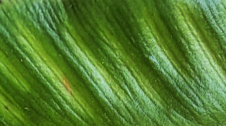
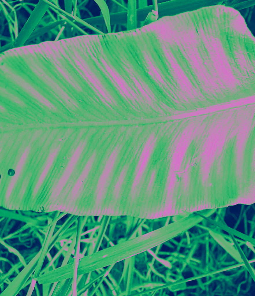
Minor White’s nature textured photos are a really interesting l part of his work and they have inspired me to use natural forms for this texture experiment.
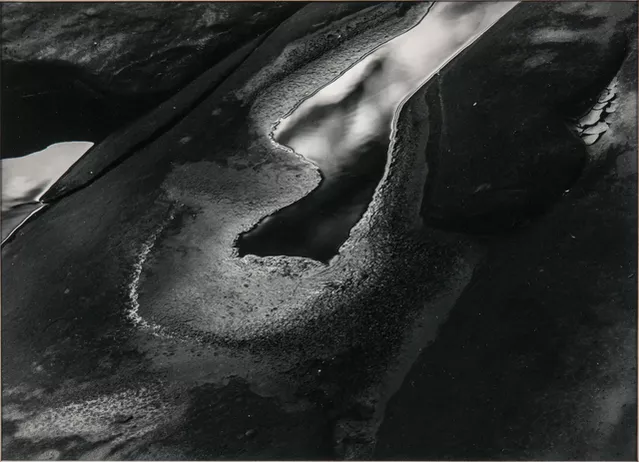
He had a knack for capturing the little details and beauty of the natural world. His images often focus on textures in landscapes, plants, and other natural forms, playing with light and shadow to create depth, which I have utilised in my images.
By getting up close and using shallow depth of field, he makes those textures stand out, giving his nature shots a really intimate feel. His love for nature comes through in his photos, making them not just pretty pictures but also something to think about. They evoke feelings and spark contemplation, making them relatable on many levels.
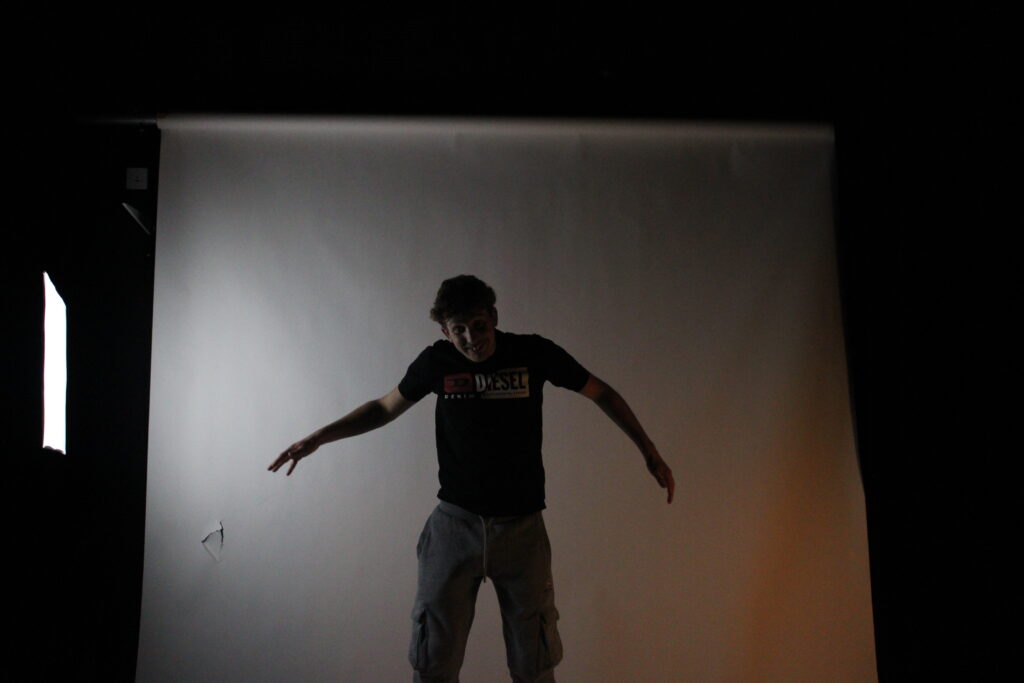
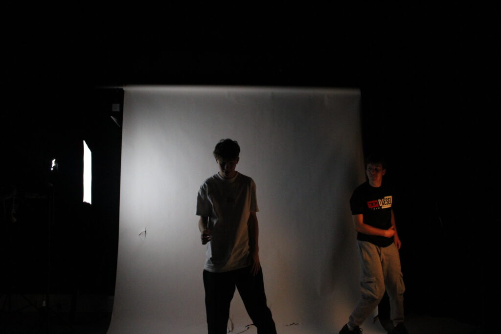
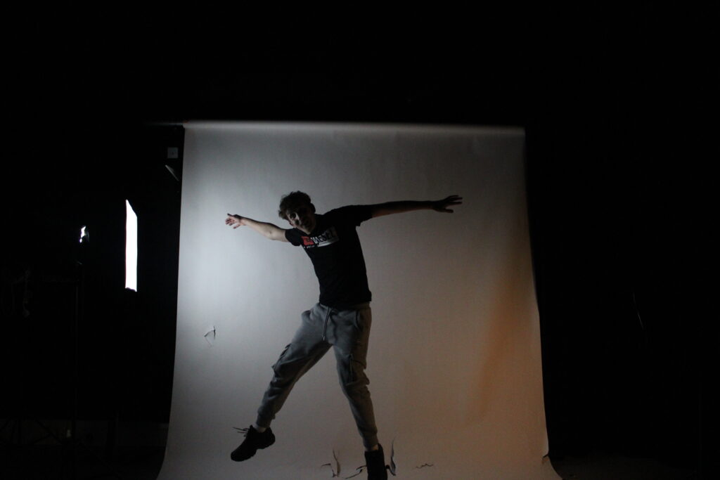
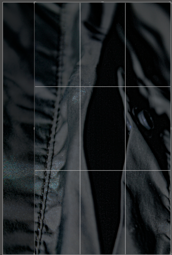
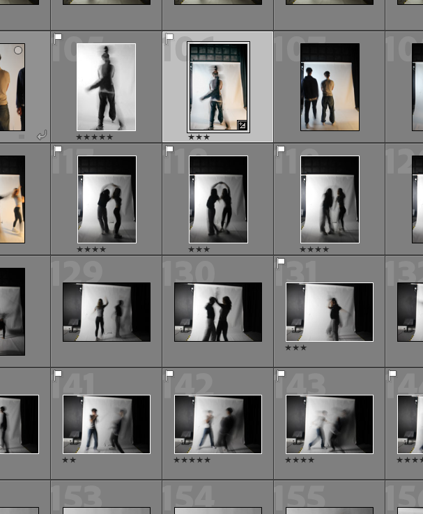
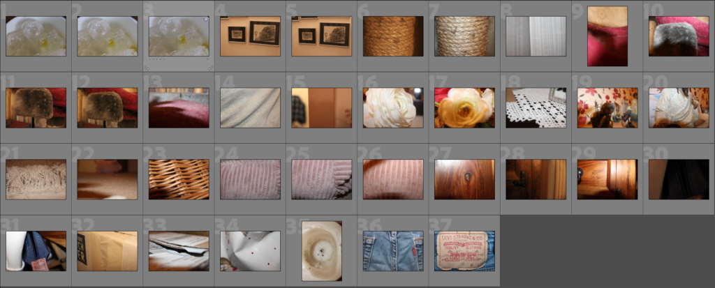
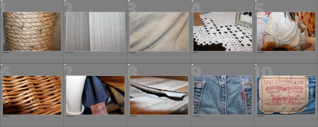
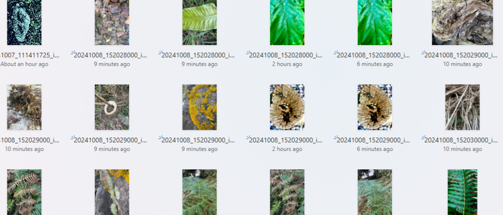
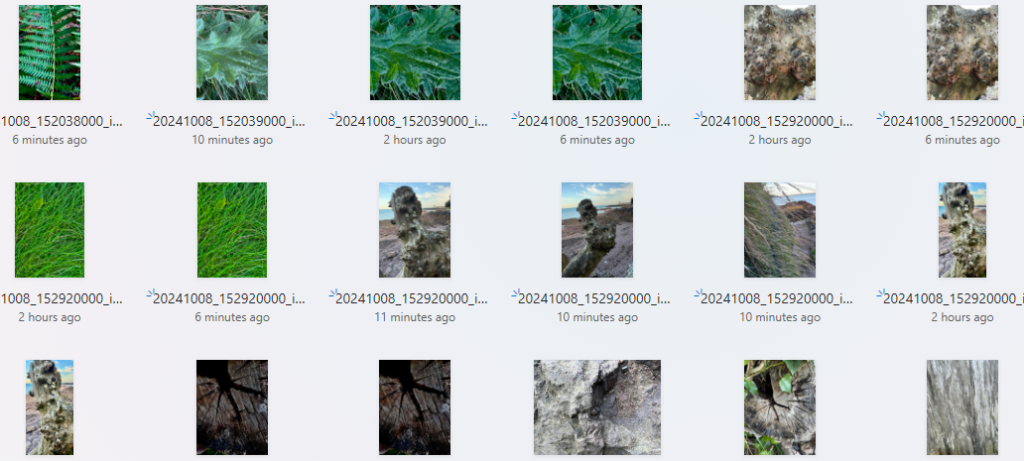
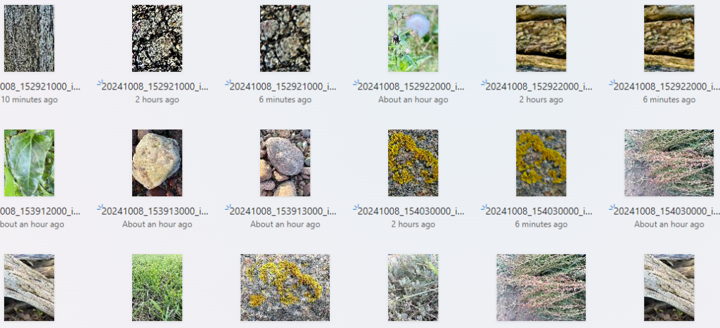
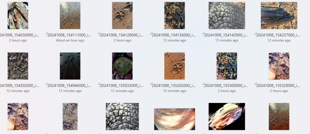
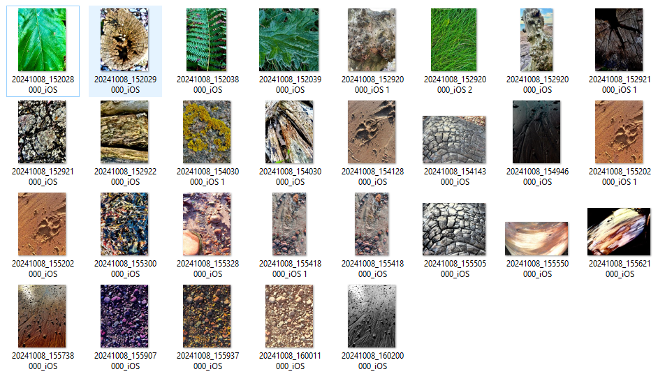
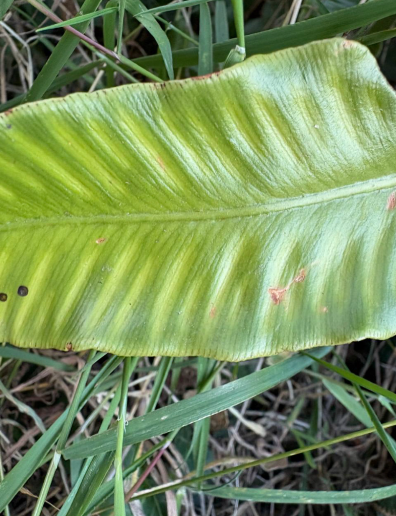
Contact sheet – all photos I have taken
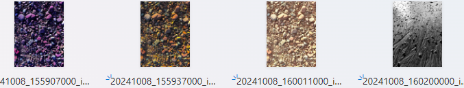
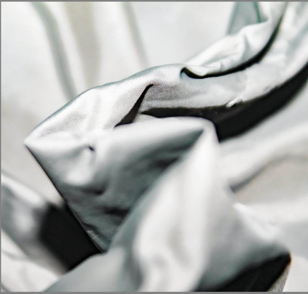
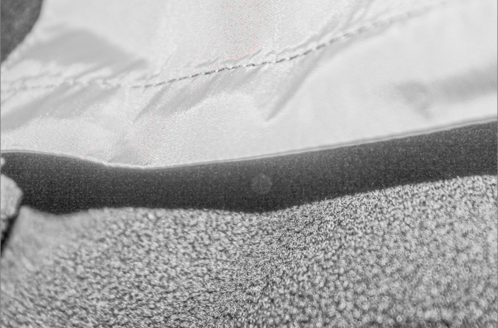
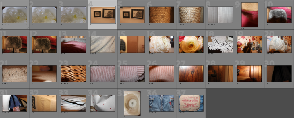
Strongest Images – with preliminary editing
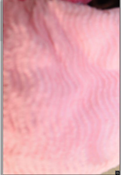
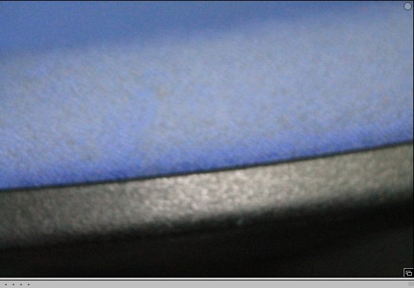
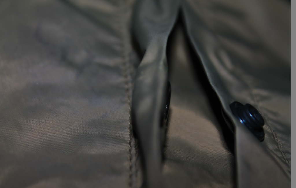
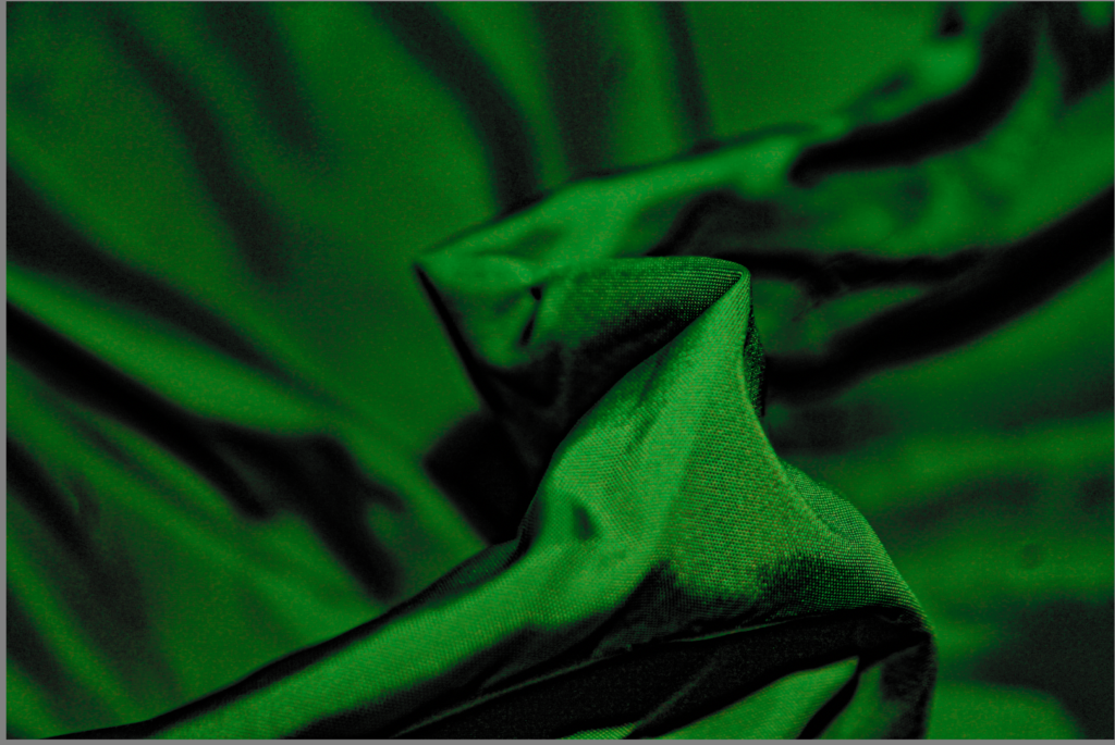
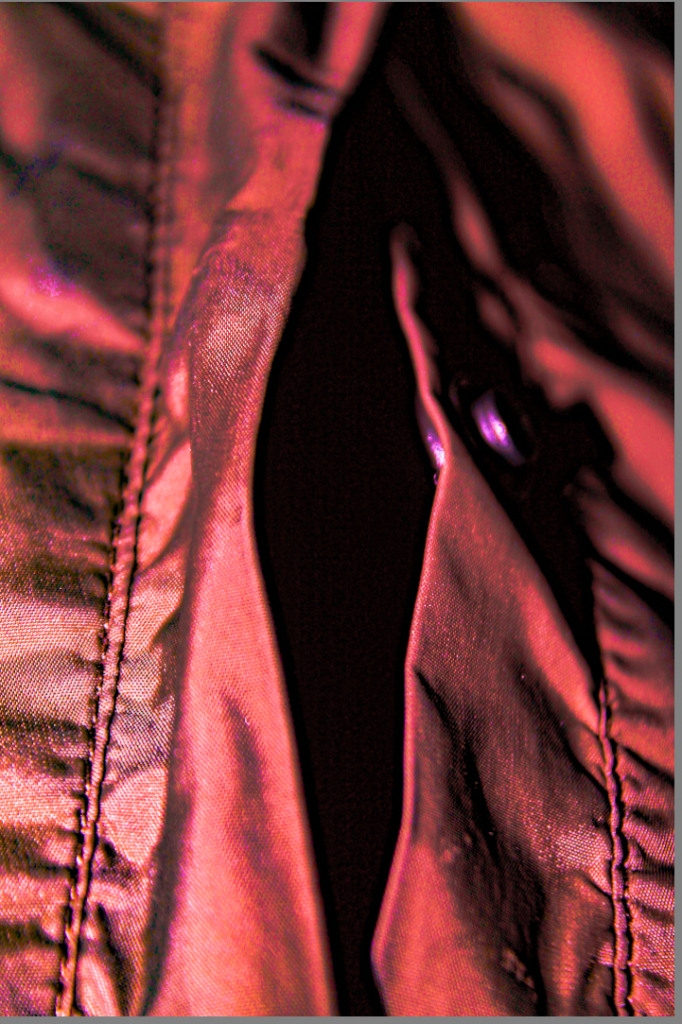
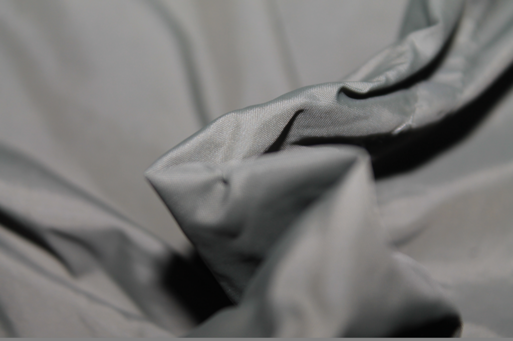
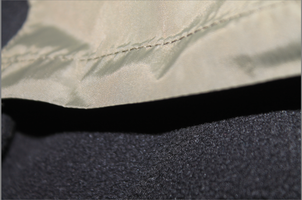
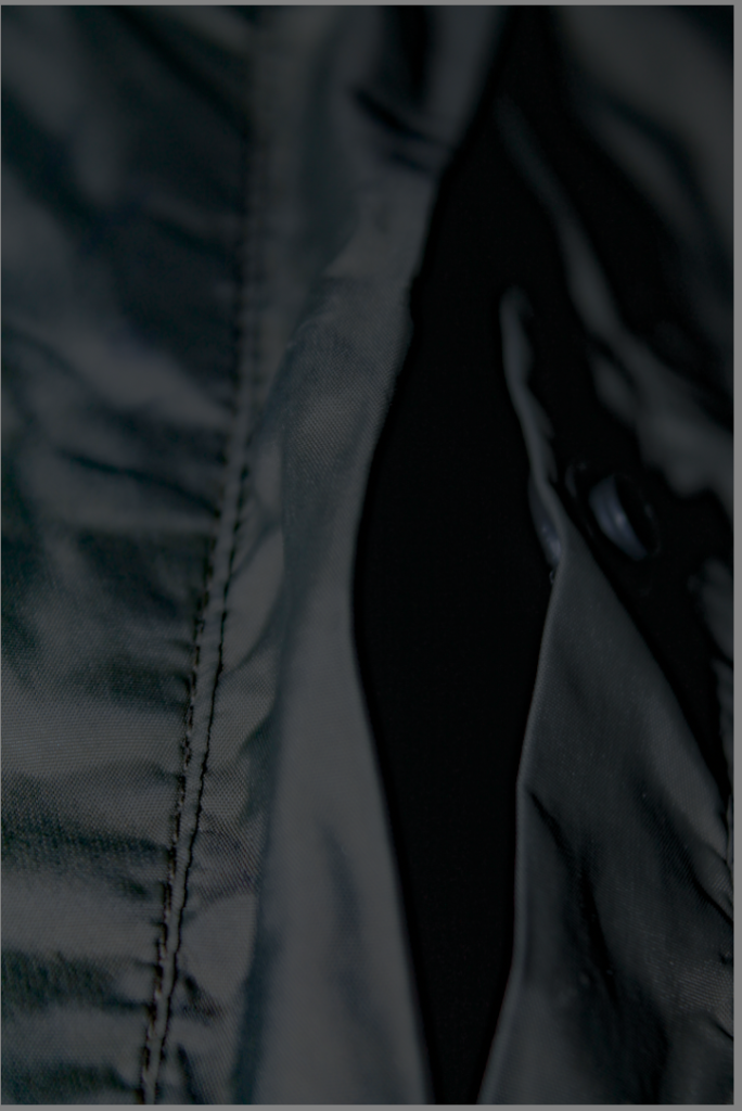
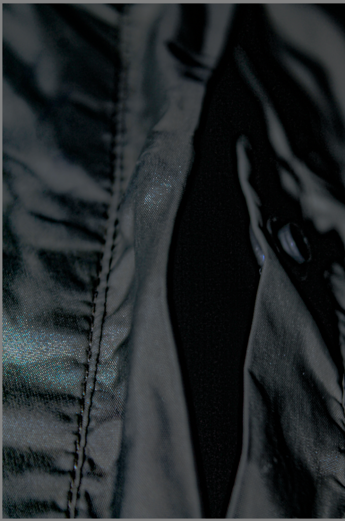
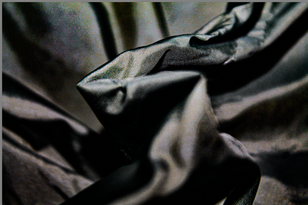
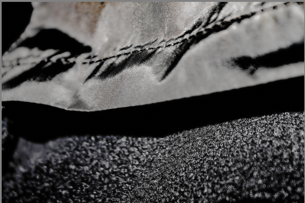
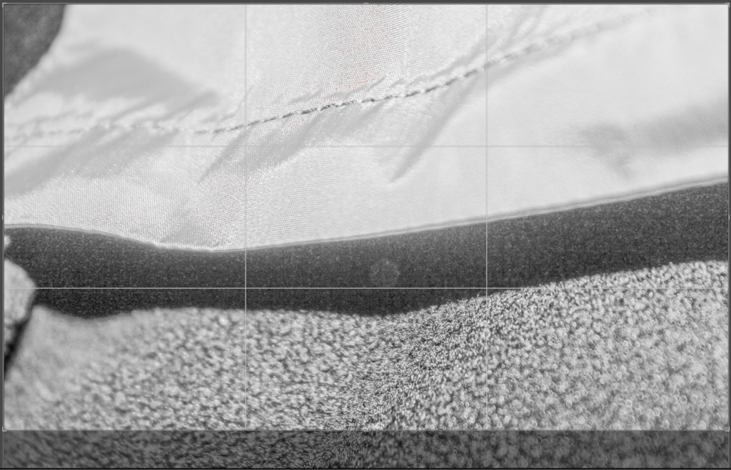
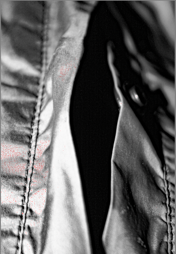
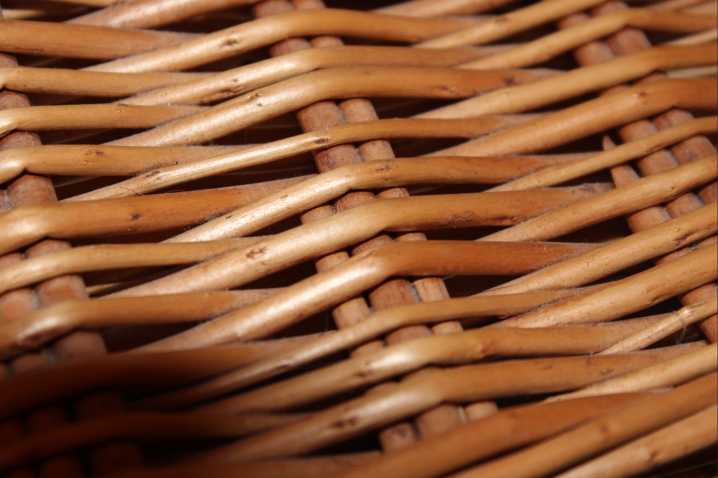
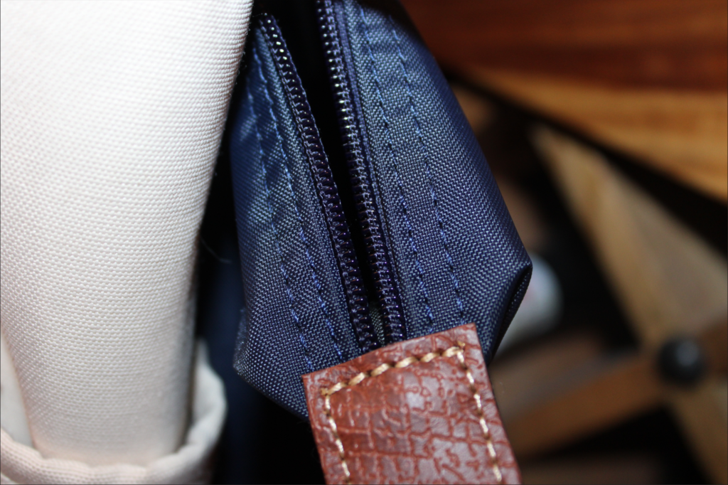
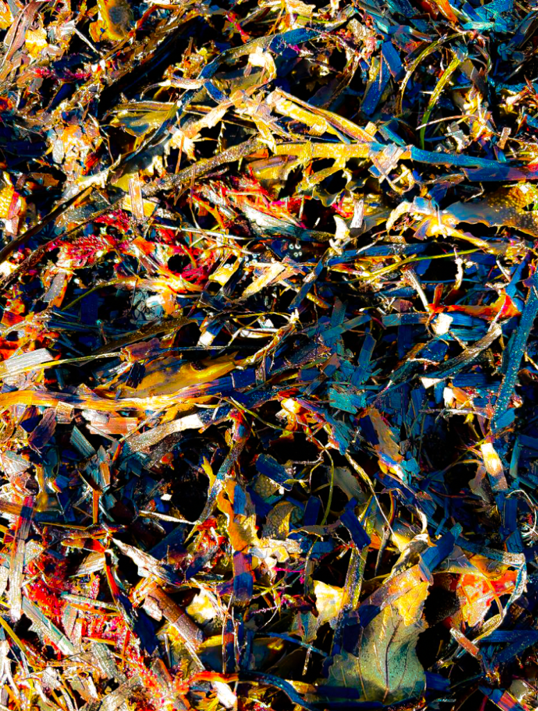
I took the majority of these images up-close in order to capture the texture of the materials. This resulted in a couple of the images become abstract and unrecognizable which I like. Many of the images are deadpan images which create a sense of detachment and sharpness throughout.
My Best Images
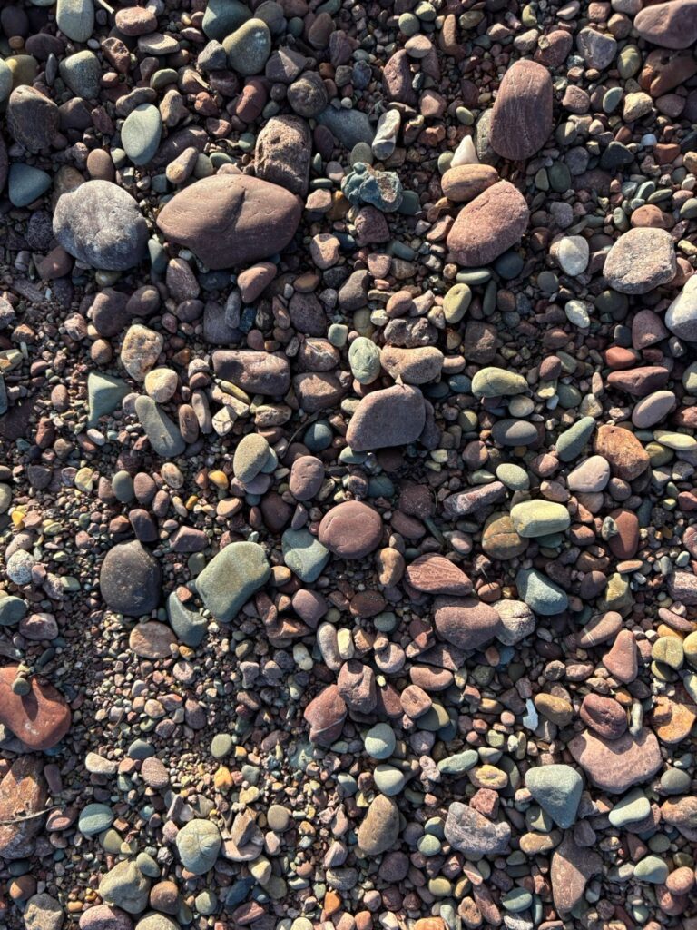
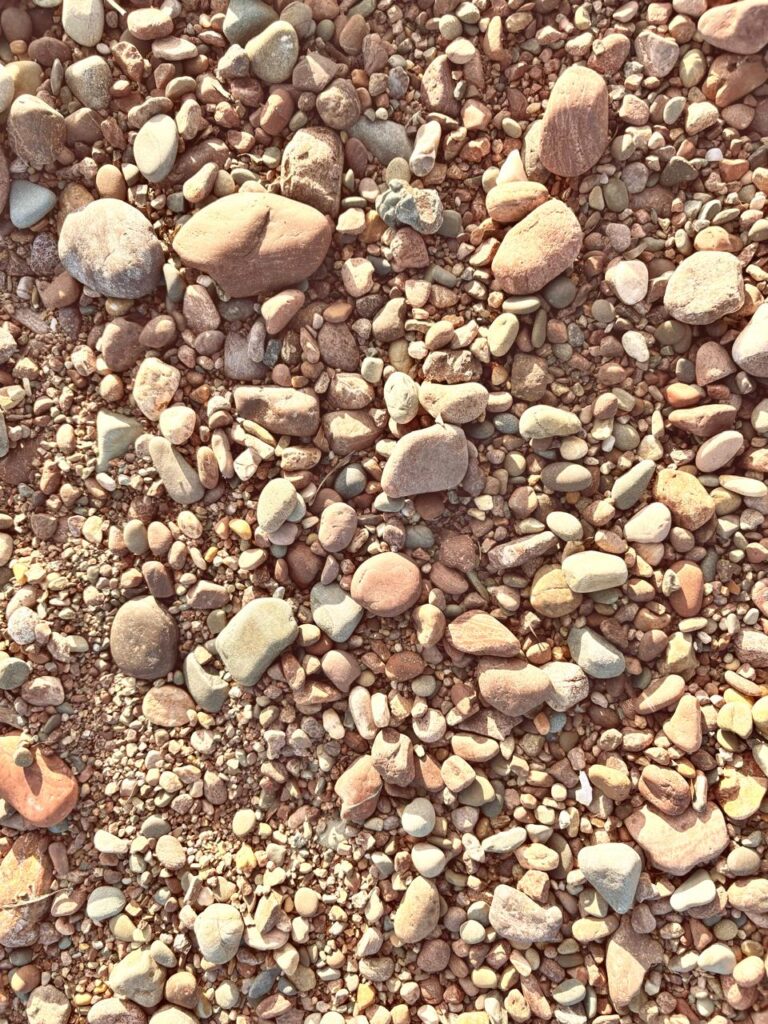
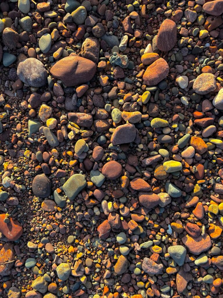
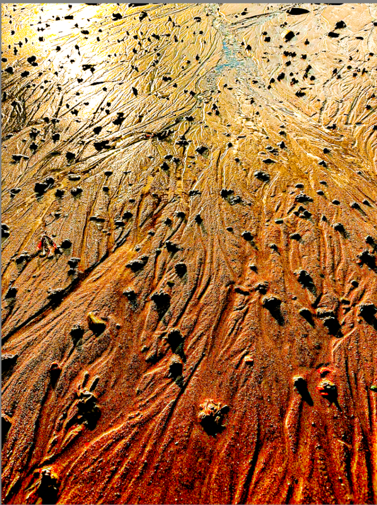
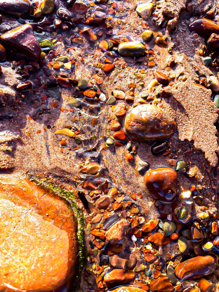
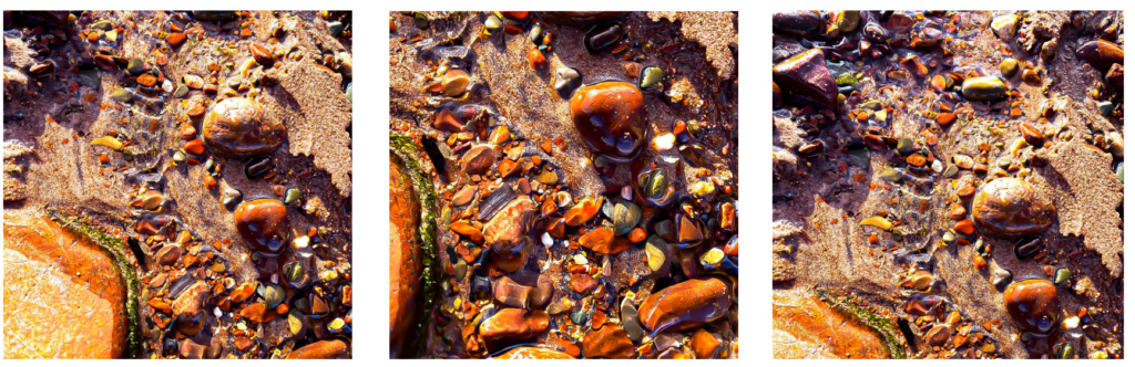
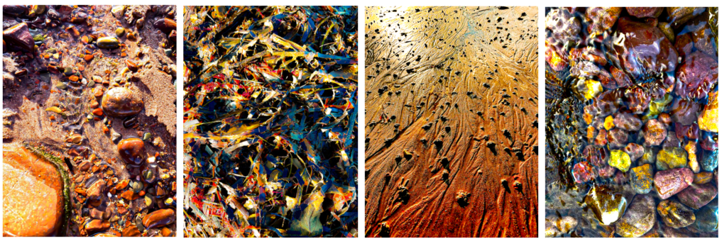
This is my favourite version of the image that I edited on my phone. I like this image because it creates a sense of ‘golden hour’ as it looks like the sun is casting golden light over the pebbles. I did this by increasing the warmth in the image and turning up the exposure which exaggerated the light areas. I like how the light hits the high points of the pebbles because the light creates shapes on the pebbles surfaces, enhancing the image. I also increased the contrast which allows the texture of the pebbles to become more apparent.
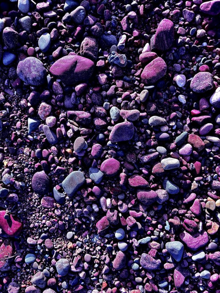
This is the edited version, I like this image because you can’t immediately recognize what it is, so you aren’t distracted by the material itself, your only focused on the texture. I like how there is a vague pattern in the texture which enhances the impact of the image. With editing the silvery colours are exaggerated which gives the surface a metallic appearance.
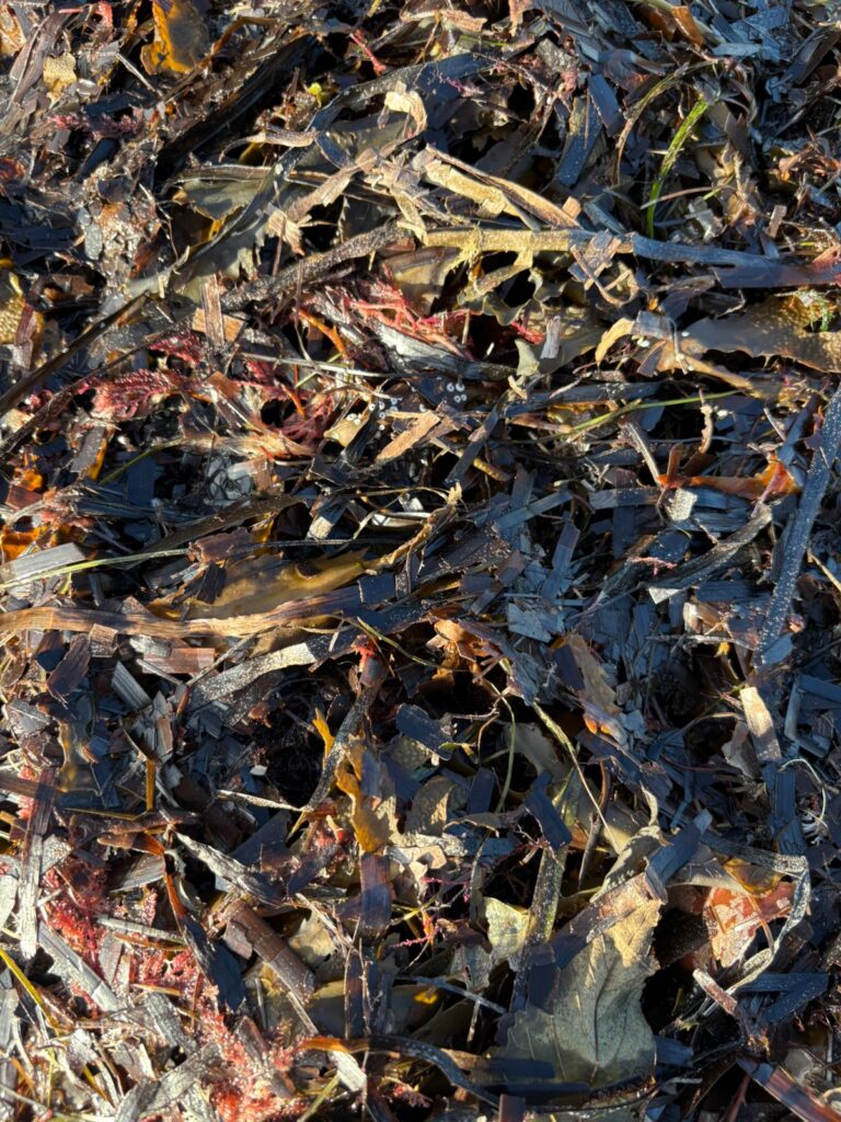
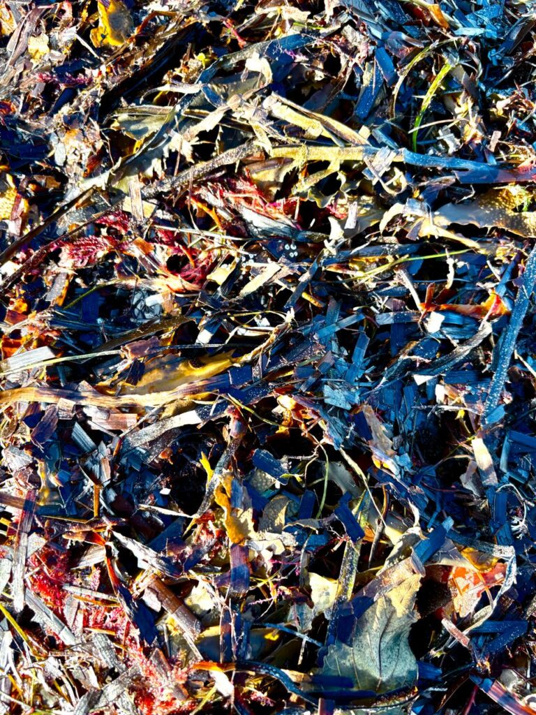
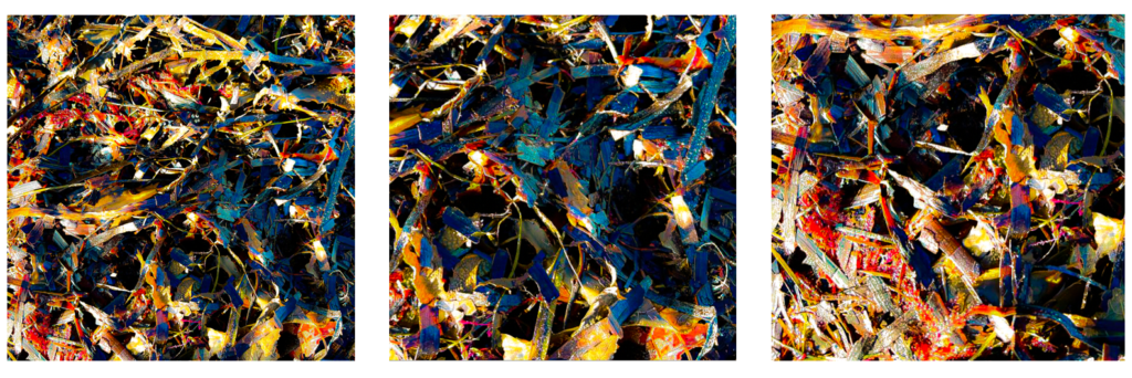
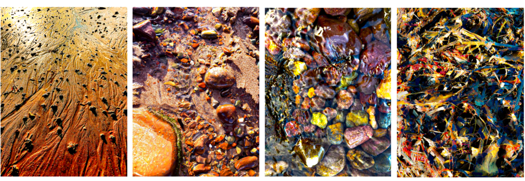
This is the image after I edited it on my phone. I like this image because of the texture created by the overlapping of the sea weed. I increased the exposure in order to contrast the lighter and darker areas. I also increased the saturation and vibrancy which made the dull colours become brighter.
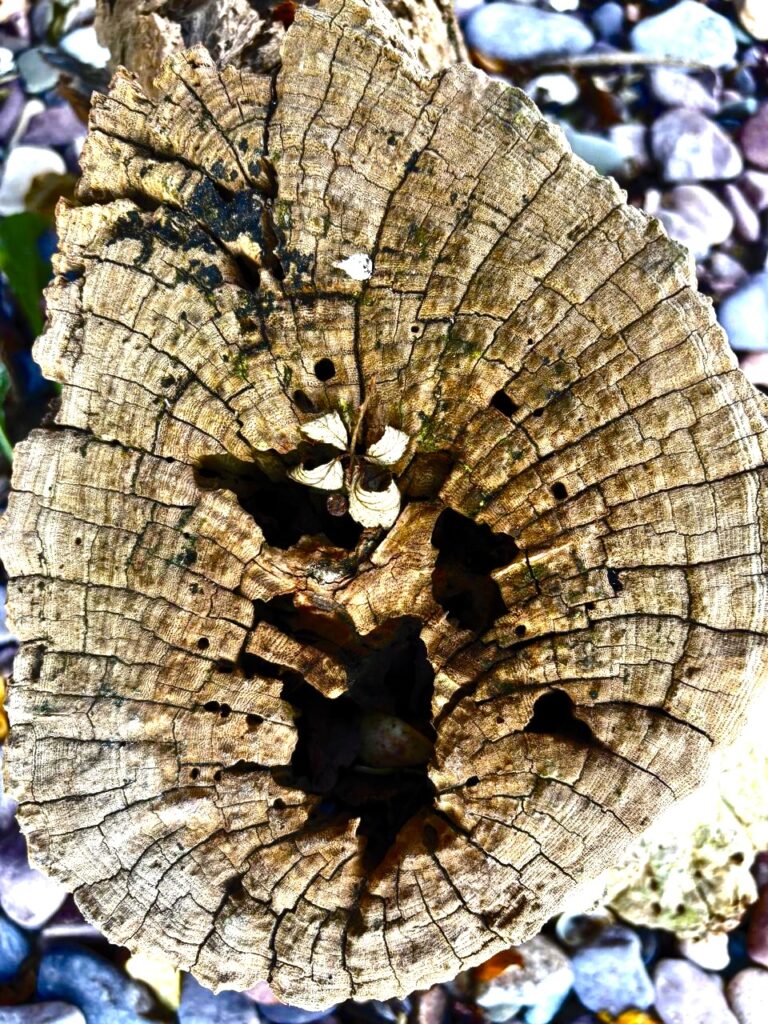
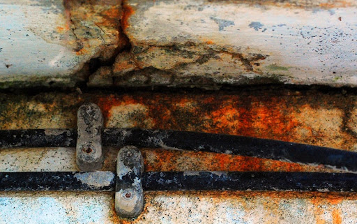
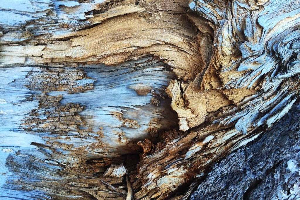
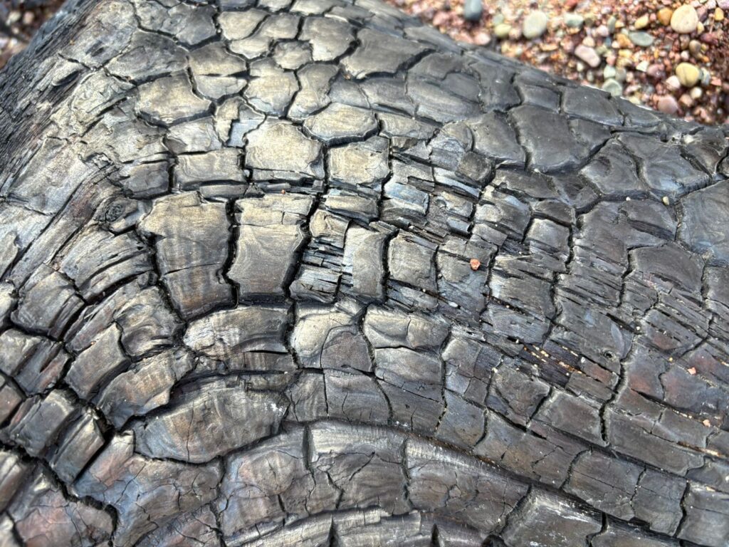
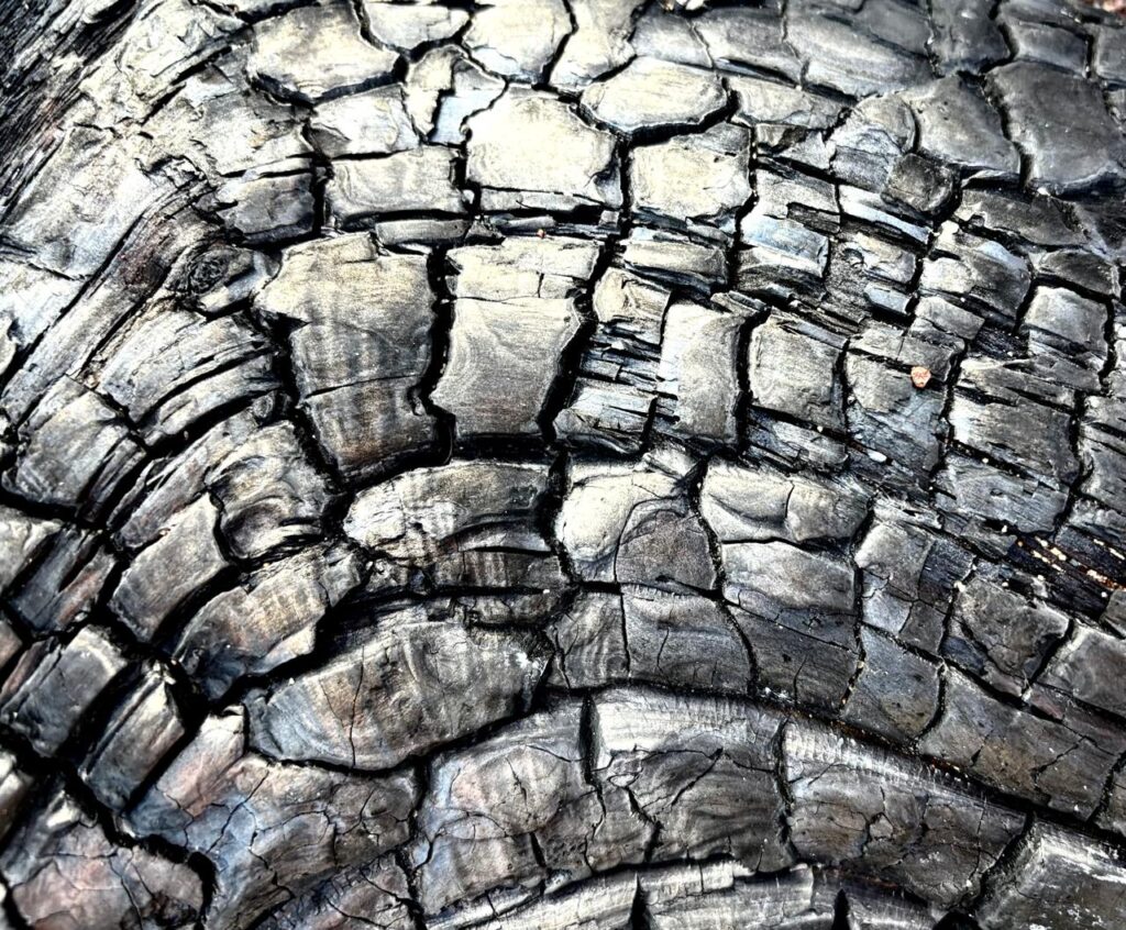
I love this image as you can clearly see every line and crack in the wood. I contrasted the light and dark in order to make these lines stand out even more and create an even wider range of tone. I also like how there is a ring of warmer colours which fade into lighter, cooler colouring. The focus is on the wood whilst the stones around it have a softer focus, I think this creates sharpness and definition as it is being contrasted with the background.
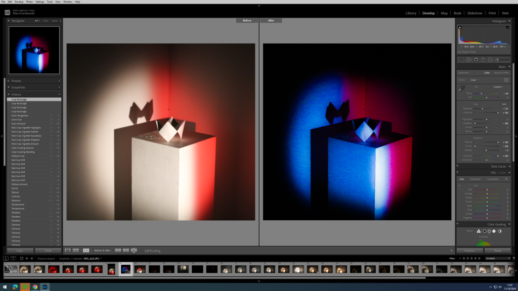
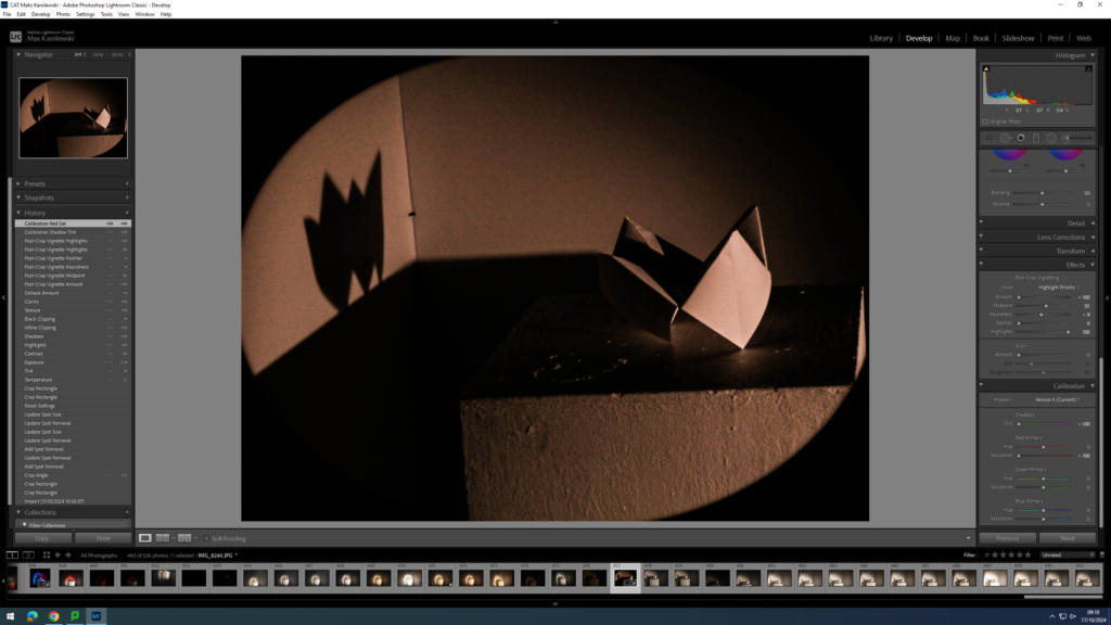
Edits on lightroom/photoshop
Original Image
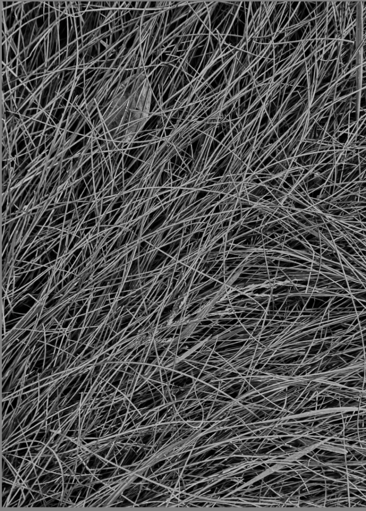
I edited this image to be black and white to take the focus of the colours in the image and allow the texture to be the main point of focus.
Experiments
I used photoshop to experiment with editing this image:
Using the sepia tool to change the colours in the image:
My Final 3 images


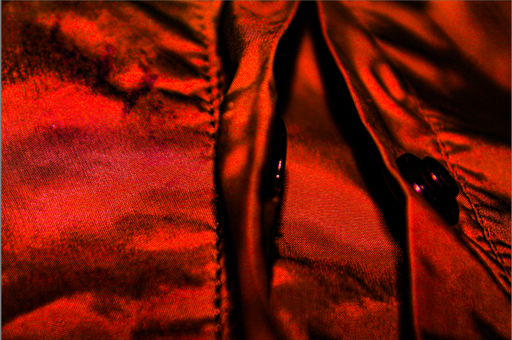
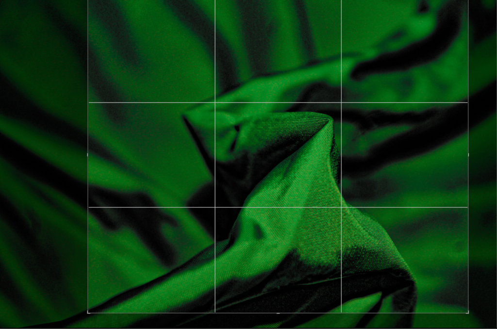
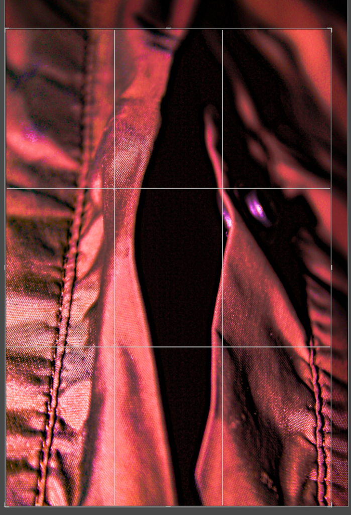
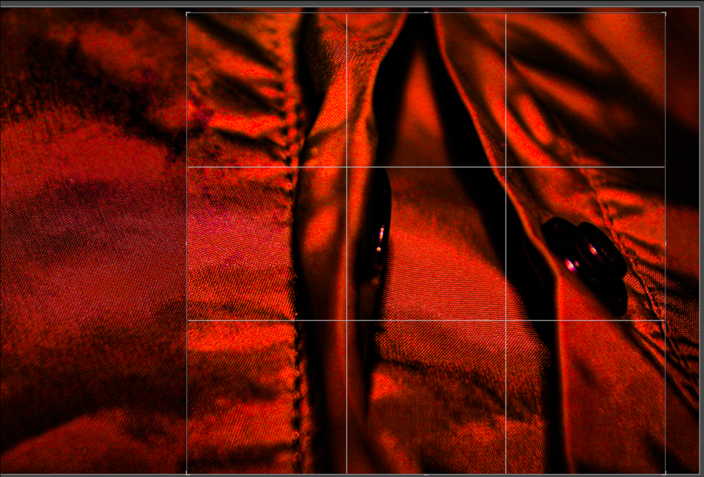
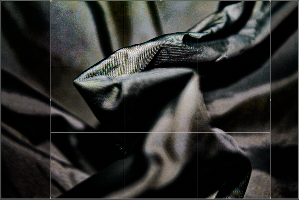
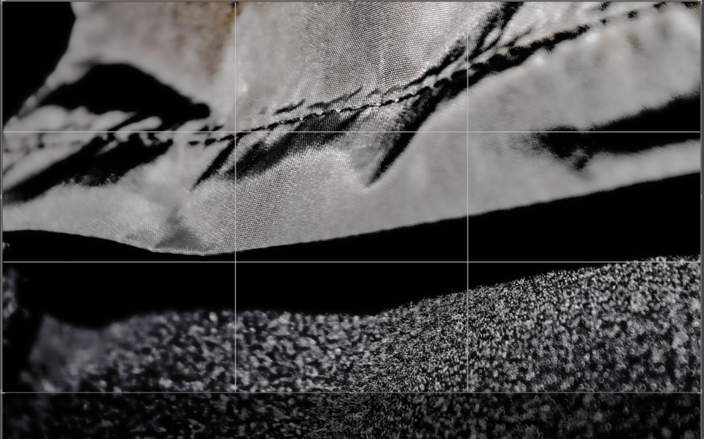
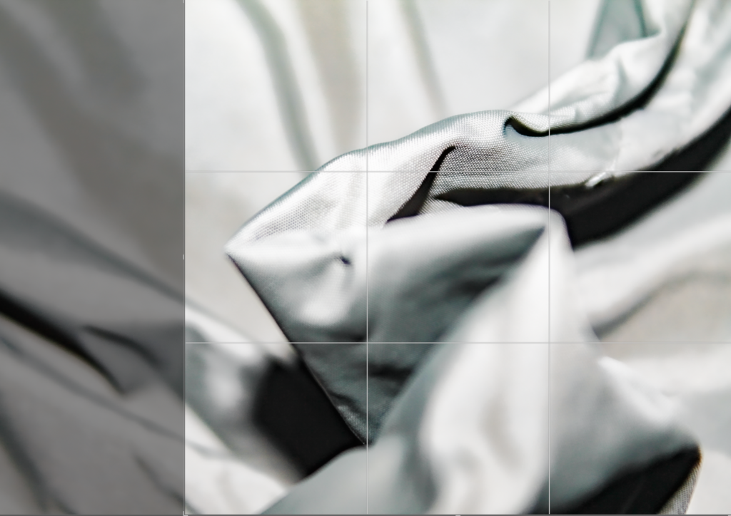
Cropping
Here I cropped each image 3 times to see which version was the best.
Layout Experimentation
Final Images
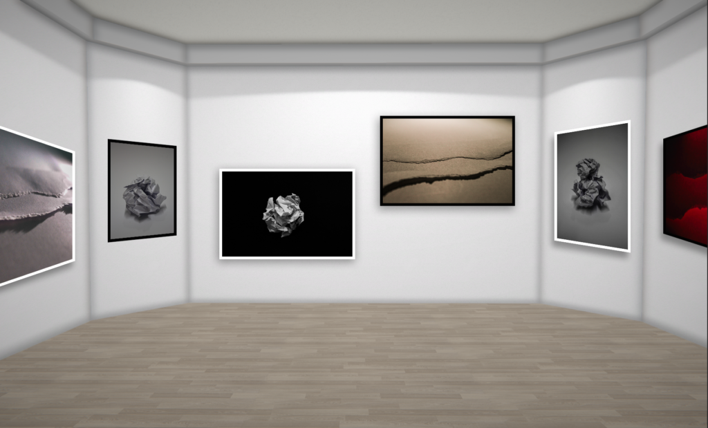
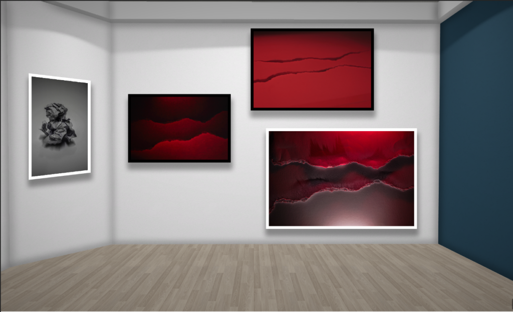
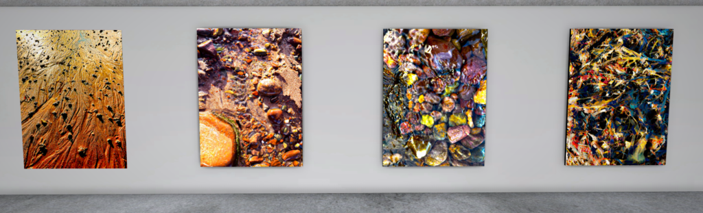
Images in Virtual Gallery
Evaluation
Overall, I have used organic shapes, combined with busy textures and a vibrant use of highlights and shadows. All these elements enhance the formal elements throughout my photos.
Throughout my images I have focused on organic natural shapes and enhances the highlights, which creates a consistent warm tone throughout the group of photos. Throughout this collection I have also tried to achieve consistent shadows to add depth which also enhances the organic textures and shapes.
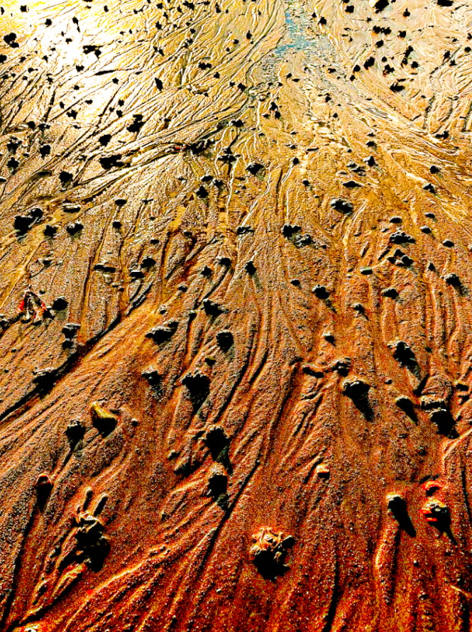
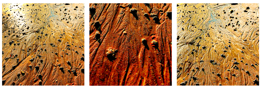
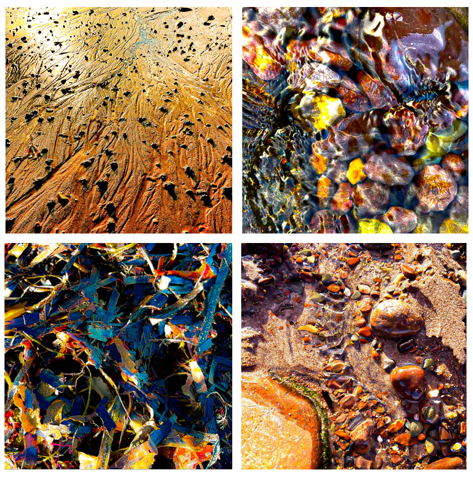
My first image I edited multiple times, this version is my favourite due to the use of textural lines that create a path that pulls you through the image. adding depth and perspective. The foreground of the photo has a darker tone of deep burnt orange which blends to a bright yellow towards the top (background) of the photo. This variation in tonal range adds balance to the composition. This creates a wide tonal range within the image. The lines also break up the texture of the sand by enforcing some areas to seem smother and others to appear more texturized. The bumps of sand exaggerate the shadows and highlights as they are raised and some areas are hit by the light and others aren’t, this adds to the overall texture of the image.
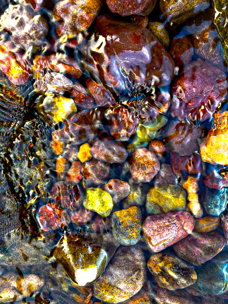
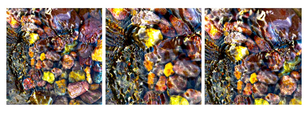
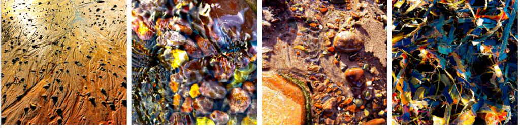
In contrast, this image has less depth to it and it’s been taken at a deadpan angle. Unlike the first image which takes you on a path, this image focuses solely on the shapes of the pebbles and the reflective surface of the water. The vibrant areas on the pebbles stand out which creates a bright formation of colours, beneath the rippling water. These colours are framed by the shadows around the pebbles, this creates texture and contrast within the image.